Friday 29 June 2018

Take a Stress-Free Vacation This Summer (and Keep Your Business Running)

An OnDeck Vacation Study reported that only 57% of small business owners planned on taking a vacation last year. Further, only about a quarter of these owners would allow themselves a few days away from work.

There were a couple more disturbing facts that came out of this infographic. The first being that the majority of small business owners wouldn’t fully disconnect from work while on vacation; another discouraging statistic showed a greater reluctance among self-employed individuals—especially those with new businesses—to take a vacation at all.

Considering how costly burnout can be for freelancers and small business owners, it’s a much wiser choice to put aside any fears you have and make time for a vacation this year.

Rather than give you the usual advice (ie: plan ahead, notify your clients, disconnect from technology, and relax), I prefer to go the more practical route. Below, you will find 12 things you can do to have a stress-free vacation while keeping your business running.

12 Tips for Taking a Stress-Free Vacation as a Freelancer

I know it can be so scary to think about taking time away from your business. After all, if you’re not available to work—especially if there’s no one to cover for you—all production stops. Right? Well, not necessarily.

Here are some things you can do now to ensure that you have a stress-free vacation and your business isn’t too greatly impacted by your absence.

1. Schedule Vacations Ahead of Time

There are times when you’ll feel tempted to take a day off when work is light or non-existent, and you should take advantage of those impromptu opportunities. That said, if you want to take off a larger chunk of time, it’s best to schedule it in advance as it gives you and your clients more time to prepare.

2. Schedule Vacations Strategically

Depending on which industry you work for, you may be lucky enough to work with clients that take vacations around the same time every year. Like the education sector being off in the summer. Or certain kinds of sales departments taking a break over the holidays. If there is a low season for you, take advantage of it and schedule your vacation then.

You could also plan a vacation around a conference you were planning to attend. For instance, if you’re a WordPress web designer, you might be thinking about attending WordCamp this year. Why not build in a few extra days around it and take a break then? It might also make you feel less guilty about it.

3. Take Shorter Vacations

I’m one of those people who feels guilty about taking time off, which is why I plan shorter vacations for myself throughout the year. Rather than do an entire week or two, I schedule three or four days every couple of months. I get the same amount of time off that others do, I just don’t do it all at once.

4. Add Time Off to Your Calendar

Once you’ve made the decision to give yourself a break, put it on your calendar so it’s always top-of-mind.

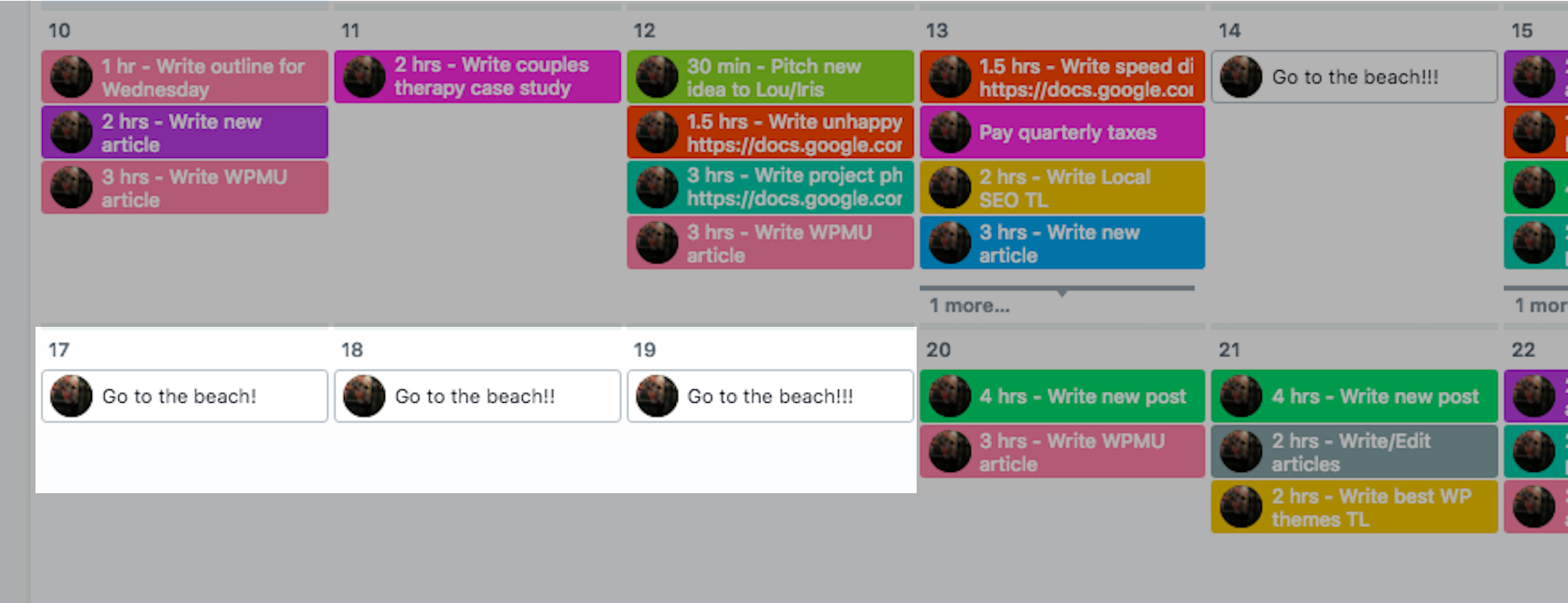
If you have a separate system for tracking projects and tasks, add it there too. I write my vacation days into Asana as it keeps me motivated throughout the month to get all my assignments done early. It also helps the planning process so I make sure that all work is accounted for and completed before I leave.

5. Budget for Vacation Time

If you’re less worried about losing clients or getting behind on work, and more concerned that you’ll lose money by taking a vacation, add vacation-related expenses to your budget. That way, you can adjust revenue and sales goals to compensate for the “loss”.

You can always put aside vacation funds every month, the same as you would for rent, insurance, marketing, and other traditional business expenses.

If you’d rather not budget for lost time, you could always work weekends to make up for it. For every day you’re away, plan to work one day every weekend until you’ve accounted for the loss. But be careful. This could put you in danger of burnout, which defeats the whole point of going on vacation.

6. Notify Current Clients Early

Anything more than two days of unavailability (basically, anything you can’t use a weekend to make up for) should prompt you to notify clients. And you should notify them as soon as you have plans finalized. This way, it won’t be a surprise when a client asks for an ETA on their design project, only for you to tell them it’ll be a couple more weeks because you’re on vacation next week. If you give them enough notice, they’ll be much more understanding.

7. Turn on an Autoresponder

For everyone else—inactive clients, prospects, third-party suppliers, or anyone else you’re not in regular contact with—use an email autoresponder to notify them of your absence.

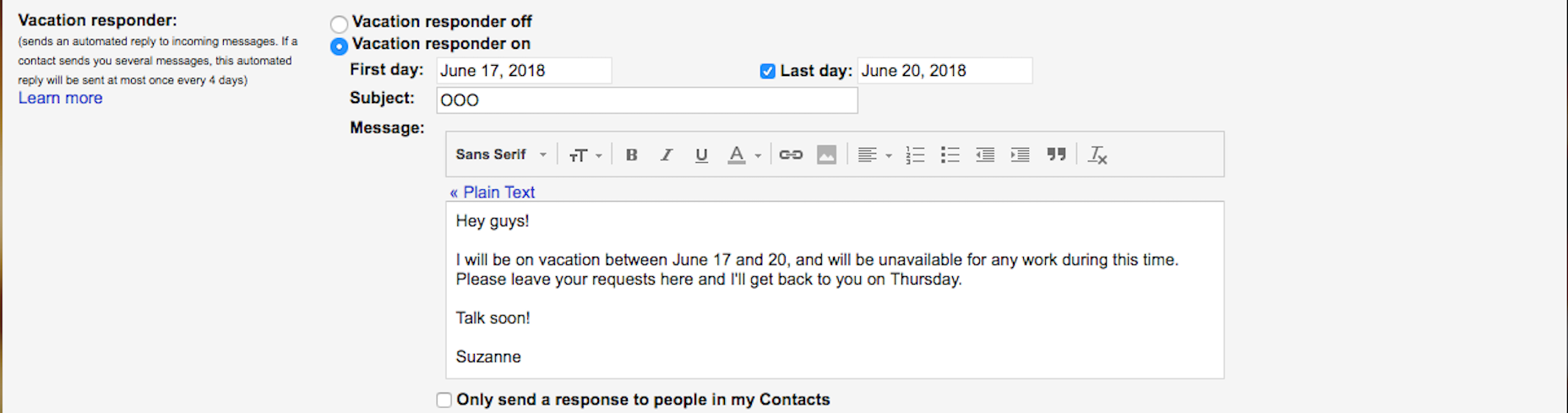
It doesn’t need to be anything long nor do you have to tell anyone where you’re going. The only thing I’d suggest is a notice about emergencies. If you want clients to be able to reach you in case something urgent comes up, you can leave an email address or phone number they can use in that case.

8. Keep the Week Before Vacation Light

When scheduling your workload before vacation, don’t plan for anything too critical. In other words, don’t launch a website, don’t send a client their very first set of mockups for review, etc. Don’t put yourself in a situation where an anxious/upset client is left without the ability to talk to you if something goes wrong.

Also, don’t take on any new clients or projects before going away. The relationship you have with clients can be delicate at first, so it’s best to kick off new work when you have the time to commit to it fully.

9. Automate Whatever You Can

For web designers, automation isn’t necessarily an option. What I would suggest, however, is that if there are any parts of your process you typically outsource to someone else (like a writer, developer, QA), schedule it so your projects sit with them while you’re away.

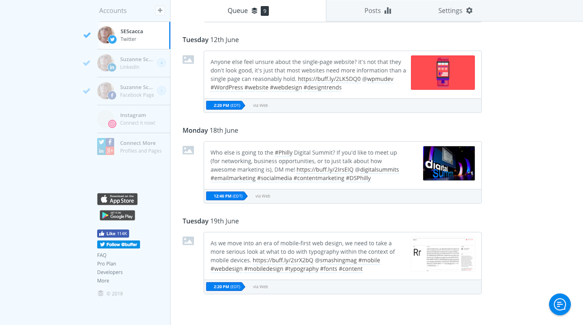
I would also suggest automating as much of your business-specific processes as possible. Marketing is an easy one to do. Write blog posts ahead of time. Create your weekly/monthly newsletter early. Write all corresponding social media messages. Then, use your marketing automation tool to schedule them to go out while you’re away.

10. Delegate to Others

If you currently work solo, then this option doesn’t apply; that is, unless you have another web designer you trust to manage your assignments while you’re away. Basically, all they have to do is babysit any clients who have questions or concerns, and address emergencies that come up. There really shouldn’t be much for them to do if you prepped your clients. And you can handle this like a trade: when they go on vacation, you do the same for them.

Another option is to hire a virtual assistant to provide coverage, though it’s probably best to get another design expert to hold your place while you’re away.

11. Don’t Take Your Computer on Vacation

If you bring your computer on vacation, you’re going to be tempted to work. Instead, rely on your mobile device to provide coverage if it’s needed. Just make sure you set it up beforehand:

  • Add any apps you might need to handle emergency situations (e.g. Adobe software, WordPress, etc.);
  • Filter all work-related emails into a special folder so you’ll know where to check them;
  • Add a list of client contacts and project notes to your phone for easy reference.

And if you must work while on vacation, only do so during limited and dedicated hours each day. This is time for you to unwind, not to work in a different locale.

12. Generate Passive Revenue

The key here is to find a way in which your design business can generate passive revenue: configure your personal website with affiliate marketing, write an ebook, launch a video tutorial series, sell design templates or icons on Dribbble, etc. Then, let this revenue stream provide you with supplemental income that affords you the opportunity to take a stress-free vacation.

It may be too late for this one to help you feel better about taking vacation this year, but it’ll definitely lay the groundwork for next year’s if you get started now.

Wrapping Up

What is it that you’re afraid of by allowing yourself the time to take a vacation? Afraid you’ll lose money? Afraid clients will abandon you because you spent five business days away from them? Afraid you’ll be too overwhelmed by work when you get home? Whatever it is that scares you, there’s a solution for it.

Add Realistic Chalk and Sketch Lettering Effects with Sketch’it – only $5!

Source

from Webdesigner Depot https://www.webdesignerdepot.com/2018/06/take-a-stress-free-vacation-this-summer-and-keep-your-business-running/

Thursday 28 June 2018

11 Secrets of Actionable UX Reports

When designers and developers work on projects, they have a lot of questions: What do our users expect to see on this screen? How are users supposed to interact with our product? What should our onboarding feel like? These questions are commonly asked during product development.

Every team wants to reduce the risk of incorrect design decisions and as the complexity of products increases, the digital product design industry puts usability practitioners in high demand. Usability practitioners are people who help product teams make informed decisions. In most organizations, the primary role of usability experts is design validation—making sure that a product is usable.

But many usability practitioners (particularly those who are new to the field) complain that product teams don’t act on their research results. While this could be due to many different issues, most often it is due to poor usability reports; if product teams have trouble understanding findings, or don’t know what to do with the findings, they’ll simply ignore them.

That’s why it so important to make reports actionable. In this article, we’ll share eleven tips that help usability practitioners to reach this goal.

1. Know Key Business Objectives

Most companies have a clear understanding of what their business goals are. The reason companies invest money in usability analysis is that they believe that it will help them reach their goals.

It’s possible to put more weight into usability reports by creating a direct connection between solving usability issues and reaching business goals. Thus, usability experts should take enough time to figure out what the key business objectives are and make sure that the usability insights are aligned with them.

2. Be Specific When Presenting Findings

Imagine when someone opens a usability report and sees a sentence like: “The process of purchasing a product was hard,” without any additional details. With a high probability, they will consider such a finding as too vague. Vague findings don’t give product teams many insights. A lack of detail can, at best, leave teams wondering what the problem was. But at worse it can lead to an unfavorable outcome—when a product team misinterprets findings they can start solving a wrong problem.

That’s why all findings in a report need to be specific. It’s essential to write usability findings in a clear way that helps the team identify the cause of a problem and work toward a solution. Thus, instead of saying “The process of purchasing a product was hard,” provide a clear context for the issue. Say why the process was hard. Were too many steps involved? Were field labels in forms unclear? Make it clear in your report!

3. Never Blame Users

Describing findings in relation to users is a relatively common problem of many studies. “The user had to do this” or “Unfortunately, a user was unable to …” Although such statements sound innocent, they can cause significant damage to your reports. Such language switches the focus from a design and puts the blame on the user. It becomes a user problem, not a product problem. When team members and stakeholders read such findings, they might think “Well, this user wasn’t experienced. Maybe we should conduct another testing session with more experienced testers?” and can dismiss the issue.

One of the purposes of a research study is to generate empathy for the end user. Good UX practitioners always start usability testing session with words “We’re not testing you, we’re testing our product.” The same attitude should be used in usability reports.

4. Don’t Lose Sight of the Wood for the Trees

A famous Charles Eames quote: “The details are not the details. They make the design” is a bad joke for some usability professionals.

All too often they become too focused on the details, so they forget to notice huge issues. For example, when analyzing specific user flow, it’s easy to be focused on providing concrete recommendations on how to improve user experience (e.g. changing the size of the buttons, renaming labels, etc.), but forgetting to notice that the entire flow doesn’t match user expectations or doesn’t meet their needs. If users have trouble at every step, perhaps it’s the overall flow that’s to blame, rather than separate details along the way.

5. Add Redesign Recommendations to Usability Reports

The goal of user research and usability testing is not only in finding issues and defects; it’s also proposing solutions to those problems. Too frequently usability practitioners conduct usability testing, track all issues, but don’t provide recommendations on how to fix the problems. Recommendations play an essential role—they help determine next steps and make the results actionable.

Usability practitioners are the right people for writing recommendations because they have unique expertise in thinking about design solutions. They run lots of usability tests and have first-hand knowledge of what works and what doesn’t work for users.

Writing useful and usable recommendations is a skill that all usability professionals should master. Here are a few things that should be taken into account when writing recommendations:

  • Avoid vague proposals: Vague recommendations such as “Make the error message clearer” doesn’t say enough for people who’ll read reports. It’s essential to make recommendations constructive by providing sufficient details.
  • Avoid biased recommendations: Stay away from assumptions. Reference studies and best practices in your report.
  • Discuss your usability recommendations: Talk with designers, developers, sales and marketing teams to learn what works and what doesn’t work both from a business and technical point of view. The wisdom of the crowd can help you to come up with better solutions.
  • Write recommendations in the readers’ language: The readers of recommendations are not necessary usability specialists. Thus, avoid usability jargon such as “508 compliant” when providing recommendations.
  • Visualize your recommendations. A picture is worth a thousand words and this rule applies to recommendations. Visualizing recommendations doesn’t mean that usability specialists should create high-fidelity interactive prototypes. Creating a quick sketch to illustrate a point is totally acceptable.

6. Involve Teams and Stakeholders in Usability Testing

Work closely with the design and development team, rather than simply delivering a report and walking away from the project. Make team members and stakeholders contribute towards study designs.

Here are a couple of tips to take into account:

  • Ask designers, product managers, marketers about their expectations before conducting testing. By asking a simple question “After we conduct this research, what results would you expect?” you build interest to the upcoming test session.
  • Invite team members and stakeholders to watch usability testing sessions. Nothing beats watching how users interact with a product. Seeing how users struggle when working with a product will make stakeholders understand the value of session.

7. Keep Your Reports Short and Focused

Readers of usability reports are busy people, and it’s relatively easy to overwhelming them by putting too much information in a report. Long lists of recommendations are less likely to be read and acted upon. Remember that with each additional issue mentioned in a report, you decrease a chance that readers will reach the final page of your report. Thus, keep the report short and focused.

8. Rank Findings

No one team has infinite time to solve all possible issues which were found during usability testing. It’s vital to understand that every issue that was discovered through usability testing is not equally important. Usability practitioners should prioritize all findings and put a focus on the most important ones. Ranking findings as low, medium or high severity helps the team understand what critical issues the usability study exposed

But before assigning a priority, it’s essential to work with a product team and stakeholders to build a consensus around what is considered as a high priority usability issue vs. what is recognized as a low priority.

9. Make Your Reports Sound Human

Don’t just list your findings and recommendations; describe them in a format of a story—a story of interaction users with a product. Usability reports are the most impactful when they illustrate problems using video clips of test participants and when they contain participant quotes recorded during testing sessions.

10. Customize Your Report for Different Audiences

It’s worth creating a few versions of usability reports for different audiences. For example, when it comes to writing a report for developers, you can provide more technical details, but for stakeholders, you may only skim an executive summary of prioritized issues.

11. Actively Promote Your Findings

It’s not enough to conduct testing, send a report as an email attachment and believe that team members will read it and act upon it. Usability practitioners should actively market their findings—make sure every person who needs to know, is familiar with your report.

Add Realistic Chalk and Sketch Lettering Effects with Sketch’it – only $5!

Source

from Webdesigner Depot https://www.webdesignerdepot.com/2018/06/11-secrets-of-actionable-ux-reports/

Wednesday 27 June 2018

GoDaddy Changes its Logo (Again), Loses its Daddy

Once upon a time in the long lost world of the 1997 (more or less), a little boy was growing up watching Hercules: the Legendary Journeys, and Xena: Warrior Princess on the weekends. He got a Hotmail account because all of his siblings had one; but he didn’t really know anyone else who had email. Still, the spark was struck, and his interest in the Internet was born.

Around the same time, GoDaddy was born; born into a world of wondrous possibility, creativity, and hope for a technocratic utopia that we were all sure would be made possible by the Internet. Well, that didn’t work out so well, but GoDaddy, at least, would go on to become the largest ICANN-approved domain registrar by 2005, and was the first place that little boy ever bought a domain name.

In that time, it was common for Internet companies to embrace the wild west of the Internet with branding that reflected the “wacky”, “zany”, and generally Nickelodeon-ish aesthetic preferred by those who were engineers first, and designers second…or fifth–look, it took a while to get the print guys on board. Anyway, anyone who was anyone used either a sort of “hand-made” look in all of their branding, or super-corporate branding a la IBM.

That age is long gone, with both the informal-looking branding and our dreams of technocracy drifting into the past. GoDaddy had already updated the text in their logo to look a little more modern back in 2016, but now, the mascot informally known as “Daddy” is going away, too. It’s the end of an era.

(For comparison, we turn now to these images sourced from Logopedia, which is a real thing I just found out about. I plan to waste a fair amount of time there.)

So that’s the original logo. Nice and ‘90s.

Here, then, is the 2016 variant where they first updated their type. As you can see, the type has a few playful touches, but the whole aesthetic is more in line with what you’d expect from a multi-million dollar corporation.

And here’s the new logo. As you can tell, it’s just the 2016 type without the Daddy that made GoDaddy a thing.

GoDaddy is following a trend that has been happening for years, now. Hotmail, Yahoo, Google, and pretty much every major Internet company has modernized their logos and branding. The fact that they’ve all done this in almost the exact same way, with sans-serif type, has drawn criticism from those who feel like their new identities lack any sense of personality.

if corporate really is the new “trendy”…they nailed it, but it makes me a little sad.

I can’t say that’s wrong, exactly, but I have a theory about where this trend is coming from. The companies that were once plucky startups are now entirely beholden to stockholders and boards. Investors often seem to prefer companies with a stable, mature, and even boring image. Where their value was once in their ability to challenge the status quo, they now focus on maintaining their market value, and increasing it at a more reasonable pace.

A part of that shift is a shift in branding. Is this a bad thing? If you long for the old days of the Internet, it probably seems like it. If you’ve invested in those companies, it’s probably alright with you.

An alternate theory is that the new branding actually looks more like the branding for recent startups, which have steadily moved toward corporate-looking branding. This could actually be an effort by GoDaddy to stay on-trend. And if that’s the case, if corporate really is the new “trendy”, I just don’t know what to say. They nailed it, but it makes me a little sad.

Add Realistic Chalk and Sketch Lettering Effects with Sketch’it – only $5!

Source

from Webdesigner Depot https://www.webdesignerdepot.com/2018/06/godaddy-changes-its-logo-again-loses-its-daddy/

Tuesday 26 June 2018

How To Design The Perfect Gradient

When you work for a user experience design company for as long as I have, you start to notice the cyclical nature of industry trends. Just like fashion or art, what goes out of style inevitably resurfaces a few years down the road, only to become adopted by the mainstream, and fade into obsoletion once again.

In the digital design world, there’s maybe no better example of this than the rise and fall (and rise) of the gradient. Considered a lynchpin of interface design in the nineties (how many geocities sites had a gradient WordArt header?), the trend likely dates back even farther. Consider this iconic logo:

‘Back To The Future’ is a fitting example for a design trend that has just recently resurfaced today, perhaps most notably in Instagram’s logo redesign in 2016 and Spotify’s dual tone playlist icon. Gradients have become increasingly popular in the user interface design world, and for good reason—they inject depth and texture to the interface. They serve unique, even conflicting roles: gradients realistically mimic the colors we see around us (rarely do we encounter single tones in the real world), but they can also be used to create color patterns we’ve never seen before.

When used improperly, gradients spell out a design disaster

The gradient is a powerful design technique, and with great power comes great responsibility. When used improperly, gradients spell out a design disaster. They can muddle a layout, distract the user, and ruin an interface’s entire aesthetic. In this article (with the help of my trusty team of UX designers), we reveal the secret to crafting a gradient that elevates your interface to the next echelon, rather than remind the user of 1997.

Start With a Strong Foundation

Whether it’s dual tone or multi-tone, every gradient is only as strong as its base colors. And just like all color-based design choices, we can refer to the color wheel for guidance when selecting the correct ones.

Don’t worry, you don’t need to be an expert on color theory to make prudent selections for your gradient. The general rule of thumb is to choose colors that are close to each other, thus allowing them to blend more naturally. UX Planet includes a great diagram—look how seamless the transition from yellow to orange is compared to the green-purple.

Why are colors in proximity on the wheel so visually appealing? Perhaps it’s because those are the gradients that naturally occur so often. Which brings us to an excellent trade secret for UI designers: turning to nature as a source for inspiration.

Gradients In Nature

We constantly encounter gradients in our day-to-day lives: the sky, sunsets, bodies of water. No matter where we are in the world, the sky especially serves as excellent source material. Just take a look at the breathtaking natural tableaus designer Anna Grenn showcases, complete with their accompanying color makeups.

And while the sky may be the most common source material, there’s no end to examples. There’s probably a natural gradient around you right now. The color of the real life does not neatly fill inside the lines, but rather blends.

Taking it to the Next Level

So let’s say your existing brand’s colors aren’t exactly conducive to gradients. Or maybe your standard two-tone gradient simply isn’t cutting it. Never fear: injecting additional hues to the gradient is a great way to enhance its visual interest and distinguish your UI even more.

As you’d imagine, additional colors are going to flow best when they fall in between the start and end color on the color wheel. Revisiting the same diagram from UX Planet:

Just be warned: the more colors you add, the more complex your gradient, and the more difficult a design balancing-act you’ll have to perform. You could aim high and shoot for a multi-layered gradient like Instagram’s logo, but go overboard and you could end up with something closer to this deliberately ugly MTV web design.

Light Source & Shape

Even after nailing down the perfect color combination, there’s still the matter of actually implementing it into the design. First, some of the basics:

Gradients should align with their containers, contouring to the layout and directing where the user’s eyeballs should be pointed. For x-sided polygons (squares, triangles, rectangles, pentagons, etc.) this usually means a linear gradient; rounder areas call for a radial direction.

Some UI designers like to assign an imaginary ‘light source’ for the page they’re working on, the same way an artist painting a landscape might. This helps them decide how to orient the gradient—the lighter side should obviously be closer to the source, the darker side farther away. Assigning a light source can also help inform other graphic elements of the page, and act as a focal point too.

Note the light source in the upper-left hand corner for this music app’s interface.

When all of these individual elements are chosen properly, they coalesce into a gorgeous, eye-popping gradient. And that, in turn, serves as a huge boon to the interface as a whole.

Where Do Gradients Go From Here?

Including a gradient in your UI is an excellent, easy way to modernize your platform. By following the tips discussed here, you can ensure you’re wielding this powerful design tool properly. To recap:

  • Select the appropriate base tones using a combination of your brand and the color wheel
  • When in doubt, turn to the natural world for inspiration
  • Kick things up by adding more hues, but be careful not to overdo it
  • Choose the correct shape and placement within your interface. Remember: our eyes follow the gradient!

Like all UI design trends, gradients will fall out of fashion—toppled by the next big thing. But for now, they’re a pillar of cutting-edge UI design.

Add Realistic Chalk and Sketch Lettering Effects with Sketch’it – only $5!

Source

from Webdesigner Depot https://www.webdesignerdepot.com/2018/06/how-to-design-the-perfect-gradient/

Monday 25 June 2018

Essential Design Trends, July 2018

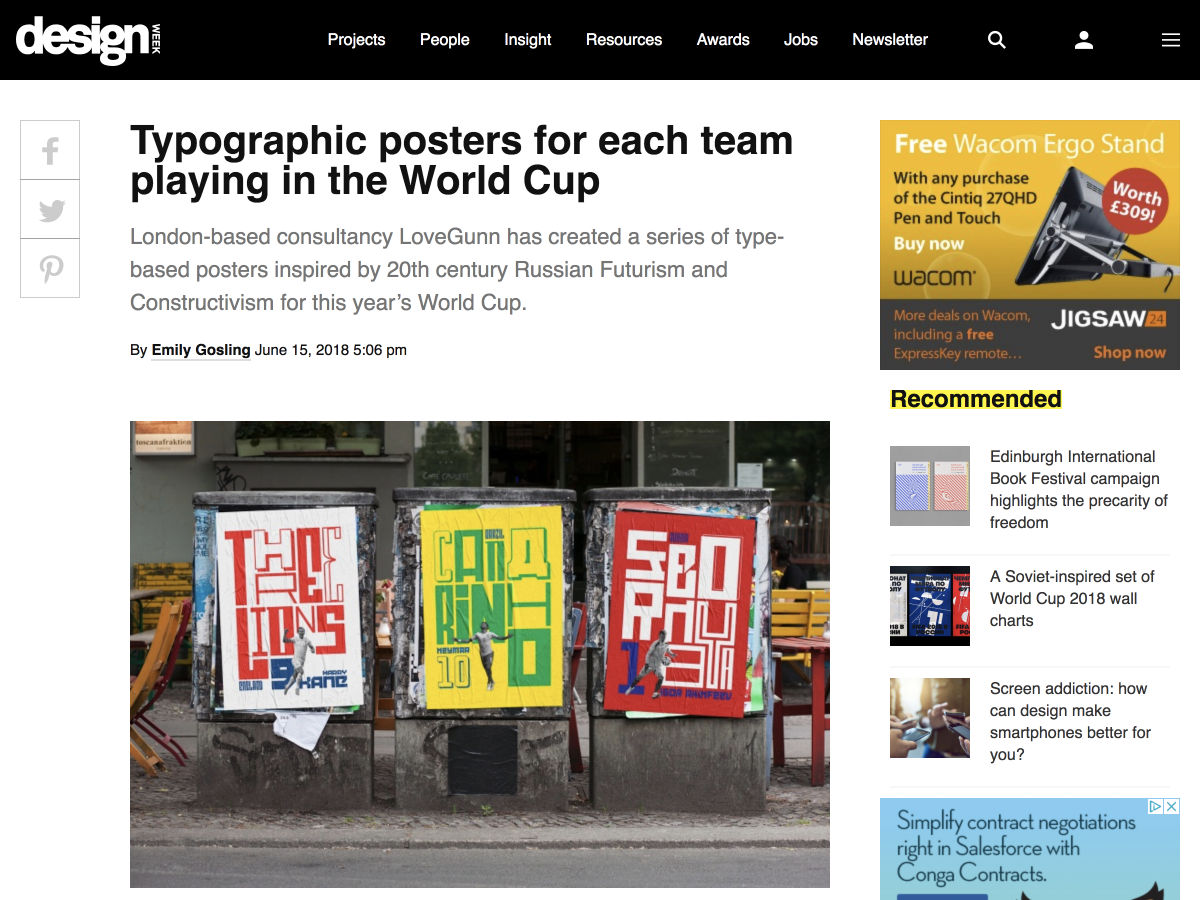
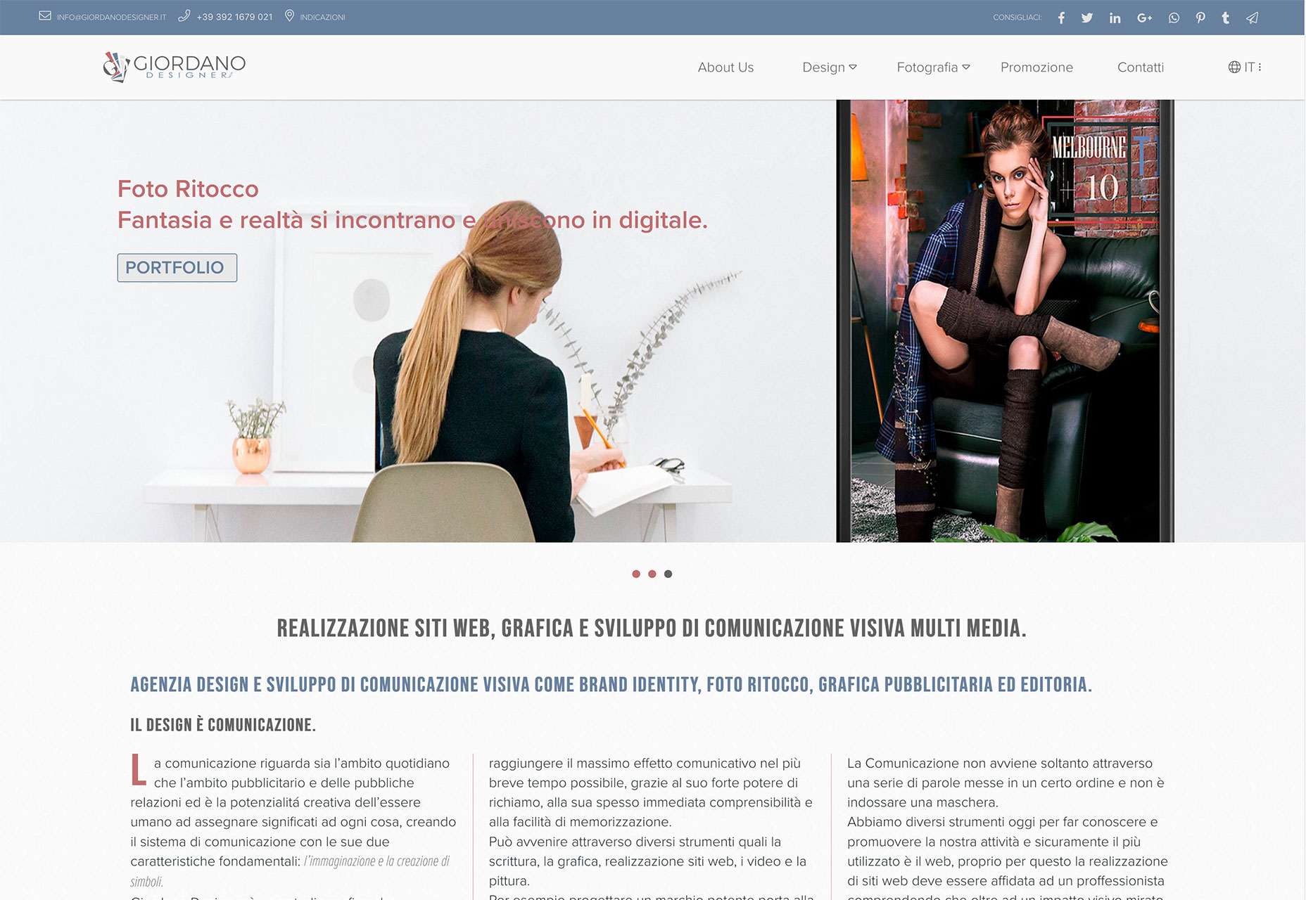
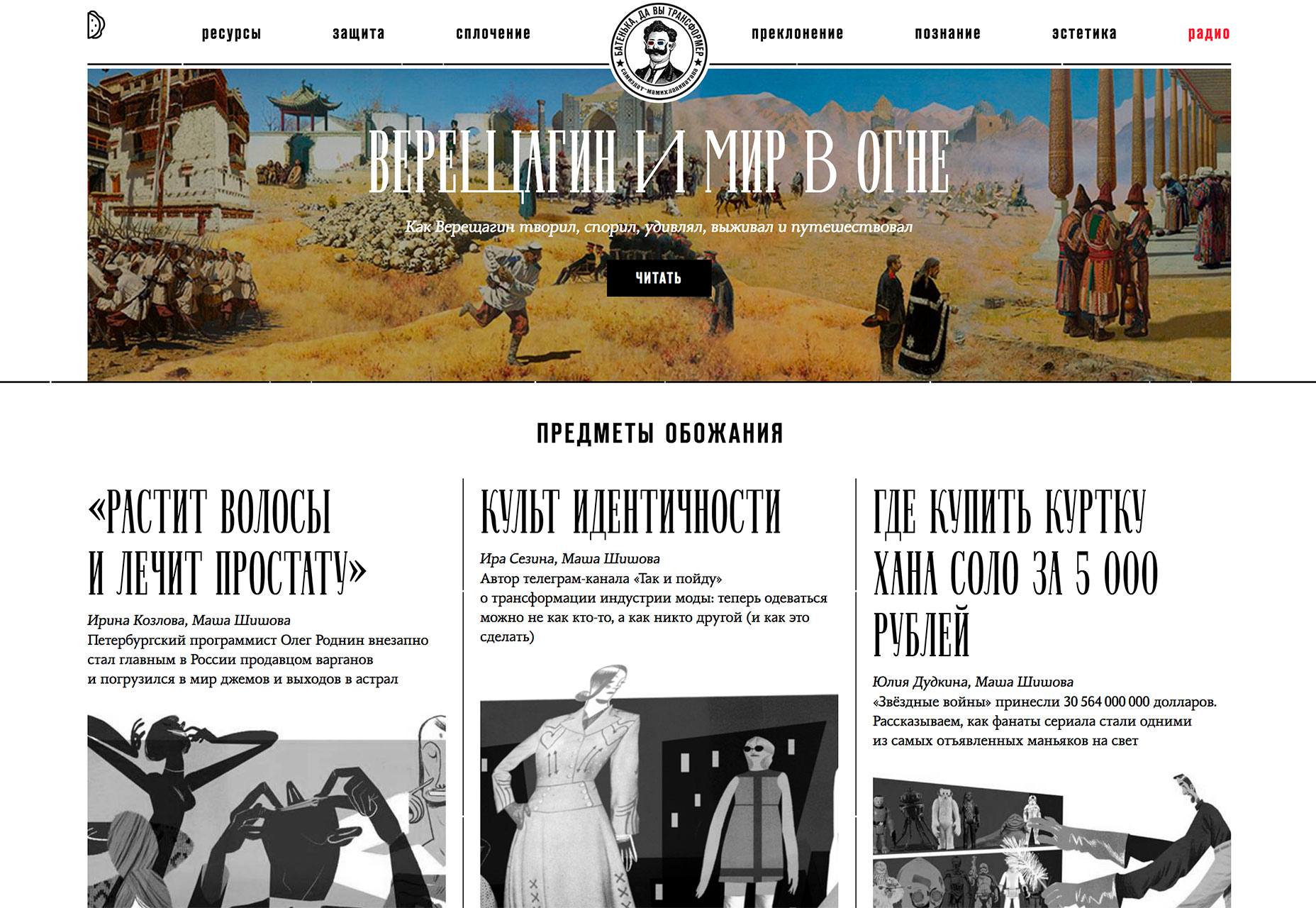
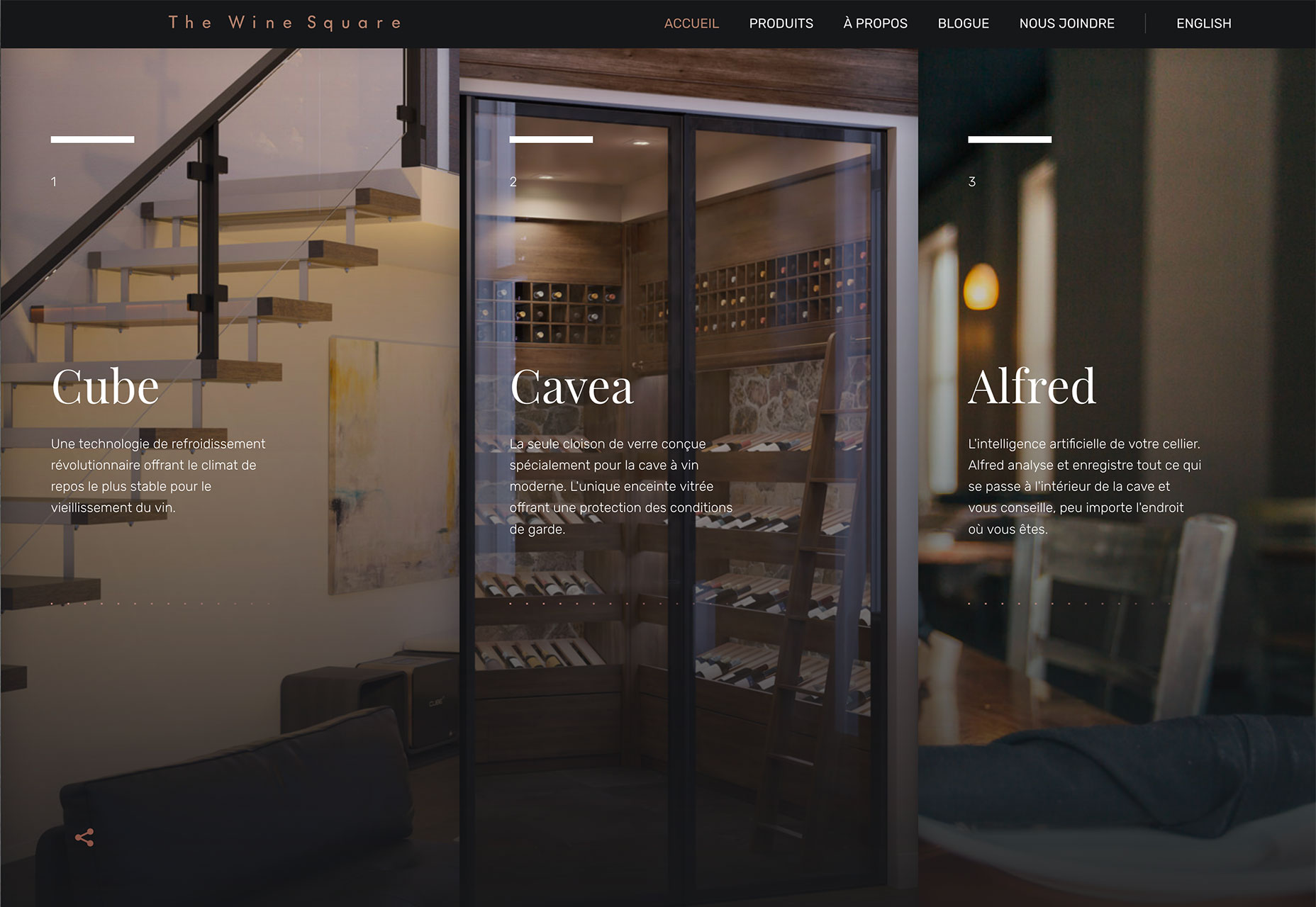
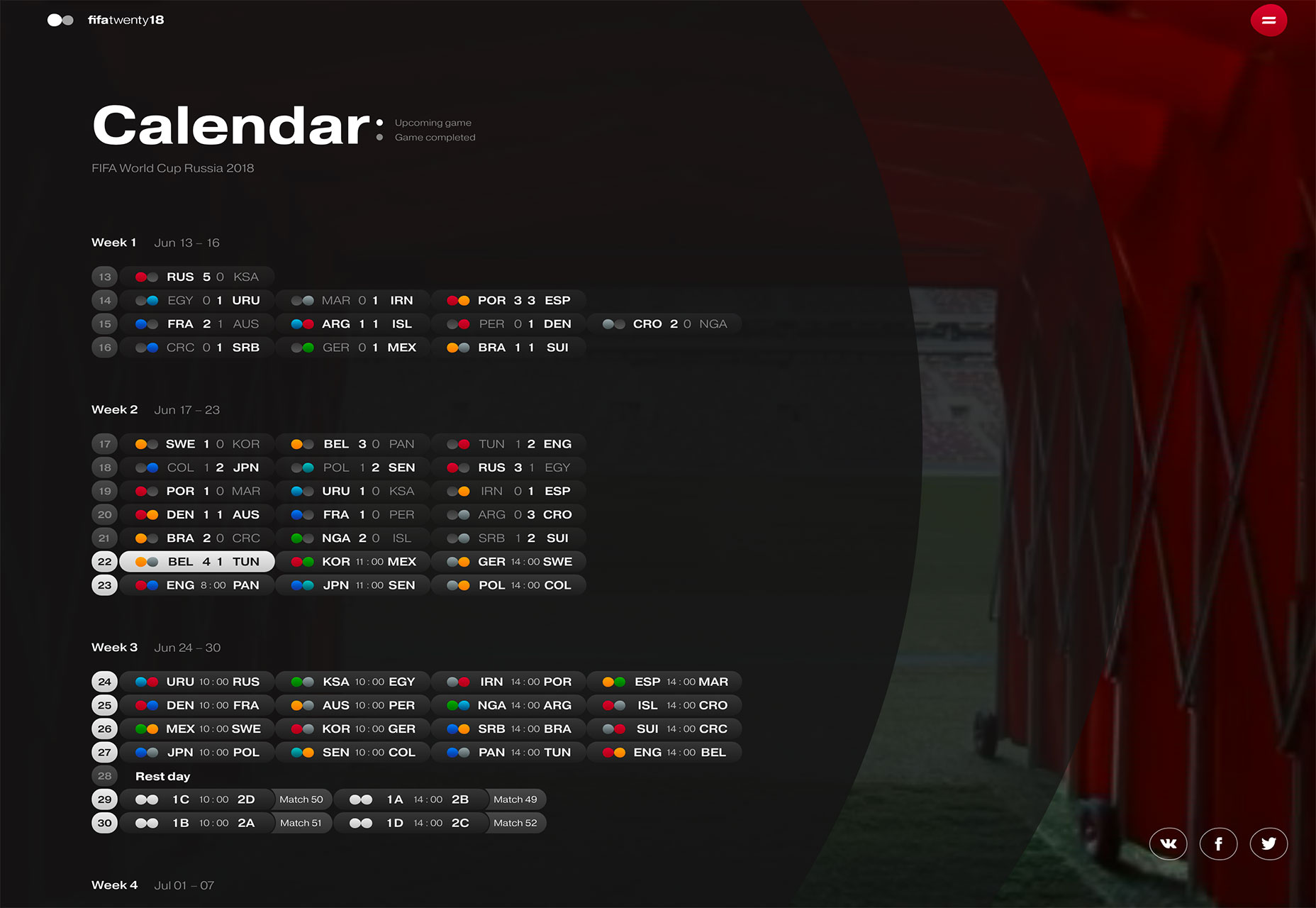
With the heat of summer comes a little bit of a design slowdown, but there are still plenty of projects worth your attention. Most of the major design trends happening right now feature structural components of website design, such a interactive layers or multiple columns of text. And there’s also this “little” international event that’s having some influence as well – the soccer World Cup.

Here’s what’s trending in design this month:

1. Interactive Layers

Designers are constantly trying to develop ways to keep users interested in the design for longer period of time. Using more interactivity is one way to do that.

Pairing that interactivity with layered effects is another way to do it that has high visual interest. (It’s like putting the best of the visuals and interaction together.)

Much like how parallax scrolling has worked for some time, interactive layers give users something to do with the design, generally scrolling, while elements on the screen move in different ways. The layered effect makes everything look a little more real, a little less cartoonish and can help increase engagement.

It’s a mix of information and gamification. Each of the three examples below do it in a different way.

  • Salomon uses a scrolling story with great photos layered over a background image with depth and plenty of supporting facts. Almost haphazard placement of photos keeps the scroll action obvious so that users don’t stop moving through the content.

  • ENO tells a story with video and sound in the background, while a simple foreground layer clues users into their products in the scene. It’s like watching a movie and knowing exactly what the product placements are so you can watch for them. Plus, adventure-style is instantly engaging.

  • Martin Laxenaire uses fun color and animated hover states to provide content in a top layer with a similar visual in the background for depth and visual interest. And it’s a lot of fun just to see how the animations shift and shape elements on the screen.

2. Three Columns of Text

One … two … three! Three columns of text!

While multi-column text blocks phased out some time ago, that trend seems to be circle back. More designs are featuring three columns of text. (Maybe because users have wider desktop screens? Three columns is a little less unwieldy to read.)

There’s a lot of science to back up the idea that elements in threes have a natural and harmonious feel to them.

The “rule of three” has long been associated with content creation and speechwriting as a way to bring home a set of points. Think of all the stories that feature threes – Three Little Pigs, The Three Musketeers, Three Stooges – and in literature plays use three acts. It’s also a common practice to use three bullets points to support facts in slides and presentations.

The rule of thirds helps you understand how and where users look at visual elements and even helps photographers and illustrators compose their work. So, it seems like a natural way to organize visual content as well.

Using a three-column structure for text blocks can make it easier to break up the design. A full-width text block can be difficult to read unless the text is overly large. The ideal character count per line on a desktop is about 65 characters, so the size of the screen and size of the text do factor in.

Each of the examples below use a three column format to organize information. While the first example uses three columns to break up a single block of text, this same concept is east to apply to three distinct copy blocks as well (such as in the other examples). The structure works best visually when all three text elements have similar weights and content styles.

3. World Cup Fever

It seems like almost everyone has World Cup fever. With the international soccer tournament happening through mid-July, the sport is top of mind for sure.

From website designs that focus on the event itself to others that are drawing inspiration from the sport, there’s a World Cup influence on design.

Think about the design elements that can be pulled from World Cup designs:

  • Bold color choices such as the bright red and blue from the FIFA branding and design.
  • Typography choices, such as the uppercase, curved lettering style uses in the main logo.
  • Color combinations from all the world flags, many of which feature bright colors and reds, blues and greens.
  • Soccer-field inspiration with more gridded or block-style designs.
  • Hexagon shapes from the panels on a traditional soccer ball.

World Cup-inspired projects also give you plenty of room to experiment with different types of data visualizations, such as the cool calendar grid from FifaTwenty18, below. Sporting events are packed with data points to plot, analyze and visualize.

The event is also a good reason to provide some soccer history for users, such as the visual exploration of ball types used in the website-based infographic below.

And there’s plenty of interest in websites with these themes right now, so it shouldn’t be hard to find material to work with and plenty of sites to explore for inspiration.

Conclusion

My favorite trend this month is definitely all the soccer—dare I say “football”—projects. It’s great to see all the world influences and how something like a major event can impact the mood and visual composition of design projects. What trends are you loving (or hating) right now? I’d love to see some of the websites that you are fascinated with. Drop me a link on Twitter; I’d love to hear from you.

Add Realistic Chalk and Sketch Lettering Effects with Sketch’it – only $5!

Source

from Webdesigner Depot https://www.webdesignerdepot.com/2018/06/essential-design-trends-july-2018/

Sunday 24 June 2018

Popular Design News of the Week: June 18, 2018 – June 24, 2018

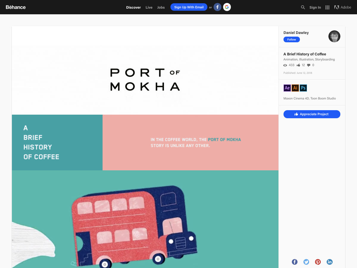
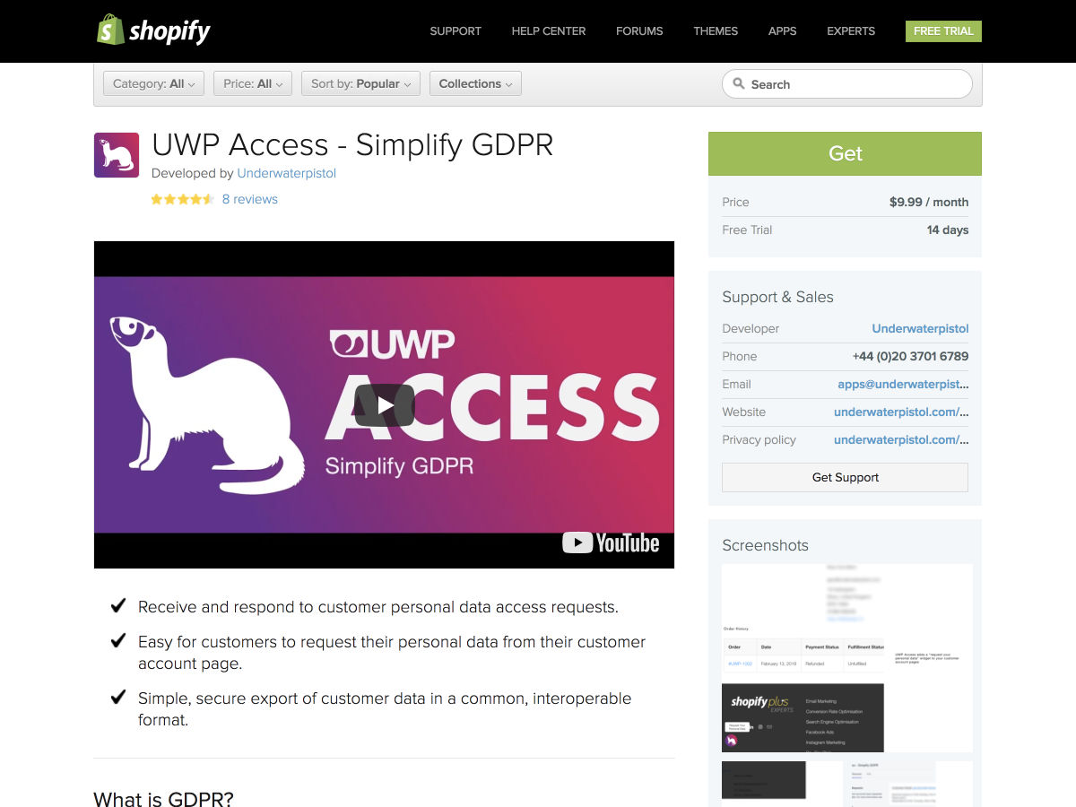
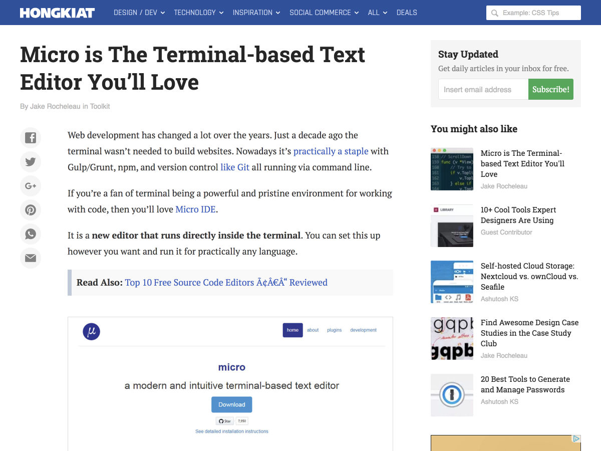
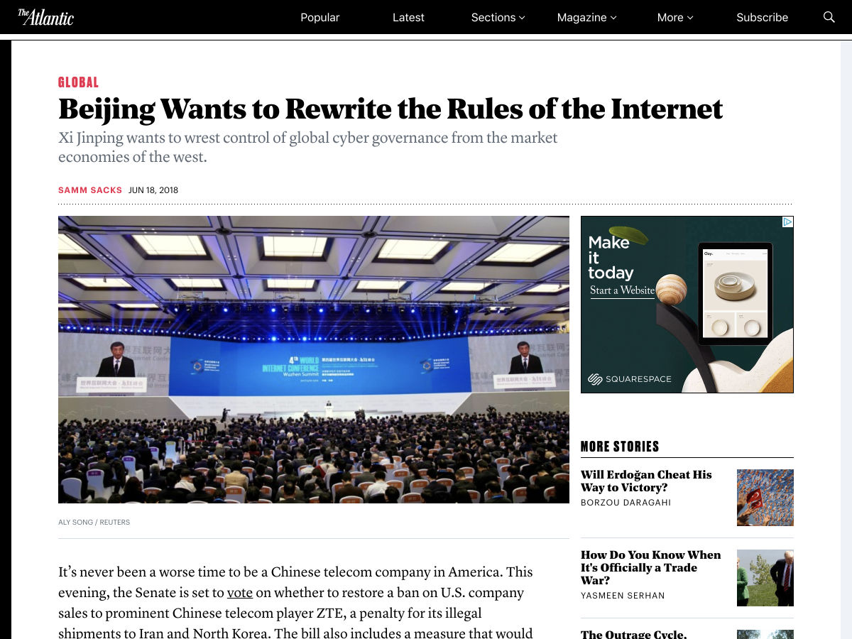
Every week users submit a lot of interesting stuff on our sister site Webdesigner News, highlighting great content from around the web that can be of interest to web designers. 

The best way to keep track of all the great stories and news being posted is simply to check out the Webdesigner News site, however, in case you missed some here’s a quick and useful compilation of the most popular designer news that we curated from the past week.

Note that this is only a very small selection of the links that were posted, so don’t miss out and subscribe to our newsletter and follow the site daily for all the news.

8 Brilliant Blogs Run by Ecommerce Stores (And What You Can Learn from Them)


The Ultimate ECommerce Website Design Guide


How to Design a High Converting Email Newsletter


Lessons Learned Making my Variable Font


Analytics Without the Numbers? Explaining Our Early Product Design Decisions


A Brief History of Coffee


UWP Access – GDPR Access Requests for Shopify


Site Design: Bear Grylls


Micro is the Terminal-based Text Editor You’ll Love


Beijing Wants to Rewrite the Rules of the Internet


Designing Design Culture Wrap-Up


Project Rush: Adobe Announces All-new Video Editing App


Centering: The Newest Coolest Way Vs. The Oldest Coolest Way


A Free Futura Alternative


ShipFast – The Simplest Project Management Tool Ever


The Unseen Value of Brand Design


Five Rants from a Cranky Designer


Typographic Posters for Each Team Playing in the World Cup


SimplePortfolio.co, Easily Create a Simple Portfolio Webpage for Free


5 Ways to Handle Forms on your Static Site


Gradient Joy – Gradients as Placeholder Images


EU Takes First Step in Passing Controversial Copyright Law


Interface Exploration: Depth and Color


Take the Money


Open Logos


Want more? No problem! Keep track of top design news from around the web with Webdesigner News.

Add Realistic Chalk and Sketch Lettering Effects with Sketch’it – only $5!

Source

from Webdesigner Depot https://www.webdesignerdepot.com/2018/06/popular-design-news-of-the-week-june-18-2018-june-24-2018/