Monday 30 July 2018

3 Essential Design Trends, August 2018

From light and bright designs to complex data visualizations and a new take on polygons, this month’s design trends are anything but ordinary. And they are so practical you can deploy them on single pages or for a complete design overhaul.

Each of these trends shows and evolution of styles that’s been progressing for some time: minimalism to white and light color schemes, data “everything” to data visualization for the web, and a fresh look at poly shapes.

Here’s what’s trending in design this month:

1. White and Light Color Schemes

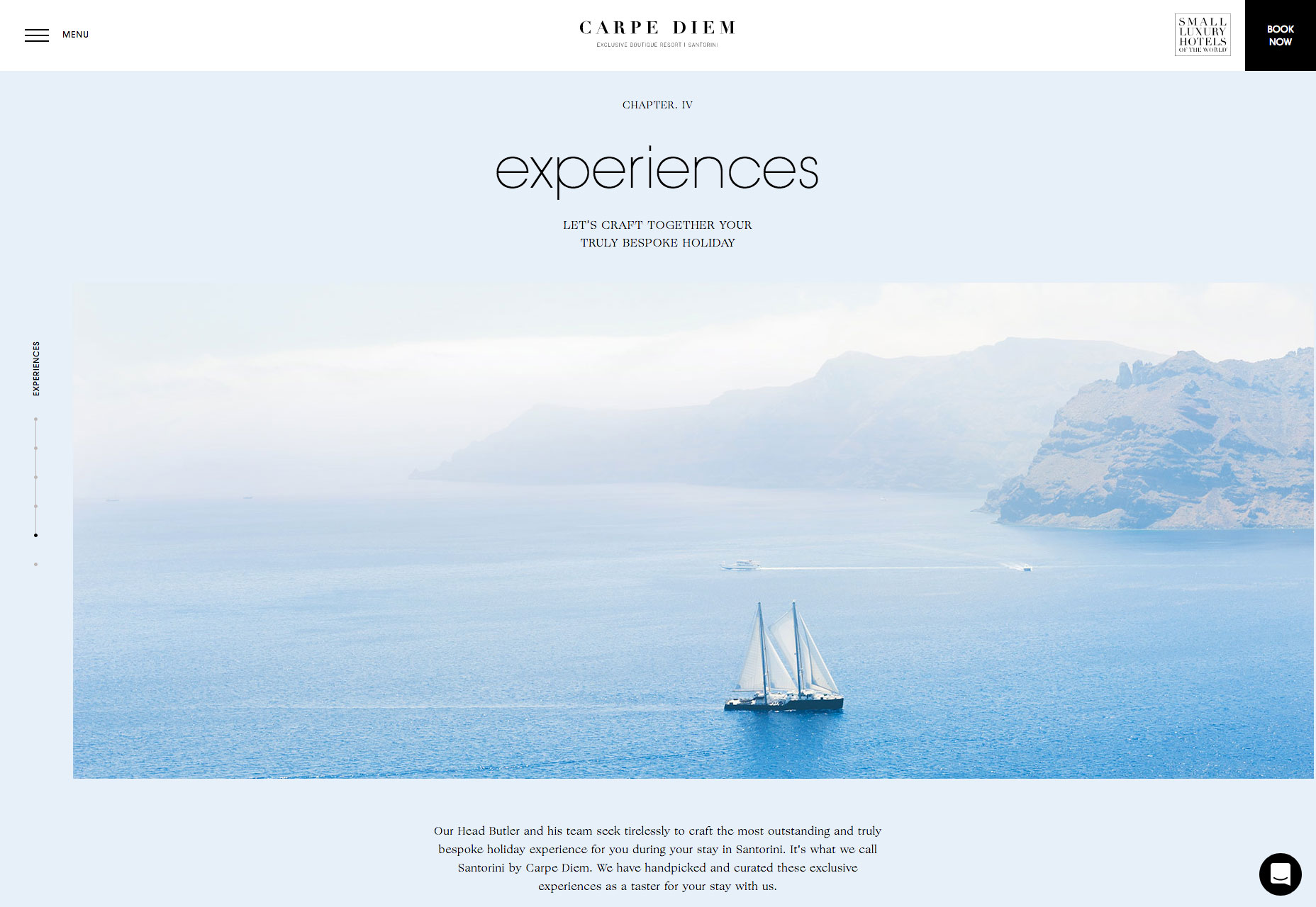
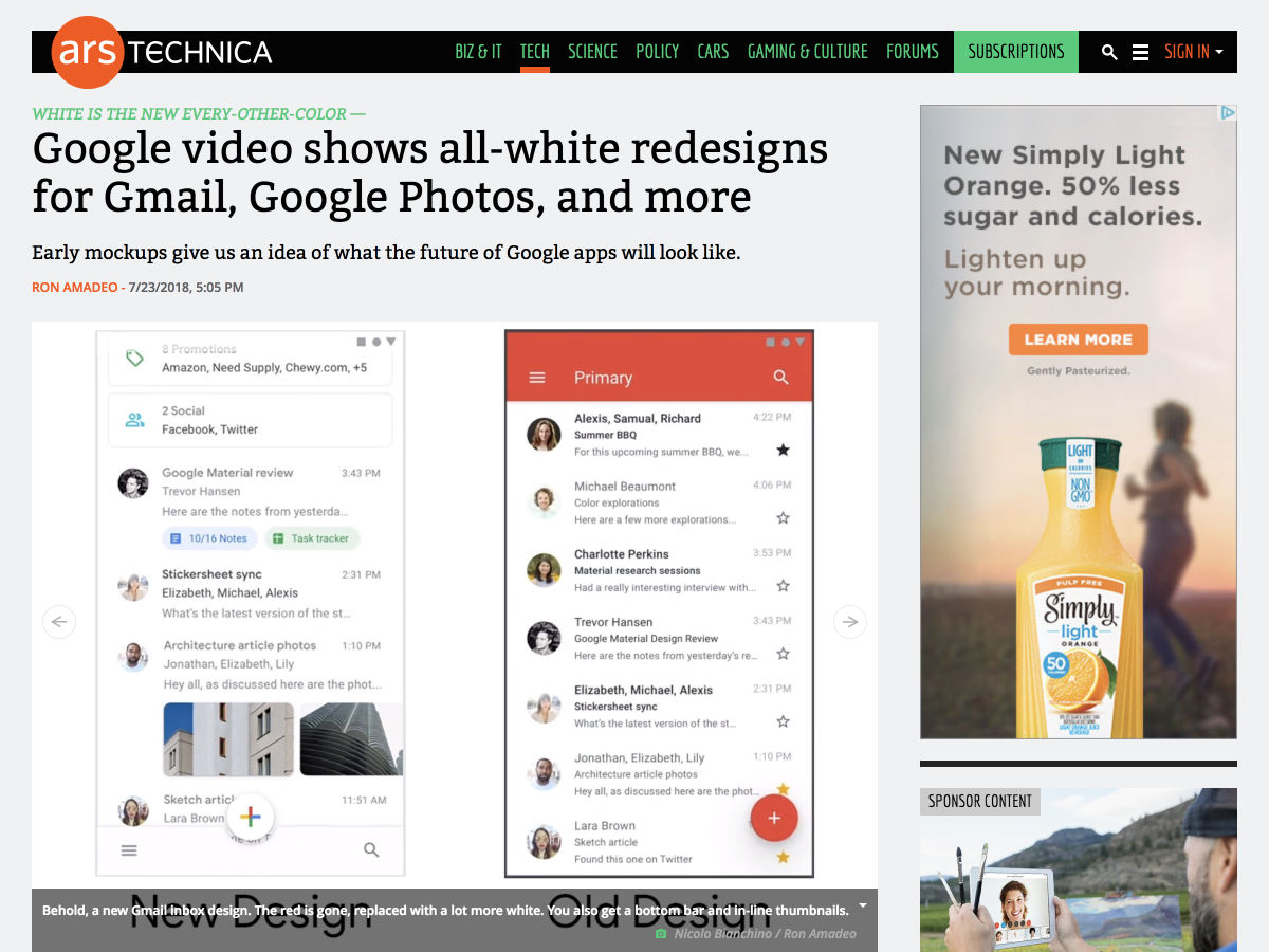
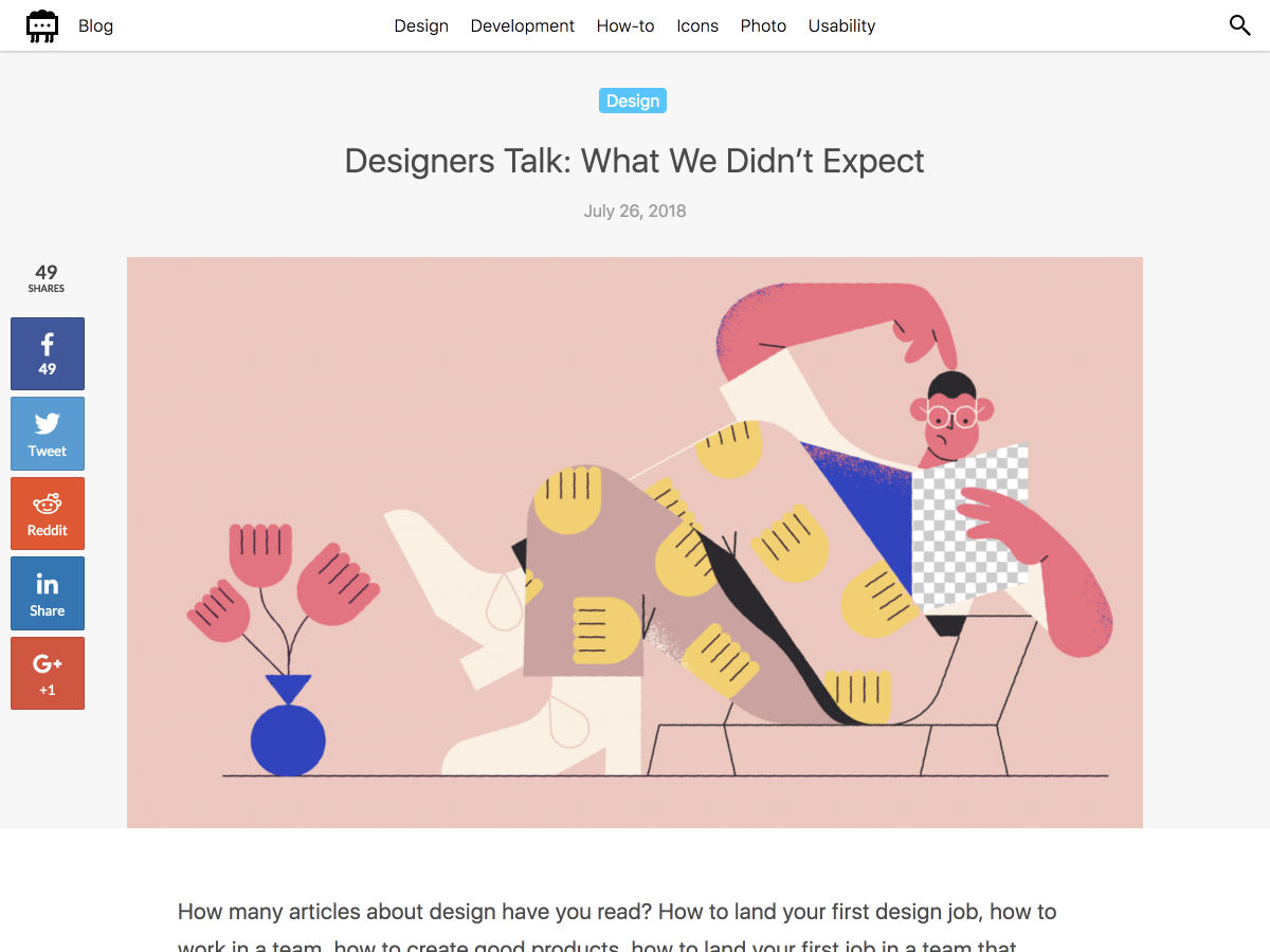
White and light color schemes seem to be popping up everywhere. (We could probably have dedicated an entire post to this design trend because there are so many designs featuring this color trend.)

The main characteristic of this design trend is an aesthetic that uses a predominant white or light color scheme. This includes the background, images and even other foreground elements. While white is a popular option, color palettes featuring soft grays, cool cream tones, and even some hardly noticeable pastels are equally impressive.

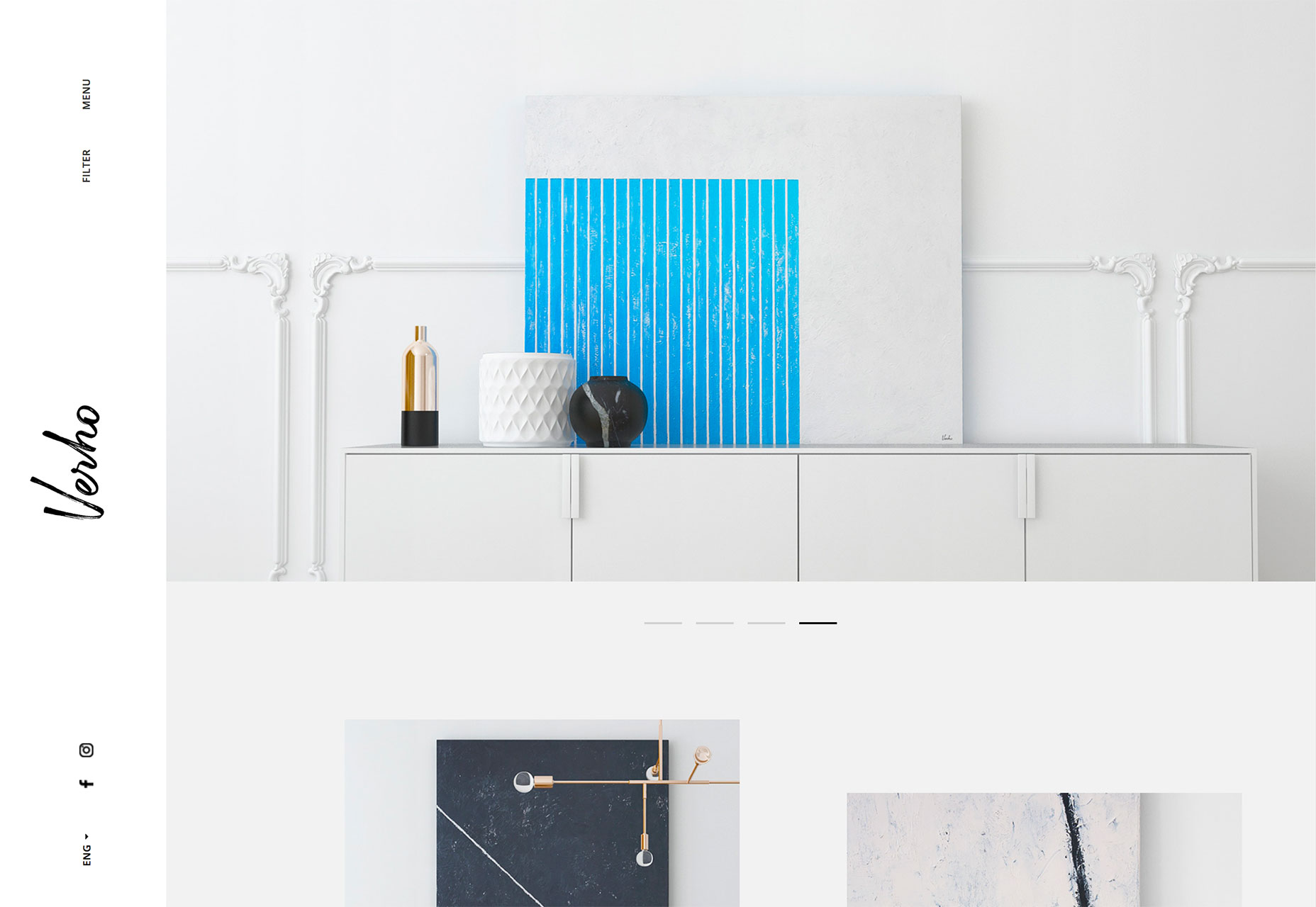
The trick to using this design technique is incorporating other elements so that you don’t just end up with a “plain” white background. Including imagery that also is light or features a lot of white can bring the design together pretty seamlessly, such as the example from Verho.

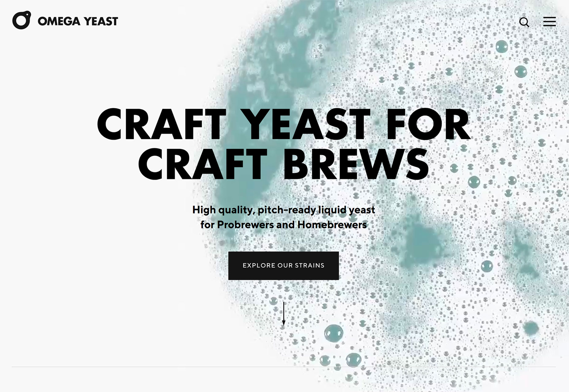
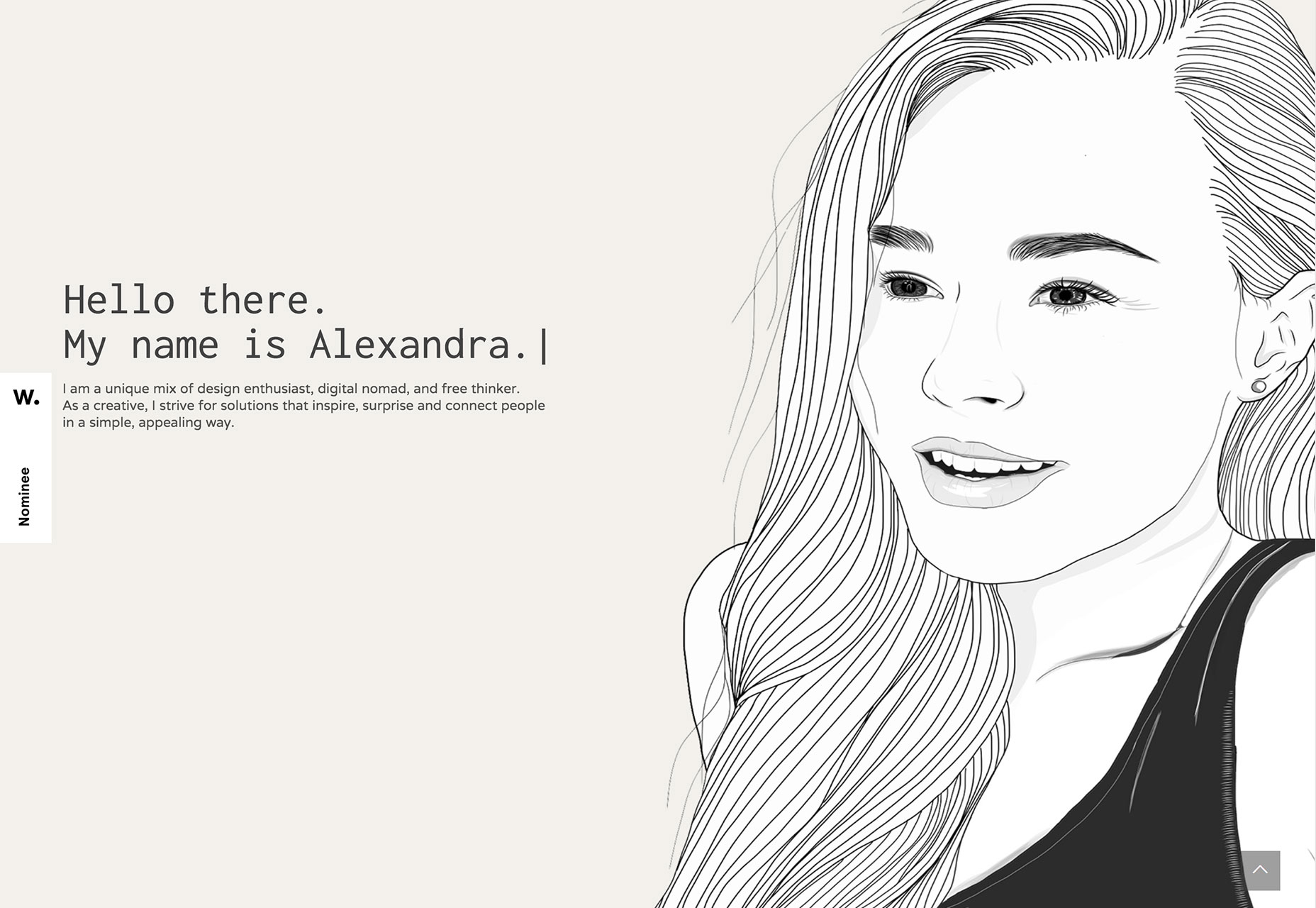
But there’s no rule that images are the only way to implement this design trend. Working with video (such as Omega Yeast) or an illustration (Alexandra Elisa) can be equally engaging.

Use this design trend for a full website theme or opt for a section or page with a light to white design to add particular emphasis to that area. Just make sure to go with a dark text option so that lettering is easy to read.

Add an extra layer of emphasis with a bright colored button or single element so that users find the most important part of the design right away. Consider accent colors in the style of minimalism rather than full color options; a simple one-color concept can work amazingly well.

2. Data Visualization

Data, data everywhere.

Or that seems to be the case anyway.

With such an emphasis on data and information gathering and delivery across industries to provide valuable and reliable information, it’s no real surprise that more designs are featuring large-scale data visualizations.

From maps to charts to interactive animations, a solid data visualization can help a user better understand a topic or information and provide an engaging (and memorable) way to learn about something.

The downside is that it can be a rather large undertaking to manage all that data. Look for a method that allows you to showcase information in an up-to-date manner without the stress of constant management. Automated tools can help. (Google Charts is simple and pretty powerful.)

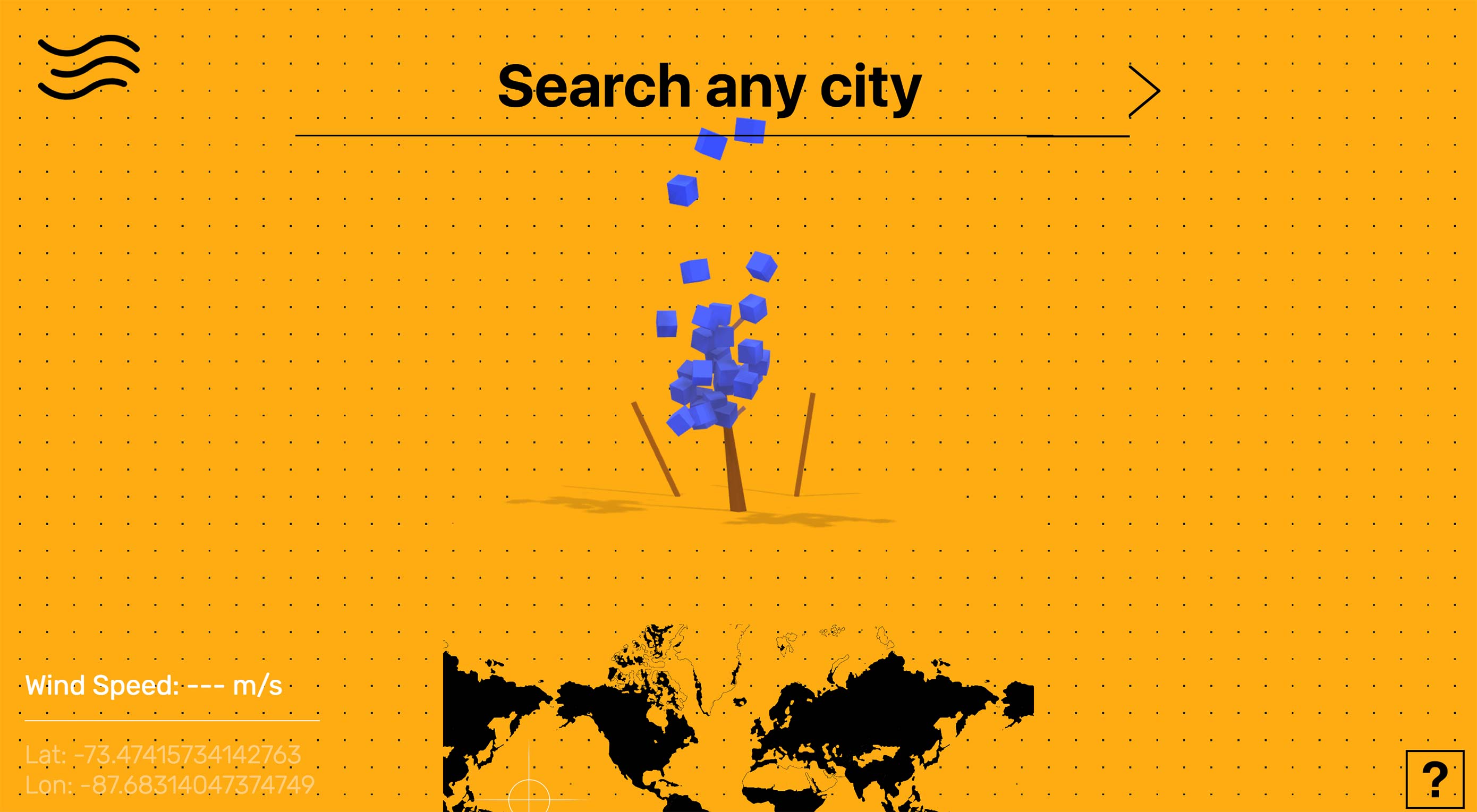
There are so many different ways to create, embed and include data visualizations in a website design. The most engaging websites using this trend have dynamic information presented in the most interactive formats.

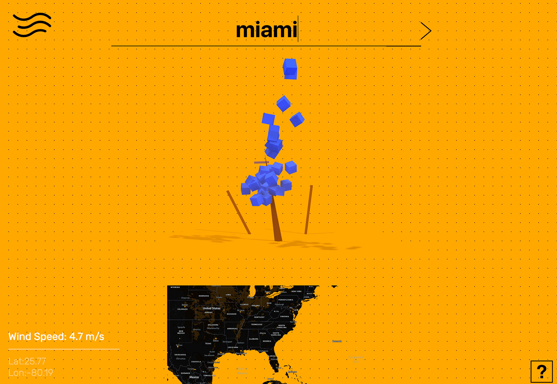
Tree Tree Tree starts by asking the user to enter the location they are interested in learning more about. The result shows the wind speed using a tree with boxes that “blow” as speed increases. Users can also engage using the map at the bottom of the screen. This is data that is begging to be interacted with.

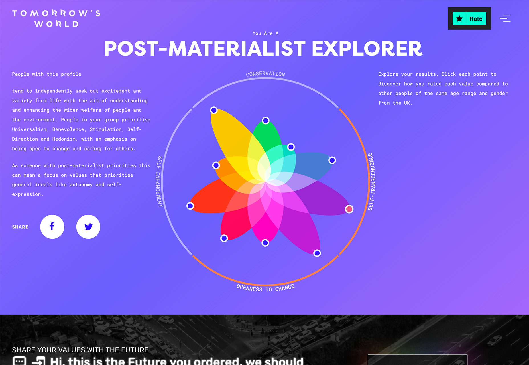
Tomorrow’s World starts with a survey that the user completes and ends with a cool visualization of how those answers compare to others. The data visualization is a tool to help the user learn about him/herself and the world around them. 

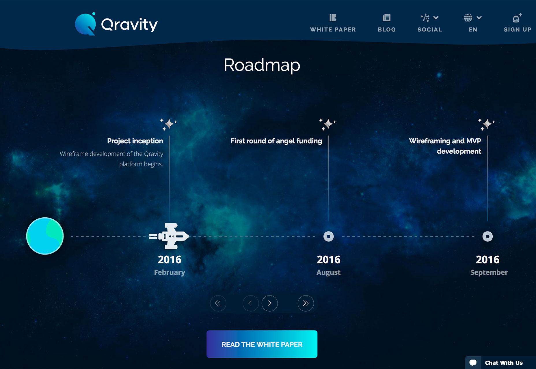
Qravity has multiple points of data entry in its website design. One of the most interesting might be the animated timeline below the scroll. This method of organizing information (dates and events) in a visual way makes the information so much easier to understand than a simple list.
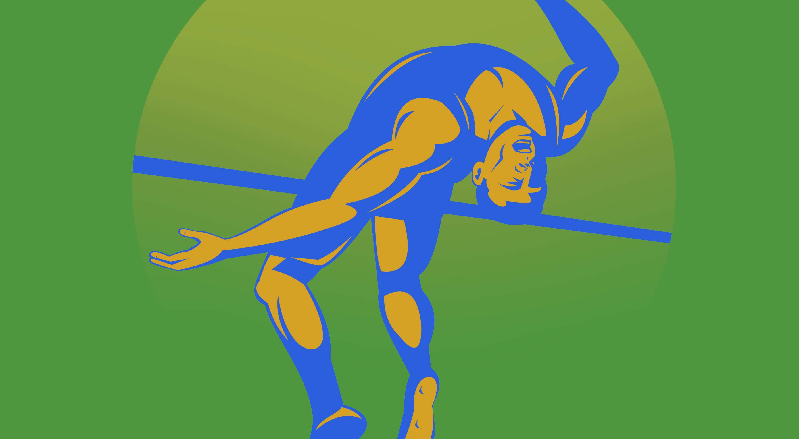
3. Polygons 2.0

Polygon shapes in website design were everywhere in late 2017 and earlier this year. That trend continues but with a different look. Rather than piles of packed polygons to create backgrounds or other design elements, designers are picking a handful of polygons and supersizing them.

These oversized shapes add a fun and funky design element that matches almost any style of project. They can be part of an overall design pattern, accent on a homepage or interesting shape container element for an image or text.

What’s great about poly shapes is that they are a little different than the standard rectangles of circles that are more common and can immediate attract the attention of a user for that reason. These shapes also have a more modern feel because they are different.

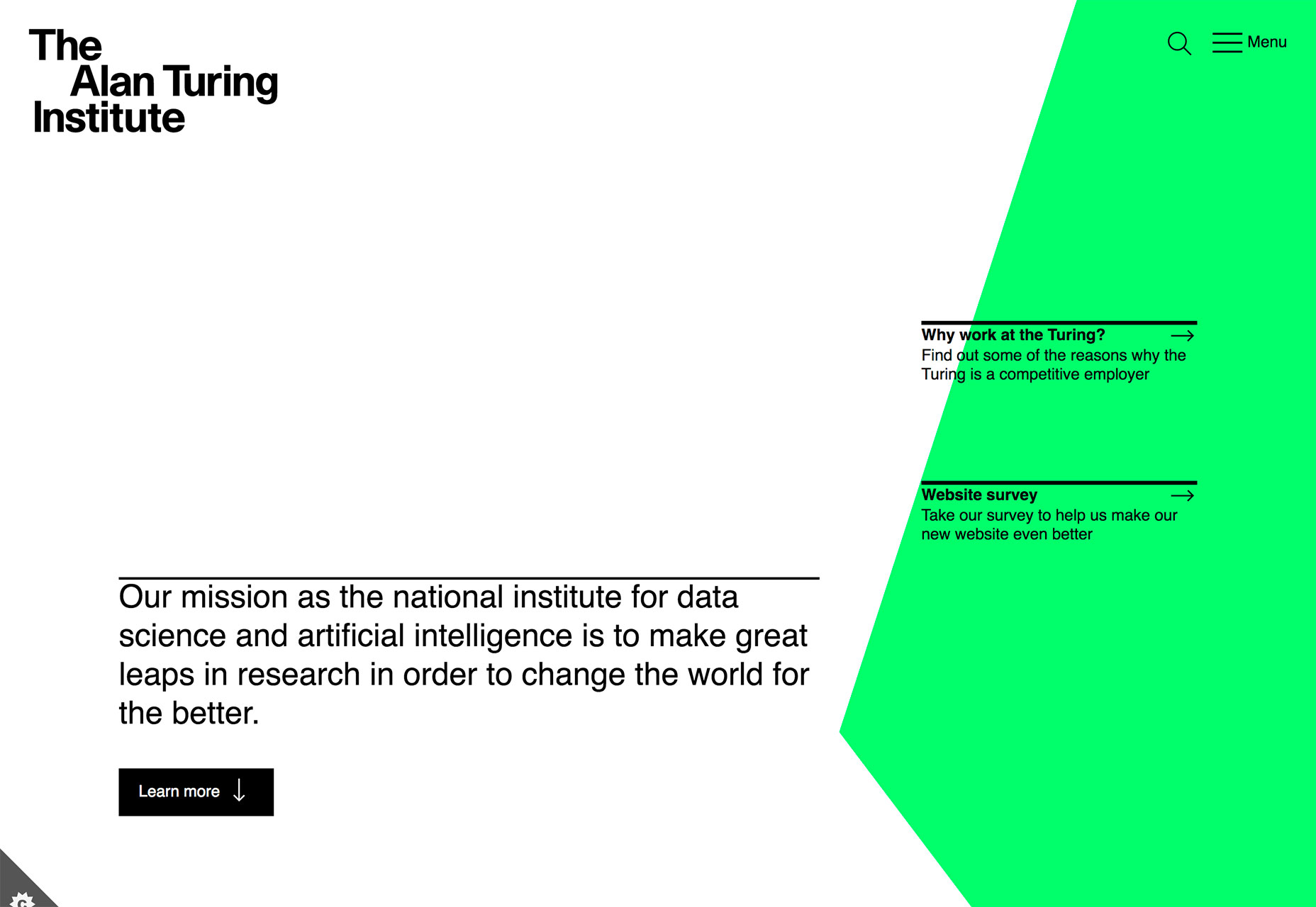
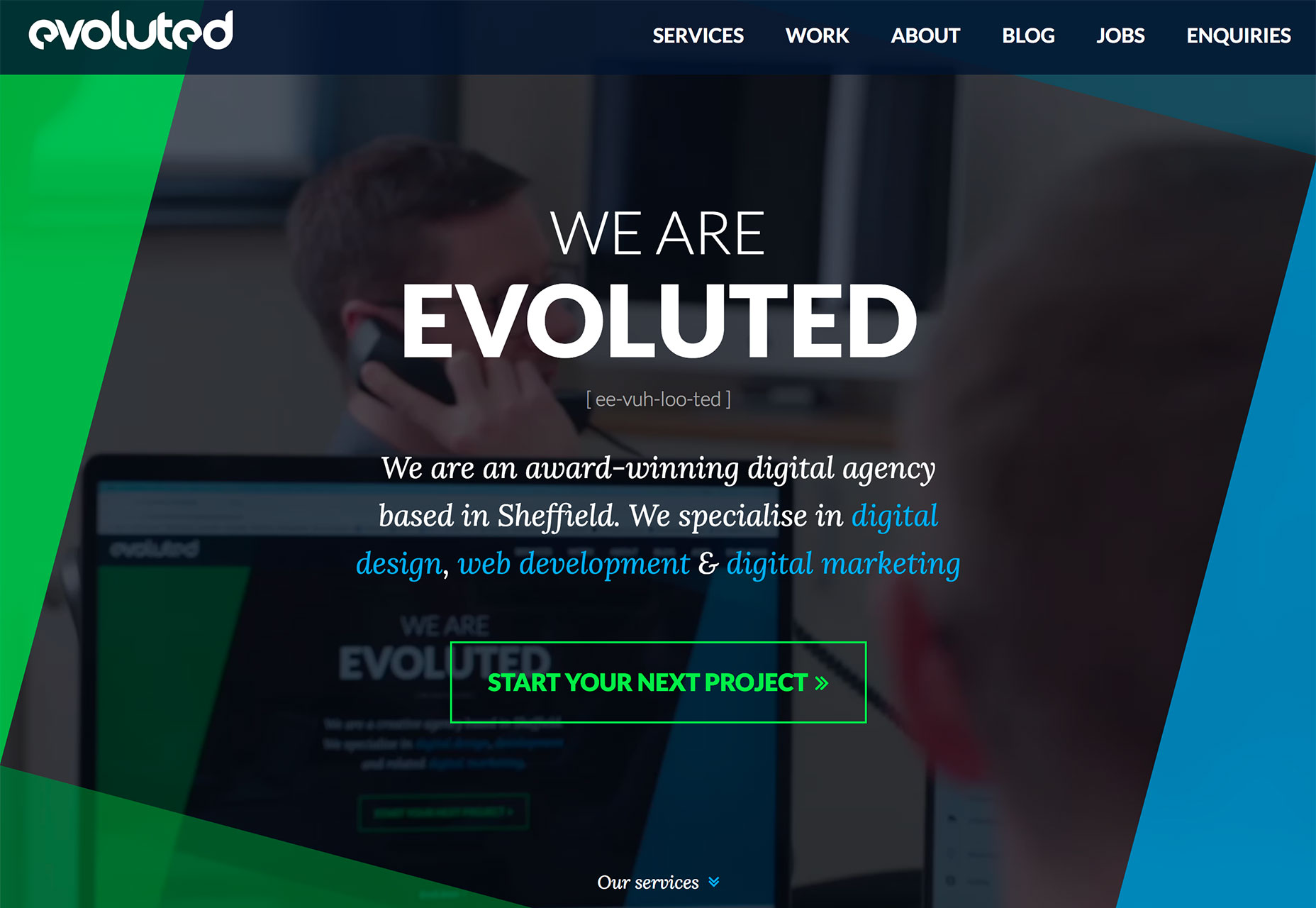
Polygons can feature shapes that have more distinct angles and sides such as the sharp animated triangle to the right side of The Alan Turing Institute website, simple lines that overlap for a more traditional poly feel (Evoluted) or simple shapes that help raw users into specific content (Iqor).

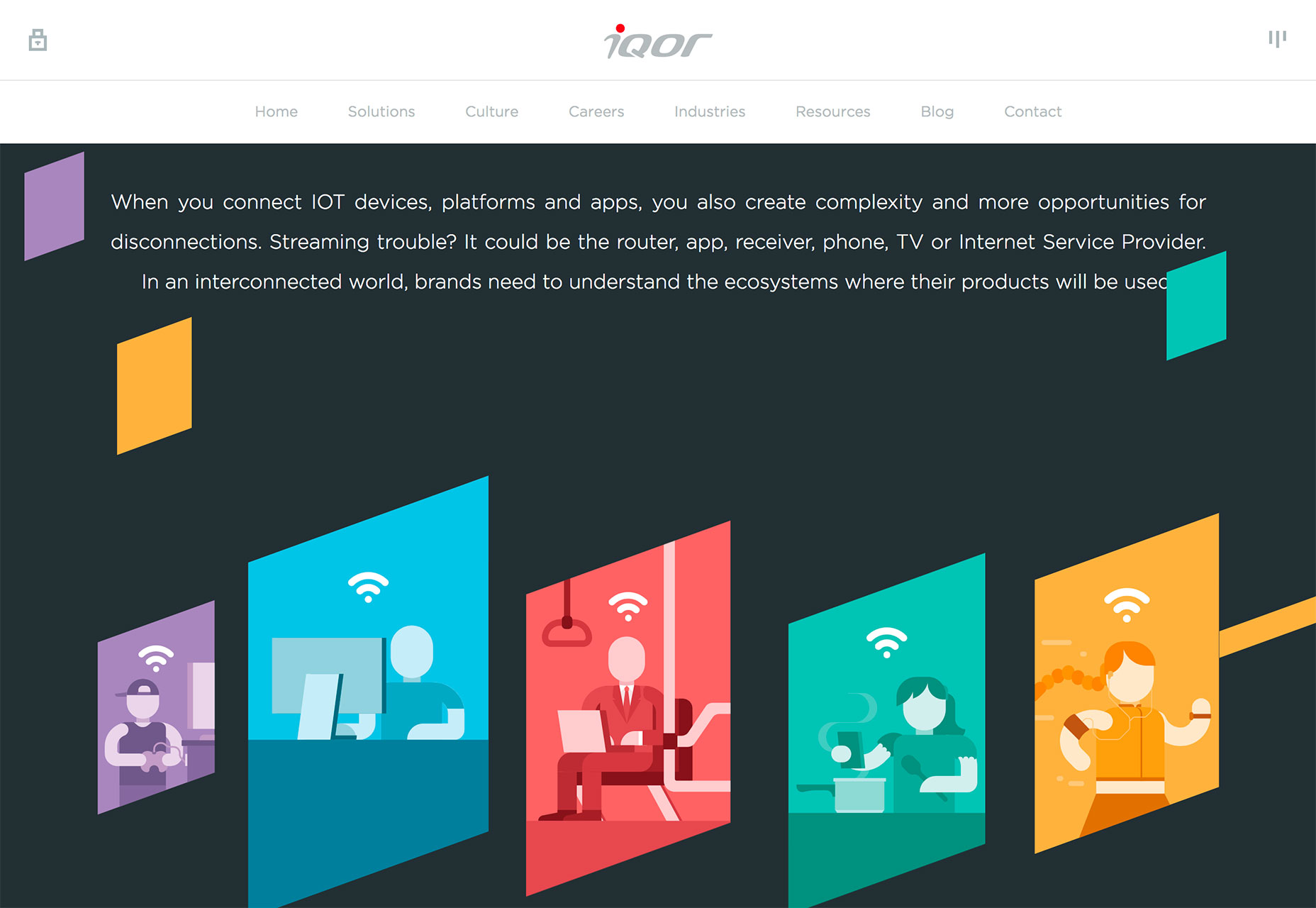
Because poly shapes are such a distinct design element, most projects feature them with bright color for even more emphasis. Just be wary of trying to fit elements inside of tilted or odd shape configurations; this can make elements to text difficult to read.

Polygons are best suited as a background or accent element, not necessarily as a home for messaging or key content items.

Conclusion

Personally, I love the white and bright design trend. With the heat of summer in full swing, these designs are appealing in so many ways. I like how versatile they are as well. A light color scheme is so readable with dark text and can work for almost any type of design project.

What trends are you loving (or hating) right now? I’d love to see some of the websites that you are fascinated with. Drop me a link on Twitter; I’d love to hear from you.

Add Realistic Chalk and Sketch Lettering Effects with Sketch’it – only $5!

Source

from Webdesigner Depot https://www.webdesignerdepot.com/2018/07/3-essential-design-trends-august-2018/

Sunday 29 July 2018

Popular Design News of the Week: July 23, 2018 – July 29, 2018

Every week users submit a lot of interesting stuff on our sister site Webdesigner News, highlighting great content from around the web that can be of interest to web designers. 

The best way to keep track of all the great stories and news being posted is simply to check out the Webdesigner News site, however, in case you missed some here’s a quick and useful compilation of the most popular designer news that we curated from the past week.

Note that this is only a very small selection of the links that were posted, so don’t miss out and subscribe to our newsletter and follow the site daily for all the news.

The Future of Mobile Web? It’s all About Progressive Web Apps


Finally… Capture your Screen Without all that Mess on your Desktop ✨


Google Video Shows All-white Redesigns for Gmail, Google Photos, and More


Forget About your Logo. Nobody Cares.


Fresh Fonts Freshen up your Font News


Your Coworker with the Annoying Sit-stand Desk May Be Onto Something


20 White Texture Background Graphics


What if People were Paid for their Data?


We’re Underestimating the Mind-warping Potential of Fake Video


5 Ways to Take Better Control of your WordPress Website


Keyframes: A Community for Animators


Designers Talk: What We Didn’t Expect


Hacking User Perception to Make your Websites and Apps Feel Faster


Site Design: Emergence


Queer UX Experience


How to Give Project Estimates—and When not to Estimate at all


Timeqube – Beautiful Timer that Helps Waste Less Time in Meetings


8 Logo Design Cliches You Should Avoid


One Year After Massive Takedowns, Dark Web Marketplaces are Thriving


User Research: Is More the Merrier?


Netflix is Launching a New TV Interface Starting Today


How We Improved Our Landing Page Conversion Rate by 500%


Why Logo Placement is Essential to your Company Website


7 Design Lessons from Silicon Valley’s Most Important Failure


Adobe Shares Pantone’s Summer Trending Colours


Want more? No problem! Keep track of top design news from around the web with Webdesigner News.

Add Realistic Chalk and Sketch Lettering Effects with Sketch’it – only $5!

Source

from Webdesigner Depot https://www.webdesignerdepot.com/2018/07/popular-design-news-of-the-week-july-23-2018-july-29-2018/

Friday 27 July 2018

7 Elements of Good UX in 2018

UX is a crucial component of modern web design, and users’ expectations are constantly shifting. Though we cannot see into the future, changes made throughout the last decade indicate that adjusting for user needs has never been more crucial. To get ahead in the ever-changing mobile app sphere, designers have to be proactive at all times.

Let the following 7 UX trends be your guide to help prep for both the present and the future of UX design:

1. Journey Simplification

Users typically engage with websites or applications with a specific intention in mind, which they want to achieve as soon as possible. The most user-friendly applications and websites strive to simplify a user’s journey with time-saving designs. The essence of such designs is that they reduce the number of steps users have to take in order to achieve their goal. This should be done by presenting applicable information in an easy-to-use format and providing a smooth navigational flow. A time-saving design can incorporate several key aspects, including:

  • Linear Design. Linear design is a structured journey containing an established layout for beginning-middle-end points. It enables users to do one action at a time at each point in their journey. The consistent flow helps viewers discern how much time is necessary to complete the task.
  • Anticipatory Design. An anticipatory design attempts to recognize a user’s needs to swiftly and efficiently accommodate them. It reduces the chances of friction that make it difficult for users to complete their intentions.
  • Progressive Disclosure. If your website or application contains a lot of information, you might want to adopt a progressive disclosure technique to enhance user experience. Progressive disclosure makes information visible solely when users need it, which ensures viewers are not bombarded with information or distracted by content that is irrelevant to their goal.
  • Context-Based Information. Displaying only the most relevant information specific to user context is instrumental in creating an optimal user experience.

2. Focus on Content

Properly organized and readily available content is key to making websites and mobile applications appealing to their expected users. Recent trends concentrate on eliminating unnecessary distractions and instead, shining the spotlight on what is truly relevant: content.

Creating content-centered experiences involves either using a design highlighting content or having the content itself frame the design. Your ultimate goal should be to ensure there is nothing obstructing a user’s exposure to your website or application’s content. Designers typically begin by removing excessive visible clutter, which helps them concentrate on the essence of the message they want to convey. Visual features of this design strategy include:

  • Precise Visual Order. A well-ordered design facilitates and expedites a user’s ability to comprehend content. Powerful visual signals, such as using dissimilar colors for call-to-action links, are great means of guiding a user’s focus on specific interactive features and significant information.
  • Operative Decluttering. Eliminating irrelevant and otherwise useless details helps magnify important information, creating a more concentrated experience.
  • Whitespace. Increasing the amount of space between content grants it room to breathe and dramatically enhances a user’s experience.

3. Improved Personalization

Personalization is a technique embedded within the strategy of time-saving designs. Understanding the importance of the shift from creating generic experiences to individually targeted experiences is an aspect of UX that deserves extra emphasis. As businesses look for new means of crafting individualized brand experiences, the effort to understand the wants and needs of users on a deeper level continues to develop.

With the help of individualized data and advances in machine learning, technology is becoming capable of adjusting automatically for specific users. One of the most popular models of individualization seen in contemporary applications and websites is the incorporation of personalized recommendations based on user behaviors. These suggestions improve the chances that a user will take action when they visit your site. Among the many techniques to enhance personalization, the following methods are some of the most common:

  • Basing Content on User Location. Because many people use their digital devices while on the road, websites and applications should use the device’s area data to present content related to the user’s geographical location. As a result, the information presented is personalized to the environment surrounding each user.
  • Specific User Interface. A major goal of personalization will be adjusting the layout of a website or application based on the individual needs of a certain user. Following how a user interacts with a digital device and what issues they encounter, in conjunction with their specific data, is a goldmine of information. With it, applications and websites will be able to decide how to adapt the site for the user.

4. Humanization

Due to the impact of technology such as touch and voice recognition on smartphones and other digital devices, people now expect to interact with digital products in the way they would typically interact with another human. This means designers should start striving to create websites and applications that offer a more human experience for users.

The popularity of humanizing digital experience is correlated to connecting with user emotions. The key to humanizing digital experiences is by allowing users to feel connected to their devices in an emotional way. Different ways designers are attempting to provide consistent reactions and humanize the digital experience include:

  • Sharing emotions with face recognition
  • Micro-interactions
  • Creating natural means of interacting with apps
  • Mimicking emotions in feedback

5. Biometric Authentication

Applications and websites can make identity verification easier by replacing conventional means of entry. As bio-metric technology becomes more available it will be capable of recognizing a person’s identity based on particular characteristics. This will create an effortless authentication process for users.

Instead of having to manage an assortment of passwords for different websites and applications, biometrics can verify users with facial or voice recognition or fingerprints. This is an advancement with the potential to bolster security for businesses and users.

6. Video Content

The trend of video content is becoming increasingly vital in creating the optimal user experience. Designers can maximize the potential of their video content by keeping the following tips in mind:

  • Adjust for Portrait Frame. Since mobile phones are used in portrait orientation almost 100% of the time, all video content, and content in general, should be adjusted for this frame.
  • Adjust Video for Short Attention Spans. Modern means of displaying important information must be timely. With the use of formatting methods such as 360-degree videos and Facebook live, designers can present crucial information in a convenient manner.
  • HD Images and Videos. Providing a full-screen experience is essential, but so is providing top-quality images and videos. The quality of the videos on your website or application will have a major influence on user experience, so ensure images and videos are not pixelated and appear in HD.

7. Voice-Based Interaction

As the hardware devices we use to access the web become more streamlined, so should the UX. The latest smart phones, tablets and even laptops are losing more and more buttons every generation. This progression has caused UX to go through one unique development: voice user interface (VUI).

VUIs have become integrated in most major technology, such as products from Google, Amazon, Apple, and Microsoft. A large percentage of web searches are done by voice, with the number projected to rise throughout 2018. With your users almost definitely using tech from one of these innovative VUI pioneers, it might be a good idea to see how your website can benefit from adapting.

Add Realistic Chalk and Sketch Lettering Effects with Sketch’it – only $5!

Source

from Webdesigner Depot https://www.webdesignerdepot.com/2018/07/7-elements-of-good-ux/

Making your ICT projects work

The current information was given by the Infrastructure Projects Authority (IPA) shows some programmes that need to be working thus ensuring deliveries that are successful. According to the annual report that is given and published by IPA, there are many ICT projects and some central government transformation that are experiencing problems.

From September 2017, the lists of progress in the incentive that is held by The Government Major Projects Portfolio (GMPP) were detailed. The results showed that about seven out of 29 ICT projects and 13 out of the 41 transformation projects had delivery doubts and they were marked with red or amber. According to the information from the report, it can be deducted that, the delivery is feasible. The only thing that is needed is the direction of attention towards giving an overrun in the schedules and cost.

The good thing that we can get from the report is that none of the projects was unachievable by being given a red rating. Instead, about 14 for ICT projects and 24 of the transformation seem feasible. 8 and four plans for ICT and change respectively have a rating of green or amber. The shows hope of success but the only thing needed is continued attention to prevent threat development. According to the report, none of them is green thus the likelihood of success is high.

The previous year’s report was similar to the current one where the rating proportions had the same colors. That report indicated that there were many projects in the two categories and some were green rated in ICT. For military capability and construction projects, a red rating or a number is used in these two categories.

Problems in the Emergency services

According to the report given by the parliament’s public accounts committee, their indication shows unhappiness. Despite that, it is good to admit that a digital developments related project has severe problems. The project has a red rating after amber that it had been holding for the last three years. The GOV.UK Verify has an amber rating which is a downgrade from green /amber. Due to that reason, the central government department was denied the chance to take the identity assurance services. Despite that, they have an aim to enroll about 25 M users by 2020 through the help of TNSC ICT support.

ICT innovation

Due to the problems that are experienced in most government projects, the GMPP is always changing the portfolio of the projects that are carried by the government. The changes aim at making changes that show the policy priorities of the government. The present portfolio has 133 projects that cost 423 billion that cater for all departments.

In general, a green rating was given to 26 projects that were completed during the part of this year. Due to the constant review, there are chances of delivery improvement and proper management of challenges. That is why the government has ambitions in its current portfolio and projects. That is why we are asked to always help in creating the required condition and environment that leads to successful service delivery.

The post Making your ICT projects work appeared first on Domain Qube.


from Domain Qube http://www.domainqube.com/2018/07/26/making-your-ict-projects-work/

Thursday 26 July 2018

5 Ways to Lower Your Site’s Barrier to Entry

The internet, like most activities on the planet, has a barrier to entry. You need at least one brain—conscious and functioning at a level high enough to tap or click on stuff—and a working Internet-enabled device. You need access, in one form or another, to an Internet service provider. And that’s really about it.

In an ideal world, that’s all you need. People without functioning eyeballs can use screen readers. People without hands have other input devices for their computers. People with crappy computers have… access to an ever-shrinking percentage of websites.

Wait… what?

Here’s the thing, each individual website, depending on how it’s built, can either increase its barrier to entry, or keep it at a bare minimum. Every time you implement a feature or technology that not everyone has access to, you raise the barrier a bit. You’re essentially kicking people off of your website. I suspect that, for the most part, you’d really rather not.

Well, you don’t have to.

1. Follow HTML and CSS Best Practices

This is the obvious one. You see, I’m hardly the first person to think of these problems. Web industry experts have been thinking about these things pretty much since the beginning. HTML and CSS have guidelines and rules in place to increase the accessibility of every website built with them.

Follow those guidelines. Use the Alt text. Use the right HTML elements for the right content. It doesn’t just help you maintain code, it helps screen reader apps navigate your site. Make sure all information conveyed with color is available without color. Heck, here’s a list.

2. Test for Accessibility

The guidelines alone won’t cut it. You need to test these things out. Grab a blind friend, or use a screen reader while wearing a blindfold if you have to. Test your site in different lighting conditions. Glasses on or off. Turn off the colors on your screen. Try apps that simulate various forms color-blindness.

These conditions (especially various forms of visual impairment) are a lot more common than you might think, so this is important. Also, make sure your site can be navigated by keyboard, where possible. Some devices for the disabled mimic keyboard input rather than mouse input, so that should be considered. Plus, some people just prefer keyboards.

3. Embrace Backwards Compatibility

A lot of people in the world still access the Internet via Internet cafes. Some by old phones. Others via gaming consoles. On these devices, not all of your usual browser features will be supported. “People with crappy hardware” isn’t a protected class, but if you’re selling a five-dollar-a-month service, is there any reason they shouldn’t be able to access it?

But what if you’re selling a luxury item? We expect people with money to have good computers, right? Well, massive corporations are known to use use old hardware and software, when they can get away with it. It’s entirely possible that there are people with six-figure salaries sitting in an office right now, browsing on a computer with Windows XP and an outdated version of Firefox because their phone is about three inches too far away. It happens.

Recently, I saw someone mention that CSS Grid has reached 70% compatibility. That’s fantastic, and designers should start using it more. But 30% of Internet users is a damned large number, and your site shouldn’t completely break if CSS Grid (or any other feature) isn’t supported. Your content should be structured in such a way that if everything goes straight to Hell, at least you have a usable, if almost entirely vertical, layout.

4. Speed and Performance

Speaking (again) of old phones and computers, loading speed and processing speed are absolutely barriers to entry. The longer your site takes to load at all, the worse it will be for spotty mobile networks, for the weirdly large number of people that still use dial-up, and for the even larger number of people with bad Internet because their provider has a local monopoly.

And even taking new devices into account, there are phones and mini-laptops still being made that sport old atom processors, and 1-2 GB of RAM. The longer your site takes to process, the worse it is for them. Yes, most Internet users are mobile these days, but they don’t all have iPhones.

5. Watch Out For Cognitive Overload

As a general rule, the busier and more visually overwhelming your site is, the more effort it will take your users to focus. The more effort it takes them to focus, the less they will want to be there. I’ve literally left sites just because the first thing I thought when I saw them was, “I just can’t deal with this right now. Nope. I’m out.”

Now in some cases, you actually want as much information on a page as you can reasonably squeeze in. One of the clearest examples of this is in eCommerce. But in eCommerce, they’re usually careful to organize the wealth of information very carefully, and categorize it all so you can find it easily. Even so, I usually feel pure relief when I finish up a “shopping trip” on Amazon.

Simply put, dealing with information (and deciding what to do with it) takes mental energy. The more mental energy used to process what you’re seeing, the higher the barrier to entry is. There is, of course, a balance to be struck. You don’t want to provide so little information that everything seems vague. Just, every time you add a bit of text, an animation, or a full blown widget (I love saying “widget”), ask yourself what the effect on the user’s cognitive load will be.

It will directly impact whether or not they feel like coming back.

Add Realistic Chalk and Sketch Lettering Effects with Sketch’it – only $5!

Source

from Webdesigner Depot https://www.webdesignerdepot.com/2018/07/5-ways-to-lower-your-sites-barrier-to-entry/

Tuesday 24 July 2018

8 Secrets of the Perfect Link

A few weeks ago a frustrated face appeared around the corner of my desk. “Sorry mate, you don’t do any printing do you?”

“Well yeah, sometimes,” I said.

I have a dedicated desk in a co-working space, we share a printer, and it was this shared printer that was frustrating the face in question: “I’ve been trying for hours to get this bloody thing printed, I’m absolutely desperate, I can’t find the right driver anywhere…”

“I think you just log into the dashboard and download it,” I said. “I think that’s what I did, hold on let me try,” I said, firing up the office dashboard. “You go to printer instructions…”

“Yep, I did that.”

“…and then you click…”

“Oh God!” he wailed. “It’s a link isn’t it.”

Here are the instructions that he’d been struggling with:

An intelligent, professional person, had spent two hours searching for the right driver for a Canon printer, never realizing that the “Download Driver” instruction was a link.

As he slunk back to his workspace, it seemed impolite to enquire as to whether or not he’s color blind, but I’d put good money on it; if he is, that link probably appears mid-grey, blending in with the rest of the text.

Links are arguably the most important element in any document. Without them, the web is just a collection of files stored on the Internet. The perfect link is simple, honest, and usable. Here’s how to design it.

1. A Good Link is Not a Button

…and a good button is not a link.

We frequently misunderstand the role of links on the web. A link describes the relationship between two pieces of data, providing context, and often providing meaning.

Buttons perform actions, links form contextual relationships

A link does not perform an action. The printer driver link above should not be a link, it should be a button; buttons don’t link data, they perform an action.

It’s entirely true that the vast majority of GUIs allow you to tap or click a link in order to access the linked data, but that is simply a shortcut. The primary role of the link is to establish a connection between pieces of data.

Buttons perform actions, links form contextual relationships.

2. A Good Link Clarifies its Purpose

Central to the problem of how a link should be used, is the fact that the anchor element is flexible enough to be used in a number of ways without breaking. A mailto: link for example should not be a link (it’s an action, not a connection between pieces of data) that has escaped deprecation by being really very useful.

We have a whole hierarchy of headings—including the relatively useless <h5></h5> and <h6></h6>—but we have a single anchor element. In an ideal world we’d have multiple anchor elements to give semantic meaning to links, perhaps a <ae></ae> element for external links (data on a different domain) and a <ai></ai> for internal links (data on the same domain). At present the nearest we can get to giving links semantic meaning is using absolute paths for external links and relative paths for internal links.

We can of course apply different styles to different classes of anchor using CSS. It makes sense that to clarify purpose, internal links should be styled in-keeping with the site’s brand, but that external links should be distinct in some way.

In Tim Berners-Lee’s 1997 thoughts on the nature of UI, he states that:

the interface to a universal space should have a certain universal consistency

Certainly users’ understanding of how to use the web has developed since those words were written, but the essential point holds true; users prefer a UI that reflects their wider experience. While there is an argument to say that internal links should be in-keeping with a site’s brand to clarify what they link to, there is an equally valid argument that adhering to the default styles—blue, underlined, system fonts—for external links, not only simplifies an interface, but clarifies that the data being linked to is outwith the current site’s domain.

Whether inconsistency of links causes more confusion than it relieves should be addressed on a case-by-case basis. But in cases where internal links and external links are styled the same, in the interests of usability, it’s the familiar blue, underlined, system font approach that best serves the user.

3. A Good Link is Visited

Thanks to William Gibson-esque metaphors, we have a tendency to conceptualize surfing the web as traveling to different locations. Links are viewed as a gateway to somewhere else, when in fact they are a gateway to somewhen else. Take a look at your browser history. It’s not a map of locations, but a chronological record of events. Links are points in the timeline of our data consumption.

visited links are the low-hanging fruit of UI design

As important as links to future data, are links to past data: visited links. Visited links are important because it is visited links that contextualize our data consumption and highlight (by their elimination) that data that we have yet to consume.

Visited links can be a little crude—ideally a link would be compared against a user’s browser history to determine not just if the document had been visited, but if the document had been updated since the user’s last visit. Despite this, visited links are the low-hanging fruit of UI design—easily styled as a slightly desaturated, less urgent version of an active link—and provide invaluable information to the user about their experience.

4a. A Good Link is Always Blue

The principle formalized by psychology as the Mere Exposure Effect teaches us that the more familiar something is, the more appealing it is.

The default color of a hyperlink in a browser, is blue. Hyperlinks appear to have been established as blue by sheer chance (presumably someone somewhere’s personal preference). The fortuitous decision benefits usability because almost no one has a blue sight deficiency; unlike red and green, we can nearly all see blue.

Whether a learned behavior, or an inherently more usable color, blue links are clicked more.

(Because of this deep association, no text should ever be blue unless it’s a link.)

4b. A Good Link is Rarely Blue

Blue is the most popular color across the board. Blue is also the most common color in UI design, especially among technology and news sites.

The omnipresence of blue raises a challenge for designers: if the primary brand color is blue, should the links in the document also be blue, or does the use of blue in the general design obfuscate the location of links?

Whenever designing with a lot of blue, I’ve found users prefer complementary colors for links; orange, or green for example. However, with the proven effectiveness of blue links, it’s worth edging towards the blue end of the spectrum: reds should edge towards purple, greens towards turquoise.

5. A Good Link is Underlined

The argument for underlining is that, as with the printer driver example, underlining reinforces the color indicator; if a person is color blind, they can still see the underline.

The argument against underlining is that it interrupts the flow of text. Google removed underlined links years ago with no apparent downside—at least not enough of a downside to cause them to reverse the decision. But then Google’s links are blue, the linkiest of all link colors, and less of a problem for the color blind.

If underlining text is genuinely too disruptive, there are two simple alternatives: you can either style a pseudo-underline by applying a dashed or dotted bottom-border to the link which will be visually less impactful, or you can highlight in a different way, such as applying a background color to the link.

(As with the avoidance of blue text, never underline text that isn’t a link; users will conclude that your link is broken long before they realize you made a poor design decision.)

6. A Good Link Stands Out

Links should be identifiable at a glance. Interaction is inconsistent across devices, and relying on scrubbing the page to uncover links is a recipe for user frustration.

Links should be identifiable at a glance

Eye-tracking research suggests that users scan through links, just after titles, to identify the parts of the page most interesting to them. This ability is even more important for screen reader users, who can’t visually scan a page for relevant content, but can (and do) scan through links to identify interesting content.

When treated as bullet points, links describe not only the data that they link to, but the content in which they sit. You wouldn’t link to information on perfume from a paragraph on mountain bikes, so it’s common sense that if there’s a link to mountain bikes, then the paragraph in which it resides will also be about mountain bikes.

7. A Good Link Uses Good Microcopy

If possible, keep links at the end of sentences, or the end of blocks of text; this limits the interruption to the thought process, and creates a less disjointed experience. However, never employ the “more information…” approach.

Running a search on Google for “click here” returns 5,090,000,000 results. A similar search for “read more” returns 17,090,000,000 results. What a waste.

Beyond the evident SEO failures of “read more”, “find out more”, “click here” etc. poorly written links give the impression that the current content is abdicating its authority. You are in effect saying, “this information is shallow, there’s better information elsewhere.”

If a link is designed well enough, it is clear at a glance that it’s a link, and “click here” style instructions are superfluous.

8. A Good Link Facilitates Good UX

It’s essential that links can be easily triggered, regardless of the delivery device; mobile sites need large enough hit areas, speech readers need distinct microcopy.

A link must always keep its promise

Links should follow the reasoned approach of the majority of use-cases. That means that internal links open in the same window, and external links open in a new tab. There are exceptions, a link to a privacy policy for example is an internal link but should be opened in a new tab. Whenever making this choice, ask yourself if the user is likely to need the back button. If so, use a new tab so it can be easily closed returning the user to the previous information.

No link should ever surprise a user, and that includes the type of content you’re linking to. If you’re linking to content that is NSFW, or behind a firewall, consider using the :before or :after pseudo elements to insert an icon next to the link, warning the user of what’s coming.

A link must always keep its promise. That means that when a user clicks, taps, selects, or otherwise triggers a link, they get exactly what they were expecting. And that includes ensuring that links are never, ever broken.

Add Realistic Chalk and Sketch Lettering Effects with Sketch’it – only $5!

Source

from Webdesigner Depot https://www.webdesignerdepot.com/2018/07/8-secrets-of-the-perfect-link/

Monday 23 July 2018

20 Freshest Web Designs, July 2018

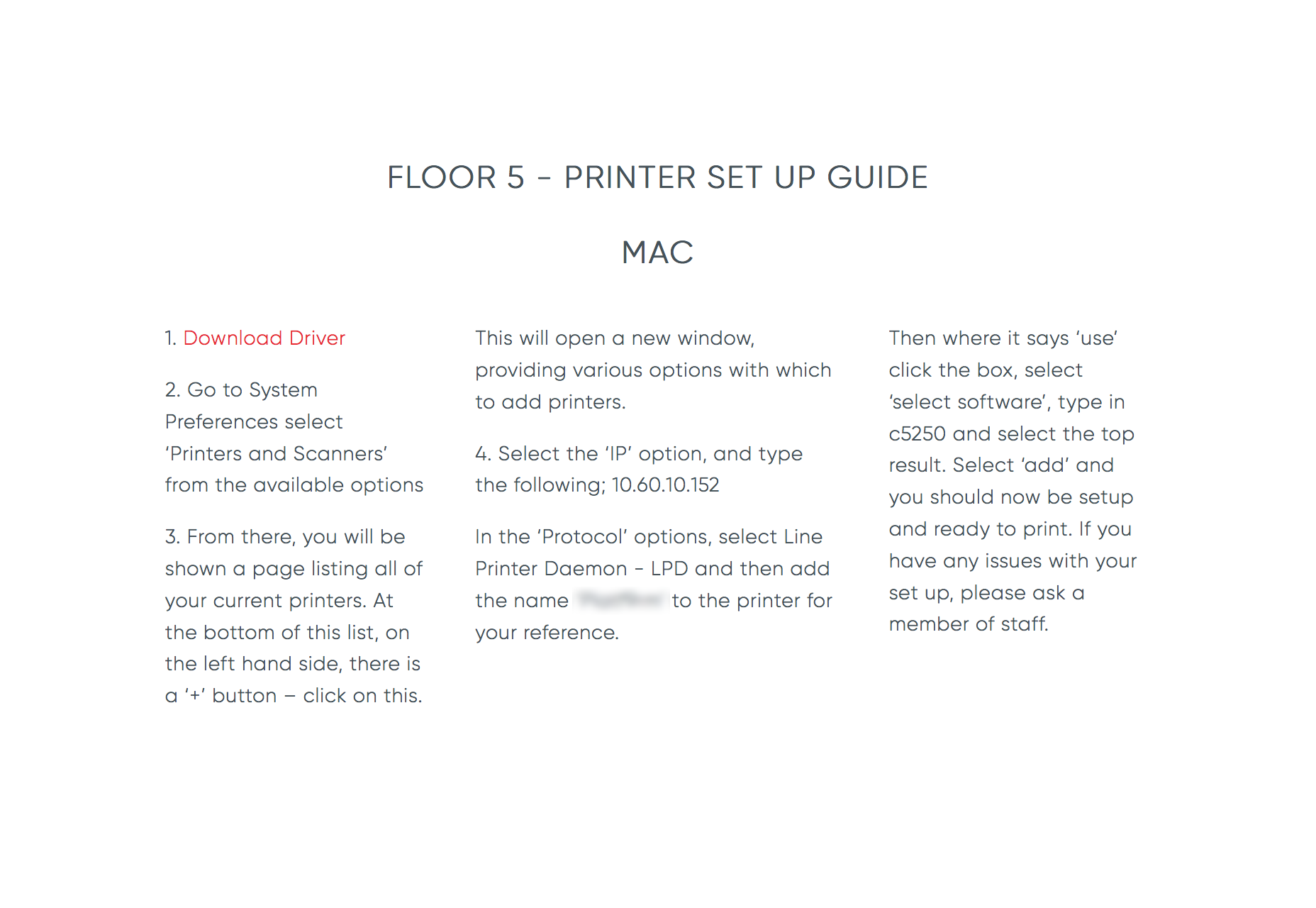
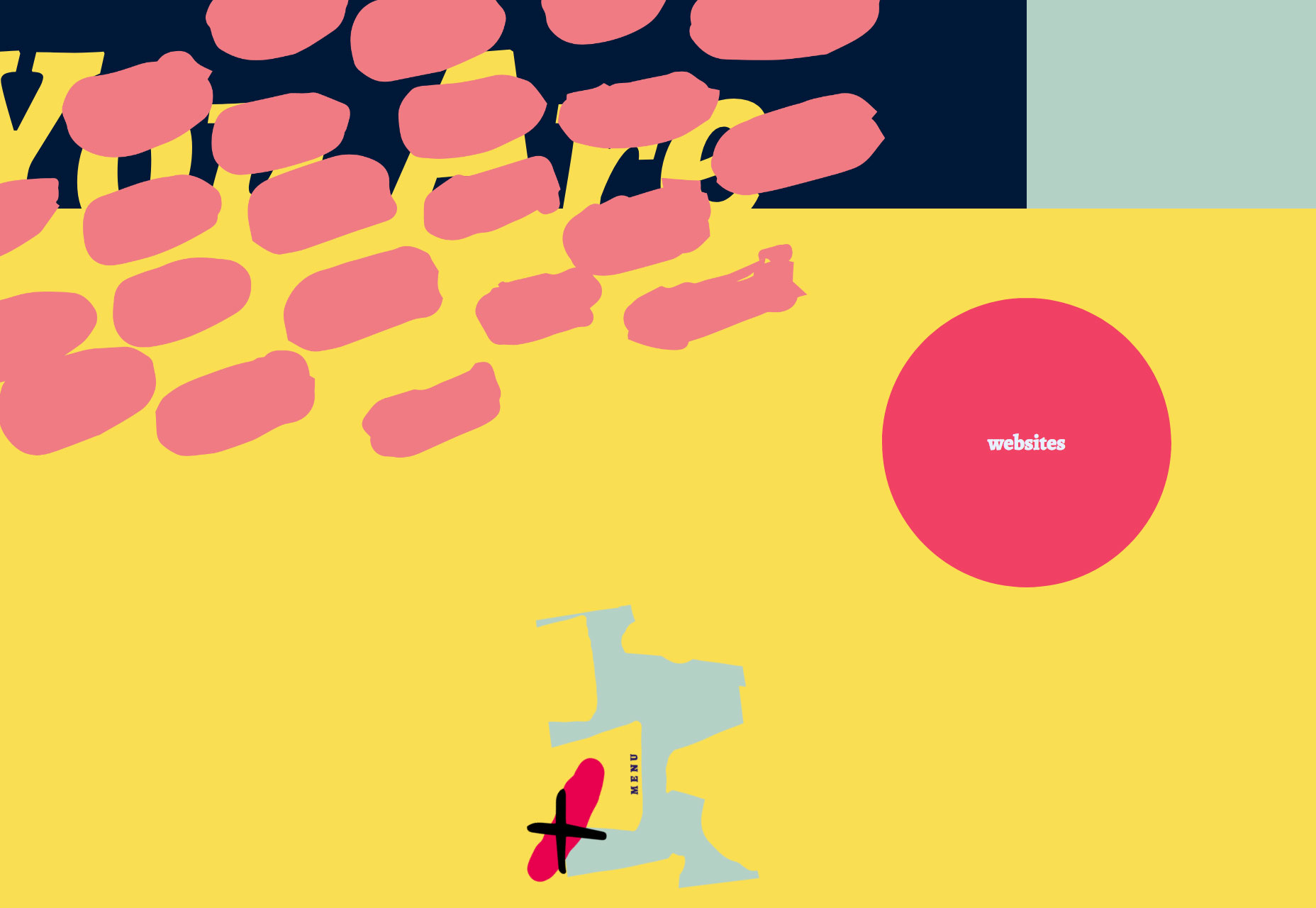
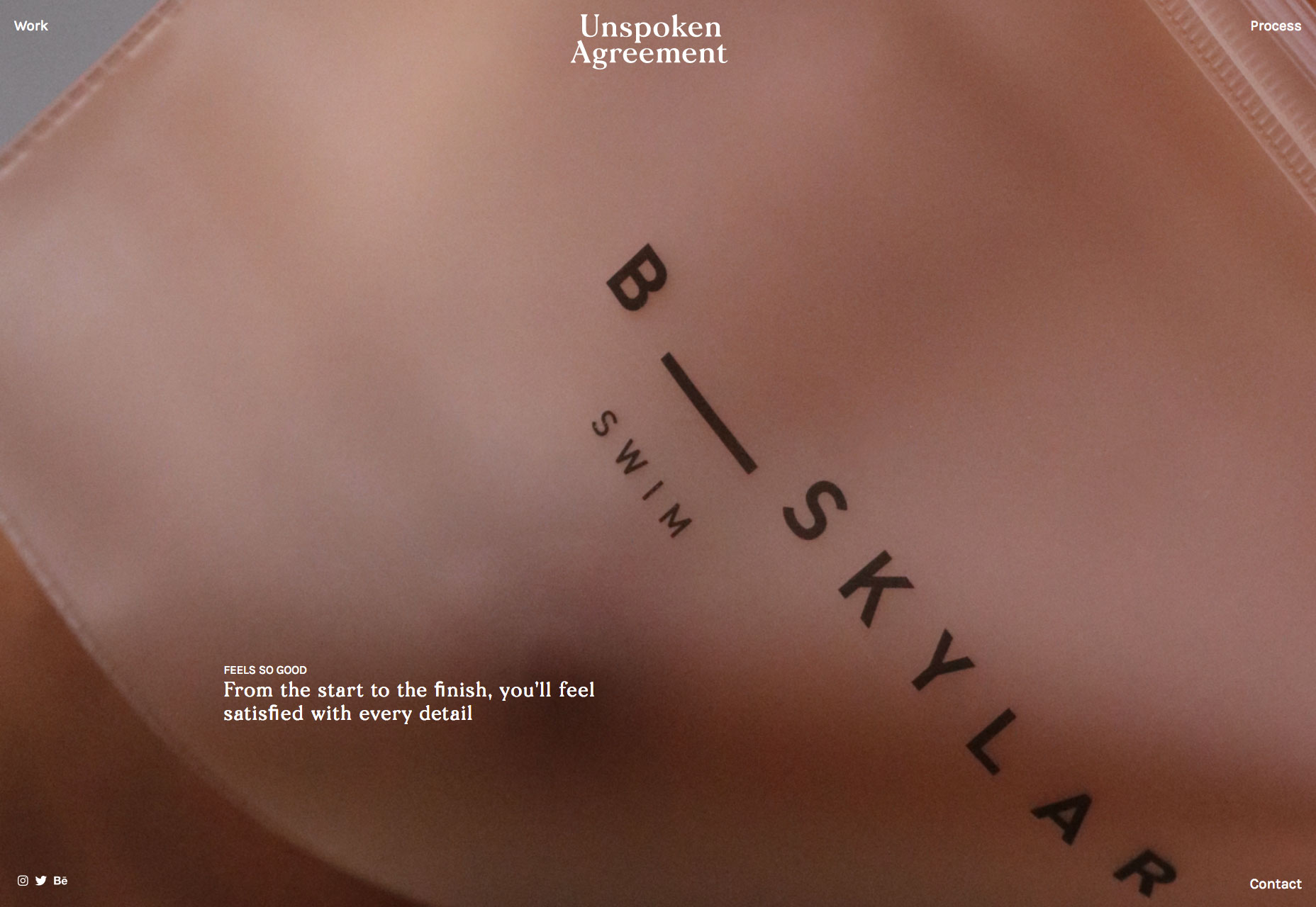
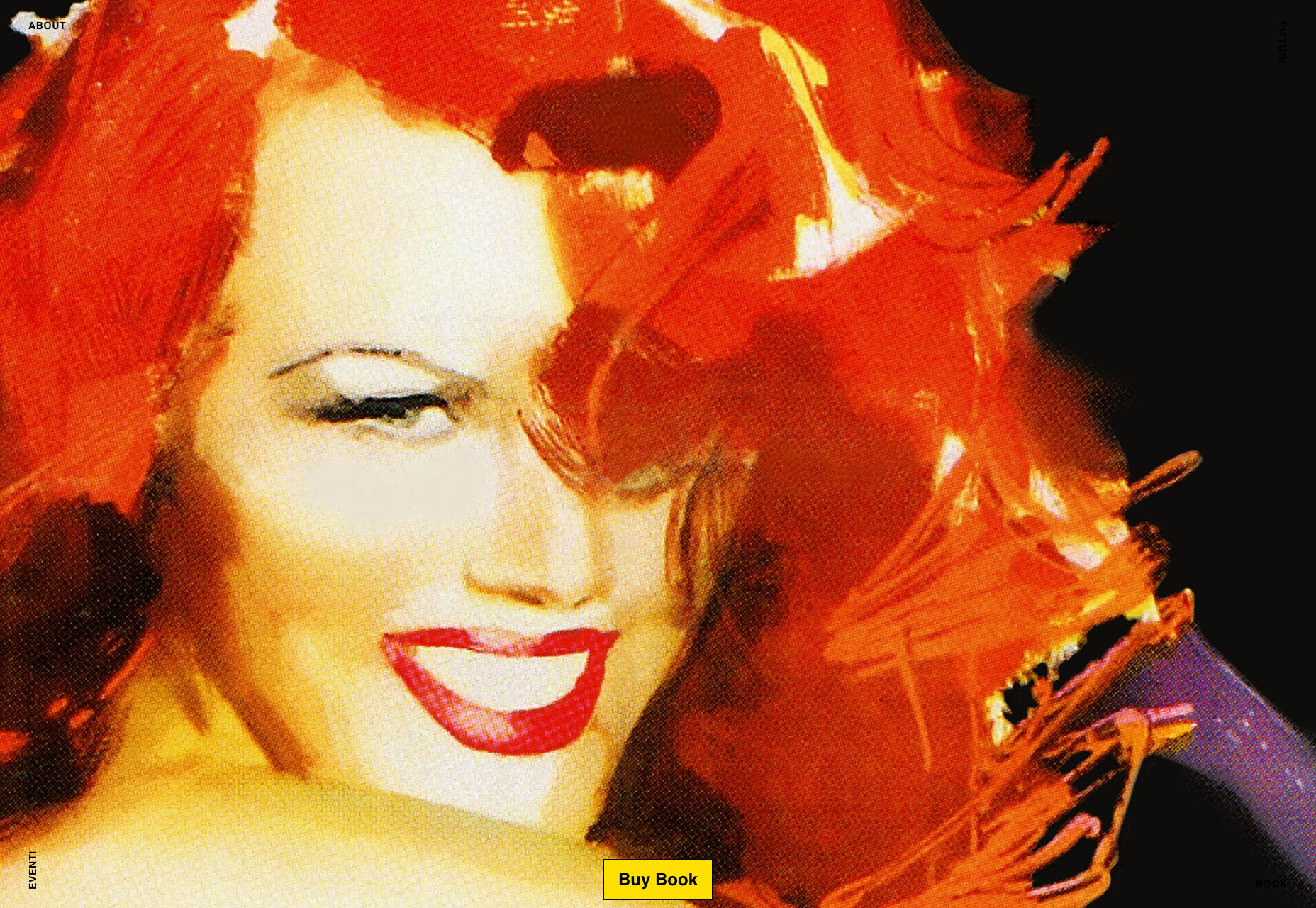
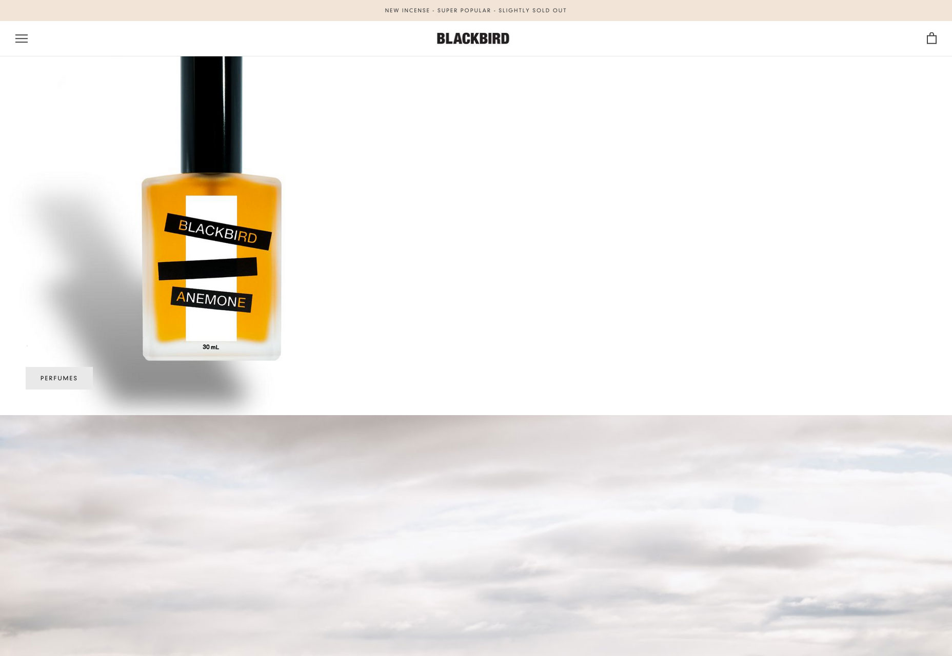
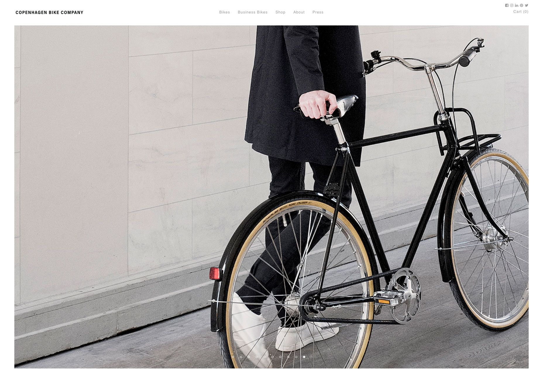
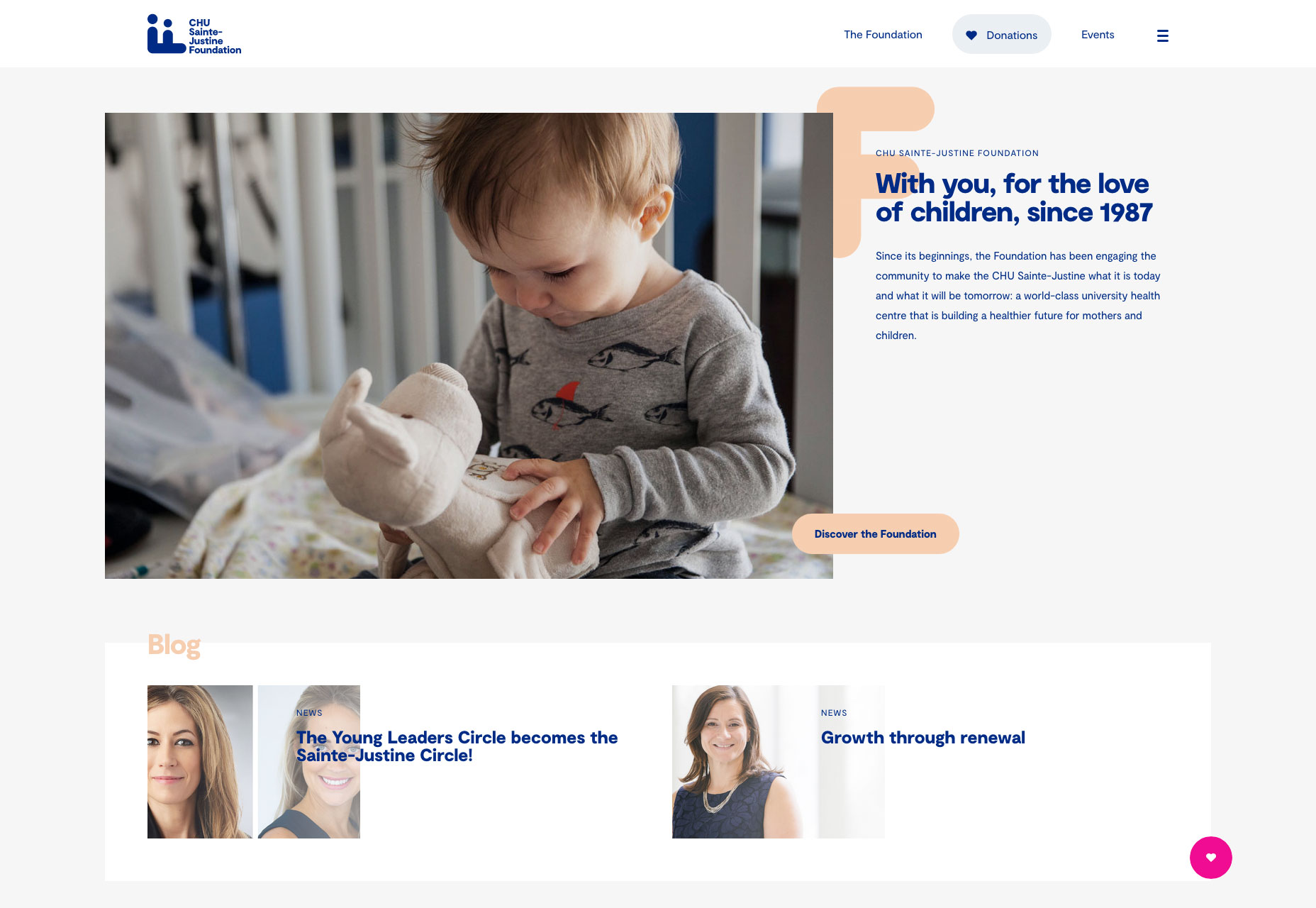
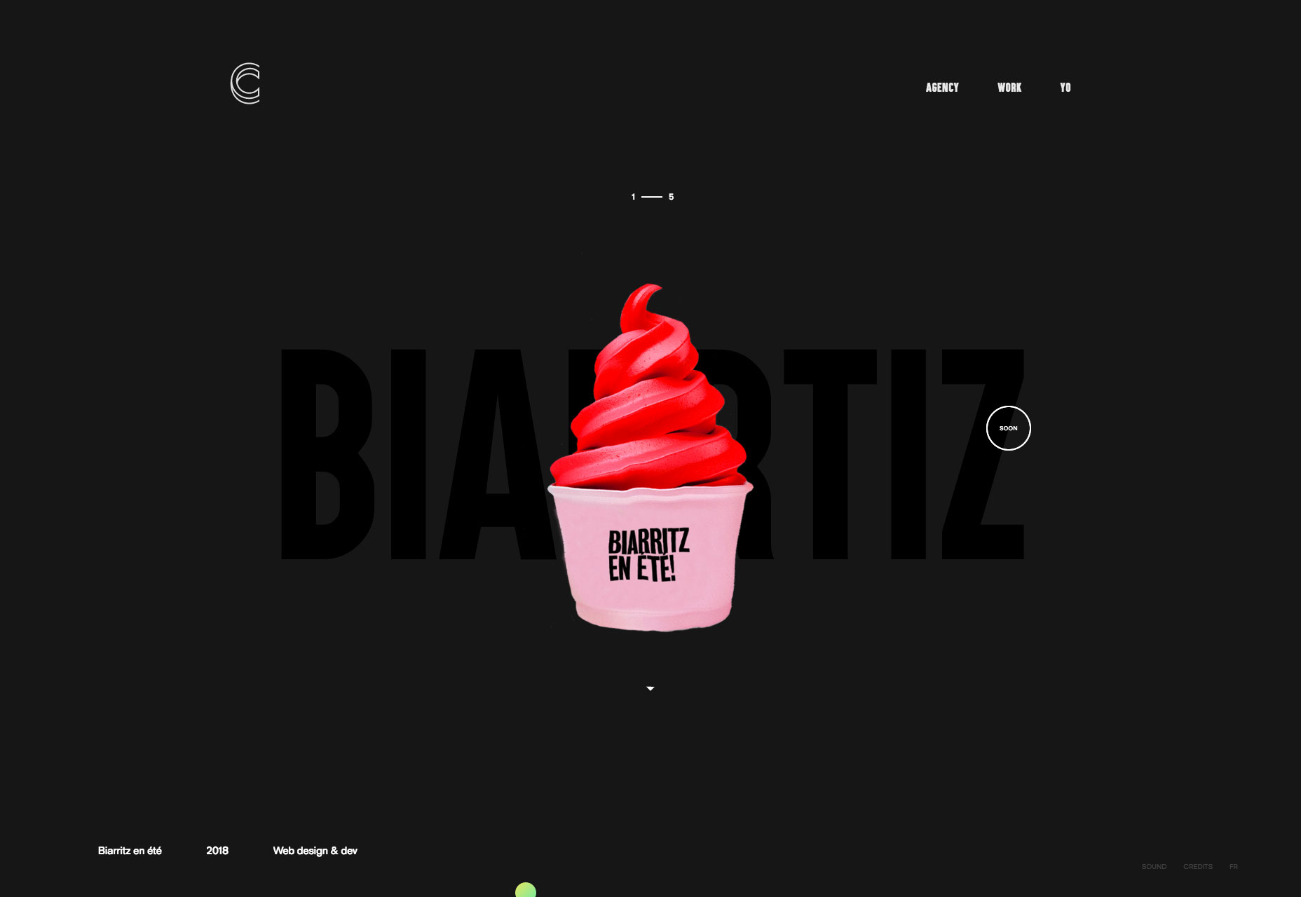
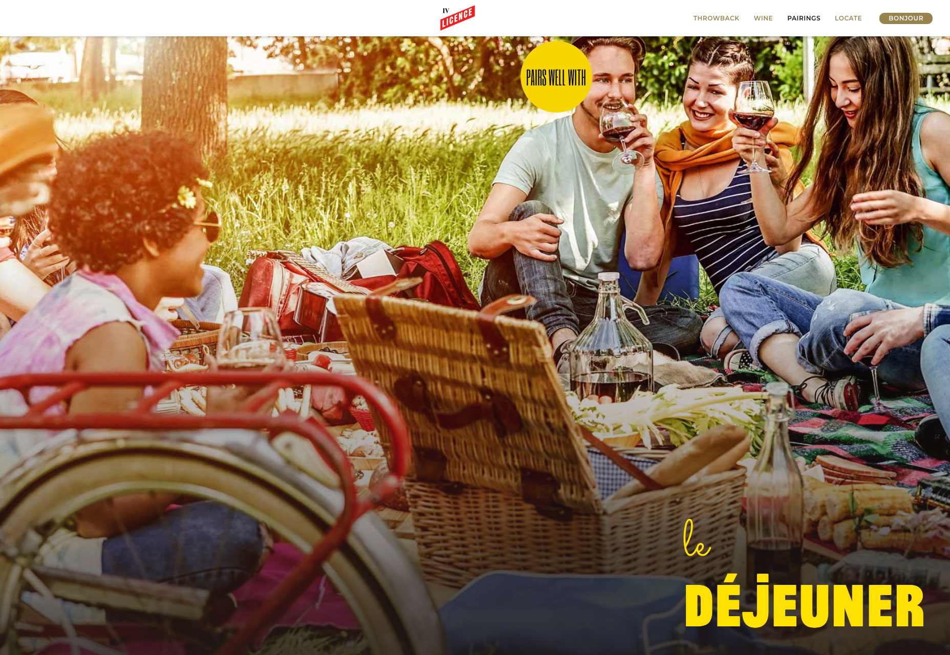
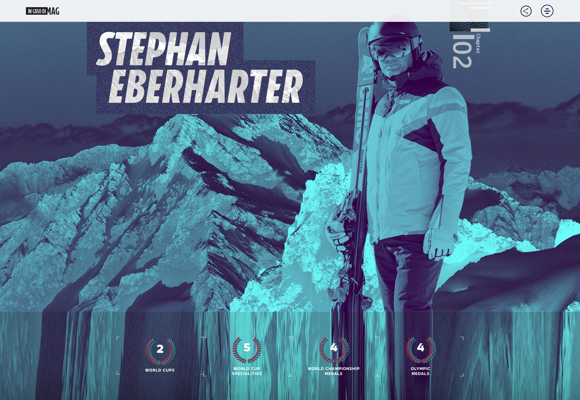
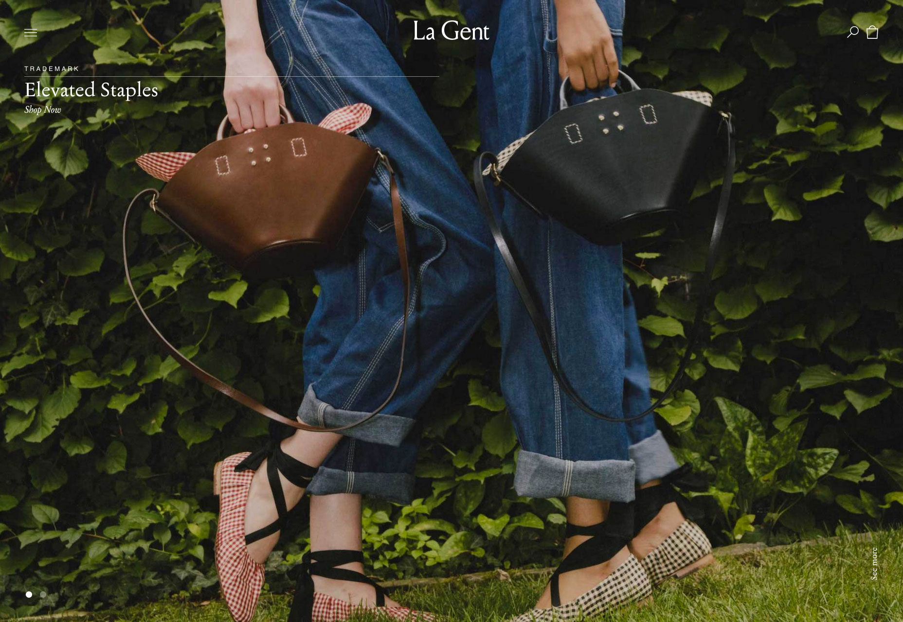
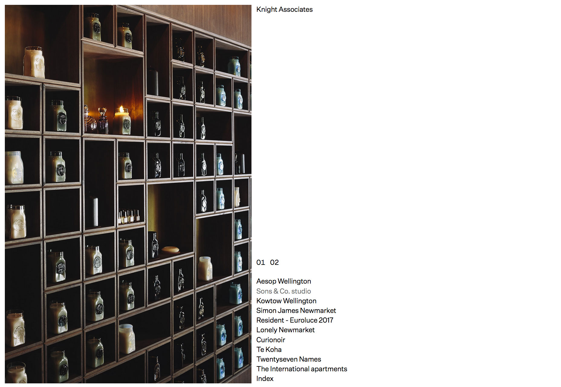
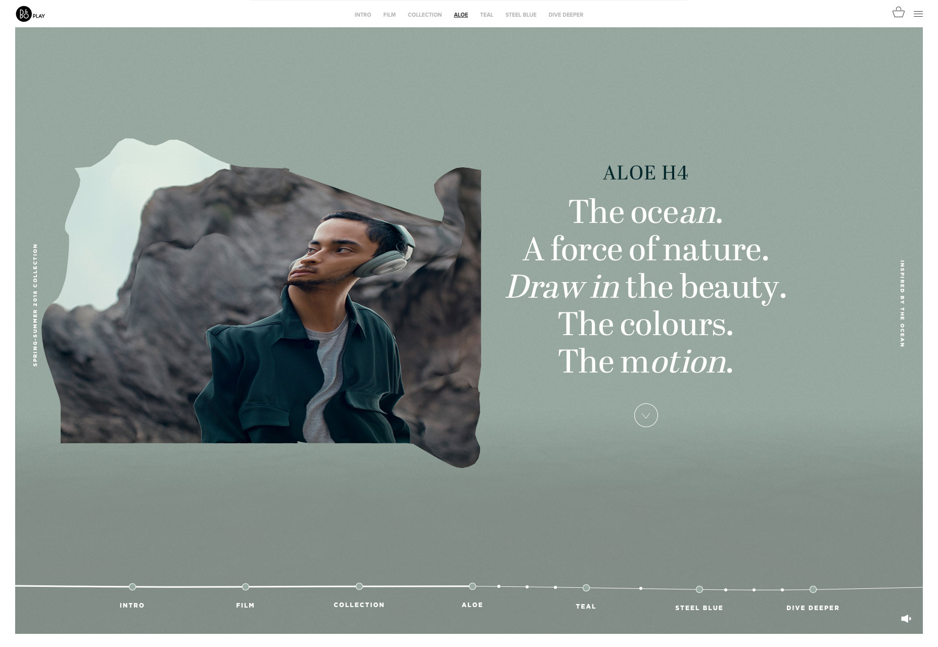
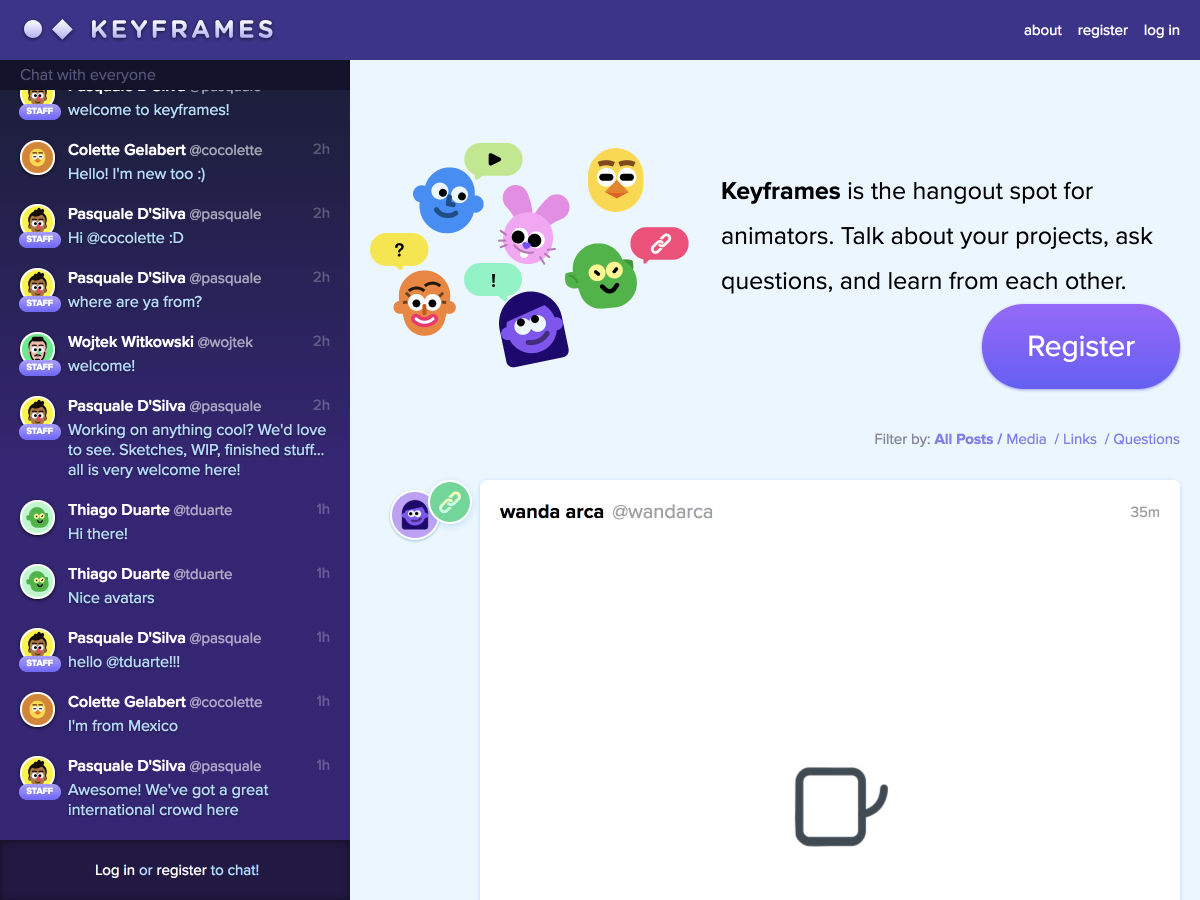
Welcome to our roundup of the best websites launched (or significantly updated) this month. July is a strange time to launch a site with the Summer slowdown in full effect, but these intrepid entrepreneurs have done so. We’ve got examples of great ecommerce, a couple of agency sites that we couldn’t resist, and lots of incredible art direction.

This month sees a big trend in compass navigation (a link in every corner of the page), and parallax is definitely still a big deal. Whether it’s inspired by the World Cup, or Le Tour, there’s a subtle gallic feel to a lot of sites this month…savourer!

Drift

Drift is a creative agency with some chops. Rejecting the minimalism that seemingly every other agency opts for, they’ve put together a charmingly animated, hand-made site. Not too functional, unless your aim is to communicate creative courage—they stand out.

Unspoken Agreement

Unspoken Agreement is a creative agency that believes in beauty. Its landing page is a schooling in art direction, and the simple bold copy is persuasive. I’m not sold on the compass navigation, but you can’t have everything.

2018 Foosball World Cup

As the final whistle is blown on the Fifa World Cup 2018, this awesome site gives you the chance to relive this Summer’s big sporting event from the comfort of your desktop. Pick a team, and click and scroll your way to victory. No spinning those bars!

Pittori di Cinema

The site designed to promote a book about film artists, Pittori di Cinema, is a suitably bold site with masses of color and strong lettering. Simple to use, it features that compass navigation again. But the graphics are something to behold.

Blackbird

Blackbird is an beautifully minimal Shopify site selling perfume. The site is a great example of how effective parallax can still be, if used effectively. I have no idea what that weird frog video is for, but it’s intriguing nonetheless.

Copenhagen Bike Company

If Le Tour is making you feel like cycling, but you don’t quite have the energy to make it up the Pyrenees, wander north to discover a cooler, more laid back approach to cycling. The site for the Copenhagen Bike Company features on-brand art direction, smooth UI details, and high-end minimalism.

Care Cards

We all get a little stressed from time to time, it’s OK to admit it. Care Cards is a progressive web app with over 80 kind tips to help you cope with the rigors of modern life. Just open it up on your phone (or notebook) and swipe through the gems of wisdom. I love this site.

CHU Sainte-Justine Foundation

Promoting fundraising for Canada’s premier hospital for the pre- and post-natal care of mothers and children. The strong grid layout, coupled with smart brand choices and subtle animation is a winning combination for this important cause.

Apostrophe

It’s always hard to design a site for copywriters, but this site does so beautifully. Hooking up the leading animation to the scroll of the page is an excellent device for driving home exactly what this minimal site is promoting.

Contemple

Another design agency showing us something special, this time it’s an amazing ripple effect on their slideshow as you scroll through the featured projects on their landing page. Click through to the case studies and there’s some awesome work on display.

License IV Wine

This simple one-page site sells a wine brand perfectly, by capturing the spirit of community around a good bottle of French wine. The License IV wine label is bringing French savoir faire to wine drinkers in the USA with this charming site.

In Caso di Mag: Kitzbühel

Kitzbühel is the latest in an ongoing series of craftily designed travelogues around the world’s best ski resorts. Each location gets its own page, with custom art direction capturing the spirit of each place. I love the attention to detail.

Carpe Diem Santorini

If there’s one place I’d love to spend some time, it’s among the cycladic minimalism of Santorini. The tiny Greek island is world famous for the beauty of its sunsets, and this enchanting site sells the romance of the destination perfectly.

La Gent

Who doesn’t love quality, independent brands that put timelessness ahead of fashion. La Gent’s site is designed for browsing. I love the fact that their slider has just two items, enough for variety but not so much that you get lost.

Fortnum&Fox

Another design agency with a flair for art direction, the site for Fortnum&Fox features an exceptional split screen design showing off an impressive back-catalogue of work. I particularly like how cohesive and simple the whole experience feels.

Maman Corp

Maman Corp is a construction company and their site reflects this with a grid-based layout and animation that feels like the site is being constructed before your eyes. I love the full-screen video and beautiful typography.

Twill

Twill is an open-source CMS kit for Laravel, offering increased productivity and more control. It’s promoting itself to developers, and that’s never an easy task, but breaking down the benefits in this one-page site it’s clearly worth checking out.

Knight Associates

You don’t get more minimal than this site for a New Zealand-based interior design firm. A simple list of projects click through to case studies. It’s a exercise in restraint from the design team than fans of simplicity will love.

Bang & Olufsen SS18

Bang & Olufsen’s spring and summer collection features aloe, teal, and steel blue hues inspired by the ocean. The whole microsite feels like its floating in water, and there’s a great liquid hover effect on the images.

Harris Farm

If you’ve had your fill of minimalism for this month, then browse over to Harris Farm. The positive feeling site is packed with illustrations and lettering that capture the spirit of this healthy, food-loving Australian company.

Add Realistic Chalk and Sketch Lettering Effects with Sketch’it – only $5!

Source

from Webdesigner Depot https://www.webdesignerdepot.com/2018/07/20-freshest-web-designs-july-2018/