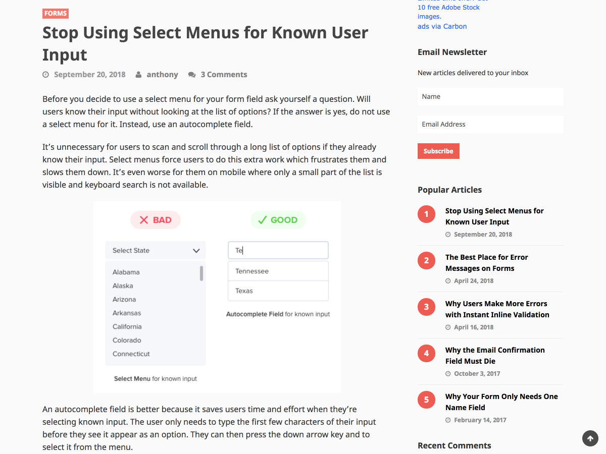
 CSS Grid and CSS Flexbox are complimentary web layout technologies that have been hotly anticipated for years. However, despite some superficial similarities they are actually used for very different tasks; they each solve a very different set of problems.
In an ideal scenario, you may find that you employ both for different layout tasks. In this post we’ll look at their differences, look at how they solve various layout problems, and help you choose which (if either) is the right solution for your problem.
Grid is Container-Based, Flexbox is Content-Based
In flexbox layout, the size of a cell (flex-item) is defined inside the flex-item itself, and in the grid layout, the size of a cell (grid-item) is defined inside the grid-container.
Confusing?
Let’s look at an example, here’s the HTML to create a row of elements:
<div class="row">
<div>1</div>
<div>2</div>
<div>3</div>
<div>4</div>
</div>
And we style this using flexbox like so:
.row {
    margin: 20px auto;
    max-width: 300px;
    display: flex;
}
.row > div {
    border: 1px dashed gray;
    flex: 1 1 auto; /* Size of items defined inside items */
    text-align: center;
    padding: 12px;
}
We defined the size of the cells inside the flex-item by setting flex: 1 1 auto;. The flex property is shorthand to set flex-grow, flex-shrink, and flex-basis properties in one statement; its default value is 0 1 auto. Notice the “row” div is the flex-container, and we don’t set the size of the items there. We set the size inside the flex-item.
When previewed in a browser we get a row of boxes, as you would expect:

Now let’s see how we can generate the same output using grid:
.row {
    margin: 20px auto;
    max-width: 300px;
    display: grid;
    grid-template-columns: 1fr 1fr 1fr 1fr; /* Size of items defined inside container */
}
.row div {
    border: 1px dashed gray;
    text-align: center;
    padding: 12px;
}
Above code will give us exactly the same output.
Notice, now we are defining the cell’s size using grid-template-columns inside the grid-container (.row), not the grid-item.
This is an important difference. It shows that the flexbox layout is calculated after its content is loaded whereas the grid layout is calculated regardless of the content inside it.
Grid Has a “Gap” Property, Flexbox Doesn’t
You can argue that a major difference between flexbox and grid is that in the latter we can create gutters between grid-items using grid-column-gap, like so:

In order to achieve the same result in flexbox we would have to use padding and nested containers, or increase the width of the flex-container and use the justify-content property to spread the flex-items.
We have to take a circuitous route in flexbox because it doesn’t have a gap property. However, it is on the way; the CSS Box Alignment Module 3 contains CSS features relating to alignment of boxes in all layout modes: block layout, table layout, flex layout, and grid layout. The Box Alignment module collects properties from flexbox, grid, and multi-column which can be used consistently across all the layout models. Eventually we’ll be able to add gaps with row-gap and column-gap properties, but not yet.
Flexbox is One Dimensional, Grid is Two Dimensional
We’ve been arranging elements as rows and columns on the web since we used tables for layout. Both flexbox and grid are based on this concept. Flexbox is best for arranging elements in either a single row, or a single column. Grid is best for arranging elements in multiple rows and columns.
In other words, Flexbox is one dimensional, and Grid is two dimensional. Let’s look at a commonly used one dimensional layout – the social share buttons:

All the elements are in a single row. We can implement this using Flexbox like this:
<ul class="social-icons">
  <li><a href="#"><i class="fab fa-facebook-f"></i></a></li>
  <li><a href="#"><i class="fab fa-twitter"></i></a></li>
  <li><a href="#"><i class="fab fa-instagram"></i></a></li>
  <li><a href="#"><i class="fab fa-github"></i></a></li>
  <li><a href="#"><i class="fas fa-envelope"></i></a></li>
  <li><a href="#"><i class="fas fa-rss"></i></a></li>
</ul>

.social-icons {
  display: flex;
  list-style: none;
  justify-content: space-around;
}
The justify-content property determines how the extra space of the flex-container is distributed to the flex-items. The space-around value distributes the space in such a way that the flex-items get placed evenly with equal amount of space around them.
Next, let’s take a look at a commonly used 2-dimensional layout:

We can’t implement this layout with a single row or a single column, we need multiple rows and columns to do that, and that’s where we use CSS Grids. Let’s make it using CSS Grid:
<div class="container">
  <header>Header</header>
  <main>Main</main>
  <aside>Aside</aside>
  <footer>Footer</footer>
</div>
and the CSS:
.container {
  max-width: 800px;
  margin: 2em auto;
  display: grid;
  grid-template-columns: 3fr 1fr;
  grid-template-rows: repeat(3,auto);
  grid-gap: 1rem;
}

.container header {
  grid-area: 1/1/2/3;
}

.container main {
  grid-area: 2/1/3/2;
}

.container aside {
  grid-area: 2/2/3/3;
}

.container footer {
  grid-area: 3/1/4/3;
}

.container > * {
  background-color: #ddd;
  padding: 1rem;
}
We are creating two columns using the grid-template-columns property, and three rows using grid-template-rows property. The repeat() function creates 3 rows with auto height.
Then, inside the grid-items (header, main, aside, and footer) we define how much area those grid-items will cover using the grid-area property.
Flexbox Wraps vs Grid Wraps
When the total width of items inside the container is greater than the width of the container, in that case both the layout models have the option to wrap the items to a new row. However, the way both handle wrapping is different.
Let’s look at that difference by building an sample layout. Create two rows and place 6 divs inside each row:
<h2>Flexbox</h2>
<div class="row-flex">
    <div>1 2 3  4 5 6 7 8 9 0</div>
    <div>2</div>
    <div>3</div>
    <div>4</div>
    <div>5</div>
    <div>6</div>
</div>

<h2>Grid</h2>
<div class="row-grid">
    <div>1 2 3  4 5 6 7 8 9 0</div>
    <div>2</div>
    <div>3</div>
    <div>4</div>
    <div>5</div>
    <div>6</div>
</div>
Now, we will use Flexbox to layout the first row and Grid for second:
/* Flexbox row styles */
.row-flex {
  margin: 40px auto;
  max-width: 600px;
  display: flex;
  flex-wrap: wrap;
}
.row-flex div {
  border: 1px dashed gray;
  flex: 1 1 100px;
  text-align: center;
  padding: 12px;
}
/* Grid row styles */
.row-grid {
  margin: 40px auto;
  max-width: 600px;
  display: grid;
  grid-template-columns: repeat(auto-fill, minmax(100px, 1fr));
}
.row-grid div {
  border: 1px dashed gray;
  text-align: center;
  padding: 12px;
}
For the first row, we are using flex: 1 1 100px to give the flex-items a base width of 100px and allow it to grow and shrink.
We are also enabling wrapping of flex-items inside the flex-container by setting the flex-wrap property to wrap, its default value is nowrap.
For the second row, we are using the grid-template-columns property to create columns with minimum width 100px set by the minmax() function. We are using repeat() function to create columns repeatedly.

You can see the beauty of Grid and Flexbox lies in the ability to stretch and squeeze the items based on the amount of space available. Flexbox achieves this using flex-grow and flex-shrink properties, and Grid achieves this using a combination of minmax and auto-fill functions inside the grid-template-columns property.
However, look carefully at the cell 5 and cell 6 as they are pushed down. In the case of Flexbox, the cell 5 and 6 are not the same size as other cells when pushed down. While in case of Grid, they retain the same size as all other cells in the grid.
This happens because when a flex-item is wrapped and pushed in a new row, the Flexbox layout algorithm treats it as a part of a different flex-container. Hence the pushed item loses its context.
This behavior could be used in some use cases, for example, an email subscriber form:

Let’s build this subscriber form:
<div class="subscriber-form-container">
  <form>
    <input type="email" placeholder="Email Address">
    <input type="text" placeholder="Name">
    <input type="submit" value="Subscribe">
  </form>
</div>
and give it some styles in our CSS:
.subscriber-form-container {
  max-width: 650px;
  margin: 40px auto;
  border: 1px dashed gray;
  box-sizing: border-box;
}
.subscriber-form-container form {
  display: flex;
  flex-wrap: wrap;
}
.subscriber-form-container form input {
  margin: 6px;
  padding: 0.4rem;
  box-sizing: border-box;
}
.subscriber-form-container form input{
  flex: 1 1 150px;
}
.subscriber-form-container form input[type="email"] {
  flex: 2 1 300px;
}
The flex property is the shorthand for three properties: flex-grow, flex-shrink, and flex-basis. We want the width of the “email” field to be double the width of other two input elements, and we achieve this by using its “flex-grow” and “flex-basis”.
The “flex-grow” property of input elements is set to “1”, but that of email input element is set to 2. So, when there is extra space available, the email input element will grow twice compared to other input elements.
Flexbox outperforms Grid in this use case. Yes, you could use some hack to get CSS Grid replicate this behavior using minmax() function, but Flexbox is well-suited for this kind of single dimensional layouts.
However, if you want a multi-dimensional layout with the wrapped elements maintaining their widths, for example, an image gallery, then Grid is the best choice:

One more thing, did you notice we are not using any media queries here. That’s because Flexbox and Grid layouts are built on concept of responsiveness and hence reduce the use of Media Queries.
Will CSS Grid make Flexbox Obsolete in the Future?
Absolutely not.
In fact, that’s what this article was about.
Currently, CSS Grid doesn’t have enough support across the browsers to make production ready websites. The general rule of thumb I use is that a feature must cover more than 95% of global usage. Only then I use that feature in real websites. Currently, Flexbox covers 95% of global usage, and Grid covers 87% of global usage.
Soon Grid will also get good support among the browsers, and we will use a mix of Grids and Flexboxes to make amazing website layouts that previously weren’t possible.
Featured image via DepositPhotos.
Source
from Webdesigner Depot https://www.webdesignerdepot.com/2018/09/grid-vs-flexbox-which-should-you-choose/
 Every week users submit a lot of interesting stuff on our sister site Webdesigner News, highlighting great content from around the web that can be of interest to web designers.


 When you
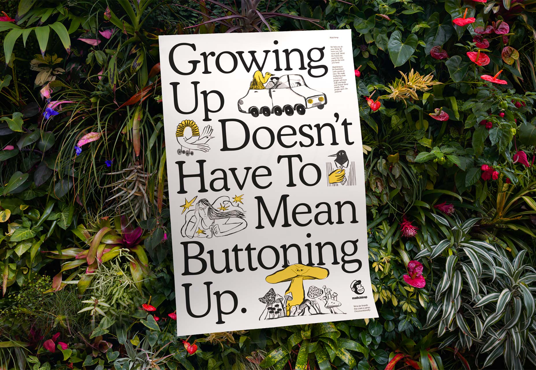
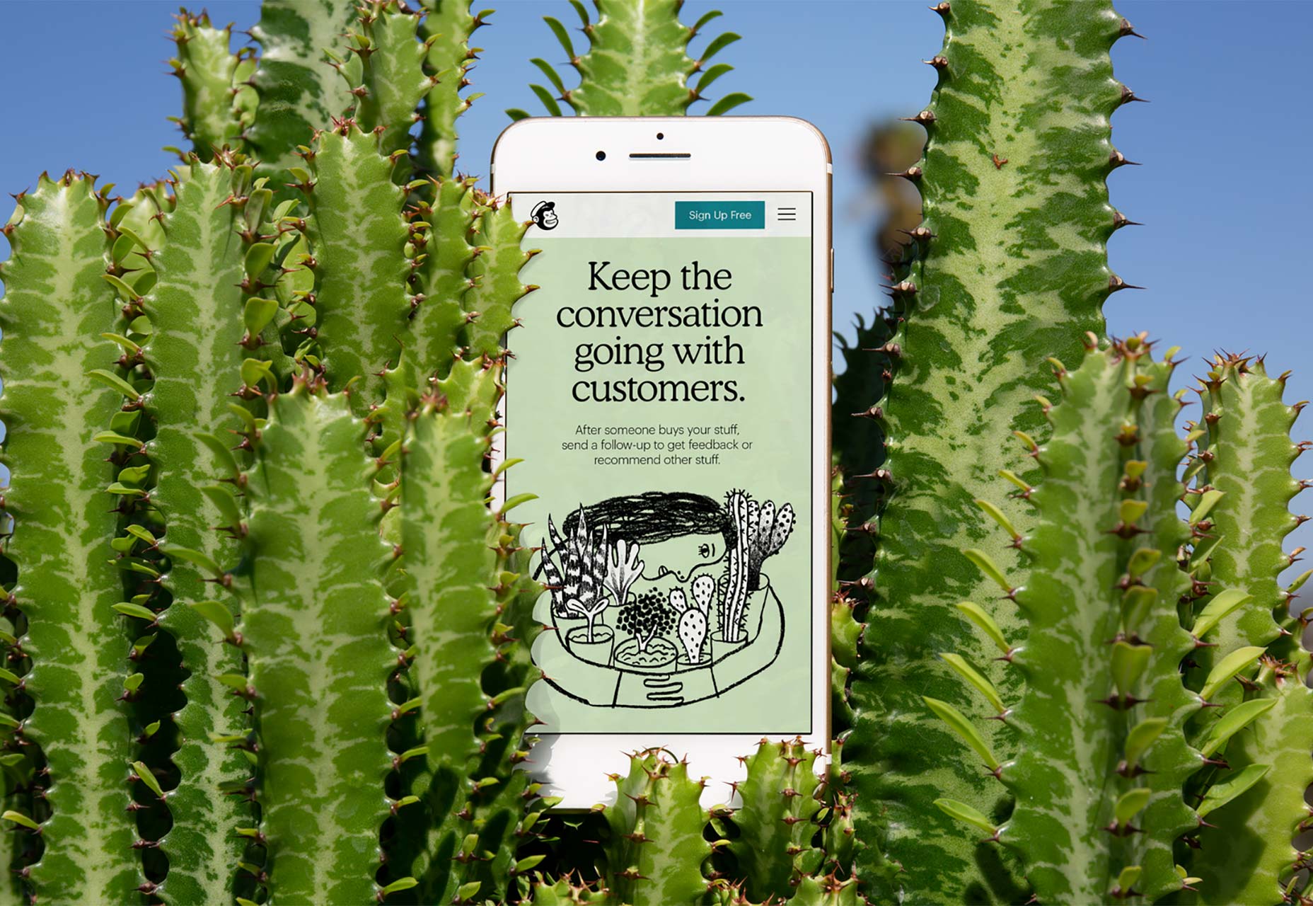
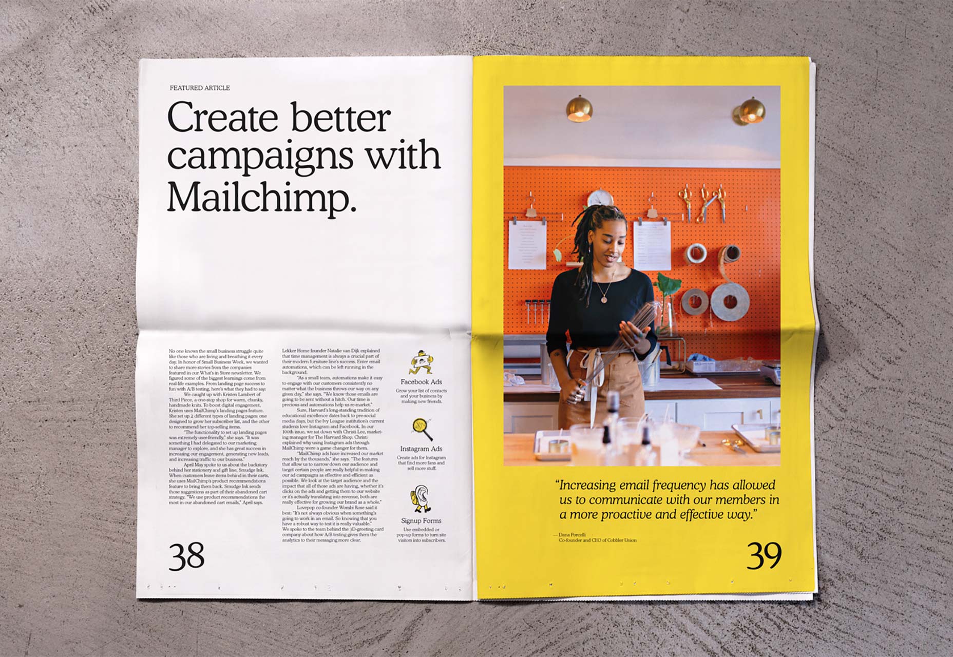
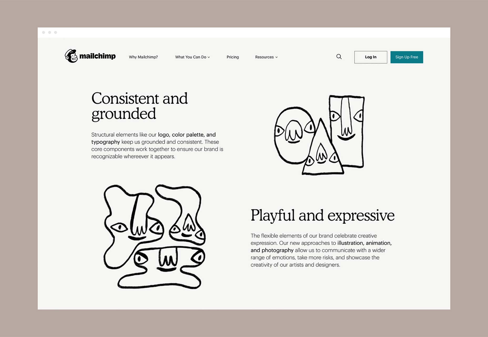
  If any single tech company embodies the spirit of web-savvy, then it is Mailchimp. Since its beginnings as a side-project in the early-2000s the marketing service has walked the line between creative experiences, and simple usability. Mailchimp is one of those companies that saunters onto the court, lobs a shot over its shoulder, and gets nothing but net.
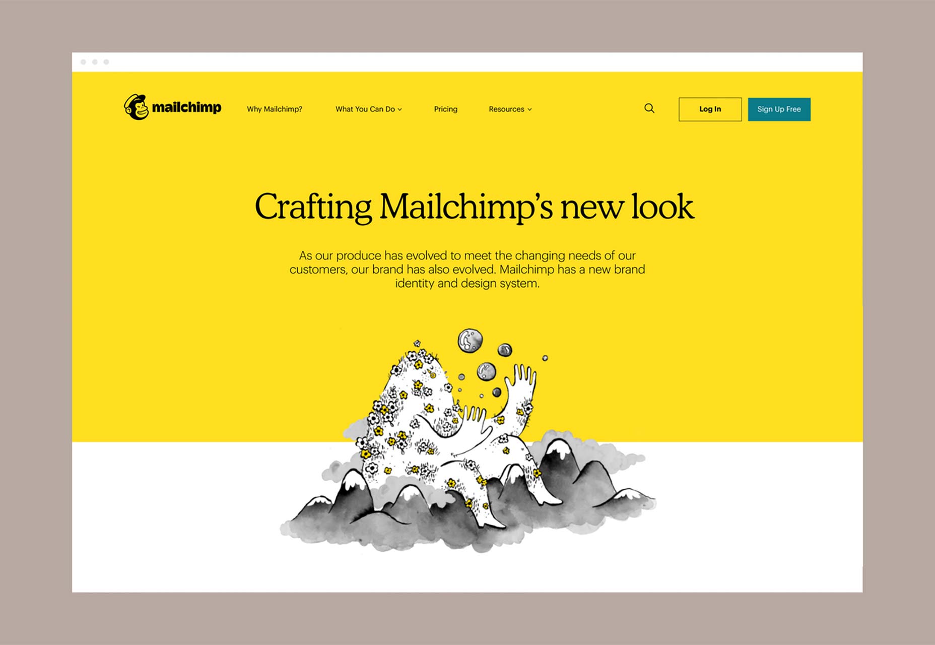

 Placeit offers thousands of