 Greetings, Readers! It’s April, so there will be no joke here. You’re welcome.
This month, designers seem to have hit the minimalism button hard. There is a bit of variety in there, but if you like lots of white space, you’re in luck. A few Powerpoint-ish sites, too. Enjoy!
Note: I’m judging these sites by how good they look to me. If they’re creative and original, or classic but really well-done, it’s all good to me. Sometimes, UX and accessibility suffer. For example, many of these sites depend on JavaScript to display their content at all; this is a Bad Idea , kids. If you find an idea you like and want to adapt to your own site, remember to implement it responsibly.
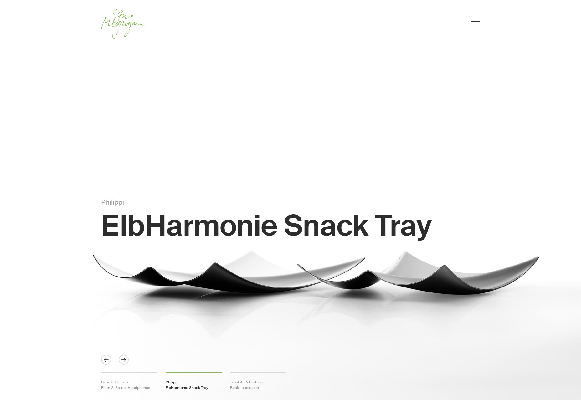
Steve Mcgugan
Steve Mcgugan has a name that is a lot of fun to say out loud, the first Drupal site we’ve had on this list in a while, and a quite minimalist approach to showing off his work. It’s clean, it’s pretty, and it’s mostly monochromatic with just a splash of green here and there. Classic and effective.
Platform: Drupal
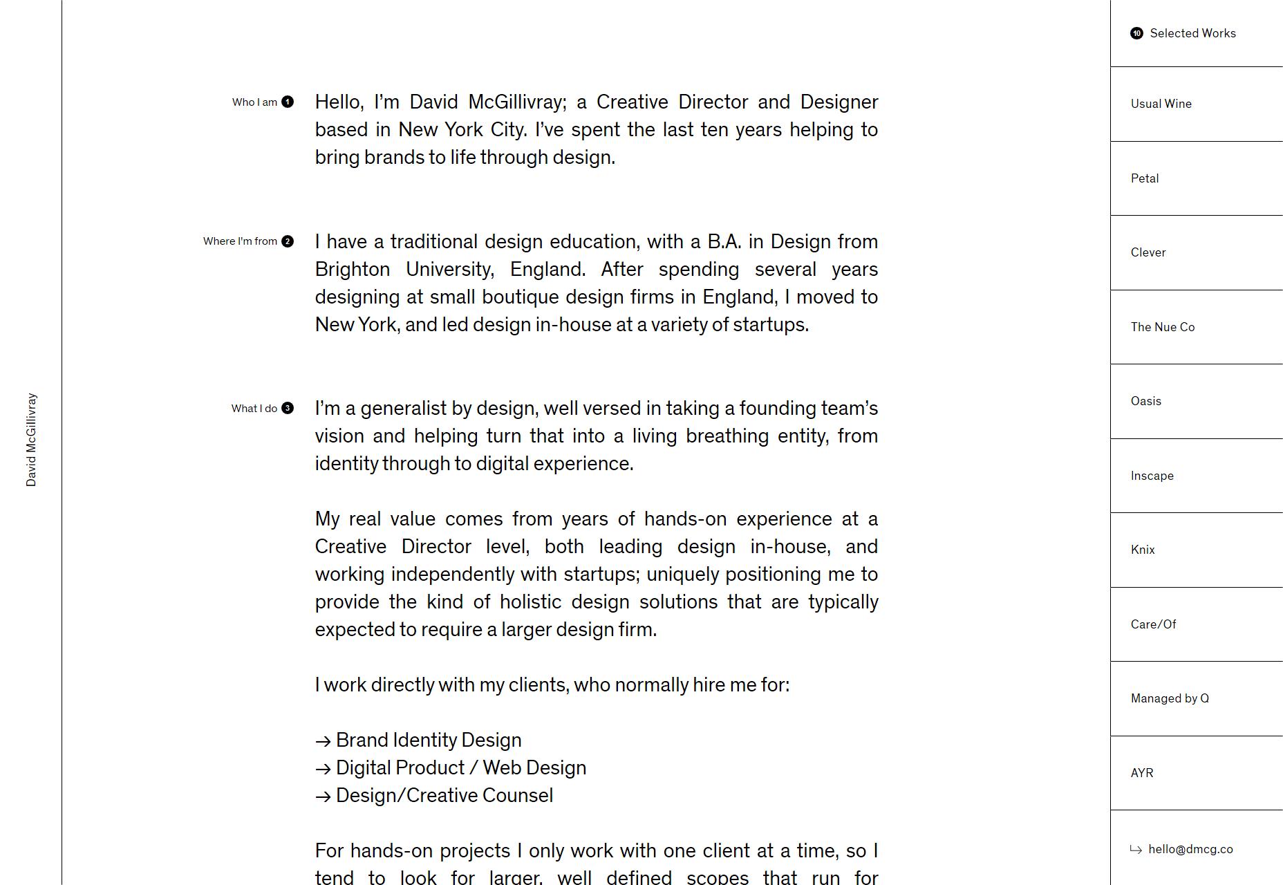
David McGillivray
David McGillivray continues the trend of the mostly black-and-white site, but with an interesting twist in the way the layout is organized. There’s just a curated list of ten projects on the right, and that’s it. Hover for a preview, then click and go.
It’s not terribly scalable, perhaps, but if you’ve curated your work down to a list of ten projects that show you off at your best, why not? We all end up redesigning our sites at least once a year anyway, right?
Platform: Custom CMS (I think)
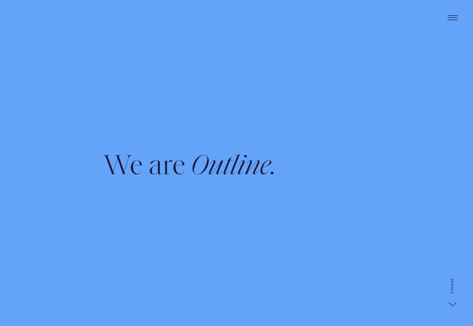
Outline
Outline is another wonderfully minimalist site, but this time with a bit more color thrown into the mix. One thing I like is that they built a multi-step pre-project interview right into the site. Sure, it’ll probably deter customers that are in a hurry, but that’s the point, right? You want the ones who have clearly thought about what they want.
My only complaint is that one of their fancier typefaces (Saol Display Light) is a bit harder to read at smaller sizes. This could be an issue with how Windows renders the typeface, but it’s something to keep in mind.
Platform: WordPress
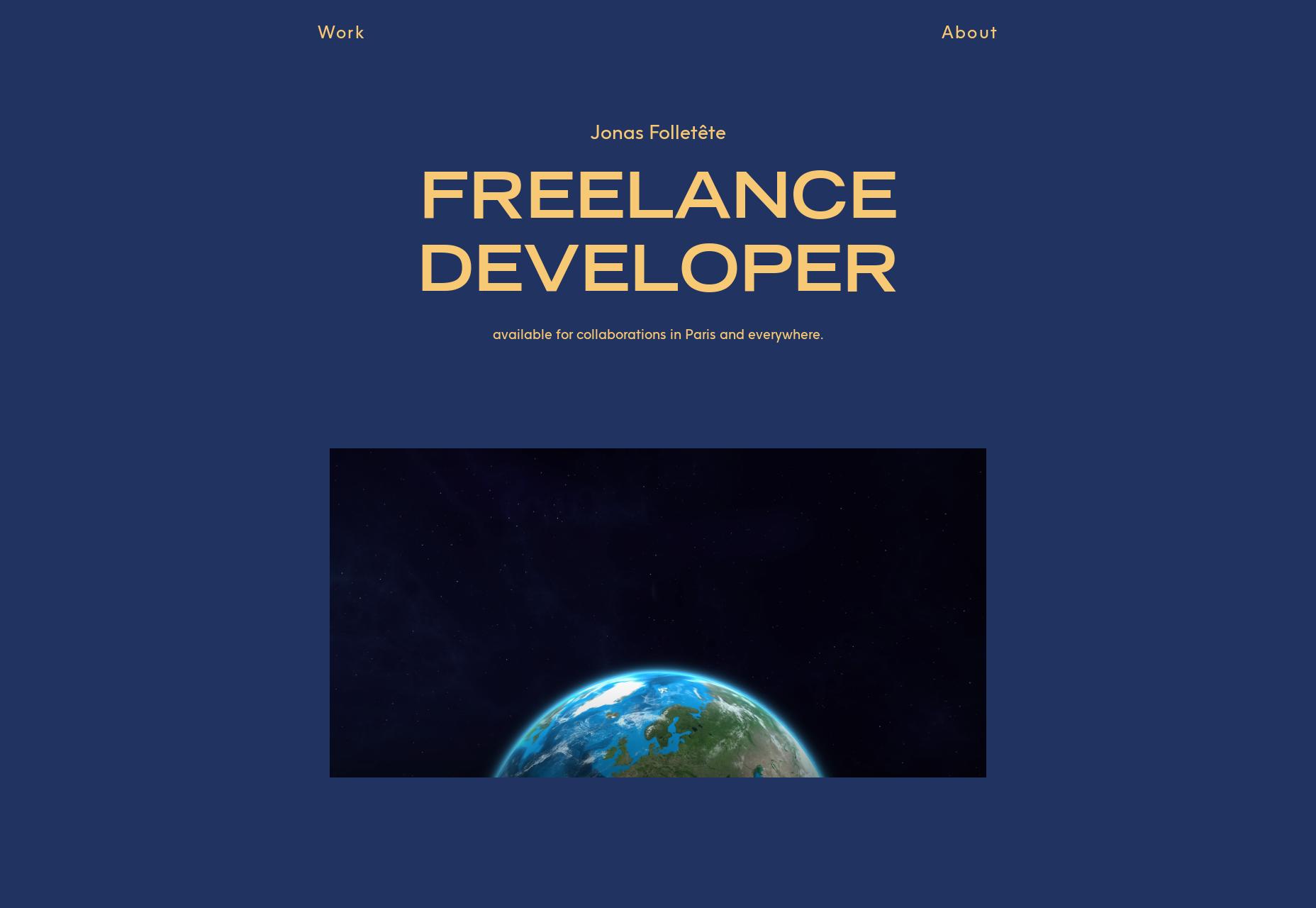
Jonas Folletête
Jonas Folletête embraces a clearly modernist aesthetic, and is one of those odd sites that, although very minimalist, would not be the same without its animated bits. It’s also odd, but the typography feels “French”, you know, like all the fashion magazines that try to look French. Given that Jonas is himself based in France, it makes sense, and it’s cool that this part of his identity is baked right into the design in a subtle way.
Platform: Custom CMS (maybe)
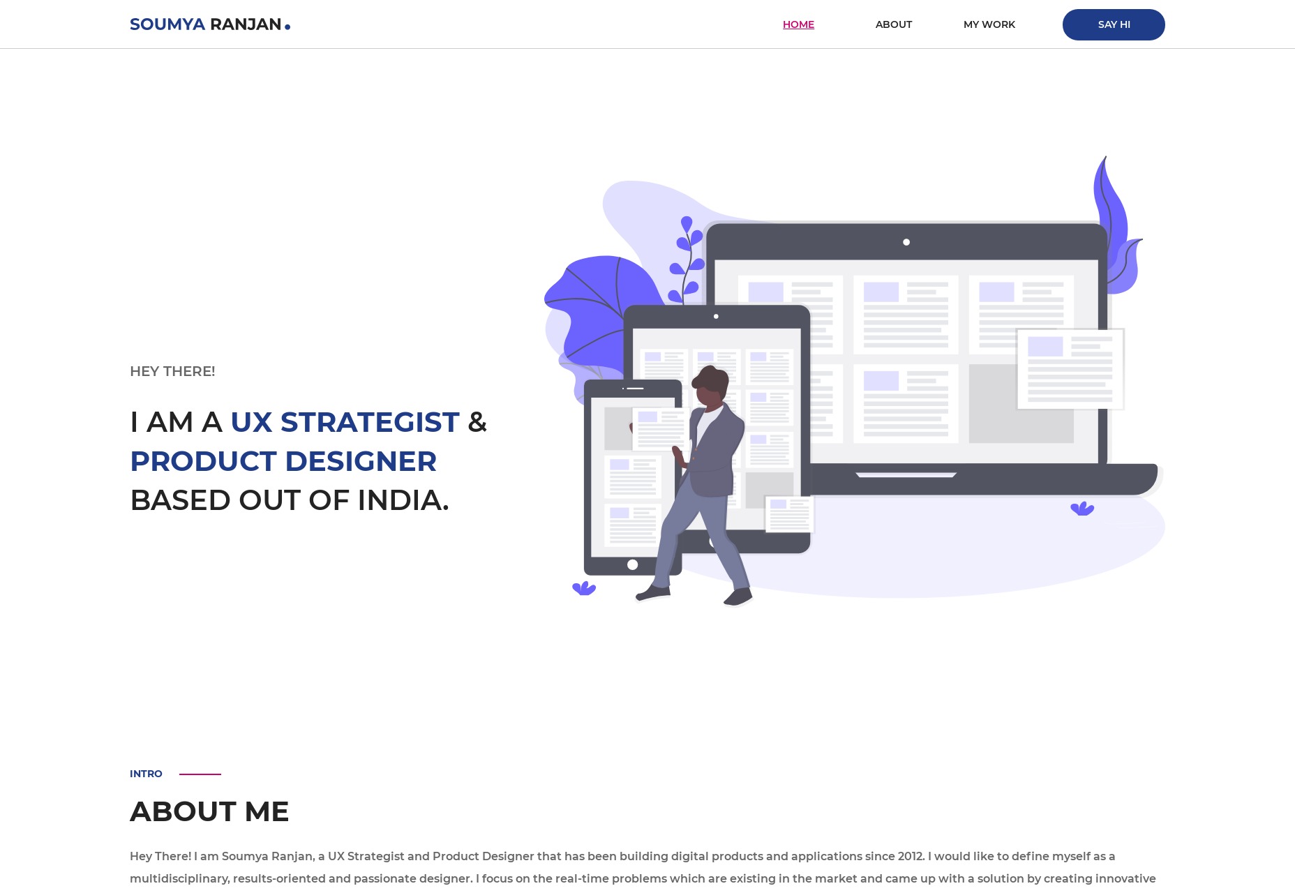
Soumya Ranjan
It’s not often that a portfolio site literally feels like a CV without directly copying a classic CV layout, but Soumya Ranjan made it happen. It’s a fairly common classic layout and aesthetic, but there are just enough small twists all over the design to make it stand out, even if only on a subconscious level.
Platform: Static Site
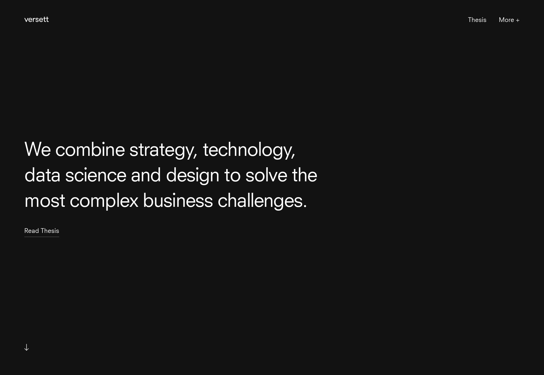
Versett
Versett is clean and modern, and while it’s not a one-page portfolio, precisely, it depends on the home page to do a lot of the heavy lifting. For example, they put all of their featured work on the home page, I particularly appreciate that they added filters for the projects section.
I also really like their “More+” menu, which describes their services in terms of what a client might want to accomplish, such as “Design a new product”, “Launch a new company”, etc.
Platform: Gatsby
Gilles Rivière
Gilles Rivière’s portfolio is highly Powerpoint-like, and still… I find myself impressed by the general sense of style. Stranger still, I find myself impressed by the animations used, and while it’s not uncommon for me to like a site’s animations, it’s rare for me to be impressed by them. There’s a lot of personality here.
Platform: Static Site (probably)
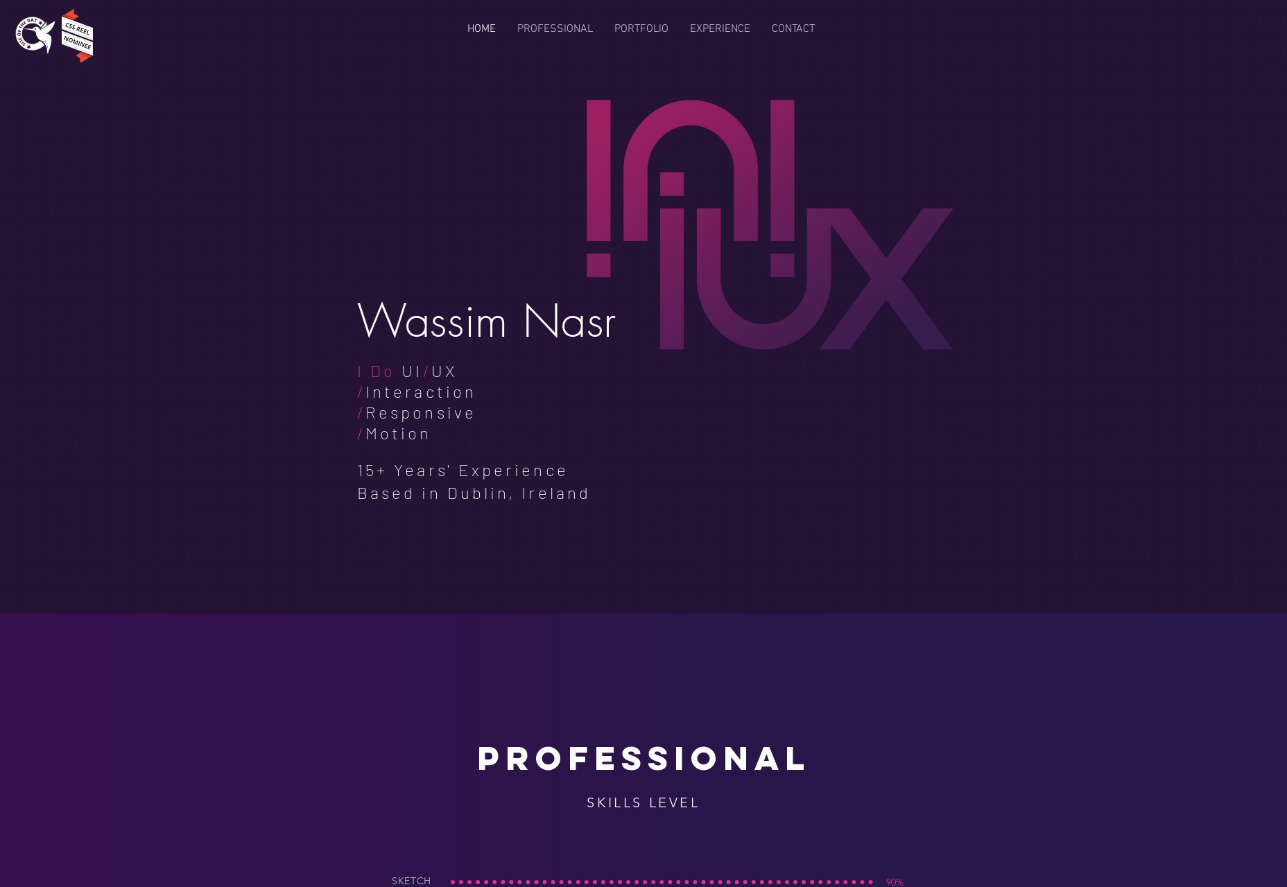
Wassim Nasr
Wassim Nasr has done two impressive things with his site. First and foremost, he build a lovely purple and pink portfolio that is just plain easy on the eyes, though I wish his input forms were perhaps a bit less transparent on that background photo.
Secondly, he built this near-masterpiece on Wix. Yeah. Wix. I know.
Platform: Wix
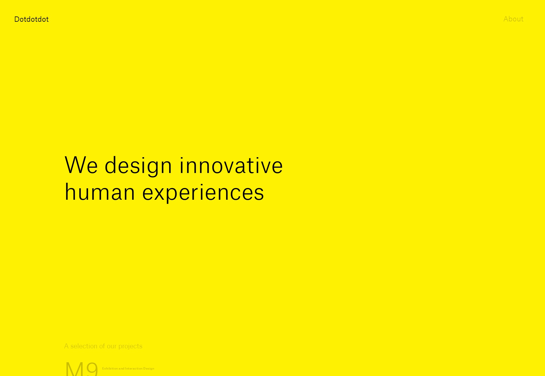
Dotdotdot
The ellipsis, AKA “…”, AKA Dotdotdot is maybe one of my favorite bits of punctuation… which is why I try not to use it too often. It’s also a design agency with a snazzy portfolio done up in bright, bright yellow, and big type. Well, long time readers will know about me and the color yellow. When people use it right, I put their site on the list.
Platform: Custom CMS (probably)
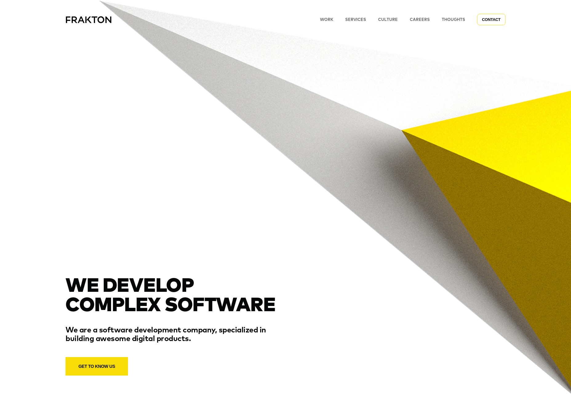
Frakton
Frakton brings us yet more yellow, but in less eyeball-smacking amounts. They’ve also brought us a heavy focus on abstract geometric shapes, and strong contrast.
Platform: WordPress
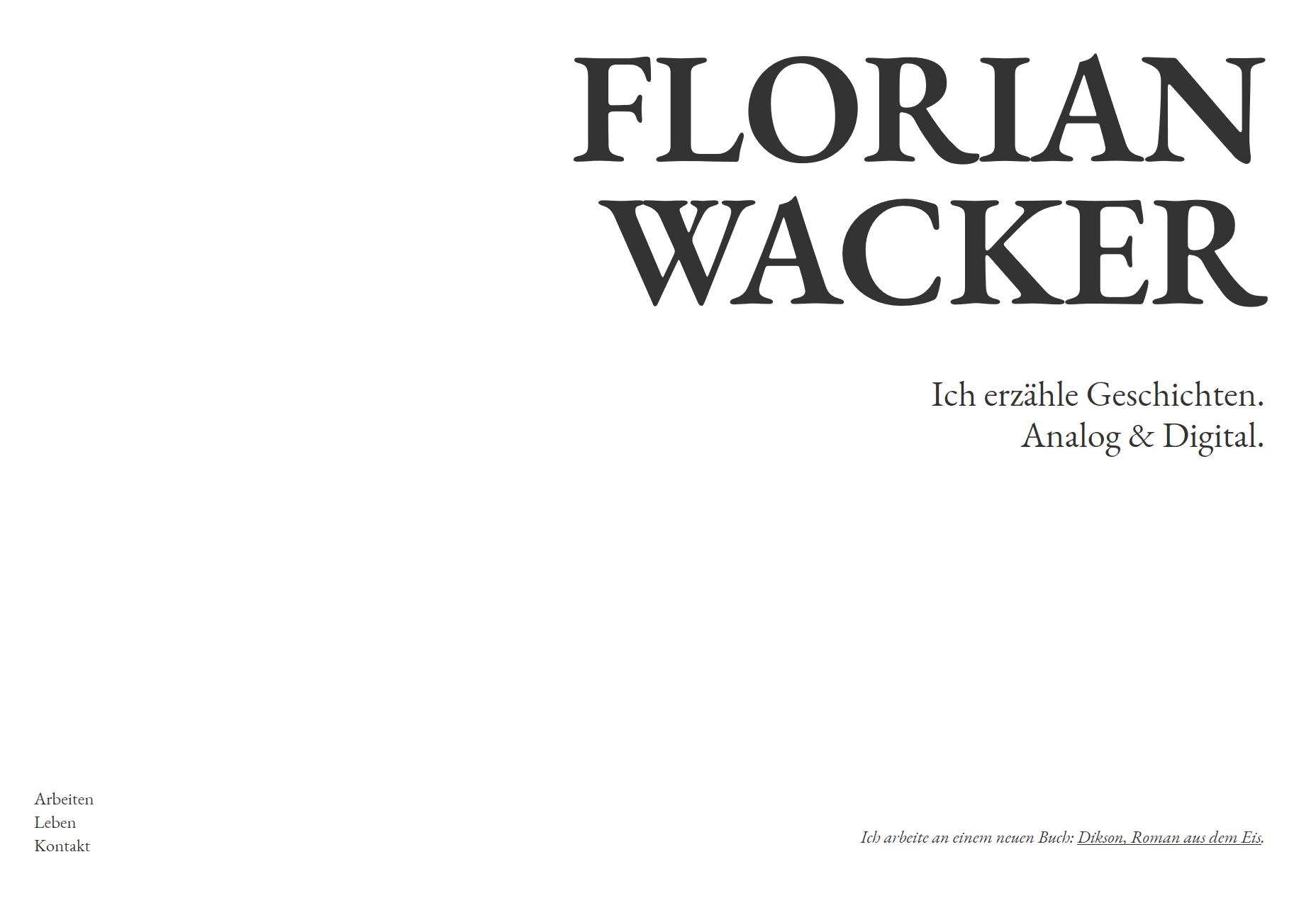
Florian Wacker
Florian Wacker’s portfolio is here because of the gorgeous typography, and especially the rendering of that type. I don’t know what they did to make it look that good on a Windows PC, I don’t know what they configured where, but it’s a pleasure to read… even if I can’t understand a word of it.
(Oh, and don’t be alarmed by the project name that mentions “Nazis”. It’s for a project that is decidedly anti-those-jerks. I checked.)
Platform: Static Site
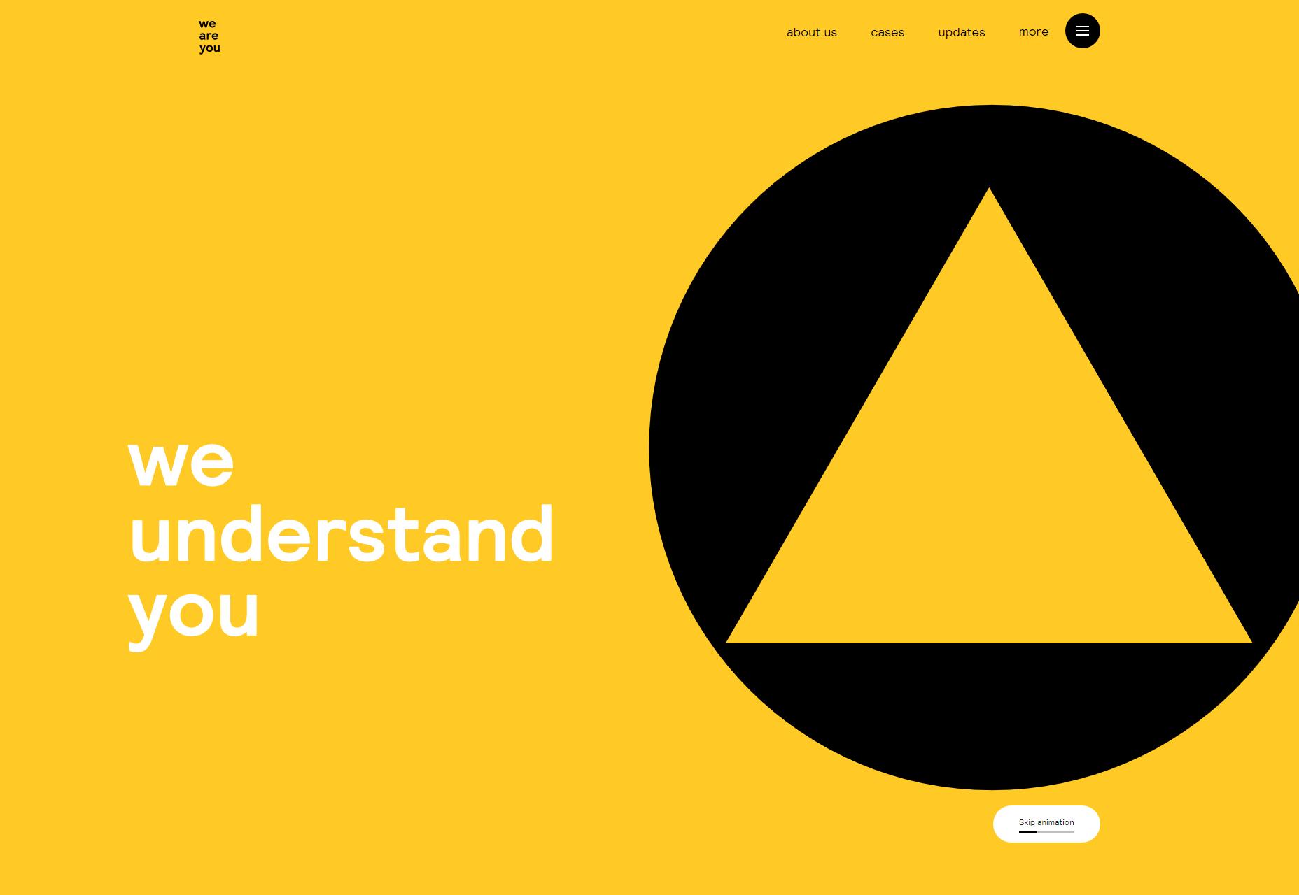
we are you
The interestingly-named we are you is on the list because it looks darned good, and that’s really enough, sometimes. Side note, they invite you to watch a video on the “About Us” page, and they tell you how long the video will be before you ever set eyes on the video player. I appreciate this a lot.
Platform: Sitecore
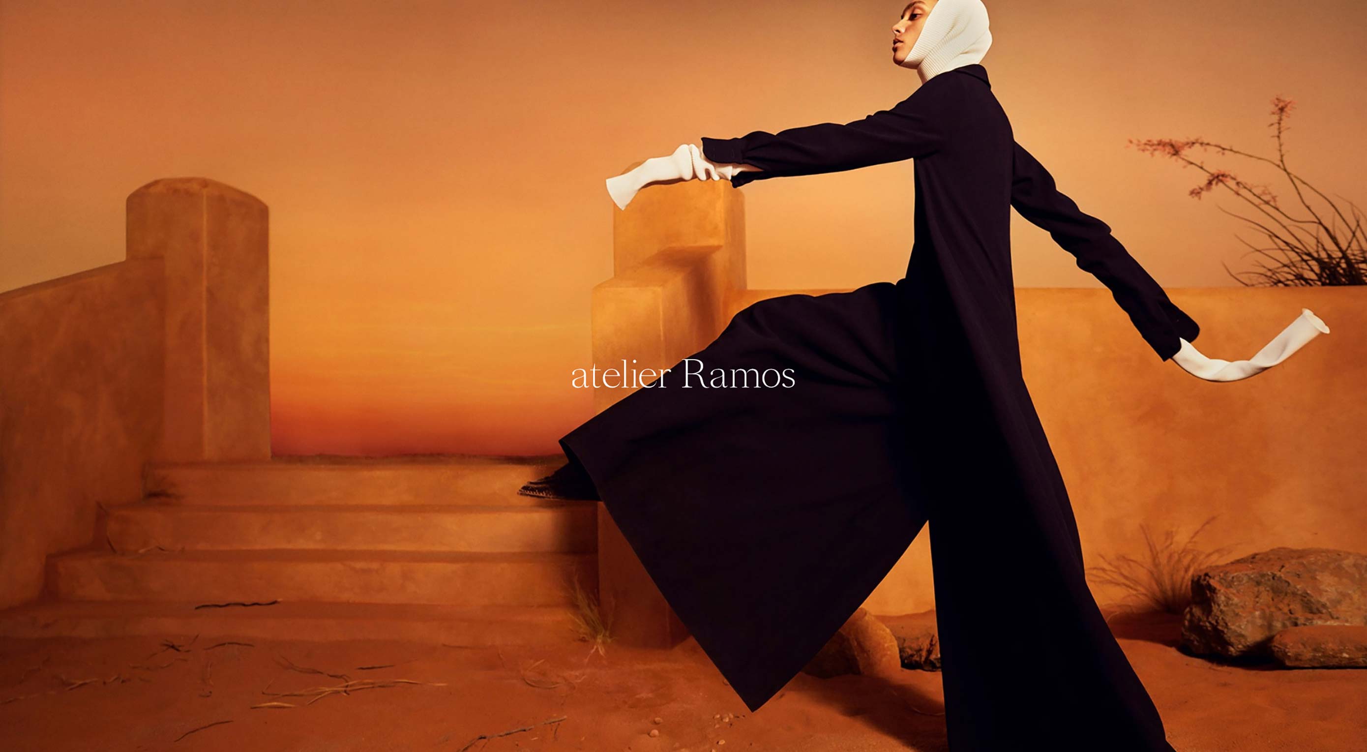
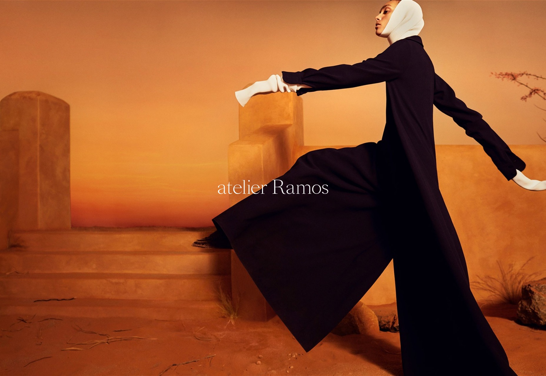
Atelier Ramos
Atelier Ramos is a simple portfolio that just puts the work in front of you with little fuss. It take masonry style layouts, horizontal scrolling, and other layout tricks, and mixes them all up with a high fashion aesthetic, and it works quite nicely.
Platform: WordPress
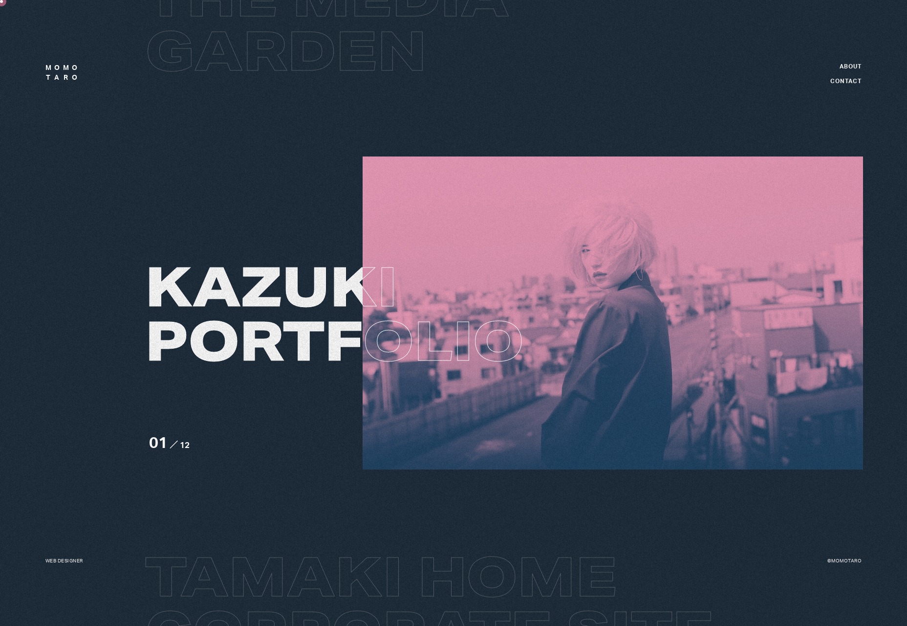
Shotaro Momoi
Shotaro Momoi (AKA Momotaro, apparently) brings us a lovely, simple dark design with lots ok pinks, blues, and a film grain effect that doesn’t get in the way at all. Also, I’m not sure how that overlapping text effect works (it’s rendered live), but I like it.
Of course, I would not be me unless I professed my dislike for custom cursors, but with that done, go check this one out. It really is just that pretty.
Platform: Static Site
Weight Creative
Weight Creative hits hard with a design that’s bright, bold, and just loaded with intentionally cheesy stock photos. It’s like a local business flyer had a baby with a modern web design, and it’s actually delightful. Sure, it’s a corporate sort of playfulness, but this is a business.
Platform: WordPress

Kazuki
Kazuki is an art director, signer-songwriter, and stylist. Her work is thus eclectic and colorful as all getout. The style of the website is a bit more familiar, with a collage-style presentational layout and the requisite serif-based type. I do have to say I like the way some of the “handwriting” was animated, though. It’s a familiar sort of site, but an excellent example of its kind.
Platform: Static Site

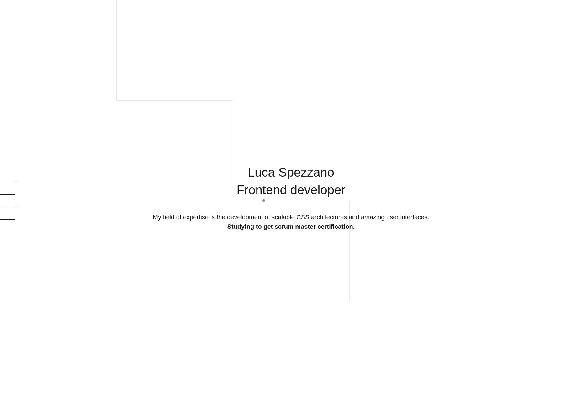
Luca Spezzano
Luica Spezzano is a front-end developer, so there is not much of an emphasis on screenshots on their one-page portfolio. I do rather like the grid of logos showcasing their various skills, but I especially appreciate that the actual name of each technology is shown on hover, just in case you don’t recognize the logos.
I also appreciate that there is an outline of things Luca learned while working on each project listed. It’s the sort of thing a potential employer would want to know.
Platform: Static Site
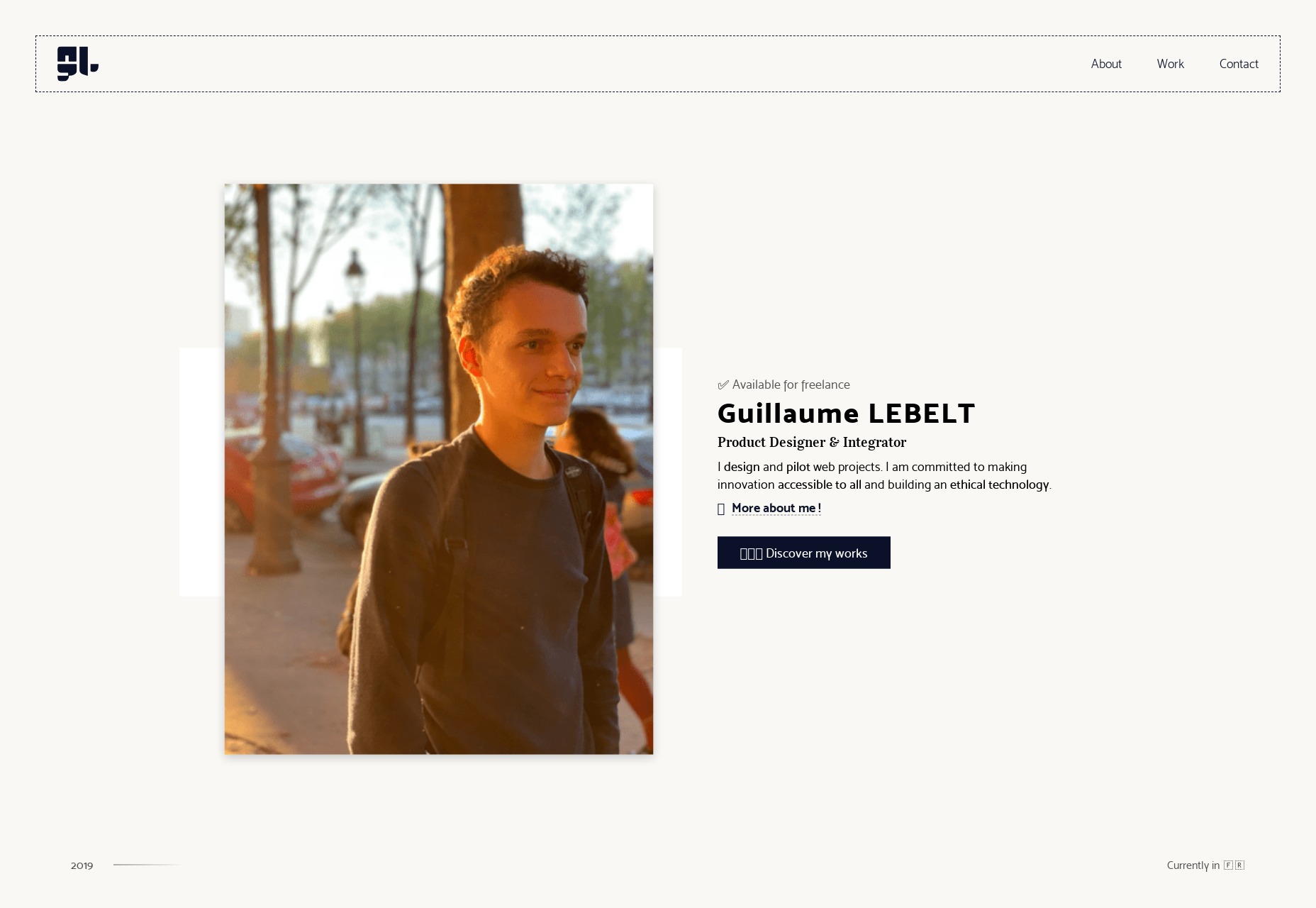
Guillame Lebelt
Guillame Lebelt’s portfolio is an excellent showcase of the way you can combine a simple design system with a certain amount of restrained art direction. Every page is different, and every bit of content was carefully planned, and not copy-pasted. Still, the whole design still feels consistent and uncomplicated.
Platform: Static Site
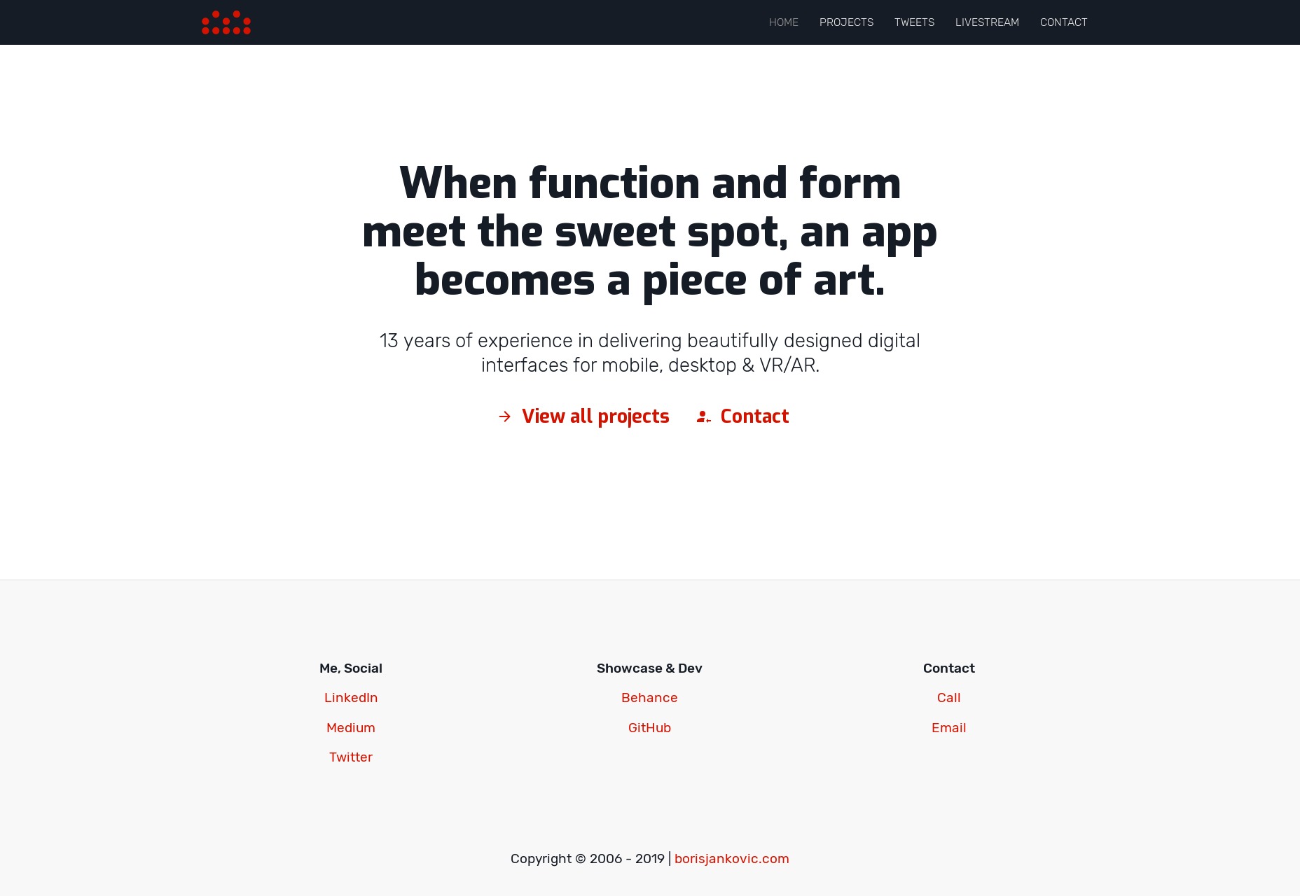
Boris Jankovic
Boris Jankovic’s portfolio is one of those less-common design portfolios that puts a heavy emphasis, not just on type, but on the writing. While it’s perfectly fine to post images and let your work sell itself, it’s always interesting to see a portfolio so clearly based on text-based storytelling. It helps that the type, while simple, is pleasant to read.
Platform: Static Site
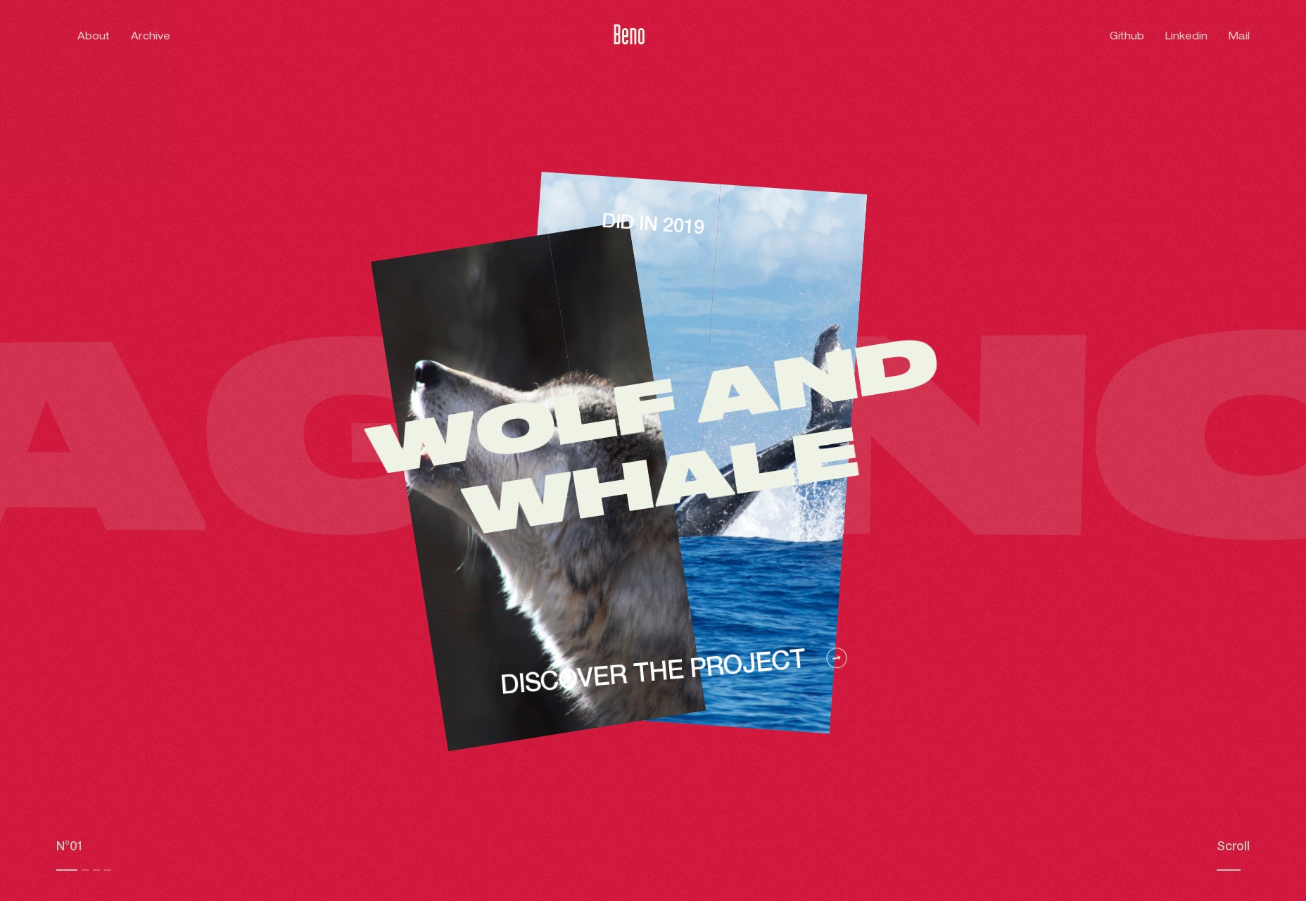
Alexis Benoliel
Alexis Benoliel’s portfolio has the sort of typography and overlapping-element style that you might expect from a more monochromatic design. But no, while there is plenty of literal white space, there’s also a very strong emphasis on color to shake things up. They took that serious, hyper-modern style and actually made it sort of… cheerful. And I like that.
Platform: Static Site
| Add Realistic Chalk and Sketch Lettering Effects with Sketch’it – only $5! |
from Webdesigner Depot https://www.webdesignerdepot.com/2019/04/20-best-new-portfolios-april-2019/
No comments:
Post a Comment