 Sometimes design trends take a little while to emerge and sneak up on you, others seem to pop out of the blue all at once. The latter is true of each of our web design trends this month.
Animated image frames, gold metallics and obvious grids seem to be everywhere (and we are guessing you might be taking notice). Here’s what’s trending in design this month.
Animated Image Frame Distortion
The verdict on this trend is still out. Do you love it or hate it?
For a lack of better description, we’ll call this one animated image frame distortion. You’ll know it when you see it for sure. Image frames shift and shape when the mouse gets close to the element.
Some images maintain their positions in the frame with no distortion to the original image while other tend to shape shift with the frame.
The shape movements are pretty cool and the animation is attention grabbing. But are you weirded out when the image in the frame gets distorted? (Personally, I have always been a fan of maintaining the integrity of a photo and tend to like the frame distortion but not on the image.)
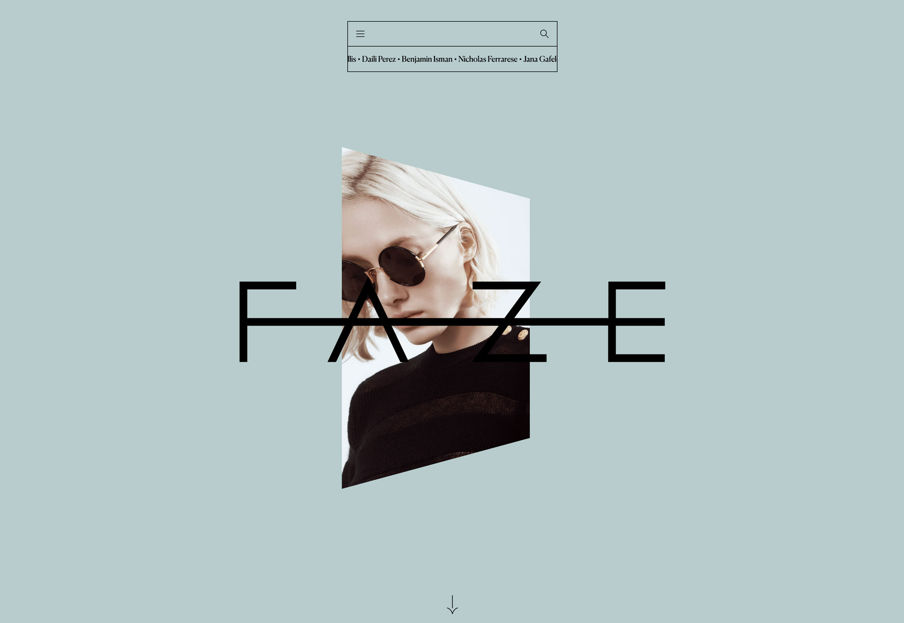
Faze Models uses this technique as a focal point with little else on the homepage. The image frame and image distort with hover action, moving from left to right and back. The movement also changes the color of the background, which is pretty nifty.
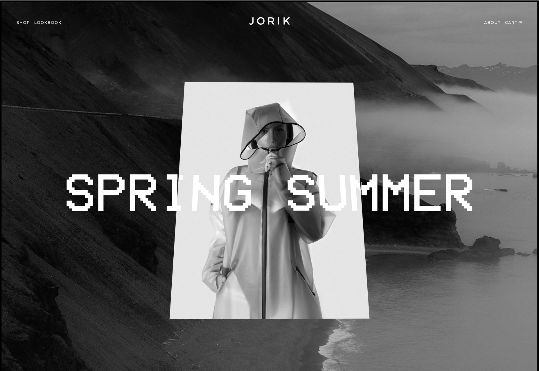
Jorik, another fashion-based site, uses animation on the image frame from every angle. The photo inside does not change and it almost looks like a 3D layer on top of the background. The best parts of this animation is that it works anywhere on the screen and when your mouse leaves the browser, everything snaps back to the original position.
Baunfire uses animation to tilt image frames as a cue that there’s a click action therein. The technique is more than something designed to grab user attention; it’s designed to help users better understand the functionality of the website and interact with it.
Gold Metallics
You can never go wrong with gold.
It’s classic and strong and creates a sense of importance and luxury.
Maybe that’s why gold is one of the most popular colors in design right now. (Even though it can be exceptionally difficult to use.)
Each of the examples below has mastered how to use gold elements and accents in projects to represent their brands in entirely different ways.
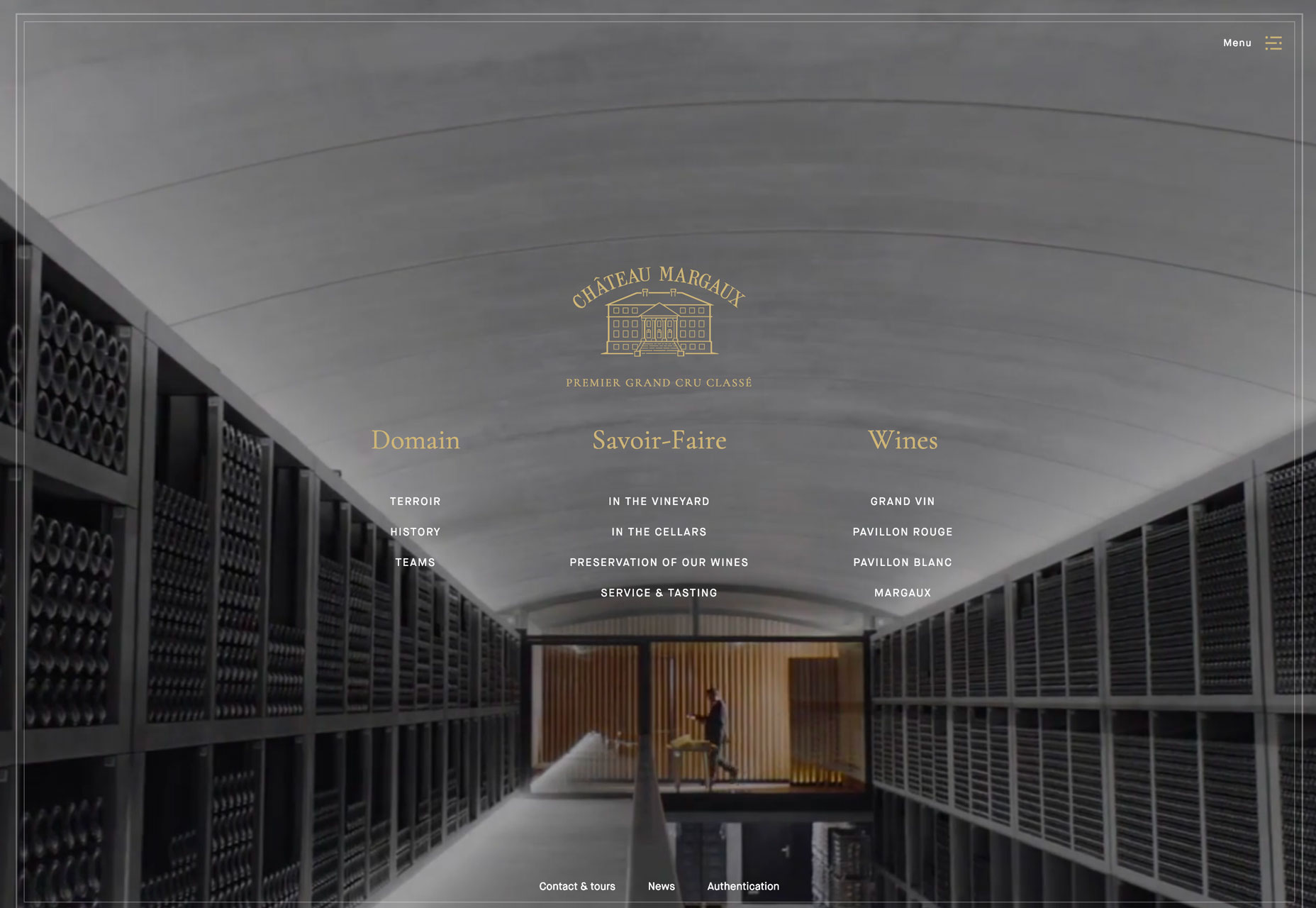
Chateau Margaux matches its gold-branded wine labels to the website design with a simple gold logo, lettering and hints of gold in the images. Using muted backgrounds helps gold emerge from the color palette to create just the sense of luxury that a wine brand emanates.
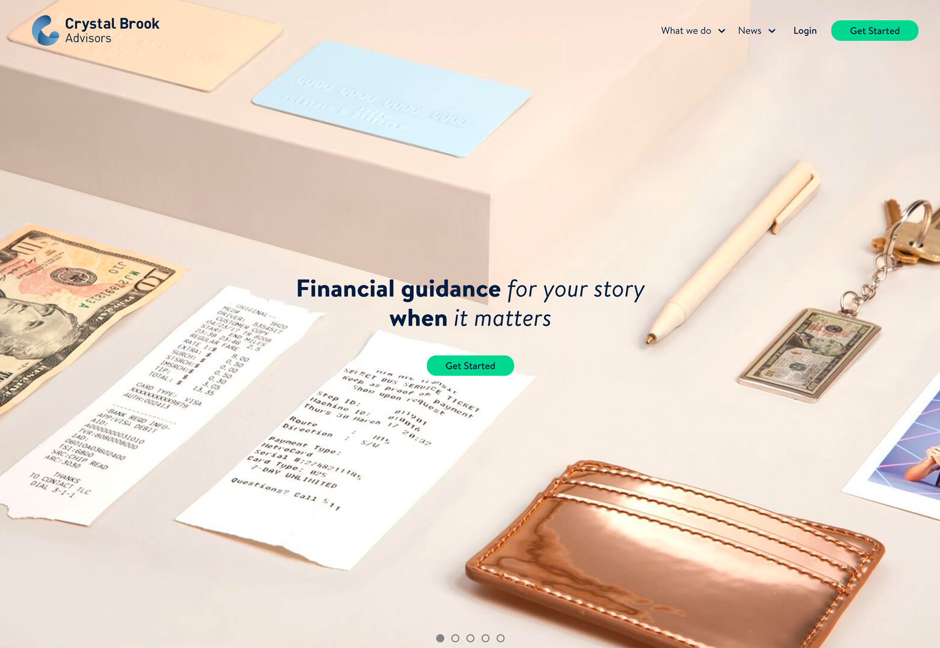
Crystal Brook Advisers uses gold imagery in the main photo to create a sense of wealth. (Seems like a great option for financial planners.) The palette is striking thanks to so many visual elements with gold or metallic coloring – from the wallet to the keys to money with a golden hue. This is a nice change from the more bland financial websites we often see; it’s a risky color choice that pays off. Not only does the brand create a sense of wealth, it also creates warmth with potential clients.
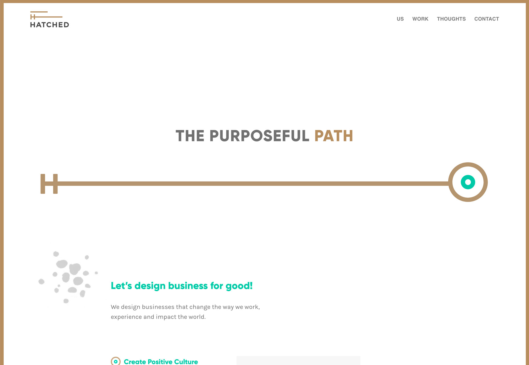
Hatched uses a gold and bright green color palette with a minimal design scheme. That combination is what makes a color that could otherwise feel dingy, seem metallic. (It’s amazing what the right color combinations and space can do for a design.)
Obvious Grids
Use of grids is at the root of design theory. Every web designer knows that the grid is at the foundation of a solid design.
These trending website designs feature grids that are obvious to even the casual user. And they are stunning.
What’s great about obvious grids is that they can take on so many different shapes and styles. The three featured styles here include a masonry grid, block grid and asymmetrical grid.
The great thing about using grids is that they provide a way to organize complex content in a manageable way. Grid-based styles have been a popular choice for portfolios for that very reason.
What sets these designs apart is that they use grids – not only in an obvious way, but also in a smart way.
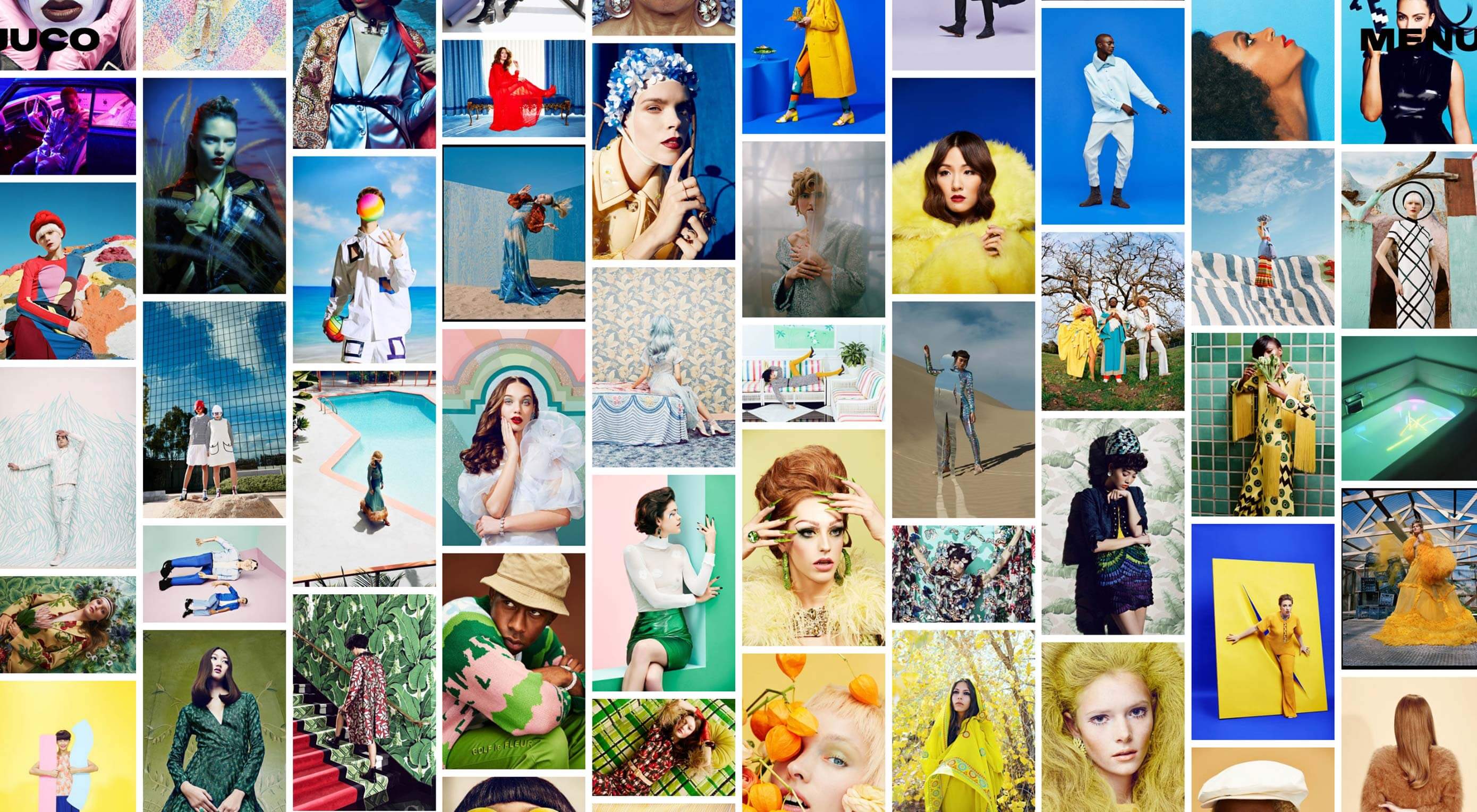
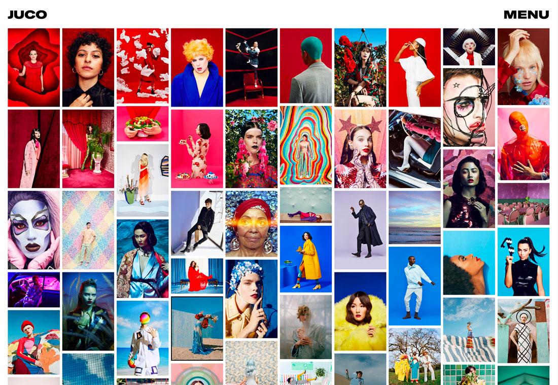
Juco Photo uses a masonry grid with photos of all different heights. While the vertical grid is the same, it’s a modern spin on the technique with photos of varying depths. What’s exceptional about it is that the grid never gets messy, partially due to the rainbow style-placement of photos. There’s a lot going on here visually and all of it is good.
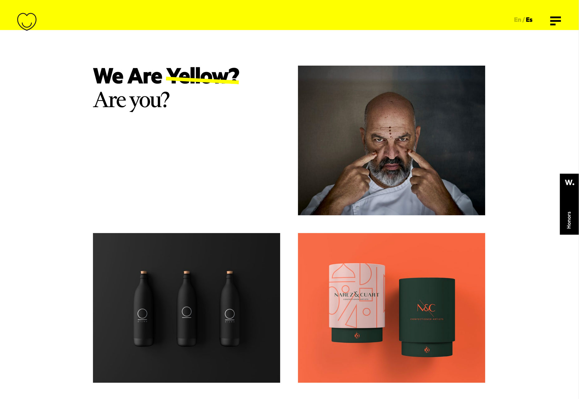
We are Yellow uses a traditional grid to showcase projects (yes, another portfolio). The best parts of this grid are the “empty” top left square which give the grid an asymmetrical feel (even though it isn’t) and the hover states for each project image. The simple animations work well and with each other to keep the design interesting.
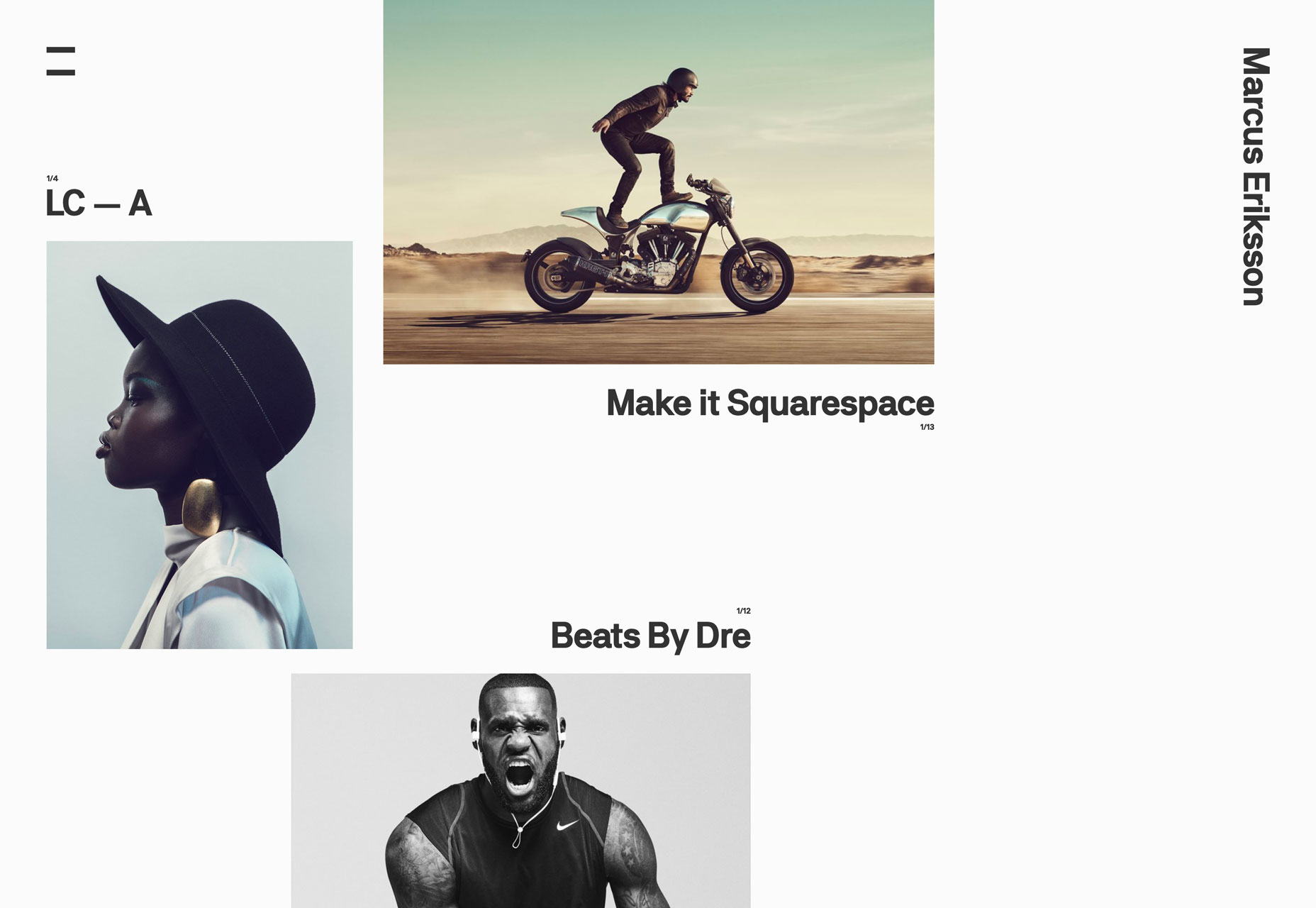
Marcus Eriksson uses an asymmetrical grid to display varying image elements with a similar style. This design works well because of the minimal nature of the background with the striking nature of each image on display. Even as the viewport changes, the responsiveness of this website design and grid, maintains perfect spacing between elements – a factor that makes you want to keep scrolling to explore more of the design and his work. (You’ll want to scroll, too, to really see how this grid comes together.)
Conclusion
I love it when trends just jump out of new designs, such as the collection this month. And what’s nice is that these are pretty usable techniques. Personally, I am a huge fan of the gridwork featured in the designs above, but the gold color palettes caught my eye in a way that was somewhat unexpected. Animated image frames are interesting; we’ll see if designers respond favorably to them.
What trends are you loving (or hating) right now? I’d love to see some of the websites that you are fascinated with. Drop me a link on Twitter; I’d love to hear from you.
| Add Realistic Chalk and Sketch Lettering Effects with Sketch’it – only $5! |
from Webdesigner Depot https://www.webdesignerdepot.com/2019/04/3-essential-design-trends-april-2019/
No comments:
Post a Comment