 WHO suggests that 1.3 billion people all around the world have some kind of visual impairment – which includes 217 million people with moderate to severe vision impairment; 36 million people are blind worldwide; 15% of the global population have some kind of disability.
With the advancements in adaptive technologies, such as screen readers, magnifiers, eye-tracking, joysticks, and sip-and puff technology, visually impaired and disabled people are able to use computers, tablets, and smartphones.
Emails that are designed taking into consideration only people with a normal range of vision, hearing, and mobility, may not be usable for others. As a result, email accessibility is now a must-know topic for designers.
Let’s take a deep dive into how to design accessible emails, and reach each and every subscriber on your list.
1. Email Copy
Divide your copy into easily readable chunks with the help of headings. By doing so, your email will be easily understandable for every subscriber, including those who are listening to the email with the help of a screen reader. Check your emails with Flesch-Kincaid Reading Ease test in Microsoft Word. It will let you know the readability score of your emails:
- 90-100: Easily understood by child of 11 years.
- 60-70: Easy to understand by 13-15 years old teens.
- 30-50: Easy to understand by college students.
- 0-30: Understood by college graduates.
Use lucid and to-the-point language to get a better (higher) score.
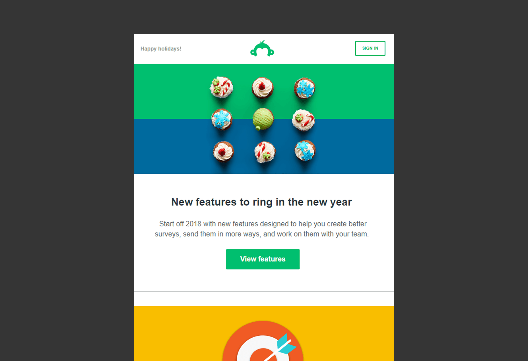
Take a look at this email by SurveyMonkey. It has a succinct copy with a neat presentation. The ample white space makes it easy to read. The contrasting CTAs in the white background are clearly visible to the reader.
2. Visual Elements
If you are creating an accessible email, the imagery should not contain the text that conveys the core message of the email. Even if you decide to use text in the images, write illustrative copy.
GIFs are being used in emails extensively but you should refrain from designing animated GIFs that flash repeatedly, lest they trigger photo-sensitive seizures in some users; use a GIF that stops after three cycles or within five seconds.
Never forget to add a suitable alt attribute inside each <img> tag. For example: Add the company name as the alternative text for the logo.
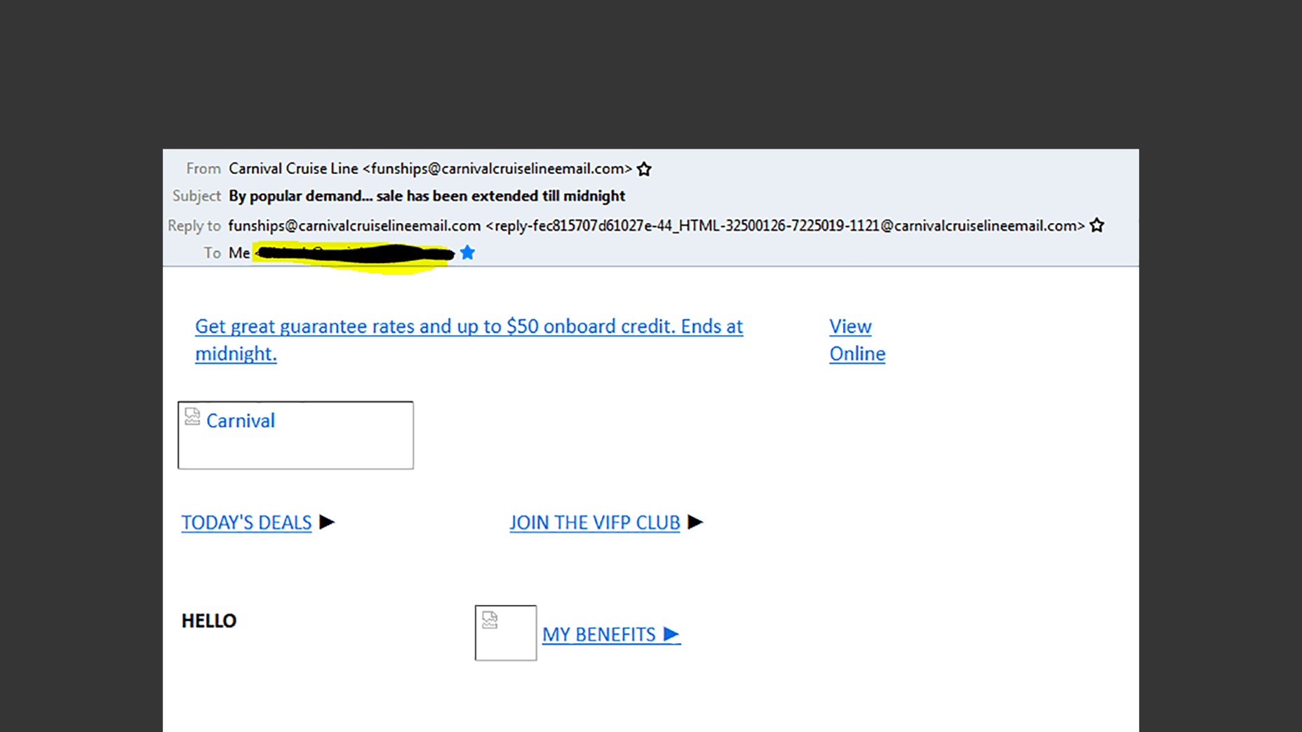
Here’s a nice example by Carnival Cruise Line:
3. Email Buttons
Design bullet-proof buttons that can be selected across the entire area with the help of a finger or thumb. In case you have multiple buttons in your email, write a different call-to-action for each. Your button should have a minimum height of 44px so that it is easily tappable.
4. Formatting Email Copy
Your email should have enough paragraph spacing so that the reader can easily discern the paragraphs. Every line of text should be around 60-70 characters. Have typographic margins with related content grouped together, and separate every group with the help of white space for enhanced readability. Set the right visual hierarchy by placing the most important message at the top. This will help subscribers with neurological and cognitive disability.
Your body copy should be left-aligned; rather than right aligned, centered or justified. Design an email in such a way that there is no repositioning of the content with CSS; it should be easy to read from top to bottom. You can check the reading order of your email through the Web Accessibility Toolbar or the WAI HTML Table Linearizer.
Fonts
Avoid using fancy or light-weight typefaces that are difficult to read. It is strongly recommended to use serif or sans-serif typefaces that are not only accessible but also rendered well on all email clients and devices. Determine a minimum readable font size for your email copy. For a font-family with a large x-height, a minimum font size of 14px is recommended and for a font family like Arial that has a standard x-height, use at least 16px as the size.
5. Color
Colors are an important aspect when it comes to subscribers who have light sensitivity and migraines. Backlit screens can lead to eye strain and cause migraines when looking at bright, saturated hues of blue and red.
The next condition to be considered is color blindness as it prevents the subscribers from differentiating between certain colors used in the email.
Did you know that according to the National Eye Institute, 0.5% women and 8% men are color blind? This implies that 1 in 200 women and 1 in 12 men are color blind.
When it comes to emails, you should always check your emails with the help of the Color BLIndness Simulator. Additionally, you should use WebAim Color Contrast Checker to get an idea of the color contrast between the text and background color.
- Don’t rely on color to convey your message;
- Use good contrast to ensure your text is readable;
- Restrict the number of colors, and if possible be monochromatic;
- Ensure the color of links contrasts with text so that they are clearly marked;
- Test your email with color blind users, or use an app such as Color Oracle.
6. Email Coding
The first requisite is to design a responsive email that renders well, regardless of the screen size, device type, and screen reader used. <h1> tags should be used to wrap the headlines while <h2> to <h6> tags for headings and <p> tags for paragraphs.
Use mso-line-height-rule:exactly; in your <h> tags so that the line-height rule is maintained for Microsoft Outlook email clients.
Write the code style=”margin:0;” into the opening tags so that email and webmail clients do not add any extra line space.
Add aria-hidden=”true” on spacer elements so that screen readers ignore the spacers in the email.
Add role=”presentation” into every opening <table> tag so that the screen readers do not read every cell into the email.
Avoid any unnecessary code that makes the HTML heavy and may lead to rendering issues.
Last but not the least, it is imperative to have both plain text and HTML versions of the email. The HTML emails will let the user see the images while the text-only email shows the text and makes it convenient to read the entire email, especially for screen readers.
Tools to Test Emails for Accessibility
Wave Tool is a Chrome and Firefox extension that lets you check your emails and calls attention to things that make it inaccessible.
With the help of AChecker, you can check the email accessibility by any of the three methods: pasting the URL of your email or upload your HTML file or copy and paste the code.
IA Toolkit is available as a Chrome browser extension that checks emails and web content for accessibility. You get an extensive analysis of the code with errors and warnings.
VoiceOver on MacOS and iOS, Narrator on Windows, and TalkBack on Android are used to get a clear idea on how the email will be experienced by the subscriber.
Final Thoughts
Accessibility has become an integral facet of email marketing nowadays. Before you set up an accessible email campaign, use these tips to follow email marketing and design best practices. That will, in turn, increase the reach of your email and enable a smooth experience for each and every subscriber.
Featured image via DepositPhotos
| Add Realistic Chalk and Sketch Lettering Effects with Sketch’it – only $5! |
from Webdesigner Depot https://www.webdesignerdepot.com/2019/04/6-actionable-tips-for-accessible-emails/
No comments:
Post a Comment