 As humans, we tend to rely heavily on one piece of information when we make decisions. We often anchor on the first piece of information we are introduced to and judge all subsequently received information in relation to it.
The first piece of information offered automatically becomes the anchor, from which subsequent judgements are made. Anchoring is the persuasive practice of creating a reference point around which we as designers want all other information to be judged and compared to.
Anchoring in the Real World
Do this test at home: Find 3 bowls. Fill one bowl with cold water, the second with hot water and third one with lukewarm water. Now, stick one hand in the cold water and the other one in the hot water and keep them there for 30 seconds or so. Now put both of your hands into the lukewarm bowl. What you will feel now is that one hand will feel the water is warm, the other one that it’s cold.
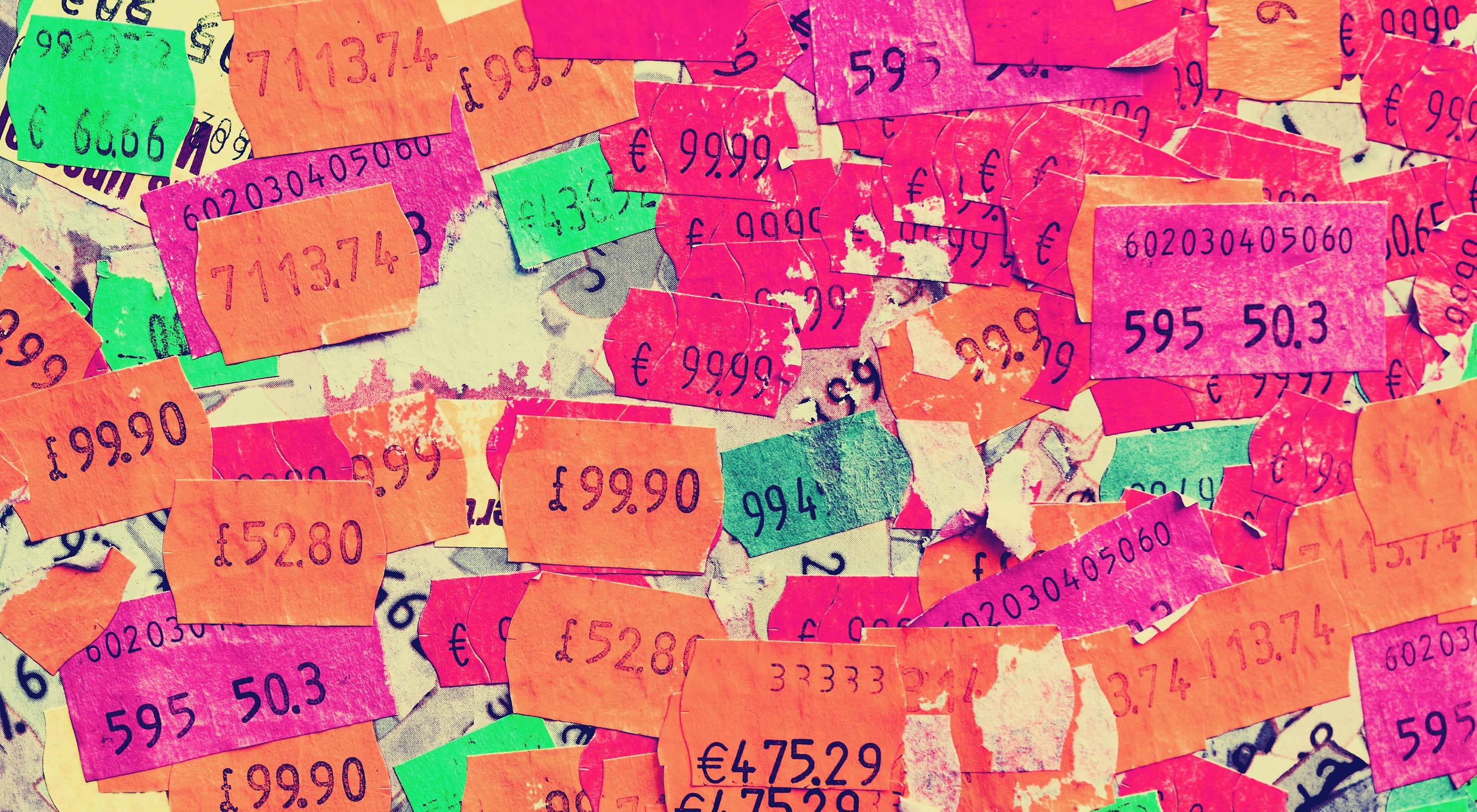
Nothing is cheap or expensive by itself, cost is always relative.
It’s about the contrast. The same principle applies to price and other comparisons. Nothing is cheap or expensive by itself, cost is always relative. So how can we establish a comparison that makes your price seem cheap?
Once you’ve seen a 150 dollar burger on the menu, 50 dollars sounds reasonable for a steak. What’s the best way to sell a 2,000 dollar wristwatch? Right next to a 12,000 dollar watch. 4 dollars seem expensive for a beer in a run down grocery store, but cheap at a luxury hotel. This mental process has a name. It’s called anchoring & adjustment.
How Anchoring & Adjustment Works
Within milliseconds, we evaluate a price, as either high or low. So how do we determine whether a price is high or low? The obvious answer is that it depends on the context and situation. While that is true, it is probably not entirely in the way, you think it does.
We tend to go through a standard process, when we make a determination whether something is cheap or expensive. When seeing a price, people either consciously or subconsciously generate a reference price; the reference point, from which subsequent judgements are made and the price people would expect to pay for a specific product; the anchor.
The reference price is based on a combination of factors such as past purchases, the prices of your competitors products, and the time and place.
we gladly accept more expensive beer prices at a fancy night club at 1 AM than we would accept at an outlaw hillbilly saloon
For example, we gladly accept more expensive beer prices at a fancy night club at 1 AM than we would accept at an outlaw hillbilly saloon.
If a product is more expensive than the reference price, then people will perceive the price of the product to be high. Similarly, if a product is cheaper than the reference price, then people will perceive the price as being low.
It seems like a very simple and very intuitive process. And it is, for the most part, but once we start breaking down the adjustment process, you will notice several opportunities. In particular, there are three places where you can make your price seem lower than if you think anchoring and adjustment into your game plan:
- How your price is perceived as consumers generate their reference price
- How the reference price is perceived as consumers pull your price into comparison with their reference price
- In the actual comparison as consumers examine the gap between your price and the reference price
Let’s examine all three:
1. Maximizing the Generated Reference Price
One strategy is to try to maximize the reference price customers generate to begin with. If your goal is to reframe the reference price people generate toward a higher numerical value, you can follow one of these two strategies:
- initiate negotiations with a high number;
- pricing your new offer lower than the old.
Initiate Negotiations With a High Number
If you are negotiating, it makes sense for sellers to initiate by setting a high anchor. By setting a high price as anchor point, the likelihood of the final settled price being closer to that range is higher.
A very common application of this anchoring strategy is when shops show the “suggested retail price”. By showing the suggested retail price next to a sale price, the sale price is anchored to the suggested retail price, which is the reference.
What wouldn’t have seen as a big deal without a comparison, suddenly seems like a bargain. A cheap price doesn’t become cheap, unless we compare it with a more expensive alternative. Setting a fair suggested price gives the customer a true sense of value. It won’t prevent low offers, but it will keep more buyers in your ballpark.
Exposing higher prices, even for unrelated products, anchor people toward the higher end of the price spectrum. So instead of just showing one product, show what else you have in store that are priced higher.
Pricing Your New Product Lower Than Your Old Product
Anchoring effects occur subconsciously, so consumers don’t need to spend conscious mental energy contemplating a numerical anchor. The mere exposure of a higher number is all that is needed to trigger an anchoring effect that will result in a higher reference price.
When launching a new and more expensive version of your current product, your current product will naturally set the reference price of the new version. If you are introducing a new version of a product that currently costs $19 dollars, and want to sell your new version for $25, the most intuitive thing to do, would be to lower the price of your older version in order to sell out.
However, if your objective is to sell as much of your new version as possible, that strategy might not lead to the best results. Instead, raising the price of your old product will raise people’s reference price, and in turn enhance the perceived value of your new product. In other words: you will release your new product into more favorable conditions.
If you choose to lower the price of your old product, you will reinforce the lower reference price and make your new product seem more expensive.
2. Pulling a Low Price into Reference Price Comparison
For your offer to seem cheap, your objective is to pull in a lower price into the comparison—to reframe your price toward a lower numerical value. If your goal is to let users pull in a lower reference price, you can follow one of these three strategies:
- Use partitioned pricing and split up your price into smaller bits
- Offer customers to pay in smaller increments
- Highlight the daily equivalence to anchor people to the lower end of the spectrum.
Partitioned Pricing
Even when people know it’s not really an accurate comparison, exposing people to lower numerical values will still alter their comparison process
One way to reframe your price toward a lower numerical value is by utilizing “partitioned pricing” – breaking up your total cost into multiple components. This will allow you to anchor people on your base price, rather than on the true total costs.
Research shows that it’s usually more effective to separate shipping and handling fees. That way, when you show a lower numerical base-price, people will be more likely to pull that number into the comparison rather than considering the overall costs.
Even when people know it’s not really an accurate comparison, exposing people to lower numerical values will still alter their comparison process.
When people compare your price to a reference price, they’ll be more likely to pull your base price into the comparison. But beware, if the common baseline includes shipping costs and is prominently marketed by competitors, this tactic might backfire.
Offer Payments in Increments
Another way to reframe your price is to give people the option to pay for your product in smaller increments rather than one lump sum. This will help anchor people on the small price.
If you are selling an online video course for $150, splitting it up into 3 chunks of $50 dollars, alters people’s comparison process. Instead of comparing your full price of $150, customers will compare your increment of $50 to competitor’s lump sum price of, for instance $130. This makes your product seem more appealing.
It’s not that your customers are stupid; they know that comparing $50 and $130, isn’t an accurate comparison
It’s not that your customers are stupid; they know that comparing $50 and $130, isn’t an accurate comparison, but subconsciously the small increment price sneaks into their comparison.
In South America, paying in installments is common practice. Breaking a $659 product into 12 installments of $84 makes the action of buying easier, as the customer anchors to the reference price of $84 rather than of the $659.
Daily Equivalence
Another way to reframe your price is to mention its daily or monthly equivalence. If you have a monthly subscription price of $29.99, reframe the price as $1 per day.
Your regular price should remain your primary focus. But, the simple act of mentioning its daily equivalence, anchors people toward the lower end of the price spectrum.
At Lynda.com, the subscription price is prominently displayed as a monthly price, even though you are billed yearly.
If you find it hard reframing your price into a specific daily cost, the same effect can be achieved by comparing your price to a petty cash expense, such as a cup of coffee.
3. Emphasizing the Gap in the Actual Comparison
The last strategy is to maximize the perceived distance between your price and higher reference prices; to emphasize the gap. Here, one tactic is to add a “decoy product”—to let other products act as reference prices.
The researcher, Dan Ariely, observed the concept in the Economist back in 2008. In an ad selling subscriptions, they gave customers three choices:
- An online subscription for $59
- A print subscription for $125
- Getting both for $125
Which offer do you think was the most popular? Dan Ariely tested the options on 100 students, who answered what plan they would choose: most people wanted the combo deal. Nobody wanted the print subscription in the middle—as it made no sense at all to choose something less for the same price.
If you have an option that nobody wants, you might think the obvious thing to do would be to leave it out. This is why Dan Ariely did another version of the offer, where he eliminated the middle option and gave it to another hundred students.
In the second study, the most popular option became the least popular option, and the least popular became the most popular. What was happening was the useless option in the middle was useless in the sense, that nobody wanted it, but it wasn’t useless in the sense that it helped people figure out, what they wanted. In fact, relative to the option in the middle – the “get print for $125”, the “print and web for $125” looked like a fantastic deal and as a consequence, people chose it.
We often don’t know our preferences that well. And because we don’t know our preferences that well, we are likely to be influenced by external forces.
Putting it all Together: Designing Pricing Tables
There are several tactics in which you can utilize the anchoring and adjustment principle to make your offer seem cheap to the customer:
- introduce partitioned pricing;
- offer payments in increments;
- show the daily equivalence;
- initiate negotiations with a high precise number;
- you can raise the price of your previous product when introducing a new one;
- offer a decoy product.
Lets see how some of these tactics have been applied in the design of one of the most used design patterns online: pricing tables.
- Highlight differences and not similarities in your offerings in order to allow proper comparison.
- Create a middle-of-the road best-deal offer. You will want to use the other offerings as anchors to this deal.
- Show daily or monthly equivalences if you’re in doubt that users will think your monthly or yearly subscription cost might seem too expensive.
- Add a decoy. Your cheapest offering is your lowest anchor. Make it decent, but not overly attractive. This will help make your preferred offering seem like a much better deal. By creating the feeble base offering, your customer becomes anchored to a minimum price. A slightly more expensive but hugely more valuable plan will then look like a steal.
- Keep comparisons to a minimum. Be careful adding more then 4-5 options. You want to make the process of comparison as easy as possible.
- Don’t scare people away. No two customers are the same. One might just be interested in a small corner of your product, while another will find value in its entirety. Make sure that you don’t scare people away who weren’t going to buy your own preferred option in the first place.
- Always test. Some of these suggestions seem bizarre and some don’t work all the time. Oftentimes theory and practice don’t align. This is why I recommend A/B testing everything you do.
Source
from Webdesigner Depot https://www.webdesignerdepot.com/2018/04/the-psychology-of-price-in-ux/
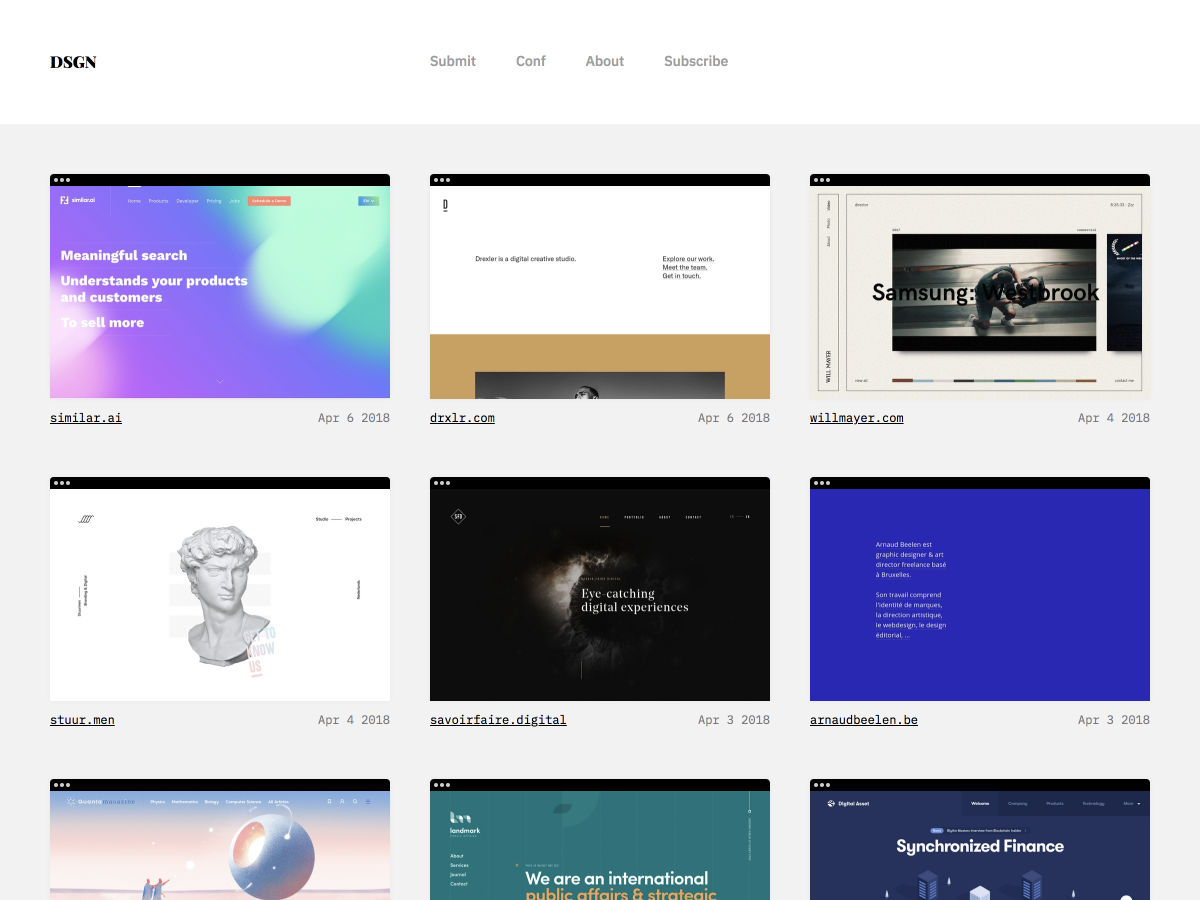
 Every week users submit a lot of interesting stuff on our sister site Webdesigner News, highlighting great content from around the web that can be of interest to web designers.


 Much has been said about the skills and capabilities of a full stack developer: On one hand, there are people who believe that a full stack developer is a “jack of all trades, master of none.” The range of skills that a full stack developer is expected to have means that those skills do not reach a level of proficiency required for one to be called an “expert.” On the other hand, there are those who argue that even if full stack developers are not experts at all layers, they are still considered skilled and competent since they can perform a wide array of tasks that many people can’t handle.
 Most people are familiar with the concept of a persona—a fictional character that embodies the traits of your target audience. Marketers gather details from user research and generate a representation of their ideal client. When developing a website or smartphone app, designing for a persona helps identify how users will interact.
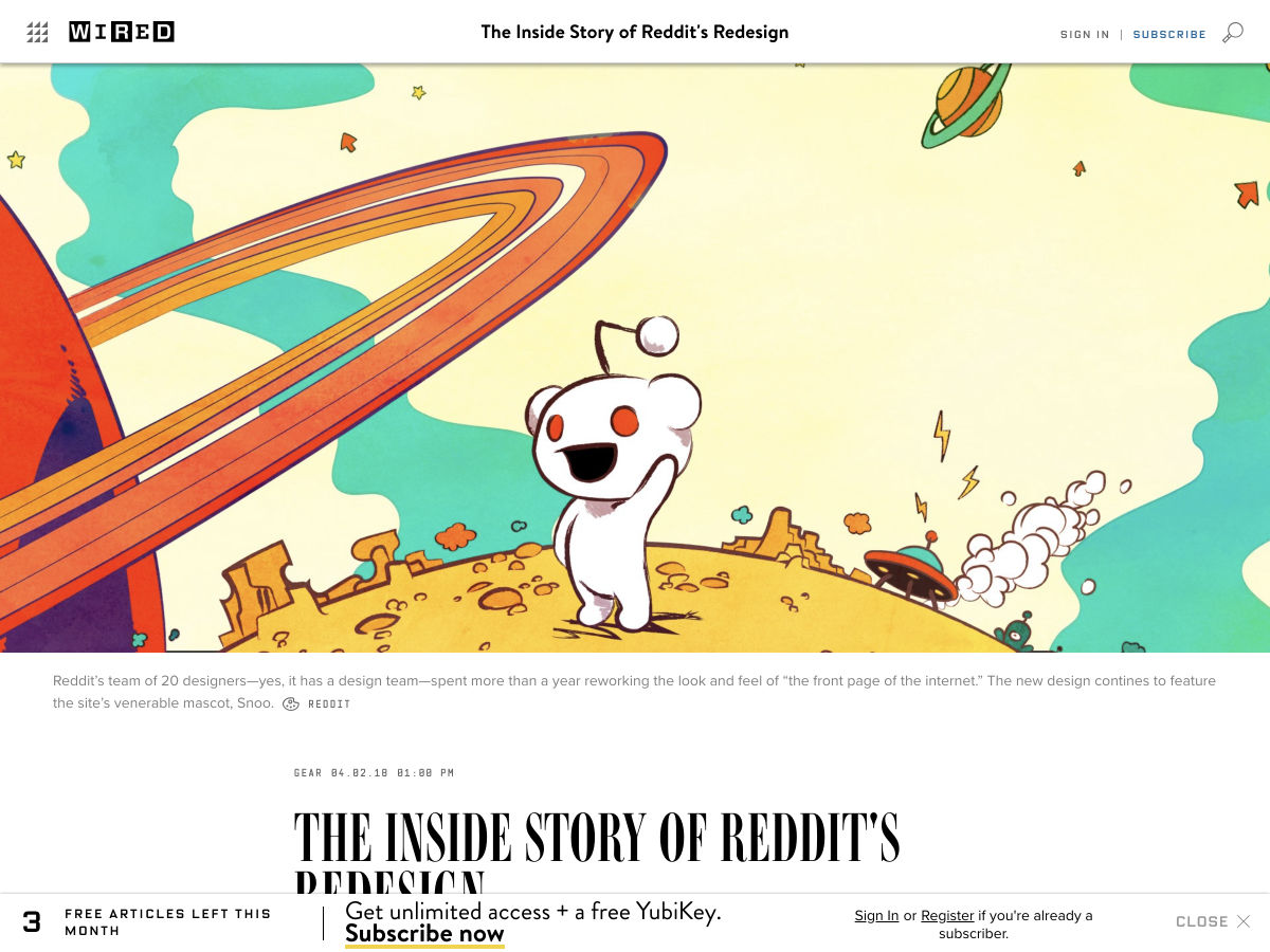
 Reddit, the self-proclaimed ‘front page of the internet’ is getting
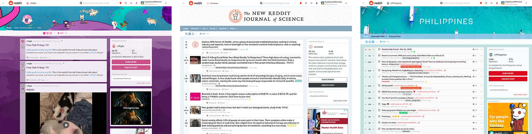
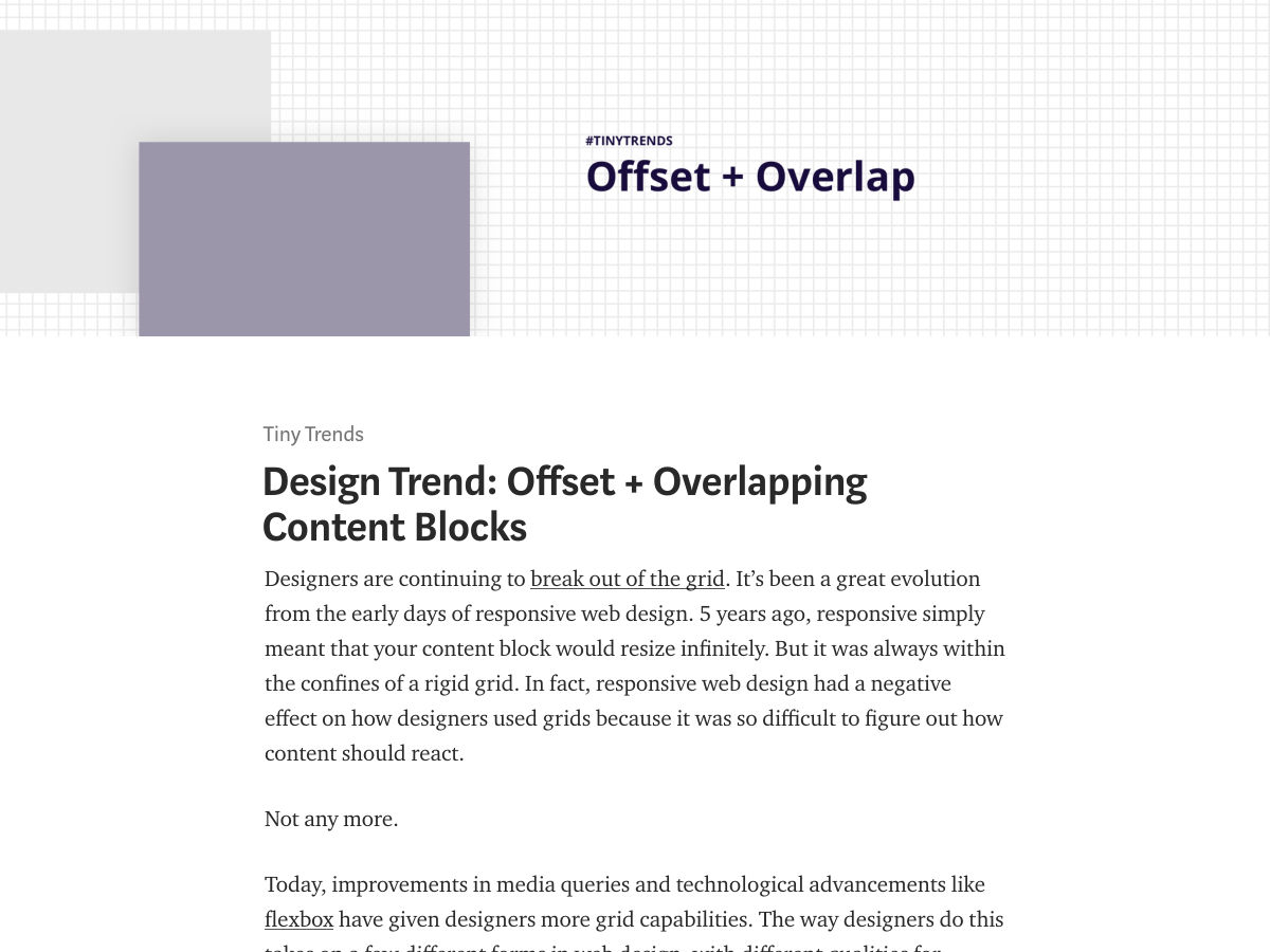
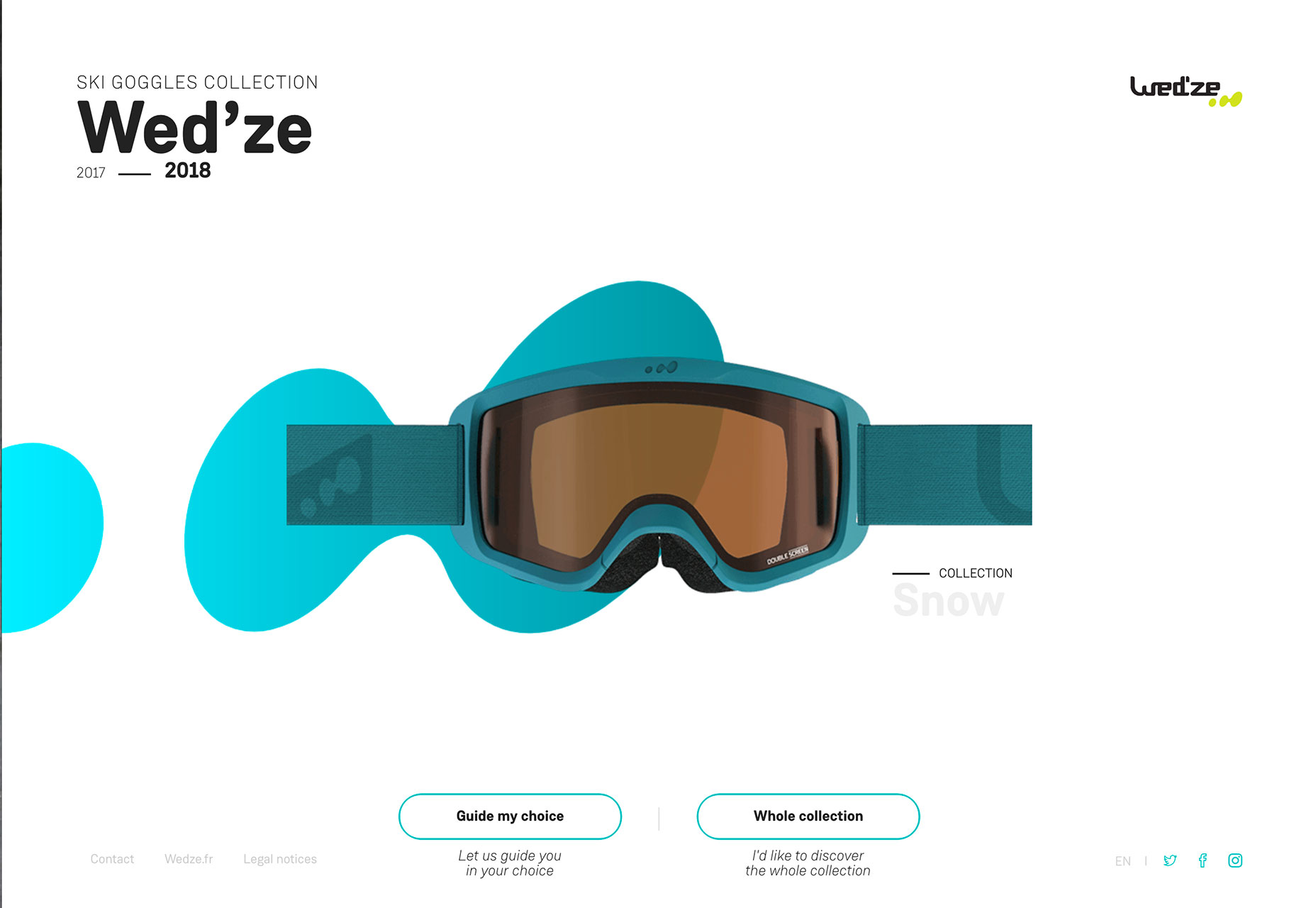
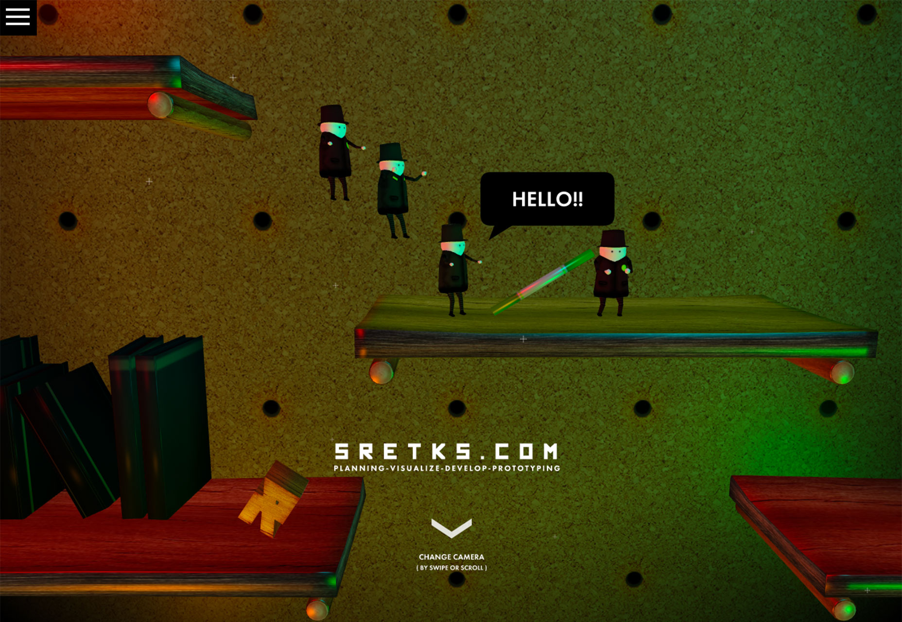
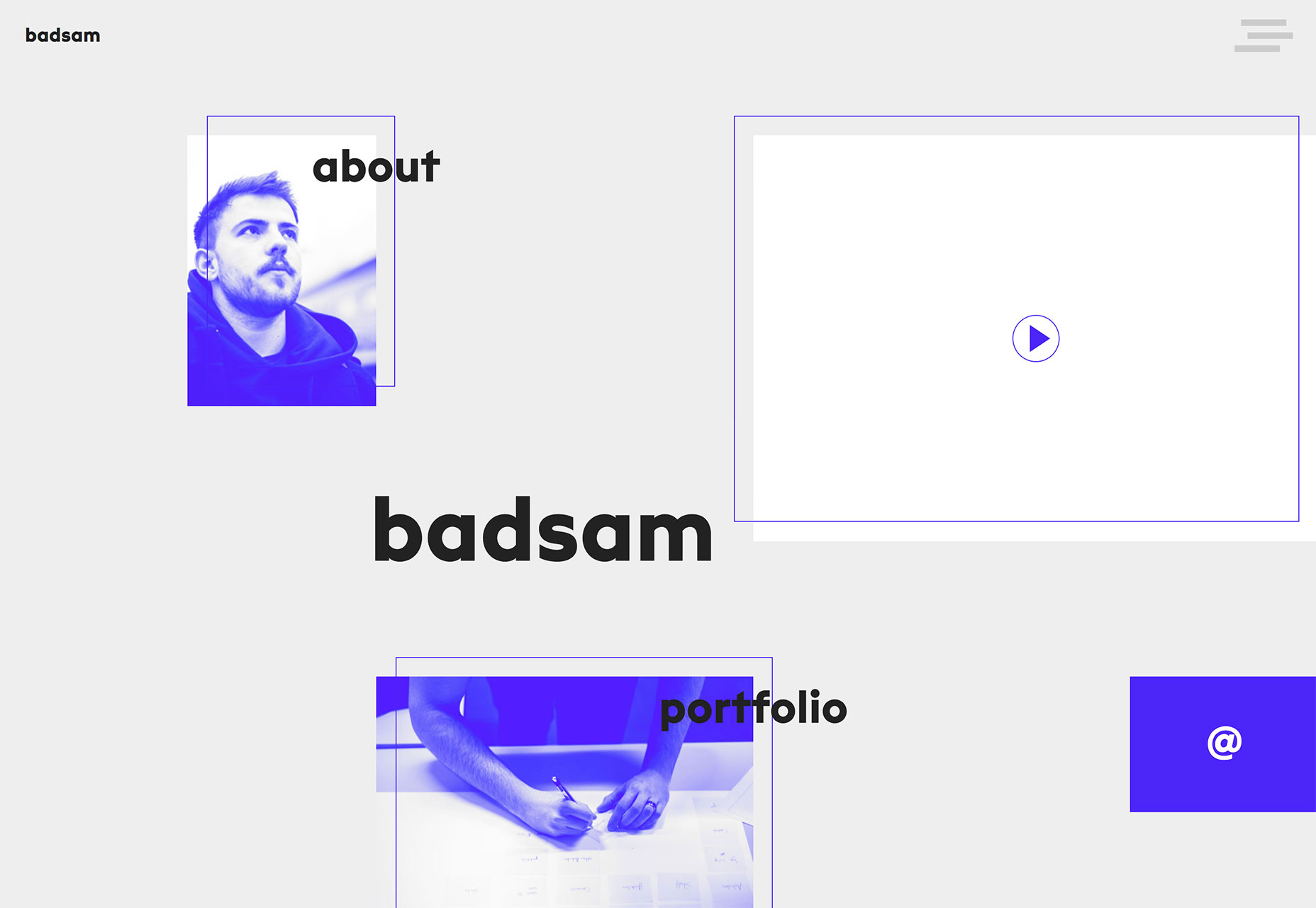
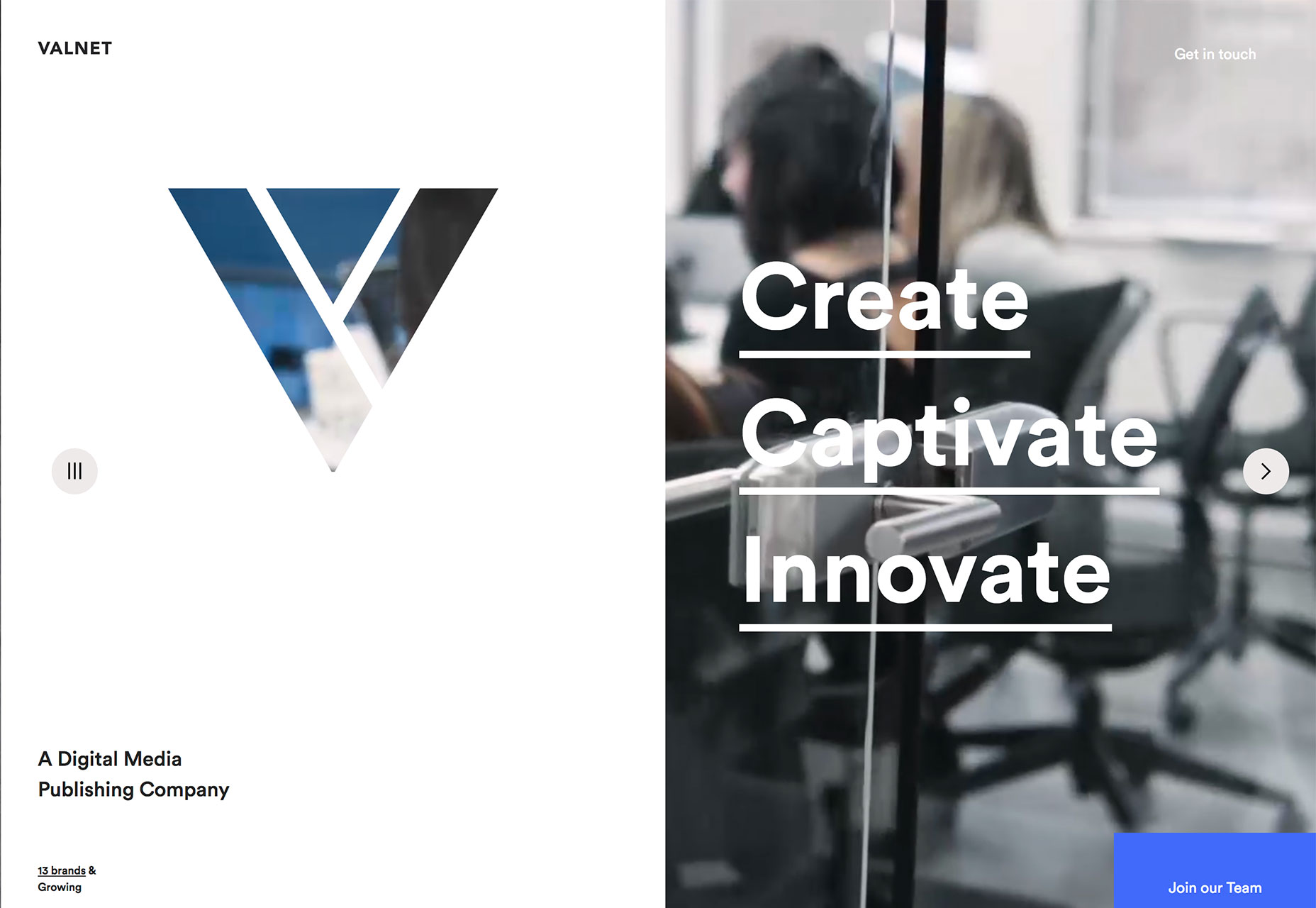
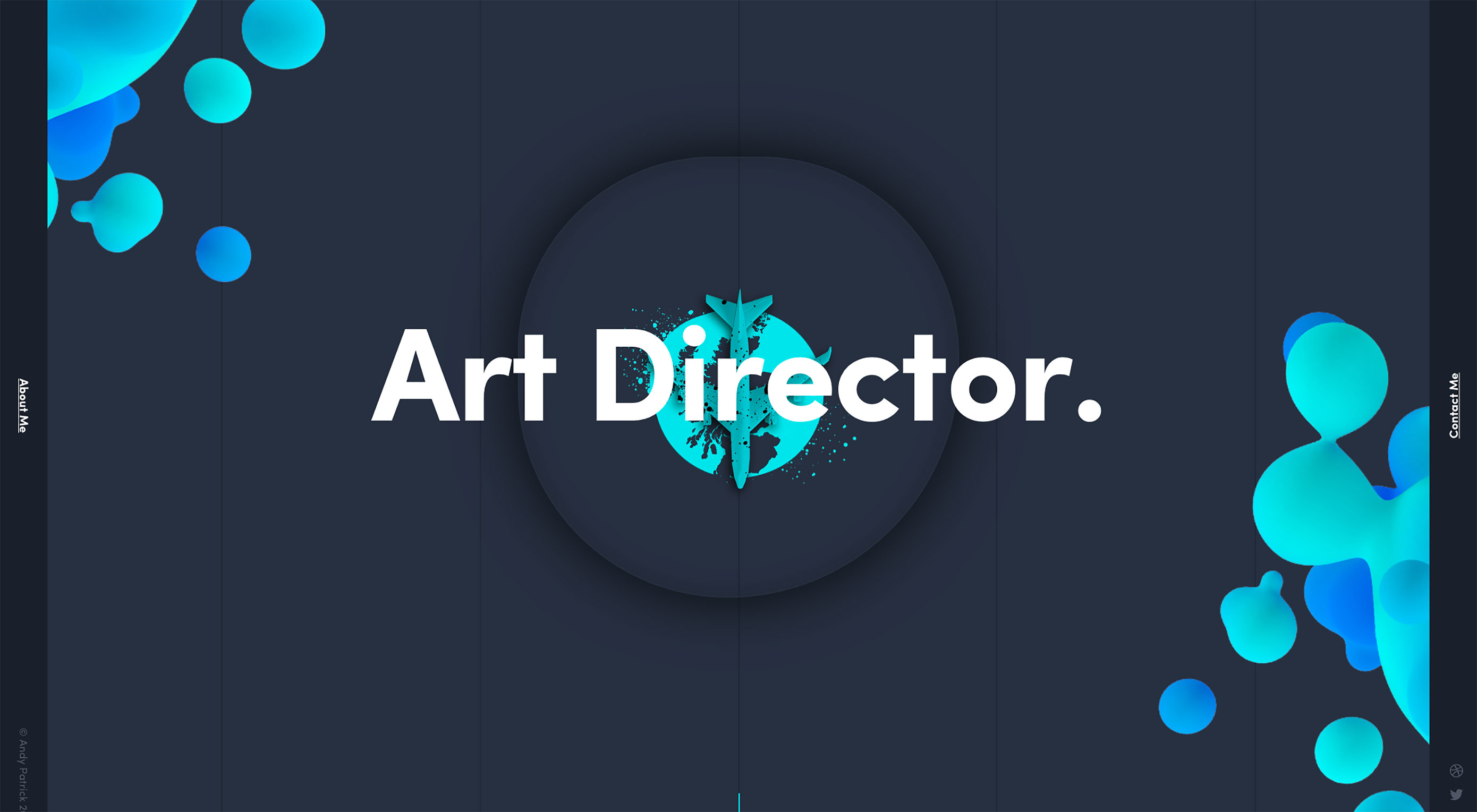 Shapes and typography are two elements that can add a lot of impact to a website design project even when they don’t always occupy the greatest amount of space. How to design shapes and typography with a little extra something is definitely on the trends radar this month, with plenty of projects using this concept.
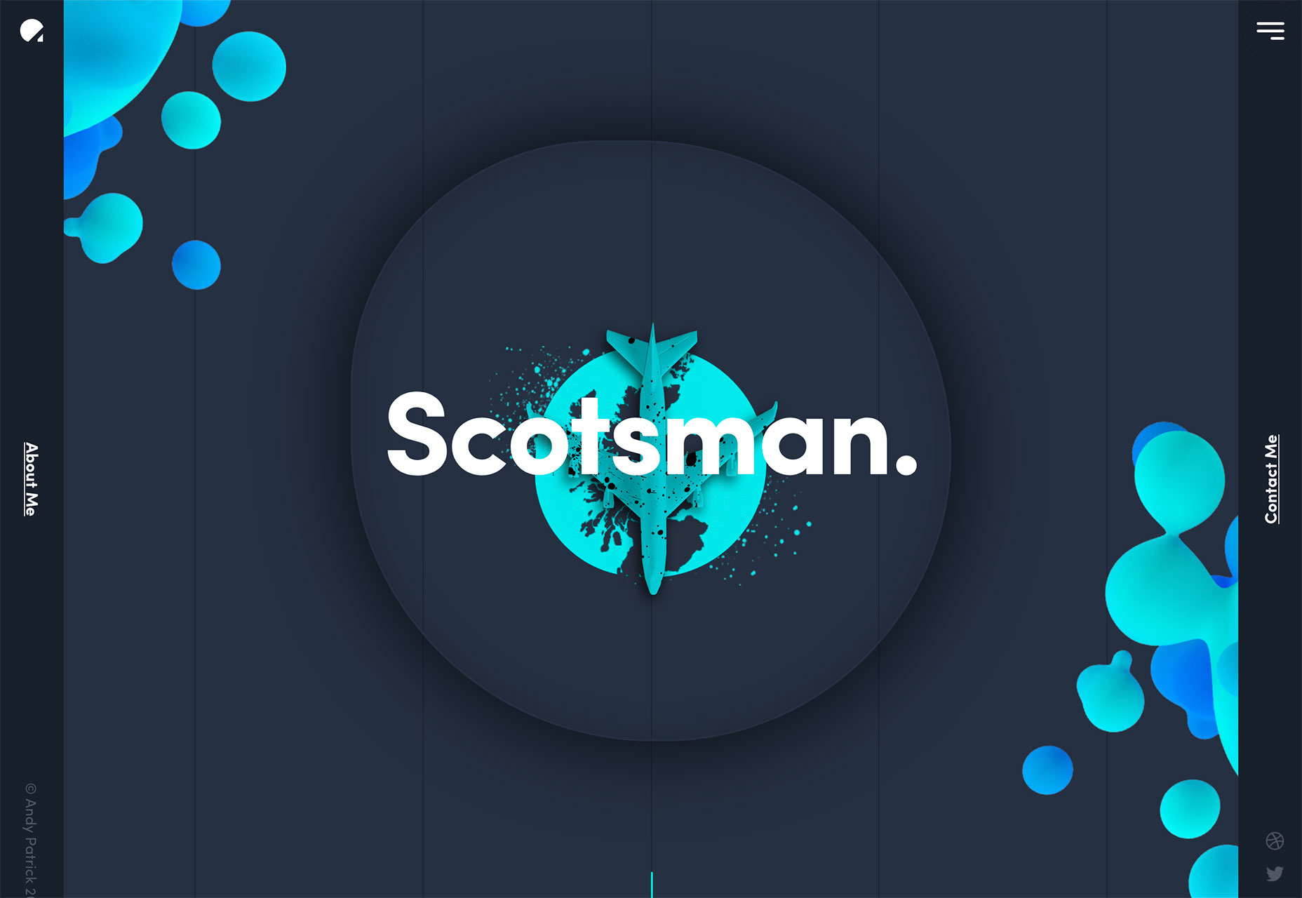


 Every week users submit a lot of interesting stuff on our sister site Webdesigner News, highlighting great content from around the web that can be of interest to web designers.