Tuesday, 5 June 2018

SVG Animation Made Easy With Hot New Tool SVGator

The best format for images on the web in 2018 is SVG. Not only is SVG resolution-independent—meaning that SVG graphics stay crisp at any size, on any device—but SVG file sizes are smaller than other competing formats.

One of the most popular features of SVG is the ability to access parts of the graphic with code, and use CSS to change properties like fill color. But did you know that you can also embed animation code in an SVG file?

Animating SVG can be complex, and requires some pretty intricate code to get right. Until now that is, because with the amazing SVGator you can actually design SVG animations, right in your browser.

Since its launch a little over 7 months ago SVGator has won legions of fans for its simple-to-use interface, and the quality of the modular code that it outputs.

Get Started with SVGator

You can get started with SVGator like this: First, create your SVG file in your favorite graphics application—you could use Sketch, or Illustrator, or even hand-code the SVG in your favorite code editor. Next, log into the SVGator site (create a account if you don’t already have one). Finally, click the “Import SVG” button to bring your graphic into the editor. Once your graphic’s in place you’re ready to start animating.

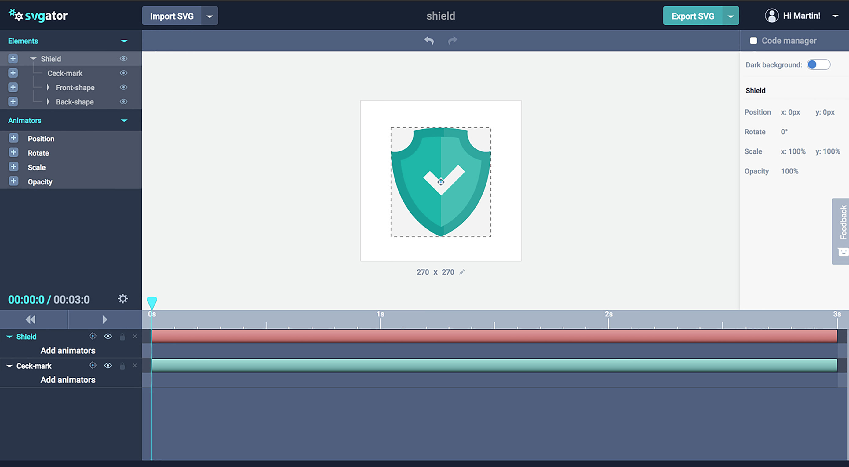
The user interface will be familiar to anyone who’s ever used an animation application, which keeps the learning-curve of picking up SVGator shallow. In the center of the screen you’ll see your SVG graphic. On the left you’ll see the different elements of your design separated into a list. On the right you’ll see a contextual properties panel that changes depending on which element you have selected. Along the bottom of the UI is the timeline that separates elements in the graphic into different channels, and allows you to animate different parts of your graphic independently.

Animating with SVGator

It’s incredibly simple to animate graphics in SVGator. Just select an element from the elements list, and add it to the timeline, then assign one or more animators to it; alternately with an element selected, add an animator and both the element and the animator will be added to the timeline. You can now add keyframes to the animators and set their properties.

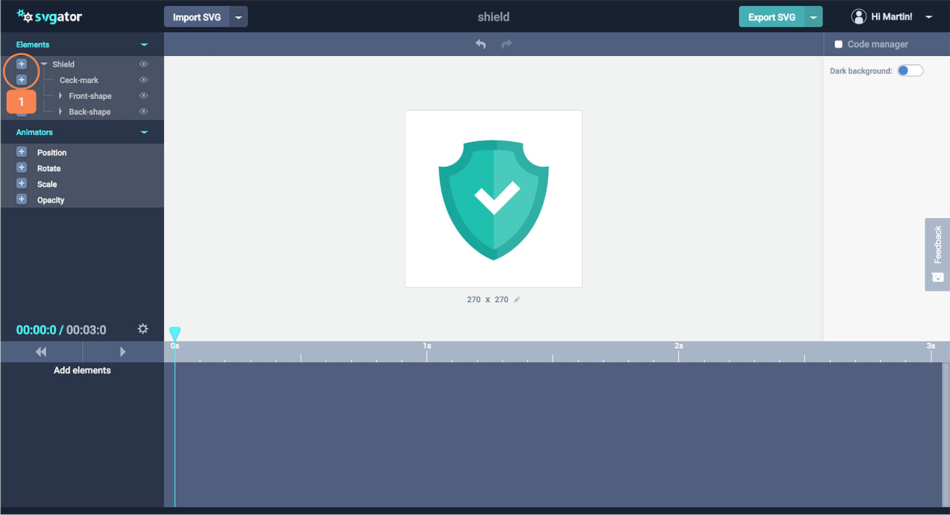
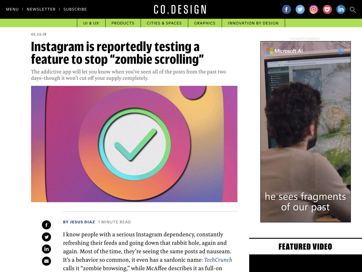
Select an element and add it to the timeline (1).

There are four properties that you can animate with SVGator: position, rotation, scale, and opacity. But don’t let the short list fool you, because you can create a huge range of effects by combining different animated elements—future plans for SVGator include path animations, which will enable elements to be animated along a pre-defined path.

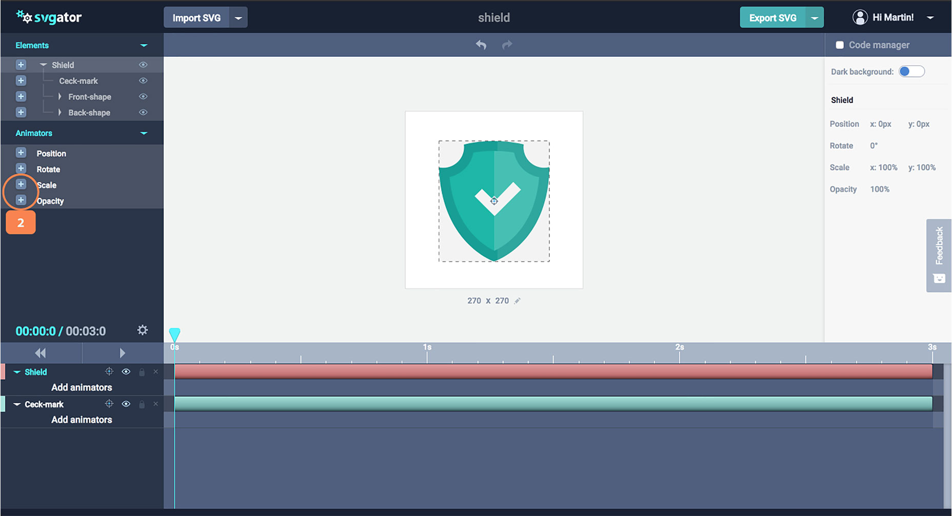
Add animators, “scale” for the shield element and “opacity” for the check mark (2).

As well as defining animation, and controlling the length of the transition, you can also add easing for a more natural-feeling motion. The available easing effects are linear (which is a constant speed), ease-in (which starts slow and speeds up), ease-out (which starts fast and slows down), and ease-in-out (which starts slow, speeds up, then slows down again).

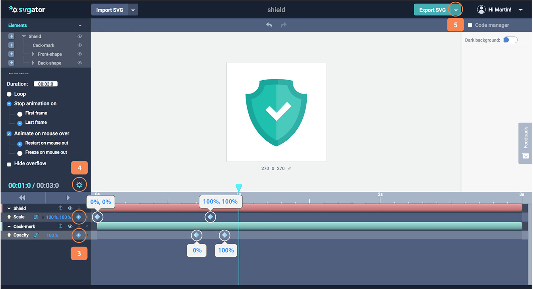
Add keyframes for both the scale animator, and the opacity animator (3). Open the settings options and make sure you have the same options as your image (4). Save your project or export (5).

You can also control what triggers the animation. You can choose to loop the animation, limit its play, or trigger it on mouse-over.

SVGator’s Code

As well as these top tools, SVGator features a code manager panel, so you can see exactly what code is being generated by the app.

SVGator exports clean, well-formatted code. So designers with no coding knowledge can use it to design animations, and then hand that code off to a developer to customize without any interpretation issues.

Choosing SVGator

The team behind SVGator created it to help promote the use of animated SVG on the web. Accordingly, they’ve placed no restrictions on the number of projects you can create. Whatever you design and animate will be stored on your account, and you can return and edit your file at any time.

If you’re looking to take your web graphics to the next level, then animated SVG is the way to go, and SVGator is one of the simplest tools you can use to create them. With new features on the roadmap, this is the perfect time to pick up this hot new tool.

Create your SVGator account, and start animating vectors today.

Add Realistic Chalk and Sketch Lettering Effects with Sketch’it – only $5!

Source

from Webdesigner Depot https://www.webdesignerdepot.com/2018/06/svg-animation-made-easy-with-hot-new-tool-svgator/

Monday, 4 June 2018

3 Essential Design Trends, June 2018

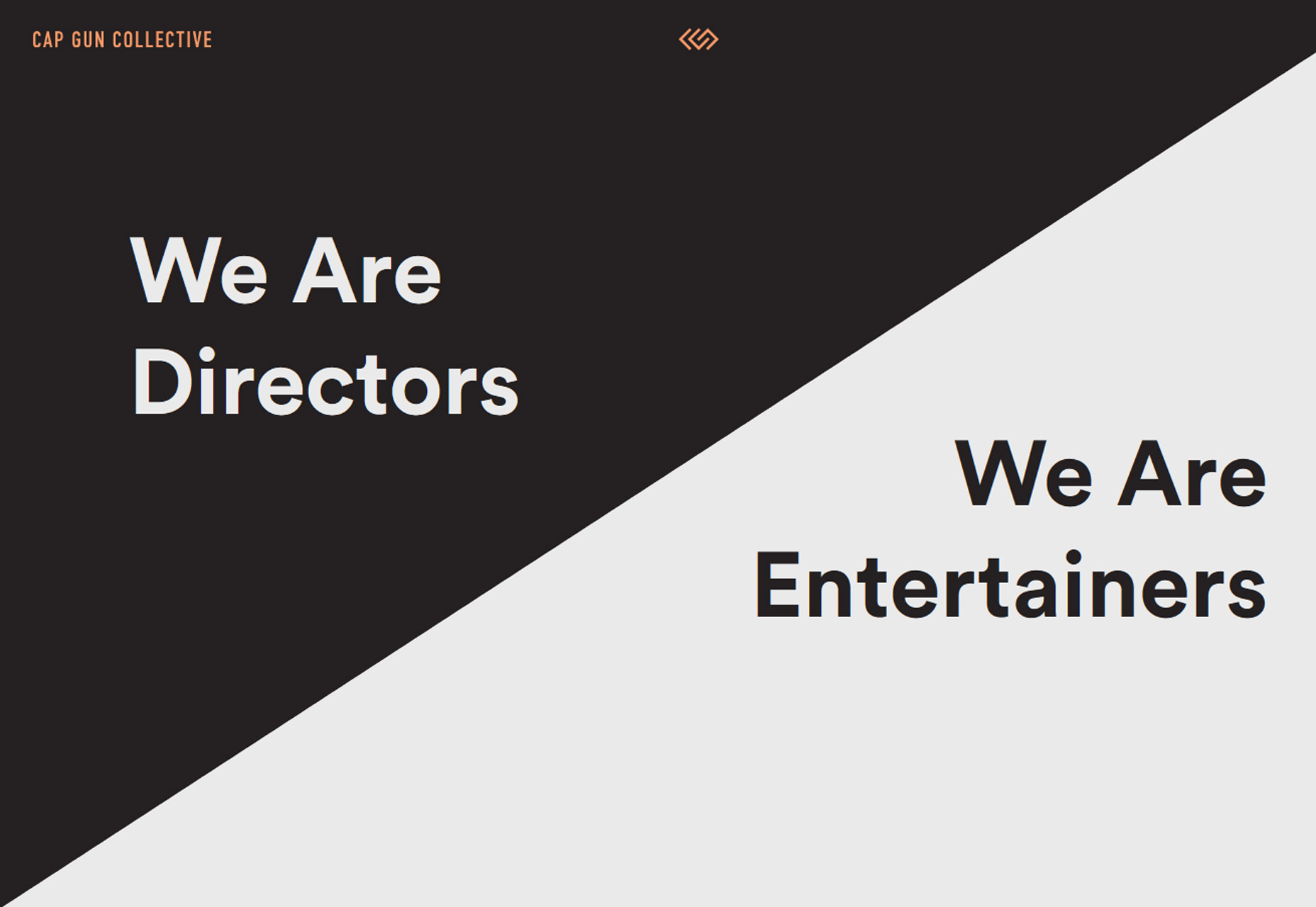
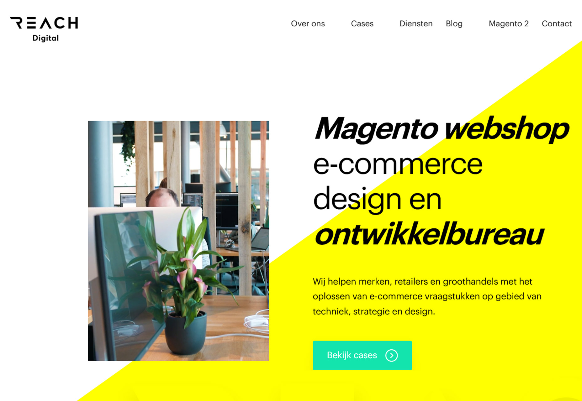
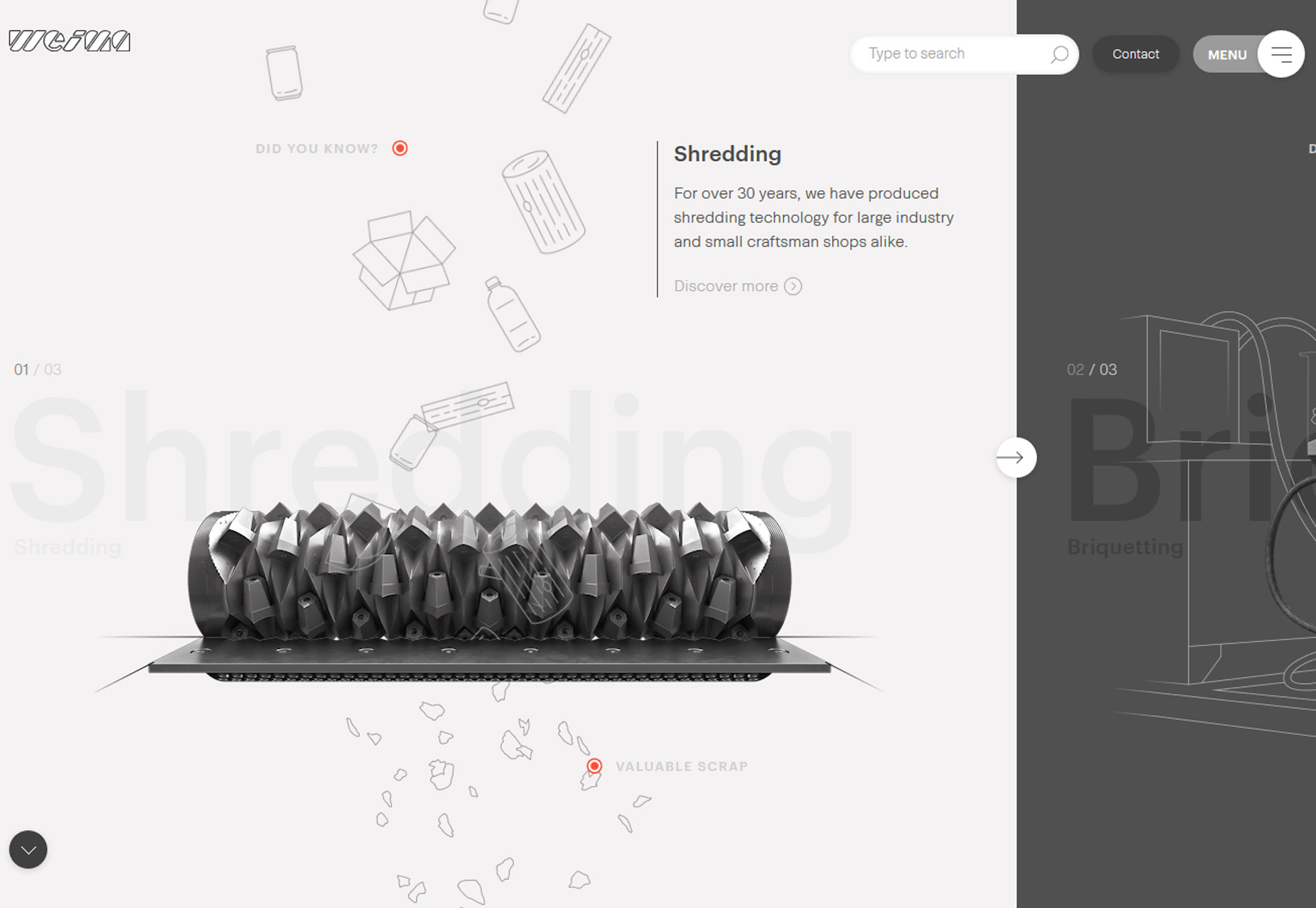
Sometimes the most fun part of looking at design trends is when you start to notice subtle shifts in trends that create new design patterns altogether. Each of the trends this month is an evolution of something that’s been pretty popular, with an interesting spin.

Here’s what’s trending in design this month:

1. Full Screen Photo

The oversized hero image gets even bigger with full-screen photo displays. The key element in this website design trend is that the home “screen” is stripped of other elements so that the photo fills the entire screen.

There aren’t separate space for navigation or other elements outside the image area. All elements are actually contained within the image. This design concept works best with a great image. Only the best, most striking and interesting photos can carry a design in this way because of a lack of other elements.

the image has to be a show-stopper

Most of the design examples below feature navigation that’s hidden within the image area – most commonly through use of a hamburger icon – and there are many other places to click or engage users. So the image has to be a show-stopper.

While these designs look great, they can present some usability challenges including lack of contrasting spaces for other elements, minimal use or space for messaging and user confusion as to what to do after coming to the page.

Additional design elements such as lines or user cues (“scroll for more”) can help. This type of design can work best for projects without a lot of content and strong visuals, of course.


2. New Take on Split Screens

Split-screen designs are something that we’ve noted in the trend category a few times at Webdesigner Depot – in the February version of this roundup and in a layout trends post as far back as 2015.  

The great thing about split screen designs is that they work with the responsive format beautifully. You get double content on desktop and stacked content on mobile screens. Regardless of device, the user doesn’t feel like he or she missed out on anything by changing device type.

The function and form of split-screen designs hasn’t changed all that much, but there has been a shift to more asymmetrical and diagonal split screens. The simple change to the aesthetic (while maintaining the great functionality of dual-content design elements) is attention-grabbing and worth trying. From the bright white and yellow combination of Reach Digital to the simple black and white style of Cap Gun Creative to the quarter-panel split by Weima, each of the alternative spits is a little more interesting than the perfectly symmetrical splits that have dominated this trend for a few years.

The nice thing about split-screen projects is that they can work with almost any type or amount of content.

From small sites to masses of content, a split screen gives users a choice when it comes to how and what to engage with first in the design. Split-screen options provide a “this or that” user experience, engaging users as they make a binary choice while interacting with content along the way. It’s easy to understand from a user perspective and highly functional.


3. Color Overlays with Minimal Transparency

Another trend that’s become overwhelmingly popular is using a color overlay with transparency over photos or video. The technique is popular because it helps create a layering effect that can make it easier to include text and other elements on top of images with a more consistent level of color contrast.

Designers are pushing the envelope with transparency options here so that the background element is hard to see at a glance. In each of the examples below, you really have to look closely to figure out what is happening in the image or how it pertains to the design. Two observations about this trend:

  • It looks pretty cool at a glance. There’s enough texture and depth from the overlay to have more visual interest than a single background color.
  • But … you lose any sense of what information the image contains. The transparencies are too “thick” to clearly discern the image without a lot of “work.” (And we know casual website users aren’t going to work to understand content.)

So that leaves us with the question as to whether this trend really works at all. Yes, it looks nice, but are you really providing information with the background image?

Don’t use this concept to make up for a sub-par image

Don’t use this concept to make up for a sub-par image. Do use this concept if you want to add depth and have an image that doesn’t need to be ready closely.

In each of the examples below, elements in the foreground are much more important to the overall messaging a goal of the design than the image beneath the color overlay. In each instance, the image is providing a hint of additional information but is not a key part of the message. It doesn’t really contribute to user understanding and is more of a visual accent than anything else.

This is a tricky technique. If you plan to use this trend in your projects, make sure you have just the right image and transparent overlay.

Gather plenty of feedback about what people can and can’t see in the image and whether using something that requires this much visual work is worth the effort. If users struggle with it, they will abandon the design and that’s not at all beneficial.


Conclusion

Pushing trend forward is a lot of fun and one of the things that can keep design fresh and eliminate that uniform look that sometimes happens when a technique gets too popular. How do you feel about these evolutions in design? Would you use them?

What trends are you loving (or hating) right now? I’d love to see some of the websites that you are fascinated with. Drop me a link on Twitter; I’d love to hear from you.

Add Realistic Chalk and Sketch Lettering Effects with Sketch’it – only $5!

Source

from Webdesigner Depot https://www.webdesignerdepot.com/2018/06/3-essential-design-trends-june-2018/

Sunday, 3 June 2018

Popular Design News of the Week: May 28, 2018 – June 3, 2018

Every week users submit a lot of interesting stuff on our sister site Webdesigner News, highlighting great content from around the web that can be of interest to web designers. 

The best way to keep track of all the great stories and news being posted is simply to check out the Webdesigner News site, however, in case you missed some here’s a quick and useful compilation of the most popular designer news that we curated from the past week.

Note that this is only a very small selection of the links that were posted, so don’t miss out and subscribe to our newsletter and follow the site daily for all the news.

20 Inspiring Web & UI Designs


Load your WordPress Site in Less than a Second


Flexy – CSS Framework


Divvy – Secure Payment Platform for Businesses


Cooki – GDPR Compliant Cookie Banners


So your Startup Receive the Nightmare GDPR Letter


Goodreads has a Beta Program for Bookworms on the Bleeding Edge


Designing for Actual Performance


Instagram is Reportedly Testing a Feature to Stop ‘Zombie Scrolling’


Typographic Posters: 100 Stunning Examples


Building a Responsive Image


UEFA Europa League Refreshes Energy Wave Identity


Chronos – A Simple Pomodoro Timer for MacOS


AI Ethics – A New Skill for UX-Designers


Rediscovering Apple’s 1987 Identity Guidelines


PatternFly – A Web UI Framework by RedHat


What is Holistic Web Design?


17 Delightfully Interactive Sites


The Future of Web Design Doesn’t Involve Computers at all


7 Tools to Create a Site that Works for Everyone


Dieter Rams 10 Principles of Good Design


Grid System Library – Free Set of Grids for iOS, Android and Bootstrap


When not to Use a Design System


Is Timeless UI Design a Thing?


5 Key Insights from the World’s Most-enduring Brands


Want more? No problem! Keep track of top design news from around the web with Webdesigner News.

Add Realistic Chalk and Sketch Lettering Effects with Sketch’it – only $5!

Source

from Webdesigner Depot https://www.webdesignerdepot.com/2018/06/popular-design-news-of-the-week-may-28-2018-june-3-2018/

Saturday, 2 June 2018

Comics of the Week #435

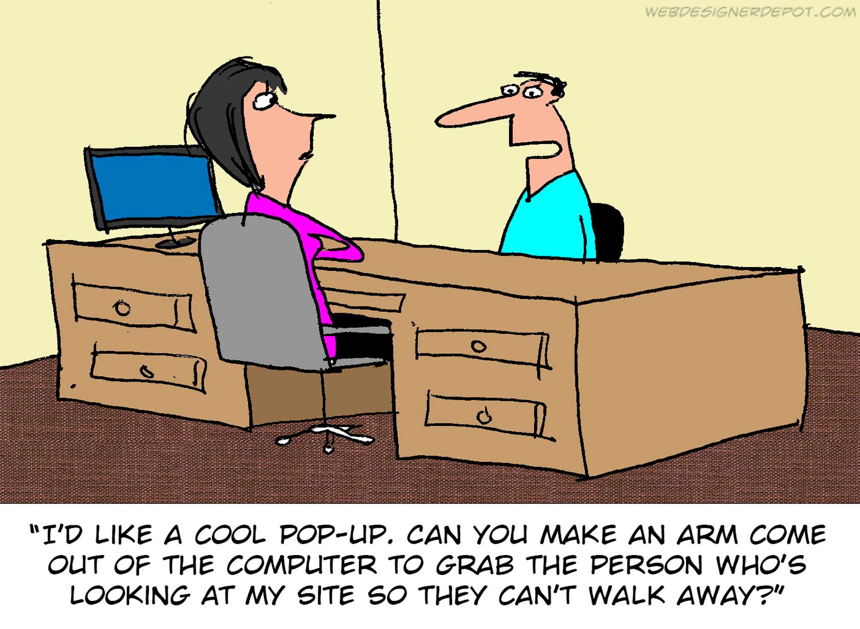
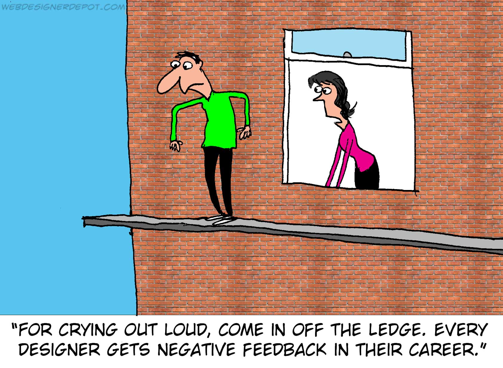
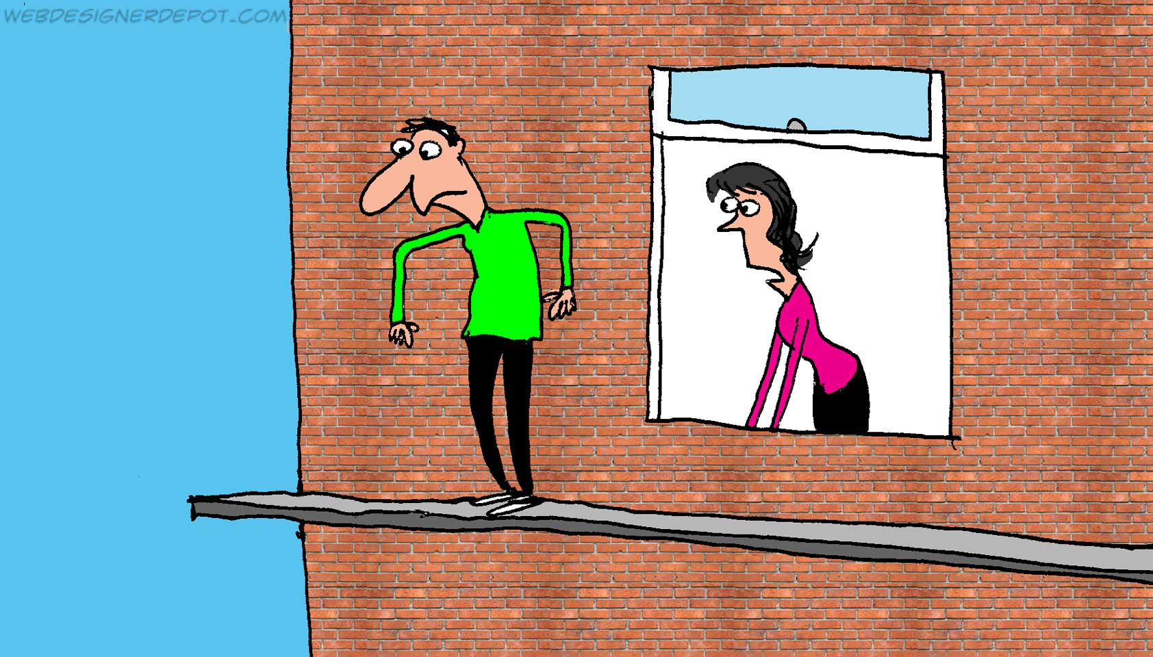
Every week we feature a set of comics created exclusively for WDD.

The content revolves around web design, blogging and funny situations that we encounter in our daily lives as designers.

These great cartoons are created by Jerry King, an award-winning cartoonist who’s one of the most published, prolific and versatile cartoonists in the world today.

So for a few moments, take a break from your daily routine, have a laugh and enjoy these funny cartoons.

Feel free to leave your comments and suggestions below as well as any related stories of your own…

Own worst critic

Intrusive ads


Sensitive designer

Can you relate to these situations? Please share your funny stories and comments below…

Add Realistic Chalk and Sketch Lettering Effects with Sketch’it – only $5!

Source

from Webdesigner Depot https://www.webdesignerdepot.com/2018/06/comics-of-the-week-435/

Friday, 1 June 2018

3 SEO “Hacks” to Boost Your Website Ranking

Looking to boost your search rankings?

While nothing can help you reach an audience better than great content, there are simple habits that can help you boost search ranking and provide valuable information for users. And it doesn’t require a complete website overhaul or hiring an SEO expert.

Here are three hacks to help you boost your website ranking and help more users find your website content.

1. Use Video and Transcription

You might already know that video is a great way to engage with users on your website. From full-screen video headers to short clips to grab attention, moving images can provide information to users that still photos can’t. Video can be more than that as well. Use video for tutorials or how-to features to drive even more engagement.

Often in website design, we use the phrase “show, don’t tell” to describe the design process. The same can be true for whatever your website is about as well. Create a video that provides a valuable resource for users. It could be a video that shows them how to use a product (if you have an ecommerce website) or how to do or make something related to your content area.

Make sure to create a high quality video. It should provide complete information in a concise way – so that users will actually watch it.

Upload the video to your website and make sure to include appropriate metadata (it works much like uploading photos with alt information and appropriate naming). Make sure to include a thumbnail that’s visually appealing and shows something interesting. This “tiny picture” can entice users to watch the video. (Try to include a person in the image to give it a personal feel.)

Next, create a full transcript of the video and include it on the page with the video itself. (Think of the design like this: big video at the top of the page, header with the title of the video and then full text of the video.)

This works in two ways:

  • It makes the video accessible to more people because they can read the information (great if they are on your website without sound).
  • It allows search bots to actually scrape the full content of the video, thanks to the text transcription. (Bots can’t actually read what’s in the actual video, only the meta data associated with it.)

Make each page with video content unique. Don’t use the same video and transcription on multiple pages of the website. It should have its own page and location. TED (shown below) does a great job with this, making videos easily accessible – and easy to search and find – for all users.

2. Link to the “Right” Sources

Linking to sources inside and outside your website matters quite a bit. The idea is that your website should be a credible and authoritative source of original information.

How information is referenced and sourced means a lot to Google’s search algorithm, making it important to use links well.

But what are the right sources to link to? First consider authority and credibility.

link to sources that relate to your content from websites that already have good search credibility

For facts and information, link to sources that relate to your content from websites that already have good search credibility. Those include websites that you’ve probably heard of and that have been around a long time. (A link to something from The New York Times is more authoritative than one from a blog start-up.) Look for official sources to link to as well. Websites that end in .gov and .org generally come with more authority than .com. Use these types of sources where appropriate, but make sure that the link is a resource related to your content.

You want to link internally as well. If you have related content within your website, make sure to link to that as well. (Internal cross-linking can provide a boost to your website and individual pages with more people looking at them.)

Then, the trick is to mix up all the right links, with the right number of linked sources. Too many links will look like link stuffing to search bots and will actually hurt your ranking.

Pick a few key places to link. For a piece of content that’s 500 words, try to include three to five relevant links that are a mix of the types mentioned.

While it’s hard for you to control what sources link to you, this is an important factor as well. The same quality of sources that you link to are the quality of sources you want to be linked from. (Say that five times fast!) When you create quality content, much of this linking will come naturally. Don’t force it.

3. Tag Like a Pro

One of the first tips you’ll get when reading about SEO is to use meta tags. Most website designers know to do that. It’s how you use tagging that can make the website stand out in search.

Meta tags – those little snippets that describe content – are part of a website’s code and not on-page content per se. (Not sure how to include meta tags? Here’s what the HTML looks like.)

To tag like a pro, think about the major types of meta tags and how to use them effectively.

  • Title tag: It what appears in the browser bar. Search engines think this is the title of the page and often matches the actual title of the content or H1 attribute.
  • Meta description attribute: This is arguably the most important meta tag for actual users. It is the short description that appears in a search engine listing. Write these descriptions to fit in the space. Although the character count changes periodically, keeping it to about 300 characters is ideal. Try to write different descriptions for each page that describe the content on that page. (Look at the example below: Which description best helps you click for more information?)
  • Meta robots attribute: This tells search crawlers whether to index the page or not. This is the index/noindex and the follow/nofollow information.

Conclusion

Quality search starts with a quality website. You need to provide valuable information for users that’s yours. You can’t copy someone else or publish a mash-up of things and expect results. Find a topic or niche and own it. Then, make sure to diversify types of content and how you reference information.

The goal is to be a credible source of unique information. That’s what these three hacks should help you accomplish in ways you maybe haven’t considered. Create content that helps people in some way, and search results will likely follow.

Add Realistic Chalk and Sketch Lettering Effects with Sketch’it – only $5!

Source

from Webdesigner Depot https://www.webdesignerdepot.com/2018/06/3-seo-hacks-to-boost-your-website-ranking/