 In a recent post, I discussed how caution needs to be taken when designing websites for a global audience. Different cultures perceive things like color quite differently from one another. Devices that might be popular in one region of the world might not be used in another. And the customs each country has—even for something as seemingly insignificant as filling out a contact form—can vary greatly.
Needless to say, global web design needs to be greatly simplified and neutralized in order to appeal to a broader audience.
Now, local design techniques, on the other hand, require much more attention to detail and personalization. In this article, I want to discuss 5 ways in which web design can be more aptly handled for a local audience, be it within a single city, or nation.
How to Design for a Local Audience
When it comes to designing locally, your goal is to tap into a very targeted audience in a highly distinguished geographic area.
1. Prioritize Intent
In many cases, a website that targets local users is one that has a brick-and-mortar component. This means that you not only have to think about why your visitors have come to the site, but also how they intend on using it to complement the in-person experience (if at all).
As such, many websites designed for a local audience place all the essentials in the header and above-the-fold. This ensures that, if there’s no time to waste, your website isn’t responsible for it.
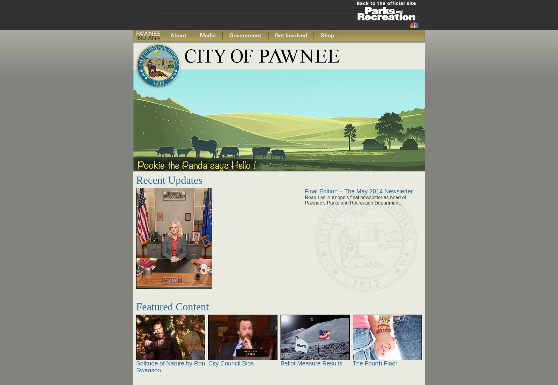
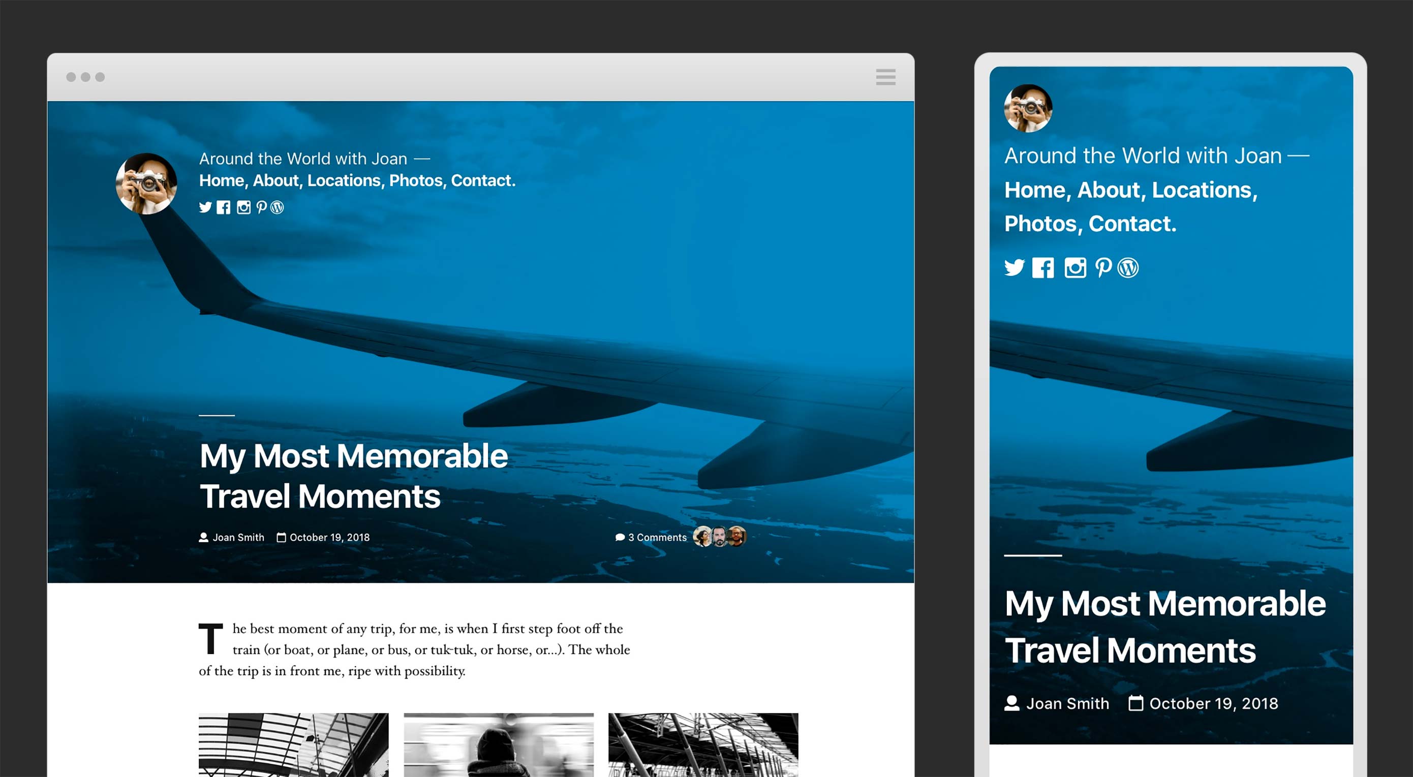
Let’s use Fusion Fitness Center as an example:
The header alone gives local members of the gym most of the information they’d likely come to the website for. This is part of the whole Google Micro-Moments proposition. The navigation is the next piece users see. Again, it doesn’t waste time with About Us pages, Team bios, and so on. While that information may exist somewhere on the site, the focus is on what this local business can do to facilitate the in-person experience for its local members.
And, if that’s not enough, the hero image at the top of the home page continues speaking to the local user. Never once does it falter and put the attention back on Fusion Fitness. It all remains on helping that user attain their goals.
2. Add a Map to the Home Page
For businesses that aim to drive virtual traffic to their website and physical traffic to their local property, a map is an essential piece to include within the design of your website. Feel free to get creative with it, too, so that it blends with the style of your site.
Here is an example from Foxwoods Resort Casino:
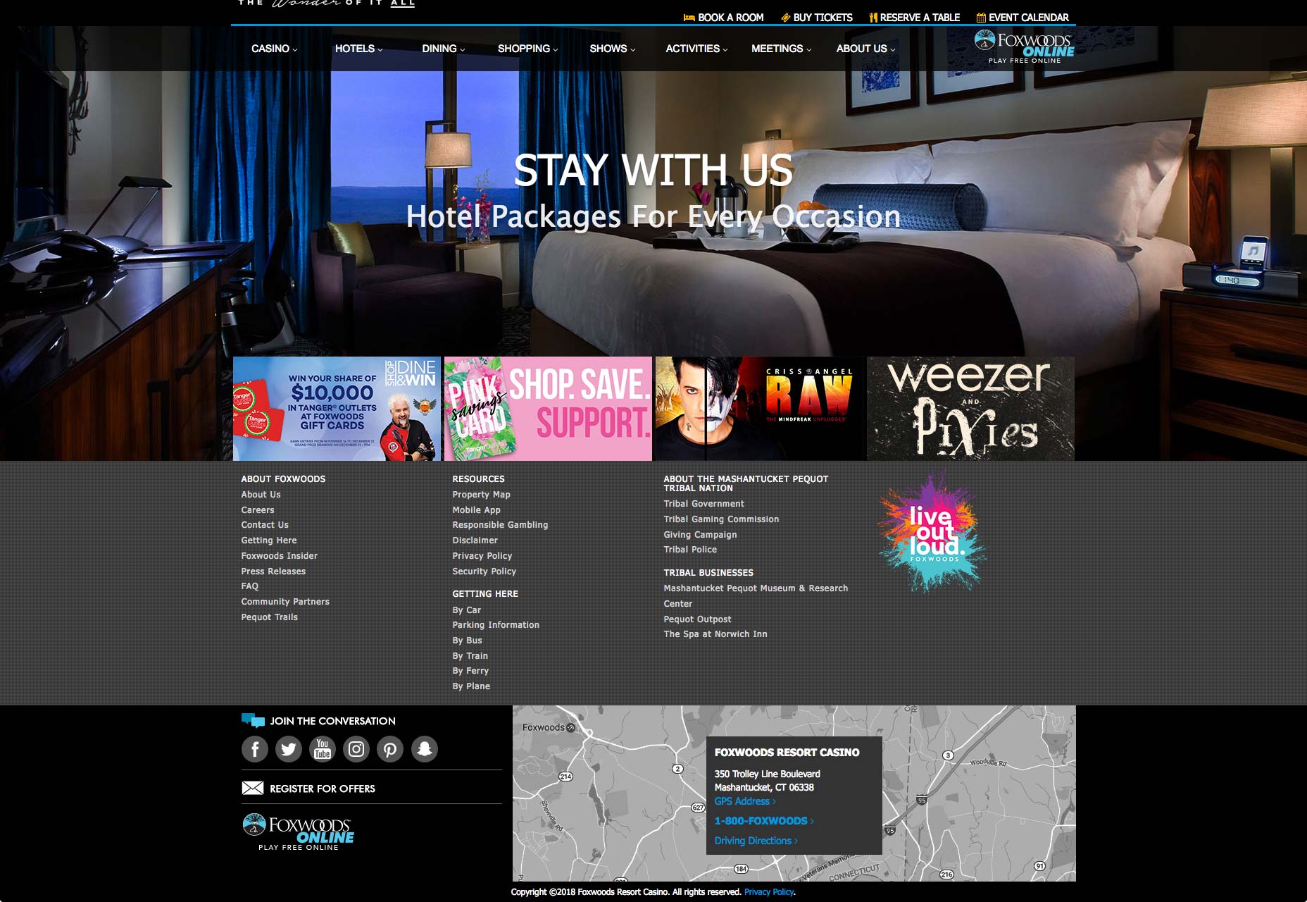
As you can see, it’s not the traditional Google Map you’ll find on websites. Instead, they’ve included a static greyscale image of their mapped location. The links within it then drive users to the relevant information they need.
3. Localize Content
Local consumers tend to have emotional connections to the area in which they live.
The nice thing about this is you don’t have to betray your brand’s color palette or sense of style in order to pull this off. Based on the kind of business you’re designing the website for, utilizing images or colors that are reminiscent of the local cityscape or landscape, home team, and so on isn’t too difficult.
Cervera Real Estate is a company in Miami that helps local consumers find a new home:
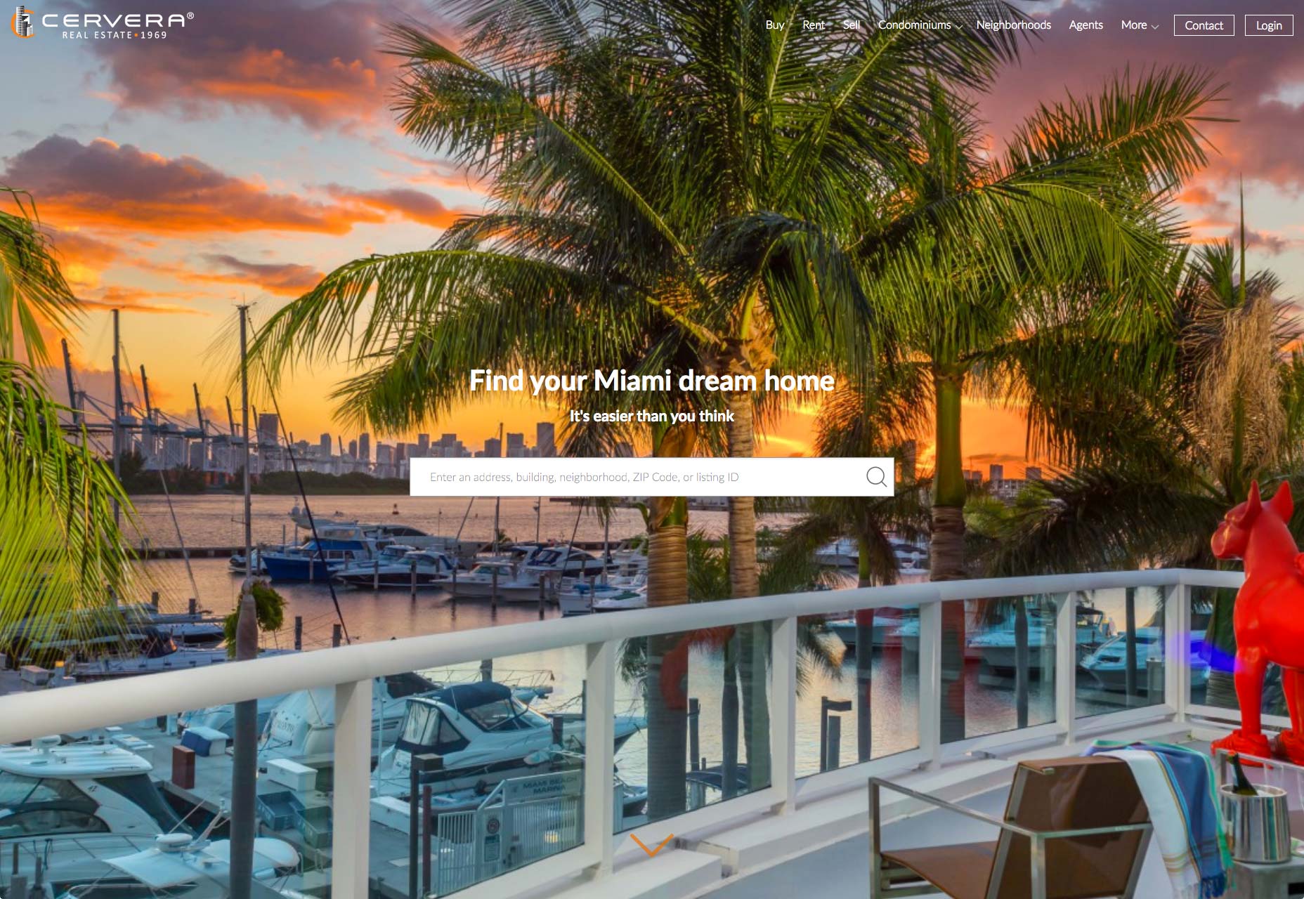
Take a look at that hero image. It’s beautiful, right? And it’s definitely one that is taken from the scenic Miami cityscape. But look a little closer. Notice how the orange hues within the sky—and even the animal sculpture on the deck on the right—play off of the orange in the logo? That wasn’t an accidental choice.
This image was selected (or custom-photographed) because of what it would do in terms of appealing to Miami residents as well as establishing a stronger brand identity that’s tied to the city.
Also, don’t forget that it’s not just visual content that needs to be localized. If you’re targeting an area with a specific dialect or jargon, make sure your writers account for that when developing content for your beautiful and local-friendly designs.
4. Create Local Pages
Businesses with multiple locations and unique teams and identities at each should have dedicated pages for them.
Slalom is a consulting firm with locations scattered all around the U.S. Each location has its own custom-designed and localized subdomain as this example from the Atlanta office demonstrates:
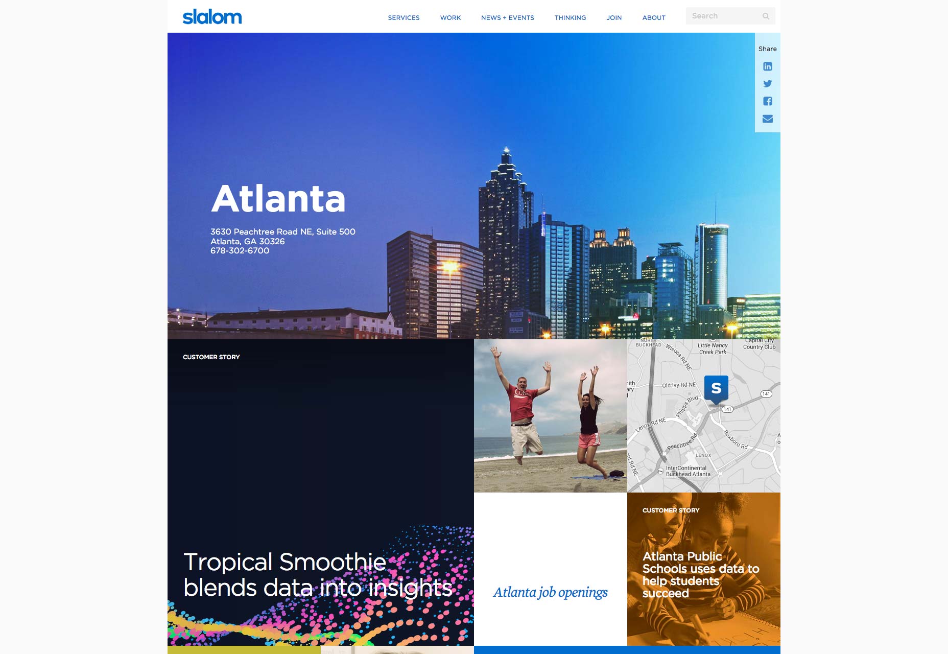
In addition to including an address for the location, this page includes:
- An image of the Atlanta cityscape;
- An introduction to the team;
- Local customer case studies;
- Job openings;
- And more…
These local pages give you a chance to establish a unique identity for each location, helping prospects in those regions to develop stronger connections to the people and not just the brand.
5. Use Recognizable Trust Marks
Trust marks are an important part of convincing online shoppers, in general, to trust a website. But when it comes to convincing local users to believe in your brand, it’s not enough to include a Norton security seal or logos from big corporate partners on your site.
To impress a local audience, you need to use names and logos that mean something to them.
- Local companies as advertising sponsors;
- Case studies from other local businesses or residents;
- Logos from local events your brand participates in;
- And so on…
Lyons Group doesn’t commit its home page—or even most of its site—to talking at great length about how they’re a successful restaurant group in Boston.
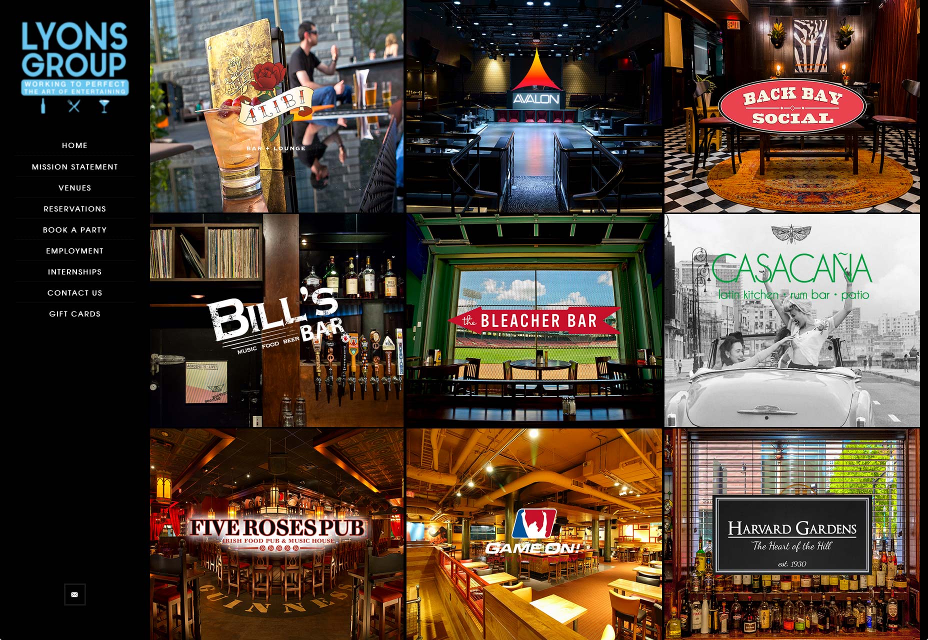
Instead, it highlights dining establishments that exist within its family of restaurants. Boston residents know these establishments quite well, so leveraging these known “trust marks” is a smart move by the Lyons Group.
Designing with More Detail
While a local website might not have the ability to generate sales around the globe, this niche market does open up other opportunities you wouldn’t otherwise have. In fact, it allows you to do much more powerful and personalized things with design as you now have a clear audience to target and you can appeal directly to things like user intent and emotions.
The key here is to do your research, so that you can aptly impress visitors with design alone.
Source
from Webdesigner Depot https://www.webdesignerdepot.com/2018/11/5-ways-to-design-for-a-local-audience/
 Every week users submit a lot of interesting stuff on our sister site Webdesigner News, highlighting great content from around the web that can be of interest to web designers.

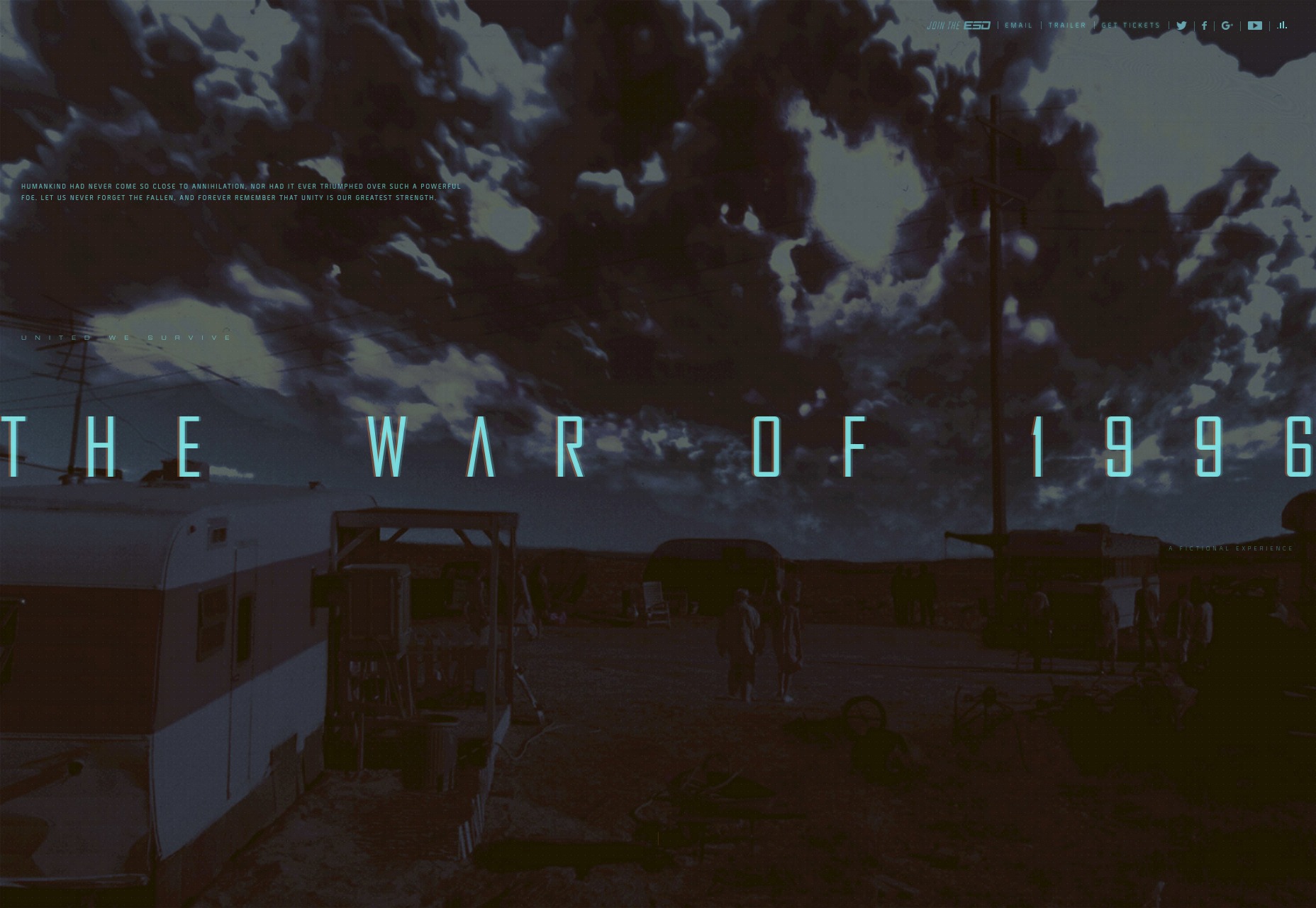
 There’s a moment that every tech nerd in every corner of the tech industry knows all too well. It’s that moment when you see that some movie or TV show has decided that your area of tech is relevant to the story, and by golly they plan to butcher it in the cheapest and most simplified way possible.
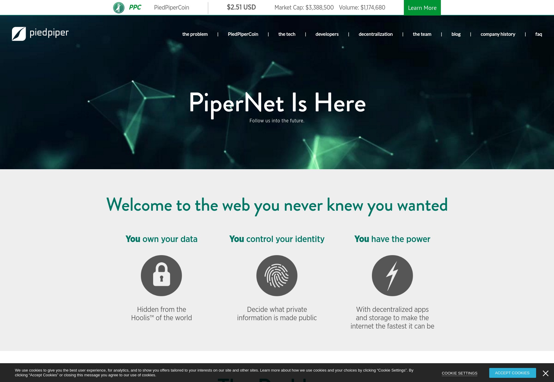

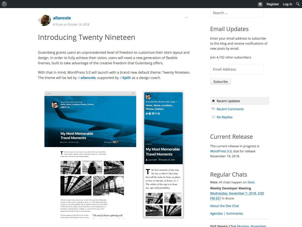
 Winter is coming, and so is WordPress 5.0. From some of the chatter about Gutenberg—the new content editor in WordPress—you might be led to believe that it’s worse than White Walkers. Others of us are more cautiously optimistic. We can all agree on two things: dragons are cool, and a lot of theme developers are going to have some work to do.