Tuesday, 4 December 2018

Content Management is Design

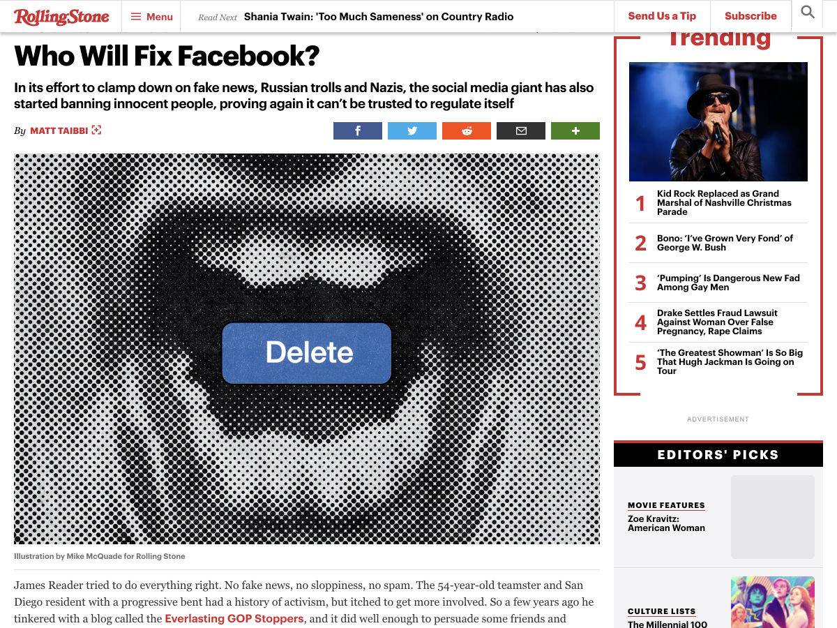
Content management is design.

I usually try to start an article with some sort of joke or metaphor for flavor, but I’m not going to do that this time. Content management is design, and that’s an important enough concept that it warrants a simple, clear statement, and needs no warm-up time.

I’ll say it again for the people at the back: content management is design, and everyone who does it is a designer.

Good content can carry a bad UI, but no UI can carry bad content

In fact, it is the biggest factor in any user experience besides (perhaps) the navigation. Every word, every picture, and every decision about where all the content goes is a design decision. Good content can carry a bad UI, but no UI can carry bad content that the user finds pointless.

Bold text is a design decision. So is the placement of a link within a paragraph. Everything done in the process of creating and managing content is a design decision.

The writer is therefore a designer. So is the editor. So is whomever decides whether images should be floated to the left, or fill up the width of the container. The client or manager who signs off on content is a designer, too. And they all need the tools to do their job right.

You might be starting to see a pattern in my article, here. Feel free to widen your eyes and hoarsely whisper something like, “It’s all connected. I see it all so clearly, now.” (Well I had to put a joke in somewhere.)

I am hardly the first person to realize this, of course. The design community as a whole has been slowly adapting to this principle in recent years. Most notably, they’ve been producing content management systems that restrict our formatting and layout options so we’ll stop screwing things up.

You think I’m kidding? Look at Medium, and the proliferation of services like it. Instead of the range of options provided by something like TinyMCE, we’re seeing more and more restrictive content editors used in an effort to make all the content look equally good. Further along this end of the spectrum, we come to CMSs that use nothing but plain old Markdown. It’s an approach that simultaneously limits our design options, but allows us to focus on the writing itself, and nothing more.

This, of course, does not entirely solve the problem of poorly designed content. If you’ve handed your client control of their site, you can’t stop them from typing in all caps, even if you strip out all other formatting options.

I truly do understand the impulse to strip away control in favor of simplicity. Making it harder to make bad decisions is a strategy that has served us well in society. For example: a padlock won’t keep a determined thief away from your bike, but it will probably keep an otherwise honest person from riding off with it while they’re drunk.

I contend that stripping away control is not what is best for the Internet

Perhaps this is just a bit of leftover idealism from my missionary days—or worse, from my Linux obsession days—but I contend that stripping away control is not what is best for the Internet. We should be encouraging web content administrators and creators to be more creative, not less. Yes, that creativity is going to result in mistakes, and even some god-awful websites, but that’s called “the learning process”.

The ’90s and early ’00s might have produced some of our worst-looking work, but even now, we look back on that time with nostalgia and not a little reverence. It’s because that was when the Internet felt creative, personal, and alive.

Of course I’m not advocating the return of auto-playing audio and other horrors best forgotten, lest they be summoned once more by children saying foolish things in front of mirrors. But we need room in our content management systems for a bit more art direction, and personal flair. Above all, we need these two things: beautiful defaults, and education for the people who manage the content.

With all of the recent focus on design systems, the smart designers have already seen the need to include content patterns in the systems. These pre-defined content patterns, the beautiful defaults, should be our bike padlocks, in a way. Instead of being restrictive, though, they rely on our natural laziness. If the text already looks beautiful, why would a user try to format the heck out of it? If the default image embedding looks great, users will feel less of a need to try to shift it all around.

At the same time, these beautiful defaults should allow for flexibility and creativity. WordPress’ new Gutenberg editor really is a step in the right direction, I think. The custom blocks will allow theme developers to implement flexible design patterns for people to choose from, so they can safely express their own creativity. It’s not a perfect system, but it’s not nearly so restrictive as Medium’s editor, and I think that’s a good thing.

Above all, we need these two things: beautiful defaults, and education for the people who manage the content

Of course, that’s all predicated on the idea that people will actually know how to take advantage of that flexibility in a way that doesn’t completely break a page’s design. That’s where education comes in. It’s a time-consuming thing, but it’s already a part of the job description. Paul Boag and others have been preaching about the need to educate your clients for years, and that hasn’t changed.

So yeah, you’ll need to have some long conversations about why italicizing every second word is bad, and they may not listen. That’s not on you. In the end, they should have control of their website, and it’s as simple as that.

Besides, there’s no reason you couldn’t charge extra for an advanced course on how to use their content management system of choice. I never said you should give away your expertise for free.


Featured image via DepositPhotos.

Add Realistic Chalk and Sketch Lettering Effects with Sketch’it – only $5!

Source

from Webdesigner Depot https://www.webdesignerdepot.com/2018/12/content-management-is-design/

Monday, 3 December 2018

20 Freshest Web Designs, December 2018

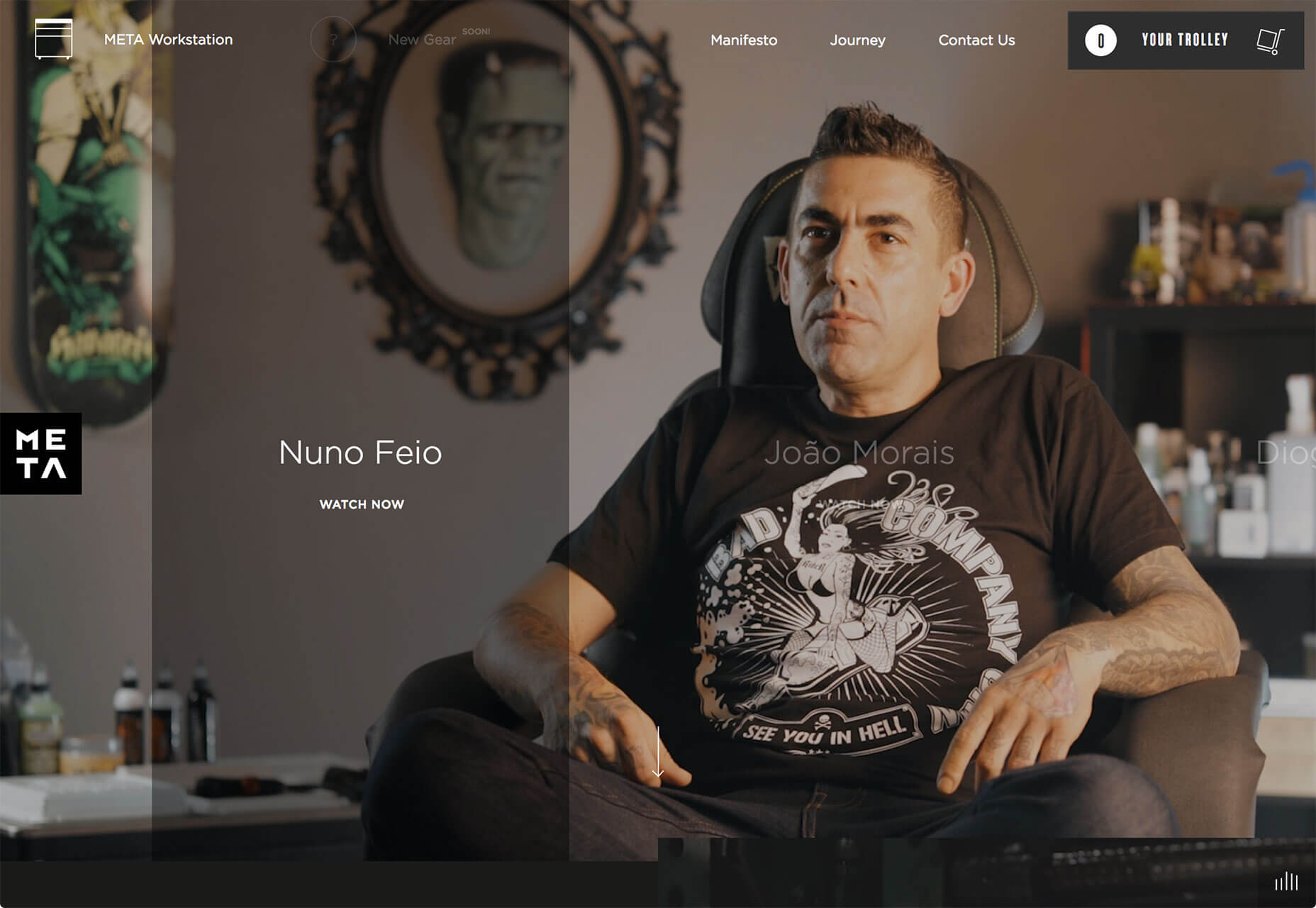
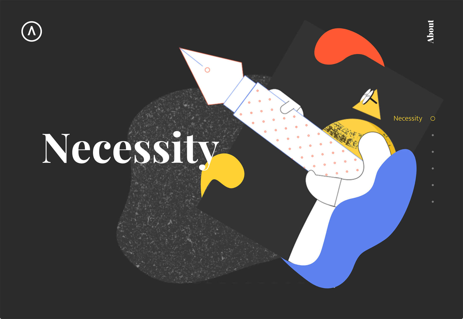
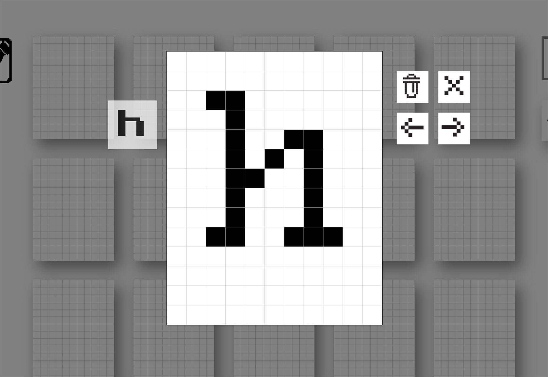
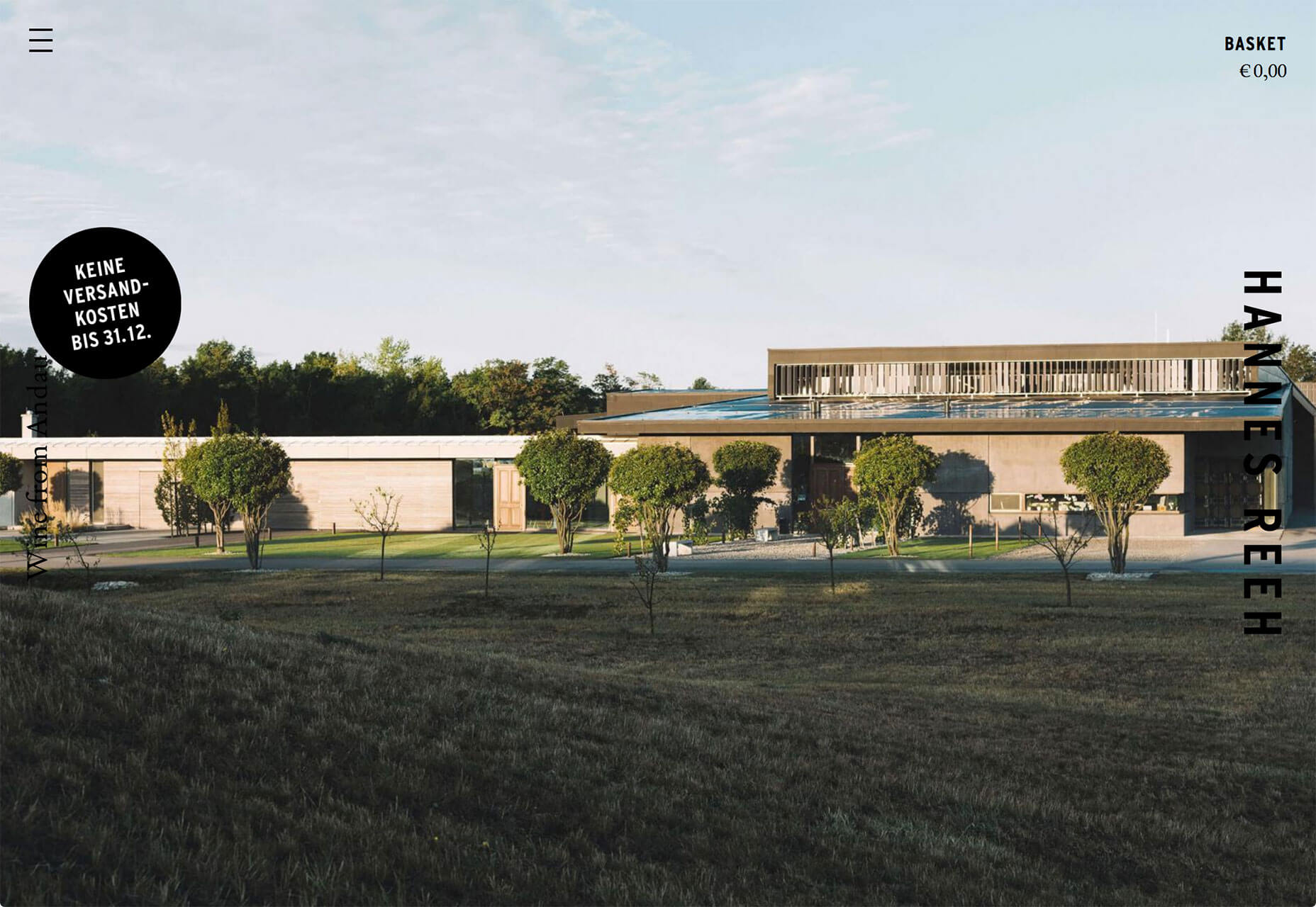
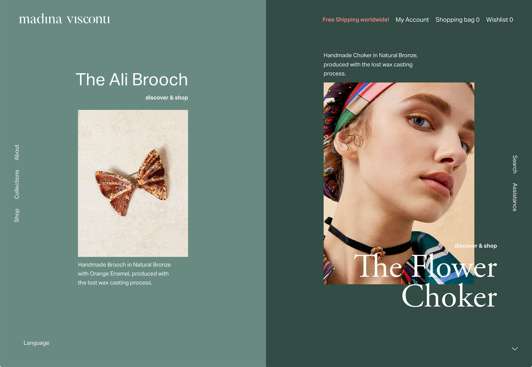
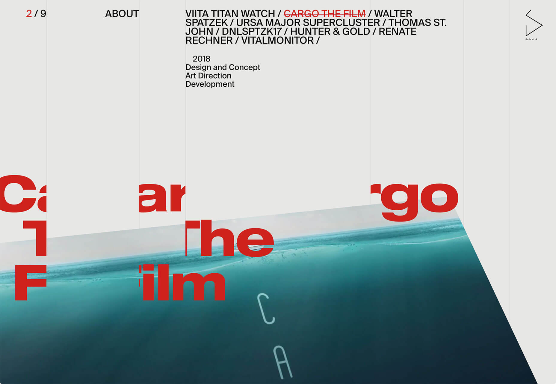
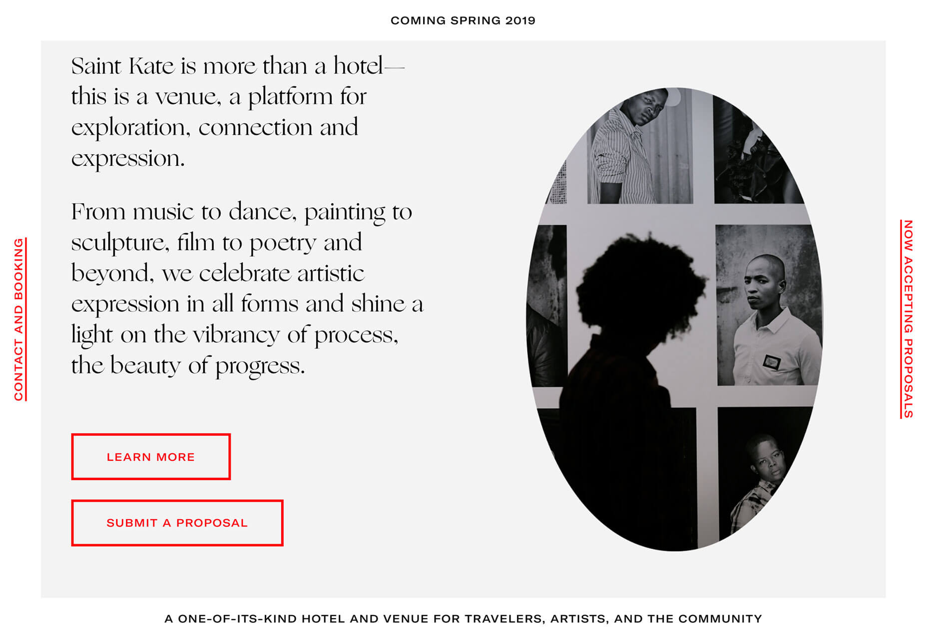
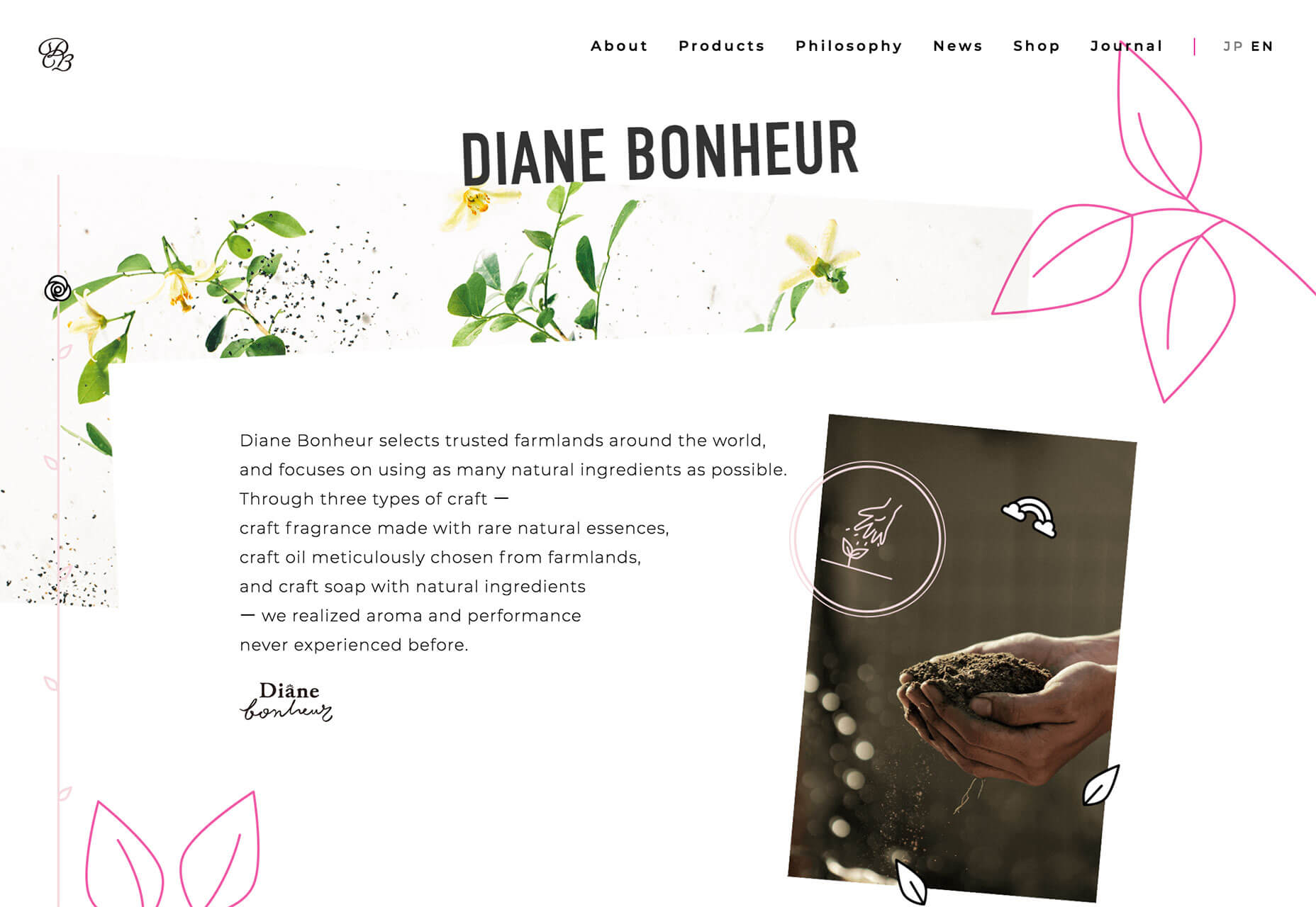
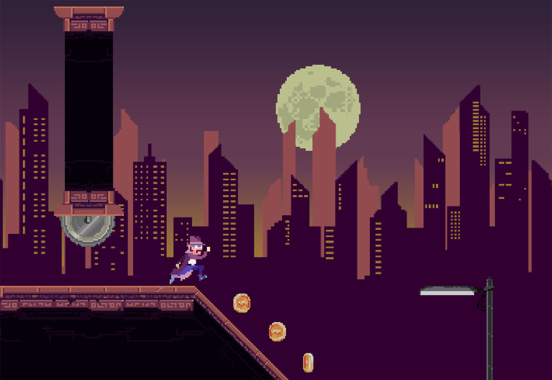
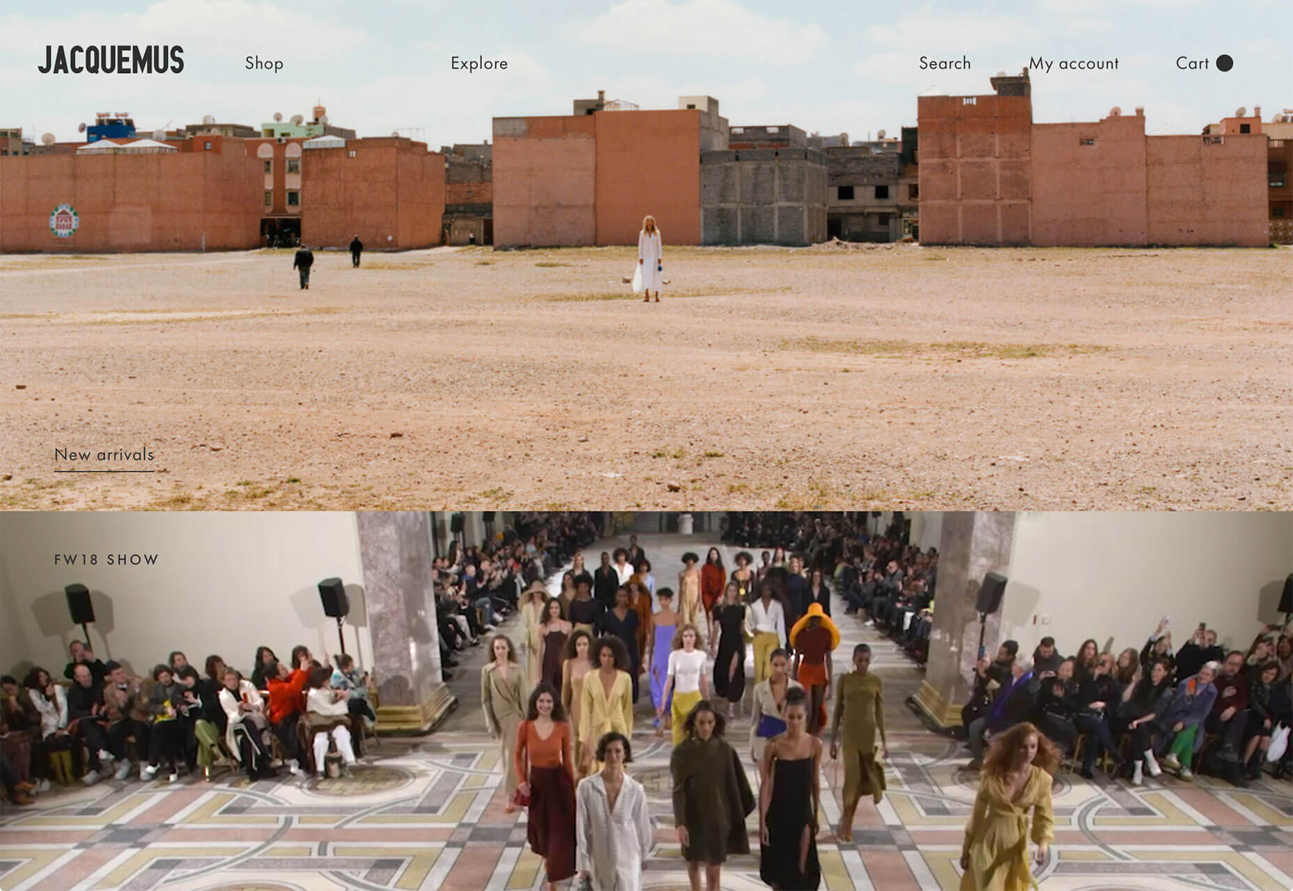
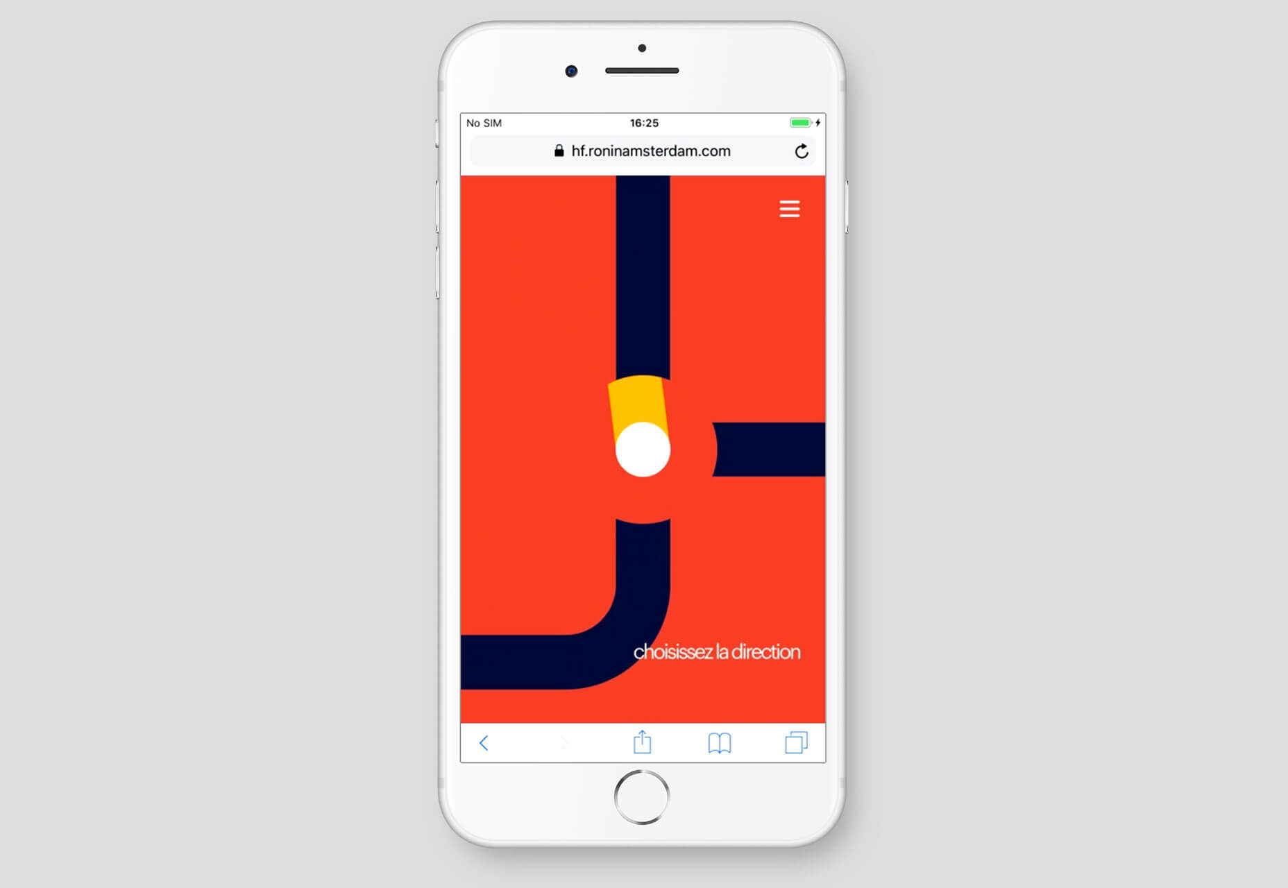
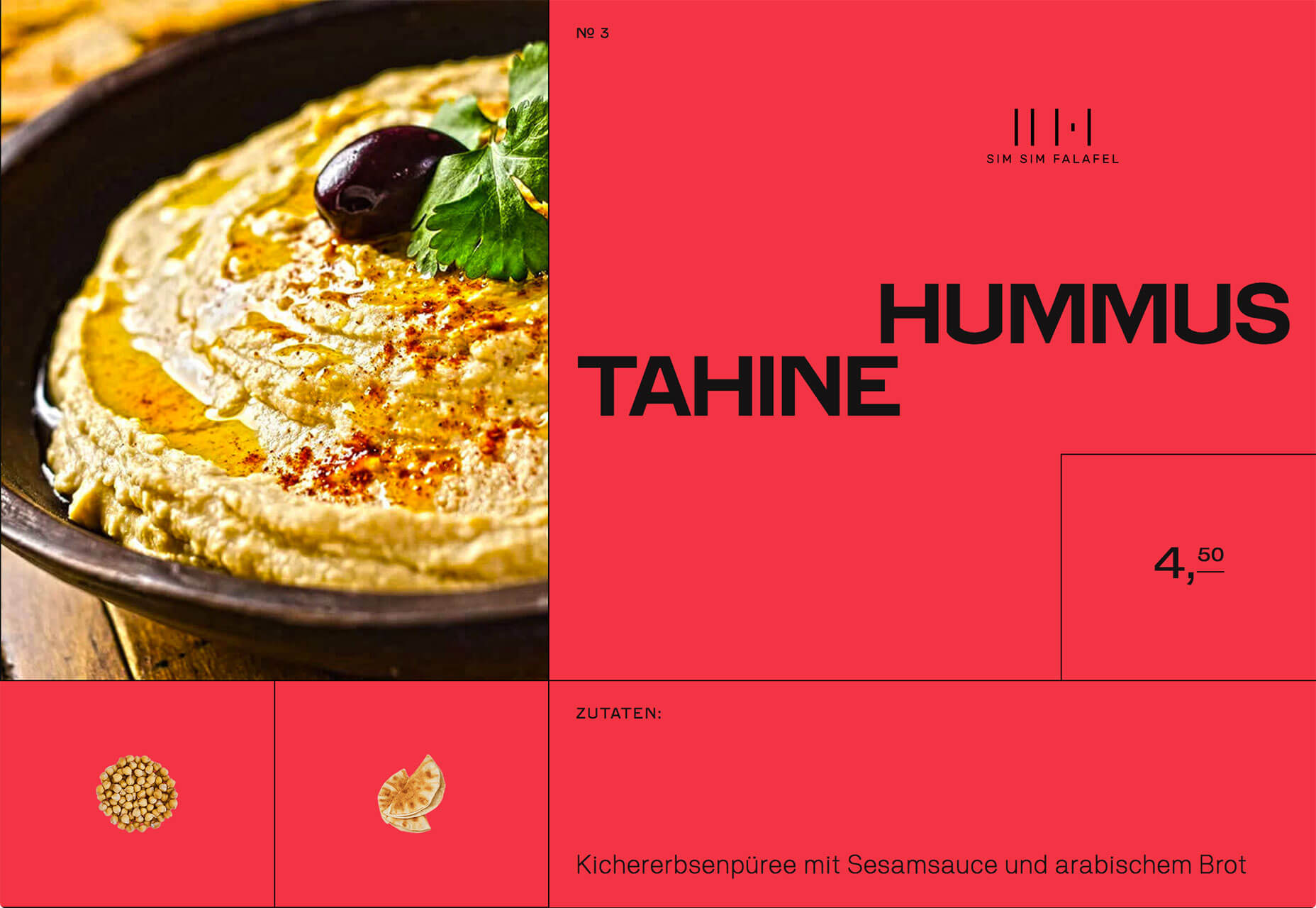
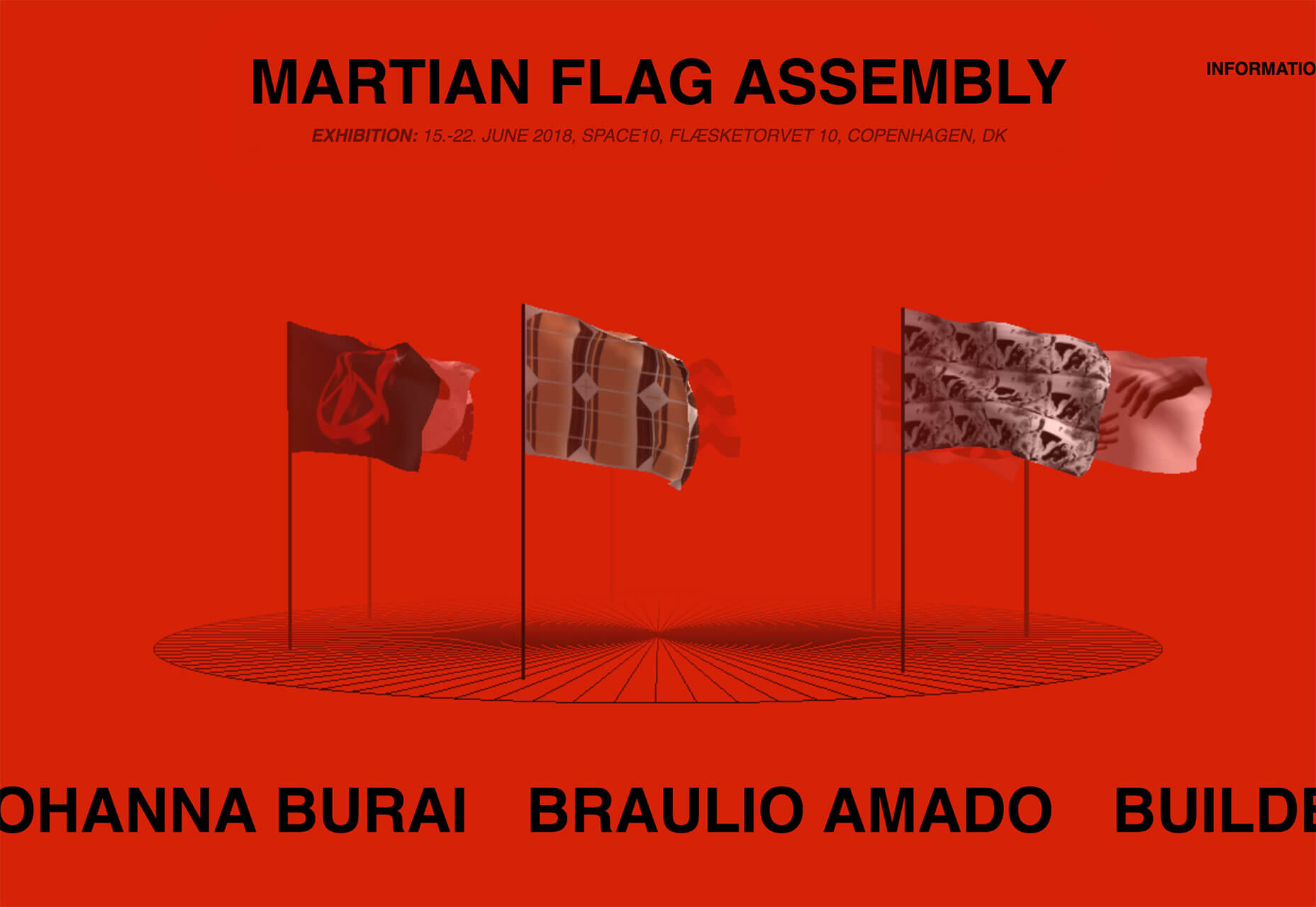
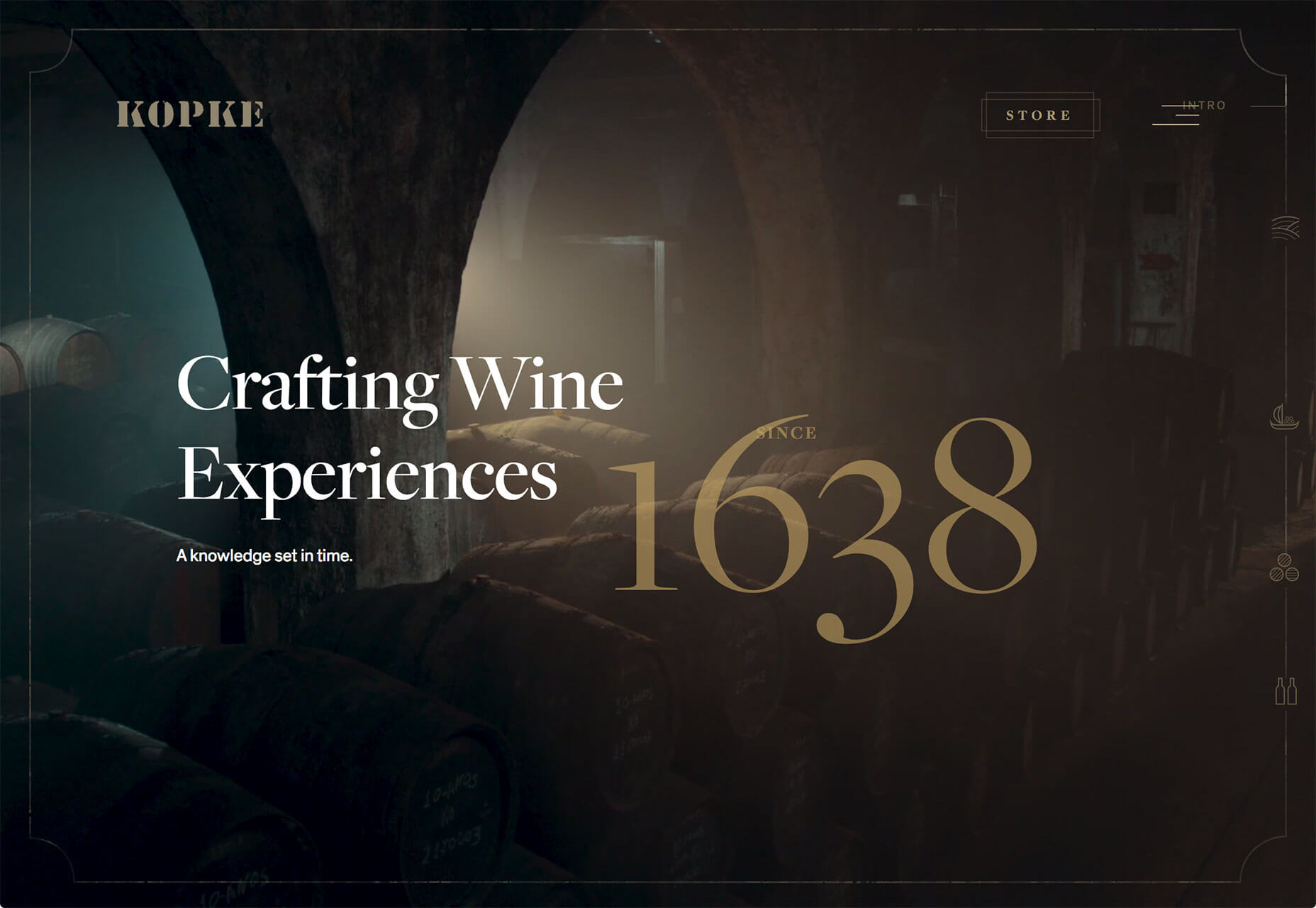
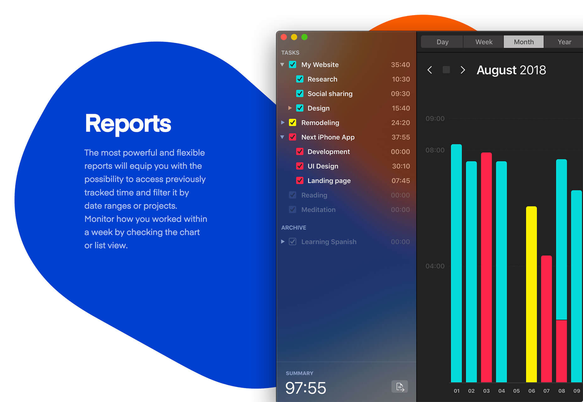
Welcome to our roundup of the best websites launched (or relaunched with interesting new updates) in the last month.

Traditionally November is a time of last-minute launches before the holiday season gets into full swing, and the last four weeks are no exception. There’re dozens of great ecommerce stores just launched—we’ve included a few of our favorites—and more than a few studios have updated portfolios so they can hit the ground running in 2019.

The color red is huge right now, and typography seems to becoming a little braver than it has been in throughout 2018. Enjoy!

Red Clay

I defy anyone to name a foodstuff that isn’t improved by the addition of hot sauce. Red Clay’s hot sauces hail from the South, and the great food photography on its site, combined with brand artwork, and some creative typography really sells them.

Julie Cristobal

Julie Cristobal is a Paris-based fashion stylist. Her simple site is brought to life with sophisticated animation, and a color palette that reflects the shoots she’s worked on. The seamless link to the next project at the bottom each project is exceptional.

Denver & Liely

With Christmas just around the corner, it’s the perfect time to think about a seasonal tipple. Whatever your poison of choice, drinking from a classy glass will make all the difference. Denver & Liely’s split-screen site, showcases their exceptional glassware.

Eduardo Nunes

The portfolio of Eduardo Nunes opens conventionally enough, with a statement about who he is, with links to his work. Where the site really excels is in the frank, and confessional case studies. This could be the perfect designer portfolio.

Forged by Meta

Meta is a workstation manufactured for use by tattoo artists. Personal recommendations are important to them, so the main section of their homepage is divided into thumbnails linking to testimonial videos. It’s an original and effective approach.

Baunfire

Baunfire is a design agency pitching itself to Silicon Valley. As part of the push, it’s published this excellent microsite, with fun animations, and some well-argued text, explaining exactly what design’s role, in places like Silicon Valley, should be.

Bitmap Typographer

Bitmap Typographer is an minimal site that allows you to design your very own bitmap font. Click on the letter to be designed and click the pixels on the grid to design your own pixel-based alphabet. Once you’ve designed it, type with it to check it out.

Hannes Reeh

Hannes Reeh takes a democratic approach to wine, believing that everyone should be able to enjoy the juice of the vine. This Austrian vineyard offers some characterful wine, at prices anyone can afford, and its modern attitude is embodied by the modern site.

Madina Visconti

Madina Visconti’s site opens with a bi-directional scroll, a design pattern that’s becoming increasingly familiar to us. Where the site breaks new ground is in rejecting the usual stark white minimalism in favor of a range of soft greens that add extra beauty to the precious metals on display.

Daniel Spatzek

Daniel Spatzek’s portfolio features an incredible typographic effect, as the titles of each of his projects are bisected by the vertical grid he’s used to divide the page. It just goes to show that an original idea, well executed, can elevate a site beyond its competitors.

Saint Kate of Milwaukee

Saint Kate is an arts hotel, opening in the often under-rated city of Milwaukee, in Spring 2019. The site utilizes bold color and beautiful typography to attract creatives, and travelers, selling the idea to the community before the product is ready to be seen.

Diane Bonheur

Big in Japan, Diane Bonheur pitches itself to an international clientele as the point at which organic meets sexy. The biggest selling point of the site is the amazing way the content animates in as you scroll, without ever feeling gimmicky.

Detective Moustachio

Detective Moustachio is an additive platform game with a plot to keep you tapping. It’s been some time since we’ve seen a truly addictive HTML5 game, but Detective Moustachio certainly steps up to the plate with buzzsaws, bottomless pits, and killer robots.

Jacquemus

Jacquemus is a fashion label with a refined taste. The muted colors of the collection are repeated in the topes, and tans of its site. The shop especially does an incredible job of echoing next season’s products. A highly refined look.

Human Forward

This site is a fun, interactive, animated story for in-house staff to experience “Human Forward” the new brand promise from Randstad. What’s fascinating, is that because it targets a specific demographic, the designers have been able to release a mobile-only experience.

Sim Sim Falafel

Among the numerous benefits immigration has brought to Germany, is the high-standard of North African quisine. Sim Sim Falafel uses primary colors to tempt us into sampling their delicacies. The hummus tahine looks particularly delicious.

Martian Flag Assembly

Interest in Mars has grown in the last decade; according to the Martian Flag Assembly site we’ll be setting foot on the red planet within the next ten years. This site, for a Copenhagen exhibition of proposed flags to be planted on Mars, features some incredible coded animation.

Kopke

With Winter in the Northern hemisphere taking hold, there’s little better than a good port in front of a roaring fire. Kopke is the world’s oldest port house, and this site’s interactive video tells the story of the prestigious brand.

In Praise of Shadows

One of the fascinating aspects of Japan, is the culture’s ability to look at things from a slightly different perspective to Western eyes. In Praise of Shadows is artist Sai Yamazaki’s ode, not to the beauty of light, but to the beauty of its absence.

Timepal

Embracing the colored-blob trend with vigor is Timepal, a Mac app that makes the simple task of time-keeping, and makes it simpler. The bold colors, and abstract shapes, create a sense of simplicity that is perfect for this comprehensive tool.

Add Realistic Chalk and Sketch Lettering Effects with Sketch’it – only $5!

Source

from Webdesigner Depot https://www.webdesignerdepot.com/2018/12/20-freshest-web-designs-december-2018/

Sunday, 2 December 2018

Popular Design News of the Week: November 26, 2018 – December 2, 2018

Every week users submit a lot of interesting stuff on our sister site Webdesigner News, highlighting great content from around the web that can be of interest to web designers. 

The best way to keep track of all the great stories and news being posted is simply to check out the Webdesigner News site, however, in case you missed some here’s a quick and useful compilation of the most popular designer news that we curated from the past week.

Note that this is only a very small selection of the links that were posted, so don’t miss out and subscribe to our newsletter and follow the site daily for all the news.

Advent of Code 2018


How to Create an Amazing Email Signature


10 UX Trends at Google


Design Trends from Cyber Monday 2018


What if Amazon.com Actually… is a Horrible Website?


Brutalism’s Comeback: Web Design and the Art Movement


Hue – Free Website and App Color Palettes


5 Key Phases to the User Experience Design Process


Major Sites Running Unauthenticated JavaScript on their Payment Pages


Sblack


Progressive Web Apps the Future of Mobile Web


We are Google Employees. Google Must Drop Dragonfly


A Statement About Facebook and Color of Change


New Logo and Identity for the British Academy


The Headspace App Achieves Design Zen


How to Earn a Living as a Freelance Designer


Bad Excuses for not Using TypeScript


Is PHP Dead? No! At Least not According to PHP Usage Statistics


OPTICIAN SANS a Free Font Based on Optical Eye Charts and Optotypes


Why Good Designers Can Never do their Best Work


Who will Fix Facebook?


Microsoft is Worth as Much as Apple. How Did that Happen?


Why do Laptop Makers Have Such Terrible Websites


The Problem with Invisible Branding


How to Balance Full-time Work with Creative Projects


Want more? No problem! Keep track of top design news from around the web with Webdesigner News.

Add Realistic Chalk and Sketch Lettering Effects with Sketch’it – only $5!

Source

from Webdesigner Depot https://www.webdesignerdepot.com/2018/12/popular-design-news-of-the-week-november-26-2018-december-2-2018/