Wednesday, 26 April 2017

7 Steps to a Flawless Design Review

The design review can be one of the most stressful milestones in any website project. While feedback is a valuable part of the overall process, sometimes the process of getting there is complicated and unwieldy.

Facilitating a flawless design review takes commitment on the part of the primary designer and team participating in the review. You, the designer, can help establish a set of ground rules and process to help make each design review more valuable for everyone at the table, resulting in a better design project.

1. Figure Out the Logistics

There’s a time and place for design reviews. Some teams plan them on a schedule with the rest of the project to catch up on milestones, while others meet every month like clockwork. While the timing of your reviews may vary, it is a good idea to build them into the project timeline.

The designer always needs to be at the design review (if there are multiple designers working on the project, the lead designer should be there at a minimum). The lead designer should be the point person for the review and run the meeting. The group should not be too large; think five to eight people to keep the conversation manageable. Everyone involved in the discussion should have some understanding of the project, but should be somewhat independent as well to provide the most broad spectrum of understanding.

Participants may include the developer, client, sales team member, company president or CEO, marketing or branding team member, designers not working on the project or anyone else who might touch the project or company in any way.

Make sure to find a space that’s comfortable for everyone and provide a place to go over the visuals. You’ll probably need a room with a large screen and internet connection. Set a time for the meeting and create an agenda in advance so that everyone stays on task.

2. Send Invitations and Set Ground Rules

Try to remind reviewers about the meeting well in advance. Even if the dates and times are outlined in the project file, send a reminder at least a week in advance of the meeting.

Make sure to include everything a reviewer would need to come to the meeting ready to talk.

  • Time and location (or call in number if the meeting is virtual)
  • Outline of project goals and constraints
  • Specific goal of this review meeting
  • Project timeline (and where you are in the process)
  • Materials to bring (such as phones or tablets to view the design)

3. Prepare for the Meeting

The lead designer or art director should be running the design review. Prepare accordingly, especially if this kind of event is intimidating. (The more you go through this exercise, the easier it gets.)

Be ready to facilitate the conversation. Plan to ask questions that help get targeted results:

  • Do the color and typography palette reflect the tone of the content?
  • Are there missing elements in the design?
  • Does it work as anticipated?
  • Did you stumble on any parts of the design?
  • What things did you like?
  • What things did you not like?

Anticipate questions and concerns that might come up so that the discussion can keep moving forward. Know that reviewers might be thinking ahead of where the design is in its current iteration and try to keep the discussion focused.

Be prepared to stop the meeting if the group isn’t ready to discuss the design. Sadly, this happens all too much and just holding a meeting because it is on the calendar doesn’t benefit anyone.

4. Check Your Feelings at the Door

This might be the most important – and most difficult – step: You have to check your feelings at the door. Designers tend to be passionate about projects, but this is not the time or place for it. You need to step back and listen to feedback.

Not every bit of feedback will be useful. There’s probably a lot of it that actually won’t be useful at all. It’s ok to disregard some ideas from the design review. What you really want to look for are recurring themes in the feedback that might indicate a potential stumbling point in the design.

Remember: You are not the design. A design that is not liked is not a personal attack or reflection.

5. Start the Review with a Recap

Breathe. Walk in the room (or start the video chat) with confidence.

Start the design review with a recap:

  • Outline design goals
  • Explain the problems that needed to be solved
  • Describe the timeline and made milestones
  • Explain what happens next
  • Walk through the design and explain how it meets goals and solves problems

Once you break the ice, open the floor for feedback. Try not to let any one person dominate the conversation and have a process for allowing everyone to speak if necessary. Allow the conversation to continue until there’s about 10 minutes left for the meeting or comments come to a natural conclusion. 

6. Speak Honestly and Respectfully

Reviewers will speak open and honestly if you do the same thing. The way you act will set the tone for the entire review.

Make a point to take notes and ask questions as well. This shows that group that you care what they think. Pay particular attention to areas where there is a lot of people who not the same issue or areas where there’s a lot of discussion. There are places design flaws often lurk.

As the meeting winds down, recap the feedback you found most useful and invite the team to provide further feedback or ask questions within a certain time frame. Don’t commit to changes during the design review; you never know what will and won’t work until you get back to working on the project.

7. Follow Up After the Review

When you have a quiet minute, collect notes from the design review and follow up with a thank you to the team and next steps. Remind the team when the next milestone will hit and what they should expect to see at that time.

Conclusion

The design review process does not have to be painful. Practice will make these meetings more useful and effective, so don’t keep pushing them off.

Start with a plan of action and goals. Explain them clearly and respect and respond to feedback. You’ll become a better designer for it.

Creative Commons images are used in this article. You can find them at Unsplash.

Create Animated Videos and Whiteboard Animations with Animatron – 87% off!

Source

from Webdesigner Depot https://www.webdesignerdepot.com/2017/04/7-steps-to-a-flawless-design-review/


Tuesday, 25 April 2017

Browser Watch, April 2017

Every month, we scour the Internet far and wide to bring web designers the latest and most relevant news stories about browsers. Here’s another edition of Browser Watch, running down everything from the interesting to the surprising in the world of browsers and everything related to it.

Google Chrome Is The Most Hacker-Proof Browser Available

In addition to speed and performance, Google Chrome has also developed a reputation for security. That’s now being confirmed after the 10th edition of Pwn2Own, which is a computer-hacking contest held annually. The aim of this contest is for hackers to aggressively attack hardware and software to discover and exploit previously unknown vulnerabilities. Chrome came out as the most impregnable—only being attacked once, but not within the allotted time limit. The worst performing browser? Microsoft’s Edge browser, which was successfully attacked five times.

Chrome 57 Marks Beginning of More Efficient Power Usage

In another boon for Chrome, its latest update will finally take it easier on your computer’s CPU. According to BGR, Chrome 57 will now extend battery life by minimizing the power impact from factors that users can’t even see. This is a reference to Chrome’s background tabs. Users are familiar with the browser’s tendency to eat up resources when they have many tabs open in the background. Now, thanks to 57’s individual background tab throttling feature, there’ll be 25% fewer busy tabs that are going to be running the background.

Google and Symantec May Go to War

Everyone has probably seen security-software company Symantec’s certifications on various websites, which many users take as the gospel truth of a site’s security. However, Google has begun taking Symantec to task for its alleged failure to properly investigate whether a domain is safe for browsing before it issues its web certificates of security. According to Android Headlines, Google might soon penalize Symantec by drastically reducing the level of trust that its Chrome browser attributes by default to Symantec certificates.

Safari Technology Preview 27 Release Features New Reload Page

Apple released the 27th Safari Technology Preview update, the highlight of which is a new Reload Page From Origin feature, according to MacRumors. This option allows users to reload a page without having to rely on cached resources. Another big browser change is the elimination of the Disable Caches option from the browser’s Development menu. Rounding out the update is a whole series of fixes and improvements to Web API, JavaScript, Web Inspector, CSS, WebCrypto, Accessibility and Rendering. Safari Technology Preview is Apple’s experimental browser that tests new features that might one day make it into Safari’s future release updates.

Apple Shows off Demos of its Proposed WebGPU Browser Engine

Earlier in the year, Apple talked about a new GPU that would strive toward more powerful Internet graphics. Now, Apple has released a few demos to show developers what its new standard can do, according to 9 to 5 Mac. Developers have the opportunity to play around with Apple’s new WebGPU demos by going to Apple’s WebKit webpage. Once there, they’ll have the chance to see four new demos in total, but they’ll have to use Safari Technology Preview, as well as activate WebGPU from the Developer menu.

New Firefox User Interface Called Photon in the Works

For Firefox’s upcoming 57 release, there’s a new user interface that the company’s working on. Named Photon, its mockup designs feature rectangular tabs that will take the place of the current round ones. But that’s not all. Users can also expect a new tab page and a new and centered address bar. Overall, this is the first major overhaul of Firefox’s UI in a number of years, since 2014, to be exact.

Firefox 52 Adds a Whole Roster of New Features

Recently, Firefox debuted Firefox 52, and it was a mega update that included a huge collection of new additions, according to TechSpot. The biggest change in the pack is WebAssembly, which allows almost native performance in apps and games, something that should be welcome for gamers on any browser. Another big improvement is the automatic identification and activation of public, Wi-Fi login services at airports and hotels. Finally, Netscape Plugin API plugins have been disabled while security also gets a big boost with a warning to users who are on webpages that are not using HTTPS during sign-in.

Downloads of Opera More Than Double After Congressional Internet Privacy Vote, Allegedly

When the House of Representatives joined the Senate to reverse privacy rules the Federal Communications Commission passed last year (but hadn’t yet taken effect), the Opera browser seems to have been the biggest winner. The company reported that, in the immediate aftermath of the vote, new U.S. users of the VPN-equipped browser more than doubled as a reflex action to privacy fears, according to Computerworld. However, statistically, third-party metrics, such as those provided by analytics company StatCounter, do not verify Opera’s claim of more users flocking to its browser.

Microsoft Edge Actually Records an Uptick in its Users

In something of a surprise, Microsoft Edge, the company’s latest browser, saw a bit of an uptick in its user share. After the browser’s user numbers fell to humiliating lows last year, the browser rebounded slightly with 0.06% more users this year, according to figures provided by NetMarketShare, a statistics company. As a result, currently 5.61% of all browser users depend on Edge to access the Internet. Still, this is far cry from the high of 16% of all worldwide browser activity Edge accounted for when Windows 10 recently rolled out since the browser was the default in that release.

There you have it! Now you know all you need to know about the latest and most important developments in browser news over the past month. Join us again next month for another roundup of the most relevant browser stories for designers and developers alike.

Reclaim Your Productivity with Focus for Mac – only $9.99!

Source

from Webdesigner Depot https://www.webdesignerdepot.com/2017/04/browser-watch-april-2017/

Monday, 24 April 2017

5 Ways Voice UI Turns Your SEO on its Head

Once upon a time, the most Siri had to deal with was a few offensive remarks or sexually explicit requests. We probably all did it at least once.

But in just a few short years, voice search has exploded to become a serious contender against traditional, text-based search.

Microsoft’s Cortana has over 100 million monthly users, 40% of adults talk to their phones every day, and it’s predicted that half of all searches will be done vocally by 2020.

If that sounds like it’s more than just a passing fad, that’s because it is.

So if you want to make sure you and your website aren’t missing out, you need to start adapting your SEO strategies now.

In most cases, it’s unlikely you’ll need a complete SEO overhaul. But there are still some significant changes you can start to make today to ensure that your site is optimised for voice search.

1. Target Longer-Tail Keywords

Most people feel more comfortable speaking than they do typing—especially when trying to type on a mobile device.

That means that voice searches are going to be more verbose. And if you want your site to get found first, you’ll need to focus on longer keyword phrases.

Plenty of searchers are either impatient, on the move, or multi-tasking. When they’re using a keyboard, they’ll be searching for the terms that use the fewest number of words to quickly get them fairly close to what they need—“Pizza New York”, or “Car Repairs”, for example.

with voice searches, [users] can rattle off extensive and detailed requests without testing their thumbs, eyes or patience.

But with voice searches, they can rattle off extensive and detailed requests without testing their thumbs, eyes or patience.

They might ask “Where can I get a late-night pizza with free delivery to Long Beach?” or “Where can I get my transmission checked in Chicago for under $50?”.

These longer searches don’t just help visitors connect with websites that are the closest match to their specific needs. They also bring your website qualified prospects that are much closer to their buying decision—and that means you need to make sure the keywords you’re targeting match up to these highly valuable searches.

2. Use Conversational Language

Be honest: have you ever really searched for something like “automotive maintenance” on Google?

Or was it something more like “auto repairs” or “car mechanic”?

Speaking in the language of your customers has been good SEO practice for a long time. And with the rise of voice searches, it’s only going to become more important.

Of course, “automotive maintenance” is a ludicrous example of an everyday search term.

But there’s still a huge difference between the things people write and the things they say out loud.

But there’s still a huge difference between the things people write and the things they say out loud.

If you’re looking for software that can help you manage your projects and stay on top of your deadlines, it’s plausible that you would type something like “organisation apps” into Google. And almost all of the search results look helpful and relevant:

But the words that come out of our mouths aren’t always so precise and succinct.

If you’re navigating the rush-hour freeway on an empty stomach before your morning coffee, your brain might not be able to do any better than “app that helps you do more stuff”. And those results look decidedly less helpful.

The solution? Create content for your website that uses the same natural language that your target audience would say out loud.

Don’t fill your web page with content that talks about “achieving higher levels of success”—tell them that it helps them to “do more stuff”, “get more done”, or “waste less time”.

3. Build Content Around Answering Questions

How do people in real-world situations get access to the information they need by using only their voices?

With questions, of course.

It’s likely that a huge number of voice searches are going to be in the format of a question—it’s just a natural fit for the medium.

That means you need your website content to answer those questions directly, accurately and comprehensively.

The simplest way to do this without affecting the experience of traditional searchers is to set up a dedicated FAQ page, posing the most likely questions and giving useful responses.

And the simplest way to come up with the most likely questions is to use the questions that are already being asked.

With tools like Answerthepublic or StoryBase, you can enter keywords relevant to your website and see the most common questions asked, broken down by the type of question (who, what, where) and the supporting prepositions (to, for, near, with).

Armed with this data, you can build the kind of helpful FAQ that brings your website closer to the top of the search results when your potential visitors need information.

an understanding of the types of questions being asked can help you to draw in the right people at the right time.

On top of that, an understanding of the types of questions being asked can help you to draw in the right people at the right time.

According to Google, there are four key micro-moments in a consumer’s journey. The types of questions they’re asking at different times can help you to understand the stage that they’re at—and give you insights into how ought to be responding.

People asking “What’s the difference between A and B?” are likely to be casual window-shoppers or curious researchers, and ought to be directed to your helpful informational and educational pages.

But those asking questions like “What’s the cheapest A?” or “Where can I find the best B?” are much more likely to be on the brink of making a purchase—and those are the kinds of questions you want to target with your PPC adverts to lead them to a landing page to close the deal.

4. Make the Most of Your Local Listings

According to research, mobile voice searches are three times more likely to ask for local information than standard searches.

People aren’t just making general enquiries when they use voice search. They’re asking for instant solutions to their pressing needs—and that means they’re ready to commit.

To make the most of these quick-sale customers, you need a site that’s optimised for local searches. So make sure you:

  • Register your website with the relevant directories (like Google My Business) and keep your details up to date. If you change your opening hours, prices, or phone number, go back to your older listings and correct them.
  • Make your online reviews shine. Reviews are critical for local searches in Google—so encourage your customers to leave reviews and do your best to respond to any negative ones.
  • Include Schema markup code to help search engines recognise your important local information, such as addresses or opening hours.

If you’re not sure where to begin, you can take a few local-friendly tips directly from Google, or try out their Structured Data Markup Helper.

5. Get your website mobile-ready

While there are plenty of desktop users who are searching vocally, you can expect a massive portion of your potential visitors to be using voice search through their mobile devices.

And if your site can’t provide a good experience for those mobile users, you can expect a massive portion of your visitors to head straight back to Google to find one of your competitors.

So how do make your site more friendly to mobile users? Here are a few tips to get you started:

  • Analyse your site’s mobile usability with a tool like Google’s Mobile-Friendly Tester. It’ll give you a screenshot of how your site looks on a mobile device, as well as highlighting any usability problems—like small fonts or the use of Flash.
  • Trim the fat for a faster user experience. More than half of mobile users will abandon their visit if your site takes longer than 3 seconds to load – so keep the number of images and their file sizes to a minimum.
  • Keep your content brief to match mobile attention spans. Use the lowest number of words you need for an effective headline, and use the lowest number of paragraphs and sentences you need to get your message across.
  • Use large icons, buttons and links. Don’t make your users zoom in for every click – and don’t punish a clumsy visitor who’s ready to convert.

To sum up…

Voice search is huge. And it’s only going to get bigger.

Just like any other kind of SEO, you’ll need to keep up with the latest developments and updates released by the search engines, and continually test and tweak your site if you want to see it climb up the rankings.

We don’t type how we talk, and you need your content to reflect that

But in the meantime, it’s worth starting to put the following into effect:

  • Go for the longer-tail keywords. Vocal searchers are more likely to make detailed requests, and they’re more likely to be close to a sale.
  • Speak in your customers’ language. We don’t type how we talk, and you need your content to reflect that.
  • Focus on answering questions. If that’s the way people are going to search, that’s the best way to give them the information they need.
  • Be there at a time of urgency. Voice searchers want quick answers and nearby solutions—so make sure you appear as a local answer to their problems.
  • Give them the experience they want on the platform they choose. When so many people are searching by voice through their mobile devices, you need to be able to capture them with a painless journey—from the desire they express to the action that satisfies it.
230+ Professional and Customizable Mockups – only $14

Source

from Webdesigner Depot https://www.webdesignerdepot.com/2017/04/5-ways-voice-ui-turns-your-seo-on-its-head/

Sunday, 23 April 2017

Popular Design News of the Week: April 17, 2017 – April 23, 2017

Every week users submit a lot of interesting stuff on our sister site Webdesigner News, highlighting great content from around the web that can be of interest to web designers. 

The best way to keep track of all the great stories and news being posted is simply to check out the Webdesigner News site, however, in case you missed some here’s a quick and useful compilation of the most popular designer news that we curated from the past week.

Note that this is only a very small selection of the links that were posted, so don’t miss out and subscribe to our newsletter and follow the site daily for all the news.

How Much Should a New Website Cost in 2017?


The Top 10 Google Webfonts for Strong Header Text


20 Split Screen Website Designs for your Inspiration


The New Google Earth


SEO Hacks for Developers


10 Inspirational & Insightful TED Talks for Web Designers


20 Animated Loaders


YouTube has a Secret ‘Dark Mode’ – This is How You Activate it


Microsoft To-Do – An Intelligent Task Management App


How We Write Proposals in my Design Studio


Zuck.js – JavaScript Library that Lets You Add Stories Everywhere


Why Performance is the Best Way to Improve the User Experience


Google Digital Academy Branding


Bonsai: A Simple, Fully Integrated Time Tracker for Freelancers


Smallchat: A Free Slack Integration for Chatting with Website Visitors


Design and Technology: A Collection of Articles and Ideas from Google Design


10 Brilliant Uses of 3D in Graphic Design


Facebook Owns Four Out of the Five Most Downloaded Apps Worldwide


Design Patterns & Sources


Hey Instagram, Don’t Tell Me When to Freeze my Eggs


An Introduction to Atomic Design for Web Designers


From Graphic Designer to Product Designer


How to Retouch Video in Photoshop


How to Run Meetings that Don’t Suck


Focus on What You do Best and Outsource the Rest


Want more? No problem! Keep track of top design news from around the web with Webdesigner News.

LAST DAY: Spring Font Bundle – 35+ Beautiful Fonts from 6 Designers – only $24!

Source

from Webdesigner Depot https://www.webdesignerdepot.com/2017/04/popular-design-news-of-the-week-april-17-2017-april-23-2017/

Saturday, 22 April 2017

Comics of the Week #386

Every week we feature a set of comics created exclusively for WDD.
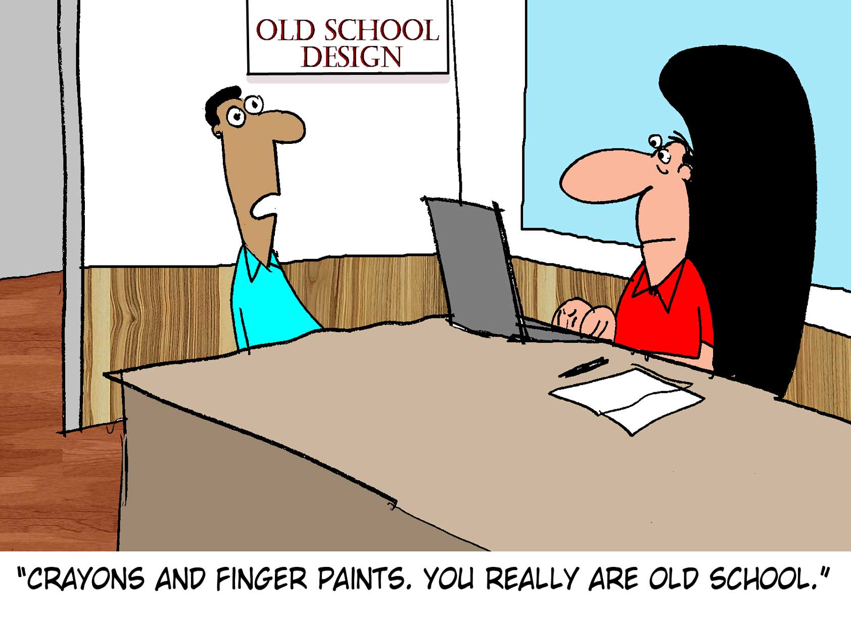
The content revolves around web design, blogging and funny situations that we encounter in our daily lives as designers.

These great cartoons are created by Jerry King, an award-winning cartoonist who’s one of the most published, prolific and versatile cartoonists in the world today.

So for a few moments, take a break from your daily routine, have a laugh and enjoy these funny cartoons.

Feel free to leave your comments and suggestions below as well as any related stories of your own…

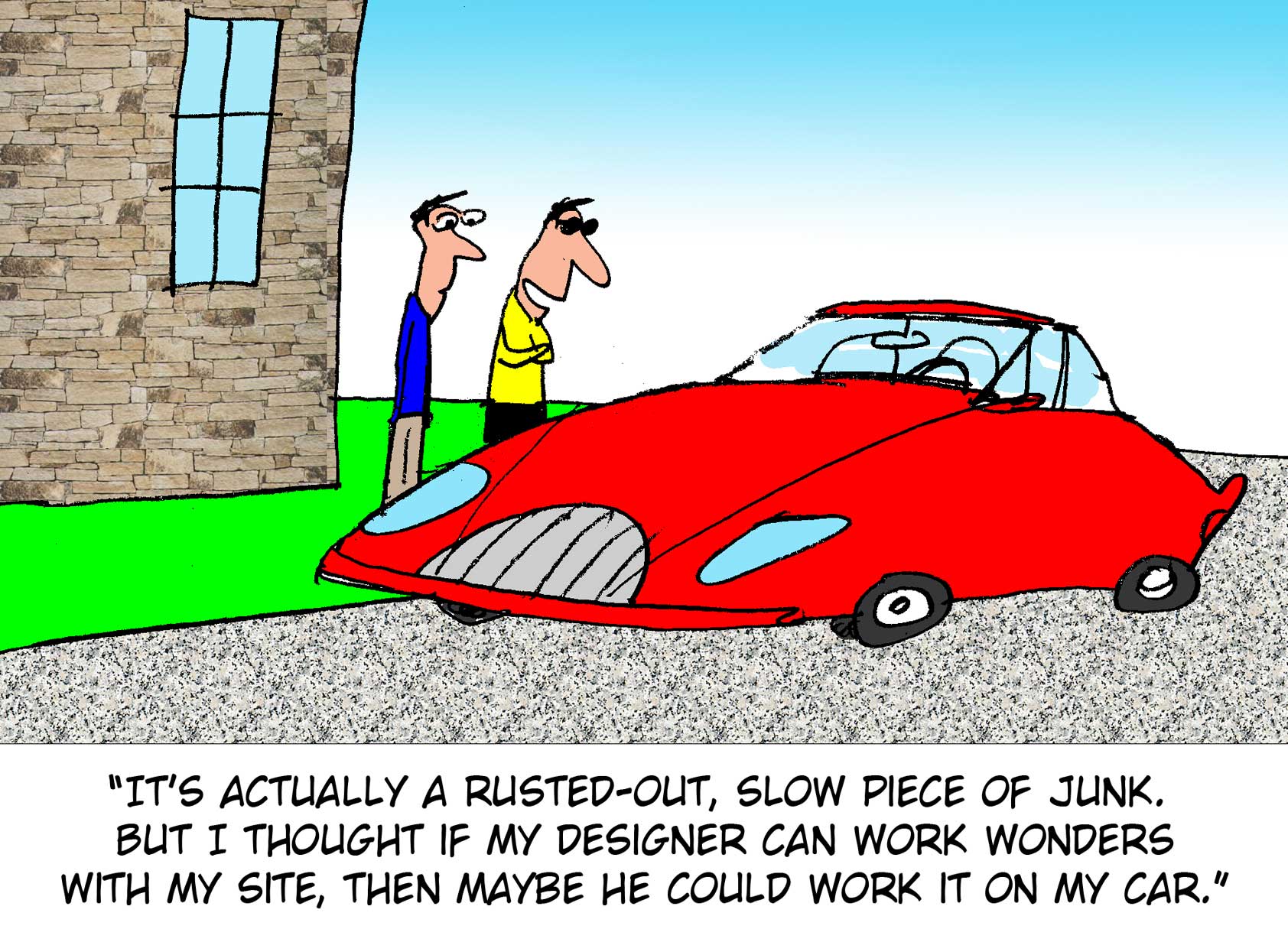
Car in disguise

Old school design


Stuffy designer

Can you relate to these situations? Please share your funny stories and comments below…

Pattern Bundle: 56 Beautiful Seamless Patterns – only $9!

Source

from Webdesigner Depot https://www.webdesignerdepot.com/2017/04/comics-of-the-week-386/

Friday, 21 April 2017

15 Essential Free Icon Sets

When it comes to web design, and especially UI design, icons play a crucial role. When used properly, icons can enhance almost any website design by adding visual interest and appeal. However, creating icons from scratch every time you start a new project is both time-consuming and impractical.

Luckily, the web is full of great resources and you can find plenty of high-quality icons available for free. Whether you’re creating a business website or need icons for the backend of your application, there is no shortage of icons.

But, as busy as designers can get, sifting through all the icon sets to find the perfect one for your project can be just as time-consuming as creating your own. That’s why we compiled the best free icon sets so you can quickly find a few of them that you can put to good use in your upcoming projects, both for personal and client use.

1. Free Minimal Icon Pack

This free minimal icon pack contains 1800 icons in SVG, EPS, PSD, AI, SKETCH, and PNG formats. The icon set comes in both black and white versions and can be used in both personal and commercial projects.

2. Free Flat Icons

The icon set from Icons8 comes with more than 40000 icons that cover several categories; from business and office settings to people, food, and social media icons. The icons are designed to mimic the look of a specific operating system and you can download them in Windows, iOS, and Android versions. All icons can be recolored and there are even apps for Windows and Mac so you can use them in applications such as Photoshop.

3. Eldorado + Stroke 3132 Mini Free Icons

Eldorado + Stroke 3132 mini is a free version of Eldorado + Eldorado Stroke icons and packs a grand total of 3132 icons in PNG format. The icons are mono-colored and include categories such as Basic, Culture, Devices, Finance, and more.

4. Iconmonstr

Iconmonstr’s collection of icons has 3600+ icons. They are a great fit if your project needs icons in black or white. You can find a variety of icons for a business site, interface design, multimedia, social media icons, and much more.

5. 48 Free Flat Designer Icons

This free set of 48 office, social, and travel icons will certainly come in handy for your next project involving a travel or a corporate website. The icons are available in AI and PNG format and come in a bright monochrome coral and multicolor versions.

6. Social Media Icons Pack

Available from FontFabric, the set contains 74 social media icons which guarantees you will never run out of icons for your projects. The icons are available as an icon font so simply download them and use the corresponding key on your keyboard to insert them in your designs.

7. 210 Vector Minicons

Try out this vector icon pack the next time you start a web design project or need to come up with a wireframe. The minicons are available in vector format, feature a clean line design, and are perfectly scalable.

8. 30 Isometric Icon Set

If your project revolves around the accounting industry, consider this set of 30 isometric icons featuring charts, graphs, folders, and more. The icons come in AI, EPS, and PNG format and can be completely edited to your liking in Adobe Illustrator.

9. Retro Icons

Some say retro style is making a comeback so for all those projects that need a retro touch, this retro icon set will come in handy. The set contains 120 icons in vector format.

10. Metro UI Icon Set

Fans of the Metro style need to check out the Metro UI Icon set which comes with more than 700 icons in two sizes. The icons are available in PNG as well as the .ICO format.

11. 40 Design Icons

Another set of design icons in vector format, the set comes with 40 icons available in multiple formats which include AI, EPS, SVG, and PNG. This set would be perfect for a designer’s portfolio or for any artistic website. 

12. 83 Flat UX and E-Commerce Icons

The next time you’re working on an e-commerce site, these icons will allow you to add a touch of visual appeal. You can find icons for shops, signs, barcodes, currencies, and more. The set is available in several colors and in the same bundle you can find a download for flat UX icons. Both sets come in AI and EPS formats.

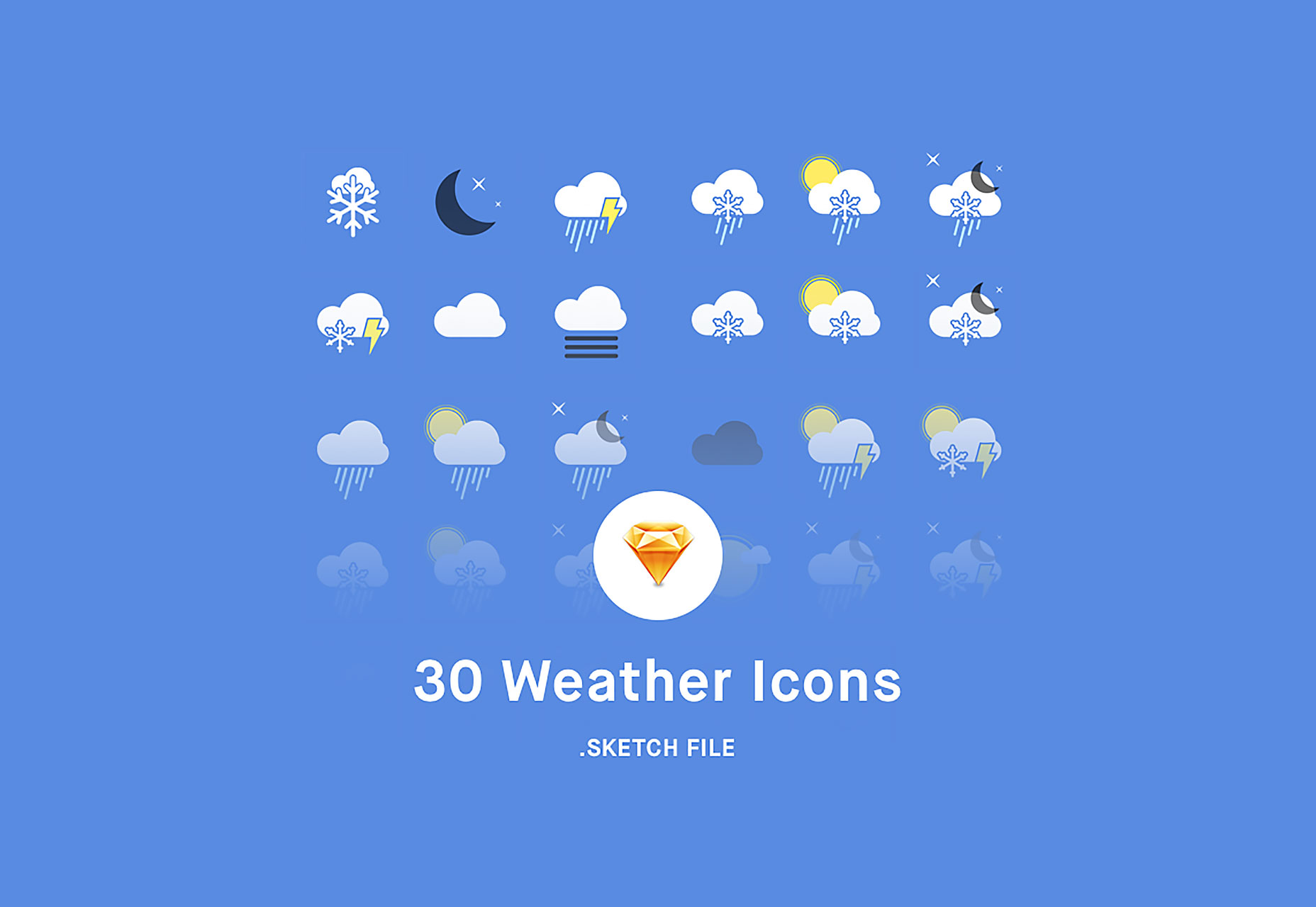
13. 30 Weather Icons

This weather icon set is a great choice for any weather app or a meteorological website. You can choose between 30 different icons which come in SKETCH and PNG format.

14. Earth and Space Icon Set

If you’ve ever needed icons that cover everything from earth to space, look no further than this pack. Created exclusively for Smashing Magazine, the set contains icons for satellites, planets, meteors, air balloons, and even strange sea creatures.

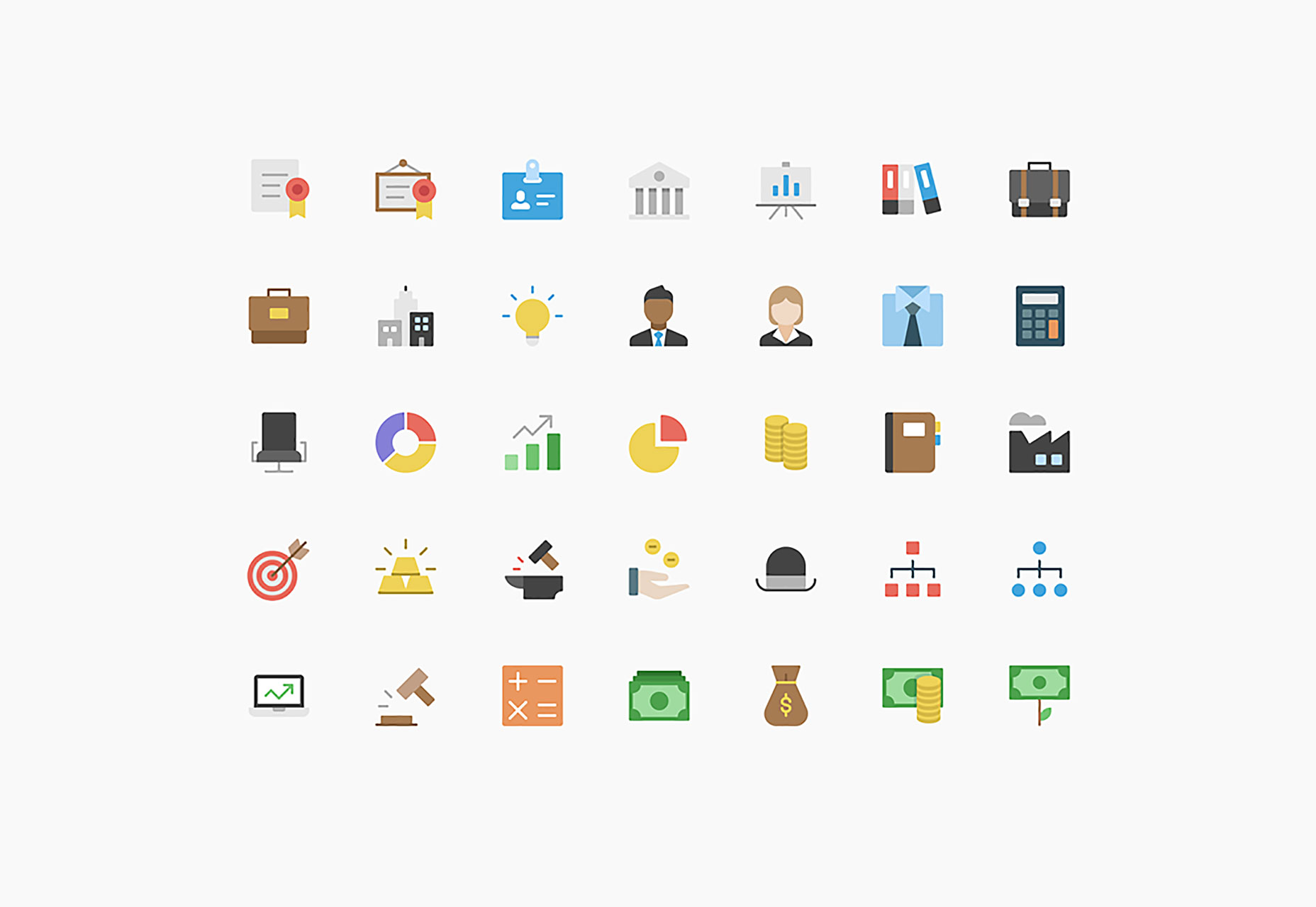
15. Nucleo Flat Business Icon Set

The last set on our list features 50 icons in a modern, flat style that will complement any corporate website. The icons are available in both AI and SVG format.

20 PowerPoint + 20 Keynote Templates (with 10,000+ Slides) – only $27!

Source

from Webdesigner Depot https://www.webdesignerdepot.com/2017/04/15-essential-free-icon-sets/