Friday, 23 March 2018

5 Best RSS Aggregator Plugins for WordPress

Regardless of what kind of WordPress website you’re running, chances are an RSS aggregator plugin can help you deliver more value through it.

RSS feeds give you the option to curate content from multiple sources and share it with your site’s readers. This way, you don’t have to worry about creating original content regularly or risk losing traffic to your blog because you don’t have enough content on it in the first place.

In this post, we’ll take a closer look at what an RSS aggregator is and what you can do with it. We’ll also run the rule over five of the best (free) RSS aggregator plugins for WordPress and list out their key features. So, by the time you’re done reading this post, you’ll hopefully have some new ideas about how you can use RSS aggregators on your website and you’ll equipped with a plugin or two to help you get started.

Let’s begin…

What Is an RSS Aggregator and What Can I Do With It?

Really Simple Syndication (RSS) is a type of web feed allows you to keep up with your favorite blog posts, articles, and online content in a standardized format on a single platform called an RSS reader. If you’ve ever used Flipboard, Feedly, or Google News on your smartphone to read news articles then you already know what RSS readers are and how they work.

For everyone else, an RSS aggregator is a tool that automatically checks the RSS feeds you’ve subscribed to for new content. When it finds new or updated content, it passes it to the device you have the RSS aggregator installed on. So, if you’re using Flipboard, you’ll get the content on your Flipboard app. And if you’re using a WordPress plugin, the content will automatically show up on your website.

The key benefit of RSS is that once you subscribe to your favorite websites’ RSS feeds, you won’t have to (manually) check all of them for new content ever again. Instead, every time something new is published, you’ll be able to view it on your RSS aggregator.

RSS aggregators can be installed to your mobile device (Flipboard), to your desktop computer (FeedDemon), or to your website.

But why would you want to install an RSS aggregator to your website? How can you use an RSS aggregator to deliver value to your site’s readers?

Here are a few different ways you can leverage RSS aggregators to deliver more value through your website:

  • Curated content: RSS aggregators allow you to automatically curate content from multiple sources and display them on your website. If you run a gaming website then you could have a section on your site that curates content from a number of high-quality gaming blogs.
  • Email newsletters: Creating original content for your weekly email newsletters can be pretty difficult – especially if you’re just starting out. With RSS aggregators, you can pull relevant articles from different websites that your readers would be interested in and send those out instead.
  • Job listings: With an RSS aggregator, you can create a job board that lists all of the available jobs in a particular niche (or multiple niches). The best part is that your job listings will refresh automatically so you can rest assured that your job board will always be up to date.

There are, of course, many other things you can do with RSS aggregators. It all depends on what type of site you’re running and what you’re trying to accomplish with it. But once you have it all set up, the possibilities are endless.

5 Best RSS Aggregator Plugins for WordPress

RSS aggregator plugins for WordPress offer a lot of variety in terms of functionality. All of the plugins listed below are easy to get started with and some of them even have a premium version (or premium add-ons) that you can purchase later on if you decide to take your content curation game to the next level.

Here, we’ll take a look at some of the best, free RSS aggregator plugins available in the WordPress Plugin Directory and highlight their standout features.

WP RSS Aggregator

WP RSS Aggregator lets you import, merge, and display RSS and Atom feeds on your WordPress website. The plugin is incredibly intuitive and easy to get started with. The core plugin is available for free and gives you the option to aggregate as many RSS feeds as you’d like from an unlimited number of sources.

Once you have the plugin all set up, you can begin displaying feed on your website using the RSS option in the WordPress text editor’s toolbar or by using shortcodes and parameters. In addition to this, you can configure the plugin’s settings to automatically link the title and source names of the imported posts and show/hide its author’s name, date, and source.

Key Features:

  • Lets you control the feed update process.
  • Configure the plugin to import feeds with unique titles only.
  • Limit the number of feed items stored.
  • Works with YouTube, Daily Motion, and Vimeo.

FeedWordPress

FeedWordPress lets you import both RSS and Atom feeds into your WordPress website as a series of special posts. The plugin is incredibly easy to use—all you have to do is enter the feed (or website URLs) of the sources you want to include and the plugin will take care of the rest.

The plugin was designed with flexibility in mind. For this reason, it offers a number of configuration options for feeds, posts, authors, and categories. What’s more is that it also lets you define how you’d like to cache the feed sources.

Key Features:

  • Lets you assign categories, tags, and meta data to imported posts.
  • Allows you to limit posts by date.
  • Lets you add multiple feed sources at a time.

RSS Includes Pages

RSS Includes Pages is slightly different than the rest of the plugins on this list in that it modifies your imported RSS feeds to include pages, not just posts. The key benefit of including pages in your RSS feed is that it’s a different post type and pages make up a good portion of a website’s content.

The plugin is compatible with other RSS feed plugins which means that you can use this plugin to supplement the content you import from other plugins. It’s important to note that the RSS Includes Pages plugin doesn’t create new feeds – it only modifies the existing ones by adding pages and custom post types to them.

Key Features:

  • Adds pages and custom post types to existing feeds.
  • Works with other RSS feed plugins.
  • Modifies RSS feeds to include pages.

RSS Post Importer

While the other plugins in this list import RSS feeds into your WordPress website and let you display them on the front-end, the RSS Post Importer plugin imports the posts as actual posts. What this means is that the feed items (imported posts) will be imported as standalone posts and show up in your Posts > All Posts screen.

The RSS Post Importer plugin lets you import as many full-text posts as you’d like from as many sources as you’d like. In addition to this, it automatically refreshes and checks for new content so you don’t have to do it manually.

Key Features:

  • Imports full-text RSS feeds automatically.
  • Lets you configure the number of posts and categories per feed.
  • Lets you assign authors to the imported posts.
  • Gives you the option to append HTML code/text to each post.

RSSImport

If you’re looking for a quick and easy way to get started with content curation in WordPress then RSSImport is the way to go. The RSSImport plugin makes it super easy to display imported feed items on your website. You can choose to display the posts using a widget, shortcode, or PHP code.

One of the best things about this plugin is that it’s efficient and focuses on making your imported feeds look good on your site’s front-end. There are a number of parameters that you can use with the shortcode option to get the imported content to look the way you want it to.

Key Features:

  • Intuitive, easy to use.
  • Lets you display imported feed items in a widget.
  • Gives you control over how the content looks on the front-end.

Conclusion

There are so many neat things you can do with a good RSS aggregator plugin from curating content to supplementing your existing content.

We looked at some of the best RSS aggregator plugins for WordPress and, hopefully, you’re in a good position now to take things further. We recommend trying them out on your own to see which one works best for what you’re trying to accomplish with your website.

Add Realistic Chalk and Sketch Lettering Effects with Sketch’it – only $5!

Source

from Webdesigner Depot https://www.webdesignerdepot.com/2018/03/5-best-rss-aggregator-plugins-for-wordpress/

NBC Unveils Ambitious Redesign

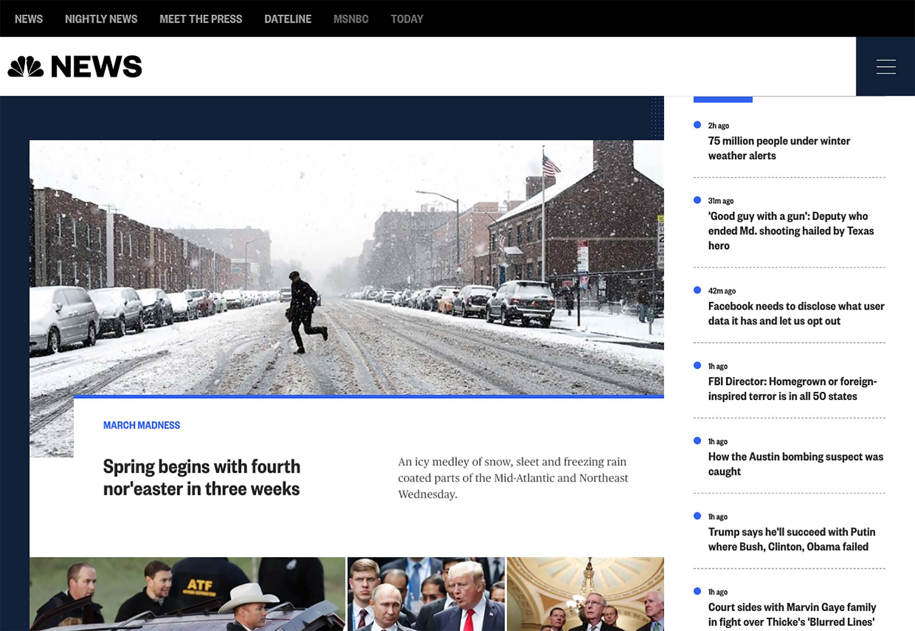
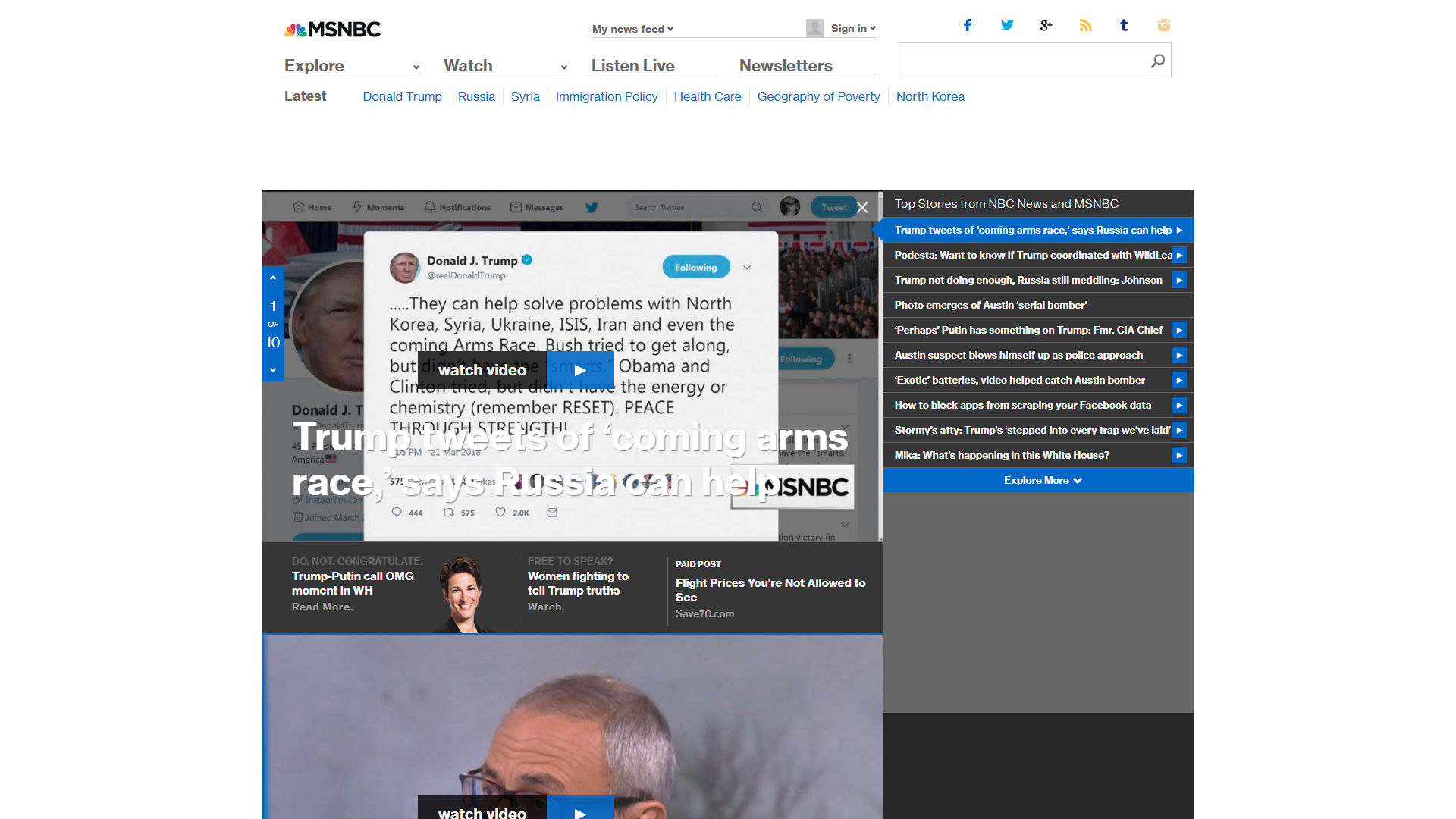
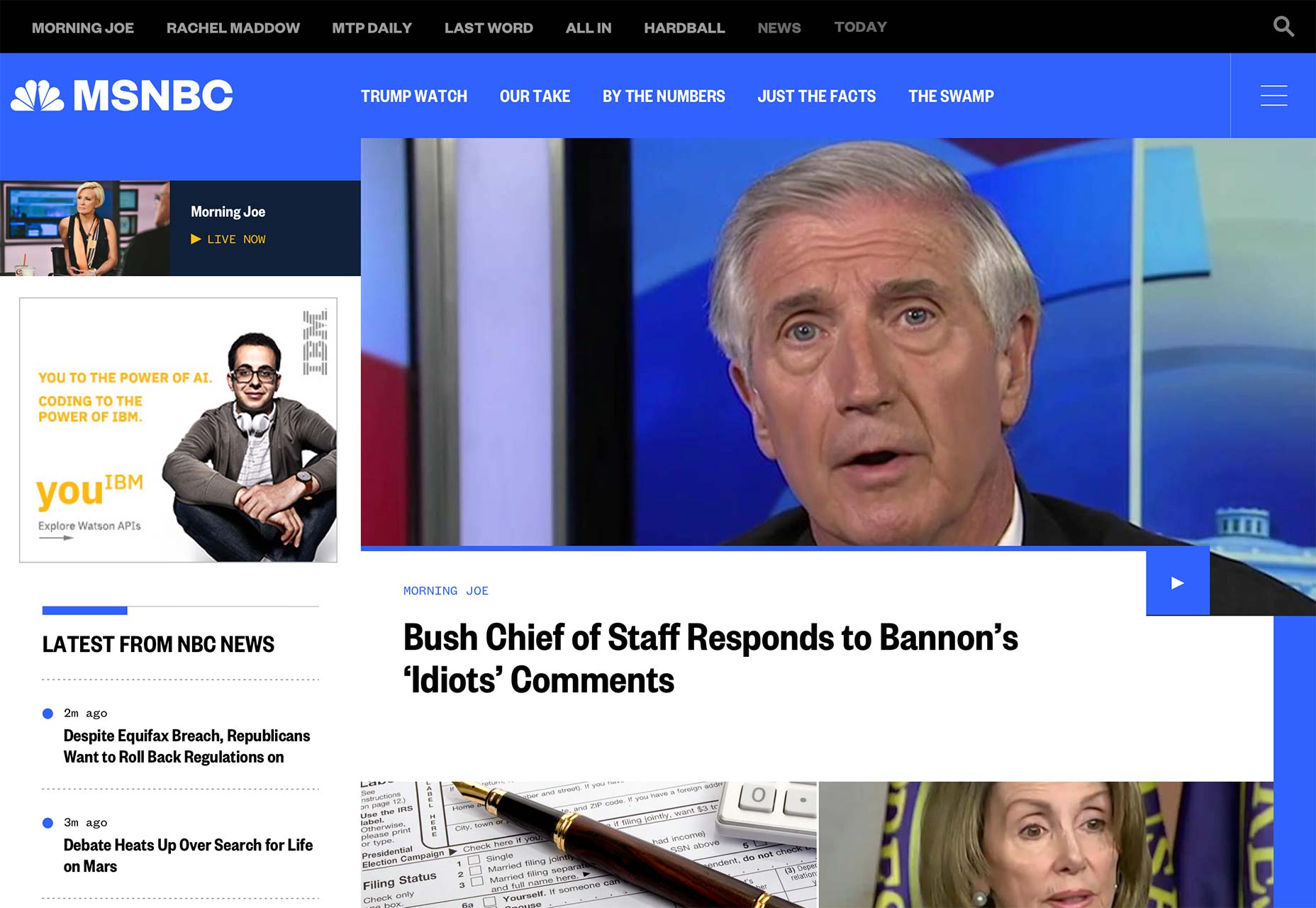
It’s here, people! NBC has gone (more) digital, because we as a society have decided that this was better for the environment, and also because the news gets to our phones so much faster. It’s also cheaper. Okay, I’m going to stop messing with the print guys—they’ve done nothing to me—suffice it to say that the industry has changed, and NBC is still changing with it, on the design front.

Back in June of 2017, we said that NBC was working on a redesign, as a part of their increased focus on digital publishing, and online video. Well, they kept working on it, and it’s here. Well, it’s here for all of NBC’s major websites anyway. It was originally launched on two sub-sites in order to test out the concepts created with the help of design agency Code and Theory.

Well apparently they’ve done enough iterating that they’re ready to release it on their “big three”: nbcnews.com, msnbc.com, and today.com. They all just got updated with a coherent, stylish, and definitely tech-blog-influenced design. For comparison, here’s the before and after:

NBC News before…

…and after.

MSNBC before…

…and after.

Today before…

…and after.

Now what has changed since they first implemented this design system? Well, the focus on imagery hasn’t gone anywhere, and neither has their emphasis on smooth video integration. There does seem to be more information and text packed into a somewhat smaller space than in the earlier iterations, but these home pages are on larger sites, so that makes sense.

The asymmetry they experimented with before has come out in full force, leaving some space for advertising, and some space to just let your eyes rest while you contemplate the headlines that just got burned into your brain. They’re going for the hit-them-with-sensory-input-and-see-what-sticks approach that, to be frank, has worked for news organizations for years, now. The main difference is that it mostly looks better, now.

NBC News and MSNBC frankly do look a lot like tech/business blogs (with more than a hint of Bloomberg, as someone commented on our last article about this), but they’re pretty and readable, so I say we go with it. Today looks like the lifestyle and celebrity gossip magazine it is, and that distinction is mostly accomplished through its typography, which is actually kind of impressive.

An interesting note is that, according to a press release, page layouts are actually supposed to change with the intensity of the news cycle, or rather, with the number of articles they have to show you all at once. I’m curious to see show this will work. I find myself wondering if the layout changes automatically, or if someone has to“flip the switch” on any given day.

There are also “sticky” ads that are supposed to be simultaneously more visible, and more visually pleasing. Even as someone who in part makes his living thanks to ads on this very site, I find myself wondering if there is such a thing as an ad that actually pleases people when they see it. Oh, ads can be intriguing, even interesting, but pleasing? We’ll see.

If you’re interested in what NBC themselves have to say about the redesign, there’s an older Medium post you can check out. It was published back when this new design system was first debuted, but it outlines NBCs goals for this redesign, which included things like staying away from rigid templates, making their video content feel like it belongs, a more cohesive treatment of images, improved readability, and evolving the brand (lightly).

Have a look at all three sites below, and judge them for yourselves whether they reached those goals. I think they largely have.

Add Realistic Chalk and Sketch Lettering Effects with Sketch’it – only $5!

Source

from Webdesigner Depot https://www.webdesignerdepot.com/2018/03/nbc-unveils-ambitious-redesign/

Wednesday, 21 March 2018

4 Most Hated UI Tricks

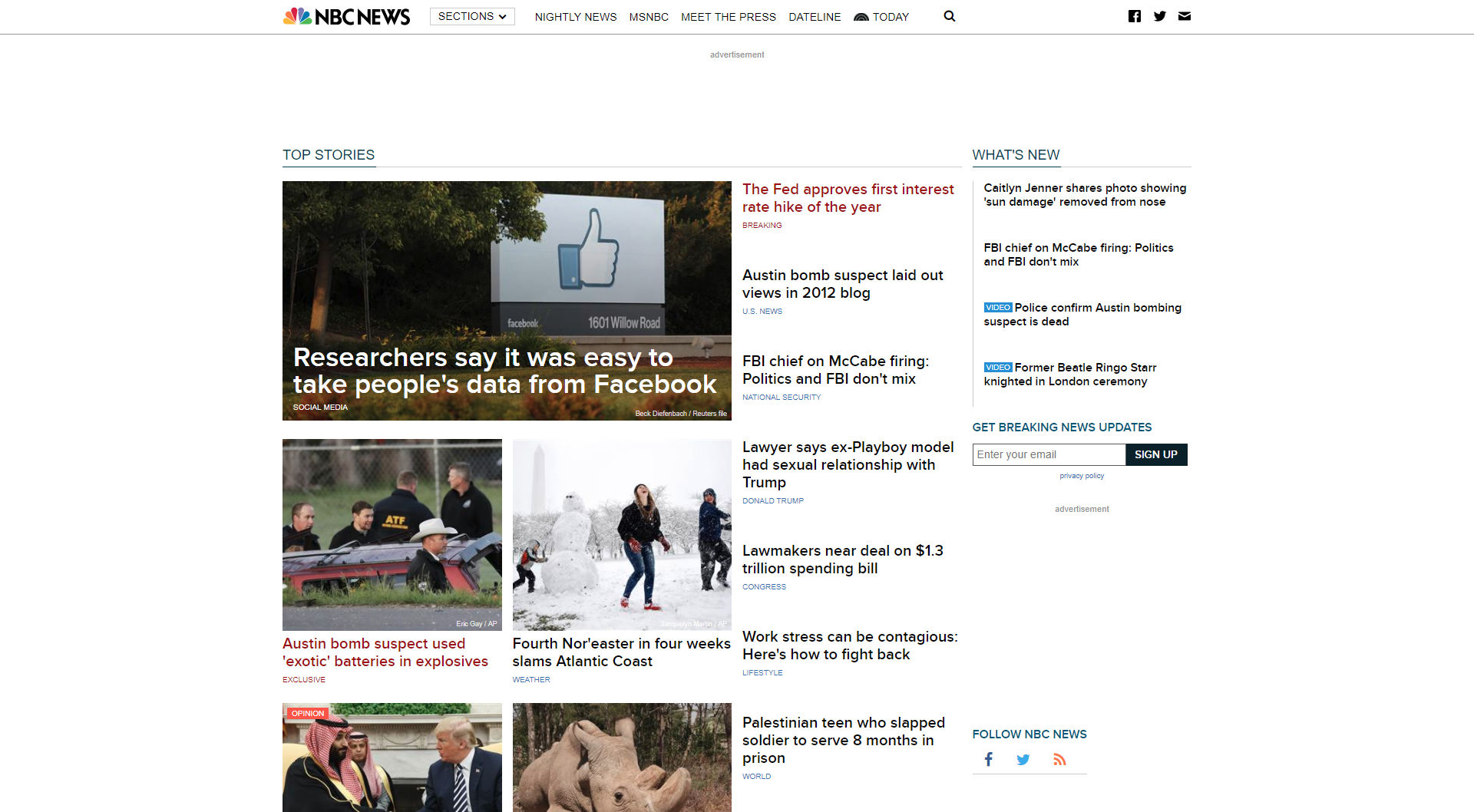
Nobody wants to create bad design, and yet it happens all the time. And while the cause of bad design varies, the final result is the same—bad user experience.

Bad user experience frustrates users and often leads to abandoning the product. In this article, I’ll focus on one particular aspect of bad design—using UI techniques that lead to bad UX.

1. Pop-Ups

If I ask you to name the single most irritating thing on the web, the odds are that you’ll reply, “Pop-ups.” According to the NN Group pop-ups are the most hated web experience ever.

We all know that feeling. You visit a new website, the content on the page seems to be interesting. You begin to read it and just when you are halfway through the text, you are suddenly interrupted by a huge overlay asking you to either subscribe to a newsletter or offer you something. In most cases, your immediate reaction will be either to close the overlay or to close the entire page, the overlay along with it.

An overlay used on the Esquire website.

It’s obvious why so many sites use this technique: Advertisers pay them to. However, the pop-up technique is too disruptive, and it has a huge negative effect on visitors. Every time you show a pop-up you ask users to stop doing what they want to do (what’s important for them) and focus their attention on what you want them to do (what’s important to you). It’s not surprising that such behavior often increases bounce rate.

It’s possible to use pop-ups without annoying your visitors. Just follow a simple rule—trigger a pop-up at the right time. For example, it’s much better to allow users to finish the current activity (e.g., reach the end of the page) before showing a pop-up. Once users have had a little more time to learn about you (your brand and your offerings), the chance that they will be willing to do what you want them to do increases.

Another important component is the actual message you have in your pop-up. You need to write a great copy. The copy shouldn’t be insulting, tricking, or confusing. Waitbutwhy go even further and incorporate humor in their text:

When visitors read the copy from Waitbutwhy, it makes them smile.

It’s worth saying that there are many less-obtrusive tools such as slide-in bars that don’t cover the whole page and produce similar results in terms of conversion.

2. Infinite Scrolling

Infinite scrolling is a technique that allows users to scroll through a massive amount of information with no finishing line in sight. The page simply keeps refreshing while users scroll down. The technique became popular in the era of mobile devices (scrolling is much more comfortable than clicking on a tiny screen). At first glance, this technique is a perfect solution for many problems—it requires less effort and makes content comprehension as easy as possible (all users need to do is to scroll). However, it’s not a one-size-fits-all solution for every site or app.

The main downside of the technique is also its primary advantage: there’s no finishing line in sight. When users get to a certain point in the stream, they can’t bookmark their location and come back to it later (notice, I mean position, not certain item). So if they leave the site (eg, move from one device to another), they’ll lose all their progress and will have to scroll down again to get back to the same spot. The inability to determine the scrolling position often annoys users and hurts the overall user experience.

In 2012 Etsy, an e-commerce website focused on handmade or vintage items, experimented with layouts for their product page. They implemented an infinite scroll interface and found that the new interface just didn’t perform as well as a previous version with pagination. Although a number of purchases stayed the same, user engagement went down.

What does Etsy’s example tells us? It tells us that with every design decision we should weigh the pros and cons before incorporating it into our designs. Speaking of infinite scroll, it works well for something like Twitter/Instagram where users are happy to scan an endless stream of data without looking for anything in particular.

3. Push Notifications

Have you ever paid attention to the number of notifications you receive on a daily basis from various apps? How many of those notifications do you actually care about? Not too many, I guess.

Everyday, we are bombarded with useless notifications that distract us from what we do. They annoy us.

The streaming service sends every user a notification every time a new episode of any show is released.

In fact, annoying notifications are the number one reason people uninstall mobile apps (according to 71% of survey respondents).

Push notification is a powerful tool, but as with any other tool, it can be used for good or evil. When users start using your app, they don’t mind getting notifications as long as notifications deliver real value. It’s essential to design notifications to be useful, relevant and timely for your users. Personalized content is a key to the excellent user experience. When you deliver the right message to the right person at the right time, your push notification becomes a powerful trigger that motives the person to take action.

Netflix does a great job of personalizing their messages to the individual receiving them.

4. Scroll Hijack

Hijacked scrolling is one of the most annoying things for many users since it takes control away from them and makes the scrolling behavior completely unpredictable. When designing a website, in most cases it’s better to avoid scroll hijacking and let the user control their browsing and movement through the site. But in some rare cases scroll hijacking might work fine for your users. For example, Tumblr uses this technique on their homepage to present information in chunks.

Tumblr use scroll hijacking to provide content in chunks.

Conclusion

It’s worth saying that all techniques mentioned in this article aren’t bad per se. Users hate them only when designers blindly incorporate them. Each technique or pattern on your website or in your app should be used intelligently and with some moderation.

Add Realistic Chalk and Sketch Lettering Effects with Sketch’it – only $5!

Source

from Webdesigner Depot https://www.webdesignerdepot.com/2018/03/4-most-hated-ui-tricks/

Tuesday, 20 March 2018

Google Web Designer Reaches 3.0 Beta

Google Web Designer just released its 3.0 beta version for public consumption and testing. Despite the product’s name, you still can’t design websites with it. For those of you who figured that out when it first released—and have ignored it ever since—here’s a refresher:

Google Web Designer is an app that makes it easier to create interactive content with HTML5, Canvas, and the like. Specifically, it’s designed for creating HTML5-based ads, and is probably worth a look if you want to serve up that kind of content with Google’s own ad platforms, because Google makes both. It’s also good for slowly but surely replacing the hole left in your heart by the stick-man Flash animations of yore.

…it’s not there yet, but it could be one day.

I mean, it’s not there yet, but it could be one day. Mark my words, I’m maybe very possibly going to look like a genius in five years.

In the meantime, most of the improvements over previous versions of Google Web Designer seem to be quality of life changes (along with a healthy serving of bug fixes). Smaller new features include:

  1. The ability to change “ad environments” on the fly.
  2. Double clicking on components in the Components panel will now put them on the canvas.
  3. A help panel integrated into the main app window.
  4. Easier file browsing for assets.
  5. A couple of performance improvements.

The big deal for this release is the inclusion of a 3D component. That’s right, 3D objects are coming to a browser ad near, you. And if those 3D objects don’t crush my phone’s processor or play music, I’ll be okay with that. This feature is most definitely still in beta, however. And even if you do use it, only a small selection of people in a pilot program can currently serve up ads with 3D content. Don’t expect to get much use out of the feature yet.

If you want to try all of that out, just click here to get it straight from Google. If you want to see the full release notes, with every bug fix laid bare, you can check out the release notes.

Add Realistic Chalk and Sketch Lettering Effects with Sketch’it – only $5!

Source

from Webdesigner Depot https://www.webdesignerdepot.com/2018/03/google-web-designer-reaches-3-0-beta/

Monday, 19 March 2018

What’s New for Designers, March 2018

Spring is in the air with plenty of new tools, particular color and CSS options. We hope that the change of season has you inspired to create and that these new design tools can make your work life just a little easier.

If we’ve missed something that you think should have been on the list, let us know in the comments. And if you know of a new app or resource that should be featured next month, tweet it to @carriecousins to be considered!

Abstract Acrylic Graphic Pack

The Abstract Acrylic Graphics Pack is, ahem, packed with textures and splashes in colorful vector formats. All of the background-ready elements are designed in a high-resolution format in JPG, PNG and AI formats. The pack includes 12 acrylic splashes, eight textures and 90 vector shapes to use as overlays. (The download does require an email address and you can add an optional donation to support the creator if you like.)

Prompts

Prompts is a lightweight, and aesthetically pleasing set of interactive prompts. It’s made with a simple code concept that has no big dependencies or dozens of tiny modules. You can design a prompt to ask for a single answer, a chain of answers or even dynamic prompting.

Dribbble Color Palette Generator

Turn any color palette from a Dribbble shot into a Sketch-Palette plugin. Just save your favorite colors and download them right to the Sketch-Palette plugin for use in projects. The tool includes Firefox and Chrome extensions.

FastPhotoStyle

FastPhotoStyle is a code repository from NVIDIA – yes, the video card makers – that includes their fast photo style transfer algorithm. The tool allows users to transfer the visual style of one image to another. The code falls under a Creative Commons Non-Commercial Share Alike license, so check the rules before using it in projects.

CSS Color Gradients

Create a more intuitive color gradient with CSS Color Gradients. Pick a start and end color and the tool adjust the gradient to give you the best and most visually pleasing color fade, so you don’t end up with harsh starts and stops. Then you can grab the CSS for your color gradient and add it to projects.

Launchaco

Launchaco is a simple website builder for small start-up sites. You can create responsive designs, apps and all of the website tools integrate with common elements such as Google Analytics for tracking, HTTPS, and custom domains. Users can create a free account to build a website or opt for the annual paid version ($49.99 beta pricing) for more robust and unlimited features.

Chrome Music Lab: Song Maker

Take a break from color swatches and code with the Song Maker from Chrome Music Lab. Color in the blocks with your mouse, pick a music style and see what your visual creation sounds like. It’s a fun–and creative–diversion!

.colors

The .colors tool solves an everyday web design dilemma: You have an array of colors in your code, but don’t always know what they look like. This tool allows you to enter an array of codes and generates a color palette with each color identified by code. Just paste any code snippet into the tool that contains colors – hex, HSL or RGB – .colors does the rest.

Today’s Date SVG

Terence Eden wanted an SVG that always displayed the current date on his blog – so he made one. Today’s date SVG is a generic date icon that accurately displays the day and date. Just add a few lines of code and JavaScript and you are ready to go.

Kutt.it

Kutt is a new link shortener with robust features so that your links are branded and trackable. Kutt lets you create, protect and delete links; track analytics; use a custom domain and integrates with an API. Plus, the tool is open source and free to use (you can even host it on your server).

30 Seconds of CSS

30 Seconds of CSS is a curated collection of code snippets that almost anyone can understand in less than a minute and deploy in website design projects. Snippets are lumped into categories so you can find just what you need with the code to make it happen (and an explanation for greater understanding).

Sketch Isometric

The Sketch Isometric plugin allows users to generate isometric views from artboards and rectangles in the Sketch app. The isometric view, which represents three-dimensional objects in two dimensions, is a popular choice for showing app mockups with multiple screens in one visual display. The plugin lets you rotate and twist, scale and change the color and depth of renderings.

Duet Display

Need more monitor space? Duet Display lets you turn an iPad into an extra monitor for your Mac or PC. The tool, which was built by former Apple engineers, can help you increase productivity and interact with your computer via touch through the iPad. All it takes to connect is a software download and Lightning or 30-pin cable.

Notifications

Inclusive Components has a good article on notifications and how to include notification components in more than just “web apps.” Notifications can be a part of any dynamic web experience when you need to draw attention to something with a short message. From understanding live regions to chat applications to flash messages, this article breaks it all down.

Pure CSS Moleskine Notebooks

Fans of the notebook of the same name will love this pen featuring CSS-animated Moleskines. Pen features four notebooks that are closed and open to feature inside pages on hover with plain, ruled, grid and dotted “paper.”

Mario Pixel Icons

Bring back fond childhood memories with a site of pixelated, video-game style icons. The set includes all the images you’d expect to see in an early video game in vector format. Use them online or even on a shirt design. The set includes 100 icons in AI, PNG and SVG formats.

Handlebars in UI Design

Shankar Balasubramanian, a designer at Angie’s List, takes a good look at handlebars, a new user interface element that’s gaining popularity. Here’s how he describes it in the informative post: “Handlebars are an interface element to help the user resize and rearrange the different sections on this canvas (or interface in modern UI). If you have used the iOS multitasking split-view on iPad, the little vertical and horizontal handles in one of the two apps in split-view are what I call as ‘Handlebars.’”

Extinct Animals Icons

Human beings have accelerated extinction rates in the animal kingdom like never before. Whether it be due to hunting, habitat destruction, or food source competition, more an more animals will never be seen again. This varied set of extinct animal icons seeks to educate as well as provide a great resource.

2018 Career Happiness Survey

What are you trying to get from your career? What parts of work make you happy? The Career Happiness Survey is trying to find that information with a survey for individuals and leaders looking to make good decisions. Everyone who participates will get the results via email.

Tutorial: Stunning Hover Effects with CSS Variables

Tobias Reich has a fun tutorial that helps you create a cool hover effect for a button. The design is simple but stands out with a nifty gradient that is just a little different from all the standard color change hover states often used. He walks you through the process so you can customize and create your hover effect.

Fonts.LOL

Fonts.LOL is the first type foundry dedicated to color fonts. The typography style is based on open-type SVG fonts that include multiple colors, strokes (and widths) and gradients. The concept behind the collection of color fonts is to push forward the technology and make color font adoption easier and more widespread. Just pick a color font, download and install to use. (Licenses can vary by font.)

Bluefish

Bluefish is a somewhat blocky sans serif with a limited number of styles in the free demo set. (A full version is also available.) It can make a nice display option and the demo includes regular, italic, bold and bold italic styles with 378 characters in each.

Gudlak

Just in time for St. Patrick’s Day is the release of Gudlak, a handwriting style typeface with clover flourishes. The demo version includes a limited set of 53 characters, but a full typeface option is available. This font can be fun for seasonal projects when used sparingly.

JMH Arkham

JMH Arkham is a vintage-style serif typeface with a lot of character. The typeface includes a full set of upper, and lowercase characters with fun tilts and notches. Some of the letters also have longer tails to add flourish to your typography.

Kabe

Kabe is a monospaced typeface with a lot of character. Its use could easily extend to display text for print and website designs. The typeface includes upper, and lowercase letters, numerals and punctuation.

Stay Classy

Stay Classy is a simple, line-style handwriting typeface with plenty of ligatures and a tall stance. The light typeface is great for display or lettering for invitations; it includes a full character set, numbers and punctuation as well as alternates.

Add Realistic Chalk and Sketch Lettering Effects with Sketch’it – only $5!

Source

from Webdesigner Depot https://www.webdesignerdepot.com/2018/03/whats-new-for-designers-march-2018/

Sunday, 18 March 2018

Popular Design News of the Week: March 12, 2018 – March 18, 2018

Every week users submit a lot of interesting stuff on our sister site Webdesigner News, highlighting great content from around the web that can be of interest to web designers. 

The best way to keep track of all the great stories and news being posted is simply to check out the Webdesigner News site, however, in case you missed some here’s a quick and useful compilation of the most popular designer news that we curated from the past week.

Note that this is only a very small selection of the links that were posted, so don’t miss out and subscribe to our newsletter and follow the site daily for all the news.

Creating User-friendly Forms


20 More UX Tools to Try Out


1 Line CSS Framework


Some Things About `alt` Text


FontSwipe: Tinder for Fonts


Evie by UnDraw – An Open Source and Extendable Web Design Framework


Creatives are Overworked


4 Rules for Better Website Typography


The Great Design Battle of 2018 – Pick your Side


How to Host your Personal Resume Using Github Pages for Free


Introducing Supernova Studio


Developers Love Trendy New Languages, but Earn More with Functional Programming


Can Skeuomorphic Design Make a Comeback?


10 Open Source Login Pages Built with HTML5 & CSS


Conversational Design


5 Fantastic Design Fails – And What We Can Learn from Them

/a>


Design in Tech Report 2018


UI Design: How to Amplify User Interface with Illustrations


25 WordPress Child Themes You Should Install


How to Start and Finish any Web App Project


35+ Free Fonts for Brutalist Websites


Fade to Grey: Will Headless Browsers Kill Web Design?


‘Ethical Design’ is a Dangerous Term


Prettier – An Opinionated Code Formatter


Becoming a Confident and Respected Freelance Designer


Want more? No problem! Keep track of top design news from around the web with Webdesigner News.

Add Realistic Chalk and Sketch Lettering Effects with Sketch’it – only $5!

Source

from Webdesigner Depot https://www.webdesignerdepot.com/2018/03/popular-design-news-of-the-week-march-12-2018-march-18-2018/