Wednesday, 24 October 2018

6 Reasons to Love Smaller CMS

WordPress, Joomla, and Drupal; these are perhaps the three biggest names in the world of the consumer CMS. They are known, they are loved, they are behemoths for a good reason. There’s no escaping them. We are all WordPress, now.

No, but seriously, there’s almost nothing they can’t do, with the judicious application of plugins, themes, and coding knowledge. Yeah, believe it or not, I’m not here to rag on them. Kudos to their developers. I’m just going to sit over here and show some love to the smaller CMS options for a bit.

If I were given to fits of poetry, I might write a sonnet about them or something. Alas, Lord Byron I am not; I am not nearly so rich, I have no desire to invade Greece, I do not own a bear. Instead, you’ll be getting this article detailing some of the wonderful things about smaller CMS, such as:

1. Clear Direction and Purpose

The operating system known as Unix was designed on this principle: one program should do one thing, and do it well. This principle was hereafter adopted into other systems, such as MacOS, and has been the cornerstone of some of the best software design over the years.

In many small CMS options, we can see that principle at work. That’s not to say, though, that a single-purpose CMS can’t be sophisticated or even rather complex. It’s just that dedication to a single goal encourages a form of excellence that more generalist systems struggle to achieve.

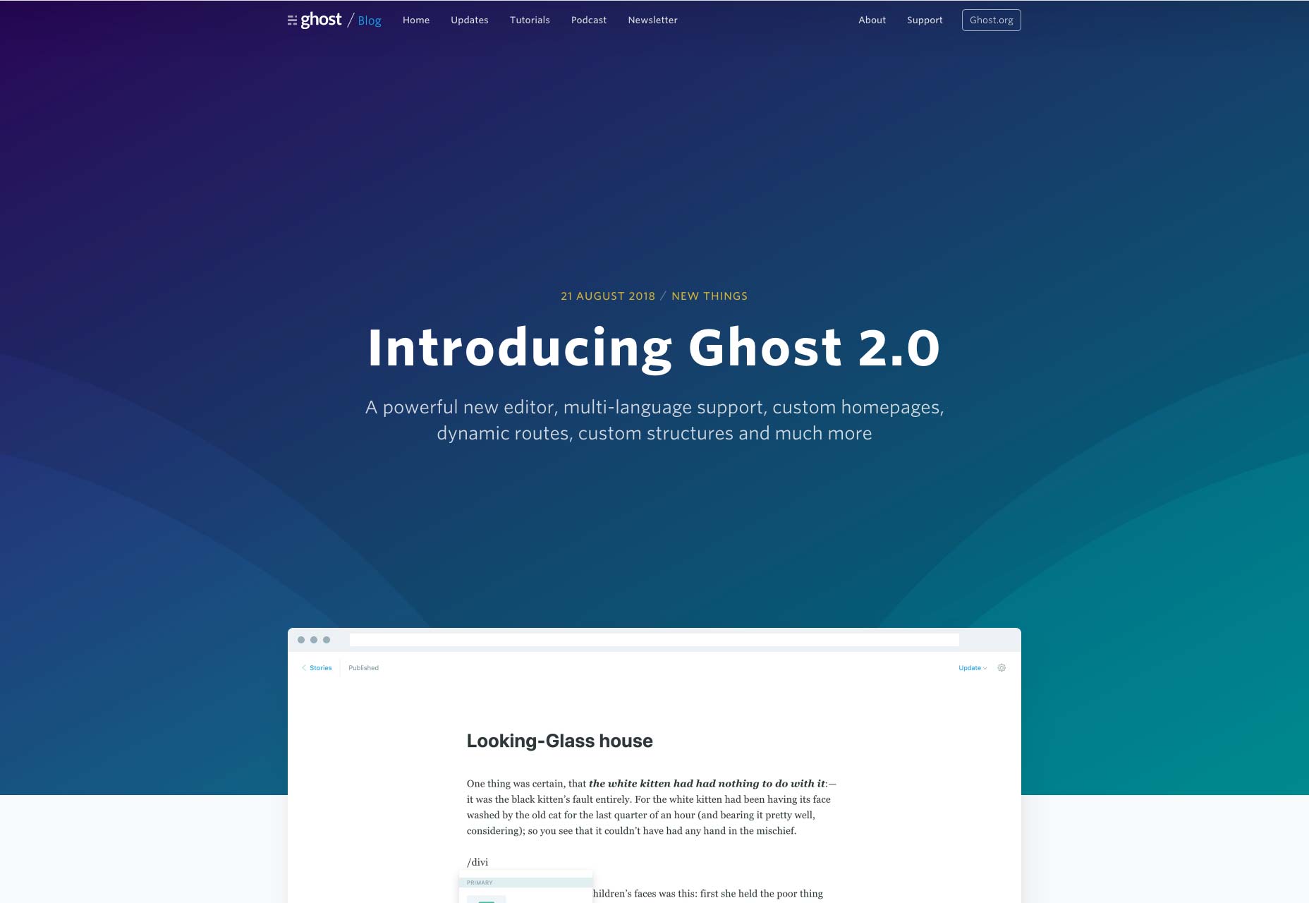
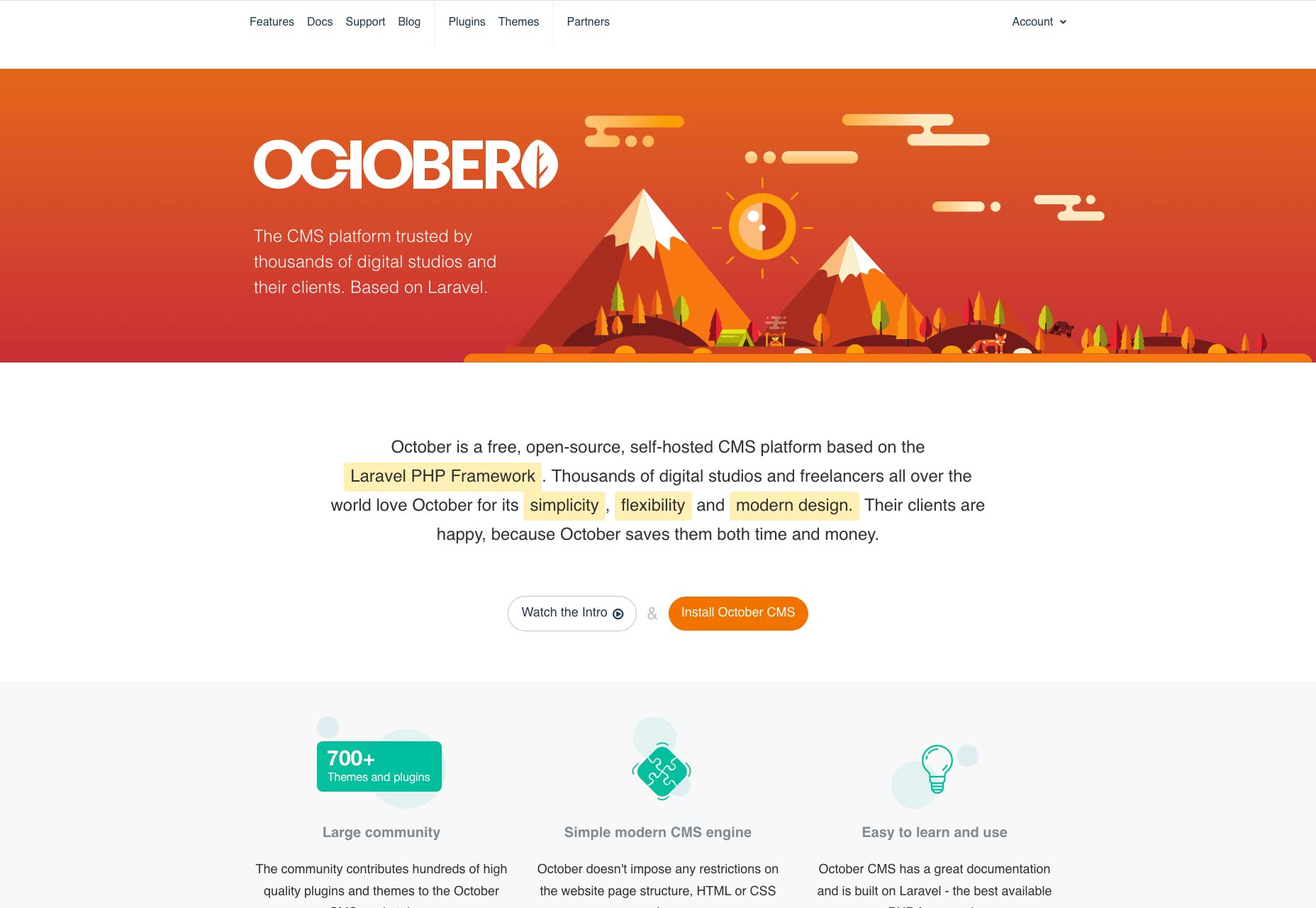
Take Ghost, for example. As of its 2.0 release Ghost has become, in my opinion, one of the best platforms for a pure-blogging experience. But even though it’s a comparatively small CMS, I wouldn’t call what they’ve done with it “simple”.

2. Lightweight, Un-bloated Code

Smaller CMS are just that: smaller. There’s a very direct correlation between the amount of code in the software, and how quickly it runs. When you only need a simple site, there’s no sense in having a CMS with loads of extra features that you’ll never touch. That’s just wasted server space.

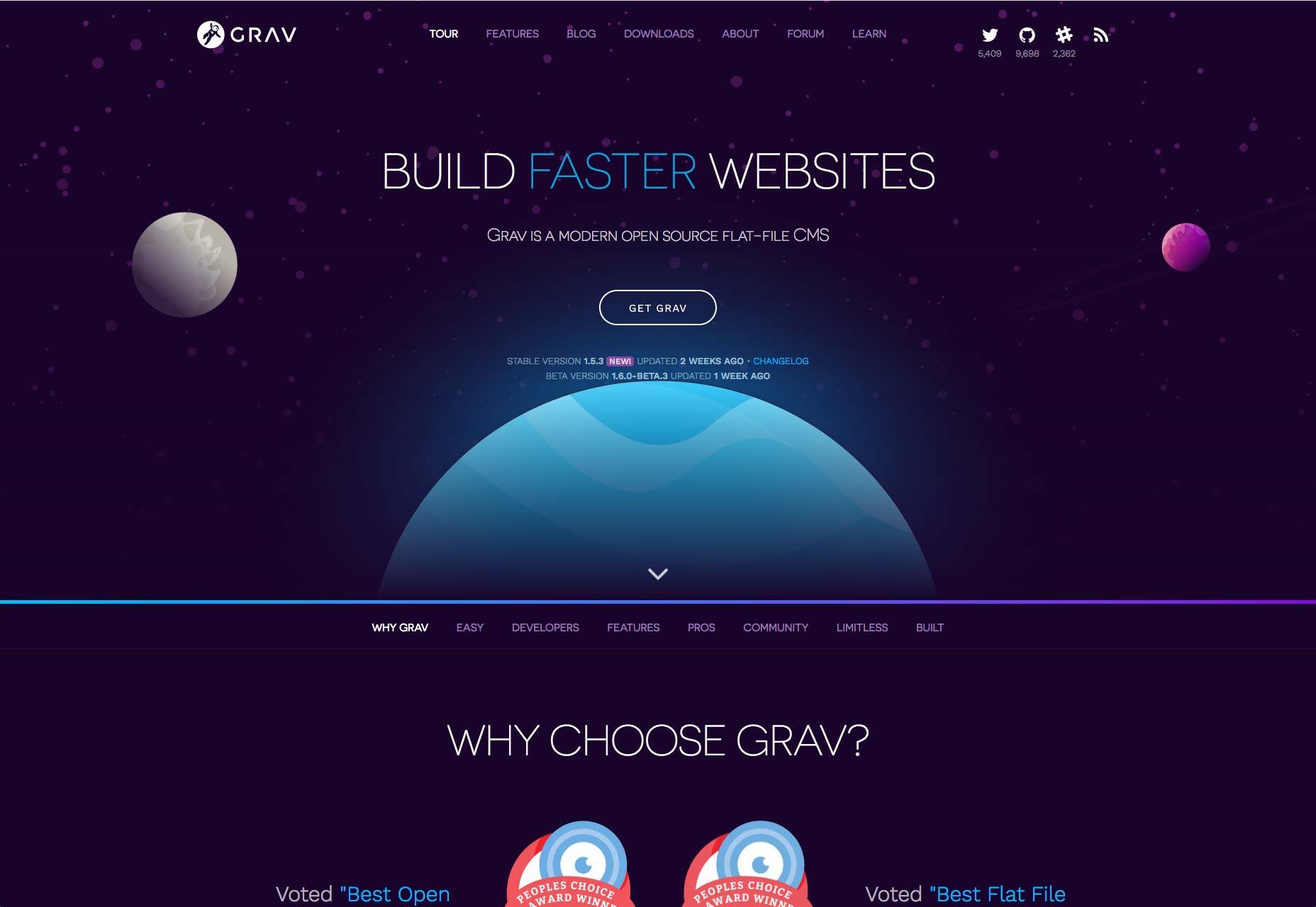
Even so, these small CMS can be very flexible. Here we look to Grav: its goal is to be a simple, developer-friendly, flat file CMS. Within that purpose, there is vast potential. Grav can be a blog, a knowledge base, or a simple brochure site, and compete with many of the big CMS options, while maintaining a (current) core download size of 4.8MB.

3. Uncomplicated Admin Experience (Usually)

Now, I’ve expounded on how a small CMS can be complex when it has to be, but it’s not always going to be complex. A truly single-purpose application will, largely due to its very nature, be rather simple to use. How many form fields do you really need to publish a page full of content, anyway?

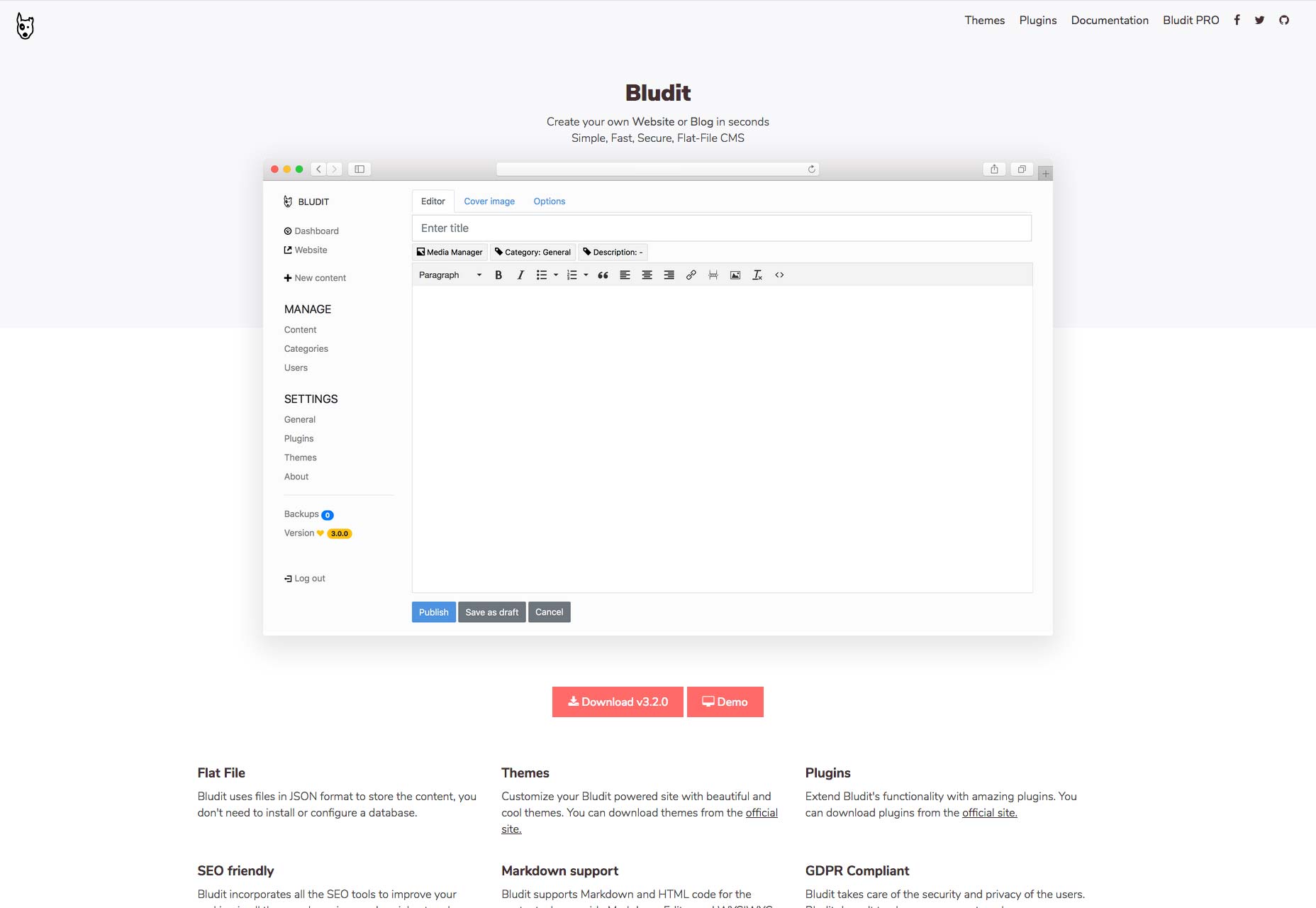
Recently I had the pleasure of working with Bludit to create a small blog. I’ve worked with WordPress, as well as many other systems, for years, but Bludit was downright refreshing. While I did occasionally chafe at some of the small limitations in the system, I absolutely adore the writing and editing experience. Well, I really like the Markdown editing experience. It has TinyMCE, too, but I didn’t bother with that.

The clarity that comes with pushing all the other aspects of publishing out of your way until you need them… it’s just my jam. I’ll say that Ghost is pretty good at that, too, but Bludit’s more bare-bones approach is more my speed. But that’s the beauty of these small CMS options: there’s one out there for just about every use case and user preference.

4. Simple Templating and Theming

When a CMS just plain does less, it’s usually a bit easier to design and code templates for. This makes it a bit easier for those of us who are more visually-oriented to spend time doing what we love, rather than learning all the quirks of an endlessly complex system.

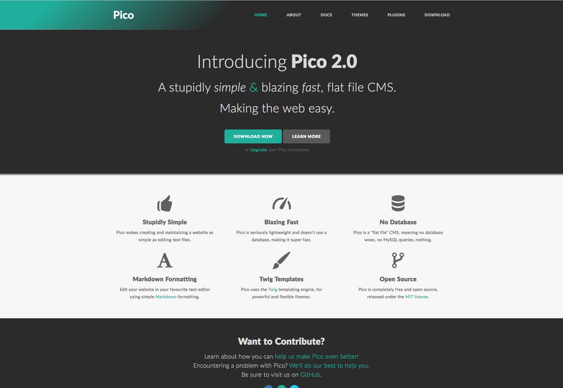
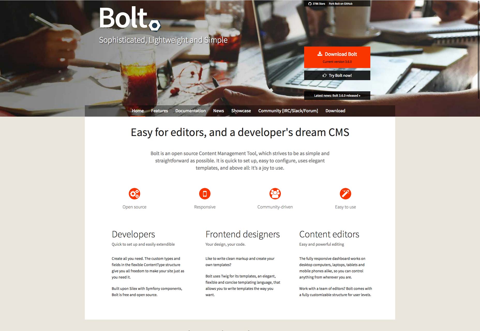
One thing a lot of small CMS do to make this even more simple, is use a templating language like Twig. If that interests you, have a look at options like Pico, or if you need something for a larger and more complex publishing endeavor, try Bolt CMS.

5. When Support is Available, it’s Nice and Personal

The organizations that develop larger CMS will often sell support to enterprise customers to fund development. That’s cool and all, but have you ever wanted to talk to the developers directly? Well, there’s always Twitter, but with many smaller CMS, developers often offer very personal attention to their users. You can contact some through GitHub, via email, or even in an IRC chatroom (or a more modern equivalent).

I’m reminded of the time I spent wrestling with October, a lovely back-to-basics CMS. I was trying to make it work with a cloud platform it really wasn’t designed for, and that didn’t work out at the time. Even so, the time I got to spend chatting with the developers and learning how they were putting things together was enlightening, and fun.

6. It’s Easy to get Involved

Technically, systems like WordPress and Drupal are open source. Anyone can contribute to their development and refinement. The truth is, of course, more complicated. Large and established open source projects have established communities, hierarchies, and very large codebases. Sure, they need all of that, but these things can make it hard to just dive in and flex your coding chops. It can be hard to get to the point where you can make real contributions.

Smaller open source projects are easier to get to know inside and out, and most of their developers (especially on the single-developer projects) would be happy to have someone, anyone, do some of the work for them. It’s easier to get in on the ground floor, and truly contribute. It’s more personal, and you get to be a part of that CMS’ history.

Add Realistic Chalk and Sketch Lettering Effects with Sketch’it – only $5!

Source

from Webdesigner Depot https://www.webdesignerdepot.com/2018/10/6-reasons-to-love-smaller-cms/

Tuesday, 23 October 2018

The Landing Page at 15: Grown Up and Professional

Tech folklore has it that the landing page was born in late 2003, when Microsoft created the concept in response to poor online sales of Office. Realising that the buying process had to be smoother and more direct, the IT giant created a separate mini-site designed specifically for buying its flagship product.

Whilst the campaign undoubtedly worked for Microsoft—we’re still stuck with Office, after all—it’s hard to believe nobody had tried the concept before, so basic is the marketing principle behind it. Surely, people had been using single, direct sales pages before 2003, even if that was their entire web presence?

Either way, catchy, compelling landing pages that convert clicks into contracts are still a must-have for any online business. The problem is that, like any marketing concept, landing pages are in a constant evolutionary race with consumers. Fifteen years after Microsoft’s breakthrough, only the slickest, most original designers are winning. Many landing pages have become formulaic, and for the average business the traditional landing page may no longer be a suitable approach.

The Early Years

In the years following Microsoft’s discovery, landing pages proliferated. And in the true style of the early Internet, they were messy, shouty affairs. Often several different brash sales pitches competed for prominence with the obligatory glowing testimonials, all on a white background.

That started to change in 2009, a year in which the landing page seemingly graduated and became professionalised. Almost overnight, a series of specialist companies sprang up and started to offer recognisably modern design. Messages became shorter, funny even. The background turned from white to hues of blue, and the photos came into focus.

Along with these visual improvements, the marketing concept was refined too. By running sites in parallel—known as A/B testing—designers literally got a scientific answer as to what worked best.

The ‘Rules’ of Writing a Landing Page

There is a lot of advice available online regarding the writing of compelling, high-converting landing pages. It comes from experienced marketeers and it has worked very well in the past. Certain elements of this advice effectively serve to define what we understand as a landing page today: A catchy headline; a punchy intro directly addressing a core customer need or desire; and a concise ‘call to action’.

Lance Jones, of Copy Hackers, recommends writing a landing page from the bottom up. He says:

Start with the goal. The call to action. The thing you want visitors to a landing page to do. Then, work backward from your button, writing only copy that will convince people to click that button. Nothing else makes it on the page. Nothing.

The ‘CTA’ is perhaps the defining characteristic of the pure landing page. While some marketeers still advise including testimonials, and telling customers exactly how you will solve their problem, others have stripped things back to the very basics: the initial page is primarily just a ‘buy’ button or an email field, even if a little bit more info is available by scrolling. Microsoft themselves have evolved towards this approach.

Short and Simple Sells

While popping a ‘buy’ button in front of the customer straight off is visually appealing, that simplicity of approach is only possible when people already know what the product is. Big companies with enough branding behind them are just providing a gateway to the product: Smaller businesses can attempt this by running social media or advertising campaigns that sell on specific points. The landing pages these campaigns point to can, in theory, be highly simplified because the selling points have already been addressed.

Businesses offering relatively complex and high value services will struggle to sell directly through a conventional, simple landing page., however. Their options, in the modern era, are to go for a simple first screen that then scrolls to further information set out in a visual, reassuring and intuitive way, like this Australian business finance firm; or to target something less than a full sale.

The Squeeze Page

If all you want is an initial contact or an email address from a customer, you don’t need to go for a hard sell. In this example, a no-obligation opportunity to interact leads the customer into a mini-site. What marketeers call a funnel, these simple ‘squeeze pages’ have become a sub-category of the landing page.

The concept of a squeeze page is to keep things very simple, because all you want is an initial contact or, more usually, an email address. In order to do this, businesses offer a free downloadable guide; a trial version; or a no-obligation consultation, for example. For a squeeze page to work, is has to be clear that what is being offered is free.

Linking to a Search

There is one further approach for more complex services, and that is to simply start the customer’s search for them. Airlines and online booking companies do this: imagine how Hotels.com will load on your screen if you search for ”Paris hotels” and then click on the company’s ad.

The Landing Page Links Debate

Most landing pages have links—84% of them, if you believe the latest count, which seems reasonable.

But a series of A/B tests by HubSpot, using their own landing pages, suggested that at best links made no difference and at worst they were an unwelcome distraction: when it came to free trials and demos, the versions without links performed 16% and 28% better in terms of conversions, respectively.

Tests by other companies have shown even bigger jumps in conversion rate when all links are removed. But these tests have no way of accounting for cautious potential customers who want to browse your site a little before they commit to buying—because these potential big spenders would eventually contact you via a different page, or perhaps by a phone call.

Unsurprisingly therefore, the inclusion or otherwise of links—even to your own homepage, remains a hotly contested topic for landing page experts. Online marketer Neil Patel suggests that the only clickable link on a landing page should be your call to action, and possibly a link to more information for those who are undecided:

Forget about links to everything else…all they do is clutter up the page and increase the likelihood that your visitors will abandon your landing page without converting.

Pages Must Fit the Business

What seems clear is that as landing pages have evolved, they have become more varied. Despite ruthless live testing, no secret formula has emerged. Indeed, several different approaches have thrived in response to the many and varied businesses that use them.

Karla Cook, writing for Hubspot this year, said:

Best practices will tell you that both short and long forms perform well—it all depends on whether you want to generate a lot of (potentially) lower-quality form submissions, or a smaller number of higher-quality submissions.

If you’re an online business that can offer something immediate, therefore, landing pages work and you want to keep them simple. It seems brutal, but the statistics suggest that, if you can offer a free trial, a demo version, or if you basic product is basically free, then all you need is a catchy page that looks good, loads quickly and is highly functional and intuitive.

If you’re in a more complex sector and you want this, it’s even worth creating a freebie—usually an e-book or guide—as a way of collecting email addresses with this approach.

On the other hand, if you provide complex products and are essentially hoping that customers will call your expert advisers—or you, if you’re a small business—and discuss their needs in more depth, you’ll want them to be able to check you out in full. Arguably, what you will then build is not a true landing page. But if it is designed to meet specific traffic, then the basic rules are still applicable.

Neil Patel sums it up:

Your copy should be clear and concise. It should be persuasive, too. Landing pages are not the place to show off your creativity, unless that creativity is clear, concise, and persuasive. Leave the creative turns-of-phrase for your blog.

Add Realistic Chalk and Sketch Lettering Effects with Sketch’it – only $5!

Source

from Webdesigner Depot https://www.webdesignerdepot.com/2018/10/the-landing-page-at-15-grown-up-and-professional/

Monday, 22 October 2018

20 Freshest Web Designs, October 2018

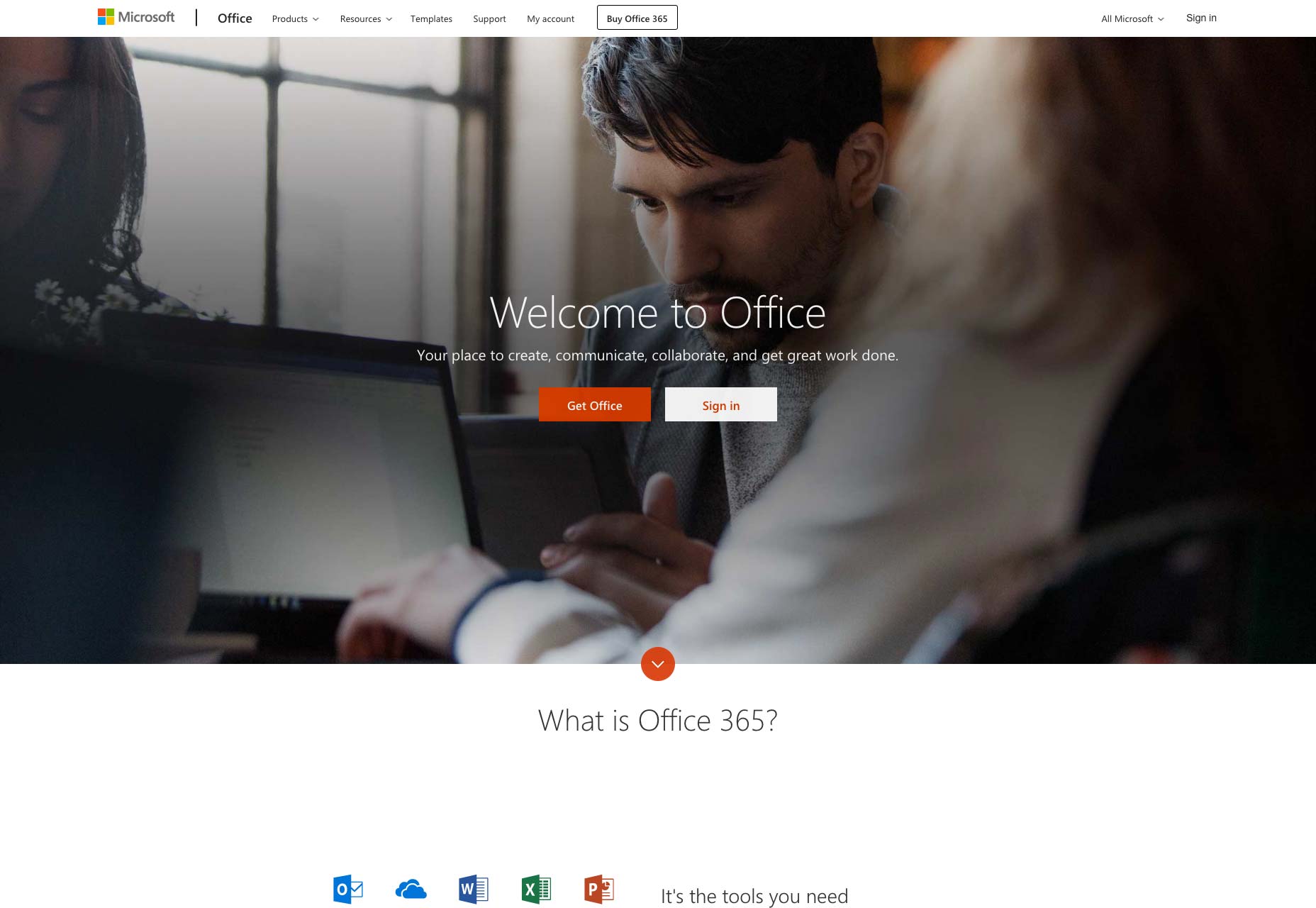
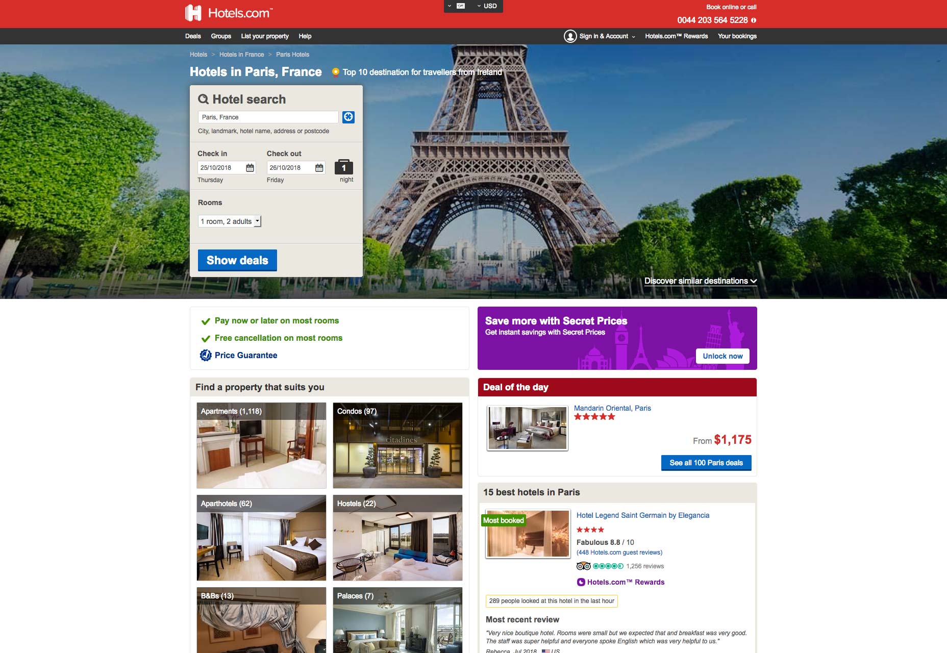
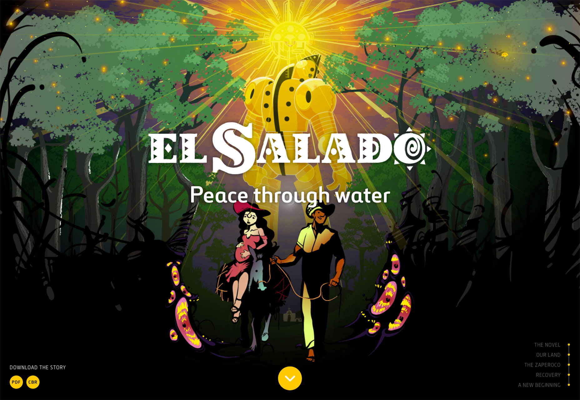
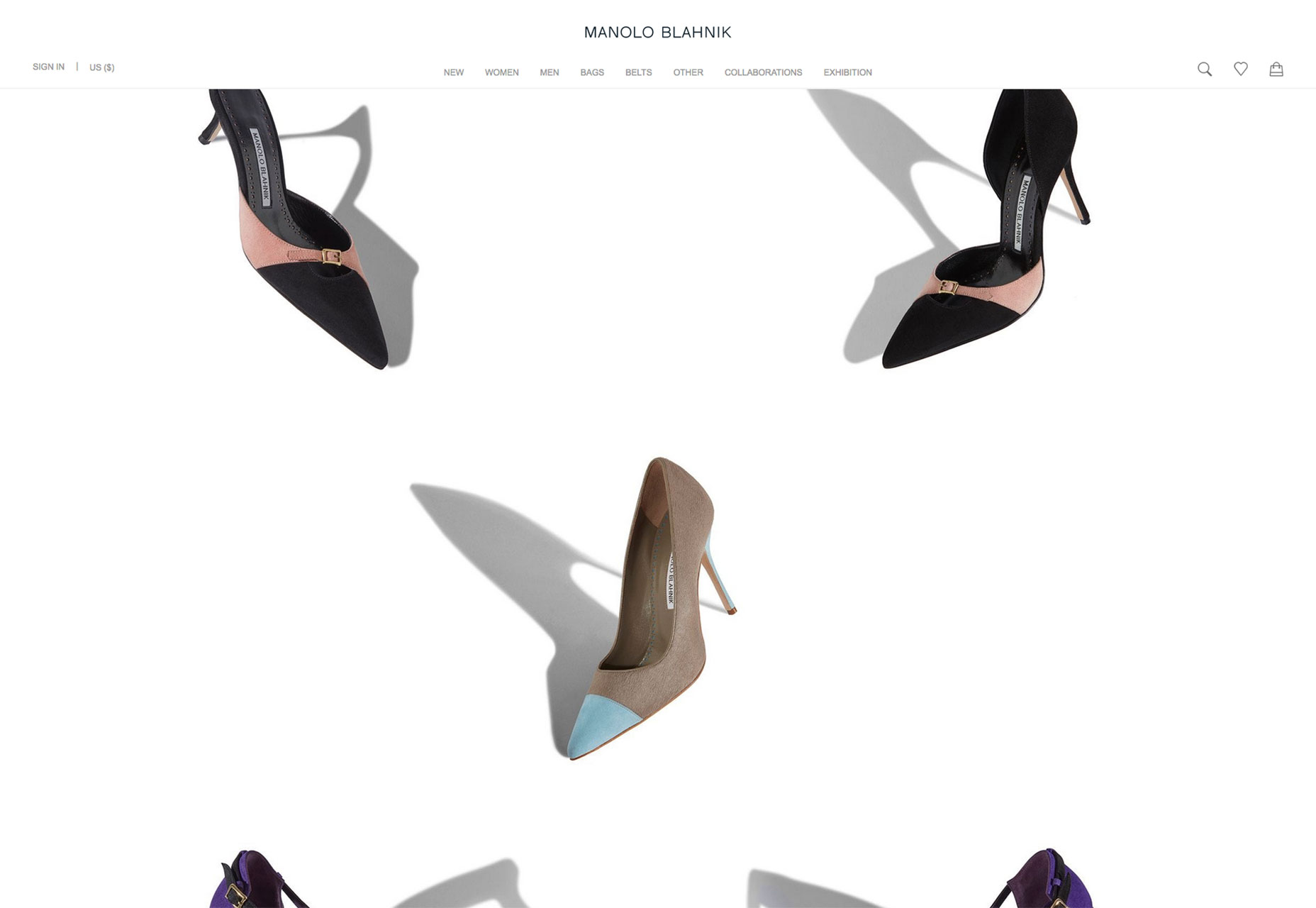
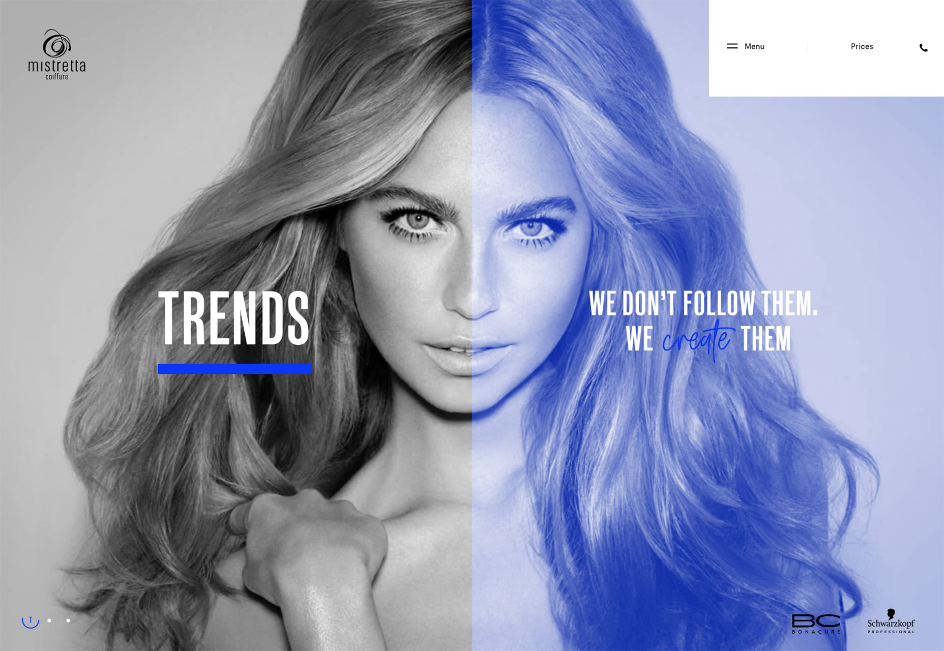
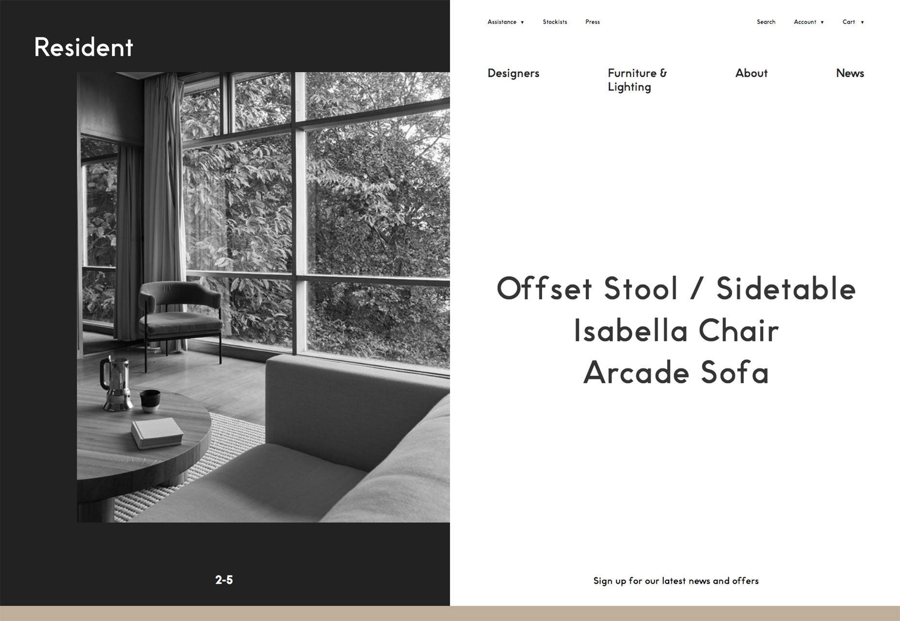
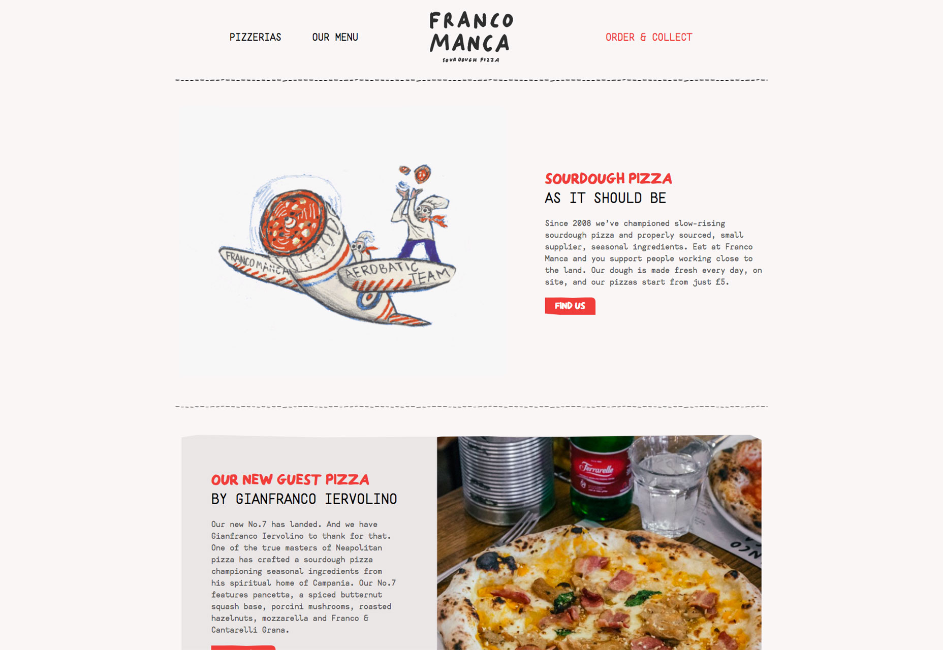
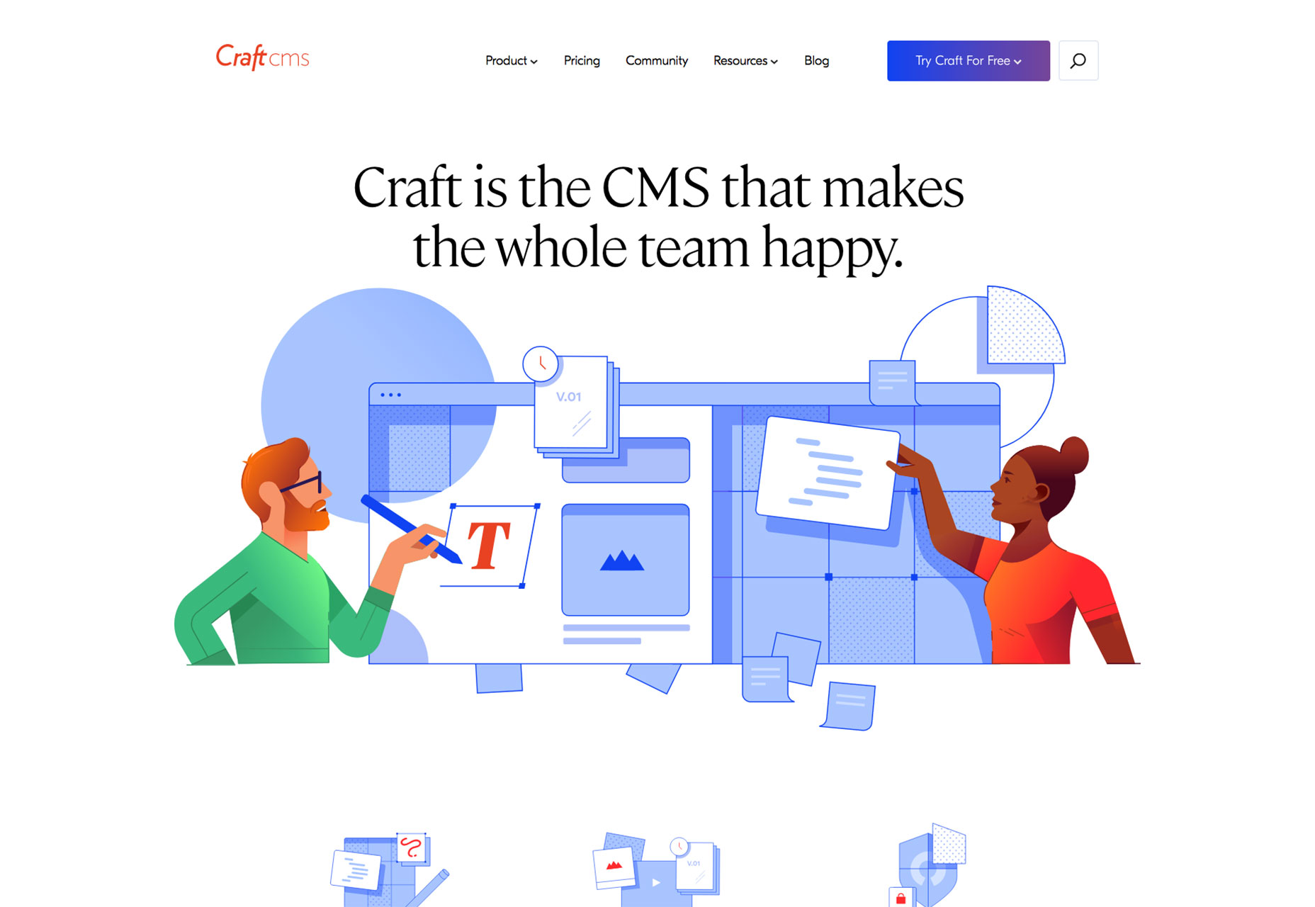
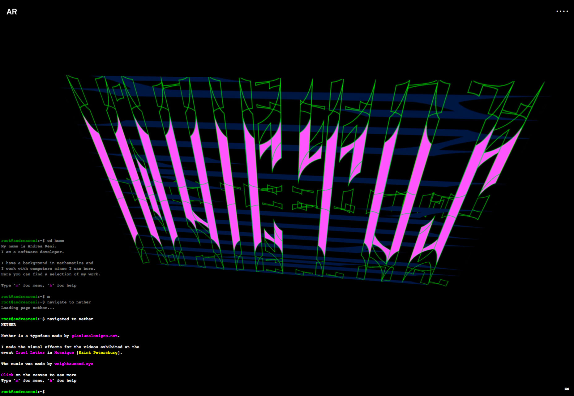
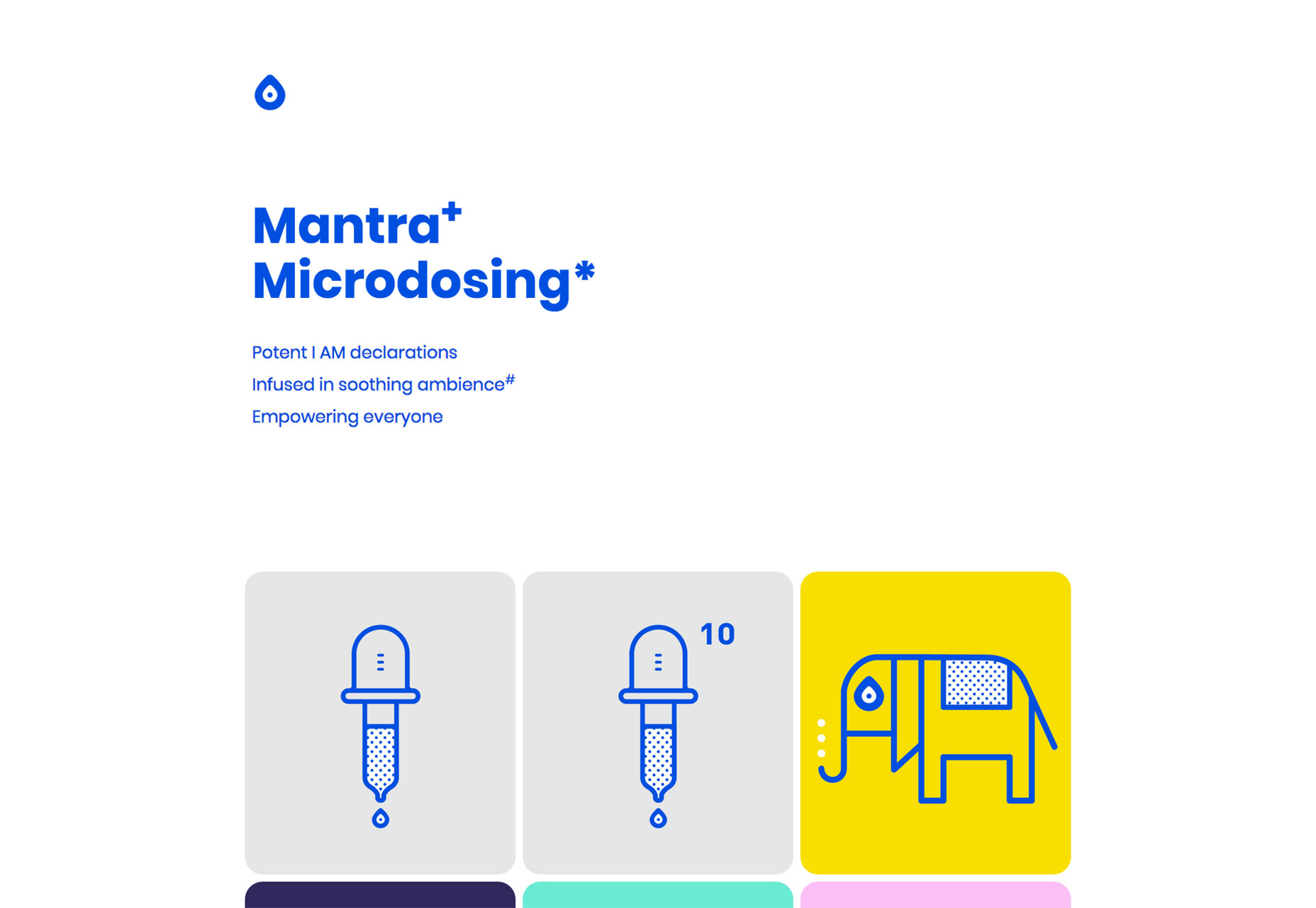
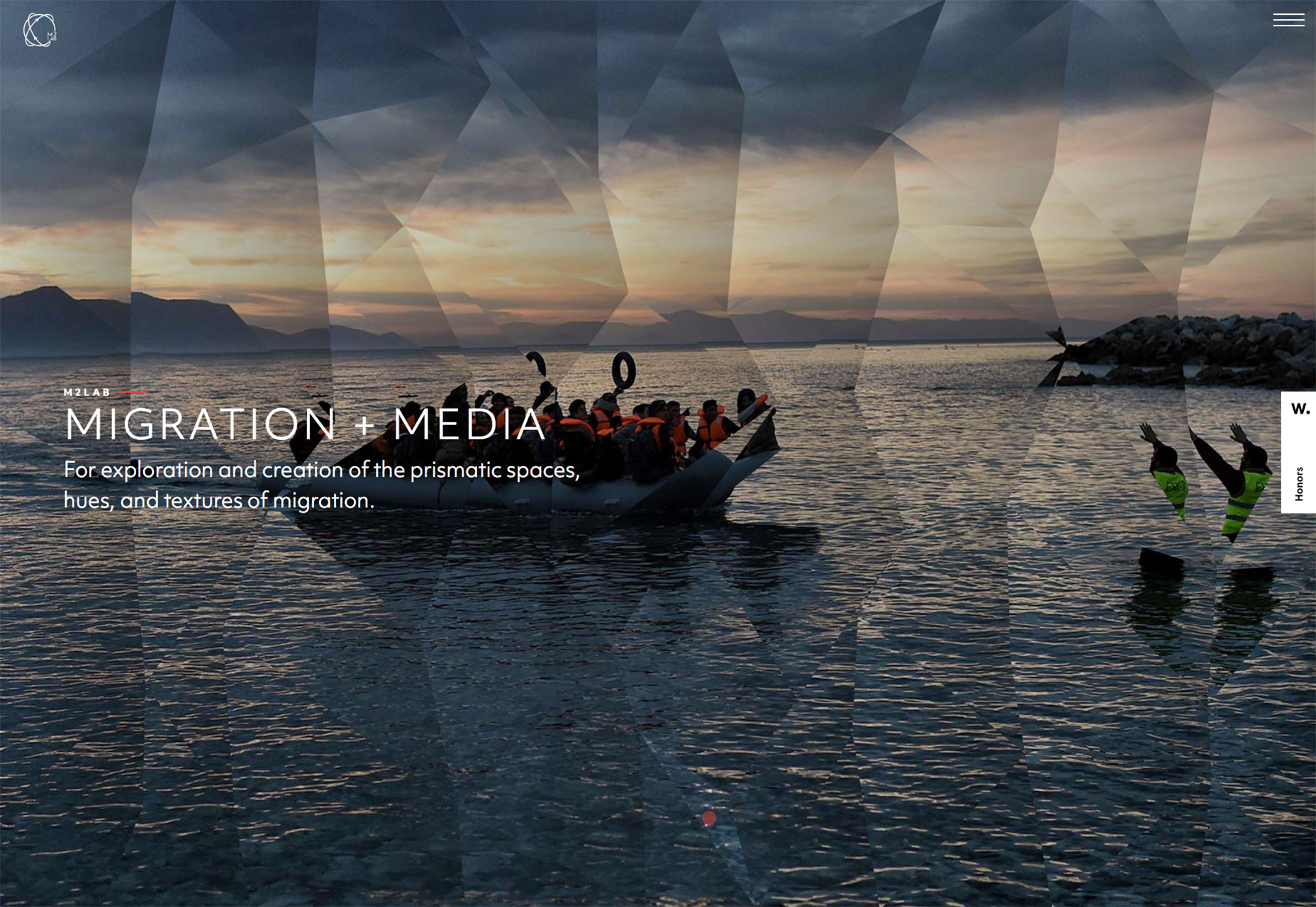
Fall is truly upon us in the Northern hemisphere, and Spring is in bloom in the Southern hemisphere. Bright colors, uplifting gradients, and bold color blocking have been evident through much of 2018, and October’s ramping it up another notch. This month you’ll find luxury goods, ethical concerns, large scale images and videos, and designers playing with the grid. Enjoy!

Myro

Some products are easy to sell, and some are not. Myro is the latter, a refillable deodorant. This site does an exceptional job of putting an aspirational spin on a product that many of us simply use and forget about.

Satellites

There are hundreds of thousands of objects orbiting the earth, from natural debris to parts of rockets from past space missions. Satellites is an absorbing ambient visualization of them all.

El Salado

Following in the long tradition of art tackling big issues, El Salado is a graphic novel themed around social problems in provincial Columbia. The site tells the story behind the novel, and you can even download the novel.

Manolo Blahnik

Manolo Blahnik’s minimal site presents its wares on a minimal white background. It may seem like any other minimal fashion site, but the shoes are presented outside of the grid, at angles. This simple approach feels free and emphasizes the luxury on offer.

Green Party of Ireland

The Green Party of Ireland is the sister party of many Green parties across Europe, seeking to build a sustainable future for everyone. Their site is an exemplary example of how a non-profit can promote itself well online.

Le Grand Courtage

A site selling wine to women, Le Grand Courtage features some tres chic typography, glamorous photography, and subtle pastel tones that reflect the color of the wines on offer.

Mistretta Coiffure

Mistretta Coiffure is a fabulous site for a hair dresser. A bold grid matches a bold color palette and the home page features a really attention-grabbing liquid effect.

Monograno

Who knew that the highest quality pasta comes from 1km above sea-level… Monograno’s site features beautiful imagery and typography to sell its vision of the world’s best pasta, direct from the Italian alps.

Mailchimp

Mailchimp’s redesign has been everywhere this month. The bold new color, coupled with incredible original illustrations is a brave approach to take and fits the personality of the company perfectly.

Resident

Resident is a furniture and lighting store from New Zealand. The high-design products are beautifully complemented by the strict geometric grid that underpins the asymmetrical layout.

Curadoria DiVerGente

Greeting you with an acid orange slap in the eyeballs, Curadoria DiVerGente has a nice subtle segue effect from one page to another with its initials sliding sideways on the screen. It’s great to see some bold color use.

Pre Helsinki

Celebrating the unique vision of Finland’s burgeoning fashion scene, Pre Helsinki features huge edge-to-edge videos, a superb range of fashion photography, and large-scale typography.

X

Describing itself as a diverse group of investors and entrepreneurs who are seeking to use technology to solve humanity’s problems, X’s site features inspiring videos and images, and an exceptional logomark.

Franco Manca

There’s no pizza as enjoyable as sourdough pizza, and Franco Manca offers some of the best. The quirky site perfectly captures the offbeat approach of this growing eatery brand.

Berlin Grotesk

Berlin Grotesk is a site promoting yet another sans-serif workhorse typeface. The bold black and white design is impactful, and does a great job of selling a font family in a saturated market.

CraftCMS

Craft CMS is one of the best premium content management systems available, and its new site does a great job of walking the line between familiar design patterns, and its own unique brand approach.

FJ 1857

FJ 1857 opens with an intrusive interstitial, but skip it and you’ll be rewarded with a high-class site featuring bold typography and edge-to-edge video, all carefully integrated with a well crafted sales funnel.

AR

Andrea Reni’s site is presented as a terminal, which might be intimidating for a layman, but tells his intended audience (other developers) exactly who he is. It’s refreshing to see an unusual approach.

Tonik

Tonik is an app site with a difference. Rejecting the usual, screenshot of an iphone and the stock image of a girl in a coffeeshop, Tonik uses bold type, a bold blue color, and some simple illustrations to sell itself.

M2Lab

M2Lab is an attempt to engage thinkers, writers, the media, and the community to think differently about immigration and refugees by visualizing the movement of people across cultures in new ways.

Add Realistic Chalk and Sketch Lettering Effects with Sketch’it – only $5!

Source

from Webdesigner Depot https://www.webdesignerdepot.com/2018/10/20-freshest-web-designs-october-2018/

Sunday, 21 October 2018

Popular Design News of the Week: October 15, 2018 – October 21, 2018

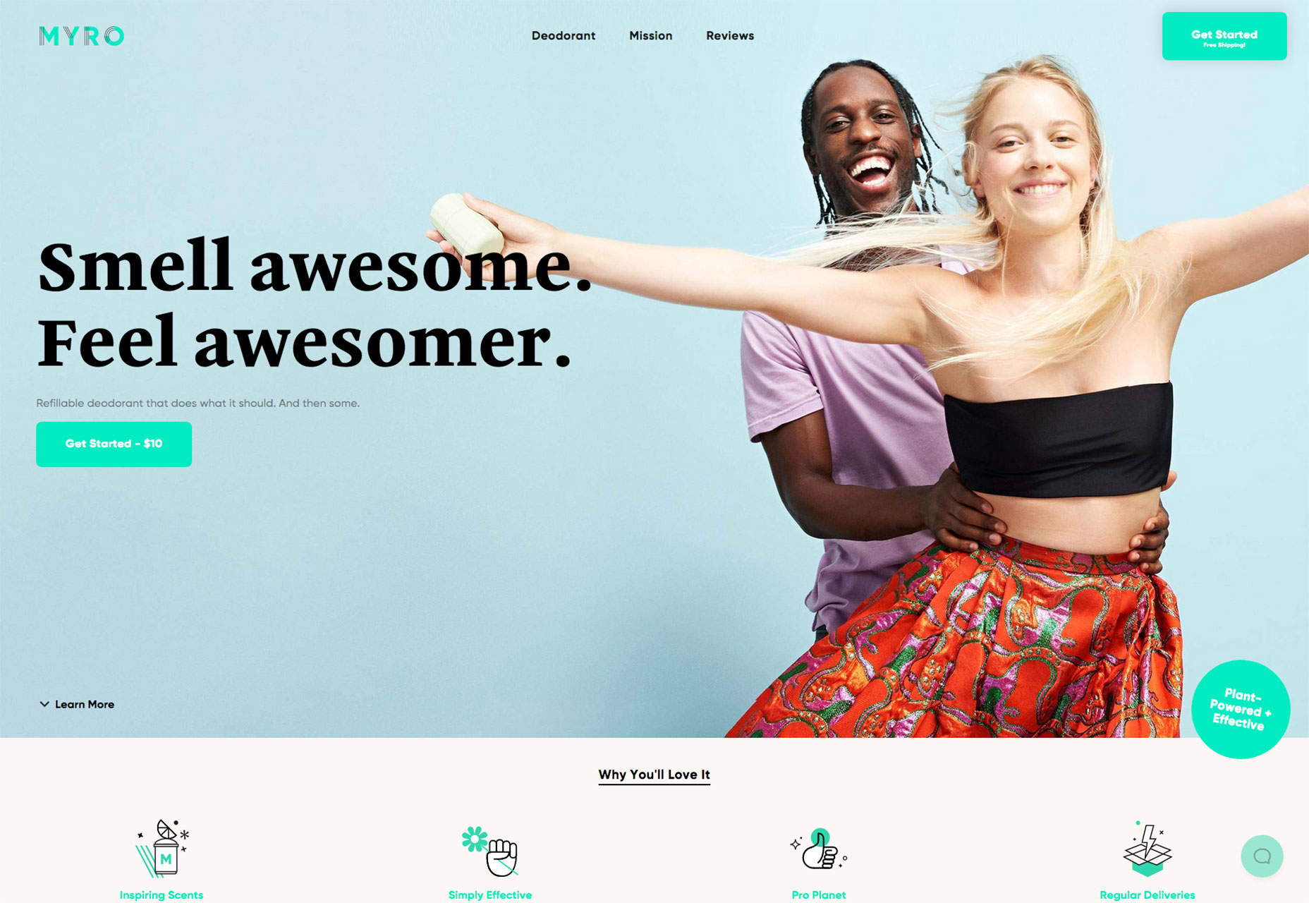
Every week users submit a lot of interesting stuff on our sister site Webdesigner News, highlighting great content from around the web that can be of interest to web designers. 

The best way to keep track of all the great stories and news being posted is simply to check out the Webdesigner News site, however, in case you missed some here’s a quick and useful compilation of the most popular designer news that we curated from the past week.

Note that this is only a very small selection of the links that were posted, so don’t miss out and subscribe to our newsletter and follow the site daily for all the news.

Why Web Sliders Suck and 5 Ways to Fix Them


Meetter – Reduce Time Wasted by Meetings


A Guide to Rhythm in Web Typography


Keys to Maintainable CSS: Order


About Design Critique


How not to Design a Product like Everyone Else’s


Become an Emoji!


The Best Colors Named After People


Documenting Design Workflows


Funkify – Experience the Web Through the Eyes of the Differently Abled


Planable 2.0 – Collaborate on any Social Content, from Anywhere


Evergreen: A React UI Framework Built by Segment


If You Want to Design your Life, Start by Designing your Environment


Dribbble Launched an Official Sketch Plugin


Building an Image Generator for the Number 1 Track on Spotify


Uber’s Undoing: Local Vs. Global


Designing for Cognitive Differences


Why We Need to Stop Over-complicating UX


The No. 1 Thing You’re Getting Wrong About Inclusive Design


UX Amoeba for your Resume


Become a Stylistic Typography Expert in Sketch


Inclusive Design 24


Embracing Design Generalism


The Most Important Design Tool You’re not Using


Instagram has a Massive Harassment Problem


Want more? No problem! Keep track of top design news from around the web with Webdesigner News.

Add Realistic Chalk and Sketch Lettering Effects with Sketch’it – only $5!

Source

from Webdesigner Depot https://www.webdesignerdepot.com/2018/10/popular-design-news-of-the-week-october-15-2018-october-21-2018/