Friday, 19 April 2019

6 Tips for Posting Content Anonymously

For one reason or another, you may find yourself wanting to publish things online anonymously. Now to some, the “A-word” conjures up images of hackers, Guy Fawkes masks, and people generally saying terrible things to each other on Twitter. There’s long been an ongoing debate about whether anonymity is something that should even be allowed on the Internet.

Yes. Yes it should. There’s no doubt that there are terrible people in the world; but anonymity is a powerful tool for good as well. Here are some of the more obvious examples:

  • Fighting the power: It sure would be nice if we lived in a world where everyone in every government had the people’s best interests at heart. We don’t, and they don’t. Ask Nelson Mandela, or any number of other great men and women throughout history who have fought for progress and human rights.
  • Exposing criminal activity: Whether you’re a crime blogger writing about the criminal underworld, or a whistleblower from some large corporation, exposing criminal activity is dangerous. People have died.
  • Adult content, and other “culturally offensive” themes: Something as simple as writing your own (very personal) memoirs can draw a lot of unwanted attention from those around you. Even if what you’re doing isn’t morally or ethically wrong by any reasonable standard, people aren’t always terribly understanding. And then, perhaps the people in your life would rather that their personal activities didn’t become public knowledge. Staying anonymous is a good way to avoid unnecessary drama, in cases like these.
  • Maybe it’s just work: One of my favorite blogs back in the day was Waiter Rant where a then-anonymous waiter told all of his juiciest stories. He stayed anonymous for the simple reason that his bosses didn’t want any extra drama at their restaurant. Besides, rude customers who might’ve just been having a really bad day don’t deserve the kind of hate the Internet can put out.
  • Not holding back: Webdesigner Depot runs a series of posts written anonymously called The Secret Designer. They’re anonymous, because they expose the underside of the web design industry that the writers don’t want to be associated with.

Now if any of this sounds familiar to long-time WDD readers, that may be because I addressed some of these points in The Ultimate Guide to Blogging some time back. I wanted to address the topic in a little bit more detail, and cover some more options we have for protecting our privacy. Here they are, in no particular order:

1. Paranoia

The most common security point of failure always has been, and always will be people. You could be uncovered by some random screw-up you make yourself, or you could be outed by trusting the wrong person. Even people who would never hurt you on purpose can give things away by accident.

More commonly, people who supposedly want to remain anonymous get caught because they can’t help but brag. If this is something you’re committed to doing, you need to change your entire outlook on life. You can’t be Hackerman by night, and turn it off by day. You need to get paranoid, without acting obviously paranoid; because someone probably is out to get you, but they can tell if you start acting too paranoid.

Sounds fun, right? [/sarcasm] How do you know when you’re paranoid enough? Let’s start with the realization that doing everything on this list alone isn’t enough to keep you perfectly safe. This is a basic beginner’s guide at best.

Oh, and remember to avoid actually writing any identifying information in your actual content if you can help it. Just sayin’.

2. Avoid Big Platforms

Don’t use Google for e-mail, sign-ins, or anything else. Ditto Yahoo, Outlook.com, or basically any other major corporation. If they have a reputation for collecting your data and selling it, they’ll mostly likely sell it to the people you want to hide from.

The same goes for your publishing platform. Simply put, you want as much control over your data as possible. That means you shouldn’t give your data to Medium, Tumblr (which is owned by Yahoo), or even good old LiveJournal (yeah, that’s still a thing). The bigger corporations have a history of playing nice with other corporations, but they play especially nice with governments. They will not advocate for your privacy, or even for your life if you find yourself in that sort of situation.

Their PR teams might mutter something about human rights, but you’ll be human left-for-dead. (Sorry, I wanted to lighten the mood a bit.) In any case, most of these platforms probably don’t even want sensitive content associated with them, and will likely take it all down.

3. Hosting

So if you’re going to be buying hosting, here’s the criteria:

  • You want privacy nuts.
  • You want a hosting company that is willing to take the (legal) fight to whoever comes looking.
  • Ideally, it would be good if they believed in your cause, too. That will make them fight harder to protect your data.
  • You want your hosting to be in another country entirely. Distance is a good way of delaying people trying to track you down. It means less in this day of the Internet, but it still counts for something.

In general, these guys are pretty good options, and they’ve been around for some time:

It should be noted that secure hosting and adult-content-friendly hosting are not the same thing. If you need hosting for those racy memoirs or what-have-you-I’d-rather-not-know, you need to find a host that specifically allows you to host those things in their TOS.

4. Intermediaries

Now remember where I said to be careful who you trust? That still stands. Even so, you may find it incredibly helpful to find someone who can act as your intermediary. If you’re acting in a whistle-blower capacity, you might be able to find a foreign aid worker or activist to do things like help you buy hosting and domain names.

Having a third-party represent you can be indispensable to a smooth operation. But remember that if things are potentially life-threatening for you, it can also get hairy for them. You want someone either committed to your cause, or at least someone who is very, very far away.

If you’re just posting stuff that’s perfectly legal where you are, but still potentially embarrassing, you might use an attorney to handle these sorts of details for you. Attorneys are expensive, but that’s because their silence is worth it.

5. Location and Devices

Don’t write from home, if you can help it. If you’re going to write from home, at least don’t post things from home. Take your device to a separate network far away from where you live, do everything you can to mask your IP, and then post. Do this with different networks, preferably in places that forgo security cameras. This is the time to be most paranoid.

Purge your machine of your notes and rough drafts regularly, preferably right after you’ve posted. Secure your machine with a password only you know on the BIOS, and on the OS, and for God’s sake, use some form of Linux or UNIX-based operating system. Nothing you do will keep a dedicated person who has physical access to your device from breaking in, but you can delay them.

You might consider forgoing a laptop or phone altogether, and just have a USB drive with a Linux OS on it, and no persistent storage. That way, you can go to almost any computer, boot it up with the OS on your flash drive, write your post, and leave. No persistent storage means that your files will not be saved when you shut the computer down.

Now which OS should you use? You might try Tails.

6. Pay Your Taxes

No, really. Whether you’re exposing corruption in your own government, or just posting some artistic photos that conspicuously do not show your face, you need to live as legally and unobtrusively as you can in your day to day routine. It’s the best way to avoid unwanted attention. Remember, not even the Joker would mess with the IRS.


7. Extra Notes

VPNs

VPN services have gotten traction, recently, as more and more privacy scandals hit the airwaves. Most of them, however, are not all they’re cracked up to be. Many keep logs of exactly which traffic goes where, and so they are a weak point if anyone wants to track you down.

That said, you should probably still use one. Just pick one that doesn’t keep logs, and allows you to pay with anonymous options like cryptocurrency. Here’s a list of some of the better privacy-oriented VPNs.

Tor

Using Tor to anonymize your browsing can help, but remember that the network has been compromised before. It’s perfectly fine to use it so long as you realize it’s just one extra layer of security, and not a guarantee of safety.

That’s just what everything on this list is: a layer of security that can, with time, be peeled back. The rest is up to you.


Featured image via DepositPhotos.

Add Realistic Chalk and Sketch Lettering Effects with Sketch’it – only $5!

Source

from Webdesigner Depot https://www.webdesignerdepot.com/2019/04/6-tips-for-posting-content-anonymously/
Thursday, 18 April 2019

Why Don’t We Just Use Material Design?

I work out of a small office in a co-working environment. Next to my dedicated space is a hot-desking area used primarily for video conferencing. Thanks to a bank of west-facing windows, an overenthusiastic heating policy, and unseasonably hot weather, meetings are often conducted with the doors open, and it’s then that I overhear some of the most engrossing insights into the minds of both clients and designers, that I’ve ever encountered.

Last week, as I munched on my lunch, I was eavesdropping on a meeting to determine the design direction of a fairly well known site (that will remain anonymous). The owner was connected from Australia, there were high-up members of the team connected from the US, and the UAE, and the design/dev team was about 10ft from me.

The conversation was increasingly heated, and centered around the fact that one of the design team had been removed from the project: such-and-such was a great person, and really dedicated, but her design style was all wrong; things had gone off the rails since such-and-such left; such-and-such did beautiful work, but it didn’t test well with users; and so forth.

Material Design…is seen as the standard to aspire to

The management team were clearly desperate to uncover a new design direction in which to take the service, and the design team were clearly desperate to accommodate them. After several hours of back and forth based on little (as far as I could hear) but subjective opinions, someone uttered a phrase that almost made me crash the meeting with subjectives of my own:

“Why don’t we just use Material Design?”

I’m not sure who said it, but it sounded like it was in the room. What followed was a cacophony of praise for Google’s design system: The designers admired it, the one developer I could identify loved it, the owner hadn’t heard of it but loved Google’s business model, the UX Lead—who until this point, I hadn’t heard contribute anything, said it was the “ultimate refinement of human-centered design”.

Five minutes later the meeting wrapped, a design direction chosen, a design team clutching a set of guidelines, a development team mentally mapping components. Leaving me, watching in horrified fascination as they filed back to their respective offices.

An Unhelpful Question

Material Design is astronomically popular. So popular in fact that I’ve spoken to numerous designers who refer to their work as “Material Design” when they have either never read the specification, or are ignoring it entirely.

Of course, there’s no reason that designers should implement Material Design. It’s simply an indication of its omnipresence that it is seen as the standard to aspire to.

The question posed in that meeting (Why don’t we just use Material Design?) reverses the design process in a way that epitomizes the problem with any design system. The question that should have been asked was: “Would employing Material Design solve some, or all, of our problems?”

If It’s Good Enough For Google

There’s an assumption that Material Design, as published by Google, is a magic bullet that addresses most, if not all, challenges in modern web design. I think that assumption probably stems from the fact that the Material Design specification is well written, and feels authoritative. I also think that assumption is false.

Material Design was initially intended as a solution to Google’s design problem—unifying a disparate group of services and apps, into a single brand identity and experience. It is now described as “a comprehensive guide for visual, motion, and interaction design across platforms and devices.” Which you have to admit, sounds pretty awesome.

when the insects take over the earth there will still be Google products about to receive their long-awaited Material Design upgrade

Just last week, there were reports in the design news that another Google product was about to receive its long-awaited Material Design upgrade. It doesn’t matter when you’re reading this, when the insects take over the earth there will still be Google products about to receive their long-awaited Material Design upgrade.

At the time of writing, it’s been five years since Google went public with Material Design. In that time, Google’s products have been constantly revised. Anything that hasn’t been updated in five years is probably at least mothballed— Google is far from shy when it comes to killing off projects.

If Google itself struggles to implement Material Design, and it has the get-out-of-jail-free card of writing (and rewriting) the specification with its own product demands front and center, how difficult is it to apply it to a third party site or app?

Don’t Even Get Me Started on That Floating Button

Probably the most controversial element of the Material Design specification is the floating call-to-action button that hovers in the bottom right of the screen, joyfully obscuring the single piece of content you are trying to access.

Material Design, means restructuring the architecture of your site

Design thinking is split on the floating action button, and anecdotally I’d say it’s roughly an even split. Some designers love the forced simplicity of a single call-to-action button imposing a primary action on a screen. Other designers object to an over-simplified user journey when natural experiences tend to be more nuanced.

In many cases implementing Material Design, means restructuring the architecture of your site or app. In other words, for the sake of an aesthetic your project needs to conform to Google’s preferred approach.

When all You’ve Got is Material Design, Everything Looks Like Gmail

There’s truth in the pop-wisdom that, when all you’ve got is a hammer, everything looks like a nail.

we’ll look for problems that don’t exist, in order to explain the solutions we have to hand

There are as many design approaches as there are designers and it would be preposterous of me to say “design is…” and expect it to be universally true. However, design, when done well, isn’t about putting a shiny polish on a project, design is inherent to what the project is, and to what it aims to become.

By framing a project in Material Design — or to any other design system — we are presented with a set of answers to which, as rational cause-and-effect minds, we will try to find questions. This means two things: firstly we’ll very likely distort our problems to fit those solutions because they’re the only solutions available that don’t break the specification; secondly we’ll look for problems that don’t exist, in order to explain the solutions we have to hand.

Why Don’t We Just Use Material Design?

Material Design is a design system, not the design system. Its failings are the failings of all design systems when applied to third party projects; namely that it is driven by a different, often undisclosed, set of priorities.

Of course, it’s entirely honest to confess that many designers dislike Material Design because it’s mind numbingly boring to implement someone else’s ideas. After all, we didn’t get into design to abandon creative thinking in favor of a paint-by numbers, one-size-fits-all approach.

Personal preference aside. We shouldn’t be using Material Design, because it puts the cart before the horse. It is a set of solutions to someone else’s set of problems. It may eventually work for Google, but it won’t work for you.

Add Realistic Chalk and Sketch Lettering Effects with Sketch’it – only $5!

Source

from Webdesigner Depot https://www.webdesignerdepot.com/2019/04/why-dont-we-just-use-material-design/

Tuesday, 16 April 2019

7 Steps to Successfully Onboarding Design Clients

You’ve done the hard work: you’ve taken a lead and turned them into a paying customer. Congrats! Now, you have to build their website.
But is it that simple? The client signs the contract and you immediately get to work on designing the website?

You could certainly approach the kickoff of a web design project that way. However, you’d be missing out on the huge benefits of having a well-laid-out onboarding process.

By the time you have a signed contract in hand, you’ve already established some basic expectations with your client. That’s good. You never want to enter into a relationship with a client if they (or you) don’t know what they’re getting themselves into.

Onboarding further strengthens the basic groundwork you’ve laid down.

Use this onboarding checklist to ensure you give each of your web design projects as strong a start as possible.

Step 1: Duplicate Your Project Management Template

This first step assumes that you have a web design project template. If you haven’t created one yet, I’d strongly encourage you to do so. Each project you take on will have the same basic structure, so why not spare yourself the trouble of having to recreate it every time?

Regardless of which project management software you use, duplicating your template is easy.

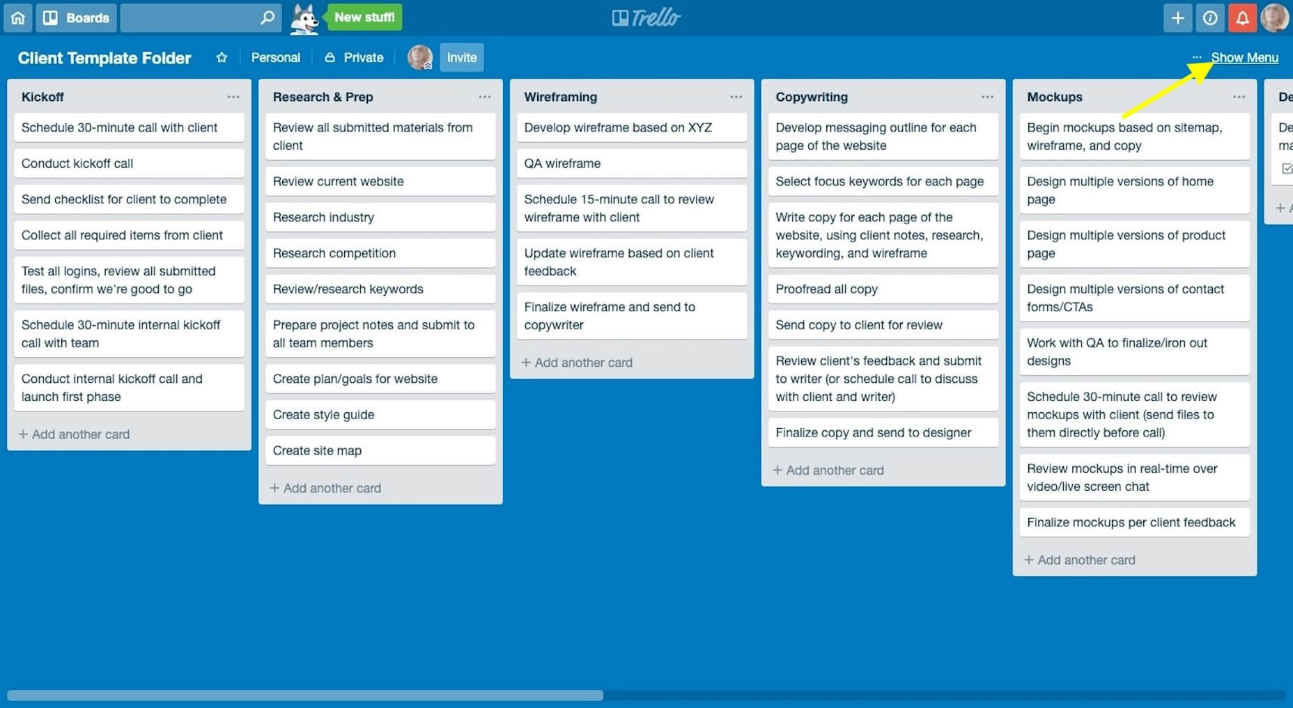
In Trello, you’ll click “Show Menu”:

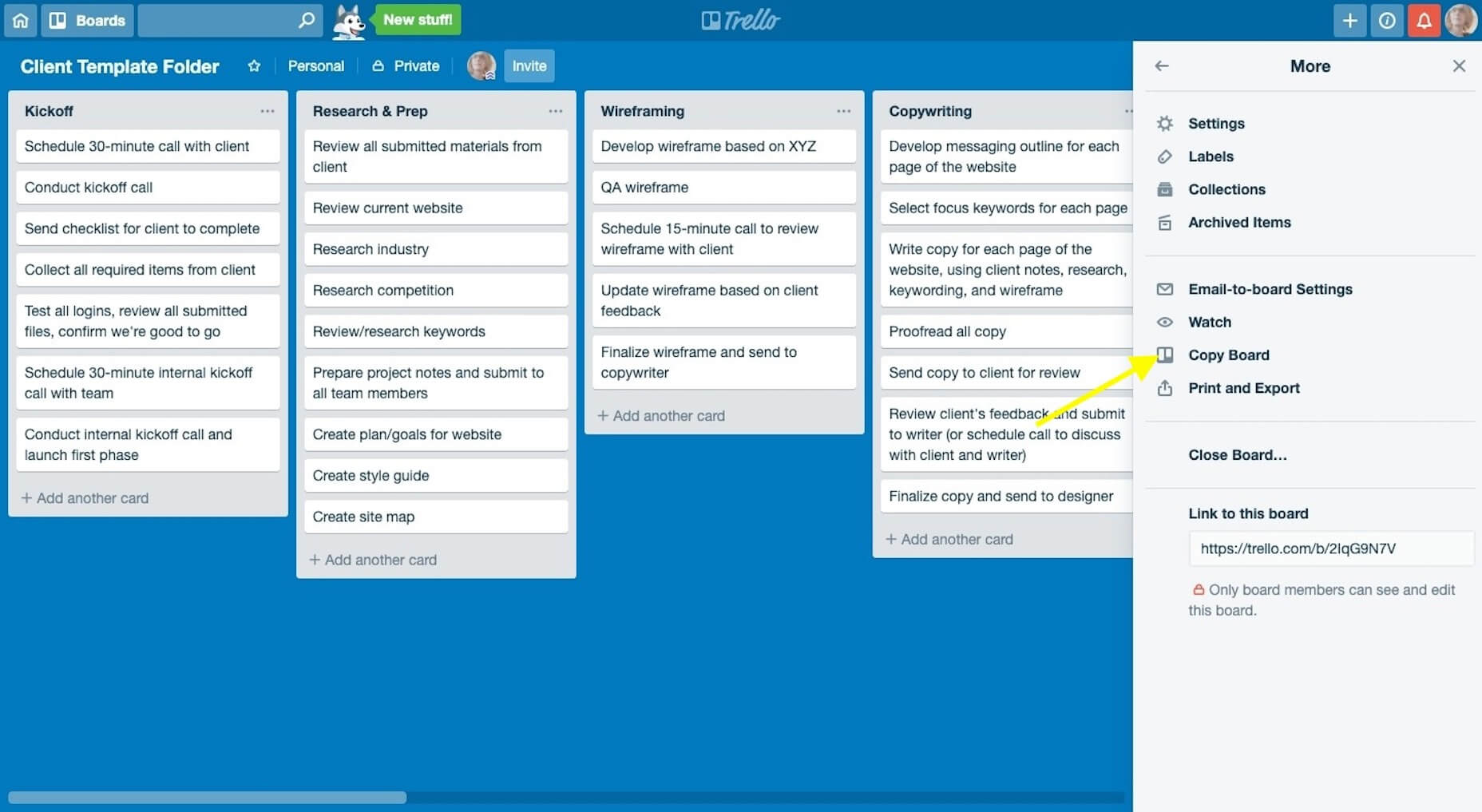
Then, “Copy Board”:

Name it with the new client’s name and click “Create”.

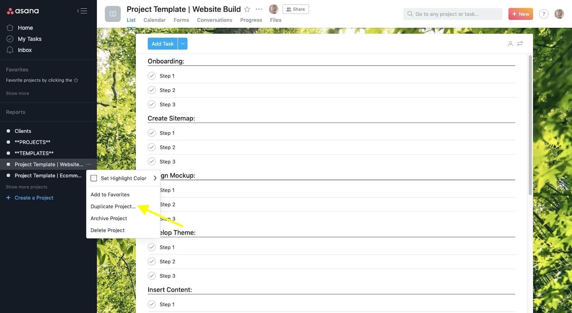
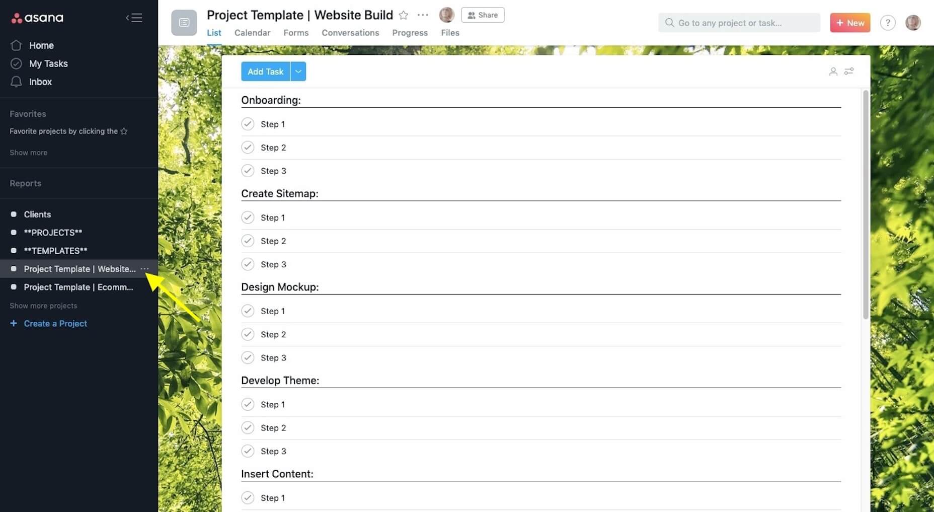
Or, in Asana, you’ll click on the “More” (three dots) icon:

Then, “Duplicate Project”:

Name it with the new client’s name and then click “Create New Project”.

Add any team members that will be working on the job to the folder now.

Step 2: Save Project Documents to the Folder

Centralize all of your documents, communications, and deliverables in the new project management folder. Start with the scope-of-work (SOW), proposal, and any notes you gathered on the client prior to the signing of the contract.

Step 3: Schedule a Kickoff Call with the Key Stakeholder

If you haven’t already done so, identify who the key stakeholder is on the client’s side. Ideally, this is one person. Is it the CEO? The marketing admin? A project manager? Whoever you will be dealing with throughout the project (i.e. the decision-maker) should be the one to attend the kickoff call.

This will streamline all communications during the project to ensure you’re not having to field requests or feedback from multiple parties.

Step 4: Reinforce Expectations During the Kickoff Call

Over the course of 30 minutes, it’s your job to briefly communicate what the client can expect from you over the course of the job while reinforcing what you need from them to make it happen.

This means talking about things like:

  • Your process;
  • Project timeline;
  • The feedback process;
  • Milestones and progress calls;
  • An introduction of your project management software (if you can do it through a live screen-share, that would be best).

This is also when you’ll reinforce the accountability piece by letting them know that “homework” will follow shortly.

Step 5: Send the Welcome Questionnaire

In the Welcome questionnaire you send after kickoff, explain to the client that they don’t have to worry about a thing in terms of building a beautiful website for their business. That’s your job. However, you do need certain things from them in order to do the job well.

Although I don’t build websites for clients anymore, I still use the same onboarding process for my copywriting clients. Here is the Welcome email I send to them (feel free to tailor this to your own needs):

Welcome aboard, [client name]!
I’m very excited to get started and hope you are, too!
I know what a pain it is to create content for your own brand, so I’m happy you’ve entrusted it to me.
As we get moving here, I’m going to ask you for just a few things: [link].
Please fill this out within the next seven days. If I have any questions, I’ll be in touch as soon as I can.

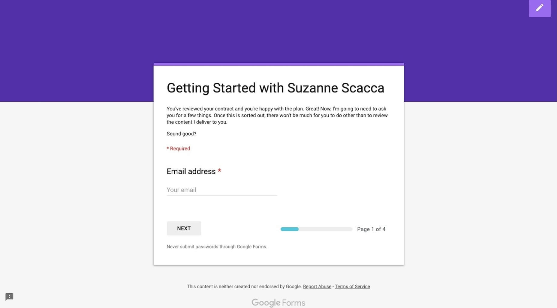
It’s succinct and let’s the client know I’m not asking for much. I then send them a Google Forms questionnaire to collect all the remaining details, documents, and logins I need from them:

Personally, I love Google Forms for onboarding copywriting clients, but you may want to use something like Content Snare if you expect to receive lots of design assets and content.

In terms of what you ask for? It depends on how much you’re doing for the website, but I’d suggest starting with these:

  • Logins to their content management system and control panel (plus, logins to third-party integrations if you need them)
  • Logo
  • Brand guidelines
  • 3-5 websites they like the look of
  • Top 3 competitors’ websites
  • Images, videos, and other brand assets
  • Website pages (navigation)
  • Content (if they’re writing it)

Don’t start any work until you receive everything they owe you. One of the reasons you have an onboarding process is so they can’t drag their feet and cause delays later on.

Step 6: Generate the Creative Brief

Based on everything you know about the client, their target audience, and goals for the website, you now need to generate the creative brief.

This is a succinct document that lays out the details and plan for the website. It ensures that all parties — you, your team (if you have others working for you), and the client — are on the same page and in agreement of what’s to be done. That way, if questions or disagreements come up later, the creative brief will put any doubts to rest.

You should include the following:

  • Title (i.e. website name)
  • Project summary
  • Start date
  • Projected end date
  • Deliverables
  • Problems to be solved
  • Goals/objectives
  • Target audience
  • Project milestones and due dates

Also, if you’re in the habit of creating moodboards for clients, you can send that over with the creative brief.

Make sure to get a signature of approval before moving on. HelloSign can help you do this easily and cheaply.

Step 7: Schedule Progress Calls

One last thing to do is to schedule progress calls with the client. It might seem too early to do this, but it’s not really.

You have a project start and end date. You have projected milestones. By scheduling progress calls for each milestone now, you can put the website on everyone’s radar, which will keep everyone involved (including the client) accountable to the project.

Once your client has accepted the invitations, it’s time to start assigning tasks in your project management software and get to work!

The Benefits of Onboarding

Think about all those times a client failed to deliver something that was owed to you (like logins, logos, or content) — and how that set your project timeline back.

Think about all those times a client said, “I hate it” or asked for a fifth or sixth round of revisions despite clearly not knowing what they really wanted.

Think about all those times you missed a step and had to backtrack once you were hip-deep in the design process.

Onboarding web design clients helps you avoid common issues and strengthen your workflow by:

  • Documenting and storing everything in a centralized spot;
  • Setting and reinforcing client expectations;
  • Preventing scope creep;
  • Designing websites with better outcomes;
  • Boosting trust in your business.

As you refine this predictable onboarding process, you’ll be able to complete website projects more efficiently which, in turn, will lead to higher profit margins.


Featured image via Unsplash

Add Realistic Chalk and Sketch Lettering Effects with Sketch’it – only $5!

Source

from Webdesigner Depot https://www.webdesignerdepot.com/2019/04/7-steps-to-successfully-onboarding-design-clients/

Monday, 15 April 2019

What’s New For Designers, April 2019

We’re all about learning tools this month in our round of up new resources and tools for designers. From games to books to tutorials, there’s something new for everyone to learn and enjoy.
If we’ve missed something that you think should have been on the list, let us know in the comments. And if you know of a new app or resource that should be featured next month, tweet it to @carriecousins to be considered!

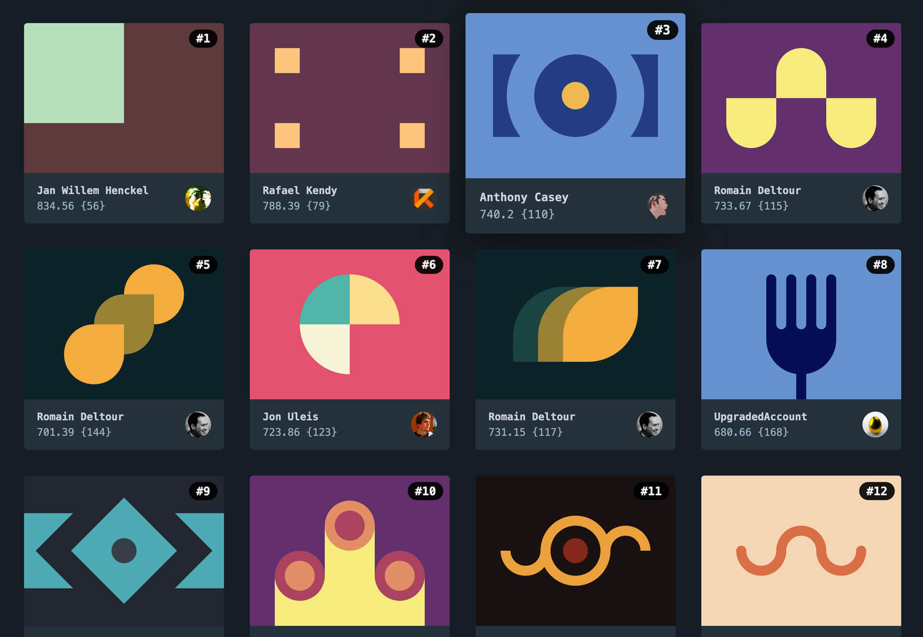
CSSBattle

Jump to the top of the CSSBattle leaderboard by using CSS skills to replicate targets with the smallest possible code. Put your skills to the test in this fun way to test your knowledge. New targets being added as well so you can keep going and moving up in the rankings.

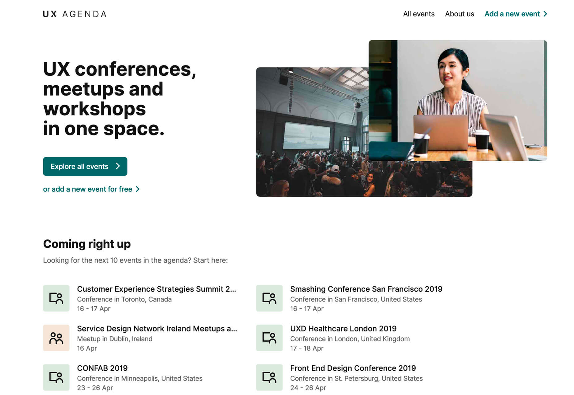
UX Agenda

UX Agenda is a compilation of conferences, meetups and workshops in a single, searchable location. Look for events near you or add your own UX events for free.

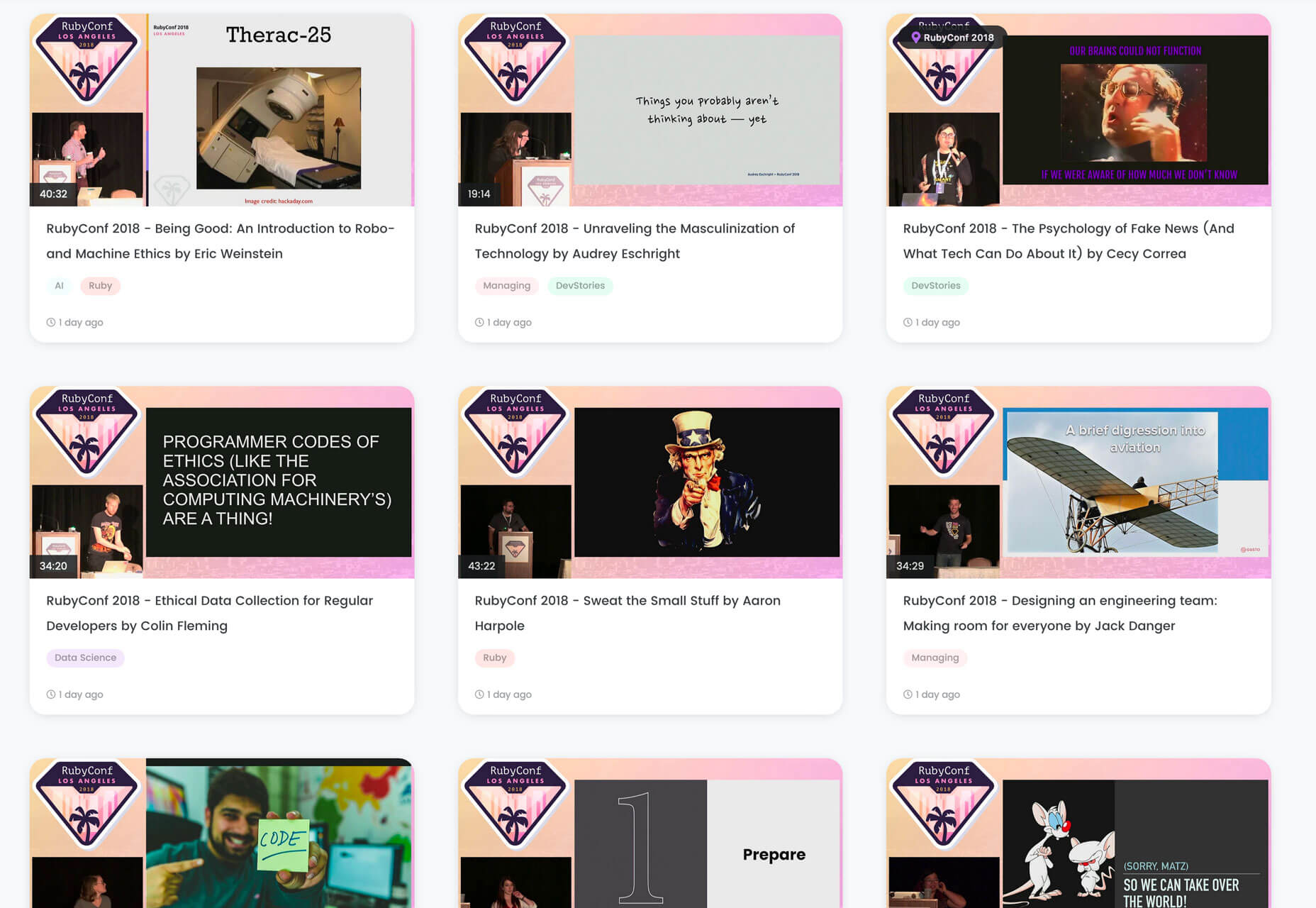
Codetalks.tv

Codetalks.tv is a collection of the best talks about coding around the world in one place. Watching any of the videos is free. Look for talks from specific conferences or by topic.

Static Pages

Static Pages allows you to publish any static page on a WordPress website with any URL in a matter of seconds. It also includes SEO optimization for ease of use.

Static Pages – Upload Static HTML Pages to WordPress

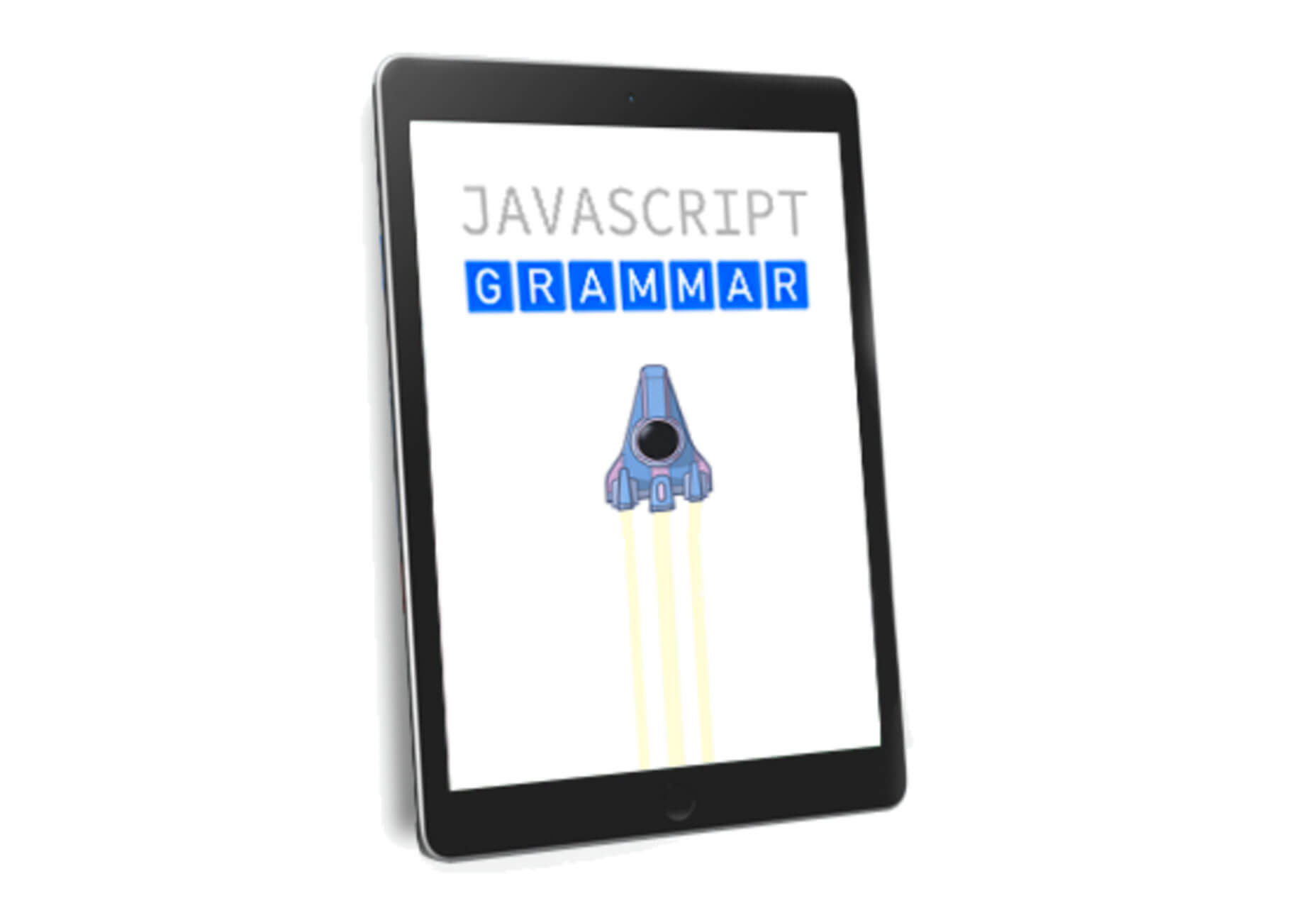
Javascript Grammar

Javascript Grammar is an educational e-book offering from Greg Sidelnikov, also known as @js_tut or JavaScript teacher on twitter. You can get it on Amazon, with a tweet or direct from the author.

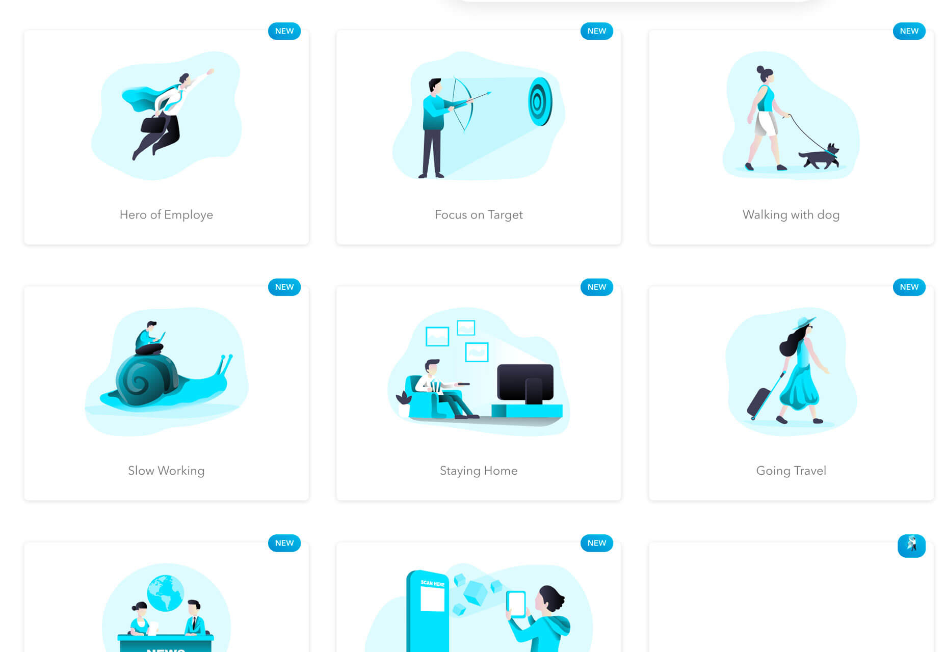
Illustration Gallery

Illustration Gallery is a collection of royalty-free illustrations for projects. It’s updates weekly with plenty of options for personal or business use in a clean, modern style.

Neort

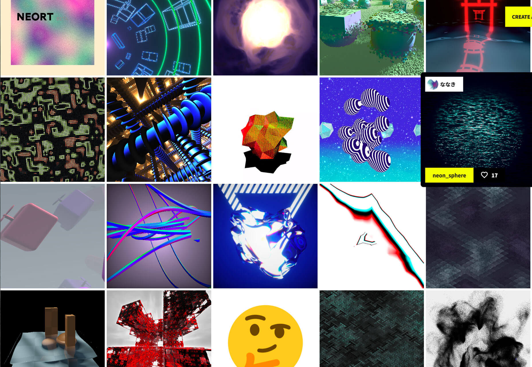
Neort (which is still in beta) is a digital art gallery where you can share artwork and how it was created. Upload work with a short description and gather feedback on it from a community of artists. Think of it as the artist version of Dribbble.

Geenes

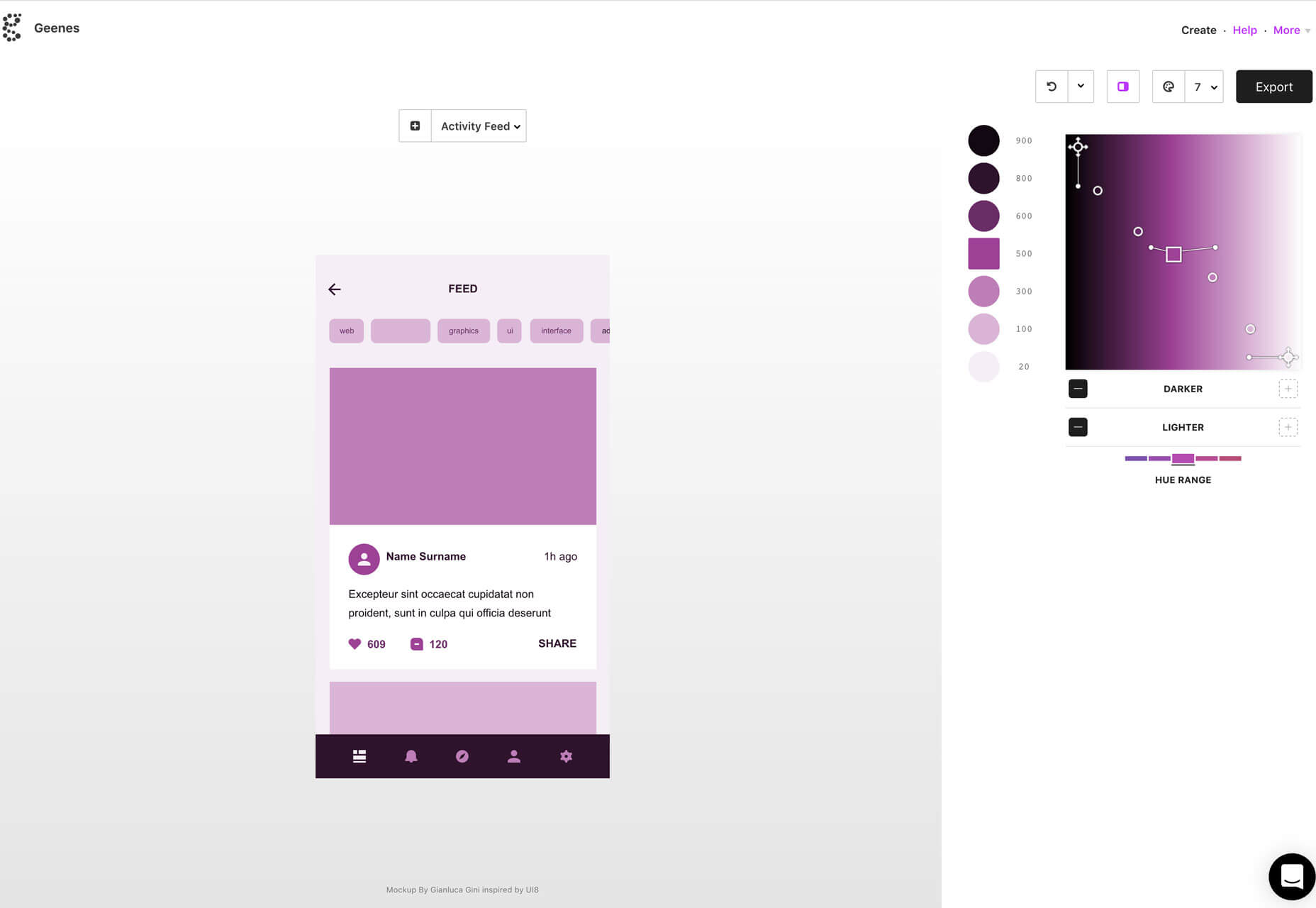
Geenes is a color scale tool to help you generate color palettes for user interface elements and then export the hues for Sketch or other programing tools.

Color Review

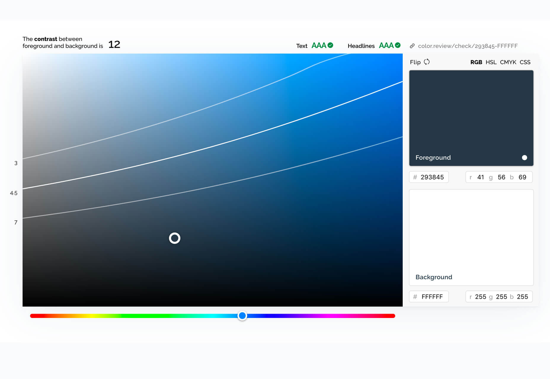
Color Review is a tool to help you test contrast between color elements in a design. This can help you ensure that foreground and background elements have enough contrast to be read with ease by all users and is a great accessibility tool. Use it online or download the app.

Spider

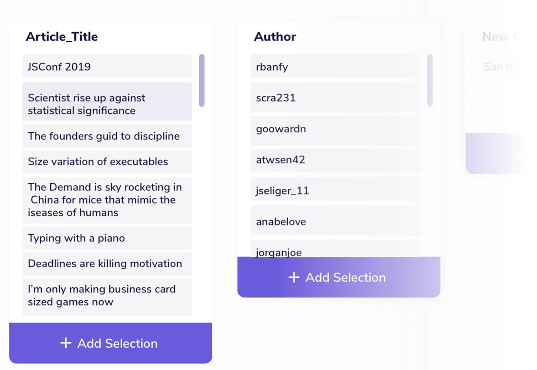
Spider is a tool that helps you turn websites into organized data without coding. Add the extension to Google Chrome to start scraping data; just point and click to collect the data you need.

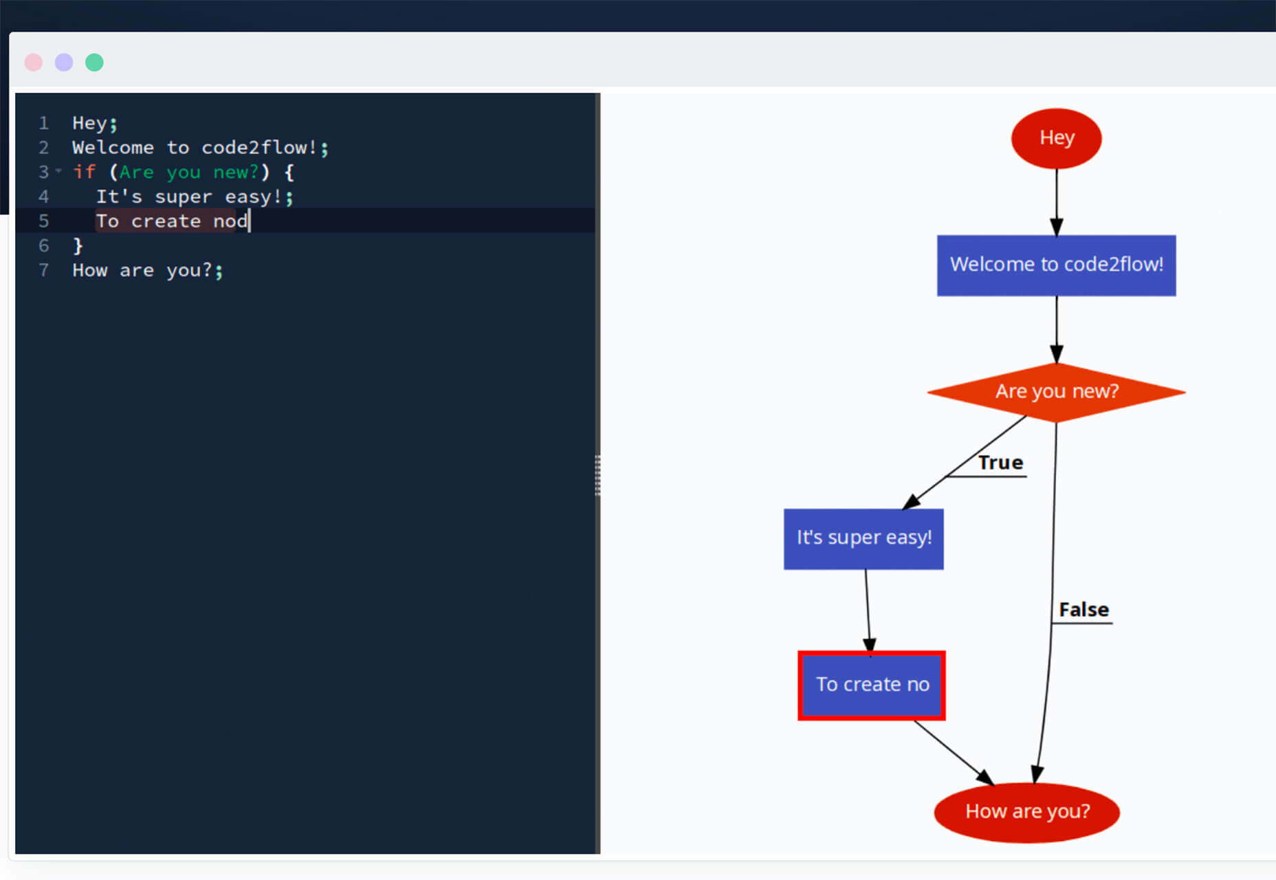
Code2Flow

Code2Flow is a tool to describe workflows and patterns in an easy (and visual) format. Create and build flowcharts in seconds and don’t worry about needing more complicated drag and drop tools. And it’s all interactive.

Mosaic

Mosaic is a front-end JavaScript library for building user interfaces. It uses a component-based system and has an extremely small library size.

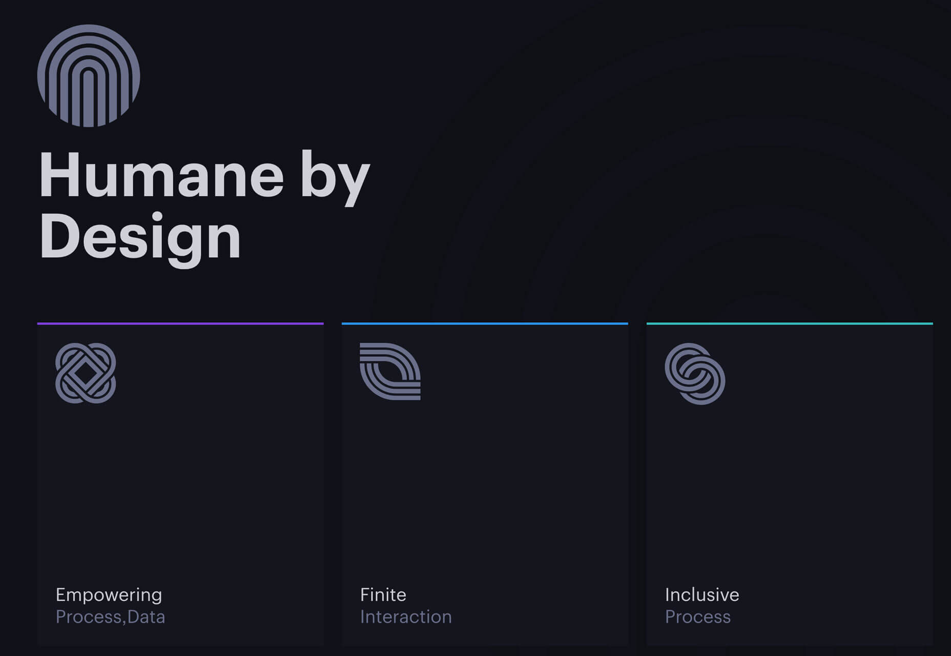
Humane by Design

Humane by Design is a project by Jon Yablonski to provide information about designing ethically humane digital products. From the site: “The exponential growth of mobile technology has ushered in an age where time and attention is an increasingly scarce resource. Instead of technology enhancing our abilities as humans, we’ve seen it become a vehicle for extracting our attention, monetizing our personal information, and exploiting our psychological vulnerabilities. As designers, we play a key role in the creation of such technology, and it’s time we take responsibility for the impact that these products and services we build are having on people it should serve.”

Outdoor Icon Pack

The Ultimate Outdoor Icon Pack includes 64 editable vector icons and a checklist for adventure designs. The flat line styles are trendy and easy to use.

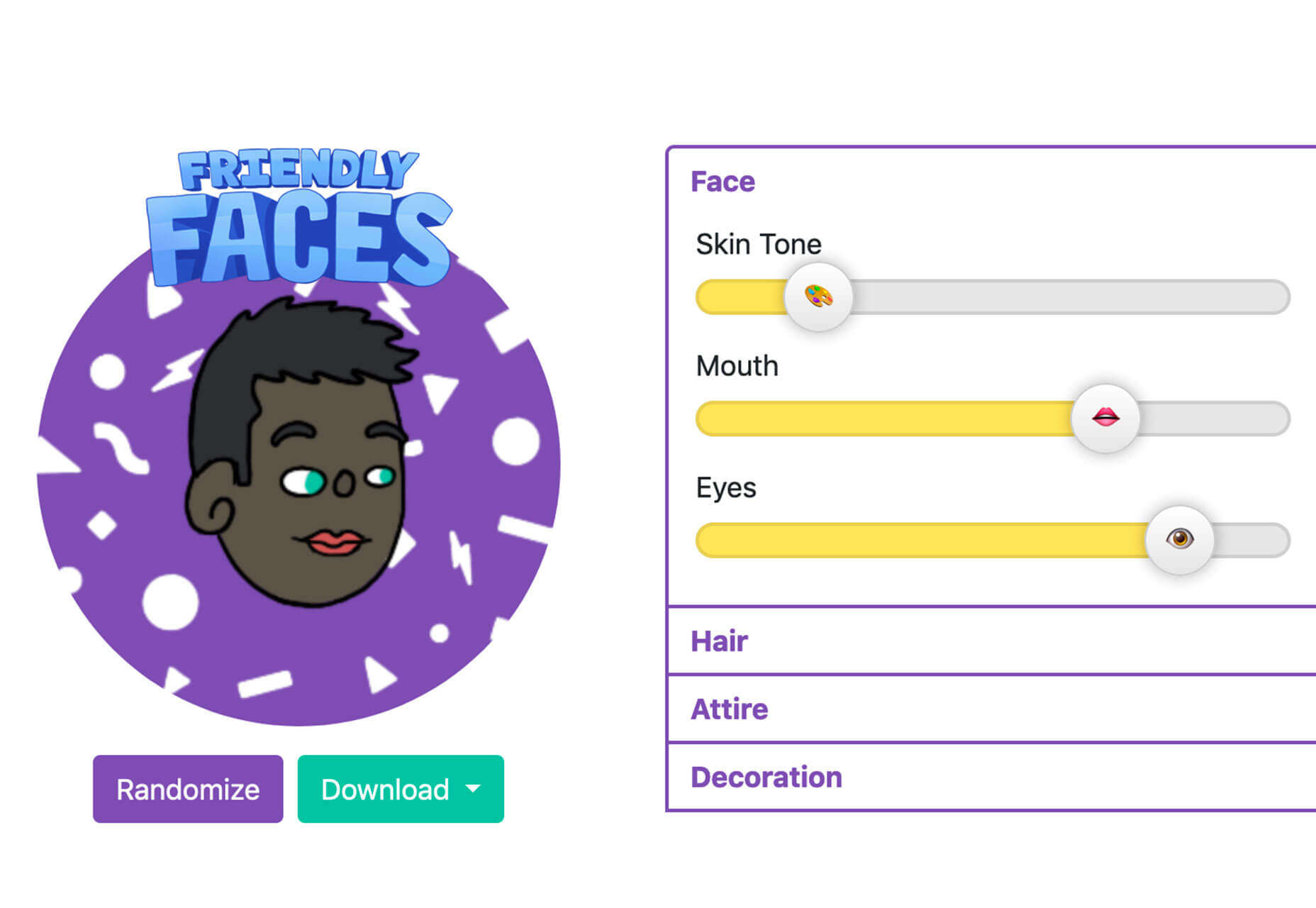
Friendly Faces

Friendly Faces is an inclusive avatar generator. Pick random options or adjust specifics to find an avatar that looks more like you. Then download and share.

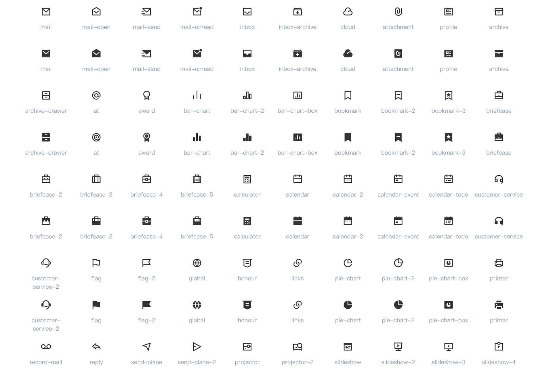
Remix Icon

Remix Icon is a set of open source line-style icons in a variety of categories. Use them as part of a consistent design system or as stand-alone elements.

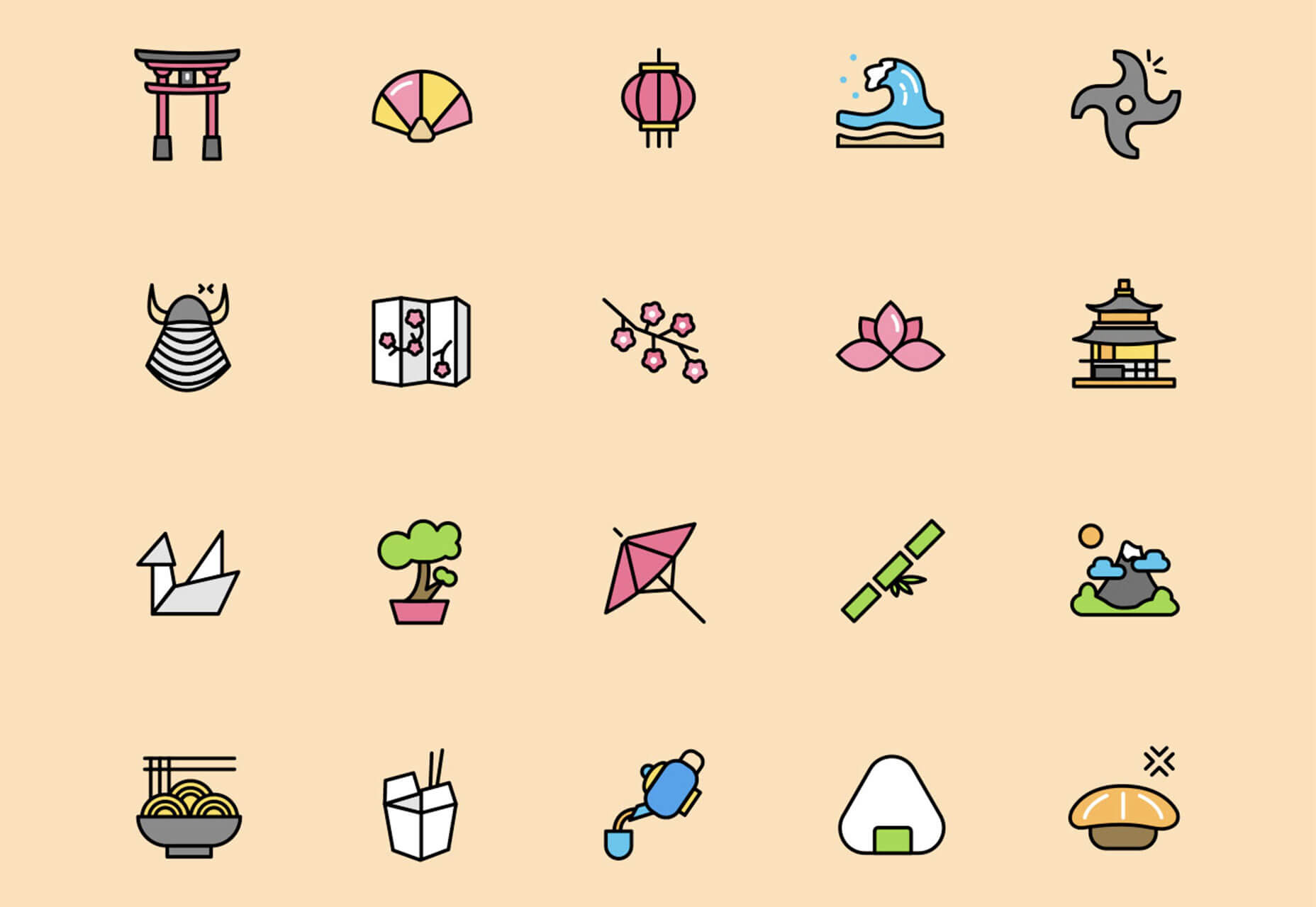
Asian Adventure Icons

Asian Adventure is a colorful set of 76 flat icons that represent Asian culture and elements. Icons comes in AI, SVG and PNG formats.

Tutorial: How to Make a Speech Synthesis Editor

This great – and detailed – tutorial from Smashing Magazine helps you understand the logic behind the technology powering all the voice assistants in our homes. This guide helps you create a “What You Get is What You Hear editor for digital speech synthesis.

Tutorial: How to Create Clipped, Blurred Background Images in CSS

This tutorial takes you through creating seamless blur effects using CSS filters for a trending photo look. The tutorial includes written and video instructions and is easy to follow.

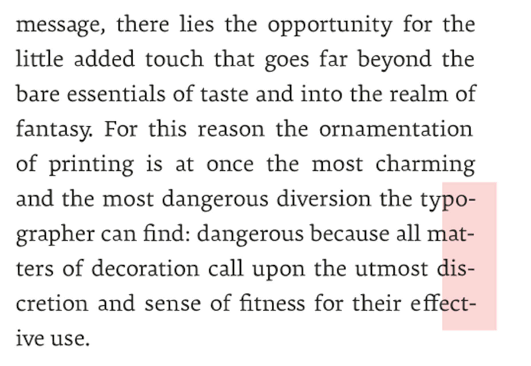
Tutorial: All You Need to Know About Hyphenation in CSS

How do you feel about hyphenation on the web? It can be a somewhat touchy subject. This tutorial by Richard Rutter explains hyphenation dictionaries for the web and related CSS guidelines.

Tutorial: How to Organize Files in a Design Agency

It’s an age-old question: How to you best organize design files? The team at Clay digital agency go behind the curtain on their process, and you can definitely learn from their workflows and file structures.

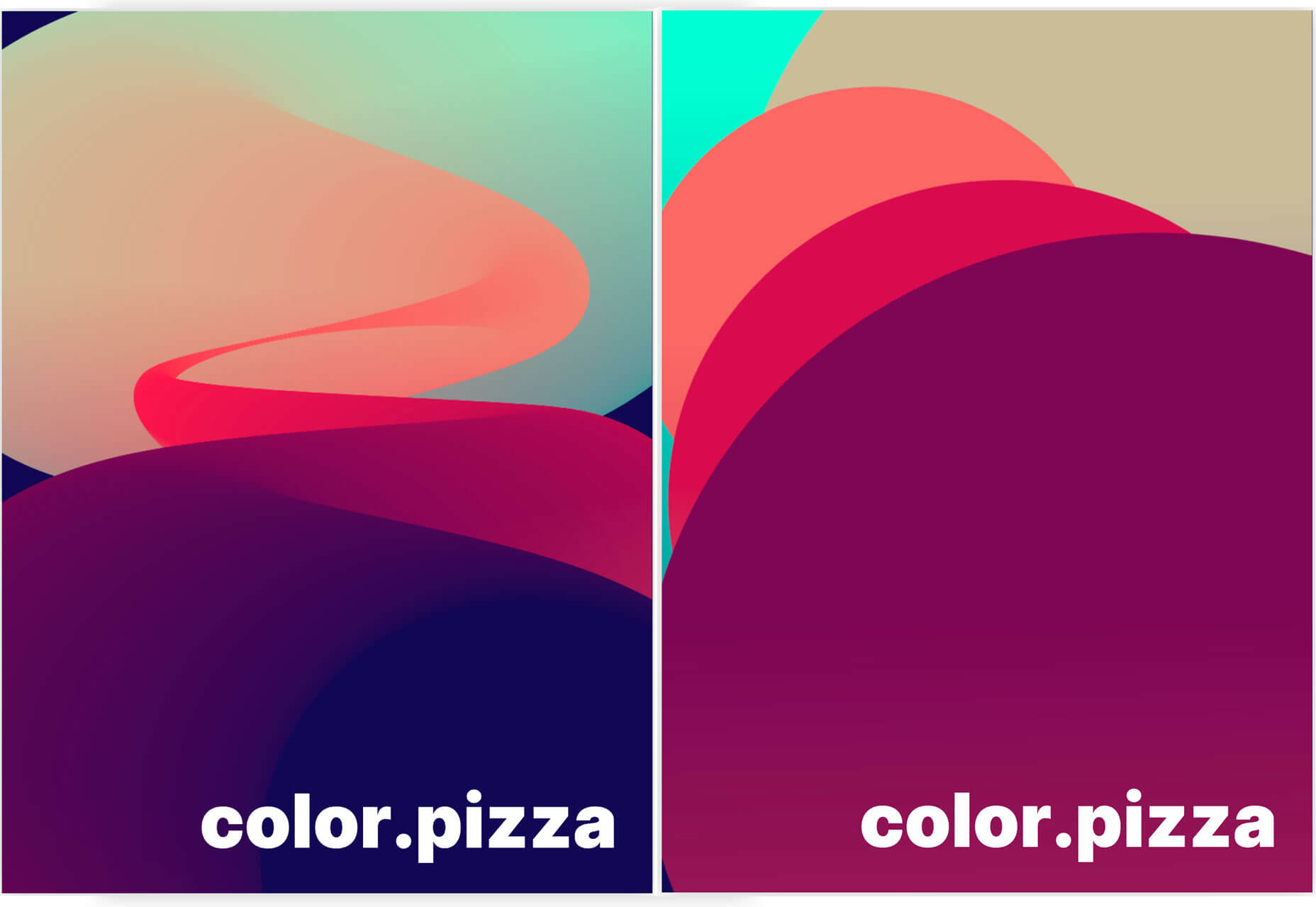
Generative Poster

Generative Poster is a fun pen that will allow you to adjust parameters and create an abstract poster design quickly. Just adjust the controls to see changes as they happen and keep tweaking until you find the right design.

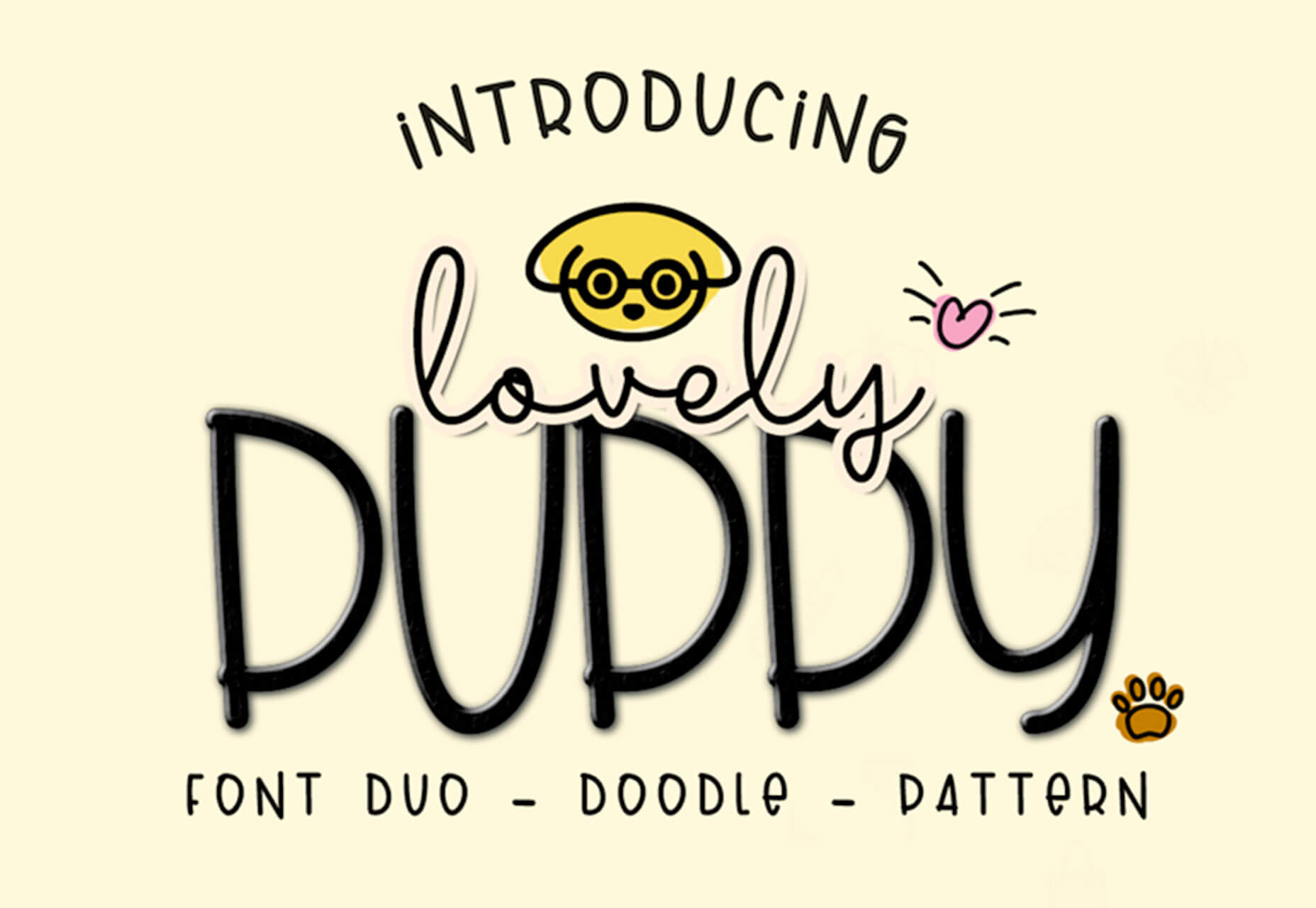
Lovely Puppy

Lovely Puppy is a light and cheerful display font for children’s or whimsical purposes. The download includes a font duo with the sans serif and script versions as well as a set of doodles and patterns.

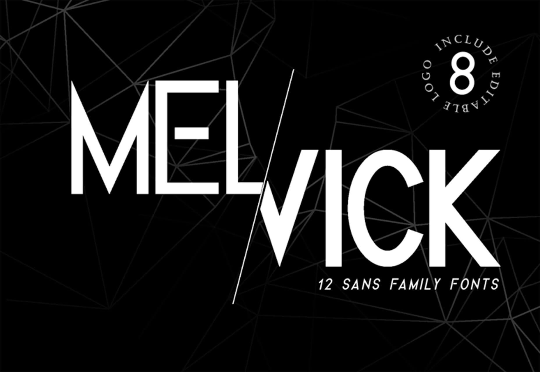
Melvick

Melvick is a strong, display sans serif. It has a distinct style with upright letterforms with some disconnected strokes. This typeface includes uppercase characters and numerals.

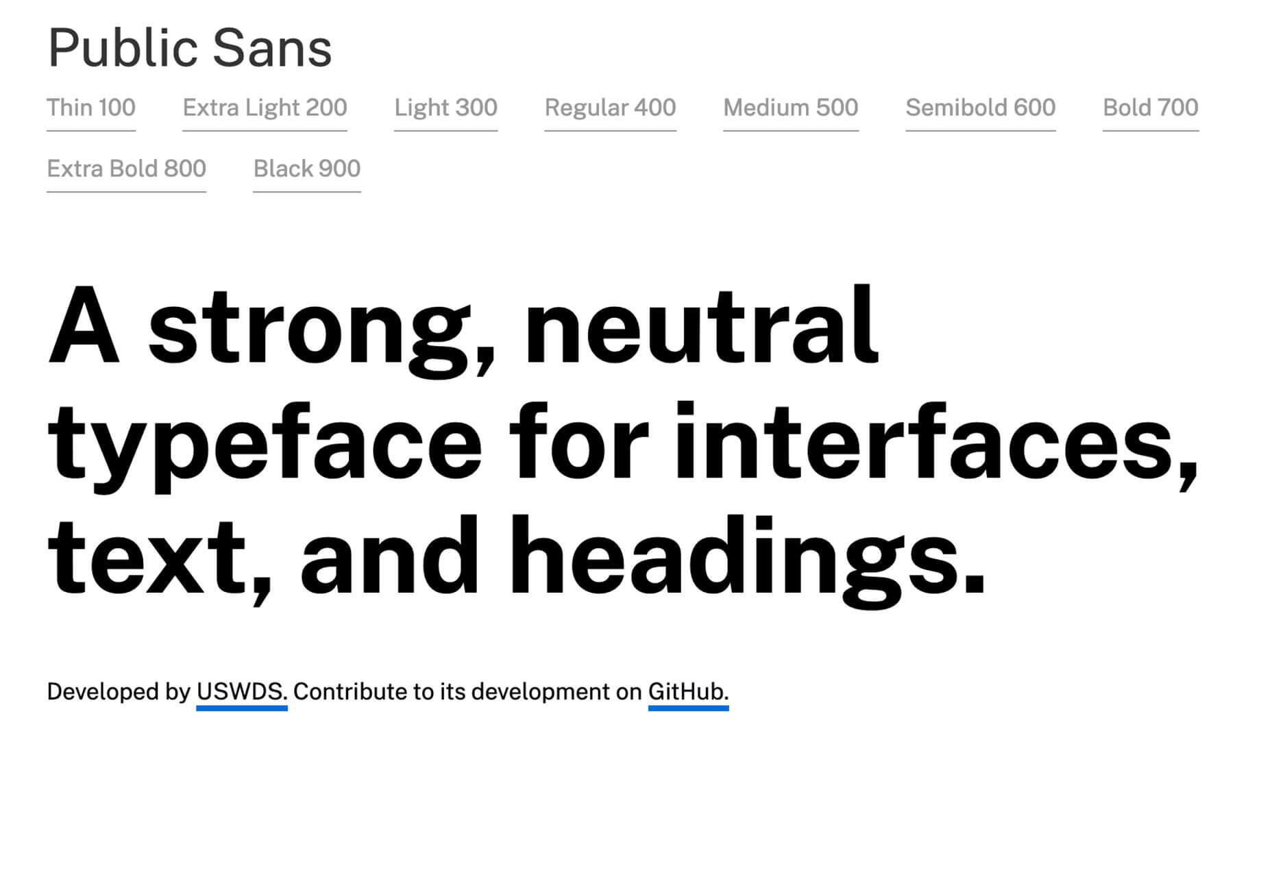
Public Sans

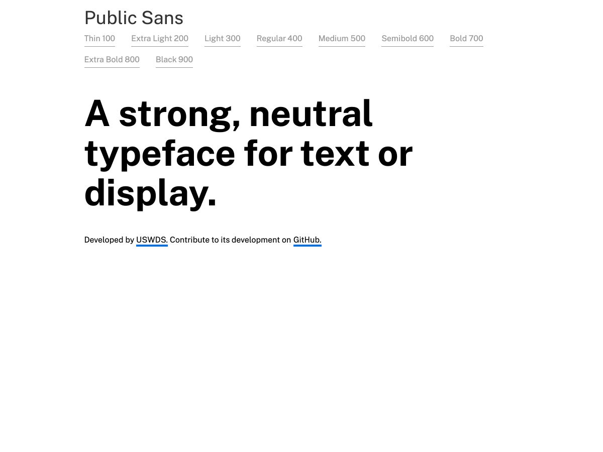
Public Sans is a strong neutral typeface for various uses. The family includes thin, extra light, light, regular, medium, semibold, bold, extra bold and black variations. Plus, you can join the development on GitHub. The typeface is a variation of Libre Franklin.

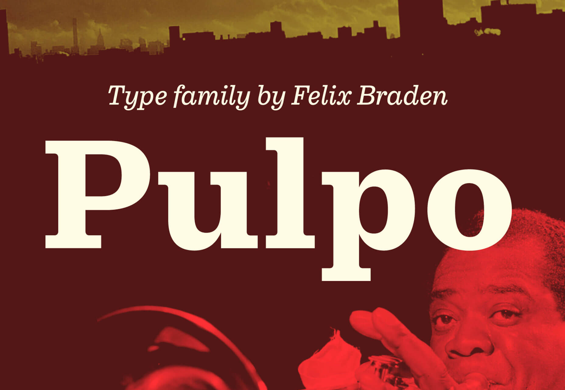
Pulpo

Pulpo is a Clarendon style typeface with the skeleton of Century Schoolbook. Longer extenders give text a bit more air to breathe and improve legibility in small text sizes. Despite the strength and sturdiness of the design, each letter shape carries warmth and an echo of the human hand. The familiarity of the letterforms also conceals some nostalgia. The family has 10 styles, ranging from light to black (including italics) and is ideally suited for editorial, advertising and packaging as well as web and app design. A massive body combined with low stroke contrast, emphasizing the horizontal elements, make it very suitable on screen and for small text sizes on newsprint paper.

Add Realistic Chalk and Sketch Lettering Effects with Sketch’it – only $5!

Source

from Webdesigner Depot https://www.webdesignerdepot.com/2019/04/whats-new-for-designers-april-2019/

Sunday, 14 April 2019

Popular Design News of the Week: April 8, 2019 – April 14, 2019

Every week users submit a lot of interesting stuff on our sister site Webdesigner News, highlighting great content from around the web that can be of interest to web designers. 
The best way to keep track of all the great stories and news being posted is simply to check out the Webdesigner News site, however, in case you missed some here’s a quick and useful compilation of the most popular designer news that we curated from the past week.

Note that this is only a very small selection of the links that were posted, so don’t miss out and subscribe to our newsletter and follow the site daily for all the news.

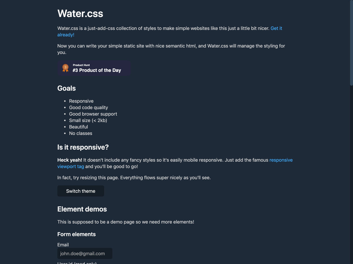
Water.css – Make your Tiny Static Websites Beautiful


How We Used WebAssembly to Speed up Our Web App by 20X


What Design Tools Get Wrong


Illustrated.dev


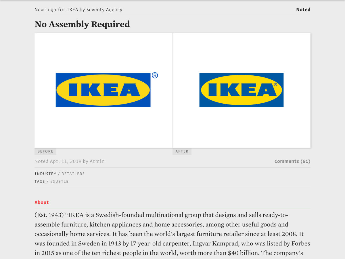
New Logo for IKEA


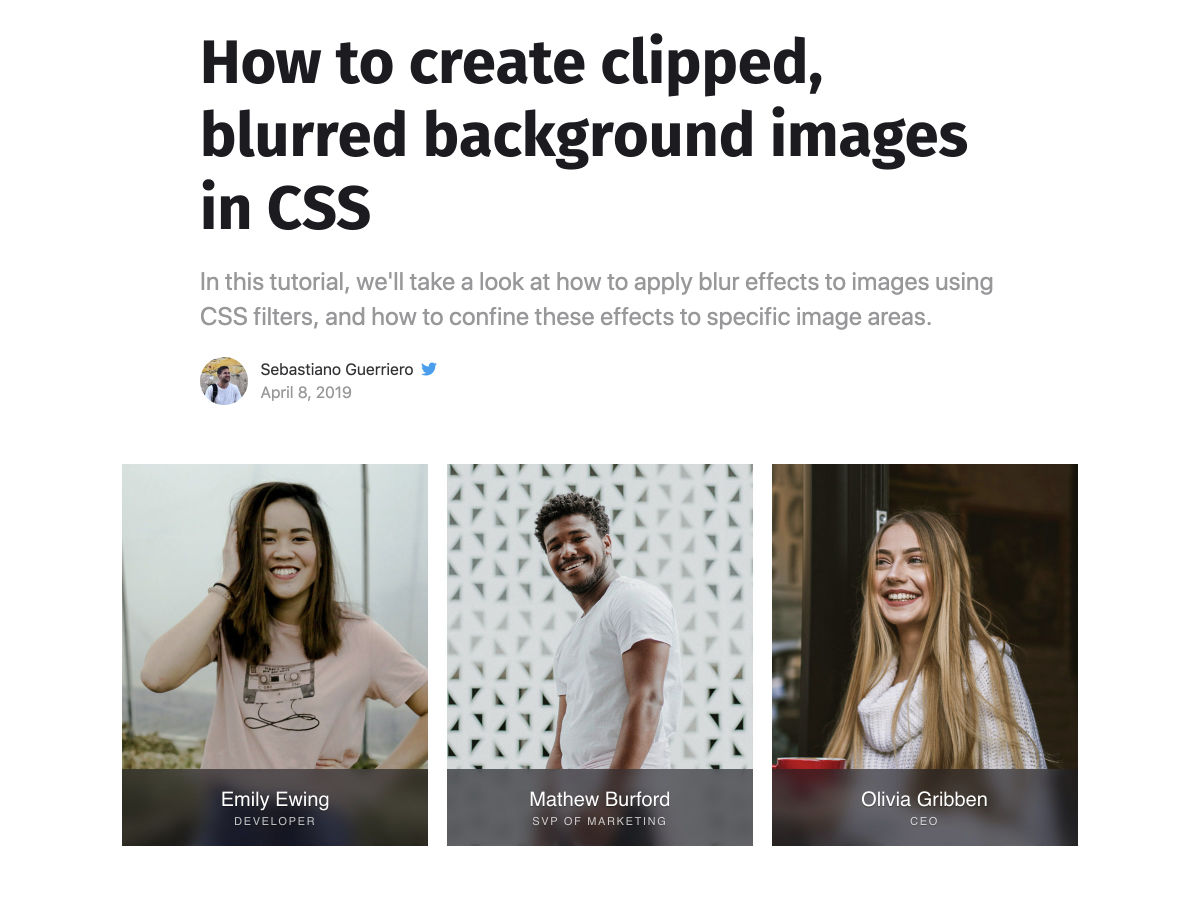
How to Create Clipped, Blurred Background Images in CSS


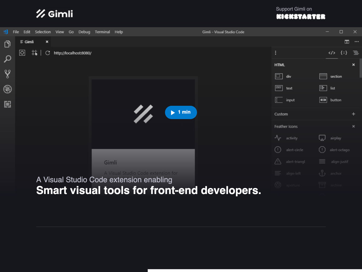
Kickstarter Campaign – Gimli : VIsual Web Tools for Visual Studio Code


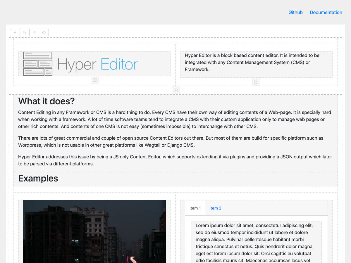
Hyper Editor – A Backend Agnostic Block-based WYSIWYG Editor


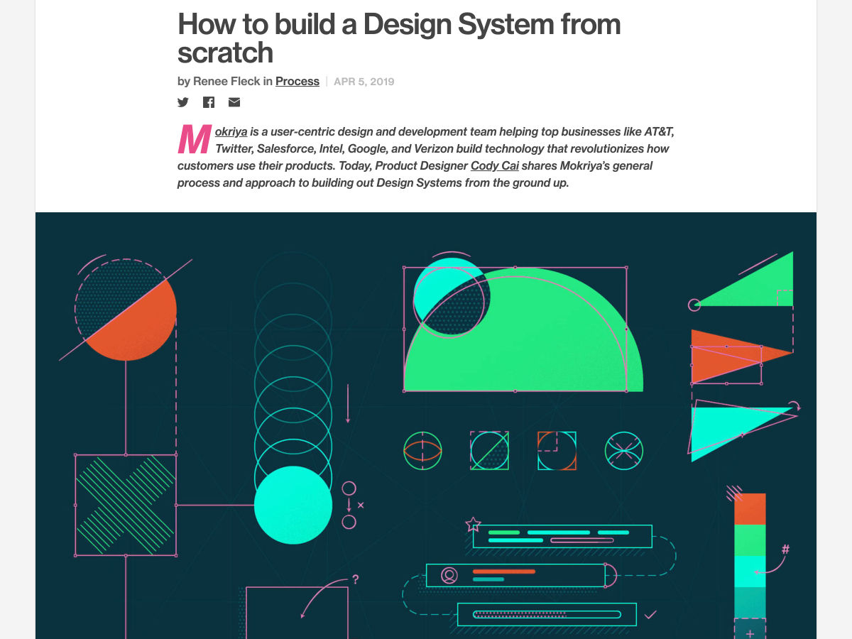
How to Build a Design System from Scratch


UI/UX Patterns You Literally Cannot Design


Find Color Names by HEX Value or Invent New Ones with this Twitter Bot


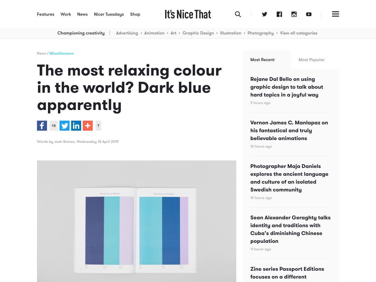
The Most Relaxing Colour in the World? Dark Blue Apparently


21 Pricing Page Design Secrets for More Conversions


Public Sans


The Five Areas of UX


Feeling Empty in Whitespace: My Love and Hate Relationship with Negative Space


Building a Front End with no JavaScript


The 12 Branding Archetypes of Successful Businesses


ColorKitty


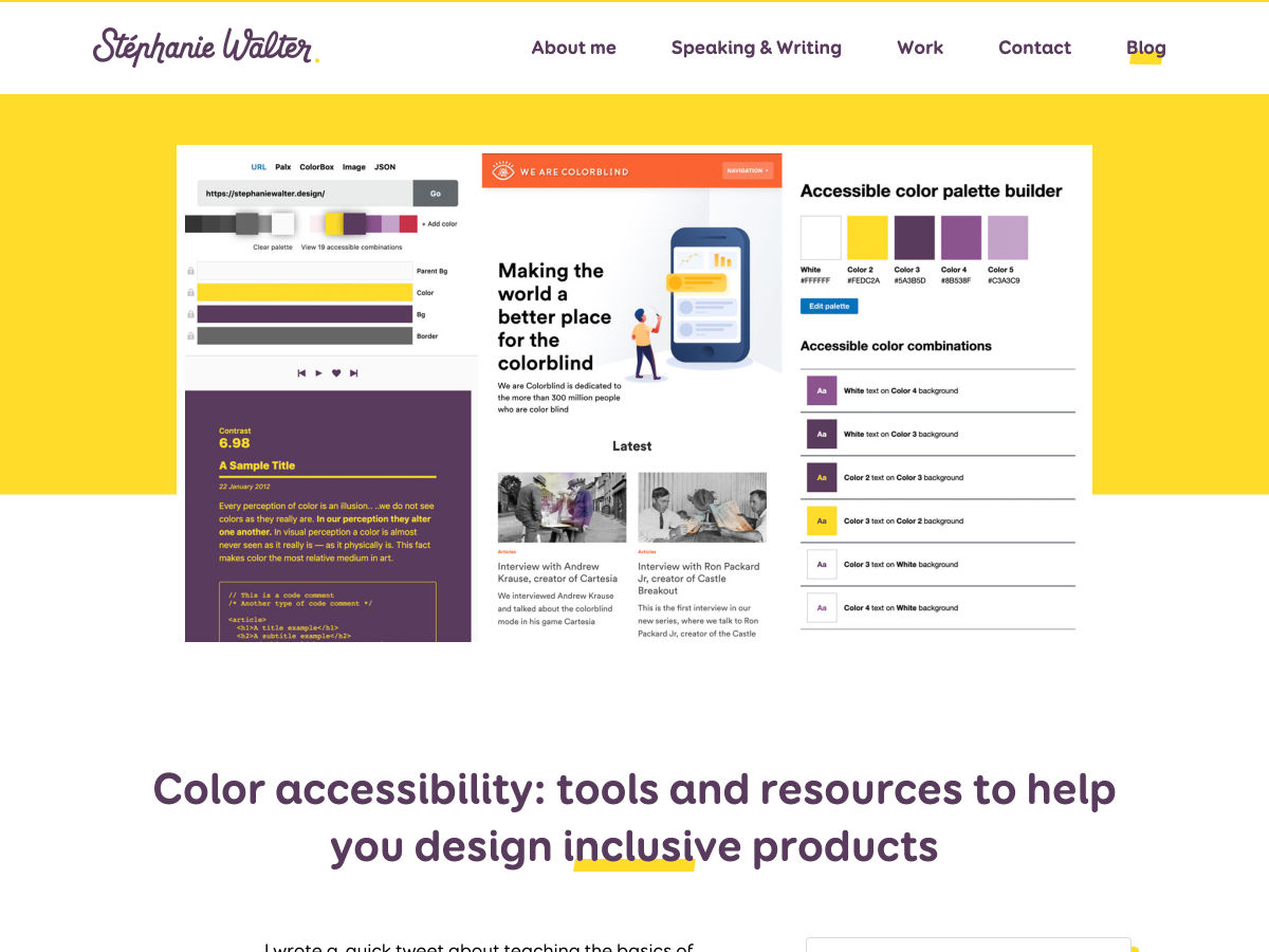
Color Accessibility: Tools and Resources to Help Design Inclusive Products


After Nearly Three Years of Development, Does Adobe XD Offer Enough of a Challenge for Designers to Consider a Change?


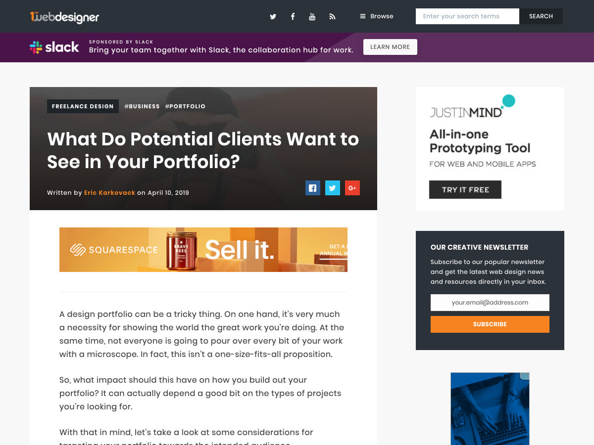
What do Potential Clients Want to See in your Portfolio?


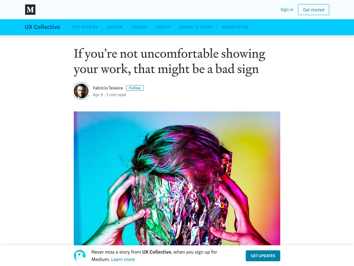
If You’re not Uncomfortable Showing your Work, that Might Be a Bad Sign


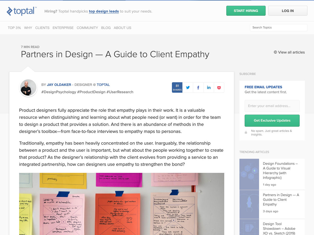
Partners in Design — a Guide to Client Empathy


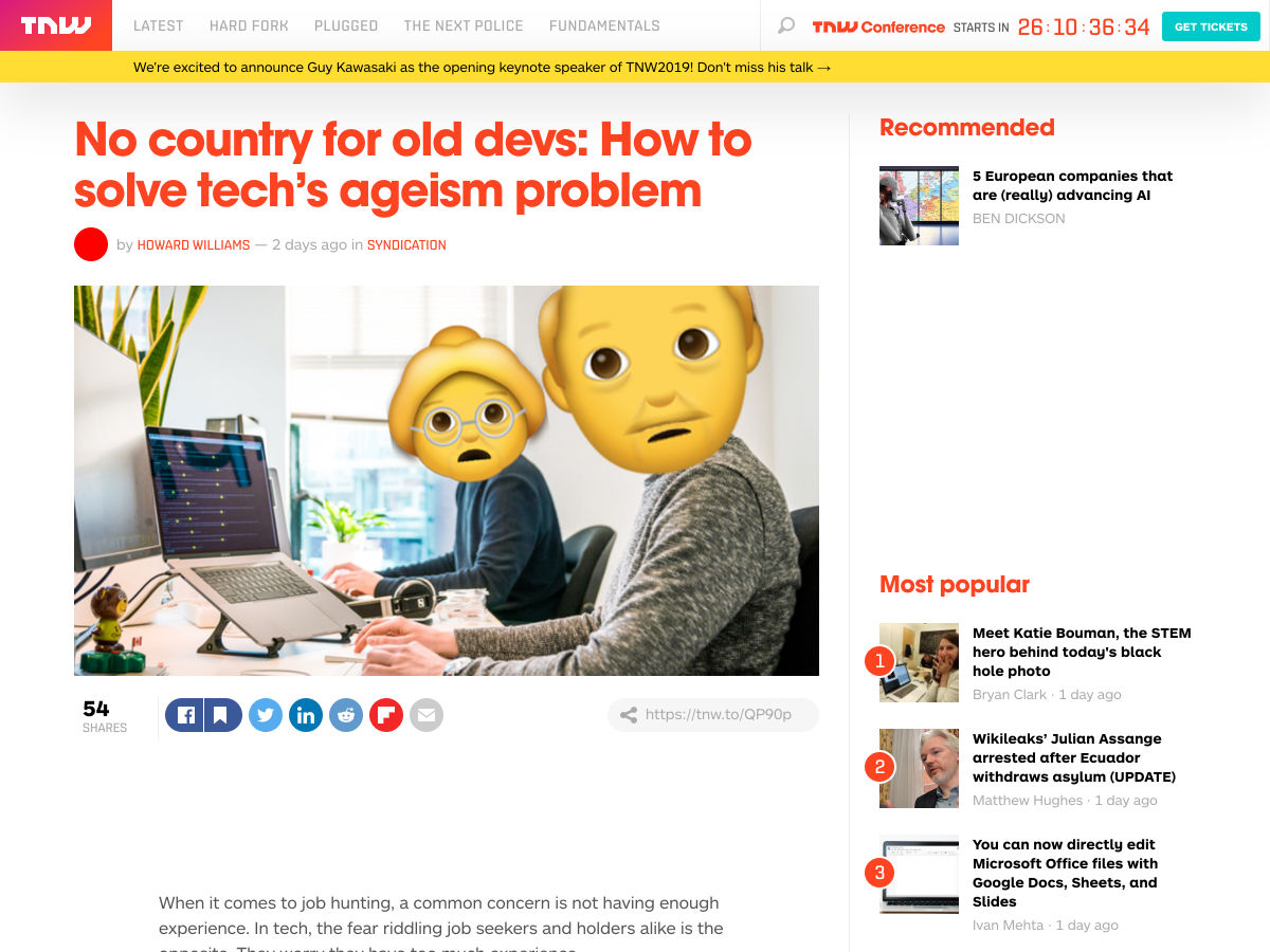
No Country for Old Devs: How to Solve Tech’s Ageism Problem


Want more? No problem! Keep track of top design news from around the web with Webdesigner News.

Add Realistic Chalk and Sketch Lettering Effects with Sketch’it – only $5!

Source

from Webdesigner Depot https://www.webdesignerdepot.com/2019/04/popular-design-news-of-the-week-april-8-2019-april-14-2019/