 It’s December, which means it’s officially carol season. Oh well. Whether you’re a curmudgeon about these things like myself, or are even now feeling the heat rise in your elf ears and Santa hat, we can all agree that portfolio sites are cool, right? Let’s see what those wacky designers have come up with now.
There are quite a few modern, as in pre-post-modern designs here. You know, classic, business-friendly minimalist sites. I must say, sometimes my writer and designer sides clash, and I worry about what design trends make me do to the English language.
(Also, I’d like to take a moment to thank Hubert Gałczyński from the previously-featured K2. He has directed me towards Wappalyzer which is a tool that’s helping me more accurately figure out what platforms and CMS everybody is using.)
Note: I’m judging these sites by how good they look to me. If they’re creative and original, or classic but really well-done, it’s all good to me. Sometimes, UX and accessibility suffer. For example, many of these sites depend on JavaScript to display their content at all; this is a Bad Idea , kids. If you find an idea you like and want to adapt to your own site, remember to implement it responsibly.
TJ Dhillon
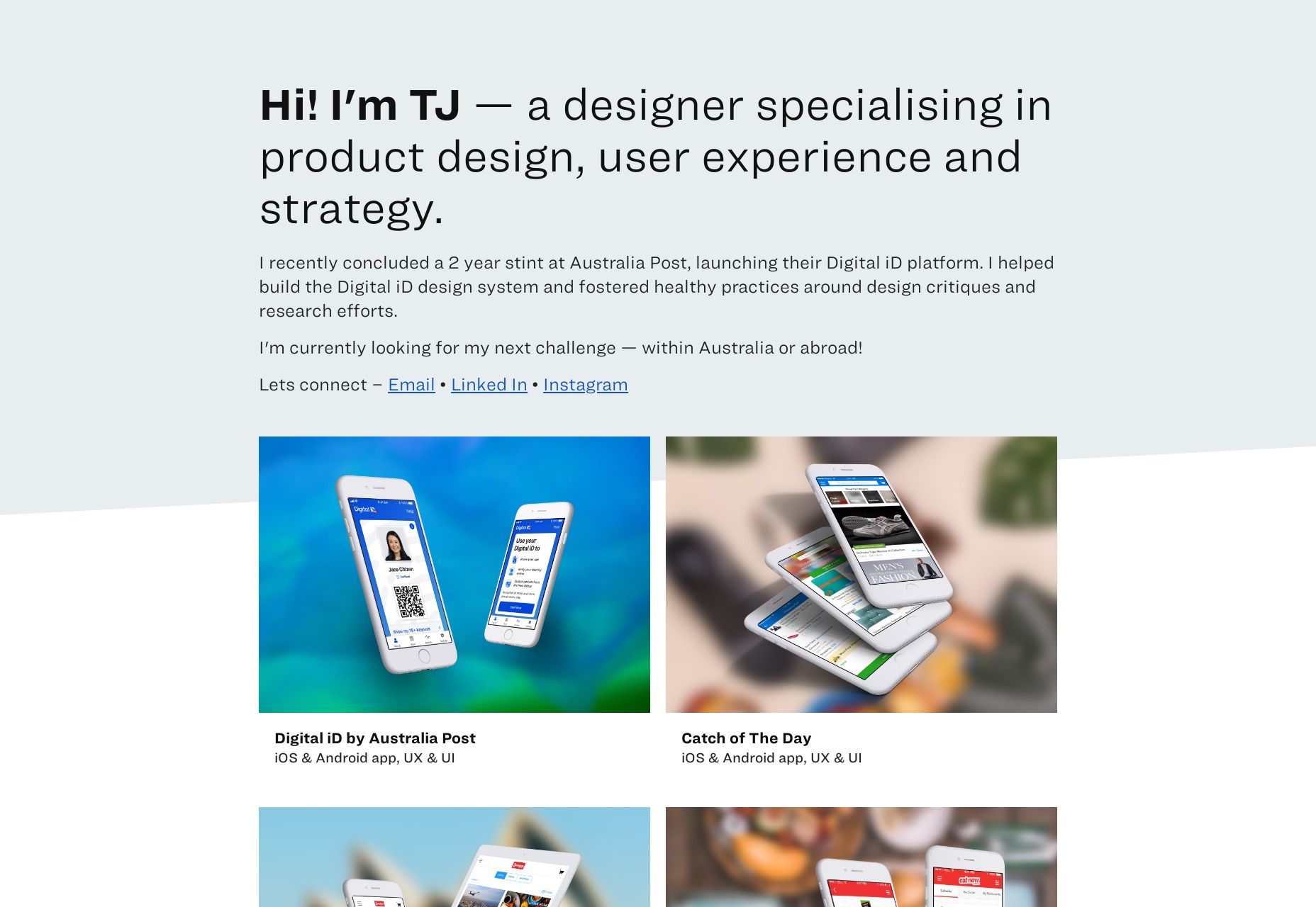
TJ Dhillon’s portfolio starts as the rest of this article will probably go on. It’s simple, it’s clean, it works. It’s got some nice little drop shadows on hovering over certain elements, and is it weird that I’ve actually missed those?
They were never a bad thing in moderation. Moderation might be the key to this whole site design. There are frills, but they’re not overdone.
Platform: Static Site
Matt Kevan
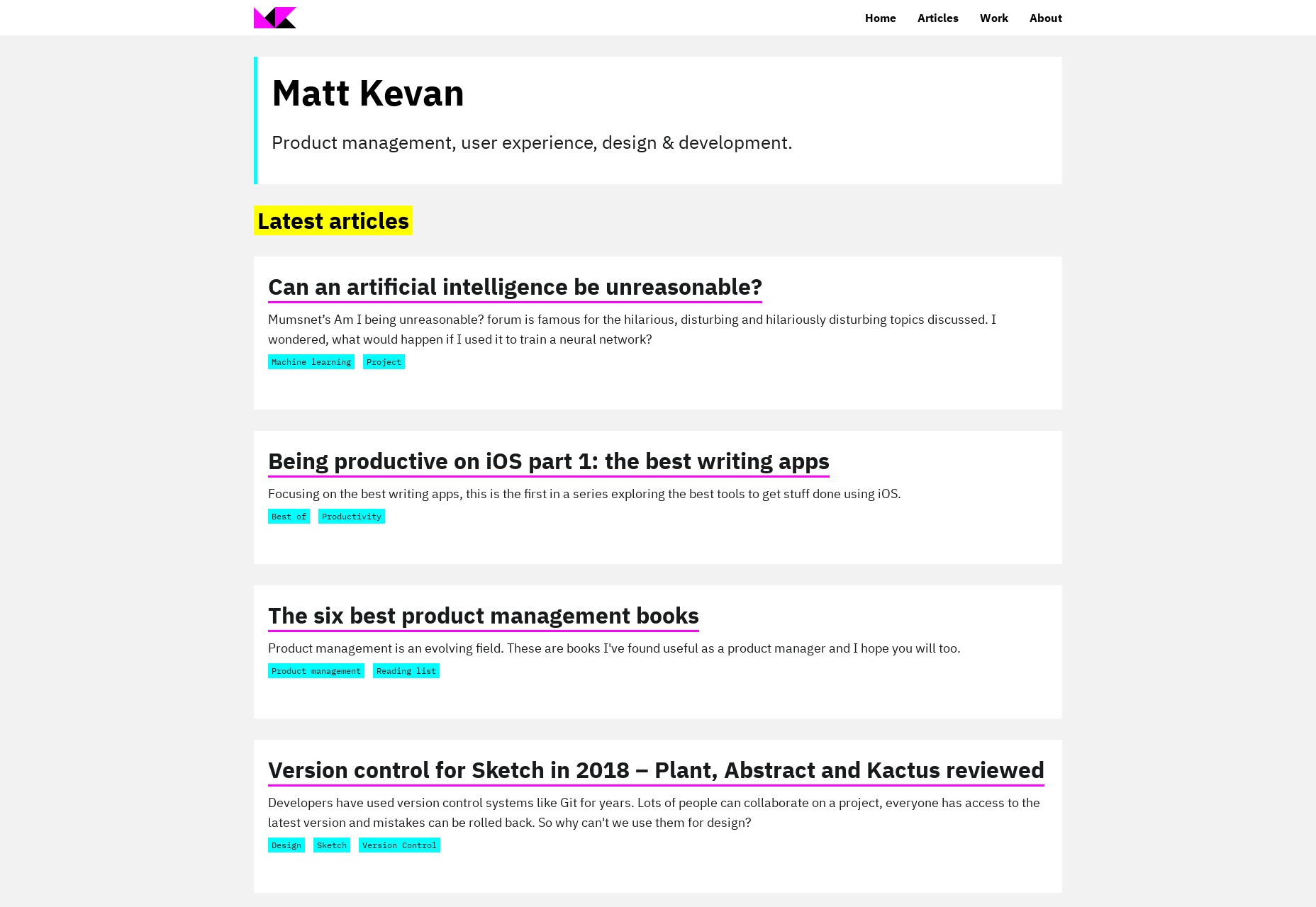
Matt Kevan’s portfolio looks a little bit like a prototype, though it’s obviously polished. As he is a UX designer, the aesthetic certainly works thematically.
He’s also elected to put his writing front and center, rather than his more visual work. It’s certainly one way to demonstrate your expertise, but I wish I had some kind of analytics
Platform: Jekyll
Daniel Spatzek
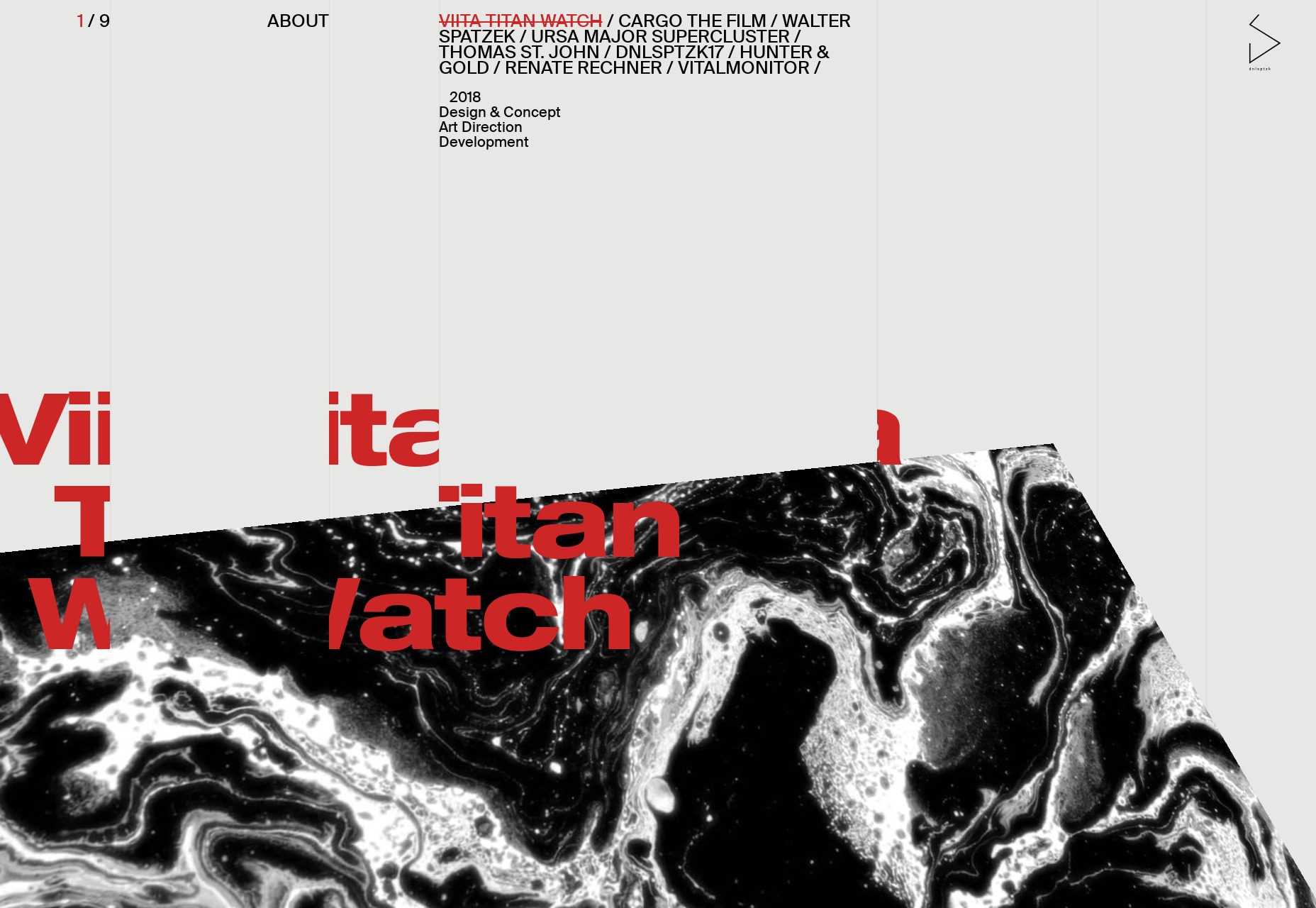
Daniel Spatzek’s portfolio will take us, just for a moment, to the world of the ultra-modern. You know how I feel about sites that are this JS-heavy, but I’m still a sucker for that grid-based aesthetic, especially when it’s properly using the full width of my desktop screen like this.
Platform: Static Site
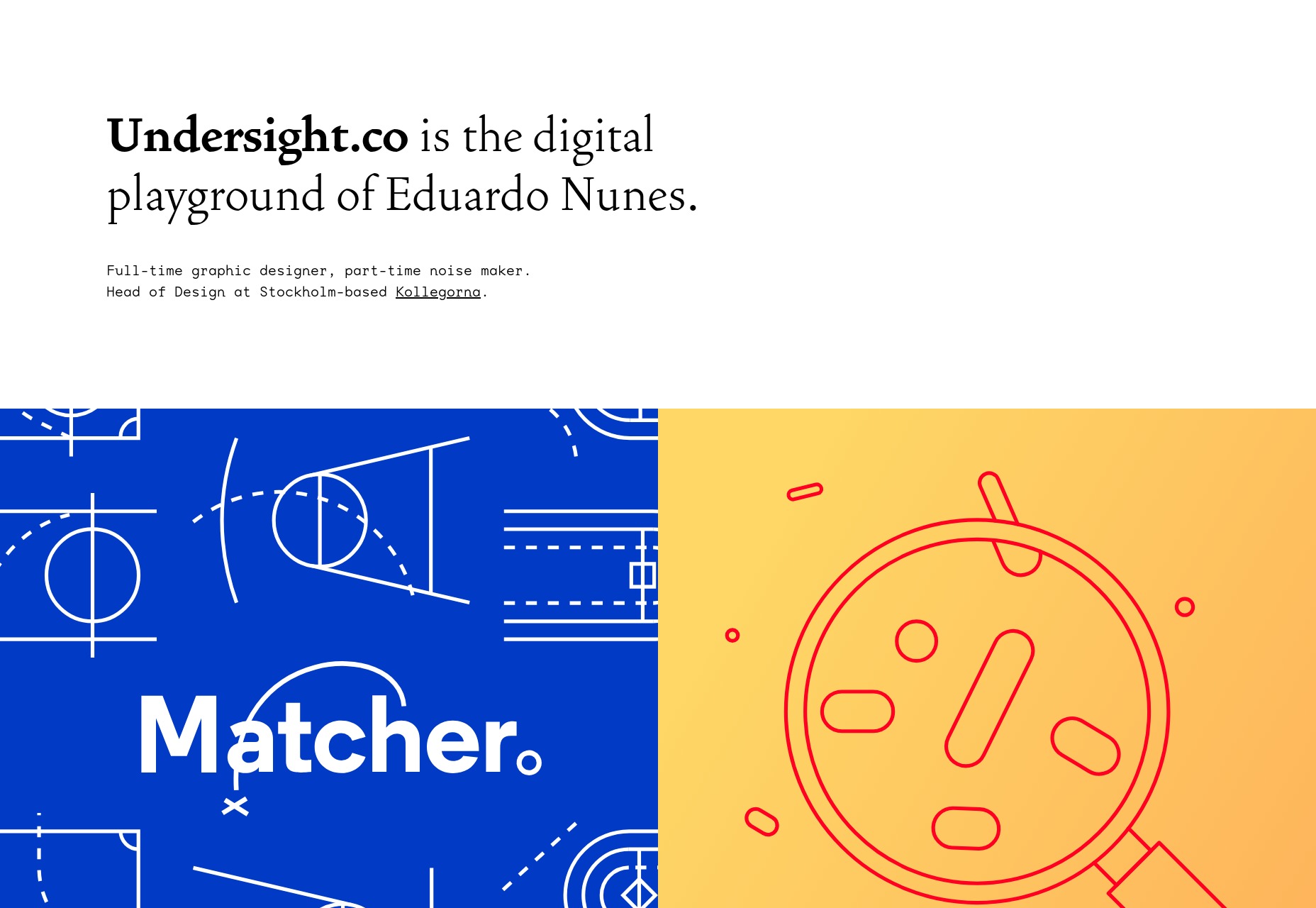
Undersight
Undersight has that clean-and-modern look, but with a little bit of artistic flair provided by the work itself. It feels like the portfolio pieces are almost as much apart of the overall aesthetic as any other element of the site. In a world where so very often the design and content almost feel like separate parts of a website, this is an improvement.
Platform: React
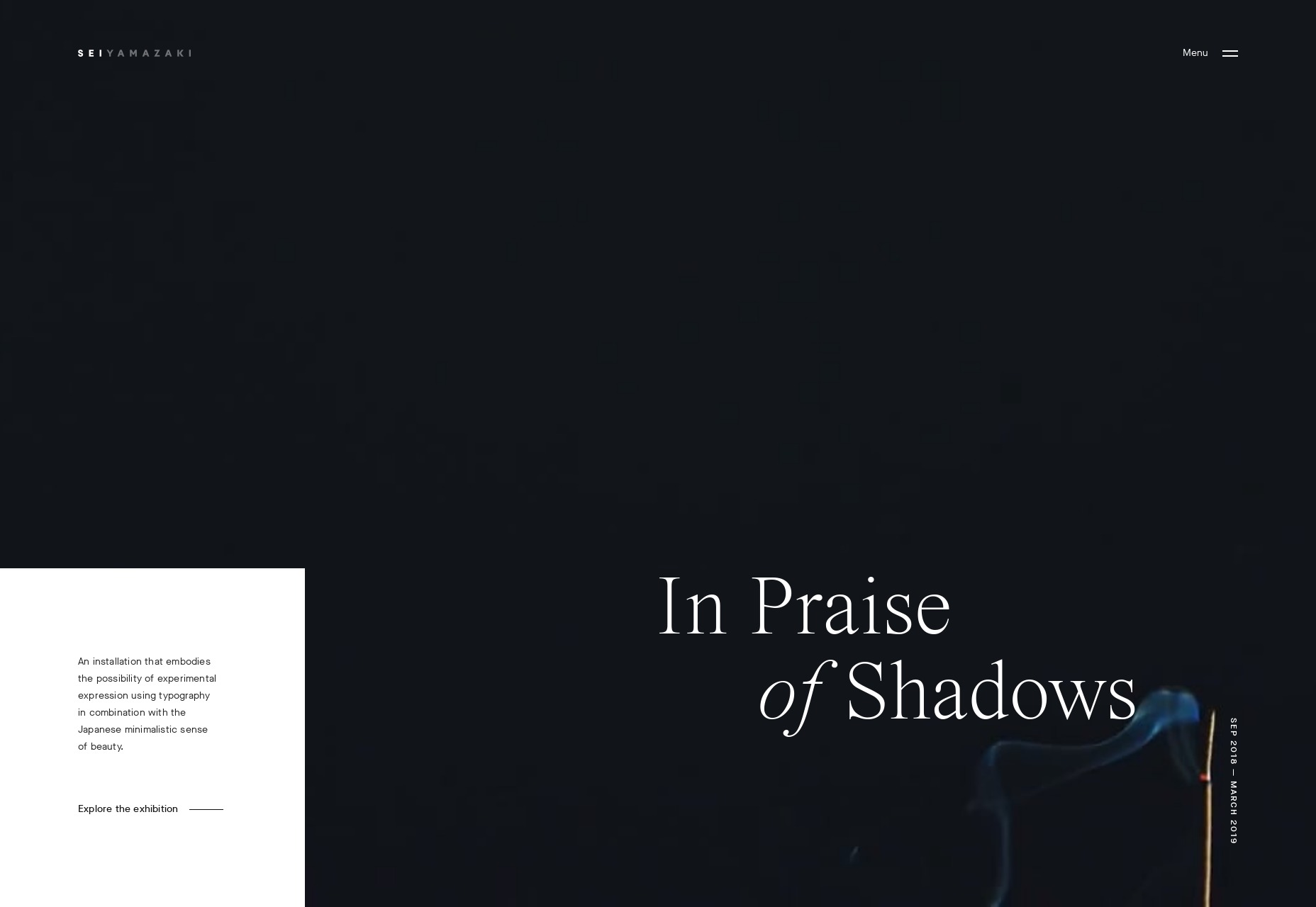
Sei Yamazaki
Sei Yamazaki’s portfolio is focused on art. With this comes the classic “art gallery style” which includes lots of white space, and text that’s perhaps a bit too small at times. Still, the layouts themselves are beautiful, and the featured installation has some of the finest video presentation I’ve seen in a while.
Platform: WordPress
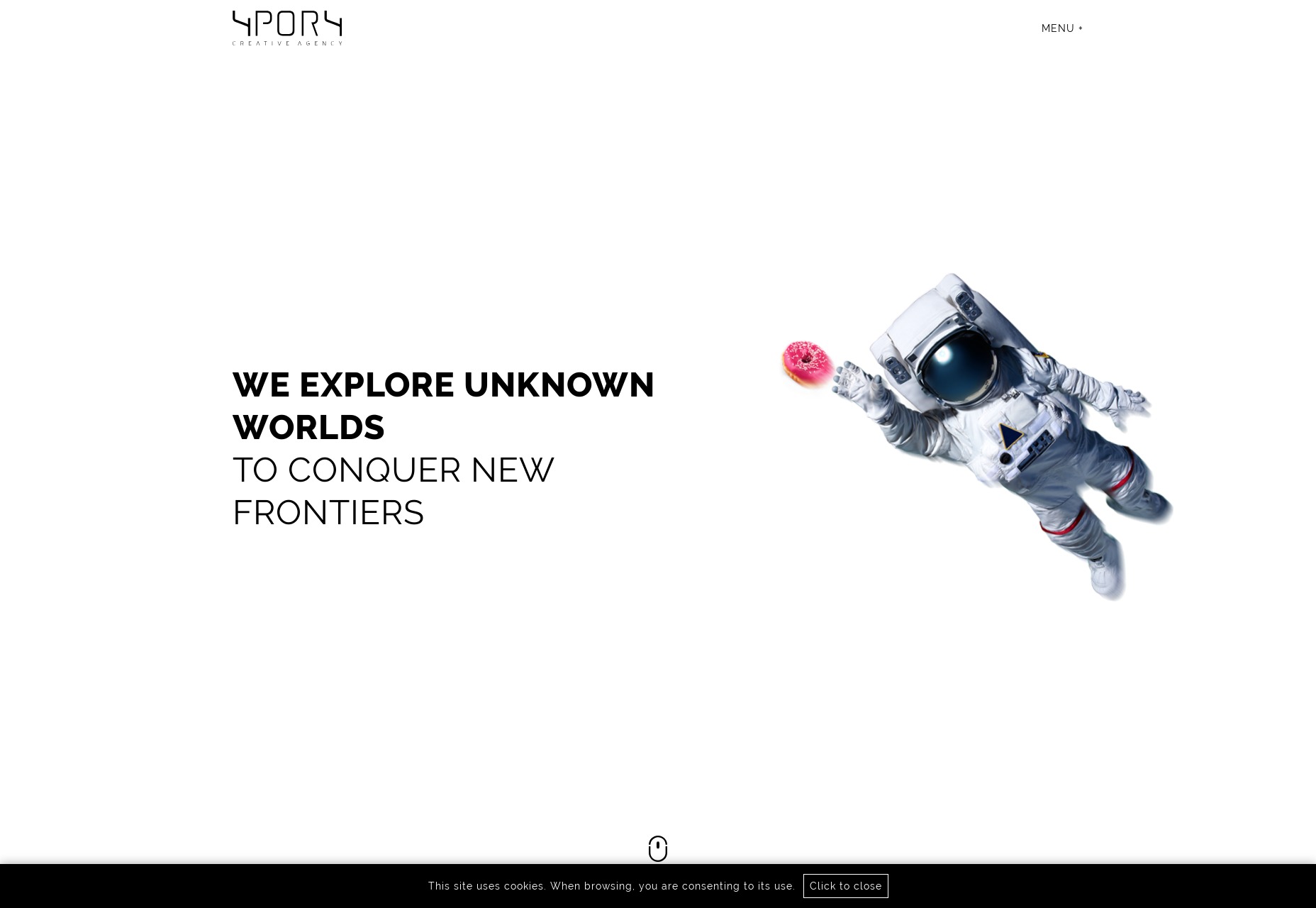
4POR4
4POR4 is a rare breed indeed. Normally websites that use this much space-related imagery have darker layouts. But here we have lots of literal white space mixed with astronaut imagery, illustration, and photomontages. It’s a bit bandwidth-heavy, perhaps, but the overall effect is stunning.
Platform: Static Site
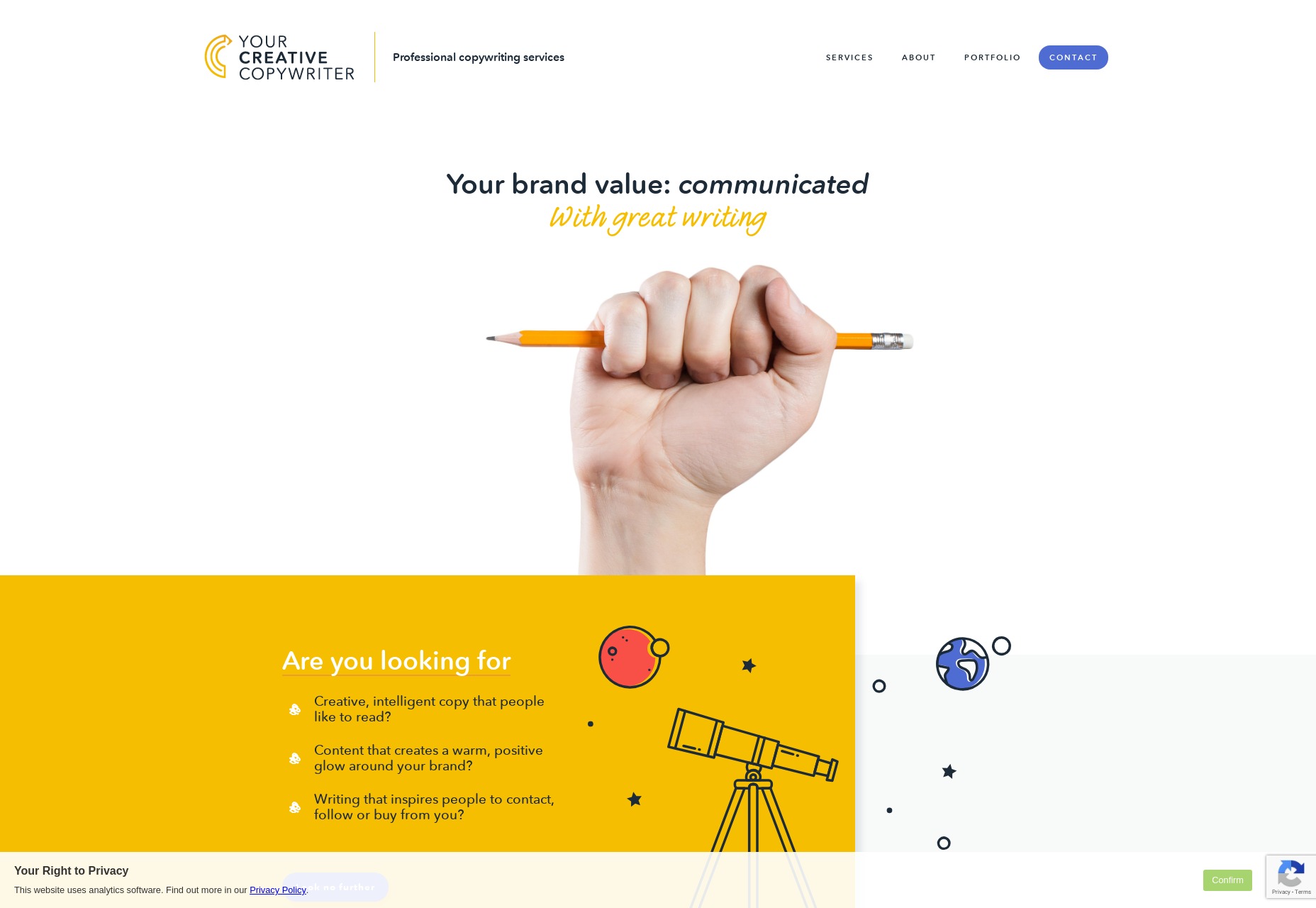
Your Creative Copywriter
Your Creative Copywriter is, as a website, the very picture of business-friendliness. The layout has elements of post-modern asymmetry while maintaining a clearly businesslike look. The illustrations are classic, and even the stock photo of the hand holding the pencil is perfect for the market.
Sure it’s a little cheesy, perhaps, but far from the cheesiest stock photo we’ve ever seen. It’s always interesting to see a site so clearly made with modern tech that feels like something from another era. It doesn’t hurt that this is probably exactly what their clients are looking for.
Platform: Static Site
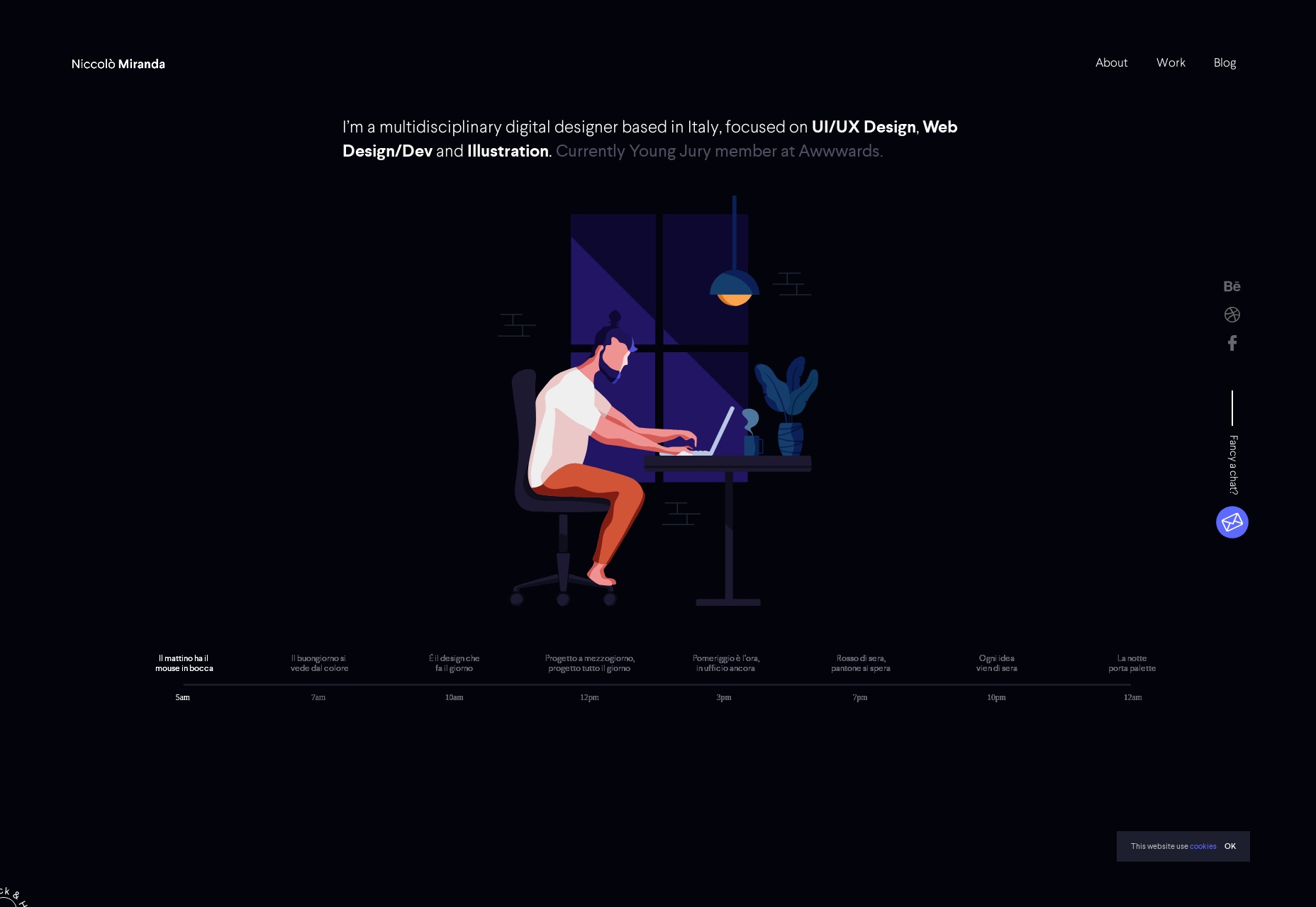
Niccolò Miranda
Niccolò Miranda’s portfolio is one of the most “presentational” sites I’ve ever seen. It’s dark, it’s got animated illustrations, and even the blog is animated to an extent.
This is only possible because every blog post is a YouTube video tutorial, with accompanying practice files. It’s not the most accessible site I’ve seen, but it is beautiful, and it takes an interesting approach to ongoing content.
Platform: Custom CMS (I think)
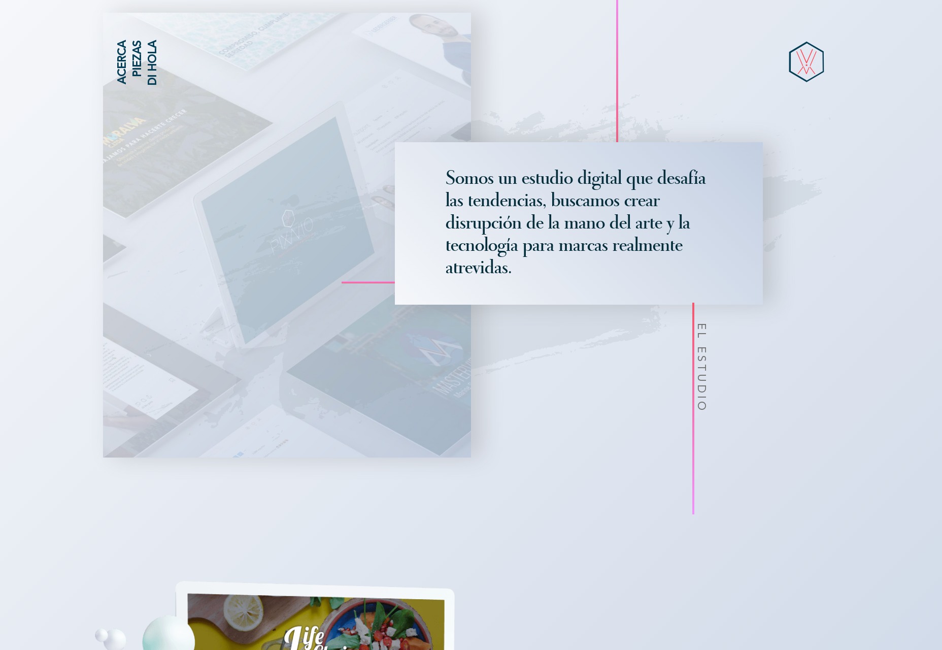
Pixavio
Pixavio is another highly presentational site with a “modern” look so old it reminds me of old fashion magazines and, weirdly enough, a lot of the barber shops I went into as a kid. It’s something about the typography and gradient use.
The site shows off the flexibility of this aesthetic by using a different color scheme for each portfolio page. It feels like a blast from the past, but it still works today.
Platform: Static Site
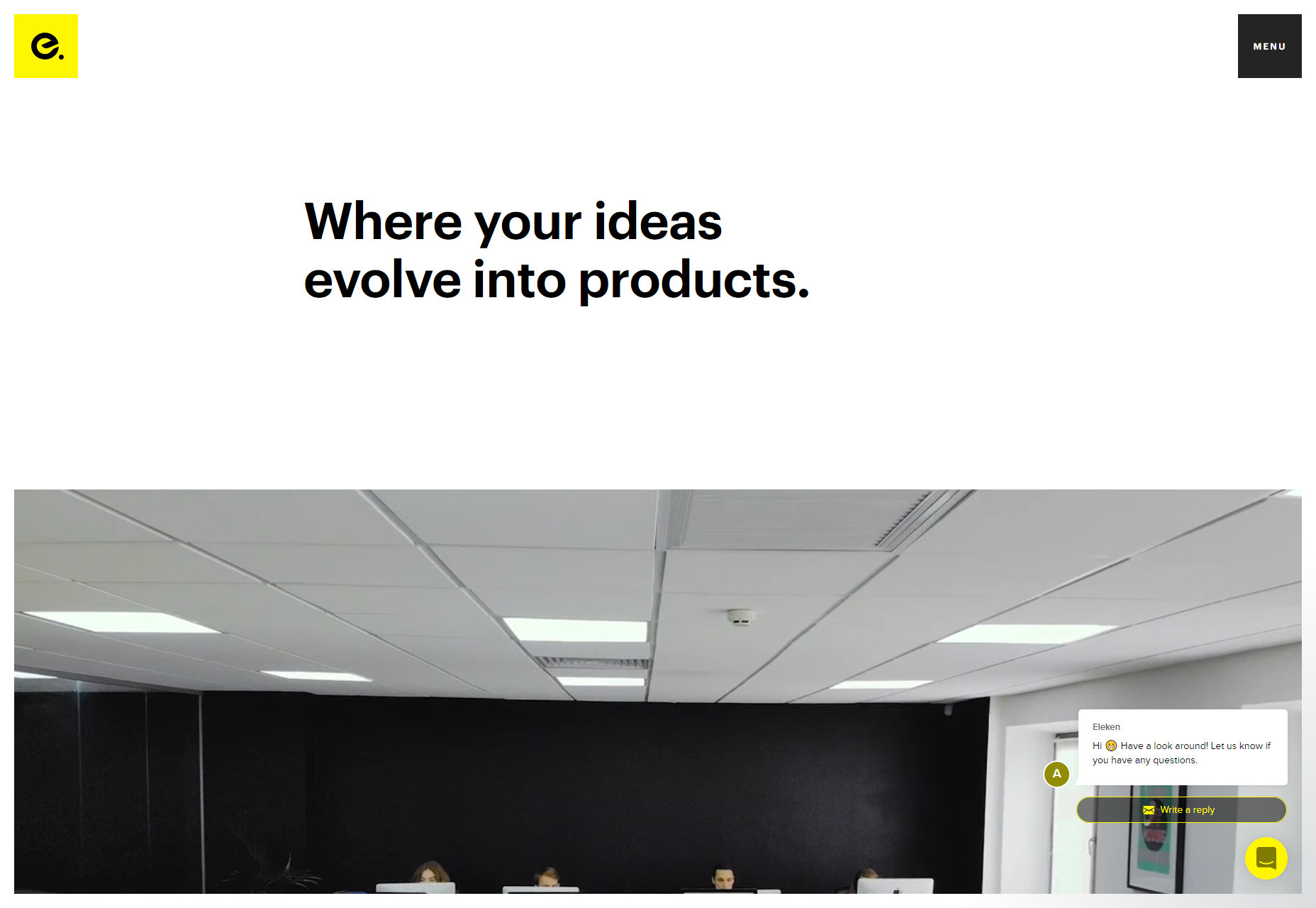
Eleken
Eleken brings me back to a time when everyone was doing design “like Apple but with thicker headings”. It’s pretty classic minimalism, mixed with a little background video, and workplace photography.
Platform: Gatsby
Kobu
Kobu is a rare beauty. It’s sleek, stylish, and makes wonderful use of curves in its illustration and animation. The animations run smoothly, and aren’t altogether too distracting. The color palette is strong, and the headings are thick.
And it does all of this without scroll-jacking. Can you even believe it? A fancy site that performs well and lets me scroll normally. I’m in love.
Being a bit more serious, it’s a lovely looking site. Just wish they had more fallbacks in place for all of the JS stuff.
Platform: WordPress
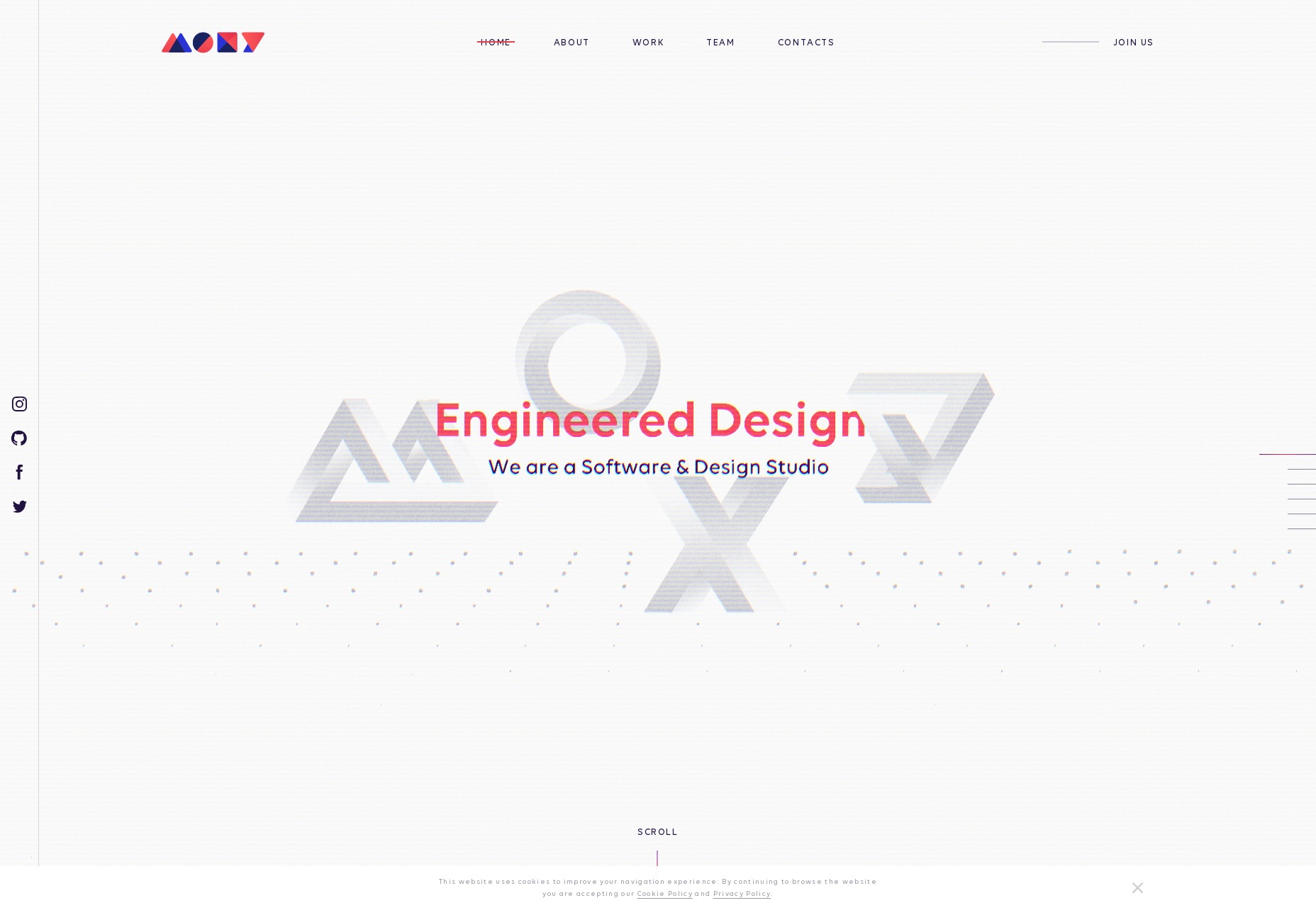
MOXY
And we’re back to the scroll-jacking. But I can forgive MOXY for this because it’s just that pretty. It’s sites like this that remind me why—even though I dislike how JavaScript has become the new Flash—web animation is a discipline and an art form all its own. It’s an art form worth exploring, and MOXY does that beautifully.
Platform: React App/Static Site
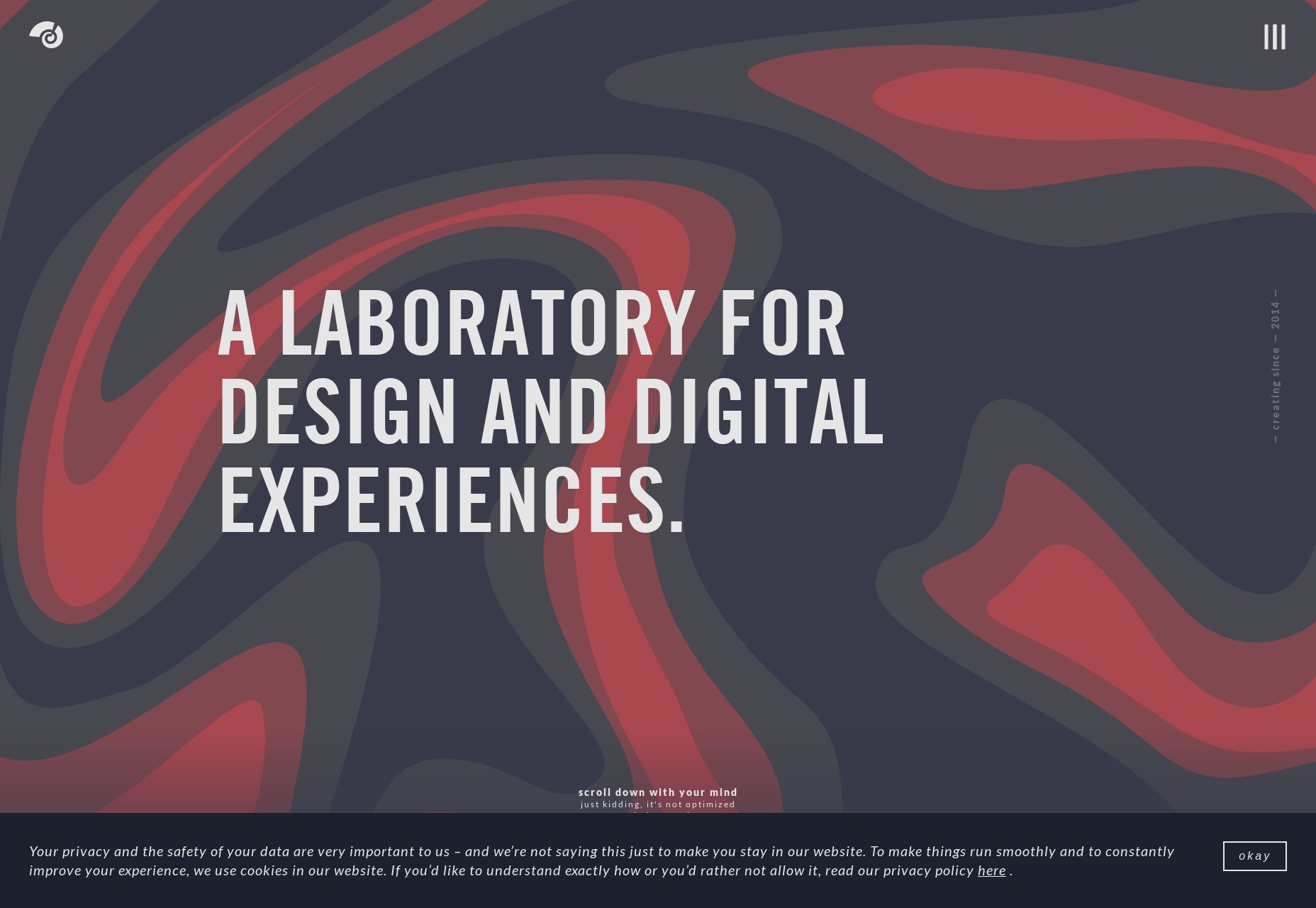
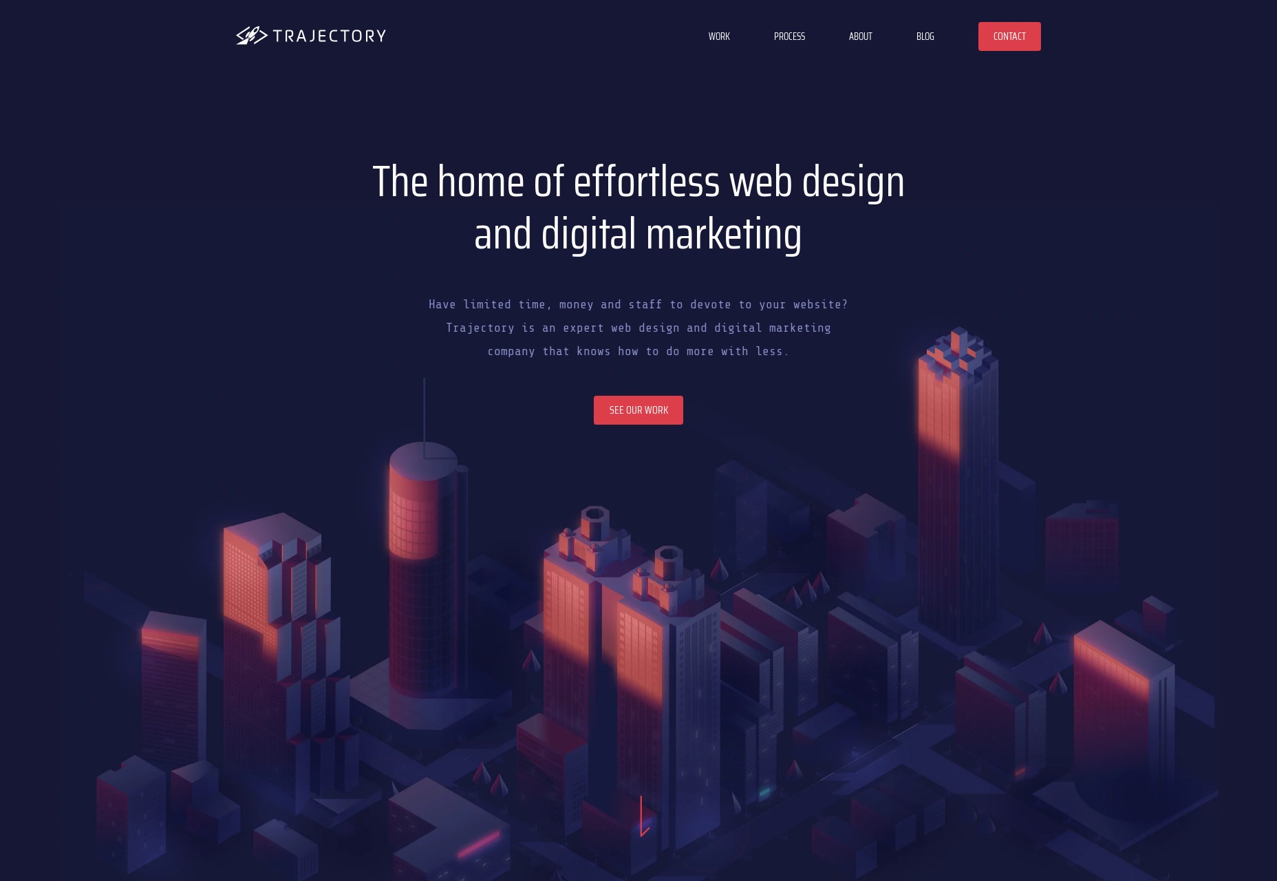
Trajectory
Trajectory is doing it all wrong! If you’re going to use a monospaced font, your site either has to be an ironic brutalist meta-commentary on web design or a post-modernist artsy design. None of this pleasant, business-friendly stuff with smooth illustrations and gorgeous gradient use. [/sarcasm]
Using monospaced type for all the body text might be a bit much, but it certainly does stand out when combined with everything else.
Platform: Craft CMS
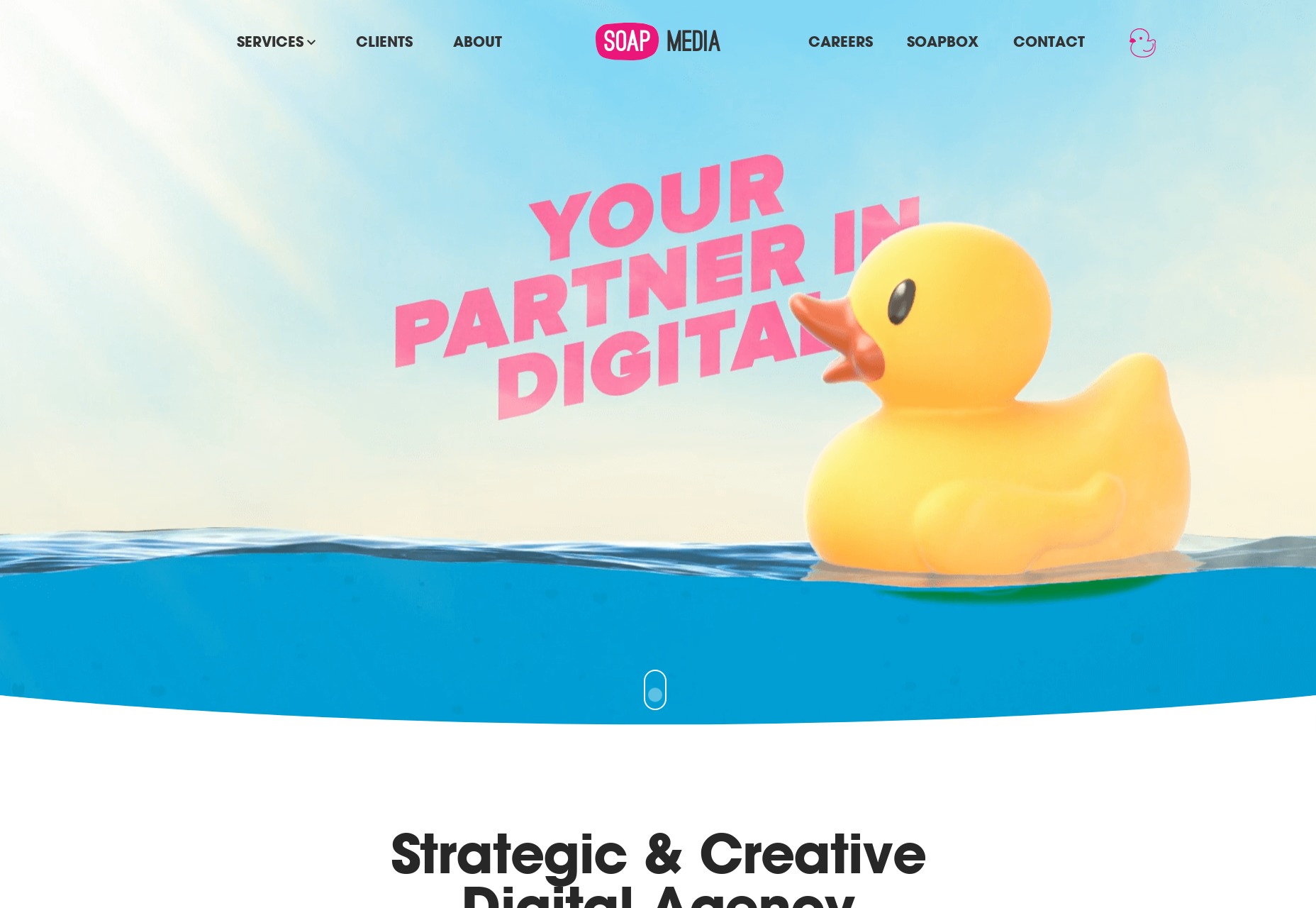
Soap Media
Soap Media is hitting all the right buttons for me, personally. It’s bright with bold colors, it’s playful, and it’s got a huge rubber ducky. This is an entirely subjective point, but I just like rubber duckies. The whole site feels creative and whimsical in that “we’ll playfully make you a lot of money” sort of way. It’s genius.
Platform: Static Site
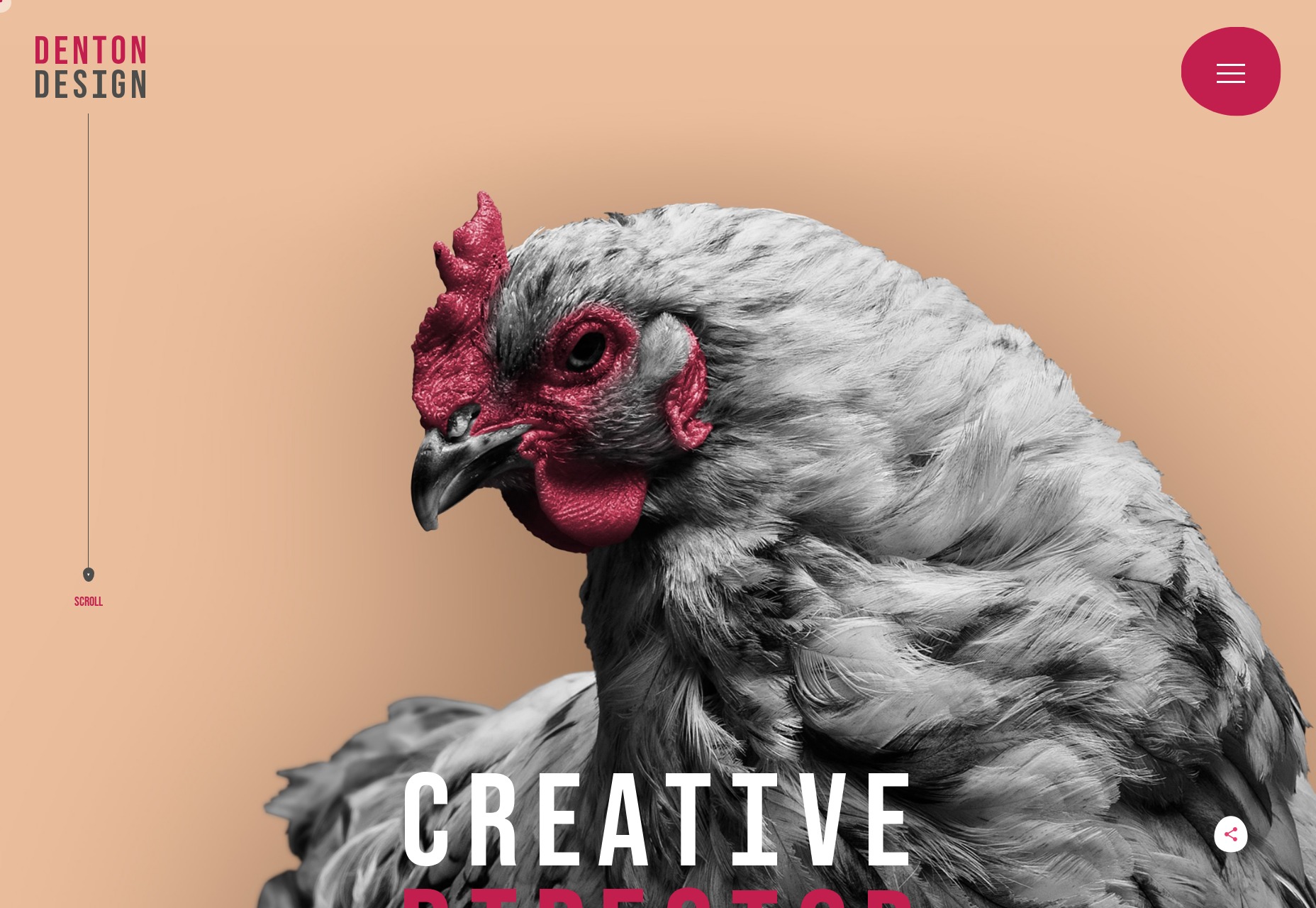
Nate Denton
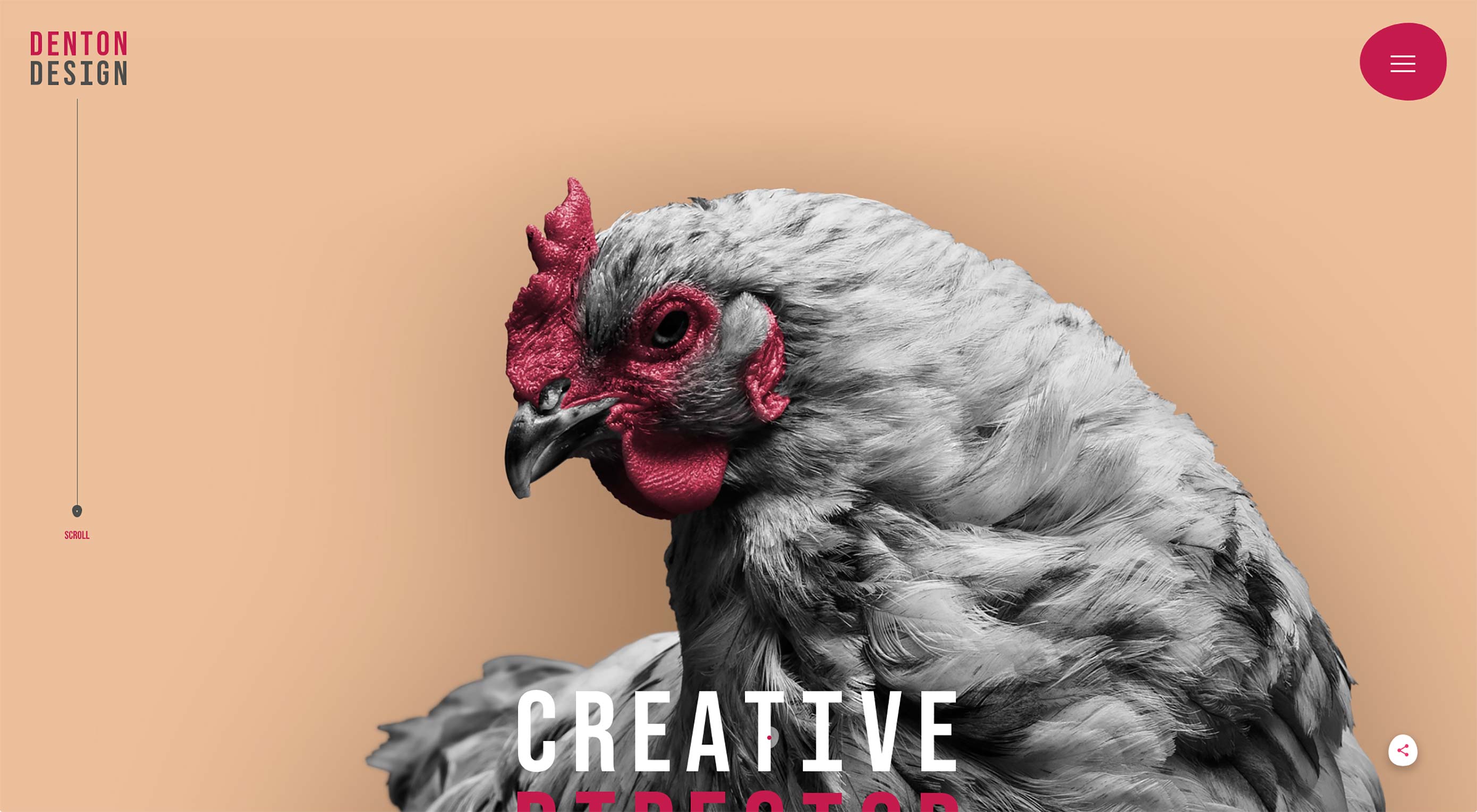
Random chickens are equal to rubber duckies if you want to be silly and playful. Nate Denton’s portfolio went with a big one, contrasted by a relatively soft and warm color palette. The resulting aesthetic is a combination of professional and artsy that is overall pleasing to the eye, but less likely to scare away the more straight-laced potential clients.
Platform: Static Site
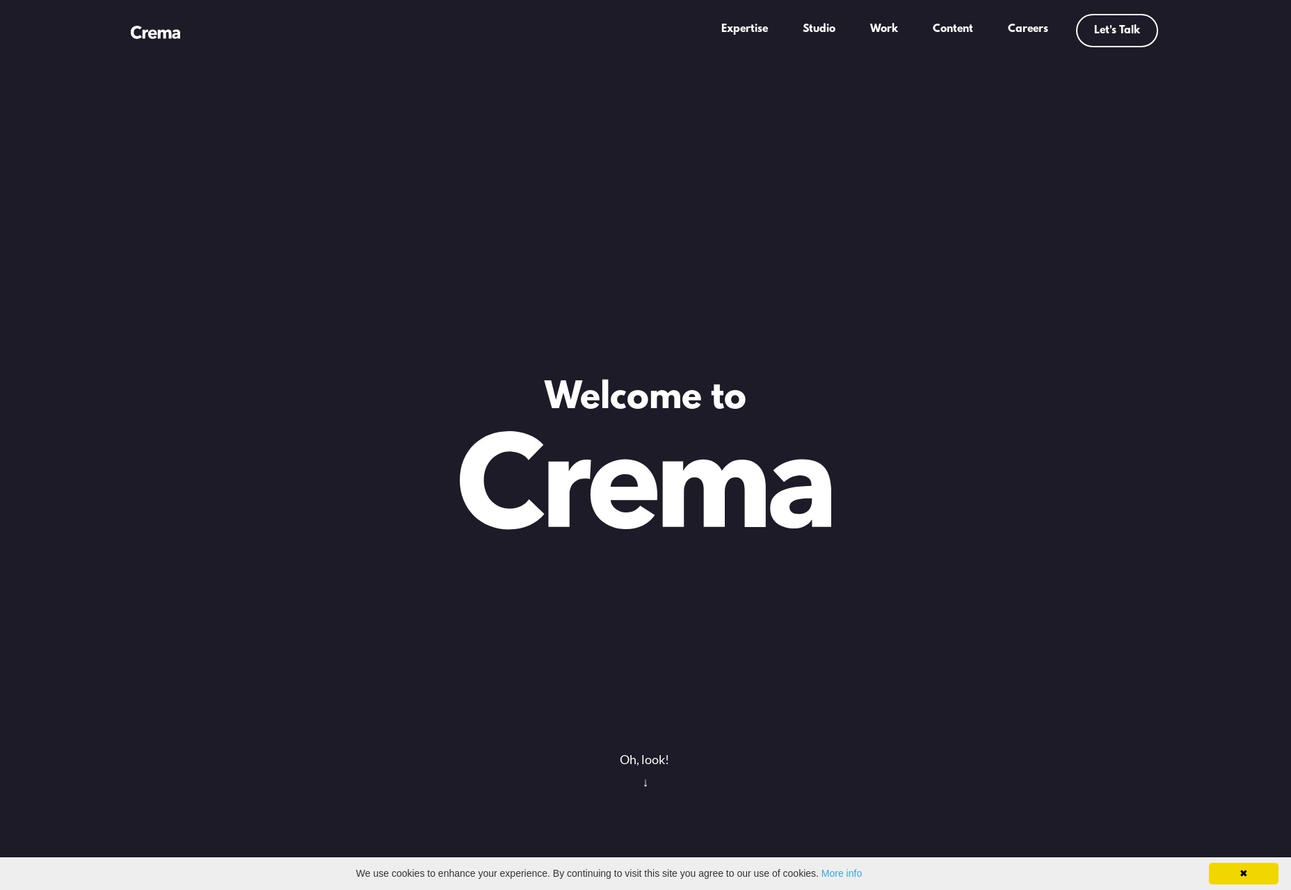
Crema
Crema is this month’s site that isn’t mind-blowingly experimental or anything, but is here because I admire the craftsmanship. Plus rounded corners. We don’t seem them as much as we thought we would, do we?
Platform: Custom CMS (I Think)
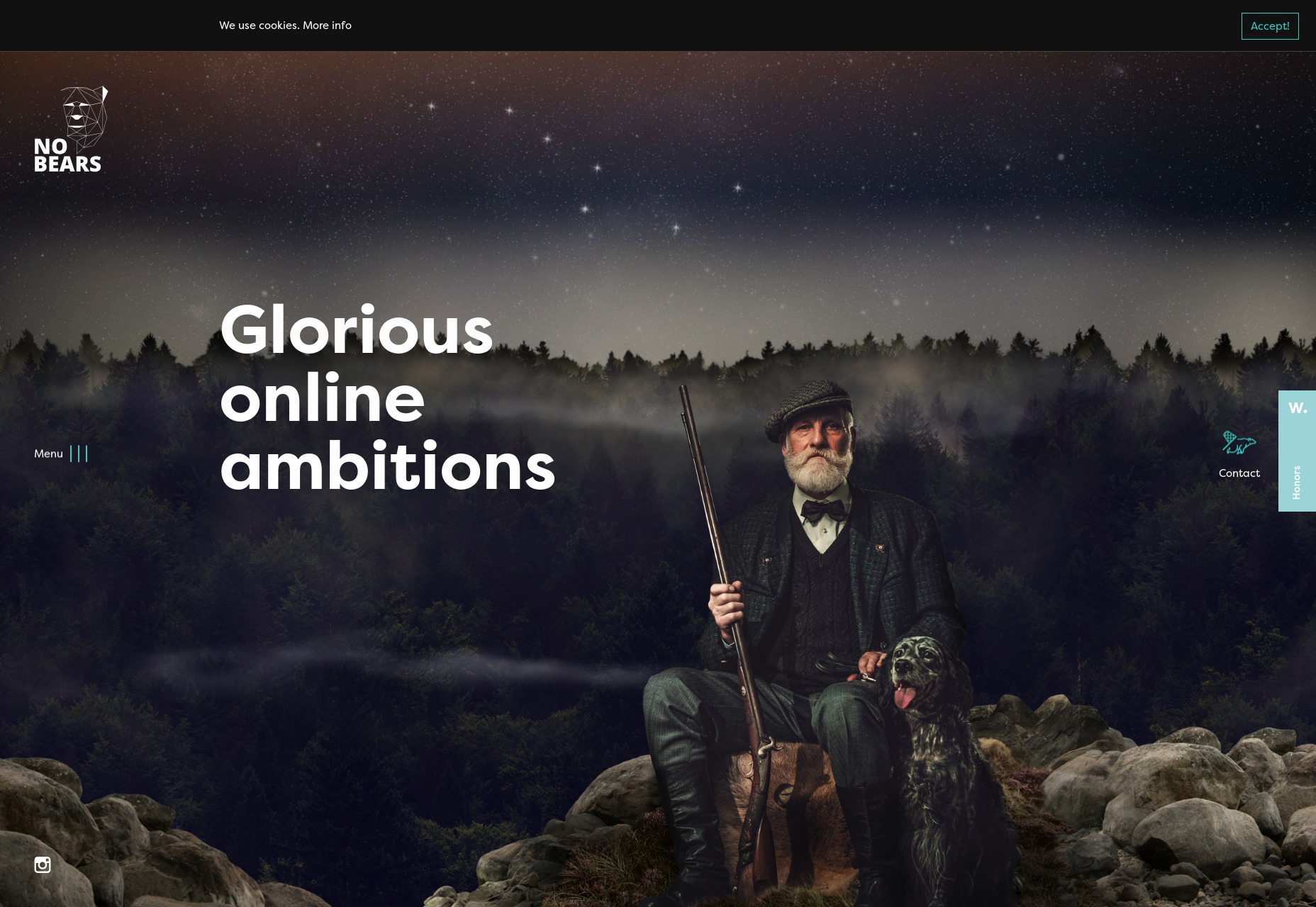
NoBears
The amusingly-named NoBears agency goes with wackiness, combining striking photomontages and background video with a comparatively subdued dark design. I’m still a sucker for those semi-visible grids as part of the design, so of course this one’s on the list.
Platform: Silverstripe
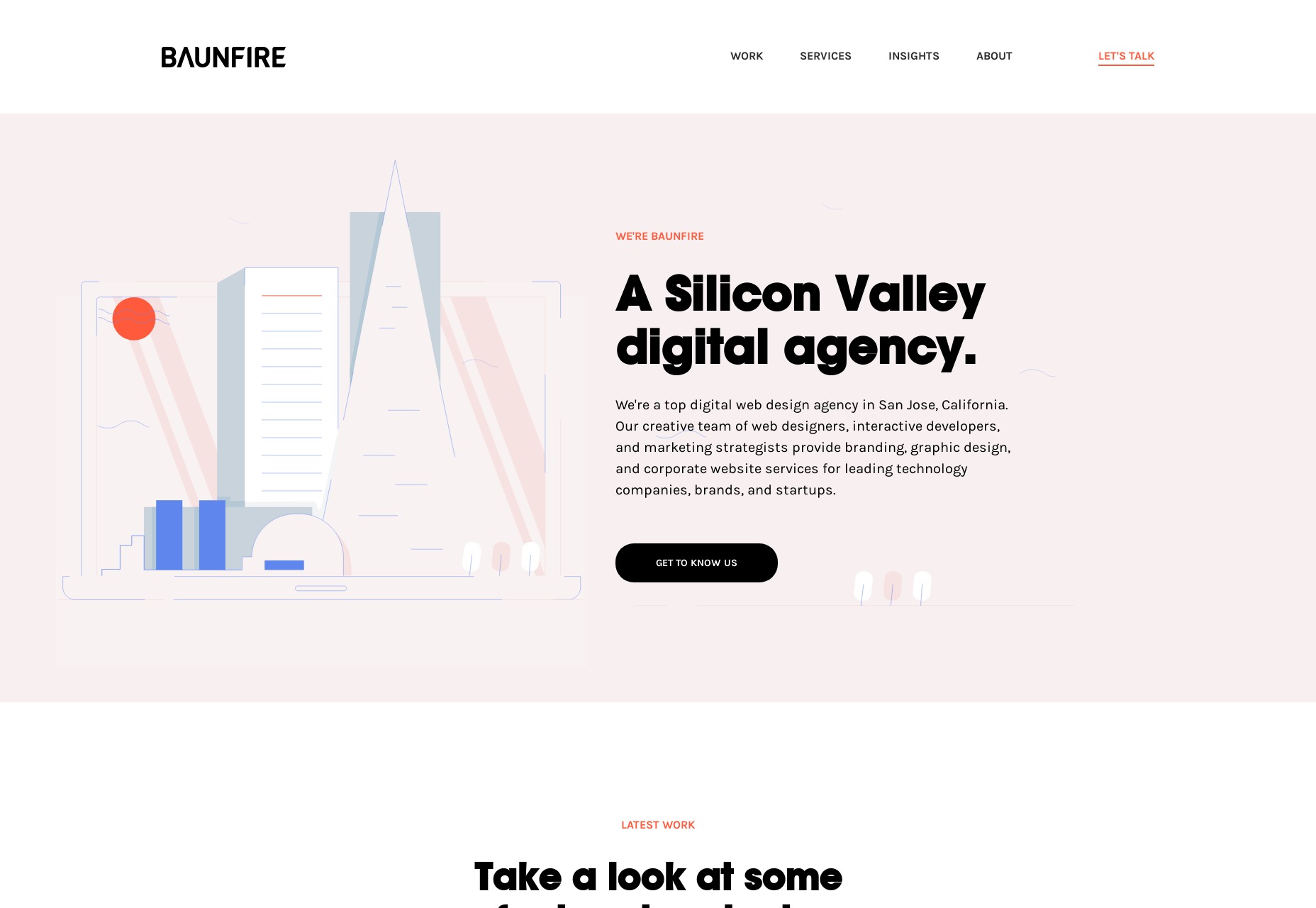
BAUNFIRE
While many other sites are going for bold and bright aesthetics, BAUNFIRE keeps it soft and pleasant with a pastel-infused, and fairly minimalist design. It’s a calming and soothing experience from an agency that presents itself as easy to work with.
Platform: Craft CMS
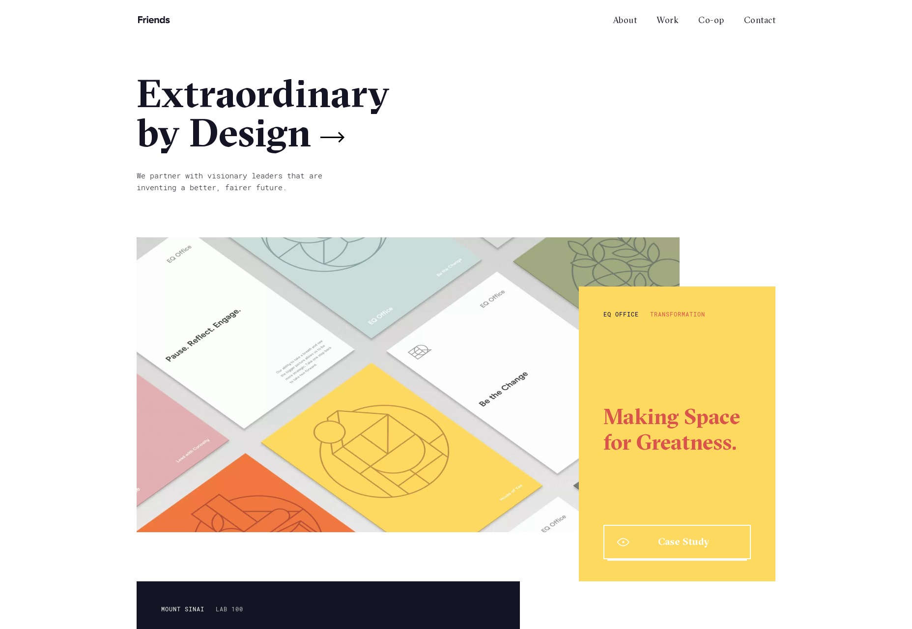
Friends
Friends’ website presents a fusion of that near-postmodern, element-overlapping aesthetic with some more classic-feeling minimalism and typography. That fusion works quite well.
Platform: Craft CMS
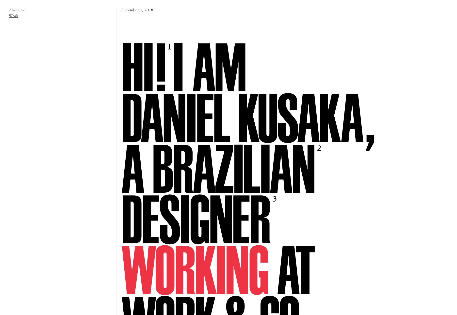
Daniel Kusaka
Daniel Kusaka’s portfolio gives me some of that good old magazine feel that designers wanted to do for years. Well now we can, and I can’t get enough of it. God bless Flexbox and CSS Grid.
Platform: WordPress
| Add Realistic Chalk and Sketch Lettering Effects with Sketch’it – only $5! |
from Webdesigner Depot https://www.webdesignerdepot.com/2018/12/20-best-new-portfolios-december-2018/
No comments:
Post a Comment