 Welcome to 2019! It’s a brand new year and there are plenty of sites taking advantage of the optimism to start afresh.
Every month we publish a guide to the freshest websites launched (or relaunched with significant new updates) in the previous 4 weeks, this is January’s edition.
The slowdown for the holiday season is well behind us now, and new projects are launching daily. With some old trends still popular, and new ideas coming through, there’s no single dominant trend, making this month’s list more diverse than ever. Enjoy!
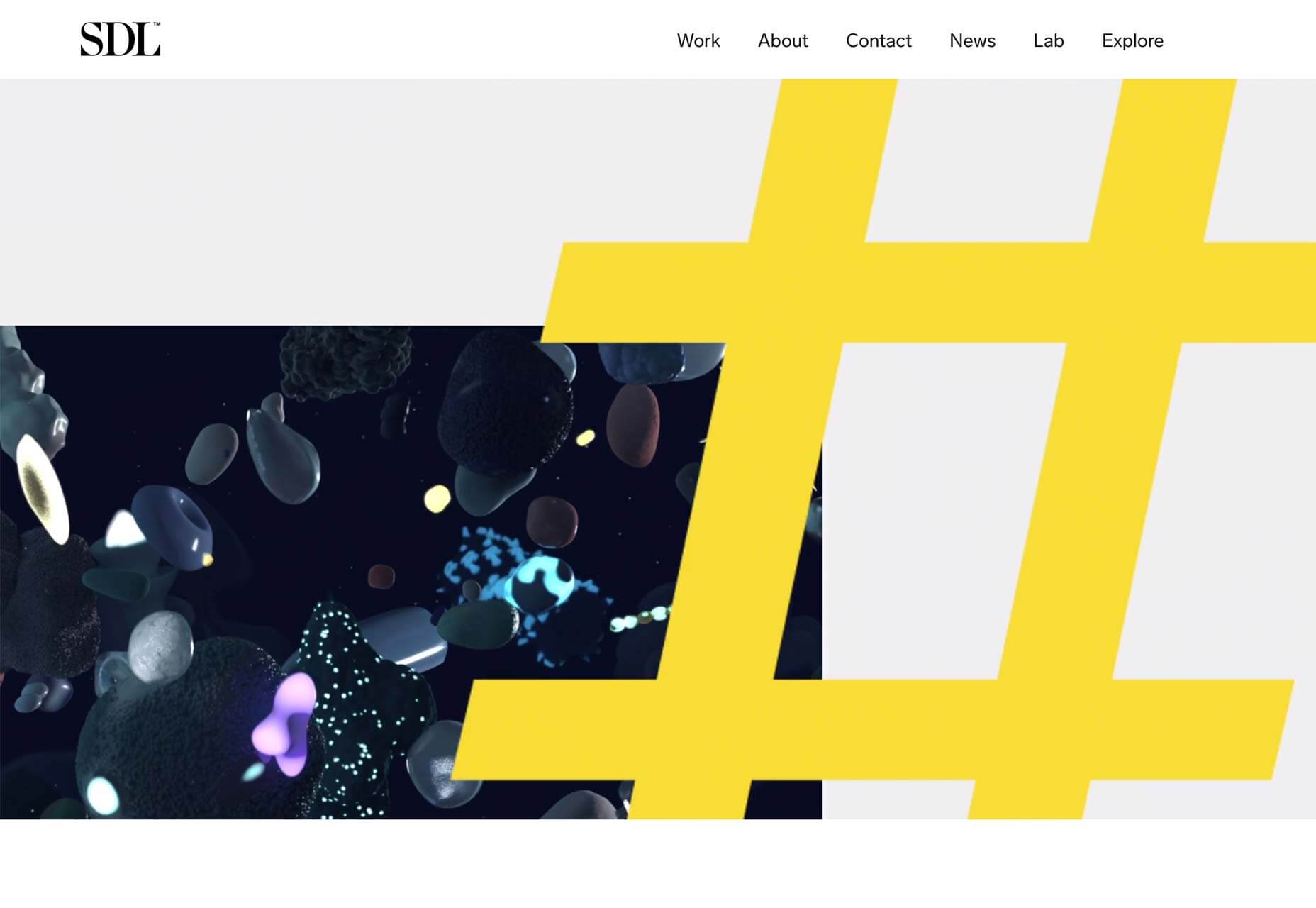
Stockholm Design Lab
The Stockholm Design Lab is a design agency that works with high-profile brands, take a look at their client list and you’ll see several global names. As if to emphasize the depth of its practice, the site lets you explore by typing different terms. It’s an impressive way to present work.
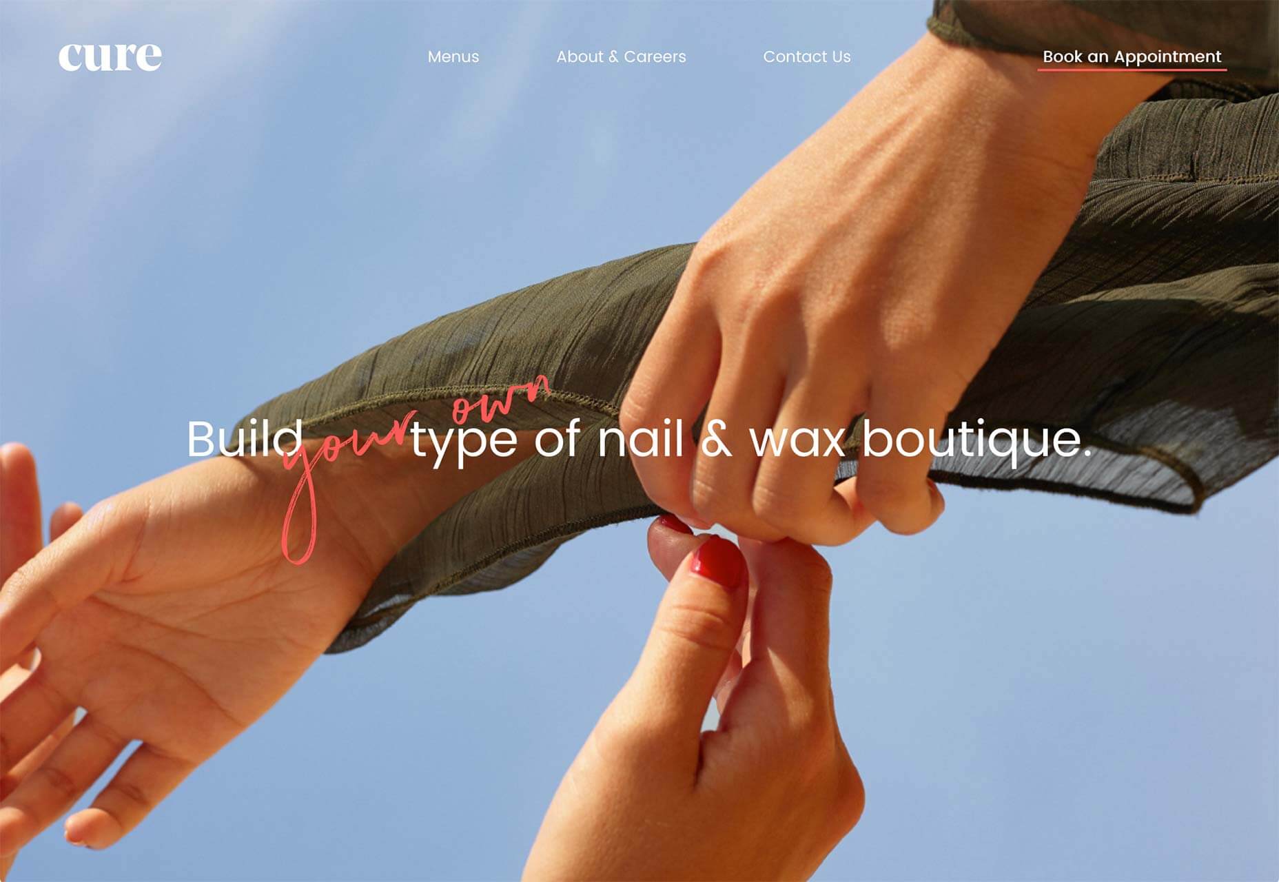
Cure
Cure is a high-end nails and wax boutique and its site showcases the aspirational lifestyle it’s selling. The typography is fresh and engaging, the art direction is modern and carefully planned, the parallax is beautifully executed, and the underlying grid is inventive.
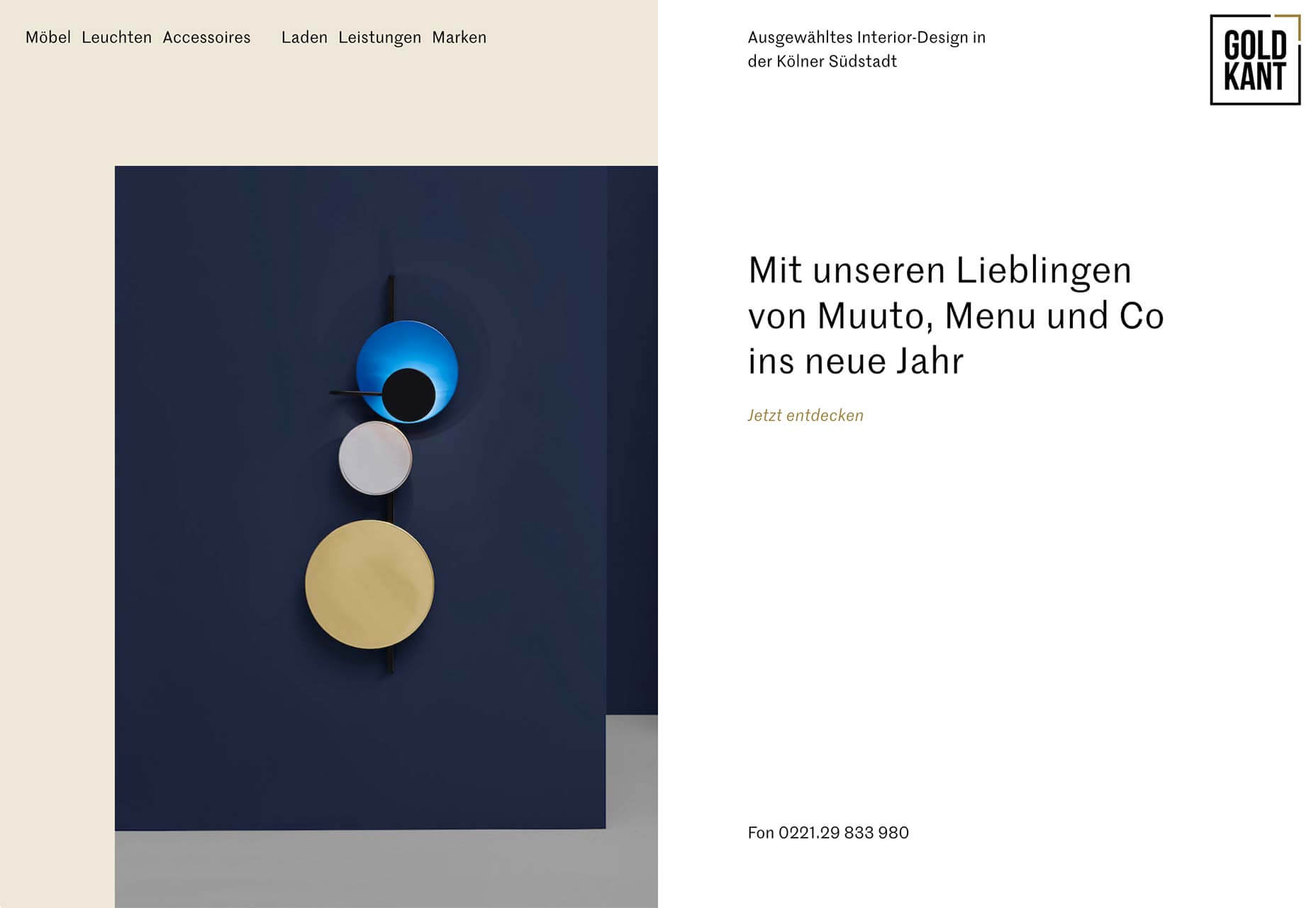
Goldkant Interior Köln
In 2019 you can expect to see designers looking for new ways to work with parallax. Goldkant gets it right by combining parallax with the split-screen trend. Lots of sites apply an effect like this on the home page, Goldkant uses it site-wide. Plus check out that slick animated logo.
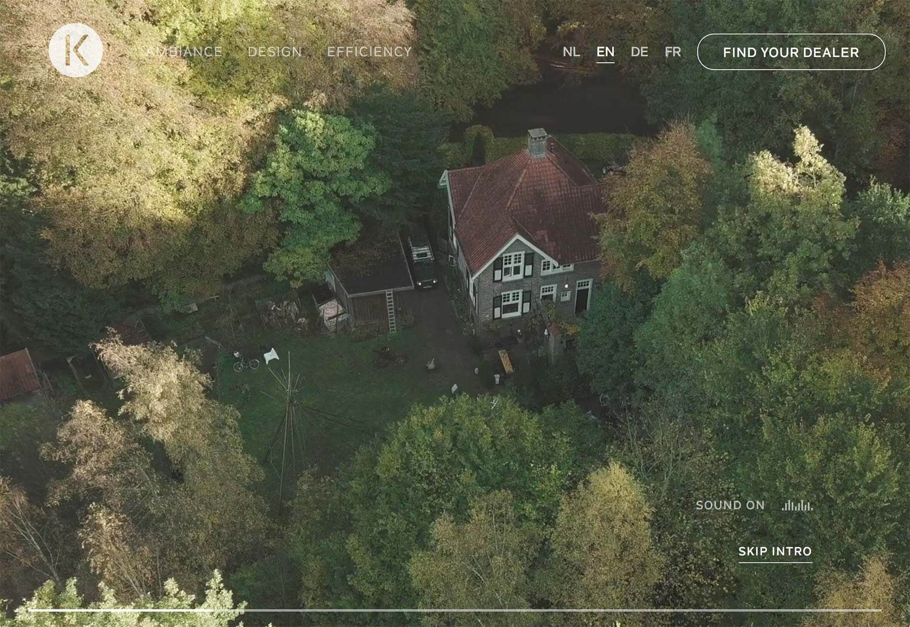
Kalfire W53/50R
The inelegantly named Kalfire W53/50R has a site that features lots of full-screen video. Click through to the design page for more video, and the efficiency page for a detailed presentation of an extremely high-end product.
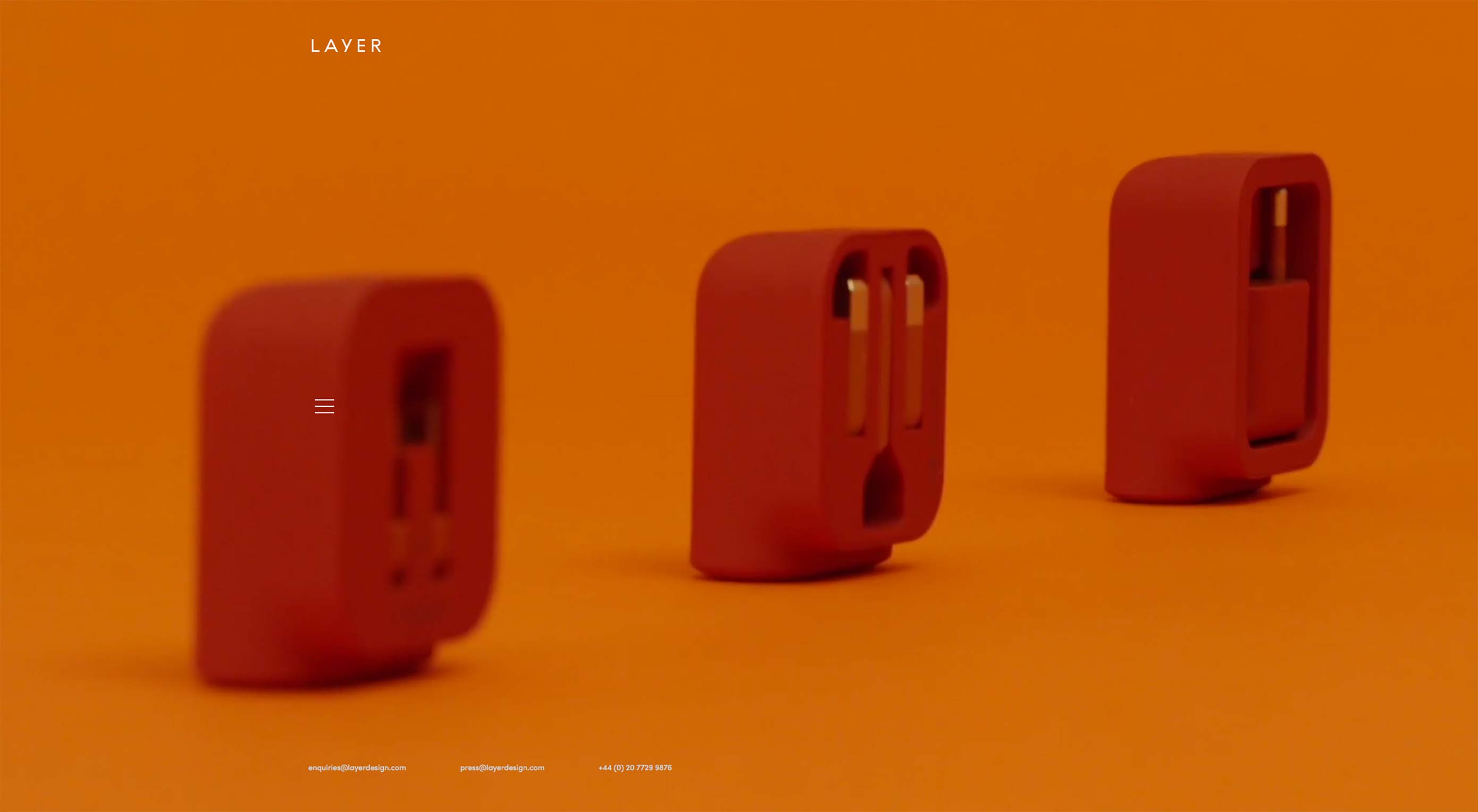
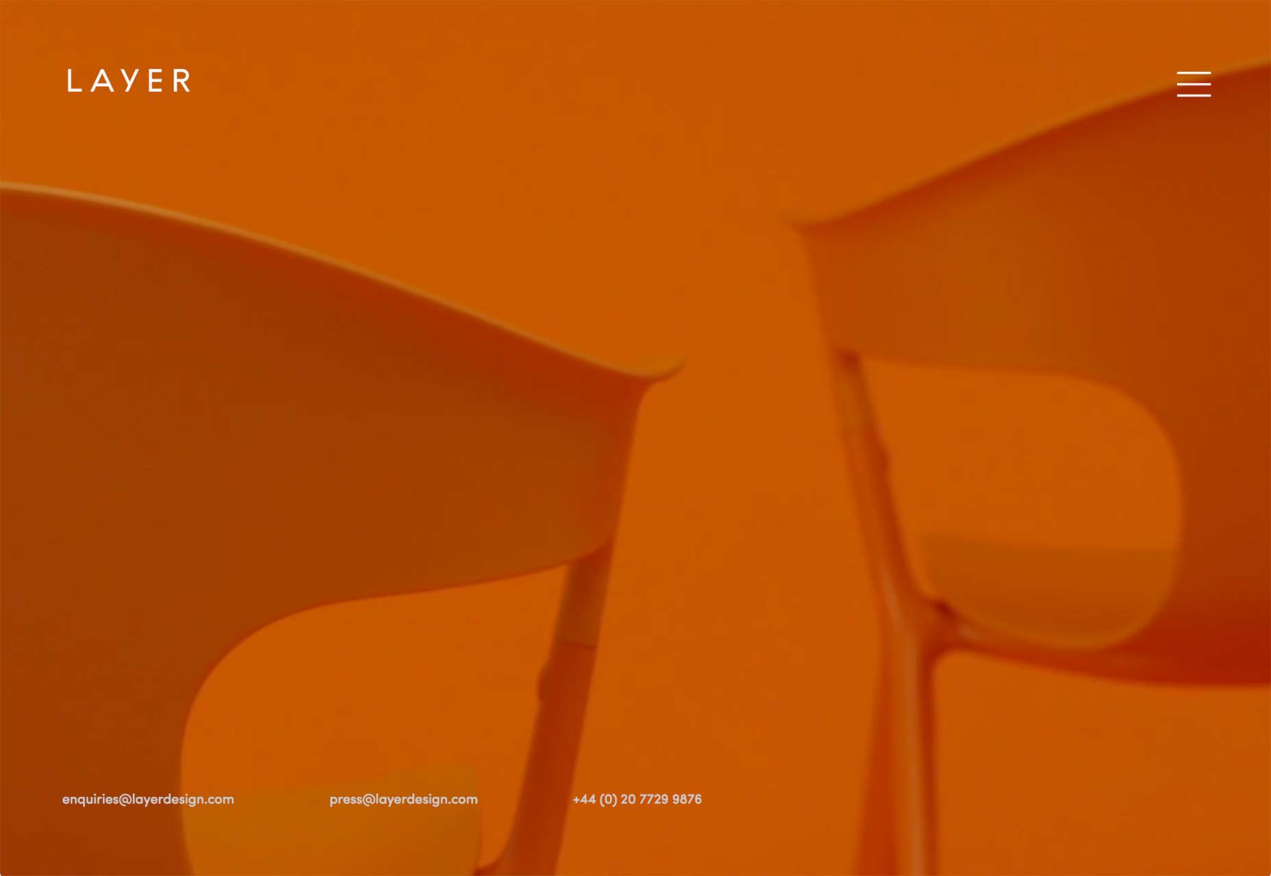
Layer
Full-screen video is going to be big in 2019 and Layer’s site is on-trend with a macroscopic view of its product range. Layer make intelligent products that form emotional connections, so their video is intimate in its approach. The whole site oozes human-centered design.
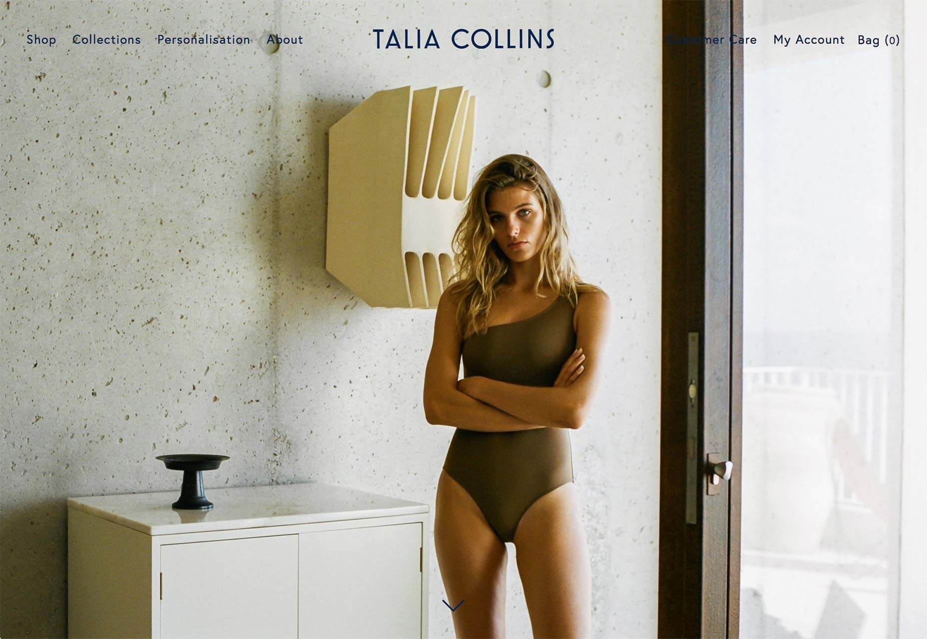
Talia Collins
The amazing Talia Collins company makes swimwear out of material regenerated from discarded fishing nets, making you look amazing on the beach this Summer, all while saving marine life. Its site does a great job of counterpointing flattering style, and a love of the water.
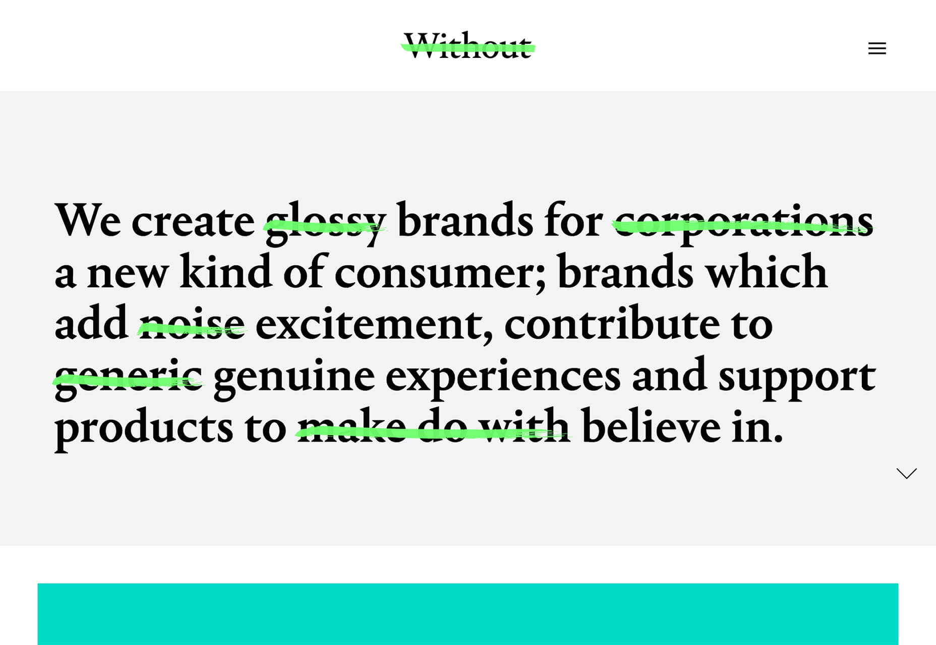
Without
Without is a design studio from London, UK. Its site features enviable typography, and a rigid application of UX principles. Scroll through the site to discover an impressive portfolio of case studies. If it wasn’t for the hamburger menu on desktop, this could be the perfect agency site.
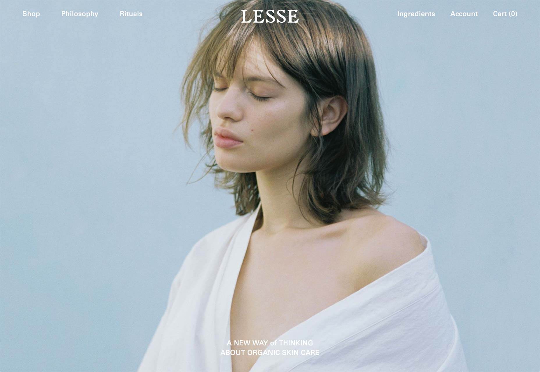
Lesse
Lesse skincare products are 100% organic, cruelty free, and vegan. Its site and its branding follows the very recent trend of embracing organic feeling serif fonts—Lesse’s logo is almost Art Nouveaux—combined with the simple sans serif its a very 2019 design.
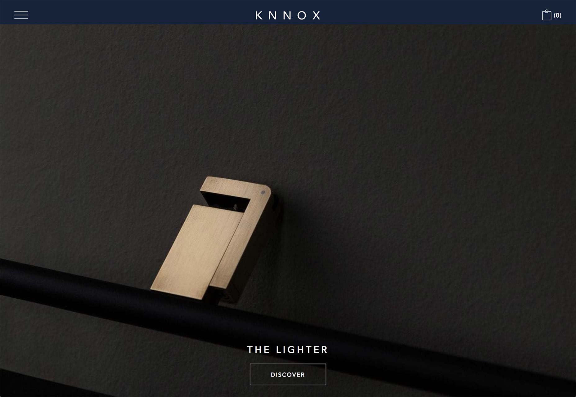
Knnox
I would, of course, never advocate smoking cigarettes (they will damage your health and that of your loved ones). But if I was a smoker, I’d want one of the brutalist brass lighters from Knnox, and it’s all thanks to the scandi-noir art direction on this site.
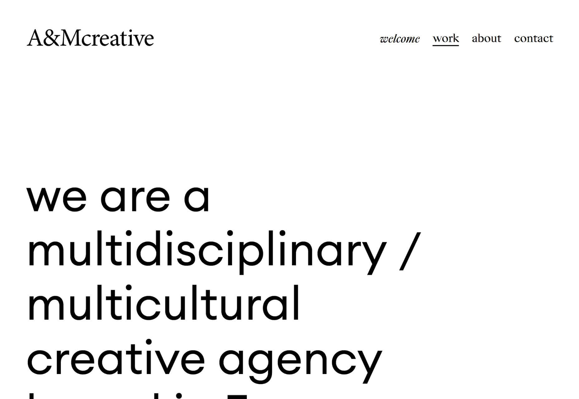
A&Mcreative
French creative agency A&Mcreative presents its work in typical Parisian style: understated, effortlessly cool, and probably three or four times over your budget. Compare the modest way its extraordinary client list is presented, to the way some agencies talk up their work.
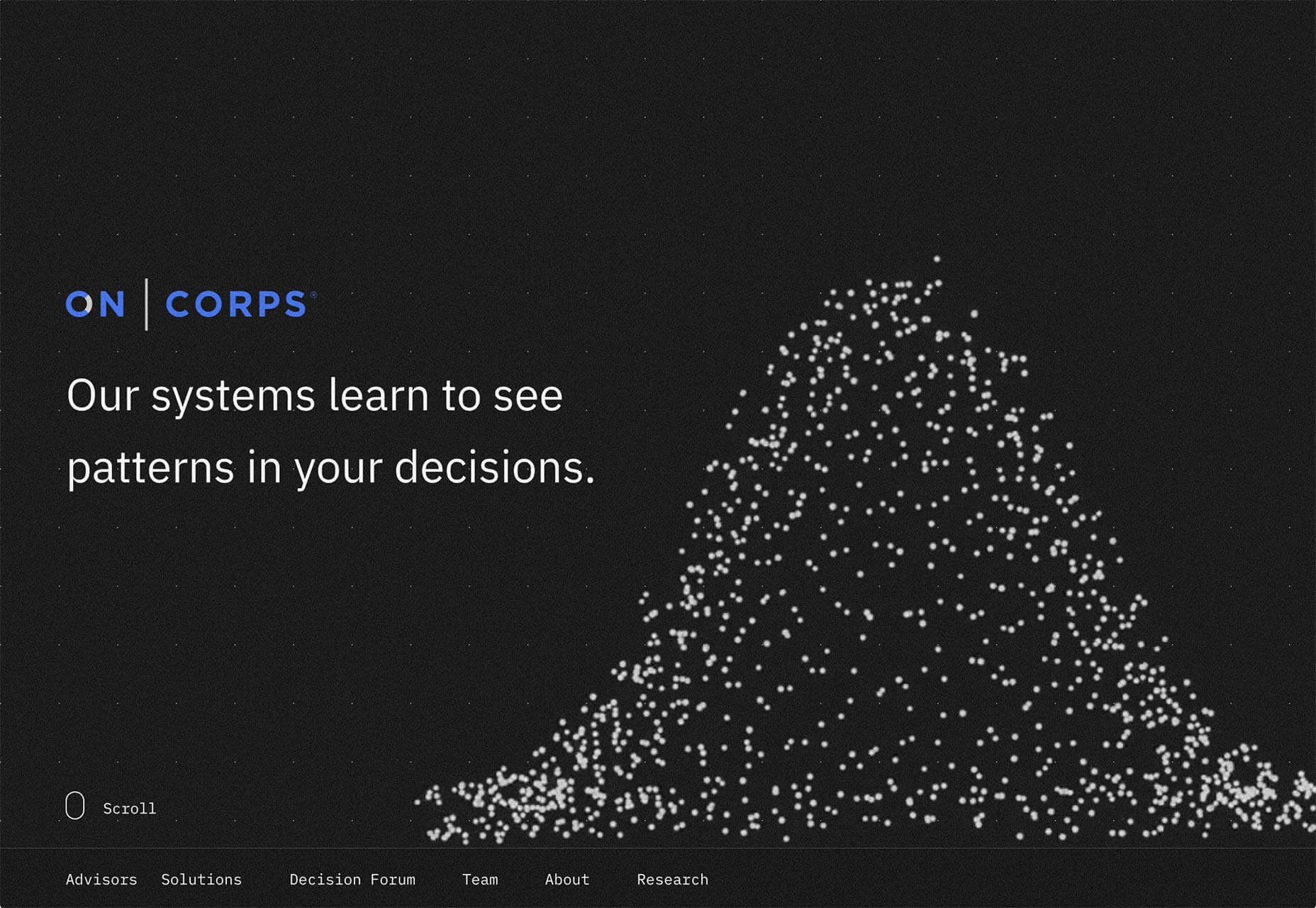
OnCorps
OnCorps decision making systems use machine learning to teach themselves about human-powered decisions, and then automate them. Its site is a simple powerpoint-style scroll, but each slide features hypnotic Math-based animations.
Part Architects
The site for Part Architects, is both extraordinary, and difficult to love. The text is very hard to read, using a font that wouldn’t be out of place advertising a club night. Scroll through and the text projects along the surfaces at the extremes of the viewport. It’s bonkers, but brilliant.
Demisol
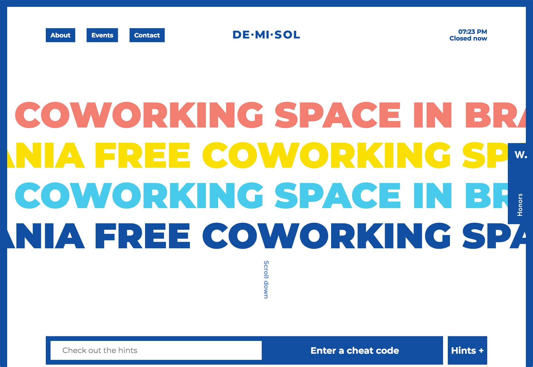
Who says work has to be boring? Demisol is a free co-working space in Brasov, Romania. Designed for hackers, designers, developers, marketers, “troublemakers and other disrupters” it’s a flamboyant site filled with energy. No doubt, much like its offices.
Fleuressence
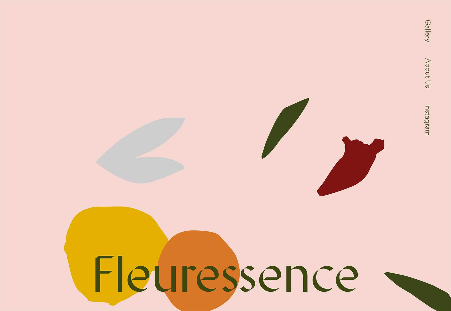
Fleuressence is a Scottish florist that sources unusual flowers for events of all kinds. True to its product, its beautifully simple site features blocks of color that on the welcome page can be rearranged with a click. A completely original approach to this type of site.
MMK
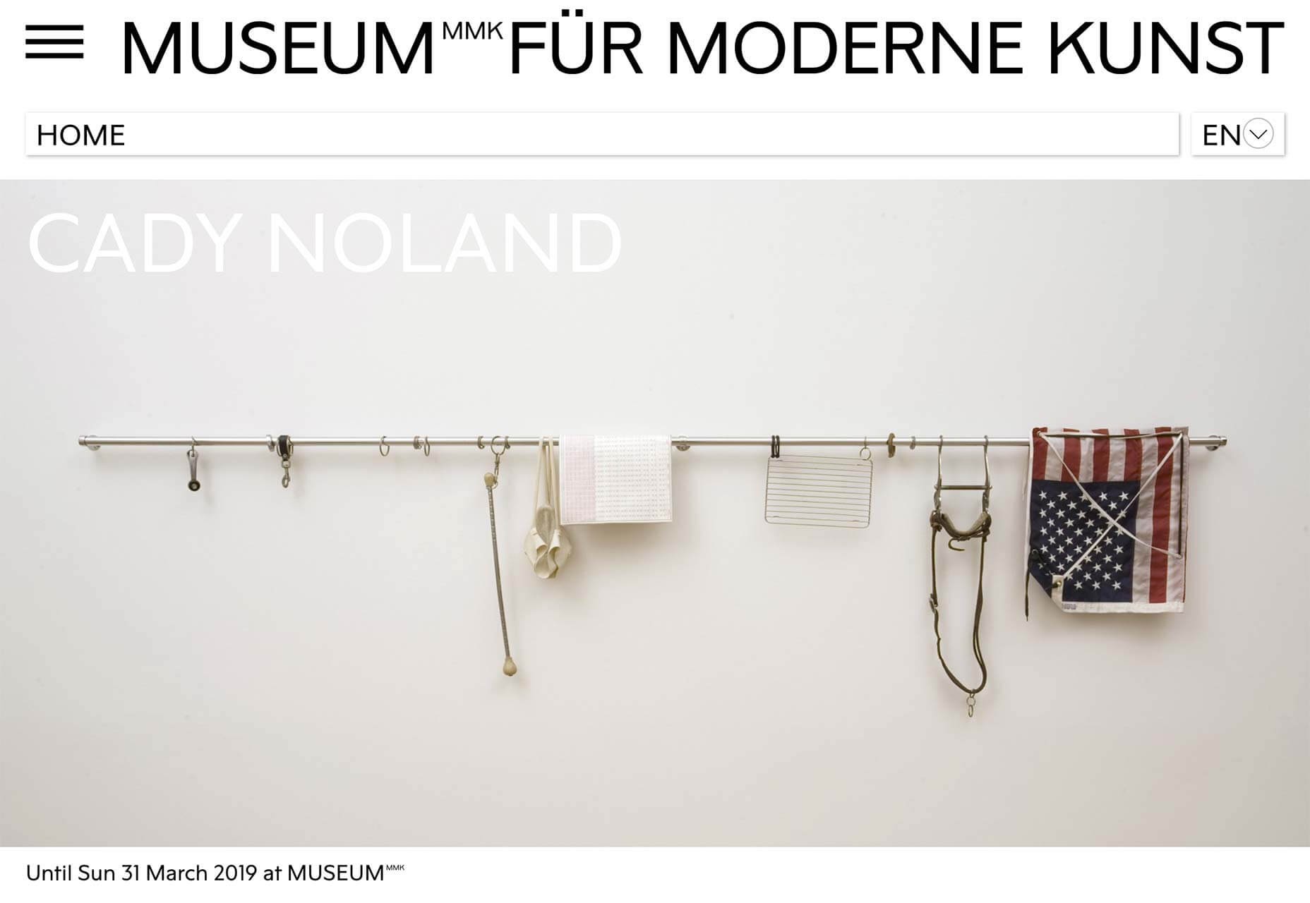
Frankfurt’s Museum für Moderne Kunst (Museum of Modern Art) strikes the perfect balance between informational and conceptual, guiding visitors to the gallery’s three real-world locations. On top of that, they have a fascinating navigation system that’s surprisingly intuitive.
Raleigh Centros
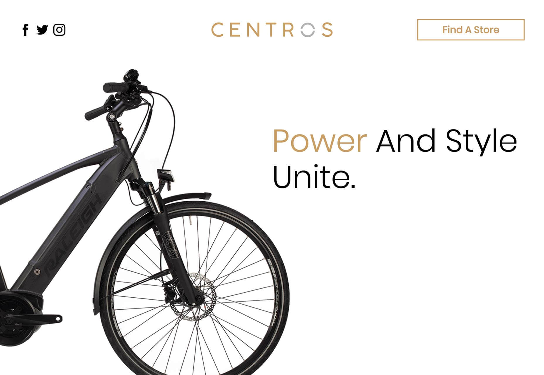
Throwing its hat into the ring of the emerging electric bicycle market is Centros. Targeting customers who have more money than peddle power, the slick, animated site mimics tech sites like Apple, without ever straying from the tablet-friendly format that baby-boomers prefer.
Josefine Laul
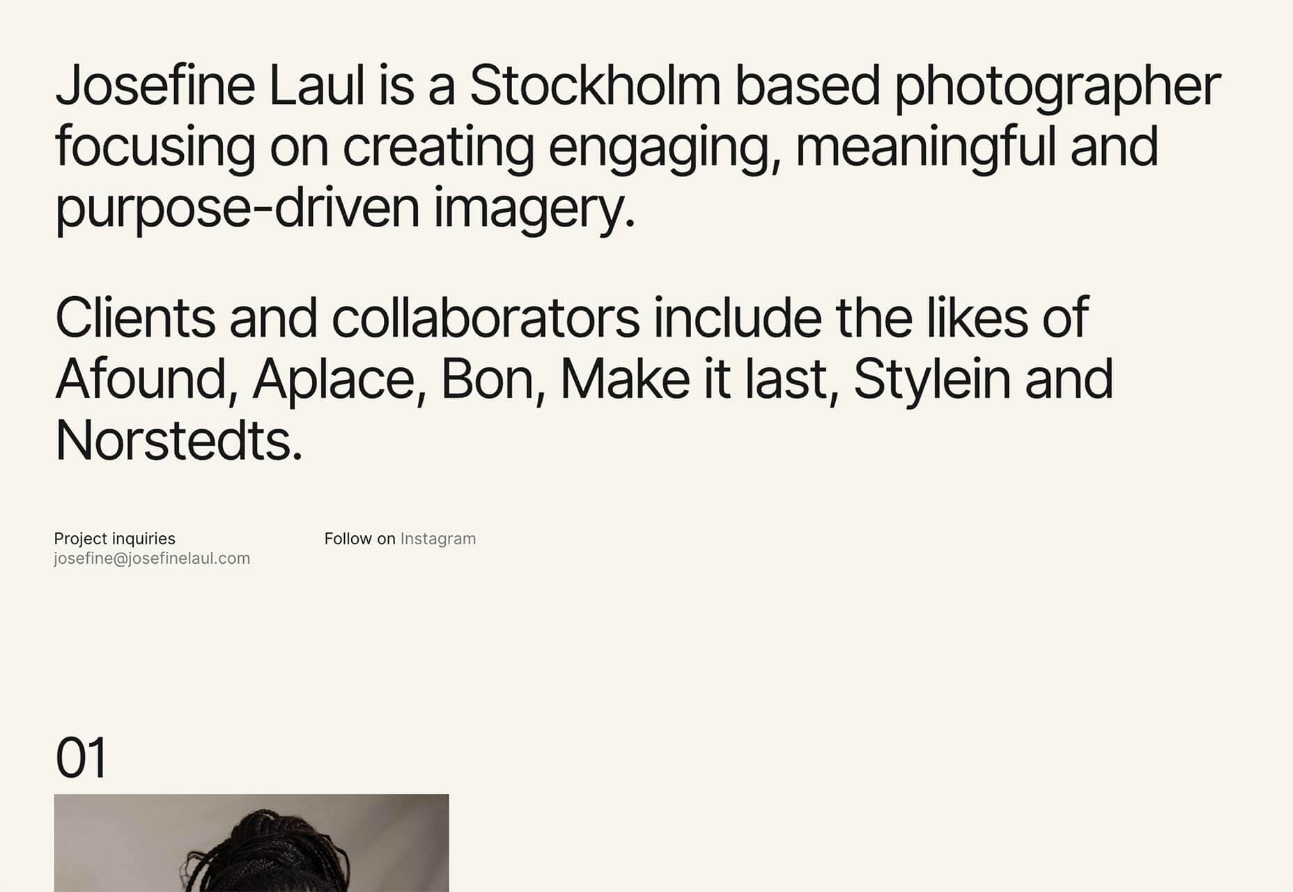
Josefine Laul’s site is an exercise in Scandinavian minimalism. The Stockholm-based photographer’s work is presented as a simple set of thumbnails, clicking on them takes you through to a project page that plays with the underlying grid.
Only / Once
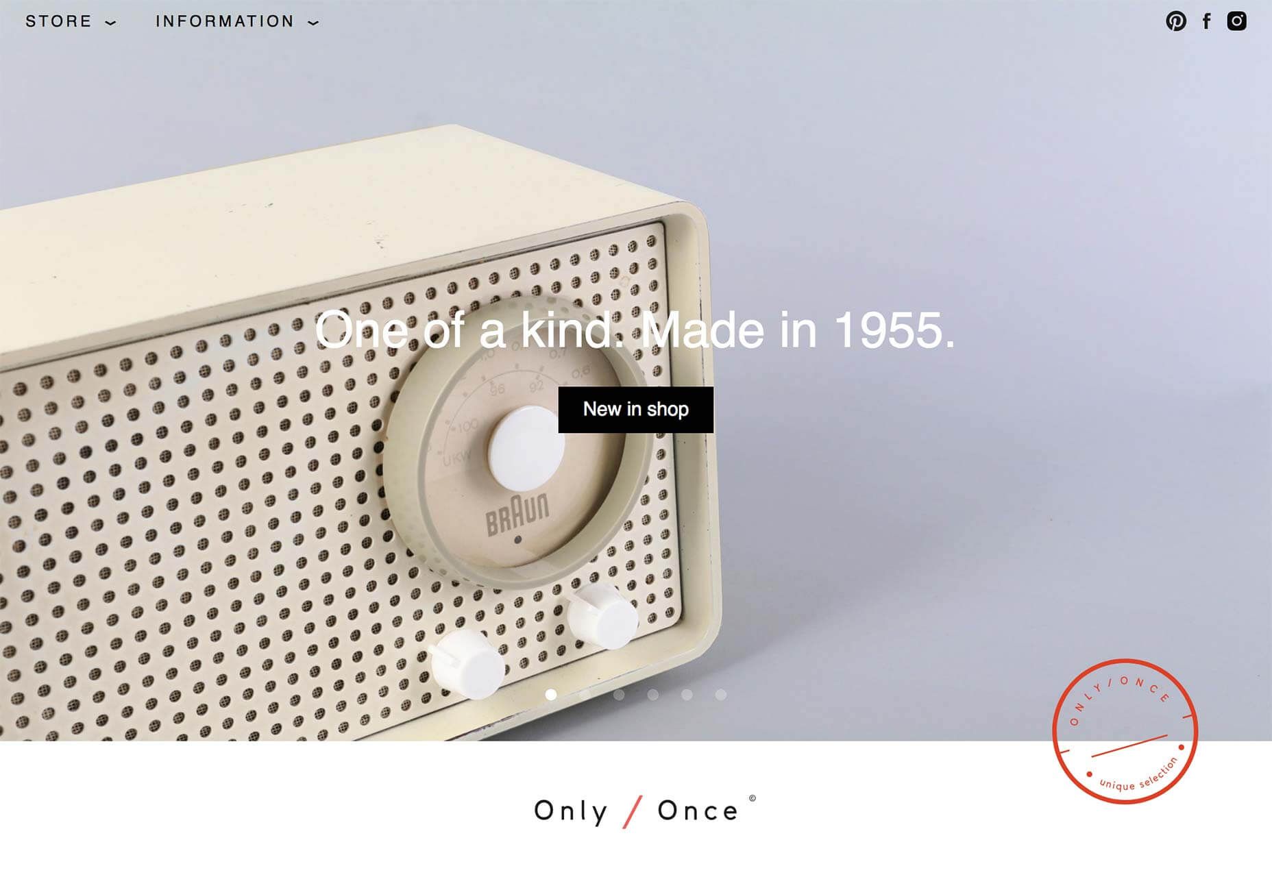
Only / Once is an unusual home accessories store featuring original vintage designs from some of the twentieth century’s greatest product designers. Fans of Dieter Rams, Christian Dell, and Josef Hurka, among others, will be in heaven.
Jordy van den Nieuwendijk
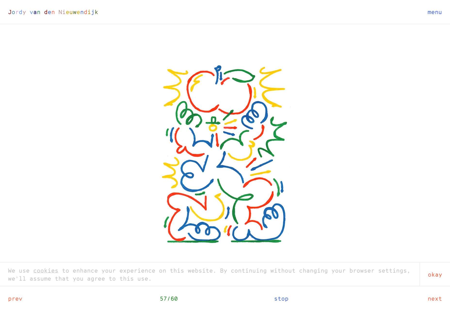
If you’re worn out by the ongoing design trend for light grey text, you’ll love Jordy van den Nieuwendijk’s site featuring wonderfully colorful text. His artwork’s a positive delight too.
Ruby Atelier
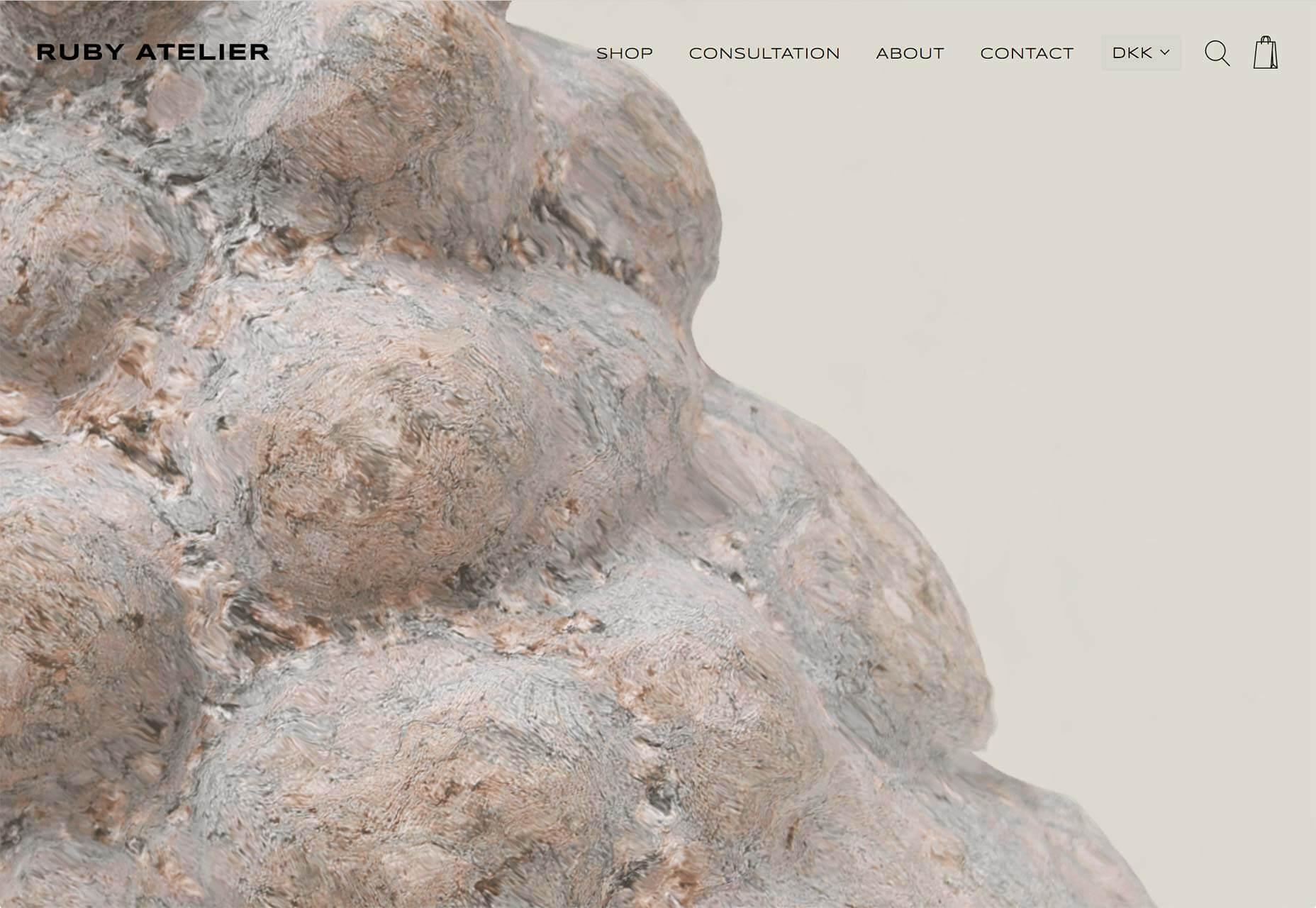
Ruby Atelier is a Copenhagen-based interior design consultancy that also sells mid-century objects. Its welcome page features a hypnotic, liquid effect. Grab and drag to distort the macro photography into beautiful distortions.
| Add Realistic Chalk and Sketch Lettering Effects with Sketch’it – only $5! |
from Webdesigner Depot https://www.webdesignerdepot.com/2019/01/20-freshest-web-designs-january-2019/

No comments:
Post a Comment