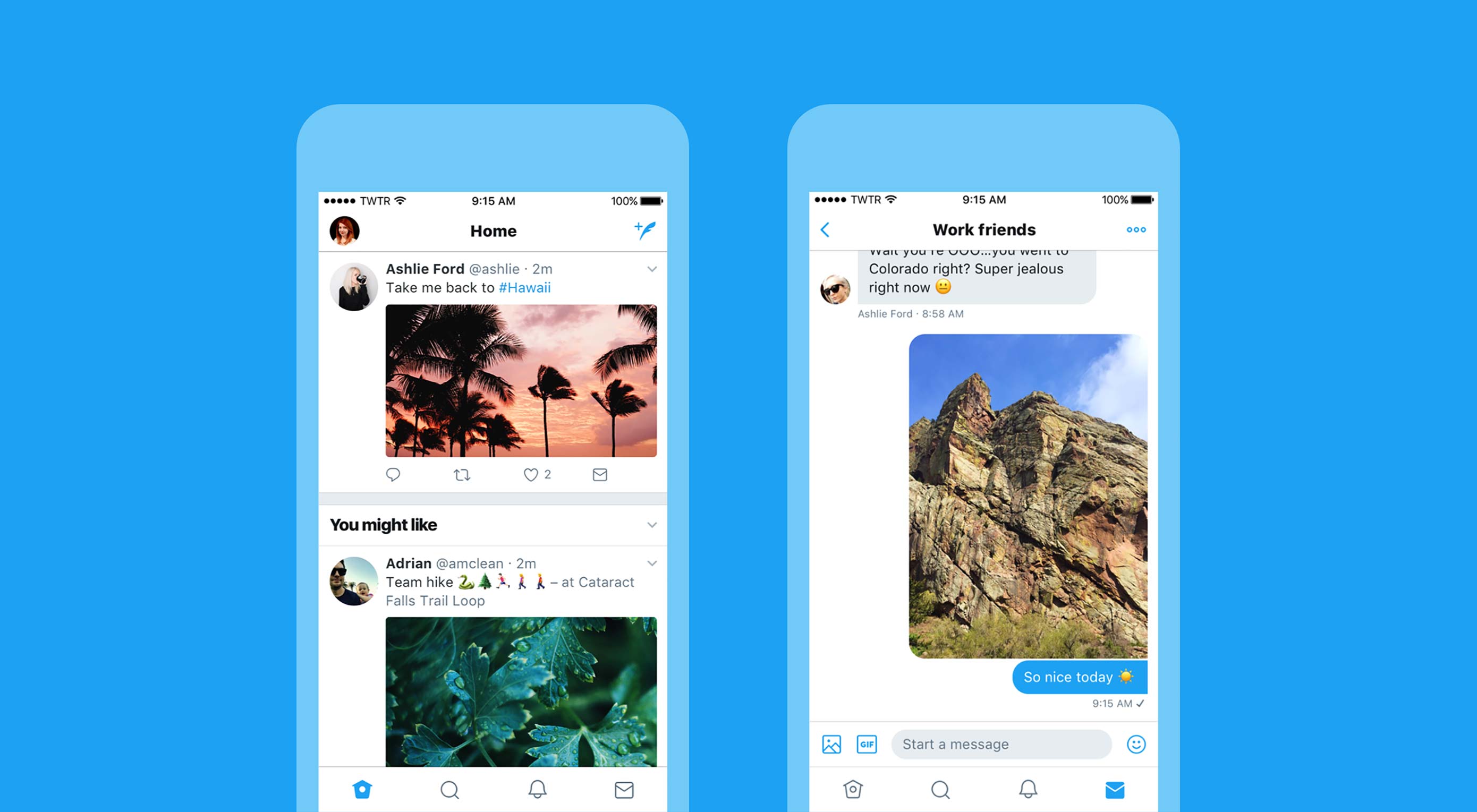
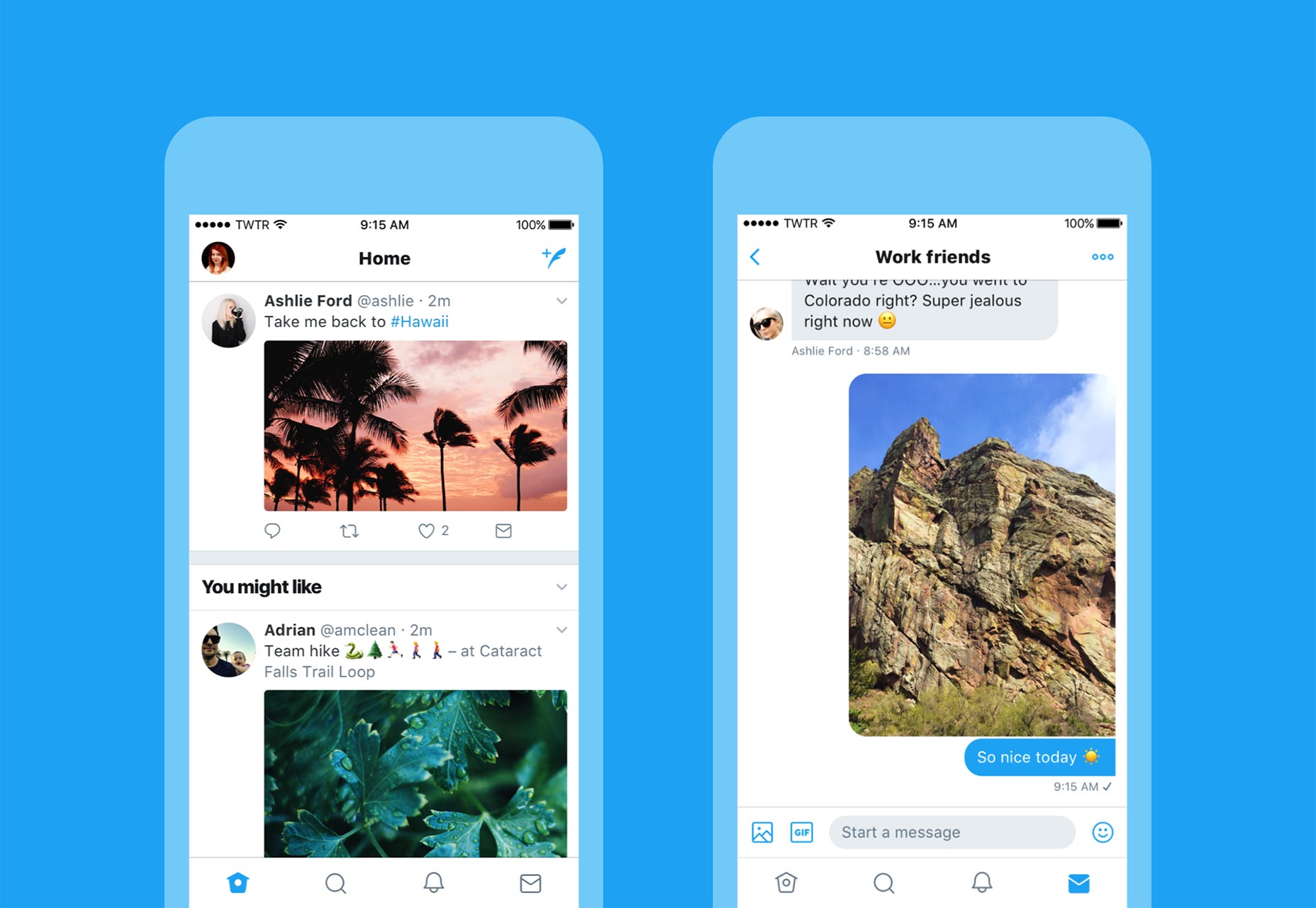
 Twitter is launching a redesign of its iOS, Android, TweetDeck and Twitter Lite apps. The redesign is intended to make the service “feel lighter, faster, and easier to use” and features a number of changes that mean an update is pending for twitter.com too.
As with any redesign, there’s some good, some bad, and some probably-ok-once-we-get-used-to-it.
The new design is expected to start appearing worldwide over the coming days and weeks, although much of the update seems to be aimed at bringing iOS in line with Android meaning iOS users will likely notice the changes first.
Twitter’s biggest UI fail still hasn’t been fixed
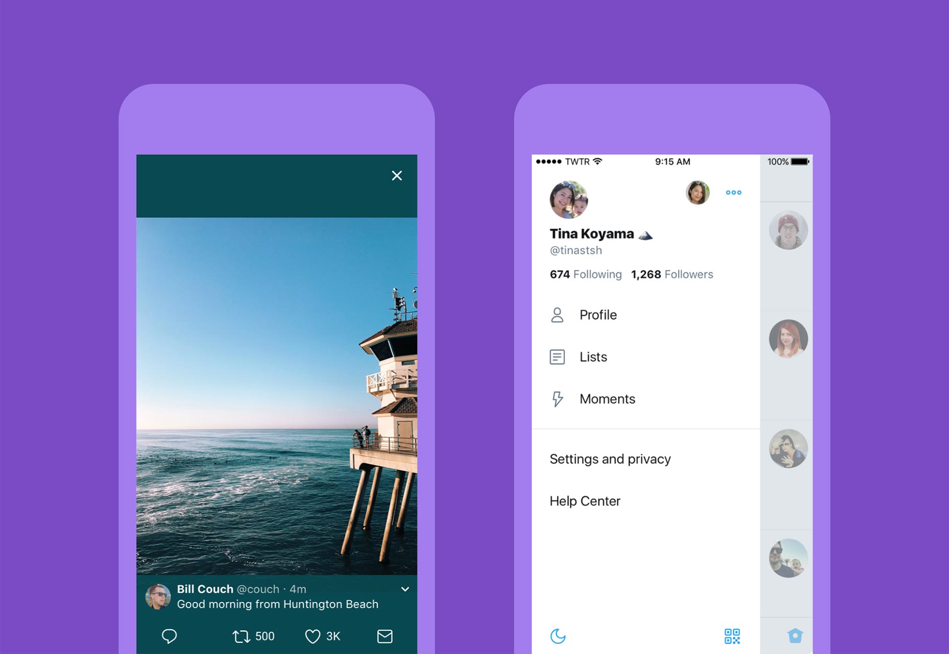
Like Twitter for Android, Twitter for iOS now puts all your settings, profile, and access to additional accounts in one place, keeping the main UI focussed on the primary functions. Links now open in Safari viewer, so if you’re signed in to other services, your login will be carried over.
iOS and Android versions now update live, so you can see your retweets, likes, and replies ticking up without refreshing.
Typography has been refined across the board for greater consistency and bolder headlines. There are also improved accessibility options, including increased color contrast.
Twitter’s biggest UI fail still hasn’t been fixed: Despite the fact that the majority of users tweet in a language that’s read top-to-bottom, the Twitter feed is still laid out chronologically from bottom-to-top. This means that new tweets are added above older tweets. The logic is then overturned by replies, which appear below the original tweet. This results in a series of awkward saccades as our eyes—and thumbs—flick up and down the feed.
The most notable changes are the new icon set. The home icon now looks a lot less like a birdhouse; the notifications icon has lost its angle—and its character with it; the direct message icon has been distorted, it now fits the scale of the other icons, but consequently looks less like an envelope. These icons were already really well designed, and probably should have been retained.
However, there is a huge positive change to the reply icon: the previous version was commonly misinterpreted as a back arrow, the new version is a speech bubble, indicating a conversation. Not only does this clarify the function, but it redefines the concept from ‘reply’ to ‘discuss’—a far more open and egalitarian action.
| Web Development Masterclass, 100s of Tutorials, 20 Unique Sections – only $17! |
from Webdesigner Depot https://www.webdesignerdepot.com/2017/06/twitter-launches-a-redesign/


No comments:
Post a Comment