 The UX design process is, in a word, complex. The discipline itself is a jam-packed intersection of contrasting fields, including art, engineering, experimental research, and interpersonal skills—a blend of technical and creative skillsets. UX designers must test, design, architect, write, and do it all ad nauseum until they’ve crafted a completely usable solution.
There’s a hint of irony to the job—making something simple truly is complicated.
And yet despite the intricacies of UX design, we often use a singular metric to measure its quality: conversion rate. It’s not a particularly robust benchmark; conversion rate is simply the percentage of users that go on to fulfill your platform’s purpose, whether that’s making a purchase, downloading an app, or registering for an event.
Conversion rate is the king of the KPIs. Marketers labor over bumping it up a few points; siteowners pull out their hair trying to optimize every aspect of their platform to increase it. But is it really the key performance indicator we treat it as?
Too often we put conversion rate on a pedestal, succumbing to the tunnel vision of boosting a lionized metric used to analyze the success of a website. We condense a long journey, a process, an entire experience, into a single number (typically around 2%), without ever analyzing or examining the underlying process it took to output that percentage.
Many marketers or designers have instead opted for a deeper analysis of conversion rate, scrutinizing the steps a user takes to achieve conversion. These steps have given rise to a new strategy: optimizing for micro-conversions.
What Are Micro-Conversions?
Imagine you’re constructing a building. The safety, stability, and overall quality of the structure you’re assembling depends on the materials you’re using. You can stack up walls, floors, and ceilings brick-by-brick to erect a building, but if you’ve bought low-quality bricks, that building’s not going to last very long.
This idea summarizes the theory behind optimizing for micro-conversions. Don’t worry about the final metric, the conversion rate, just yet—focus on the tiny, incremental steps in the user flow and ensure those are intuitive, engaging, and subscribe to user-centric design principles.
Generally, micro-conversions can be subcategorized into two groups: process milestones (also known as micro-step conversions), and secondary actions (sometimes referred to as micro-indicator conversions).
Process milestones are the steps that directly lead to the end-goal: macro-conversion. They’re probably best visualized in an ecommerce application. A conversion is defined as a sale, and to make a sale, the customer has to search the catalog, find a product, place it in their cart, and complete the checkout process.
Each of these checkpoints are process milestones. Process milestones can be further deconstructed into extremely granular tasks, each of which can be tailored for optimal UX.
Secondary actions don’t fall under the direct path to conversion—instead they describe actions that typically supplement conversion, or are decent indicators that a potential customer is considering converting. Common secondary actions include signing up for a newsletter, creating an account, or sharing content on social media.

A micro-conversion (specifically a secondary action), could be a social media share. Macro-conversions are the ones that lead to revenue.
Both kinds of micro-conversions can be easily monitored with Google Analytics, and both can provide insight into the quality of your user experience at a scale that standard conversion tracking can’t capture. Designers can delve deep into the architecture and tweak individual design elements to perform at their highest potential.
Optimizing for micro-conversion offers another boon for UX designers: streamlined testing. Instead of having to test an entire experience, designers can quickly validate the design choices they’ve made for the elements the experience has been deconstructed into.
Micro-conversions are a seemingly intuitive answer to the shortcomings of the normal conversion rate metric, but they’re not without their drawbacks. While tracking micro-conversions can’t hurt, optimizing the entire platform for them can seriously backfire.
The Problem With Micro-Conversions
We’ve established that micro conversions can help pinpoint areas where UX adjustments are necessary, and validate if design changes are impacted the user experience positively.
But companies focusing solely on micro-conversions risk tripping into same pitfalls that beset the macro-conversion rate metric. And even though micro-conversions expedite testing, it can sometime lead to misleading, or even false, data.
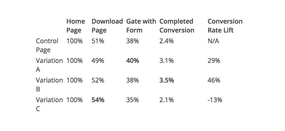
Take the excellent example posed by marketing expert Chris Goward, where a company decides to conduct A/B testing on its homepage. Looking to optimizing micro-conversions, the company deconstructs the conversion path into process milestones (in this case, just pages).

Most conversion processes won’t be this simple, but for our intents and purposes this pipeline suffices. Let’s say, to expedite testing, the designers optimize for the “download page” micro-conversion. They’re interested in selecting the homepage that best converts visitors to their download page.

Their tests yield these results, and it appears that Variation C of the home page is the most conducive for micro-converting visitors to the download page. But let’s see what happens when we continue to test down the pipeline.

We see that the best variation of the home page changes, depending on which micro-conversion you’re optimizing for (download page or gate with form). But in reality, the highest-performing home page (in terms of a standard conversion rate) is Variation B.
Like its larger, better-known counterpart, micro-conversion optimization often poses the risk of tunnel vision. When zeroing in on a specific aspect—especially one as granular as a micro-conversion—we can miss the larger picture.
Finding A Better Metric
None of this is to say that you shouldn’t be tracking your conversion rate, or even your micro-conversions analytics. But it’s likely obsessing over these metrics isn’t the answer to a high-performing website.
The idea that conversion rate is overrated isn’t a particularly groundbreaking one. Goward believes a financial-based metric is more valuable, and suggests optimizing for sales, average order value, qualified leads generated, or anything that directly produces revenue.
Other UX designers and site owners suggest forgoing simple conversion and instead optimizing for long-term metrics—such as subscribers that last for longer than X weeks.
There’s no right answer, no perfect formula that can tell you what metric to optimize for your website. But it’s likely that conversion, or even micro-conversion, isn’t it.
So while tracking and analyzing this data is highly recommended, remember to look at the bigger picture before making major UX design changes to your website.
| 40 PowerPoint + 20 Keynote Templates with 1000s of charts, infographics, maps – only $29! |
from Webdesigner Depot https://www.webdesignerdepot.com/2017/08/the-micro-conversion-controversy/
No comments:
Post a Comment