 Material Design came into the world in 2014, announced at the Google I/O conference. It combined and reinforced many of the concepts of flat design that designers at large had already embraced; it also enhanced it a bit. Material Design was also one of the first major design systems to stray back into skeuomorphic territory with its subtle drop shadows, and emphasis on approximating a tactile or “material” interface.
Nowadays, we just call it 2.5D, but I want to start calling it “skeuomorphish”, so that’s what I’m going to do. Anyway, Material Design has become a hugely popular design system, with many people using it to get their apps and websites out faster. And now, Google has made that even easier.
Enter the redesigned material.io. Google has revamped the entire experience of the site, added new documentation, new downloads, and new tools. All of this information is now divided into three main sections:
- Design
- Develop
- Tools
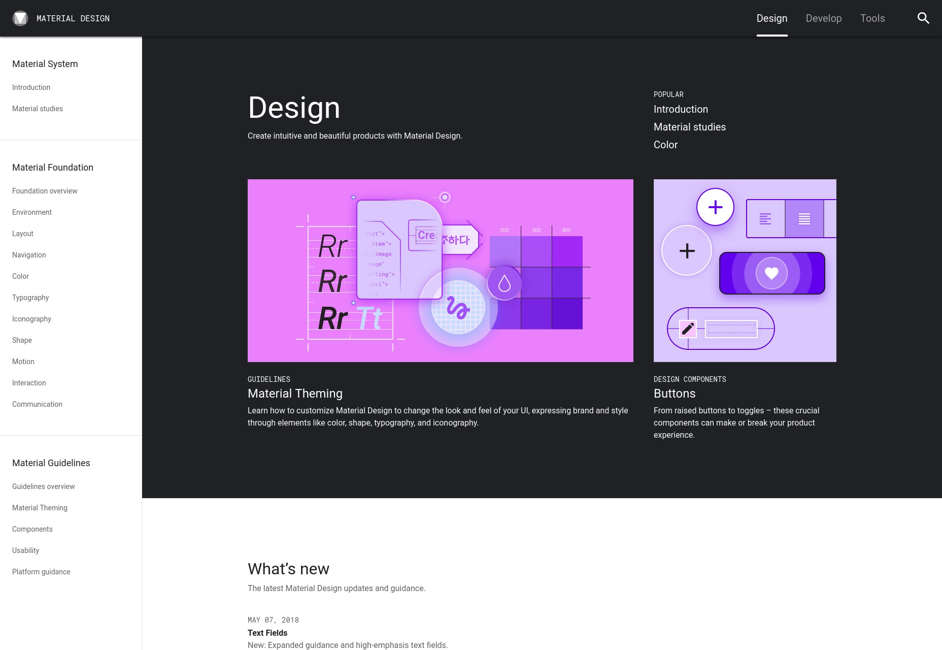
Design
This is possibly the meatiest section of the site because it’s where they put all of the theory. It’s a design system first and foremost, after all. The code used to implement it is almost incidental.
Here you’ll find an overview of all of the major concepts from Environment, to Shape, to Communication. It gets pretty in-depth. There’s also a pretty large section that deals with the individual UI components of the system, how they’re supposed to be used, etc.
There’s also a section full of general guidelines, and a very interesting set of case studies of real apps built using Material Design. If nothing else, go check that out to see all the different ways you can implement one single design system.
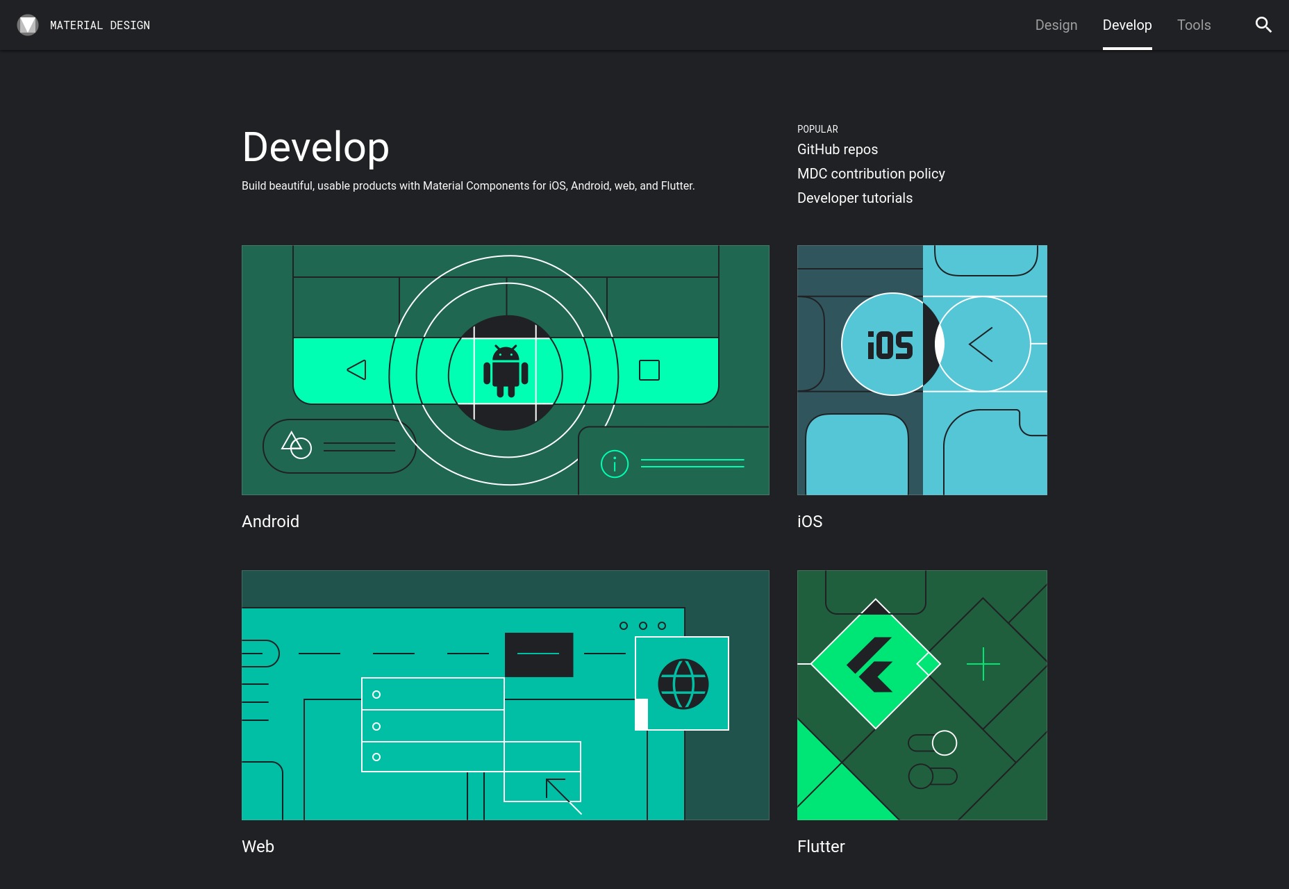
Develop
This part of the website is the bit developers (hence the name) will be looking for. It basically just offers code-related documentation for each and every UI component. The cool thing is that you can find the components in four flavors (so far):
- Android
- iOS
- Web
- Flutter (Google’s own cross-platform mobile app SDK)
Tools
Lastly, we have a small but useful (and presumably growing) collection of tools.
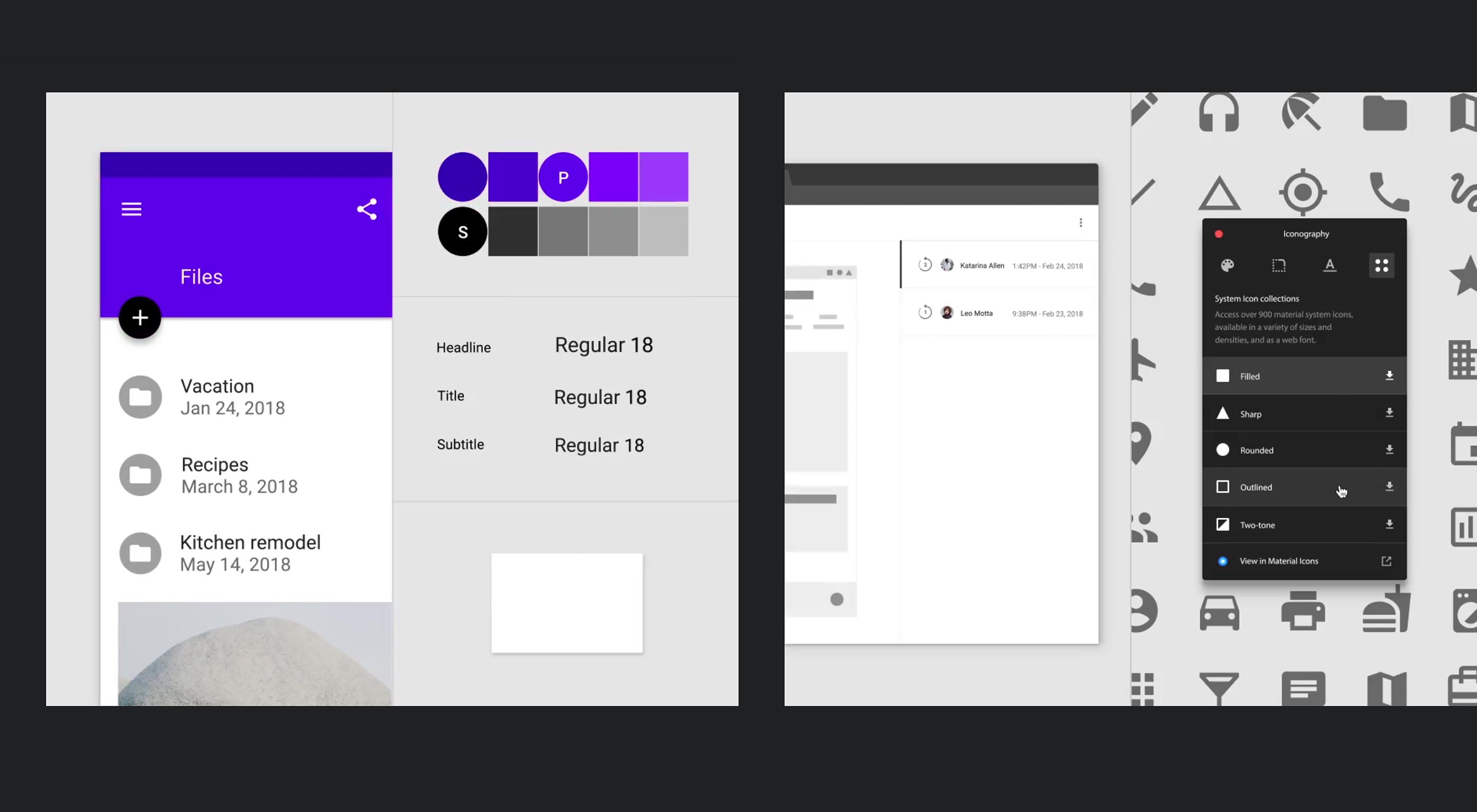
Material theme editor
This one is interesting: It’s a Sketch plugin that’s designed to help you quickly and easily make global changes to your implementation of Material Design. Basically, it’s there to help you implement your own branding with the system. Sketch users will no doubt love this.
Icons
This is just what it says on the tin: a massive set of icons to use in your apps. They come in five aesthetic flavors, too. Well, they’re all monochrome, but if you implement them with the provided icon font, or download them as SVGs, you can quickly change that through CSS whenever needed.
Color tool
Basically, it’s just a color palette generator, but it’s specifically designed for Material. It gets the job done.
Gallery
Last but not least, the gallery is basically Google Drive for stuff built with Material Design. It’s designed to host Sketch files, so you can inspect them. The service itself can link you to relevant developer resources for Material Components, when appropriate. And naturally, you can share your work, and collaborate on projects.
In Summary
For anyone looking to dive into Material Design, this is probably one of the most complete resources out there. It will also be the place to look to find information on the system’s newest components, and I have no doubt that they’ll release more tools. If Material is your thing, material.io is exactly where you should be starting.
| Add Realistic Chalk and Sketch Lettering Effects with Sketch’it – only $5! |
from Webdesigner Depot https://www.webdesignerdepot.com/2018/05/material-design-redesigned/


No comments:
Post a Comment