 Businesses have more options today in terms of how they get their goods and services out to customers: strictly brick-and-mortar, 100% online, or a combination of the two. Because of this, web design isn’t necessarily as straightforward as we’d like it to be.
Of course, there will always be certain best practices to abide by—abundant white space; responsive and mobile-first design; easy-to-find CTAs; streamlined user flow; consistent design and messaging site-wide.
But big-picture items aside, what exactly do you need to know about designing for local businesses, global enterprises, and those that attempt to span both categories? Let’s take a look at the differences in designing for audiences based on location.
Local vs. Global Web Design, What You Need to Know
Below are 4 parts of the web design and development experience that drastically differ between local and global-serving websites. Keep these in mind as you work on future projects:
1. Web Hosting
I won’t get too much into the specifics of web hosting; however, I do think it’s important to understand that some web hosting solutions just aren’t ideal for global web design. This isn’t just because of server resources and how much traffic the server, in turn, is able to handle. There’s also the matter of distance.
Think about it like this: You designed a website that’s hosted from a server in Denver, Colorado. The website sells hats. There’s nothing really tying the hat design to a regional audience, and so you’ve targeted the web design to a global audience. And, for whatever reason, people in Australia love it. However, the web hosting provider doesn’t have a web server anywhere near Australia. They are solely based in the U.S. With already limited resources in the hosting plan, the high amounts of traffic from Australia severely compromise the speed of the website (which happens when transmitting lots of website files, images, scripts, and so on around the world).
So, what do you do? Simply hope the web design and selection of hat offerings are enough to make visitors look past the sluggish loading times? Nope. If you’re serving a global audience, you need to 1) use a web hosting company with servers around the world, 2) choose a web hosting plan capable of handling that kind of traffic, and 3) equip your site with a CDN.
2. Colors
Something like color contrast is a pretty basic consideration for any website you design. But have you ever thought about the underlying meaning behind the colors you’ve chosen? And have you put those in the context of your audience’s perception?
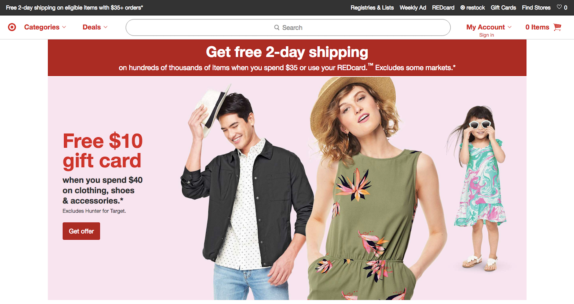
For instance, let’s look at the color red. Red is an incredibly powerful color. It’s also very memorable. Ask any consumer what Target’s logo is and they’re bound to tell you it’s a red bullseye. Not just a bullseye, but a red one.
But red can have more somber associations in other countries. In South Africa and China, red is used for mourning and funerals, respectively. If you have a growing audience in those parts of the world, that color choice might not make sense despite its more positive connotations in other parts of the world.
Conversely, you can think about how color plays into local design. If you’re trying to form a strong attachment with an audience, say in Chicago, you could use colors reminiscent of one of the more beloved sports teams there. Or design it in a way that it makes them think of a local landmark or event.
3. Images
As with color, you have to be careful about what kind of message you send with images on your website.
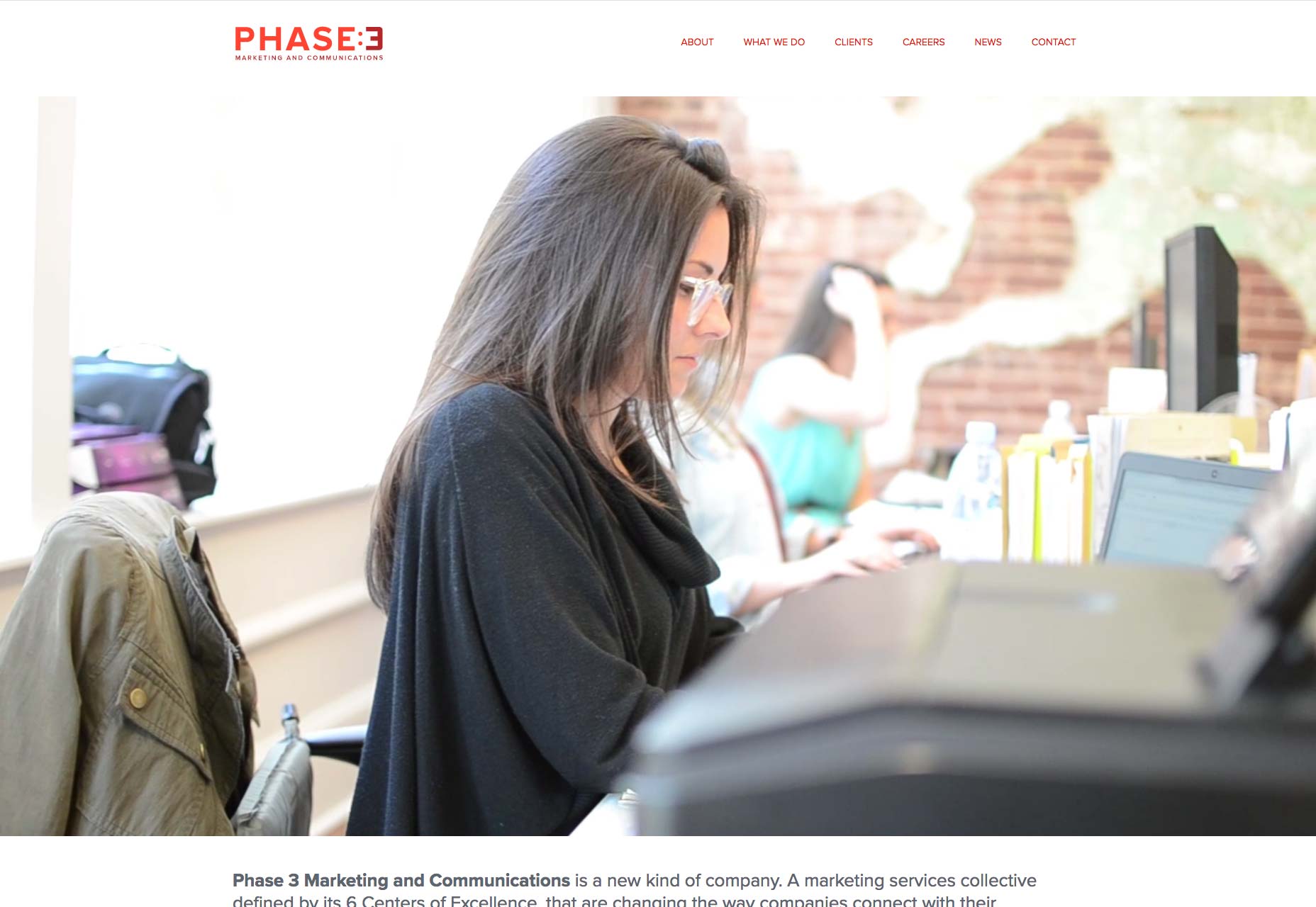
For a local audience, you’d be best off using recognizable images from your base of operations as well as of your team; not some cold, generic stock photography. Take Phase 3, as an example.
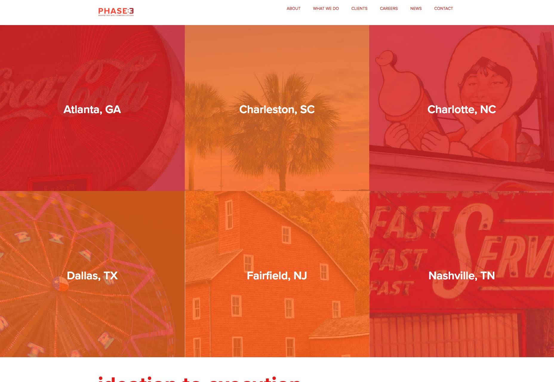
The background video that plays on the home page looks pretty darn authentic, giving visitors a glimpse behind the scenes of what the agency does. Scroll down further on the page and you’ll see that they’ve added images representative of each office location:
These small touches give a local audience a greater connection to a brand.
Now, with a global company, it may be okay to use premium stock photography, though you might be better off relying on strong swatches of colors (gradients are huge right now anyway).
4. Copy
I would suggest that, when it comes to copy, there are a few rules to stick by for global visitors:
- Keep the copy on your site short.
- Avoid any colloquial speak or jargon.
- Use long-tail keywords that focus on your service or product.
- If you sell anything on the site, include easy options for choosing other countries, languages, or currencies.
- If you have a contact form, streamline the process of filling it out by providing easy-to-use dropdowns to select country codes, populate addresses, etc.
- Mention partnerships, awards, and other associations that bring to mind a global presence (e.g. Google certifications, Amazon integration, major enterprise partners, etc.)
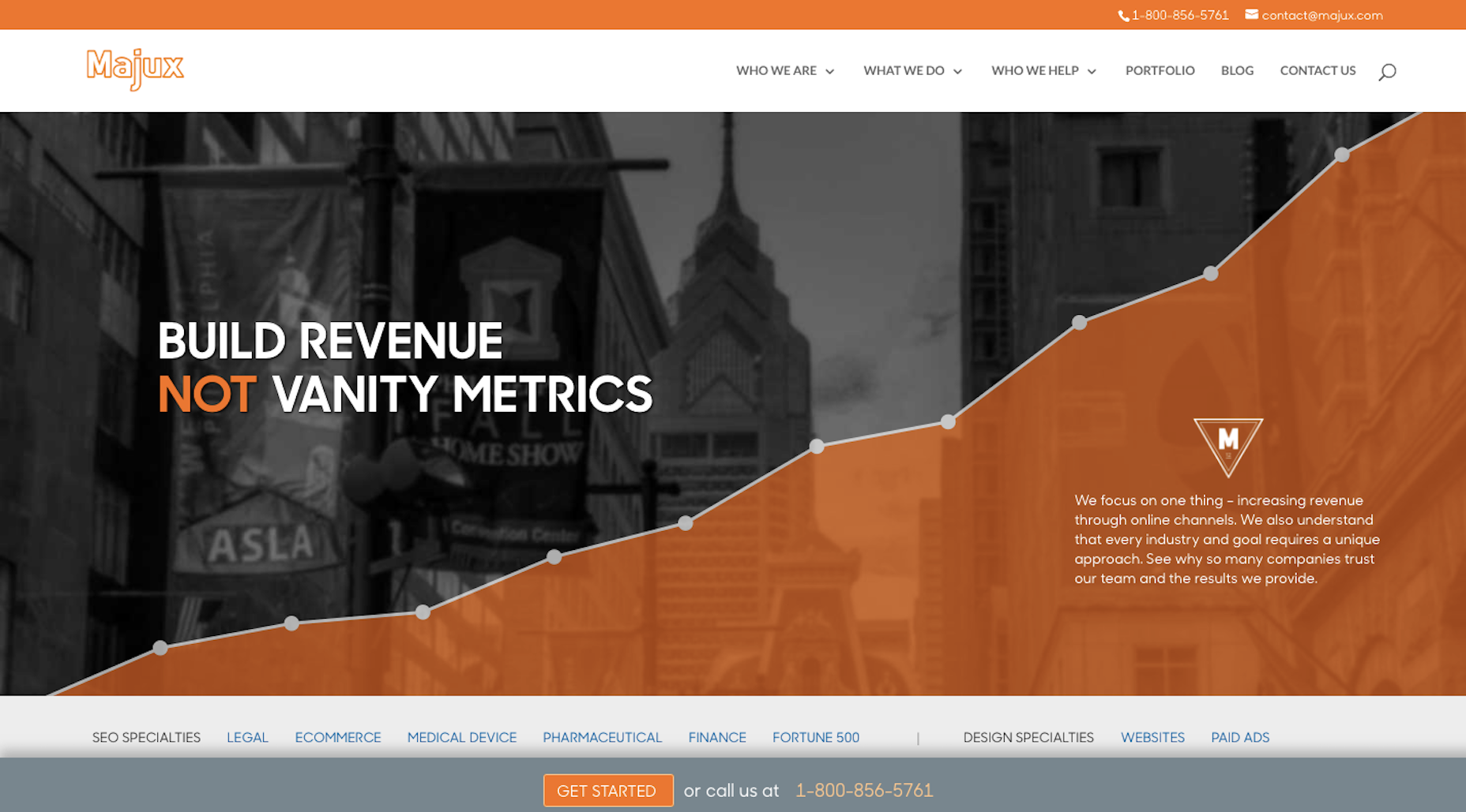
Majux is an example of a Philadelphia-based company that targets a nationwide audience:
As you can see, there’s no mention of “Philadelphia” in the copy, the metadata doesn’t include a hint of it, and they’re even using an 800-number instead of a local area code.
To write copy for a local audience, use these tips instead:
- Craft copy that’s longer and feels more personalized.
- Use colloquial speak the local audience will recognize and quickly warm to.
- Use long-tail keywords that include mention of the physical location.
- Reference the location in the copy, too.
- If you have a corresponding brick-and-mortar location, create a juxtaposition between the two experiences. Encourage customers to use the site to check prices, let them know they can order online and pick up in store, etc. Make it clear that you want it to be a seamless experience between digital and in-house.
- Mention partnerships, awards, and other associations with well-known local companies.
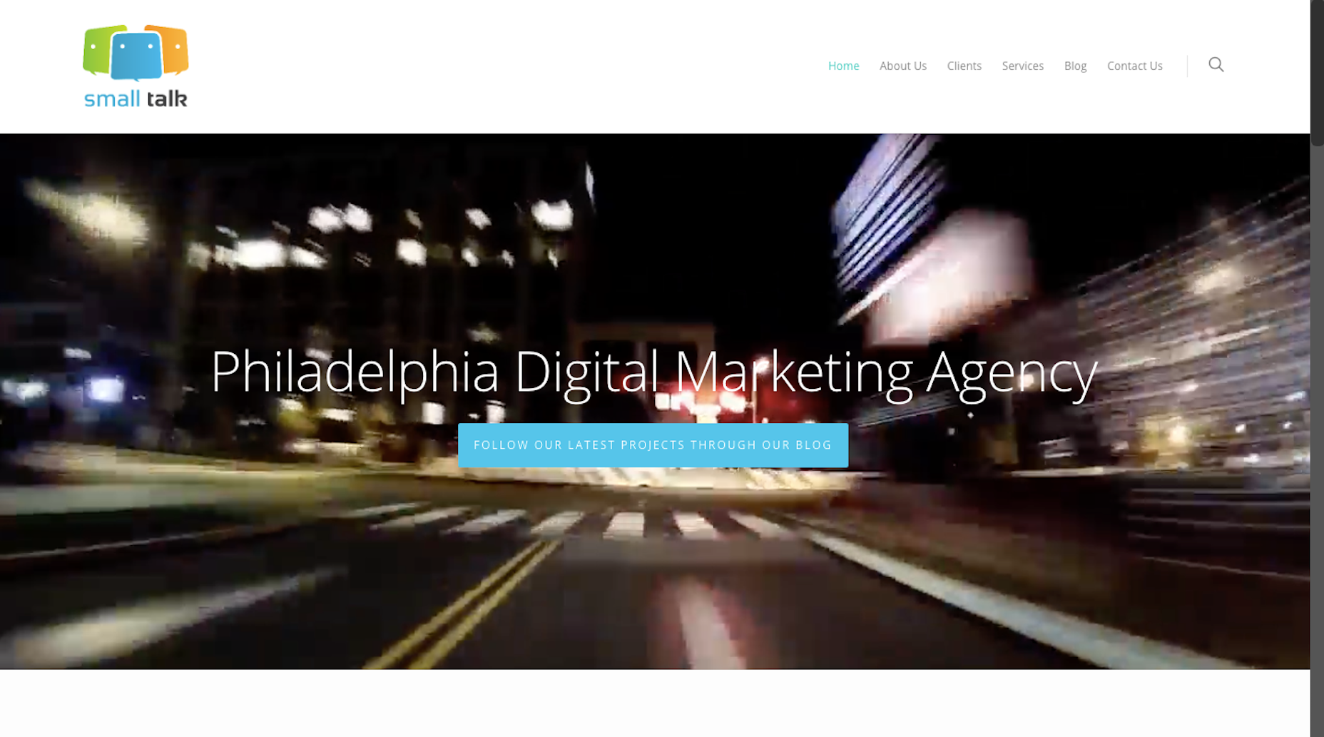
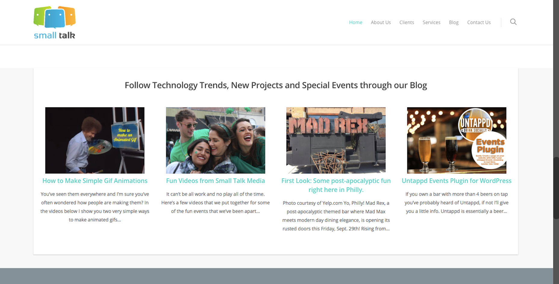
Small Talk Media is a media agency that touts its Philadelphia roots:
As you can tell from this highlight reel, their Philly location plays a big part in the brand’s identity:
Wrapping Up
In order to design a website well, you need to translate the users’ needs and expectations into an experience. And the key to having success with that experience is to target the right audience in the first place. But targeting a local user set versus one scattered around the region, country, or world requires different considerations.
In general, it’s best to play it safe and buttoned-up when designing for a global audience. That way, you run less of a risk of isolating any one group of people and you give off the impression that your brand is much larger and capable of handling anyone’s needs. And, for local design, have fun with it. Show off your local pride and give visitors a way to more deeply connect with your brand.
| Add Realistic Chalk and Sketch Lettering Effects with Sketch’it – only $5! |
from Webdesigner Depot https://www.webdesignerdepot.com/2018/09/local-vs-global-web-design-how-to-reach-the-right-audience/
No comments:
Post a Comment