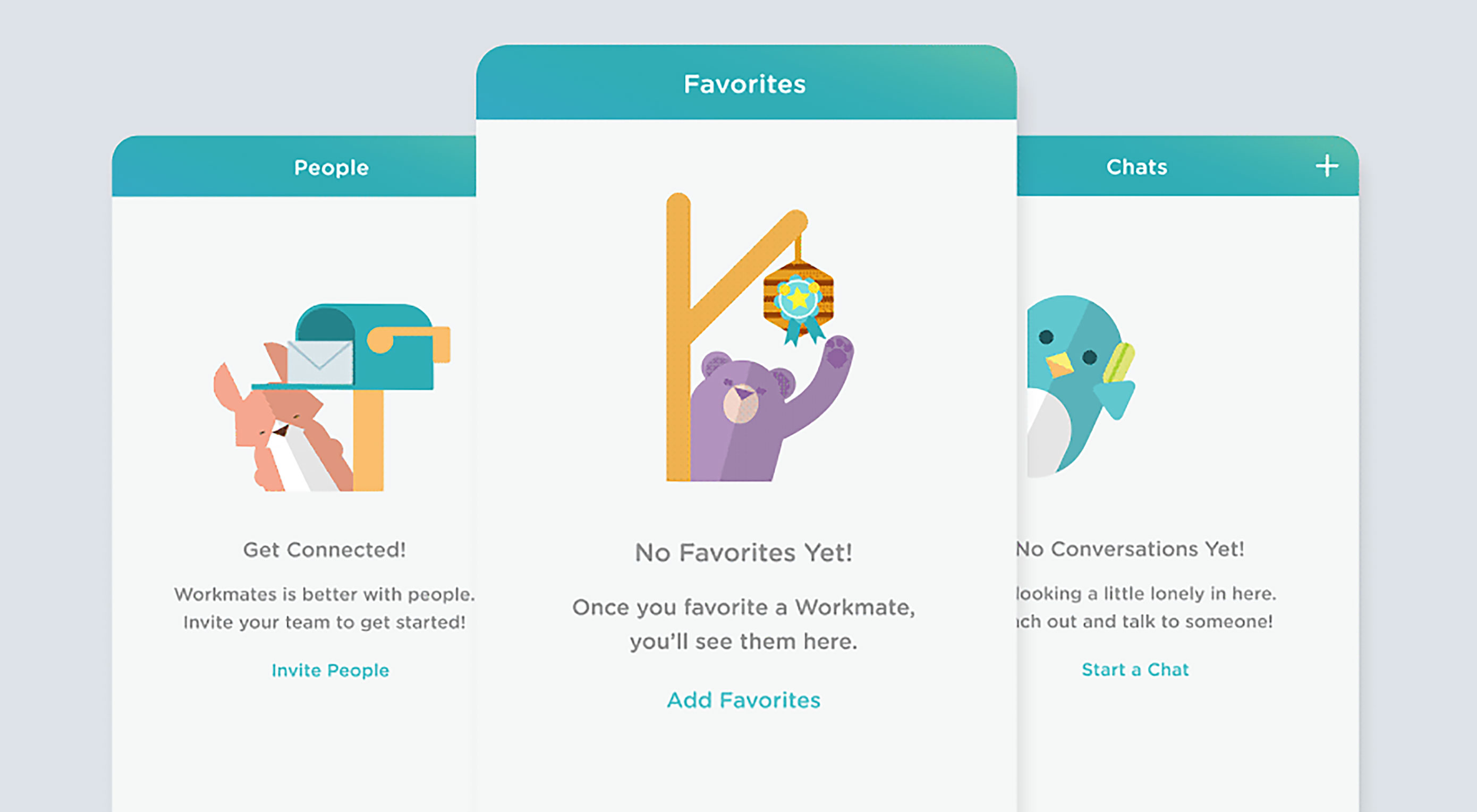
 “Delight” is a word that we’re hearing and using more often to describe pleasurable moments in our products. Delight is the magic that makes us fall in love with a product. It’s a core element to strive for when designing. When it comes to providing pleasure or delight in our websites and apps, animations contribute a lot.
Why delightful animation is important
Digital design plays a crucial role in how customers experience a product. Modern design is highly focussed on usability, because usability allows people to easily accomplish their goals. However, designing for the user experience has a lot more to it than making a usable product. Good design is pleasurable and seductive. Good design is delightful. “At this point in experience design’s evolution, satisfaction ought to be the norm, and delight ought to be the goal,” says Stephen Anderson. Animation can help you achieve this goal.
When to use delightful animation
Just like any other design element animation should contribute the user flow. Delightful animations are pleasurable for the user without detracting from the usability of the app. There are two cases when implementing delightful animation into your digital designs can strengthen UX:
- Engaging and entertaining. Entertaining animation draws attention to our products by creating a strong first impression. It can make our products more memorable and more shareable.
- Baking emotion in design. Showing the human side of your business or product can be a very powerful way for your audience to identify and empathize with you. The aim of emotional design is to create happiness. You want people to feel happy when they use your product.
Let’s look at a few ways animation can help create delightful moments:
1. Keep users interested during loading
Loading time is an unavoidable situation for most digital products. But who says that loading should be boring? When we can’t shorten the line, we can certainly make the wait more pleasant. To ensure people don’t get bored while waiting for something to happen, you can offer them some distraction: this can be something fun or something unexpected. While animation won’t solve the problem, it definitely makes waiting less of a problem: fine animation can distract your users and make them ignore long loading times.

Credits: Dribbble
2. Make a great first impression
First impressions count: people judge things based on how they look. Good animation throughout the onboarding flow has a strong impact on how first-time users will engage with the app. A good first impression isn’t just about usability, it’s also about personality. If your first few app screens look a little different from similar products, you’ve shown the user that your entire product experience will likely be different too. For example, animating an illustration for a new feature can educate the user about the feature in a memorable way.

Credits: Dribbble
3. Make your interfaces feel more alive
Creative animation can make your user experience truly delightful: they can transform familiar interactions into something much more enjoyable and have the power to encourage users to actually interact. Attention to fine movements can increase the level of usability and therefore desirability of the product.
4. Incorporate emotional interactions
Focusing on user emotions plays a huge role in UI interactions. As Aarron Walter said in his book Designing for Emotion: “Personality is the mysterious force that attracts us to certain people and repels us from others.” Using animation you can establish an emotional connection with your users, and remind them that there are real humans behind the design. An example of animation from ReadMe is full of emotions.
5. Help user recover from unexpected errors
‘Errors’ happen. They happen in our apps and they happen in our life. Sometimes they happen because we made mistakes. Sometimes because an app failed. Whatever the cause, these errors — and how they are handled — can have a huge impact on the way user experiences your app. A well-crafted error handling can turn a moment of failure into a moment of delight. When displaying an unexpected error, use it as an opportunity to delight with animation.

Credits: Dribbble
6. Make a complex task feel easier
Animation is able to transform a complex task into an inviting experience. Let’s take a MailChimp case for inspiration. What makes MailChimp awesome is its smooth functionality wrapped in cheeky humor and friendly animation. When you’re about to send out your first campaign, the accompanying animation shows how stressful it is. Mailchimp brings empathy to the design: by combining animated cartoons with tongue-in-cheek messages like “This is your moment of glory,” MailChimp softens the nervousness of sending your first emails.
7. Breathe fun into the interactions
People love to discover treats in interfaces just as they do in real life. The joy is more than the treat, it’s the discovery of the treat and the feeling that someone took the time to think of you.

Credits: Dribbble
People will forget what you said, people will forget what you did, but people will never forget how you made them feel.—Maya Angelou
Never underestimate the power of delight to improve the user experience. The difference between products we love and those we simply tolerate is often the delight we have with them.
Of course, before your application can create an emotional connection with the user it must get the basics right. Thus, make your product a joy to use by connecting feelings with features!
| Massive Discounts on Stock Photos – 67% off! |
from Webdesigner Depot https://www.webdesignerdepot.com/2017/04/7-ways-to-delight-users-with-animation/
No comments:
Post a Comment