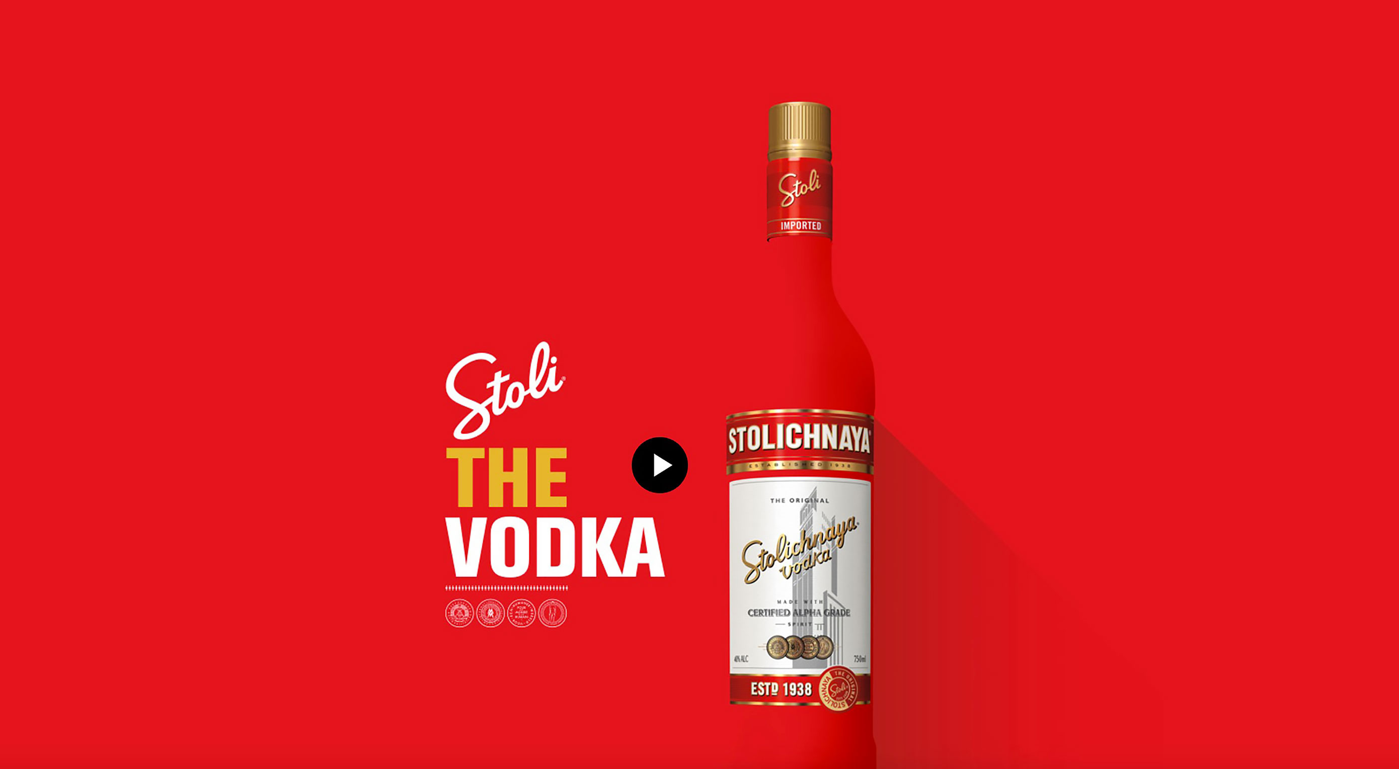
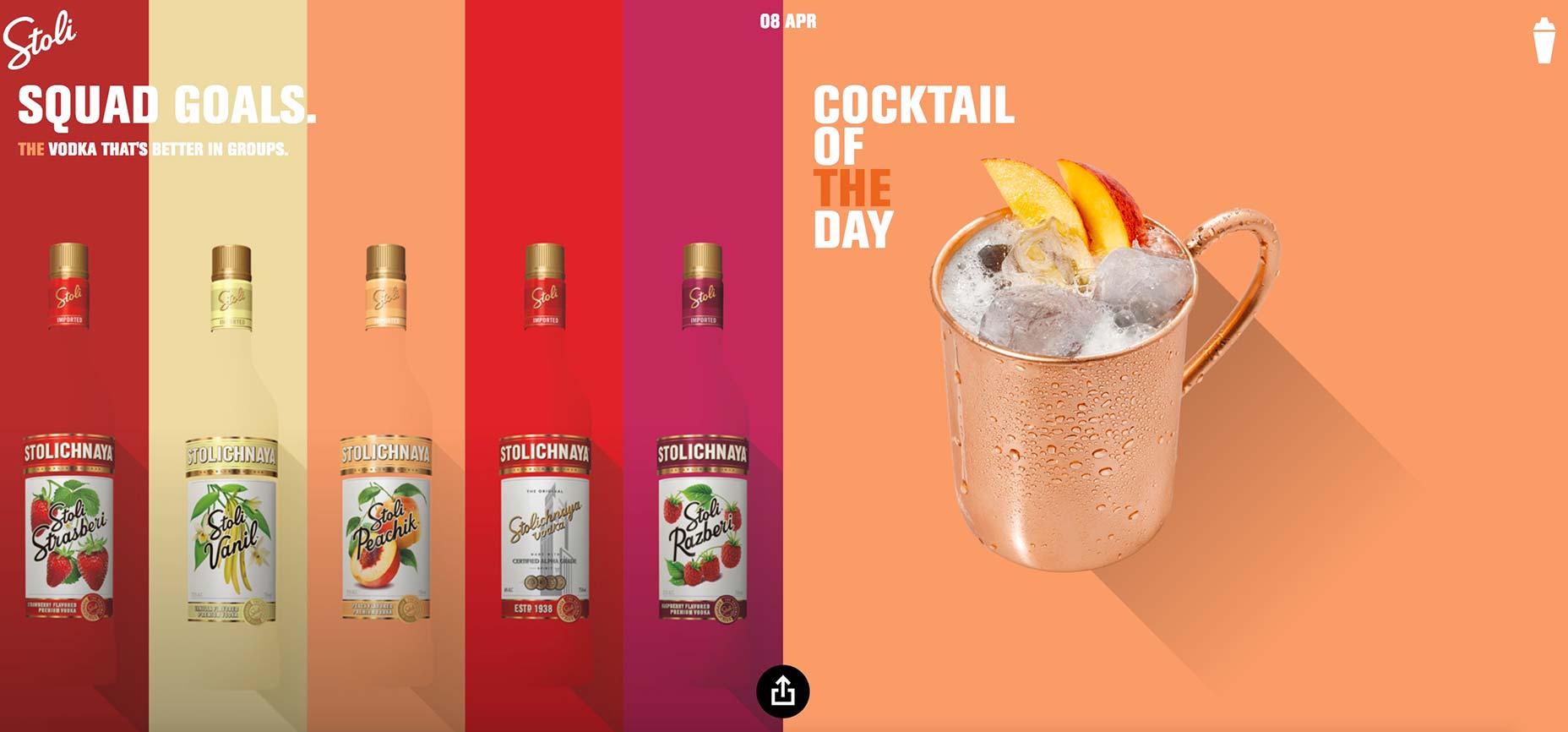
 It’s not all the time that a major brand of vodka redesigns its website to be extra artsy, but that’s precisely what Stoli Vodka has recently done. The famous Russian vodka’s site underwent a radical redesign that’s characterized by a dynamic homepage that sees fresh content every 24 hours. What also stands out to visitors landing there is the vibrancy and loudness of the colors.
According to its press release, the point of the unique redesign is to celebrate the ordinary moments in a range of things: sports, pop culture, food and beverage, social media, and entertainment. Every time Stoli’s homepage sees a new theme, there’s a vodka-based tie-in, too: Visitors will see a corresponding, new cocktail and a fun fact meant to engage its customers.
Whimsicalness seems to have been a central purpose of the redesign, as fundamental elements like the site’s navigation benefit from unexpected twists. For instance, are you looking for the navigation menu? If you are, simply hover your mouse over the cocktail shaker in the top-right corner of the homepage. Once you do that, the shaker…begins shaking, and a tooltip with the “open menu” information appears. Once you click the shaker, the menu opens, sliding in from the right.
Think of this as a twist on the old hamburger menu, where the navigational elements are hidden. However, since Stoli’s an alcoholic beverage brand, it’s clever to have a shaker take the place of the hamburger.
Whereas some brands are content to merely publish more content on their sites and so help their SEO rankings, Stoli goes a bit beyond this by dedicating its site to daily content refreshes. The content changes, but the content that surfaces is intentionally relevant to the brand’s target audience.
Another feature of the redesign is its attentiveness to social media. Certainly, brands like Stoli, which rely on the communal nature of enjoying spirits, understand that their products are almost tailor-made for social media. To wit, if you’re enjoying a new flavor of vodka that you just discovered, you’ll probably want to let your friends know about it, too.
To that end, Stoli’s homepage now features a big, black-and-white social-media button in the bottom center, which visitors can click on to show Twitter, Facebook and email icons for easy and handy sharing of Stoli content.
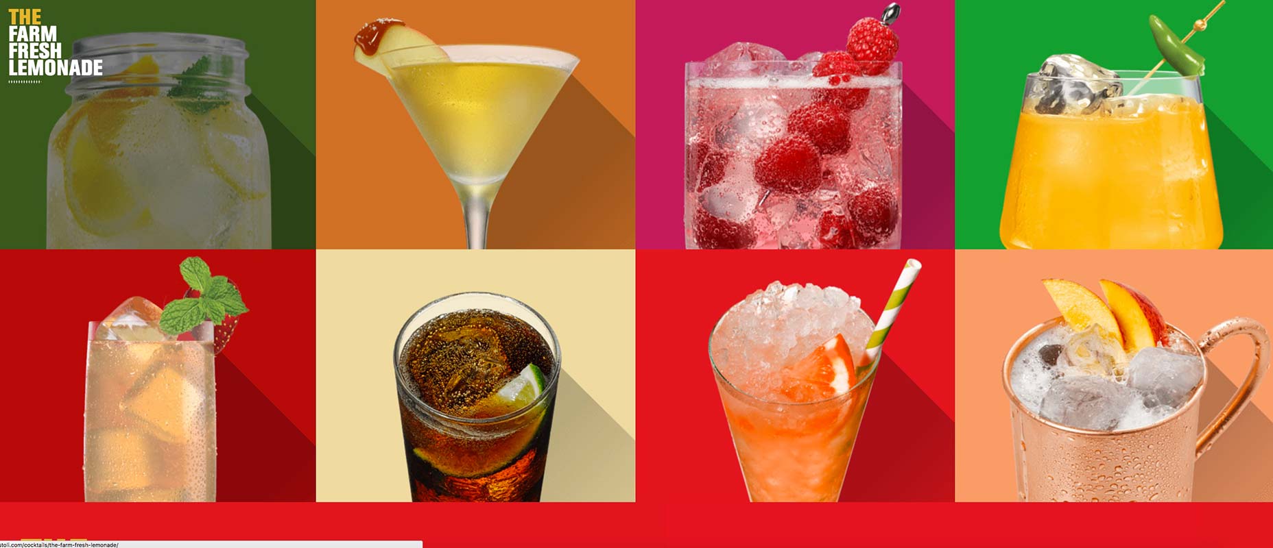
The site’s redesign also benefits greatly from its reliance on high-quality and extremely engaging imagery that showcases its different bottles, cocktails and logo, but the strength of the redesign lies in how easy it is to access information. Any visitors interested in how to mix a certain cocktail simply have to click on the inviting image and then get shown the recipe on the next page.
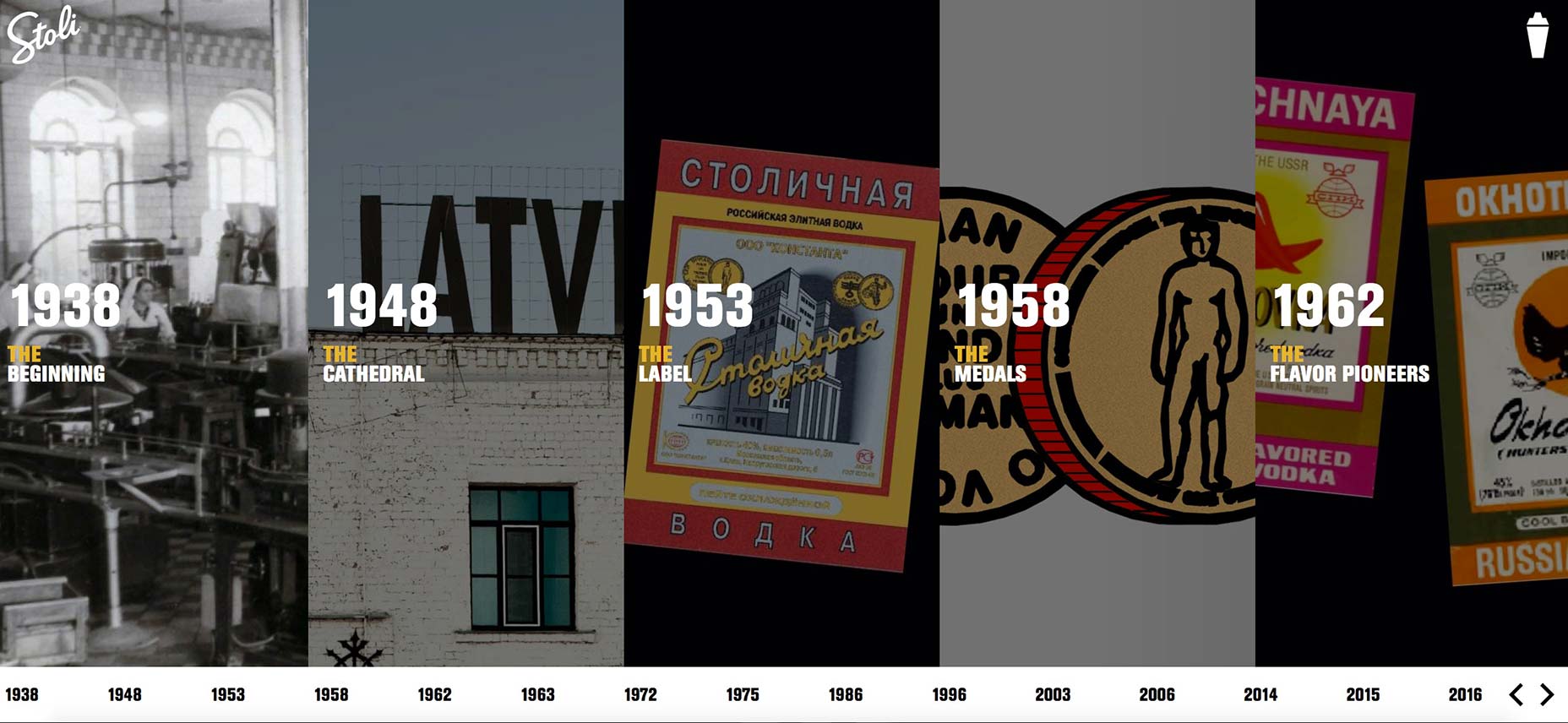
Similarly, the site’s Story and History sections are just as engaging. The former uses video and a long-scrolling page to educate visitors about everything Stoli, and the latter relies on a neat, horizontal timeline to showcase key moments in brand history.
| LAST DAY: Complete Website Builder Kit for Mobirise, 400+ Blocks, 7000+ Icons – only $37! |
from Webdesigner Depot https://www.webdesignerdepot.com/2017/04/stoli-vodka-redesigns-website-with-pop-art-focus/


No comments:
Post a Comment