 Whenever you’re working with teams as a web designer, chances are that you’re using Google Drive, Evernote, or Dropbox for any collaborations like file and image sharing. Sharing services like these make it a cinch to work remotely with teams from anywhere on the planet.
Dropbox understood the context around file sharing and the broader element of team activity, which is what its website’s redesign is all about.
According to a recent blog post on the company’s site, their latest redesign is meant to serve team-first functionality for users, thereby making Dropbox more than just a place to safely store users’ files, but also facilitate well-organized conversations and interactions around said files.
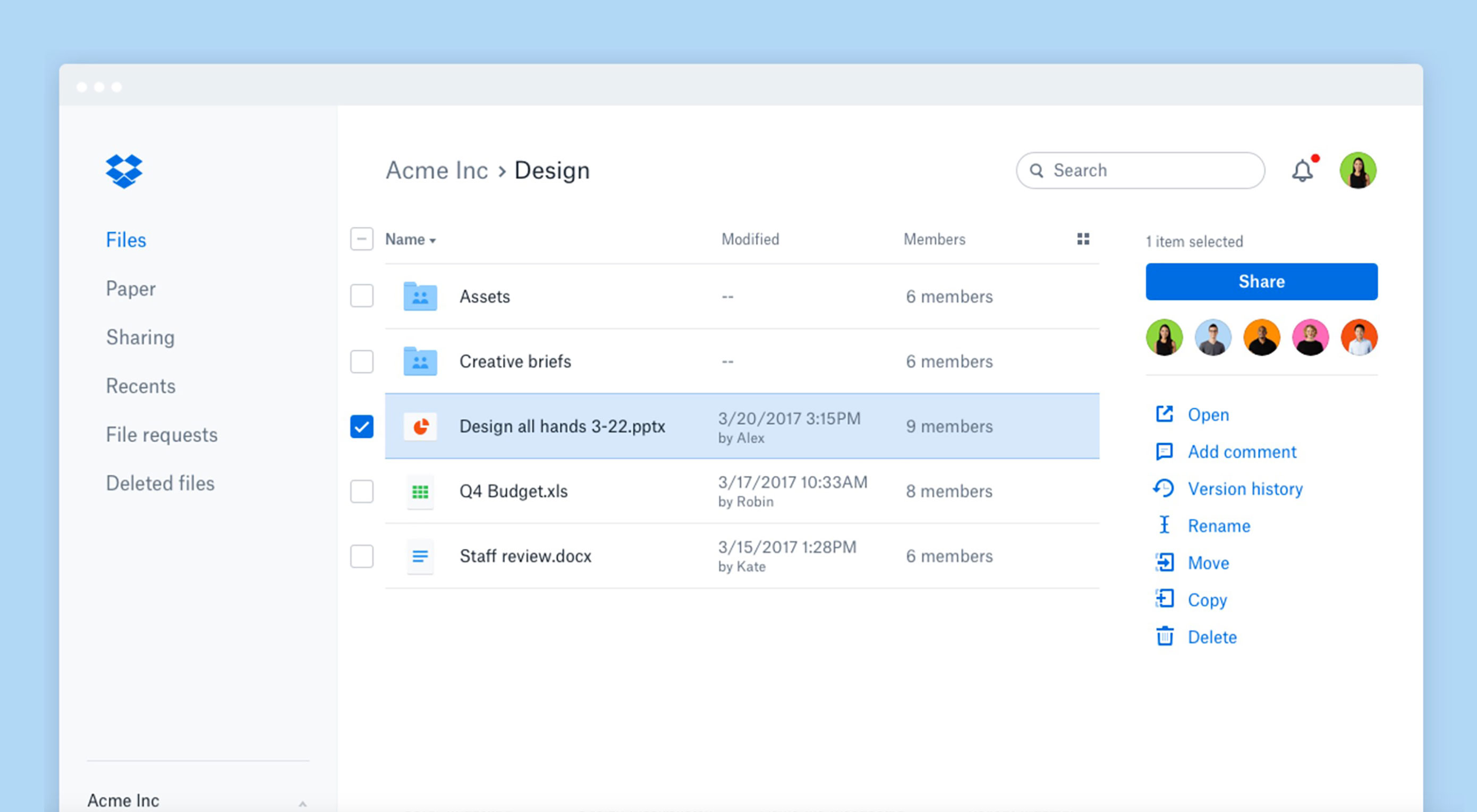
To achieve these UX goals, the company decided to simplify its navigation. This allows users to avoid the long conversations through email and instead share Paper documents and files, leave feedback, and quickly see any status updates—all from the Dropbox interface.
The toolbar has also gotten a facelift. Now, only the pertinent, next steps for a user’s workflows are displayed, based on his selections.
As a result, users should be able to get more work done and work faster, as the navigation now produces less friction.
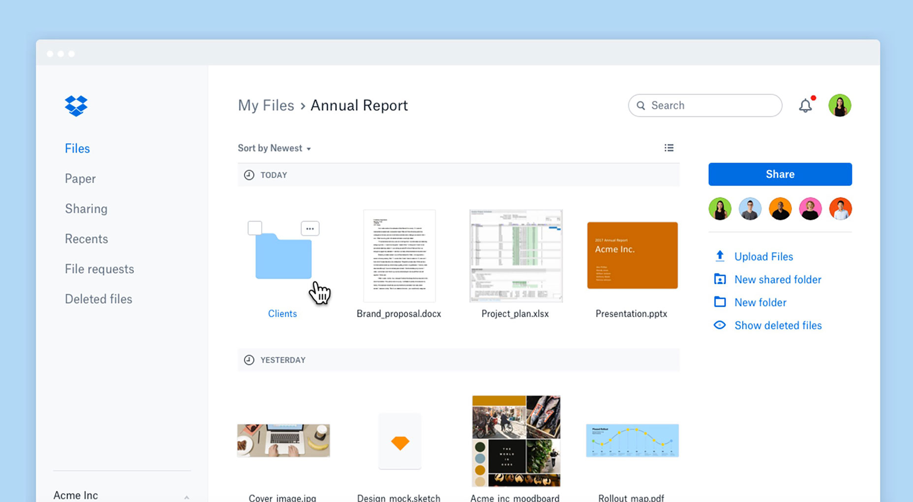
The way information is presented to users is also improved. There’s more information on tap at a glance; users are now allowed to use a thumbnail view to visually browse their files, as well as check who is collaborating with them on shared files and folders.
If you’ve ever searched on Dropbox before, you’ll remember that it wasn’t always the most intuitive feature. Thanks to this redesign, Dropbox search surfaces results across both Dropbox Paper documents and users’ files.
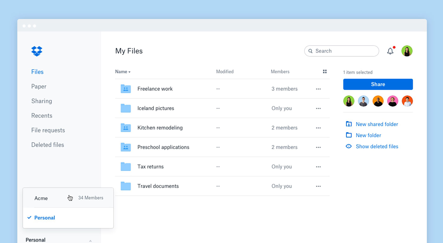
Sometimes, it gets hard to differentiate between work and personal tasks when you’re using cloud services like Dropbox. Part of that has to do with the interface not making distinct enough separations.
Dropbox’s overhaul offers clearer account separation, letting users distinguish between their work and personal accounts with greater ease. One of the biggest differences is that users will only see their specific search and notifications for the account that they’ve signed into.
Overall, these design changes should turn Dropbox into a better organized cloud-sharing service that streamlines tasks and therefore improves the UX.
The company’s not done, though. In the near future, you can expect to see a new administration console that will improve how Dropbox Business’ administrators manage their teams.
For more detailed info on how users can get the most from the redesign, see this overview.
| LAST DAY: Complete Website Builder Kit for Mobirise, 400+ Blocks, 7000+ Icons – only $37! |
from Webdesigner Depot https://www.webdesignerdepot.com/2017/04/dropbox-redesigns-its-user-interface-for-better-ux/


No comments:
Post a Comment