Some of the world’s best designers – and even the best designers where you work – all have something in common: Many of them know how to work at lightning speed. And the work is still good.
While part of this speed work comes with experience, some of it is comes back to solid work habits and great time management. Working quickly and efficiently can be great for helping you make good with the boss, and for freelancers, taking care of tasks quickly can result in the ability to take more jobs (and increase your earning potential).
So how do you get faster without sacrificing quality? Here are seven tips that you can start using today.
1. Create Shortcuts and Styles
No matter what software or tools you prefer, a set of basic libraries, styles and presets will make your life easy. That’s not to say you use the exact specification for every project, but it establishes a starting point so that you can switch fonts, colors or layouts with just a click.

One of the first things you can do is establish a set of universal quick, or shortcut, keys for all programs you commonly use. (I love the “Duplicate” function, but every piece of software uses a different keystroke combination; I always create my own cmd+d, so that the command is universal and not clunky.)
Take this a step further and create basic styles for common text bits – body text, headlines, subheads, captions, quotes – with quick keys. Then when you need to change a font, size or color, styling is universal. (This can make work in Adobe products a breeze and can dramatically speed up the prototyping process before the first line of code is even written.)
2. Organize Consistently
There’s no right or wrong way to organize your design files. (We aren’t getting into that here.) What matters is that you have a consistent system for how you do it.
If you organize files in the same manner every time, using folders, layers or labelling, then you will always know where to find things as you move through iterations of the design. Other members of your team will appreciate this consistency as well, because it will make it easier for them to use your projects as well, while understanding the filing system.
This applies both to how you organize objects and information within files and how you create and use folders outside of the actual project file.
3. Have a Go-To List of Typefaces
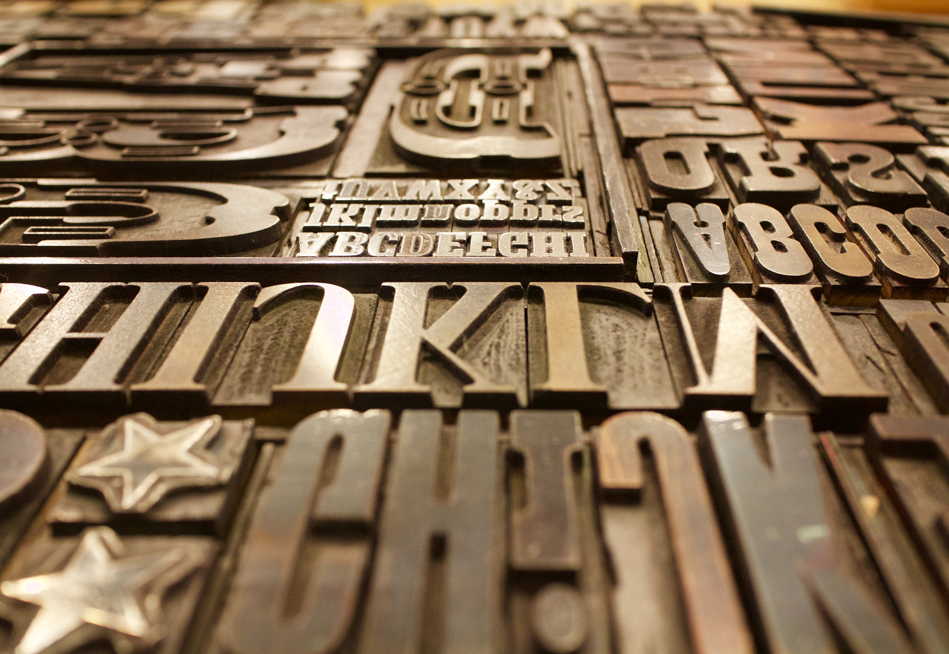
For the projects that don’t come with a set of typography specifications, it can help to have a short list of go-to typefaces to jumpstart projects. Your arsenal should include a couple of serifs, and few sans serifs and one or two novelty or script options for special use.

You won’t always end up using typefaces from this “de facto palette,” but it will get you moving quickly on the overall design outline. It will help provide a starting point for font pairing combinations that you can actually show a client almost immediately (and get a feel for how they react to those type styles).
Bonus tip: This concept works great for color palettes, too.
4. How to Use the Right Tools
Using the right tools for the job can make all the difference in the world (and prevent a lot of rework later). Think of how many times you’ve come across a logo in a raster format when the right tool is vector-based software, such as Adobe Illustrator.
This applies to every aspect of design work, both for online projects and printed materials. As a general rule, anything that’s part of a branding scheme or might be needed for multiple uses (logos, characters, iconography) should be designed in a vector format. You can also scale it down or save other files types, but you can’t go from a gif to a scalable image. One time use objects and elements can be designed using small, raster formats or with CSS tools.
Remember, no matter what file format you need for the final version, save everything in a native file for easy access later. Native files are a lot easier to edit and adjust.
5. Use Premade Parts
Repeat after me – you do not have to create everything from scratch to be a good designer. Particularly when it comes to website projects, use available kits and tools as appropriate to speed up workflows. Most buttons don’t look that dramatically different; it’s ok to start with a kit that includes buttons, icons or other user interface elements. And it will save you a lot of time.
If you plan to use some premade parts of kits, invest in a high-quality option that’s easy for you to edit and adjust. A set of buttons won’t do you any good if the colors or fonts can’t be altered. (While you are looking for user interface kits to help you get moving quickly, grab a couple of nice mockups as well. Clients love seeing their projects displayed in this manner.)

6. Cut Out the Clutter
A clean workspace makes for a happy designer. Cutting the clutter comes in two phases when it comes to your digital space:
- Keep files and folder clean and free of old versions or materials that aren’t going to be used. Project files and folders should only contain usable materials. If you want to store older versions, set aside a specific location for those elements.
- Clean your computer of distractions so that you can work without checking email or Facebook or getting lost in shopping online. (Admit it; this has happened to everyone.) When a project is pressing or even if you are just “feeling it,” turn everything else on your computer off (especially those pesky notifications) so you can focus on the work at hand. You’ll finish sooner and then have time for all that extracurricular activity.
7. Start in Black and White
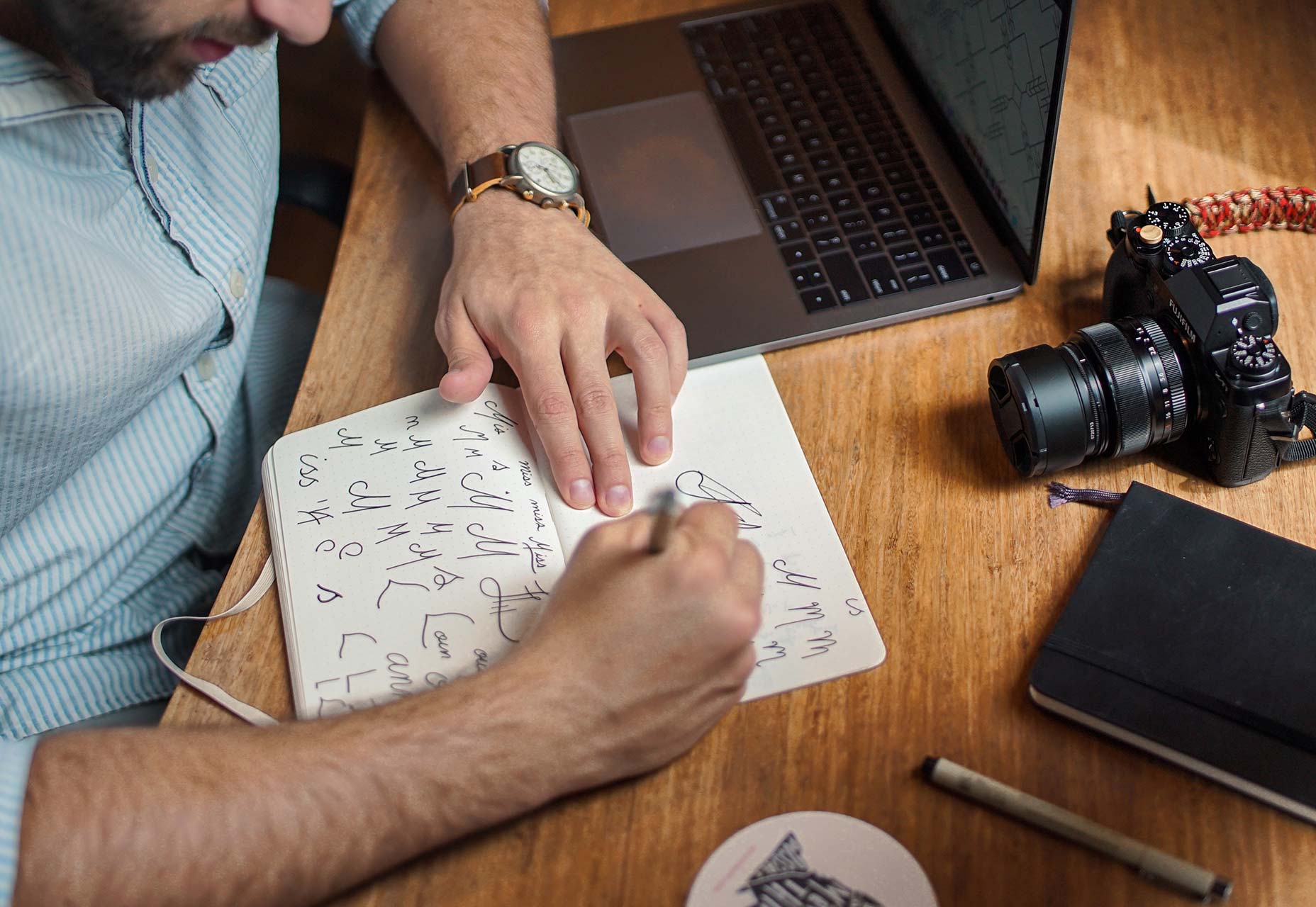
Every good website starts with a solid wireframe. That mantra can apply to the design of any element. Whether you start with a sketch on paper or screen, a black and white outline can be the first step to creating something with plenty of practical application.

Used as a tenet of logo design, a black and white concept is something most projects will need to include at some point anyway. (You might need to use the design in single color printing or all white over a hero header image.)
You’ll end up doing a lot of backtracking if your design won’t work in these ways. An efficient process starts with black and white and then color and details are added once the black and white concept is finalized.
Conclusion
Ready to get faster? Start at the top of this list and work through the tips until you are starting to shave time off design projects. The key to working at lightning speed (and staying good) is focus. There are so many distractions that take us away from good processes and work practices, go back to the basics to get reacquainted with good workflows.
And good luck. Becoming a quicker designer takes time and patience. Give yourself room to grow.
Creative Commons photos in this article are from Unsplash.
| Bundle: 500+ Gorgeous, Hi-Res Watercolor Backgrounds – only $14! |
from Webdesigner Depot https://www.webdesignerdepot.com/2017/05/7-ways-to-design-at-lightning-speed-and-still-be-good/
No comments:
Post a Comment