 Microcopy is the little bits of text that guide users through an experience. In apps and websites, microcopy includes things like button labels, hint text, and error messages. Often an afterthought that gets quickly added at the end of the development process, microcopy actually provides a really simple way to assist users as they interact with your product.
Microcopy is small yet powerful copy. Don’t judge it on its size, judge it on its effectiveness. In this article, we’ll see how microcopy can be used in all sorts of functional and delightful ways.
Microcopy is design
Design is about words. Words still form the backbone of communication on the web and in the apps, and microcopy should be a vital element of the design process from the very start.
When done right, effective microcopy increases conversions, improves the rate of task completion and delights users.
Alleviate the concerns of your users
Microcopy is extremely contextual. That’s why it’s so valuable. It answers a very specific question people have and speaks to their concerns right on the spot. You should anticipate user’s questions. User testing is a great way to find out what kind of questions users are asking.
For example, when users are about to sign up to Tumblr, they’re asked to choose a name for their blog. This seems like a big deal, because you’re going to define not just the username, but the URL at which you’ll be found by others. In order to reduce the stress of making a big decision that could affect the future of your blog, Tumblr reminds users that “You can change it any time”. Problem solved. No more worries about choosing the wrong sub-domain name.

Microcopy can be fundamental in reassuring your users at the point of subscribing or sharing details. When people add their emails or connect their Twitter accounts, say “we hate spam as much as you do.” Whilst ‘not to spam/auto-tweet’ might be taken for granted by good marketers when asking for email address/access to the social network account connections, the user is less than sure.

Microcopy from Timely covers all the potential user concerns in one tight little sentence.
We all know how frustrating it can be when you lose content while you’re in the middle of something. Autosave will help make sure that never happens. And microcopy should be used to reassure them that their data is safe.

Google Drive keeps you informed that your hard work is okay.
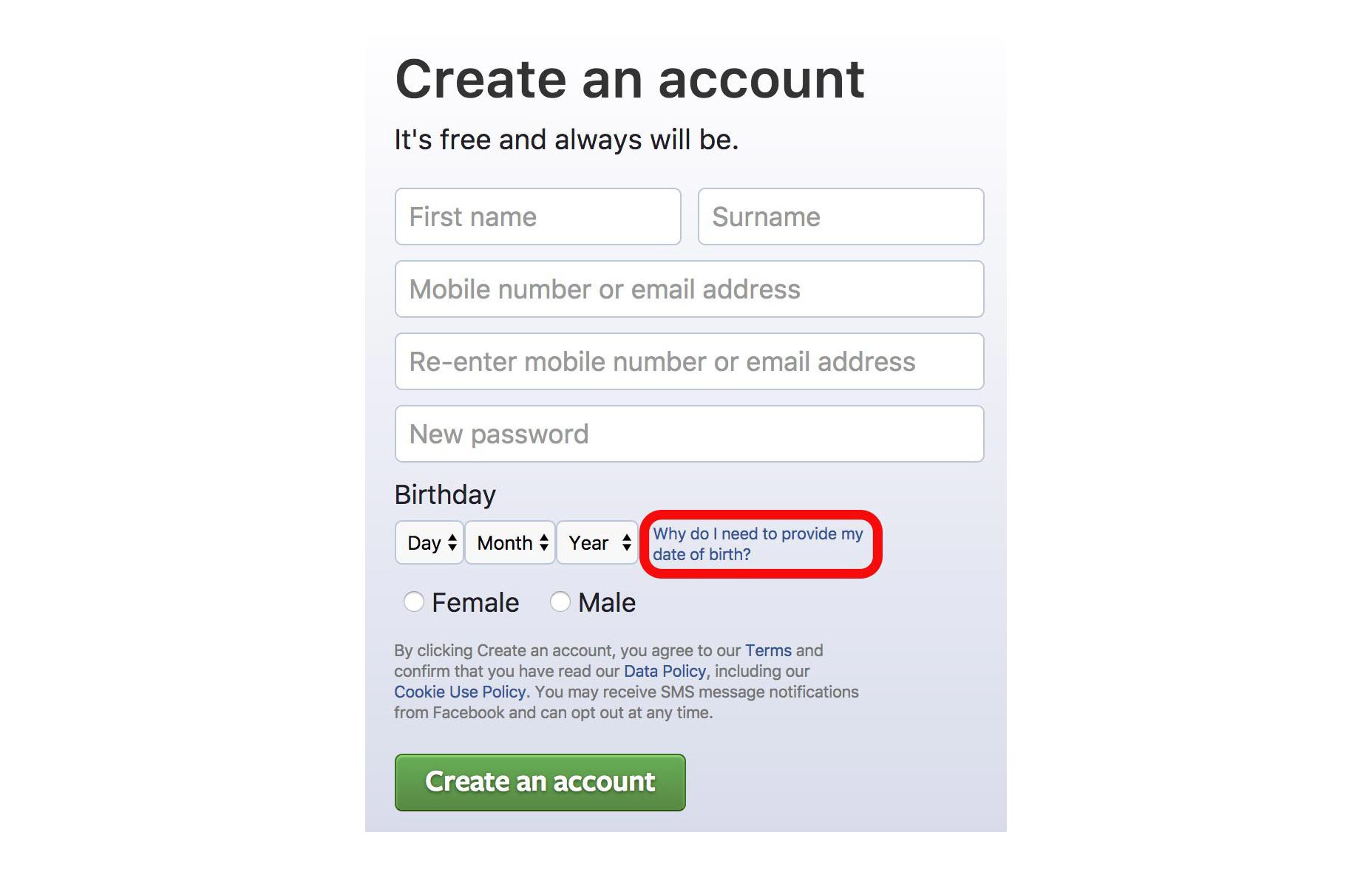
Users don’t like to give out personal information, especially if they feel it’s unnecessary. Explain to the user why you need their information, or outlining how you use (and protect) their data. For example, Facebook addresses all users concerns, head-on, in its signup box. Their form explains the service is free (forever), and if you’re nervous about giving your date of birth it deals with that too.
Use friendly and helpful copy in a moment of failure
How errors are communicated can have a huge impact on the way someone experiences your website or app. If you aren’t explicit about the error, your users are going to have a hard time figuring out how to fix it. Often overlooked, an ill-constructed error message can fill users with frustration. A well-crafted error message, on the other hand, can turn a moment of frustration into a moment of delight.
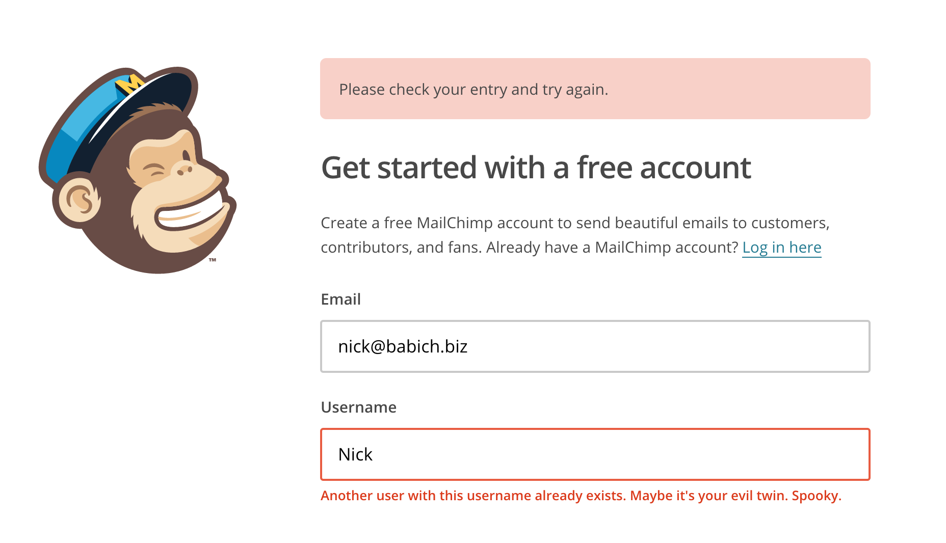
A short sprinkling of humour is often a great way to diffuse the frustration of an error.
Brings delight
Injecting delightful details into your designs is a great way to break the barriers that exist between man and machine.
Users like to interact with other people. If your product sounds human, it’s easier for people to trust you.
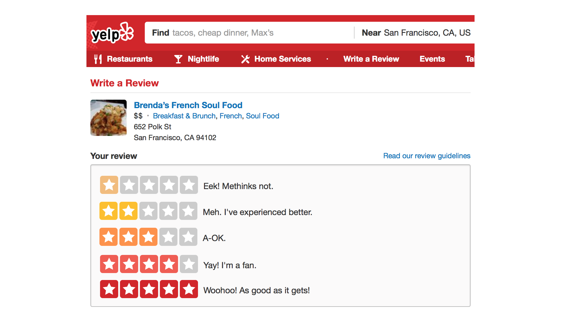
Yelp shows the humans behind the brand and encourages people to open up and leave an honest review.
Microcopy can provide a nice opportunity to convey personality to your designs. Good microcopy can turn a routine task into something memorable.
Each time you visit Flickr, the site welcomes you in a different language, which adds a quirky, playful touch.
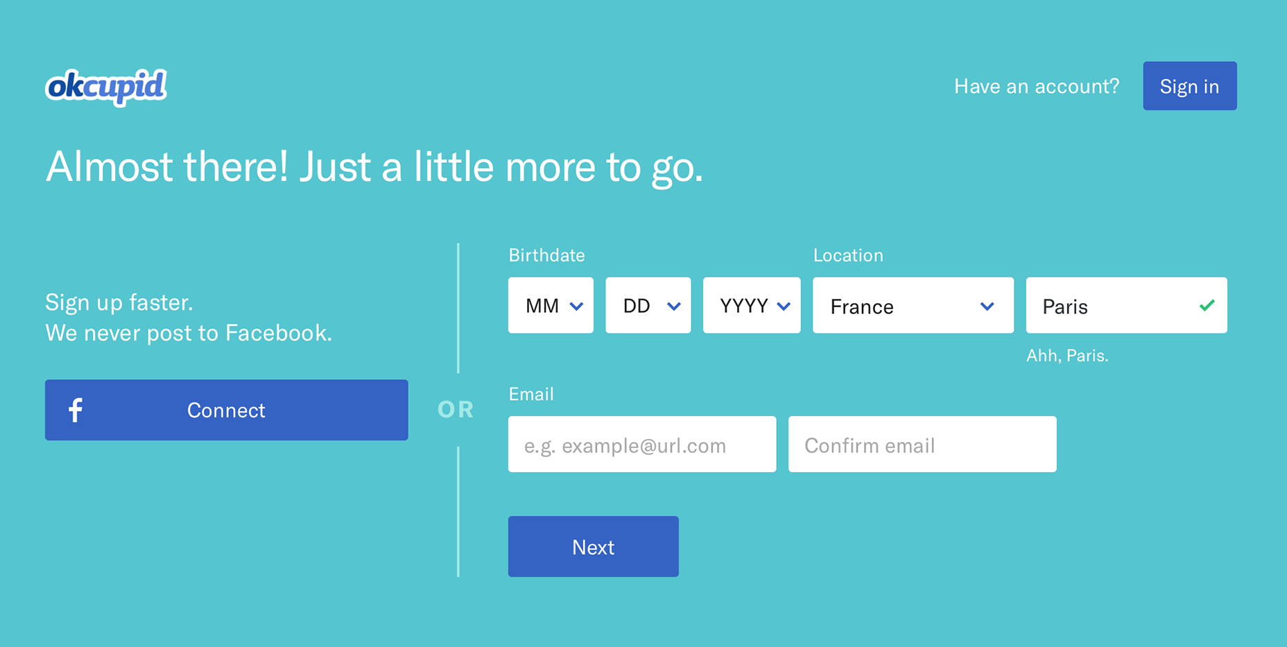
OkCupid compliments your city when creating a new account: “Ahh, Paris.”
The secret to writing amazing microcopy
Writing microcopy takes more than good writing skills. Just because microcopy is small, doesn’t mean it’s easy to implement. There are multiple factors that play a role in designing great microcopy. Here are a few tips to make a little bit of text pay off in a big way.
Avoid technical jargon
Every company has its own language, which often sneaks onto the website and in the app. Don’t let it happen. What works for you not necessary will work for your user. You need to convey technical information in simple terms.
Use your user’s dictionary
Use natural language and talk to your user like a person. Don’t write the vocabulary from the top of your head. Instead, get to know the user: research and reuse the existing language of your audience.
Keep it short and helpful
Users don’t want to read long instructions on how to complete a single task. When implementing microcopy use simple unambiguous language and short sentences. It’s supposed to be micro-, not macrocopy.
Be careful with jokes
It’s not always appropriate to use humour in your microcopy. First, not everyone shares your sense of humor. What might sound good on the paper, but in fact can be regarded as uncaring or rude.

Is it really funny or just rude?
Second, it really depends on the context. For instance, a user losing a significant amount of work—then saying “Oops! We can’t seem to save your data” is entirely inappropriate.
Pair microcopy with a picture
Whether it’s a photo, illustration, or a simple picture can sometimes be the perfect pairing for your microcopy. They work together to create a feeling of delight that’s more magical than words or pictures alone. As Dr. Seuss once said:
Words and pictures are yin and yang. Married, they produce a progeny more interesting than either parent.
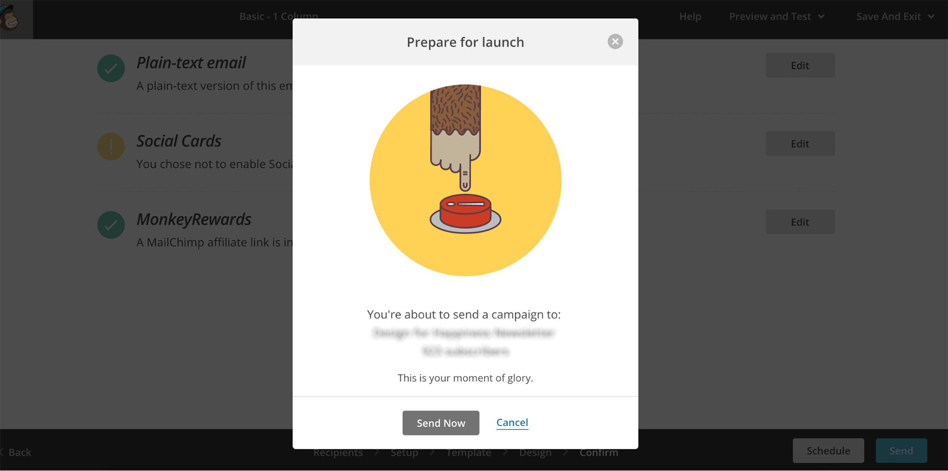
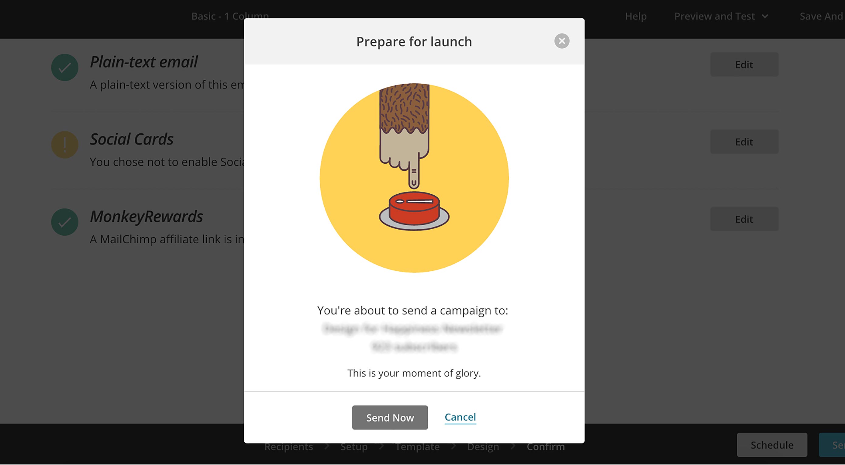
When you’re about to send out a campaign using Mailchimp, the accompanying animation shows how stressful it is.
| 30+ Professional Font Families – only $18! |
from Webdesigner Depot https://www.webdesignerdepot.com/2017/09/how-to-master-microcopy/
No comments:
Post a Comment