 Have you ever encountered a website with confusing navigation? Been sent down the wrong path by misleading labels? Or needed your best detective skills to find a particular piece of content? It’s frustrating, isn’t it? What can companies do to ensure that users can find what they are looking for on a website?
Usability testing allows you to measure the effectiveness of the site structure and labelling against real user tasks. Get real users’ insights to help you evaluate which parts of your content hierarchy work well, and which parts don’t. So you can make informed design decisions about how to organize and label your content.
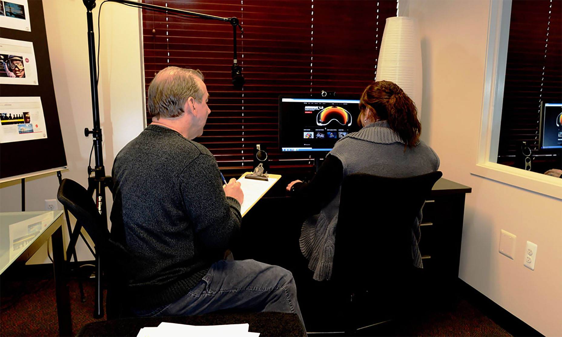
To help make the world a little easier to navigate and enjoy, you can use a technique called “Lab Usability Testing”. With this process, it is possible to get tips to improve UX and enhance the usability of your product. Individual testers whose profiles match those of the target users perform typical tasks with your product or a prototype. A researcher facilitates the quiz sessions and controls different conditions to identify usability problems and their causes. While it is one of the most reliable methods to collect data and confirm or challenge assumptions, lab testing services are quite expensive.
Fortunately, there are some tools you can use for your business that are free, or relatively cheap.
1. Usability Hub
Usability Hub features five online tools that enable usability testing of a website or a web application using screenshots of pages:
Five Second Test
This tool can be used for optimizing the clarity of design by measuring a customer’s first impression.
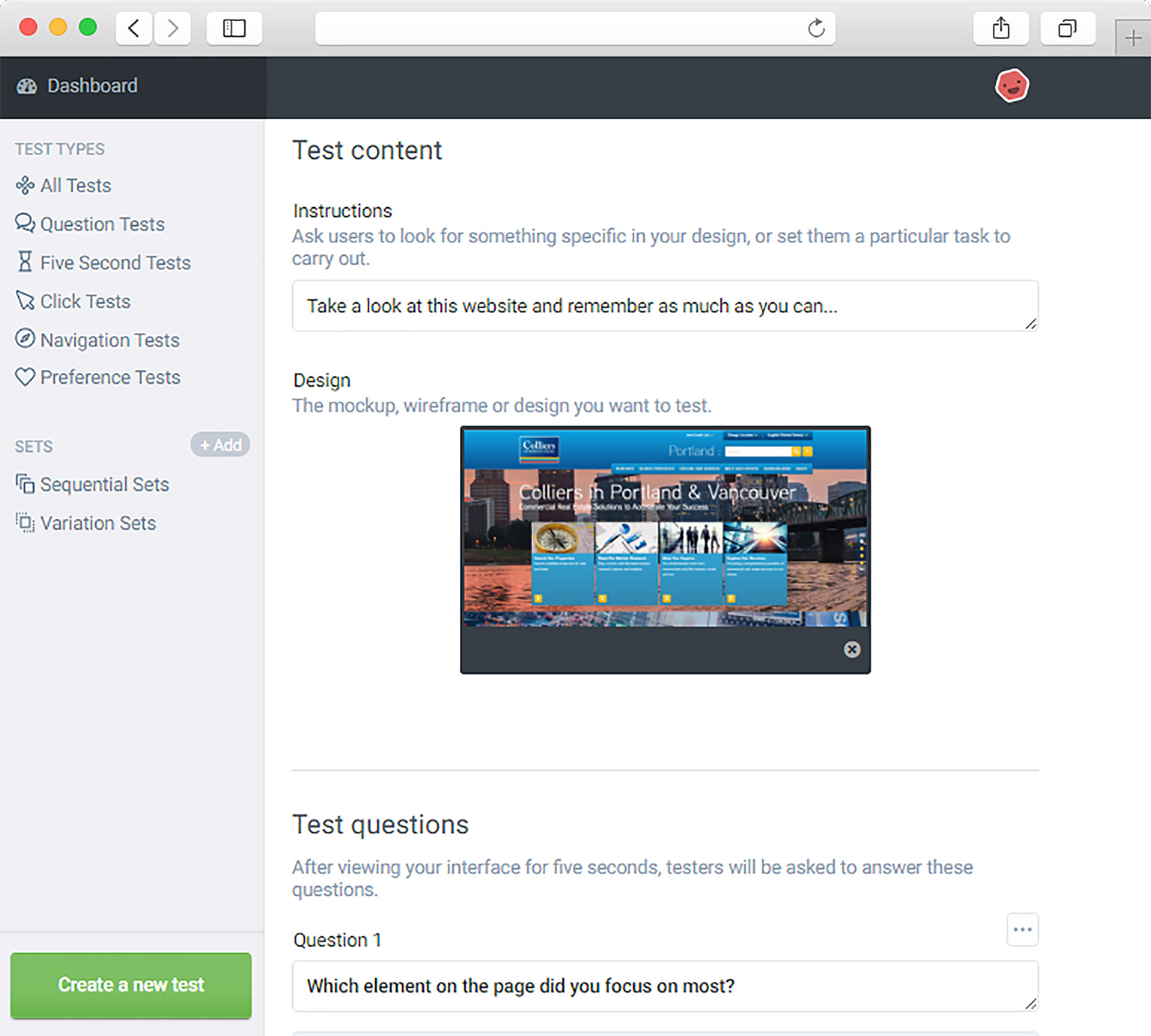
Step 1. Upload a website screenshot and set a number of questions.
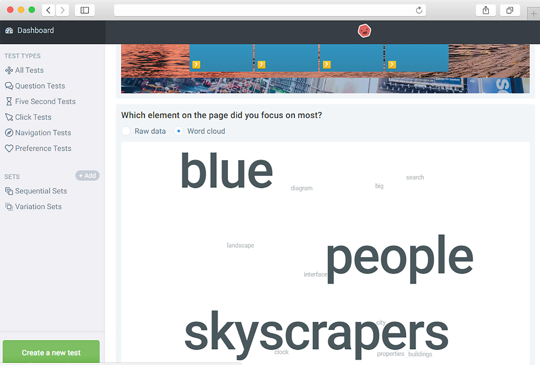
You can create your questions or choose one of the predefined questions such as “What product do you think this company sells?” or “Which element on the page did you focus on most?”. You can also ask people to rate the quality of this page between 1 (worst) and 5 (best).
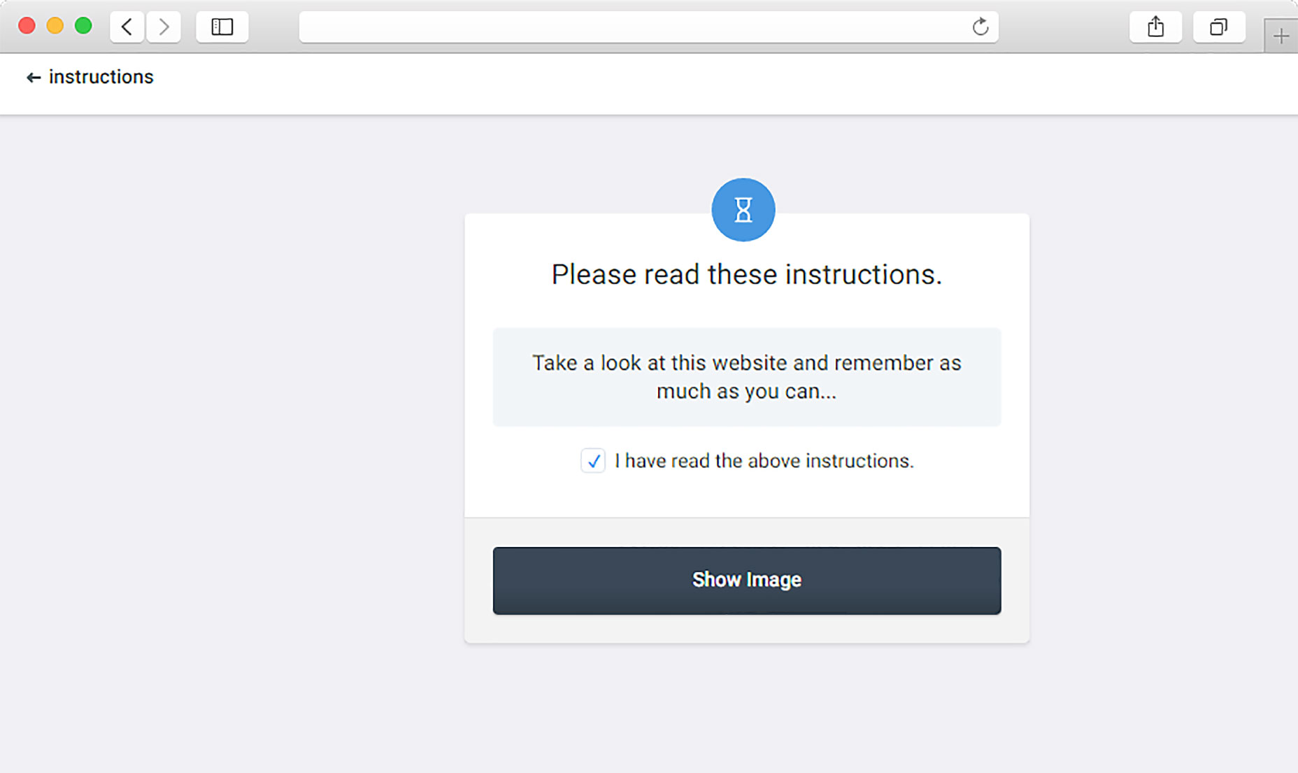
Step 2. Show a design to people for five seconds and ask what they remembered.
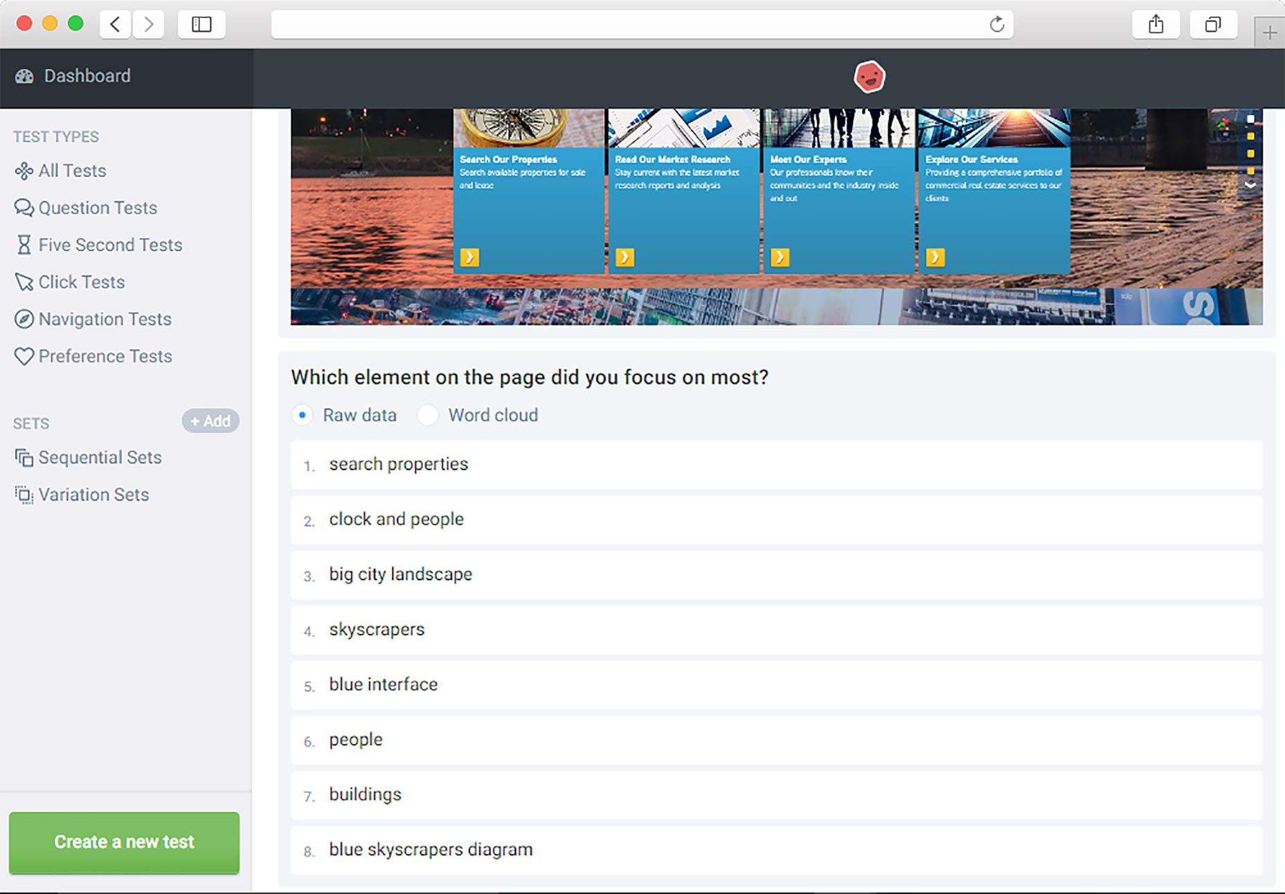
Step 3. Check a report with answers. It can be organized as a list of keywords or as a word cloud.
First Click Analysis
This tool helps you estimate how efficient your designs are at letting users perform a proposed task.
Question Test
After uploading a design, you can assemble and investigate user feedback. In addition to the response data, the system creates a word cloud to help you identify regularly occurring keywords.
Navigation Test
This tool helps you enhance your conversion rate by analyzing how users navigate through your websites and applications.
Preference Test
This tool can be used to decide between design options by asking people which one they prefer.
Pricing: Responses from people you invite are free. Responses from the Usabilityhub tester panel start at $2.50 per user.
2. Optimal Workshop
With Optimal Workshop you can optimize your site using five different tools:
Tree Testing
This tool takes visual design out of the equation, allowing you to measure the effectiveness of your site structure and labelling against real user tasks.
First-click Testing
The tool records the first click. Heat maps will then show you exactly where users get troubled, or confused, by your content.
Step 1. Upload your screenshots or designs and add a list of typical user tasks
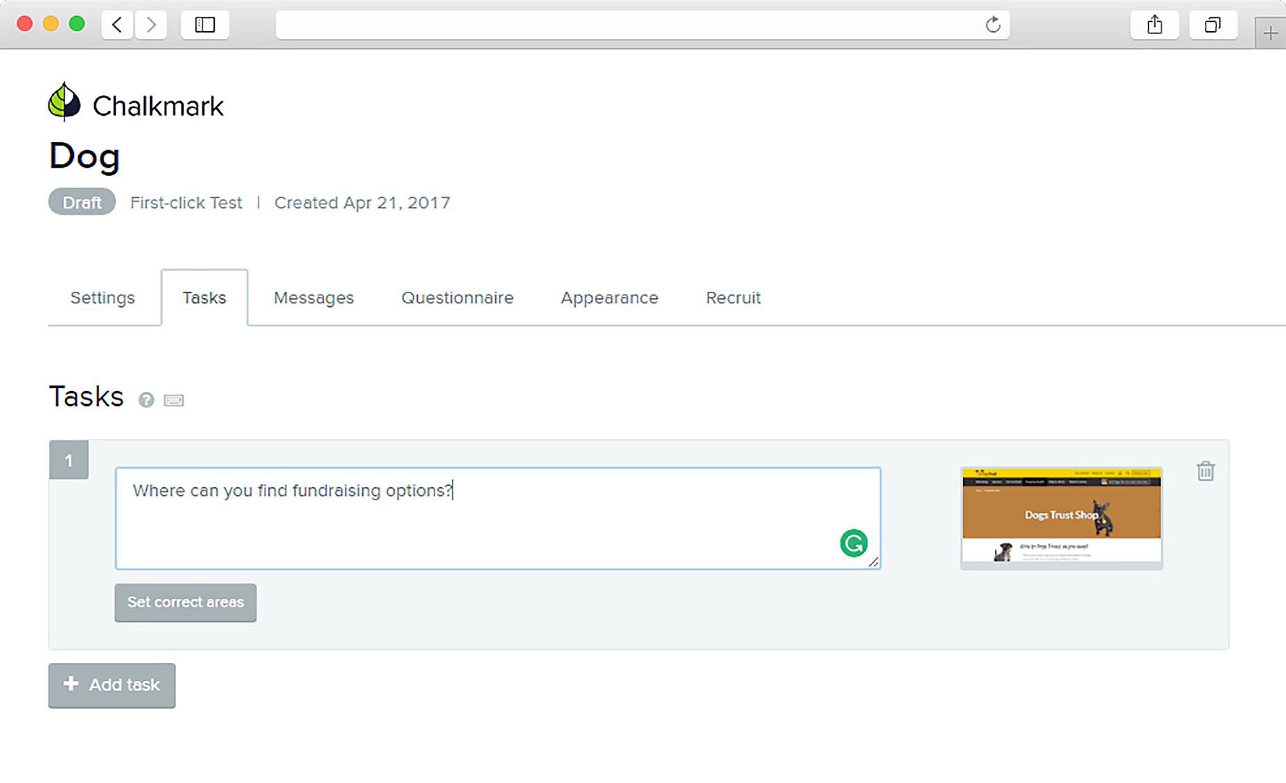
Step 2. Ask user to proceed with the task
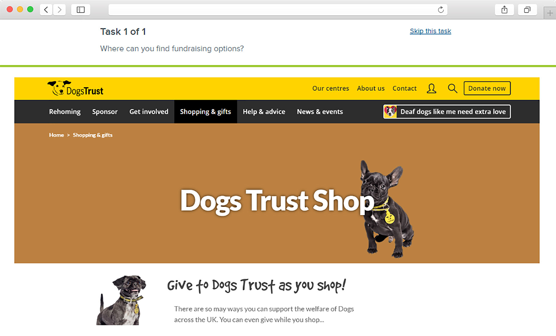
Step 3. Check these insights and make any required changes.
Card Sorting
Start by testing with the simple method of card sorting to find out how other users would classify and label content on your site. Following these patterns helps you organize content in a way that makes sense to the people using your products or services.
Pricing policy: free and paid versions; free version includes 10 responses per study and 3 tasks per study.
3. Feng-GUI
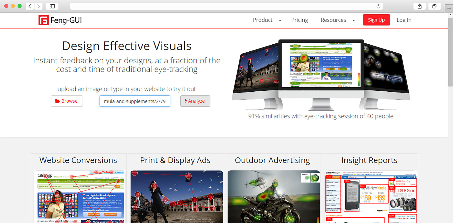
Feng-GUI simulates the user’s view for the first 5 seconds. This application creates an eye movement map on the page based on an algorithm that predicts what the real person is most likely to see.
Right on the main page of the site you can upload a screenshot and see the probable areas of the visitor’s attention.
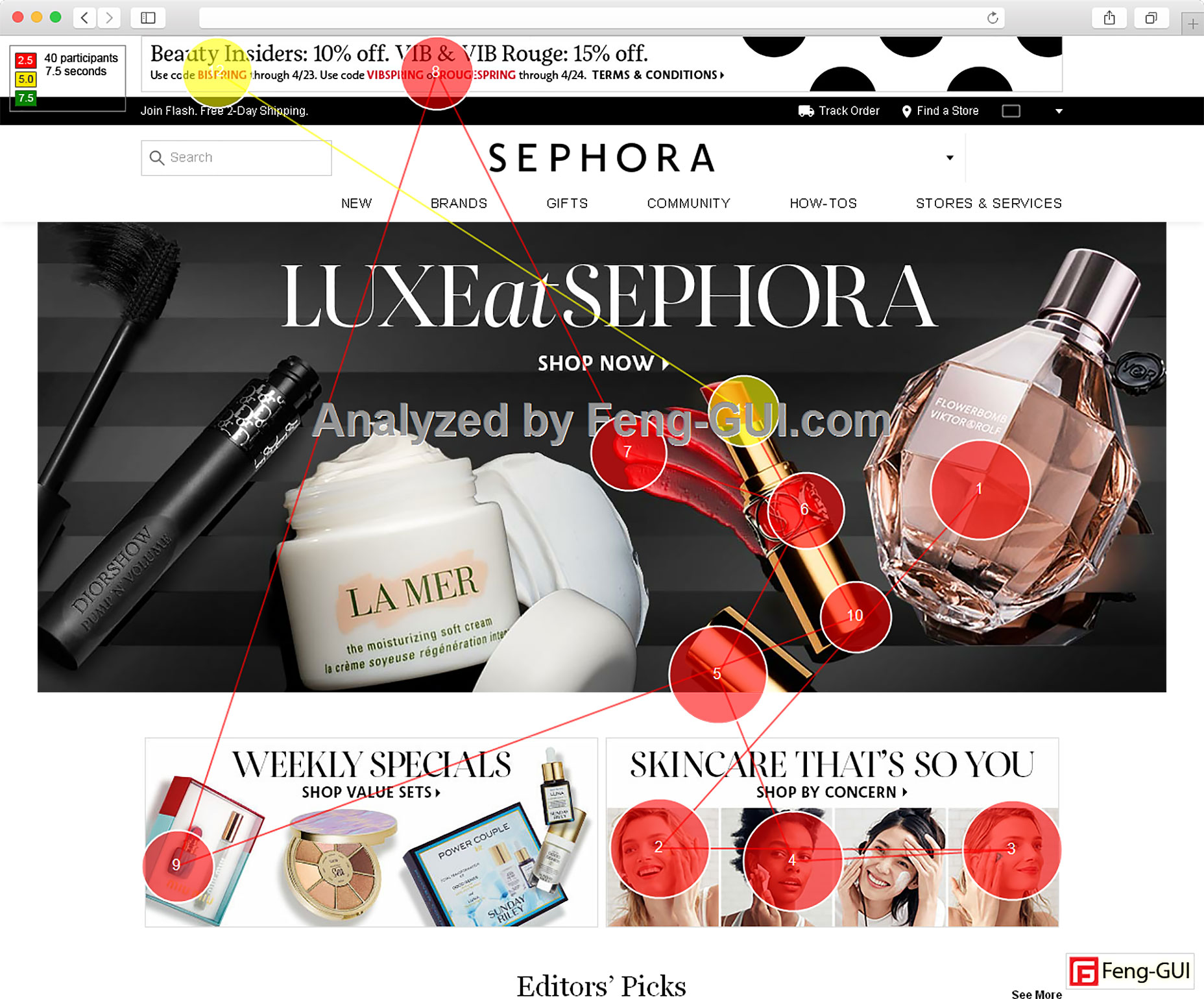
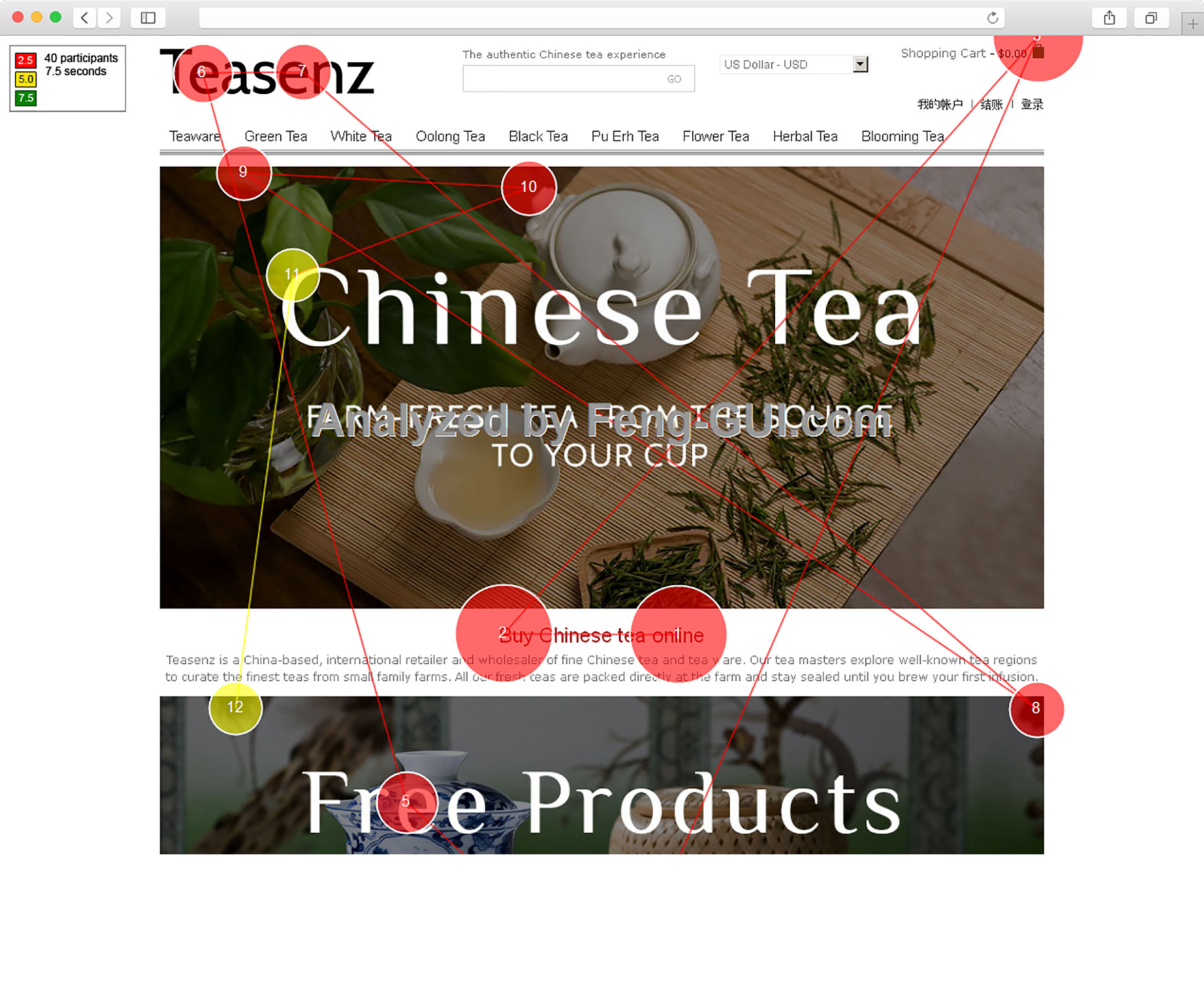
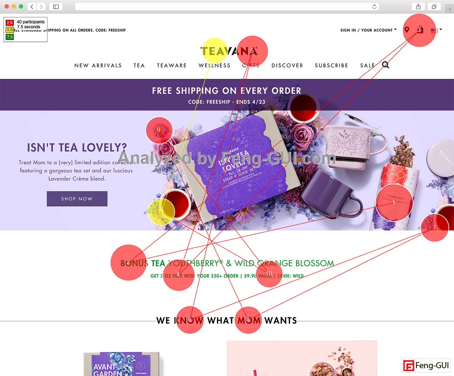
Pricing policy: free and paid versions; you can upload 1 screenshot every 8 hours for free.
4. TestFairy
TestFairy is designed for iOS and Android Mobile beta testing. It provides you with video of the tests so that you can see what exactly went wrong on the customer side.
The process is simple: upload your app, invite your friends or colleagues to examine it, then check results when the tests are performed.
There are several ways to send your app to the people you would like to test it:
- Email invitations: Enter your prospective testers’ email addresses, and send a message with a link to download the app.
- Native testers app: There is a TestFairy app for downloading and installing the apps to be tested.
- Web app: Testers who want to use an application but do not want to install a native app on their device can use this.
- Public beta pages: You can publish a public beta landing page for every TestFairy application, with an open invitation.
With more than 10,000 devices in the mobile world, your app can look different on every device. One of the most challenging jobs for mobile developers is to make confident that any app looks the same on all devices. The tool provides you with reports allowing you to see how every part of your app looks on every device.
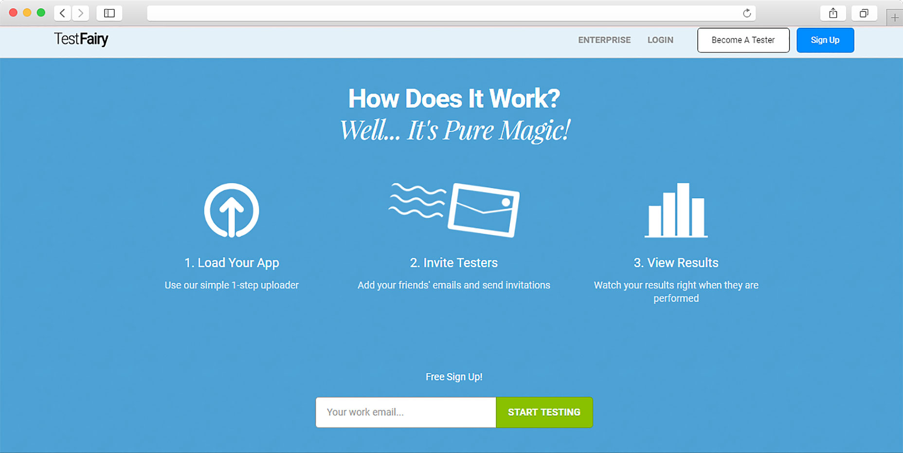
Pricing policy: free and paid (enterprise) versions.
Conclusion
Online tools for usability testing help find out how much the site meets the expectations of users. Following recommendations leads to increased involvement and, ultimately, conversion of visitors to buyers. Many companies spend millions on testing the effectiveness of their web resources. You can do this with the help of online services. Even small changes can lead to significant positive performance.
| 700+ Hand-Drawn Graphic Elements – only $24! |
from Webdesigner Depot https://www.webdesignerdepot.com/2017/07/4-usability-testing-tools-for-designers-on-a-budget/
No comments:
Post a Comment