 Everyone involved in building a website wants it to stand out from other websites. Clients want to stand out from the competition and leave a favorable impression on potential customers; designers strive for originality and to compete with other designers; back-end developers want a success story in their portfolios and an original or different-looking site can help with that.
And we want it bad. There’s a cottage industry of people writing articles designed to help us design more original-feeling sites. I’ve even seen articles about “Trends to Make Your Site Stand Out”, and it feels like at least one of those words is sorely misused.
Goodness knows I’ve obsessed over it in the past. I know the feeling that your work just isn’t good enough because man, the last couple of sites you made really felt the same. Where’s the inspiration? Where’s the creativity? Well, originality isn’t the be-all and end-all. If a site that feels the same as many others gets the results you want, that’s not a bad thing.
But you can create sites that stand out. Consistently producing original—or at least original-feeling—work doesn’t happen by inspiration or by luck. It happens with planning, and a lot of effort. Here are five approaches you can use to make your work stand out, with their pros and cons. I’m not going to include a ton of examples, because the idea is to not copy other sites.
1. Layout and Structure
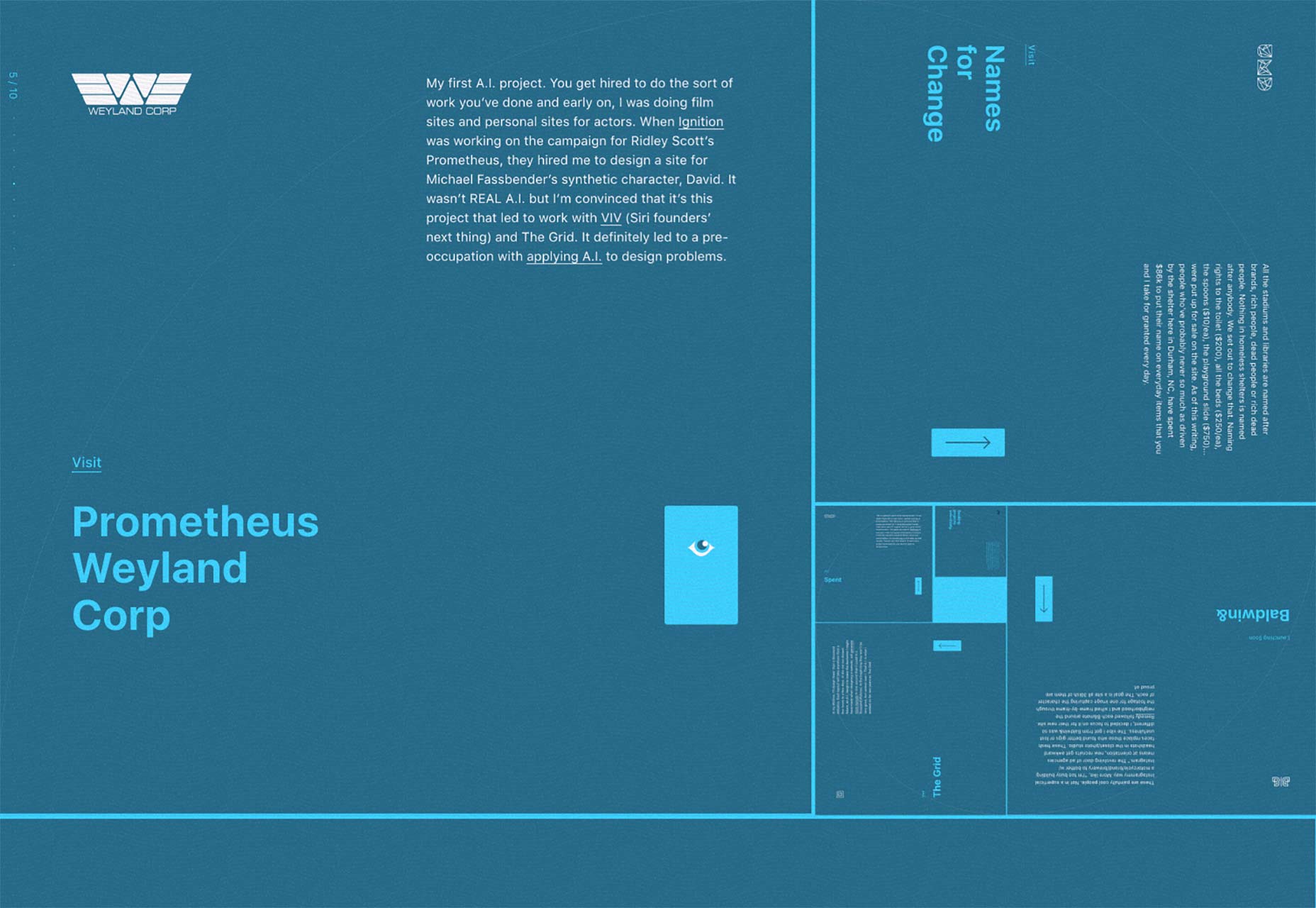
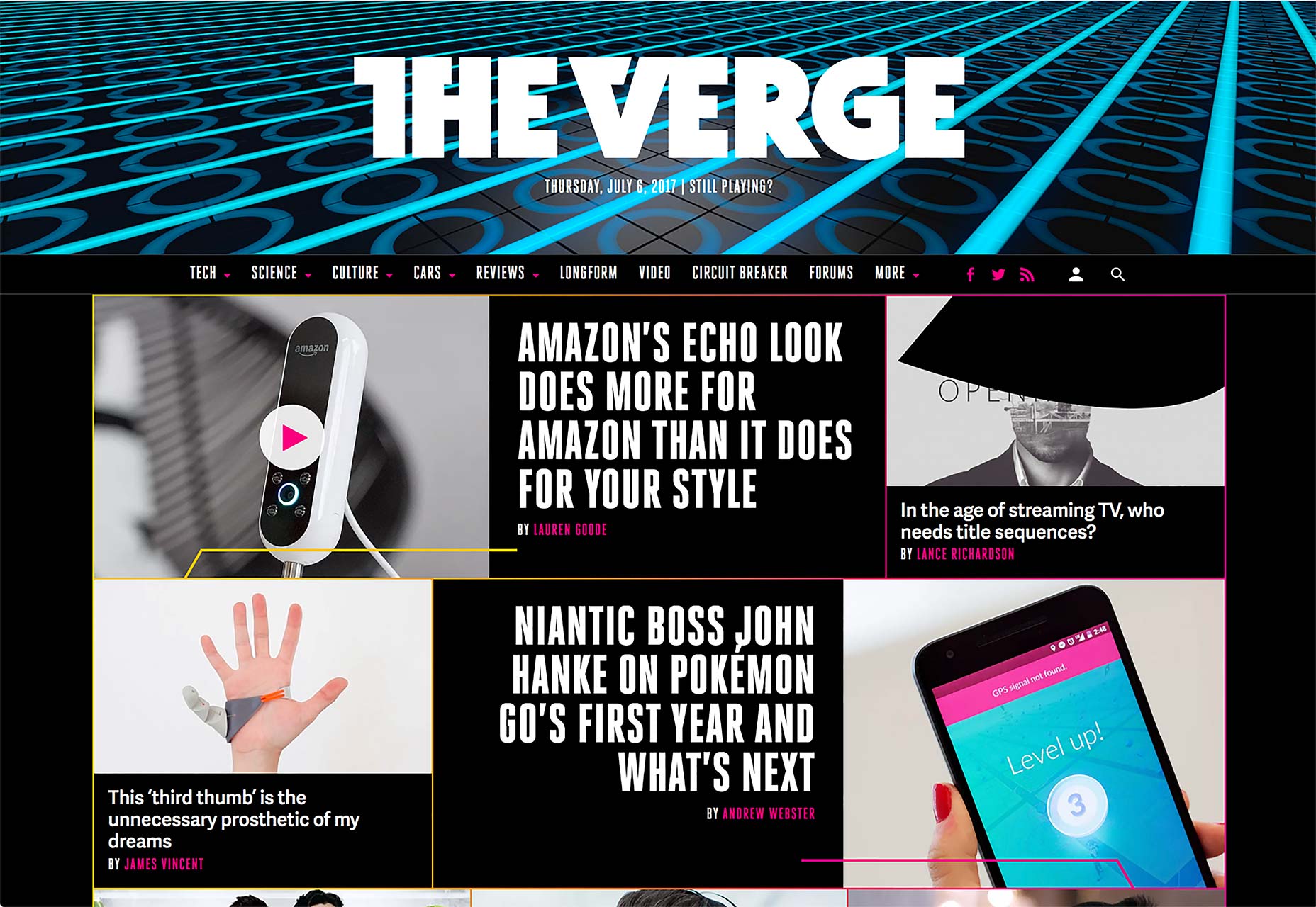
Okay, this is perhaps one of the more obvious ways to differentiate your site from the rest. It’s also the most difficult. On the pro side, using a fancy layout or site structure that no one has ever seen before is instantly memorable. It can also be a lot of fun. After creating your fifty-second three-column site, mixing up the layout provides a challenge for your visual design skills and your front-end dev skills that can’t be beat.
The cons: There are only so many ways that information can be organized before you start to lose accessibility and usability points. The development time is often increased, as you end up working to solve problems few have encountered before. The really crazy layouts often depend heavily on JavaScript. Layout should ideally not depend on JavaScript.
2. Branding
Branding is the other really obvious way to make your site stand out. And it’s easy. Just find out what your client’s branding guidelines are, and stick to them. Embrace them. Make your client sick of seeing their own logo and colors. Then maybe tone it down a little, and you’re good to go.
The cons: This approach only works if your client has highly original branding. If their brand style guide consists of Helvetica and not much else, you are at a severe disadvantage.
3. Graphics and Imagery
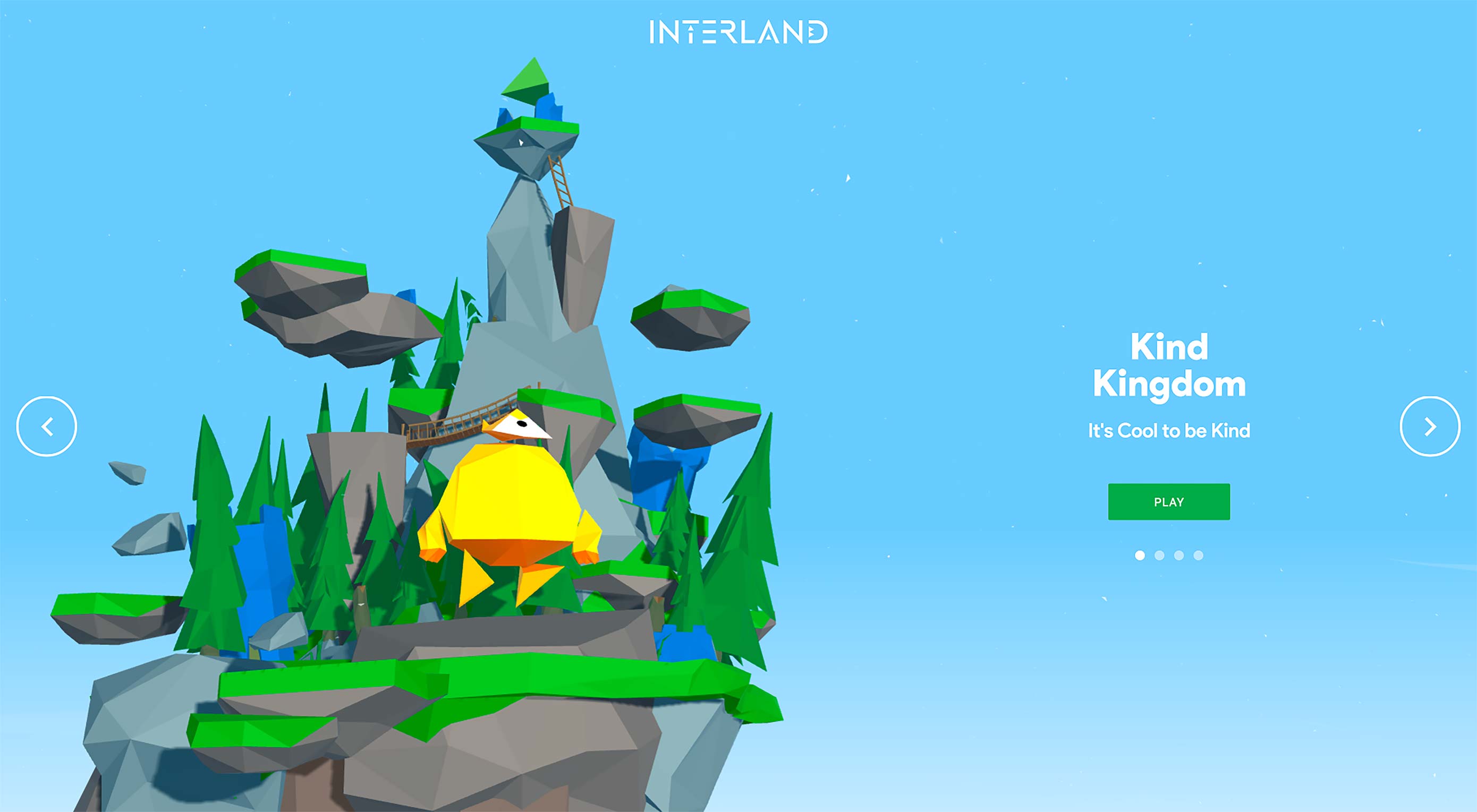
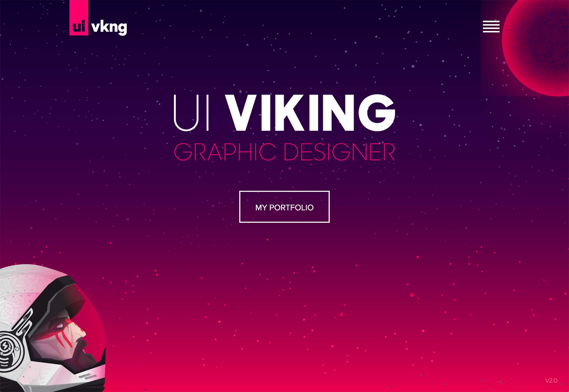
If the branding isn’t enough, you can use graphics and/or photos on your site to establish a distinct visual style. Sites with big images do tend to convert more, after all. People are visual creatures, so visual stimuli can make it easier for users to connect with you on an emotional level. Plus, the stylistic options are just about endless, which makes it easier to create an original-feeling design.
The cons: Graphics and photos that look original are expensive, because they pretty much have to be custom made. Using stock images will likely kill the distinction that you’re going for.
4. Text and Content
This is probably the most important—and sometimes the most difficult—way you can set yourself apart. What is said on any site can and should be a reflection of the client’s personality and/or company culture, while still being clear. You can use copy, microcopy, and even things like video to communicate personality in a way that sets you apart.
The cons: Ok, first you have to get any text at all from your client. Heh. And then you have to get copy that actually feels like a human wrote it. Most marketing copy has a very specific tone that seems to transcend borders and cultures. Getting the reader to see past the obvious desire to sell them things is the trick, and it’s a tough one.
I mentioned microcopy before, but it really makes a difference. Users expect sales copy when reading up on a product or service. But if the rest of your site, especially the interactive bits like forms, treat the user as human rather than as a mere customer, this will make your site stand out in big ways.
5. Animation
Animation is a huge deal right now, and for good reason. When done right, it can take a pretty good experience and make it unforgettable. While I’m glad splash screens went the way of the dodo, I can still remember some of the animated web experiences I saw during the ’90s. Did I say before that humans were visual creatures? Well make those pictures start moving, and you can start a new industry in California.
The cons: I saved animation for last because it’s very effective, but also very hard to get right. I mean, everyone and their dog is animating their sites now. That means that if you want your animation to stand out from everyone else’s animation, you’ll have to step up your game. Bouncing buttons ain’t gonna cut it. Animation that’s badly done can also cause usability problems, performance problems, etc.
Conclusion
Look around on the internet and you’ll notice that it’s very rare for any of these approaches to be used alone. It’s fairly common for people to even try to combine all five. As usual, however, it’s best not to split your focus too much.
Ask yourself where your strengths lie. Are you a good writer and illustrator? Focus on text and imagery. Are you a great brand designer and animator? Make that logo blow people’s minds. And most of all, remember to have fun while you’re making something new.
| LAST DAY: Gigantic Bundle of 1000+ Logos, Elements, Mockups, Textures – only $19! |
from Webdesigner Depot https://www.webdesignerdepot.com/2017/07/5-ways-to-make-your-website-stand-out/

No comments:
Post a Comment