 Good UX design is terrible.
At least it can be. As designers, we’re told that good UX boosts user engagement and satisfaction levels. Want your website or application to be successful? Make the UX your focus.
Just one problem: We shouldn’t make UX our focus.
There’s a time and place for everything. The vast majority of the time, good UX is a must-have; when our users are happy they reward us with more time, money or access.
That’s a no-brainer, right?
What about the times when you absolutely need to ignore good UX? I know, it sounds ridiculous.
The Ridiculous Truth: Good UX Can Be Bad
On at least three occasions you’ll want to abandon UX, shifting your focus away from good UX to bad. What should you focus your attention on?
The right UX.
The right UX isn’t the same thing as a good UX. Here’s the most obvious question: Why on earth would anyone do that? Why would UX professionals, designers and developers abandon something that makes proven financial sense?
Because users expect you to. Because it’s the right move to make.
That’s right.
Good UX Design at the Wrong Time Becomes Bad UX Design
At certain times users expect you to make a bad UX decision on their behalf. Not only that, they’ll complain loudly, demanding that you fix things on their behalf. Secretly though, they’ll be happy and satisfied with your decision.
Because they’ll know they can count on you to make the right decisions. You’ll have their complaints (and their trust).
Here’s why: Good UX Design at the Wrong Time Becomes Bad UX Design. Sometimes users need bad UX.
Okay, let’s put this to the test. When would you ever need bad UX design?
1. Ignore Good UX to Disqualify Users
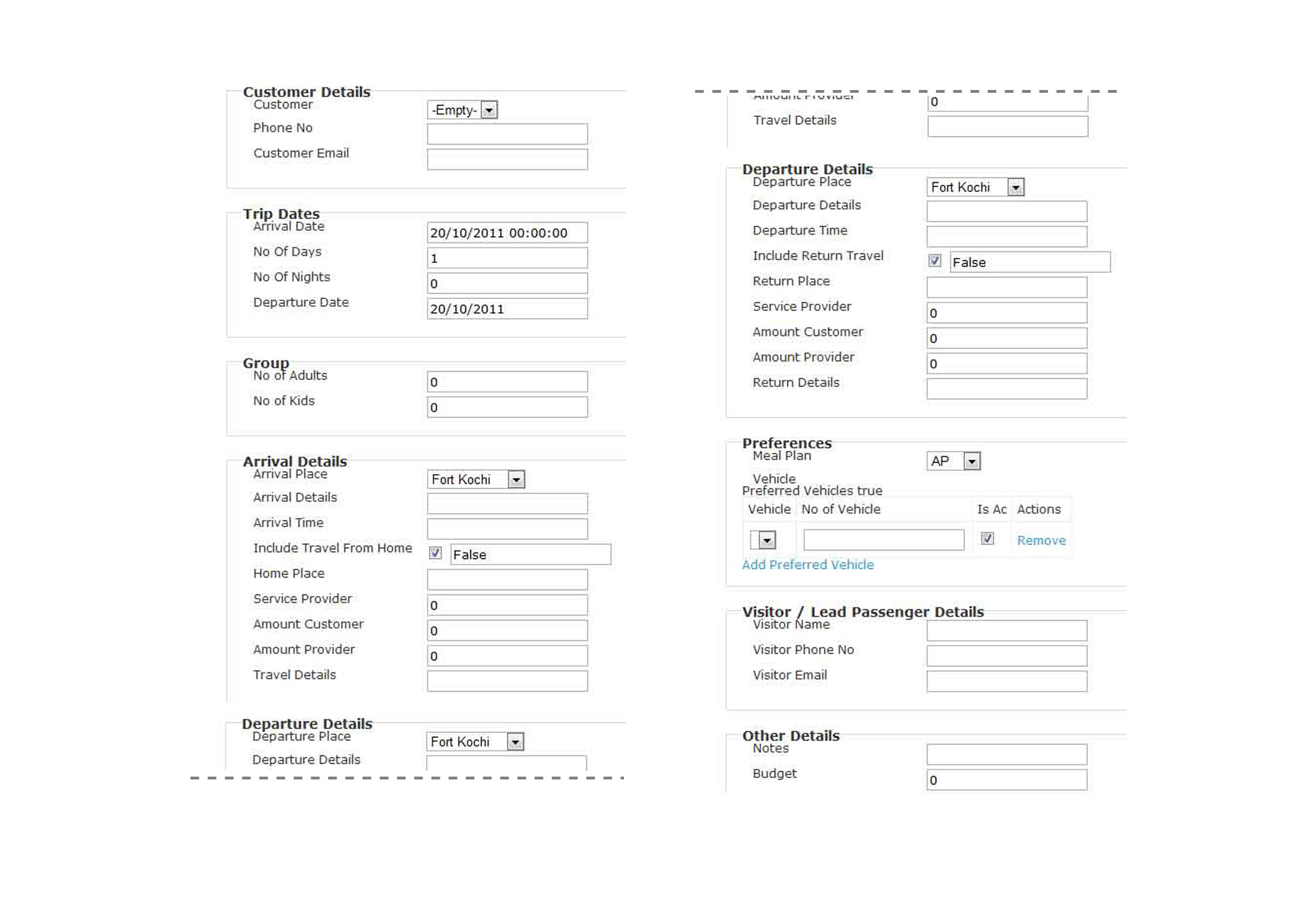
Have you ever run into a long form that looks something like this?

Experts tell us that users won’t fill out long forms like these. We’re instructed to only ask for what we need, break up long forms with pages, show fields when necessary, etc.
Are they right?
Not in this case. Believe it or not many users will take the time to fill out long forms like this one.
How do I know?
Insurance. None of us wants to purchase insurance. Yet, when it’s time to choose a provider we fuss over the details. We spend 10 to 15 minutes filling out quote forms from various providers.
What does this mean?
When you’re looking to sort and disqualify users the user experience may not be the priority.
Here’s why.
It depends almost entirely on your goals for the user. If you want motivated, high quality users? Ignore the UX, force them to jump through several hoops.
Want more users to participate? Focus on optimizing UX details (e.g. shorter forms, easy conversion requirements).
Users who make it through a UI that’s frustrating, unattractive, and somewhat difficult to use are high quality users. The more hoops they make it through the greater their value.
Why search for these users? They could be:
- Users who will share in-depth website or app feedback
- Customers who will spend more money
- Users with a major but unknown problem
- Users using unsupported versions of your software
If you’re looking to quickly identify users who are motivated, make things harder on them with bad UX design.
2. Your Users and Usage Data Don’t Agree
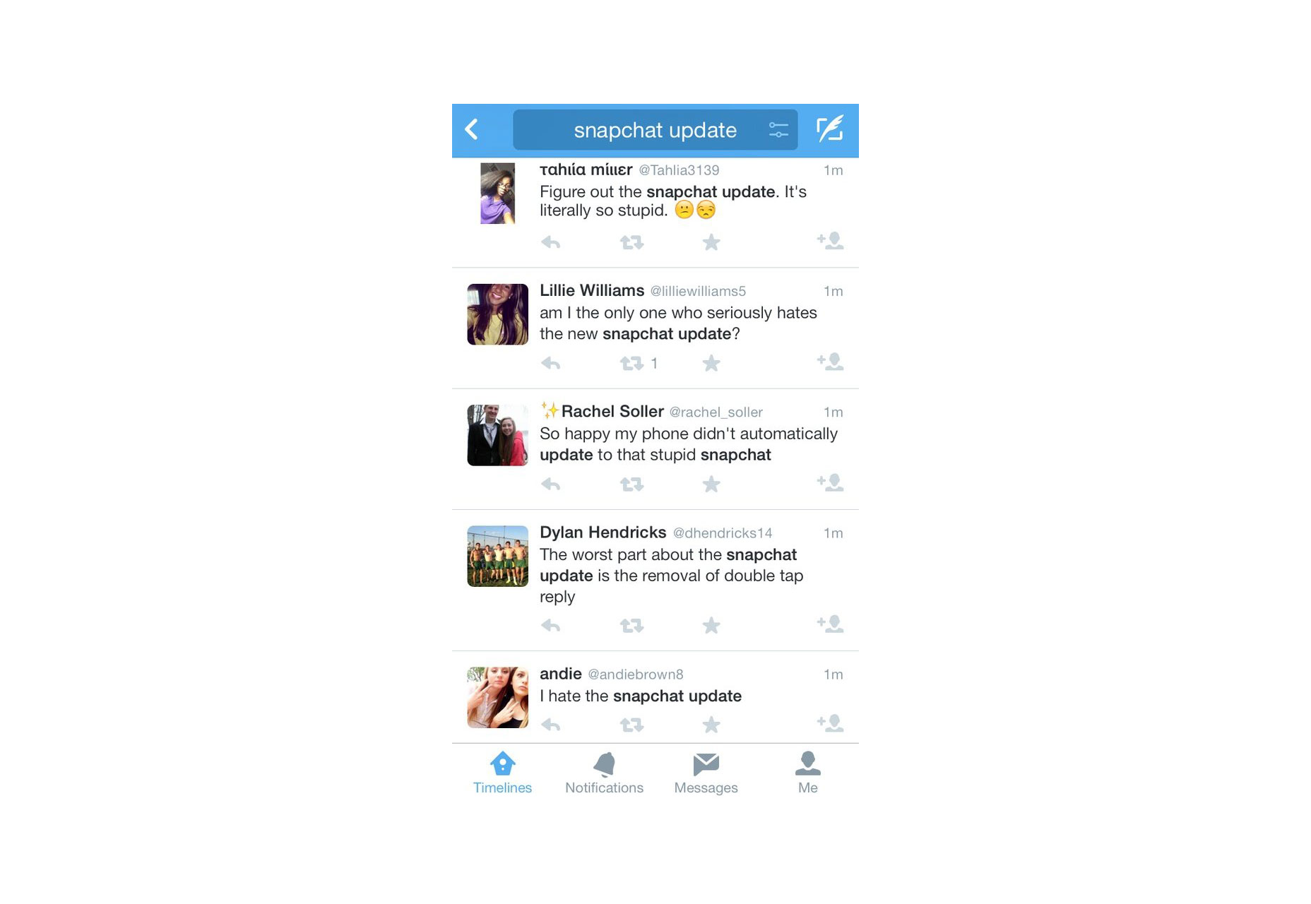
In 2014, Snapchat rolled out a major update. They gave users the ability to text and video chat with friends inside the app. Were Snapchat’s core users (teens) excited about the update?
Nope.
In fact, Business Insider mentioned they could only find one teenager who actually liked the update.
Harsh, right?
When Digg screwed up their site, they lost a third of their users overnight. Users are quick to move on if they’re unhappy.
Snapchat had a problem. Their users (a.) weren’t happy about the update and (b.) not really sure how to use it. So, users probably dumped Snapchat en masse, right?
Actually, No.
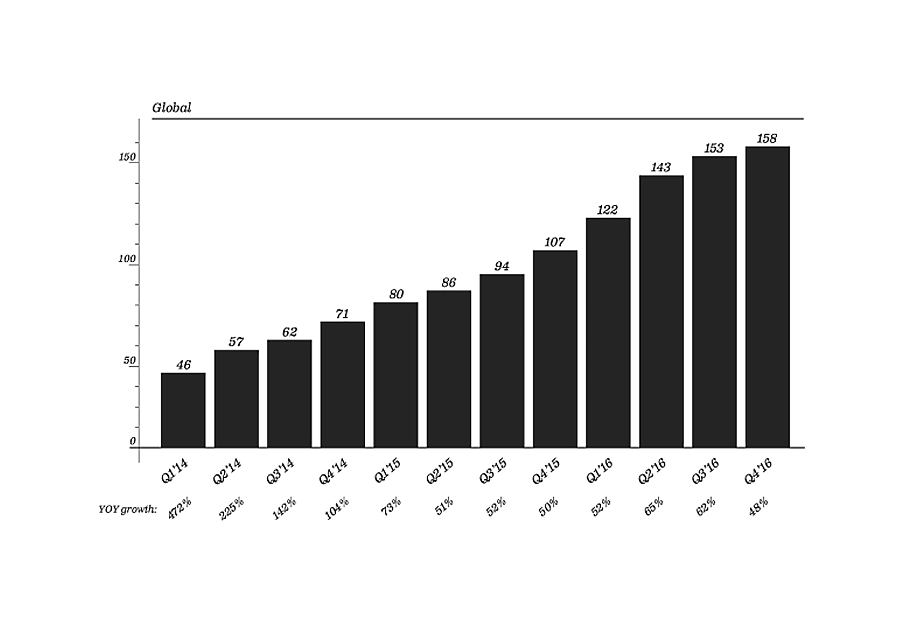
It was the opposite. User growth exploded as Snapchat grew quickly, climbing from 57 million users to 166 million users in 2017.
See for yourself.
They listened to what their users said but they focused their attention on what users did
Did Snapchat rollback these updates?
Nope.
Did they immediately make changes to the new features they implemented for their users?
Nope.
They relied on their data. They listened to what their users said but they focused their attention on what users did. As the saying goes, actions speak louder than words.
Facebook went through the same thing with their updates. So did LinkedIn, Twitter and WhatsApp.
Actions speak louder than words.
Are users completing tasks faster? Are they spending more time in-app or on-site? Ignore user complaints about the UX. Watch what they do instead.
3. Users Demand That You Hurt Them
When it comes to security, users are difficult to please. They don’t care about security until it’s too late. They’re not really interested in doing anything to protect themselves, they prefer someone else to handle it.
The most important part?
They don’t want to be involved at all. How do I know that?
Passwords.
Users know how to create a good password, but they absolutely refuse to do it.
A quick glance at the never-ending stream of data breaches shows we’re still using the same, terrible passwords (e.g. “123456”, or “password”).
Savvy designers and security conscious developers know better.
They demand that you choose a longer password, with different characters, cases, symbols and numbers. They create error messages to gently scold you when you refuse to do it.
This really isn’t about passwords.
It’s about protecting your users. Doing whatever it takes to protect and care for your users. Even when they find you irritating, annoying and difficult. Because contrary to popular belief, they don’t know any better.
What does that look like? Microsoft. Remember how they pushed Windows 10 on us in 2016? Users were greeted with an update that looked like this:
Okay not really, but close enough.
They strongly encouraged the world to upgrade to Windows 10. Then they forced us to upgrade. Then they blocked updates to Windows 7 and 8. I don’t think the forced upgrade was purely out of the goodness of their heart, but there was one thing it helped us avoid, at least temporarily: Ransomware.
Ransomware swept through the UK’s National Health Service, shutting down services and hospitals and clinics throughout the UK. The cause of the attack? Windows XP.
90 percent of the NHS runs on Windows XP. The NHS may have a valid reason for holding on to XP but their attackers obviously don’t care. It’s just another example of users valuing convenience, the UX, over security.
Your users are the same.
They value the UX—their convenience—over safety. Which is exactly when you ignore good UX design in favor of safety.
Users trust you to be the adult in the relationship
Why? Users trust you to provide them with the care, guidance and protection they take for granted. Users trust you to be the adult in the relationship.
Does this mean you abandon UX completely?
Absolutely not.
I’m saying you ignore, not abandon good UX. So what does that mean? If UX is the volume dial on your radio, you turn UX down when the situation calls for it. You don’t turn UX off, you simply turn your dial from 7 to 2.
So when do you ignore UX?
- When you need to disqualify users: Bad UX can be used to flush out motivated users, scare off terrible users and focus your attention on the details that matter.
- When your user and usage data disagree: Customers may tell you they hate your new features. But what does their behavior say? Usage data tells the real story.
- When you need to protect your users: Your users need protection from themselves, from outsiders. While they expect you to be the adult in the relationship they won’t always be happy with you.
Ignore, not abandon. See the difference?
Good UX Design Can Be Terrible
As designers, we’re told that good UX is a must-have. Want your website or application to be successful? Make the UX your focus.
Good UX design at the wrong time turns into bad UX design. The vast majority of the time, good UX is a must-have. Handled well, your users will reward you with more time, money and access. There’s a time and place for everything.
| 500 Premium Logo Templates with Vectors and Textures – only $15! |
from Webdesigner Depot https://www.webdesignerdepot.com/2017/07/the-3-times-ux-design-is-bad-design/


No comments:
Post a Comment