 Transitions are a powerful way to communicate a change in a user interface. They can be used in apps to help offload a lot of the cognitive work into the visual cortex: they help transport users between navigational contexts, explain changes in the arrangement of elements on a screen, and reinforce element hierarchy. Consequently they are an essential element of interaction design.
Successful animated transition possesses the following five characteristics:
1. Good UI Animation is Natural
State changes in UI often involve hard cuts by default, which can make them difficult to follow. In the real world, most things don’t just appear or disappear immediately. When something has two or more states, then changes between states will be much easier for users to understand if the transitions are animated instead of being instantaneous. Let’s look at an example below where the user selects an item in a list to zoom into its detailed view. During expansion, the small card moves in an arc towards its destination as it expands into a larger card. This movement is inspired by the real world forces.

2. Effective UI Animation is Staged
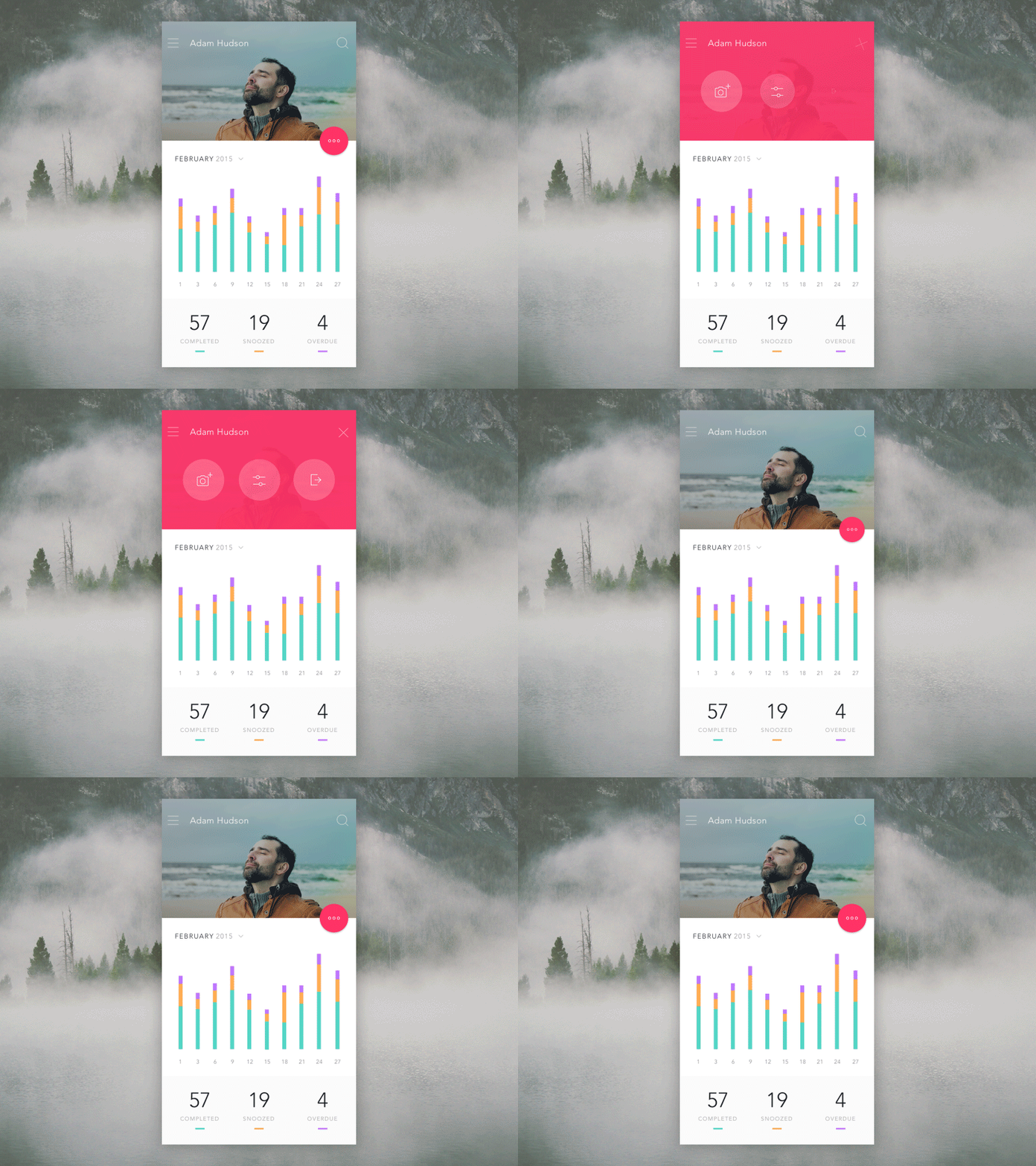
A well-staged animated transition guides your user’s attention and clarifies the change of states. This characteristic is directly related to the user focus and continuity. A good transition helps direct user’s focus to the right spot at the right time, it puts emphasis on the right elements depending on what the objective is. In the example below, the floating action button (FAB) transforms into header navigation elements comprised of three buttons. The first-time user cannot really predict an interaction that is about to happen, but a properly animated transition helps the user stay oriented and not feel that content has suddenly changed. This transition helps guide the user to the next step of an interaction.

3. The Best UI Animations Are Associative
Transitions should illustrate how elements are connected. Good transitions associate newly created surfaces to the element or action that creates them. The logic behind associative connection is to help the user comprehend the change that has just happened in the view’s layout and what has triggered the change.
Below you can see two examples of a layer transition. In the first example, the new layer appears far away from the touch point that triggered it, which breaks its relationship with the input method.

In the second example, the new layer appears right from the touch point. Thus tying the element to the point of touch.

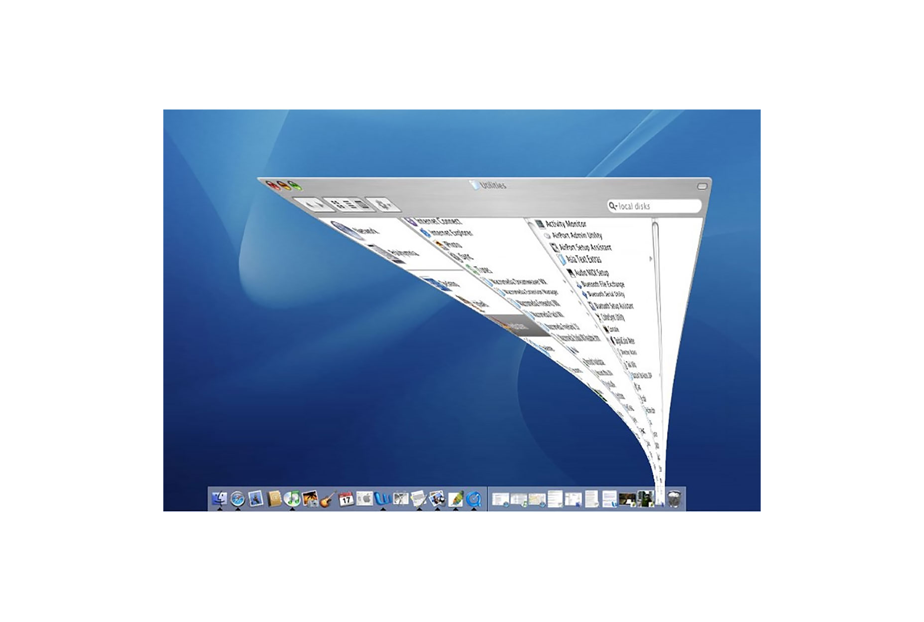
Another example can be found in Mac OS which uses an animated transition when minimising a window. This animation connects the first state with the second state.

4. Popular UI Animation is Quick
If there’s only one principle of animation you care about it should definitely be timing. Timing is arguably one of the most important considerations when designing transitions. The animation should be quick and precise, with little or no lag time between the user’s initiating action and the beginning of the animation. Also, a user doesn’t have to wait for the animation to finish. In example below, slow animation creates unnecessary lag and lengthens the duration.


When elements move between states, the movement should be fast enough that it doesn’t cause any waiting, but slow enough that the transition can be understood. For an animation to effectively convey a cause-and-effect relationship between UI elements, the effect must begin within 0.1 seconds of the initial user action to maintain the feeling of direct manipulation. Try to keep animation duration at or under 300ms as fast transitions waste less of the users’ time. Test it with your users to see what is tolerable.
5. The Best UI Animation is Clear
It’s a common mistake to overload UIs with animations or to create too complex interactions. Too much change in a user interface can leave a user disoriented and it takes time to recover from. Remember that every motion on the screen attracts attention, so too much animation at the same time creates chaos.
Transitions should avoid doing too much at once because they can get confusing when multiple items need to move in different directions. Remember, less is more with regard to animation and transitions in particular. Anything that if removed would make a cleaner UI is almost certainly a good idea. When a surface changes shape and size, you have to maintain a clear path to the next view. Complex transitions should keep a single element visible. This helps keep the user oriented.
Transitions and Accessibility
Since transitions are about visual communication, they by default are not accessible by users with visual impairments. You should provide alternate content for this group of users. webacessibility.com’s best practices for animation offers suggestions on when to provide alternate content for assistive technology.
Conclusion
When designing transitions, focus only on the practical things they do for the user. Whether your app or site is fun and playful or serious and straightforward, using meaningful transitions can help you provide a clear and quick cohesive experience.
| 109 Professional, Premium Fonts with Extended License – only $12! |
from Webdesigner Depot https://www.webdesignerdepot.com/2017/07/5-unbreakable-rules-for-ui-animation-on-the-web/
No comments:
Post a Comment