Wednesday 31 May 2017

Outgrowing Growth-Driven Design

I’ve been designing for the web for a while. Since the days of table-based sites when we spliced our images and added them into <tr>s and <td>s. The days of hit counters, Flash splash pages, and keywords stuffed into the bottom of pages (along with text links bought and sold like penny stocks) to fool the spiders. Those trends served their time (well, some of them anyway) but we have outgrown them as a design community.

And as the times progress and the community and its members mature (well, most of them anyway), more trends are thrown at us in a proverbial game of buzzword dodgeball. We may catch a couple, but the vast majority miss their mark completely.

Enter the prodigal son: Growth Driven Design.

The latest buzzword is being recklessly thrown at us like a barrage of red rubber playground balls by marketers, customers, and companies trying to sell us things that we don’t need and that won’t change our design process.

Is this one we should catch, or dodge?

Growth Driven Design is Not About Design at All…Or is it?

The phrase must have been coined by a marketer—a smart one!

One way of looking at it (mine) is that Growth Driven Design is a business approach—not a design approach. Unlike its predecessor design systems, GDD is only about creating websites that are better for business, not necessarily better designed. GDD “experts” talk about the “traditional website design process” being broken, but the frustrations they speak of are related to budget, timeline and results—not design.

In fact, I would challenge GDD proponents to look at any site I have designed and tell me if it incorporated a GDD approach or not.

I guarantee you they won’t be able to. And the reason is that GDD is not about design.

Drilling down into “how it works” of growthdrivendesign.com however, will uncover another way of looking at it (also mine): GDD is what we, as designers, have always done.

Growth Driven Design Strategy  

At the strategic level, GDD is about understanding the audience’s world and how your website can solve problems along their journey. Admittedly, we didn’t define it clearly enough in the beginning, but who in this design community ever attempted to redesign a website without first seeking to understand the target persona? We have been doing this for years.

The Launch Pad MVP  

The next step of the process is defined as “build quickly and deliver something that works better than the current site….then iterate” Again, this does not speak about design. Moreover, I find myself asking yet again, has there ever been a web designer that did not focus on delivering quickly and generating a design that performs better (fully knowing that it will be iterated on and optimized further down the road)?

Continuous Improvement

Setting aside the business-side of the equation for a moment, I have never met a designer who would choose not go back and optimize designs if they could. I have, however, met many customers and agencies who do not want to pay for continuous improvements to a site and therefore stifle the designer’s innate need to continually improve.

It therefore comes down to this: design, by definition, is (and always has been) growth-driven. The current state of the buzzword is designed (excuse the pun) to help customers recognize and agencies sell what designers have long known and practiced.

To GDD or Not to GDD?

Let’s forget about GDD as a buzzword for a few minutes (bench it, if you will). Now that those paying the bills have caught up and want us to keep doing what we have been doing (albeit, call it by another name), what’s a designer to do?

The answer is a 3-step solution based on a methodology that involves the design process, but does not change it.

1. Understand the Need

Customers have started asking for a growth driven website. Often, if asked to describe what they mean, they will either:

  1. Stutter and not know (hint: this unveils GDD as a buzzword—those who use it, don’t fully understand it—they just think they need to have it to keep up with the Joneses); or
  2. Explain that they want it quick, cheap, and easy to change based on data.

In either case, explain that this is your modus operandi; that you have worked this way since long before the term was coined and frankly, can’t imagine a design process that isn’t growth-driven.

2. Use a Growth Engineering Approach with the Entire Team

Once you recognize that GDD is not about design at all, but rather about the entire process of websites, you may find it beneficial to change how you work with the entire team.

Tackling unknown, dealing with changing priorities, relying on data—these are not problems reserved for designers. The entire team deals with these issues—both on the client side and the agency side. The solution is a growth engineering approach to the process.

We believe in investing in processes, not in projects. For example, in our recent work on a SaaS client’s site, we uncovered a need to not only improve the website, but also build a mobile app. We involved our content team to create assets that provide value to the target persona and even got granular with the client’s product team to make some required changes to the product itself and their onboarding process.

Growth Driven Design is just one cog—the entire machine needs to work in iterative processes where all participants learn and apply in continuous cycles. Our culture is driven by numbers, out-of-the-box creative thinking, and passion for engineering growth.

3. Use a Pattern Driven Approach for Design

While design principles per-se are not altered in a GDD approach—your fonts, white space, lines, iconography, etc.—how you go about putting them together may be improved.

Ever pondered the term homepage? The pattern driven approach can take that analogy to a new level. Instead of building a home—that is hard, expensive, and time-consuming to renovate, we are building a wardrobe. We define the style and create many pieces that can go together and swap out easily. If your neighbor gets a new roof and you want to keep up with the look and feel, you are in for a long and costly venture. But if your neighbor’s daughter gets a new hat, a quick trip to the mall (or the Amazon app) will have your girl in one that’s even better before the bell rings for recess—she can even do it herself because the style has already been defined.

We design patterns. And how they relate to each other in an organic way. Let’s say a section intro block that has:

  • An H1 heading
  • A description <p>
  • A CTA button

That’s a pattern! Why should we recreate the same pattern for a testimonial block? We just need to duplicate the same pattern, replace the description <p> with a blockquote, replace the CTA with the person’s avatar et voilá!

This pattern can be easily replicated for each page (even sometimes between projects) making the design process more efficient and more exact as patterns always fit the grid.

Using a pattern approach makes the user experience on our sites flow better and enables our designers to spend less time on the “science” and more time on the “art.”

At the end of the day, we deliver quicker and whether they understand the why or not, customers are happier with the deliverable and end up sending us more work (and referrals!).

Growth Driven Freedom

If Growth-Driven Design isn’t about design, then what is it about? In a word: independence.

Creating websites built on patterns puts growth in the hands of everyone—both clients and agencies can run tests and make changes easier than ever. The idea of constant improvement moves from the realm of buzzword to standard operating procedure. Aligning with customers and consultants about the need to continually improve gives power to the people.

In an era long fallen by the wayside, marketers used to need a coder to make text changes to their sites. Then came CMSs that gave them the power to update text themselves. This did not put coders out of a job, it allowed them to focus their efforts on actual coding rather than a Find and Replace script for new buzzwords.

In much the same way, GDD empowers marketers to update site designs based on data they track—and it will not put designers out of a job—it will allow us to focus on designing rather than changing the CTA button from red to orange…and back again.

Is GDD a buzzword? Perhaps, but that doesn’t mean you can’t ride the wave of its popularity to create the same beautiful and effective web designs…in a new way.  

Now, who is up for some GDDodgeball?

Convert Photos to Stunning Paintings with Digital Painter – only $9!

Source

from Webdesigner Depot https://www.webdesignerdepot.com/2017/05/outgrowing-growth-driven-design/

Tuesday 30 May 2017

7 UI Choices That Damage UX

User experience is one of the most important aspects of modern web design. The Google Trends graph for ux design shows how much this field has grown in recent years.

Yet there are still so many websites that push certain design trends which seem like the antithesis of usability. Some are done by accident or negligence, others are done on purpose. The latter are called dark patterns and they’re typically used by marketers to meet some end goal.

But as designers it’s our job to push back and fight for a great user experience. The best way to do that is by shedding light on bad practices and encouraging better ones. So let’s dive into a few of these bad UX practices to see why they exist and how they might be solved.

1. Unwanted Modals

The general concept of a modal window is actually very clever. It lets developers add content over the page without using JavaScript to pop open a new tab.

But modal windows are not the problem. Unwanted modals are the problem and they always drag down the user experience.

I’d say there are three different types of “unwanted” modal popups:

  • Exit intents which open when the user’s mouse leaves the page body, usually hovering the browser tab;
  • Timed modals that open after a set amount of seconds;
  • Scroll modals that open after the user scrolls a certain distance down the page.

You can see an example of an exit intent modal on this MaxTraffic post using their own exit intent script.

As much as I’d like to chastise this practice I do understand this from a marketer’s standpoint: it works.

The question isn’t why exit intent/opt-in modals exist. The question is whether you think it’s worth adding an unwanted modal popup to your website.

Is it worth potentially annoying most of your users just for a higher conversion rate?

If you’re more interested in a great user experience then the answer is obvious. Especially with Google now penalizing sites that use annoying interstitials/modals without user interaction.

But these unwanted messages also give modals a bad name, which is tough because they serve a real purpose in UI design. These can be used wisely, like with modal signup fields or information-based modals triggered from a user’s mouse click.

Or they can be annoying marketing messages that just appear seemingly out of nowhere. And don’t get me started on modals that won’t close even when clicking the background.

I really can’t fault marketers for using these modals because they convert well. But they’re also ruining the user experience for everyone else on the web.

2. Guilt in Copywriting

I recognized this trend years ago but I couldn’t put it into words until I read this article by Katie Notopoulos. She uses plenty of great examples to show how guilt-based copywriting annoys users and increase signups.

This writing style appears in those annoying modals I just covered. But this writing can also appear in sidebar fields or in-content opt-in forms. One example from Good Housekeeping is just terrible (hover the browser tab to trigger).

The goal with this guilt-ridden copywriting is to make the user feel so bad that they second guess their choice to close the window. It usually follows a formula that forces the user to click a nonsensical statement that’s unrelated to closing the window.

For example, a modal might offer you a free ebook on web design. The subscribe button might be simple but the cancel button might read “No thanks, I like sucking at design”. There’s actually a whole Tumblr site devoted to this shaming copywriting.

This is another example of a technique that works from a marketer’s standpoint, but certainly holds little value from a UX standpoint.

3. Fullscreen Interstitials

It should go without saying that completely taking over the screen with an opt-in or squeeze offer is just plain obnoxious.

This trend is like the unwanted modal window on steroids. These interstitials take over the entire screen and block the page unless you close the window. And sometimes it’s almost impossible to close these windows!

Backlinko is a fantastic site for SEO tips, but horrible with the pushy marketing.

First time visitors are always greeted with the same fullscreen modal that takes over the entire page. The background uses a video of Google SERPS which is both confusing and ugly.

It places a very tiny X icon in the top right corner and the “no thanks” link is much smaller than the other text, not to mention harder to read. This thing is a usability nightmare on mobile and it’s just one example of a trend that really needs to go.

4. Slide-in Ads/offers

Sometimes you’ll be scrolling down a homepage and see a small box slide into view from the side. This might be a feedback box for user testing, or it might be social sharing links or even a discount/promotion.

I can deal with these every so often. If they stay out of the way and aren’t too obnoxious then, whatever.

But on sites like AccessPress you can find at least 2 different slide-in boxes on either side of the page, and sometimes even a 3rd!

This isn’t meant to shame AccessPress or any other sites in this list. I’m just using this as an example to show how poor UX trends can go too far.

If you have a client who wants this slide-in feature try to make it subtle. No ding noises, no flashing graphics, and preferably no wacky animations. If a user wants to learn more they’ll take the time to read it.

5. Custom Scrolling

Most trends in this post have been marketing-oriented because, as Gary V says, marketers ruin everything.

But custom scrolling can’t be blamed on anyone. It’s just a trend that’s been around for far too long and feels like a remnant of an older web. Nowadays browsers like Chrome have their own custom scroll features that users can enable/disable on a whim.

But websites like Click and Grow still have these annoying JS-based scroll features that turn navigating the site into a chore.

Usually these custom scroll animations have one of two effects. Either the scroll goes too fast beyond where you wanted to rest the page, or it goes too slow and you have to whip your mouse wheel just to move. Why would any designer think these two options are better than the default?

Tied into custom scrolling is a newer trend I’ve seen on single page layouts. They have fullscreen page “sections” where your scroll wheel only moves down one section at a time. Gladly has this trend on their homepage.

My problem here is the same with fixed scrolling. It takes power away from the user.

The Gladly section animations take way too long to complete. The Internet moves fast and Internet users always want it a little faster. So any type of custom scrolling that ultimately slows down the experience is just bad UX.

6. Nav Menus Without Padding

This is a tough trend to explain but you know it when you see it.

Every site has a navigation menu and most links have padding around them. But sometimes the padding isn’t clickable, so to navigate you need to click on the exact block area of the text itself. This drives me crazy!

It takes maybe 30 seconds to move CSS padding from a link’s container element to the link itself. The navigation menu looks the same, but now users can click the link and the space around the link. So much easier!

Take a look at Tilde’s navigation for a live example.

The craziest thing about their site is that their mobile responsive navigation actually does have clickable padding. Only their desktop nav is plagued by the text-only click area.

On the flip side you’ll find many sites that understand the importance of this very subtle yet crucial detail. One example is Think With Google where you can actually see the full link size while hovering:

Just keep this in mind going forward because it’s a very simple alteration that can have a huge impact on usability.

7. Paginated Listicles

Last but not least I’m poking a bit of fun at blogs that design their content into one-item-per-page listicles.

I cannot imagine that any person enjoys constantly clicking the “next” button to read through a clickbait post. You’ll find tons of these on many different websites and none of them consider the user’s experience.

This trend is mostly about pageviews and ad revenue more than anything else. And while it’s not really in the designer’s control to fix this, it does relate to the user experience and webmasters/designers should do all they can to avoid these multi-paged articles.

I can only imagine how many other trends are out there annoying users on a daily basis. But I hope by sharing these ideas more designers will work towards eliminating these dark trends and reducing their presence on the web.

Bundle: 2500+ Professional Photoshop Actions and Vectors – only $17!

Source

from Webdesigner Depot https://www.webdesignerdepot.com/2017/05/7-ui-choices-that-damage-ux/

Monday 29 May 2017

7 Ways to Design at Lightning Speed (and Still Be Good)

Some of the world’s best designers – and even the best designers where you work – all have something in common: Many of them know how to work at lightning speed. And the work is still good.

While part of this speed work comes with experience, some of it is comes back to solid work habits and great time management. Working quickly and efficiently can be great for helping you make good with the boss, and for freelancers, taking care of tasks quickly can result in the ability to take more jobs (and increase your earning potential).

So how do you get faster without sacrificing quality? Here are seven tips that you can start using today.

1. Create Shortcuts and Styles

No matter what software or tools you prefer, a set of basic libraries, styles and presets will make your life easy. That’s not to say you use the exact specification for every project, but it establishes a starting point so that you can switch fonts, colors or layouts with just a click.

One of the first things you can do is establish a set of universal quick, or shortcut, keys for all programs you commonly use. (I love the “Duplicate” function, but every piece of software uses a different keystroke combination; I always create my own cmd+d, so that the command is universal and not clunky.)

Take this a step further and create basic styles for common text bits – body text, headlines, subheads, captions, quotes – with quick keys. Then when you need to change a font, size or color, styling is universal. (This can make work in Adobe products a breeze and can dramatically speed up the prototyping process before the first line of code is even written.)

2. Organize Consistently

There’s no right or wrong way to organize your design files. (We aren’t getting into that here.) What matters is that you have a consistent system for how you do it.

If you organize files in the same manner every time, using folders, layers or labelling, then you will always know where to find things as you move through iterations of the design. Other members of your team will appreciate this consistency as well, because it will make it easier for them to use your projects as well, while understanding the filing system.

This applies both to how you organize objects and information within files and how you create and use folders outside of the actual project file.

3. Have a Go-To List of Typefaces

For the projects that don’t come with a set of typography specifications, it can help to have a short list of go-to typefaces to jumpstart projects. Your arsenal should include a couple of serifs, and few sans serifs and one or two novelty or script options for special use.

You won’t always end up using typefaces from this “de facto palette,” but it will get you moving quickly on the overall design outline. It will help provide a starting point for font pairing combinations that you can actually show a client almost immediately (and get a feel for how they react to those type styles).

Bonus tip: This concept works great for color palettes, too.

4. How to Use the Right Tools

Using the right tools for the job can make all the difference in the world (and prevent a lot of rework later). Think of how many times you’ve come across a logo in a raster format when the right tool is vector-based software, such as Adobe Illustrator.

This applies to every aspect of design work, both for online projects and printed materials. As a general rule, anything that’s part of a branding scheme or might be needed for multiple uses (logos, characters, iconography) should be designed in a vector format. You can also scale it down or save other files types, but you can’t go from a gif to a scalable image. One time use objects and elements can be designed using small, raster formats or with CSS tools.

Remember, no matter what file format you need for the final version, save everything in a native file for easy access later. Native files are a lot easier to edit and adjust. 

5. Use Premade Parts

Repeat after me – you do not have to create everything from scratch to be a good designer. Particularly when it comes to website projects, use available kits and tools as appropriate to speed up workflows. Most buttons don’t look that dramatically different; it’s ok to start with a kit that includes buttons, icons or other user interface elements. And it will save you a lot of time.

If you plan to use some premade parts of kits, invest in a high-quality option that’s easy for you to edit and adjust. A set of buttons won’t do you any good if the colors or fonts can’t be altered. (While you are looking for user interface kits to help you get moving quickly, grab a couple of nice mockups as well. Clients love seeing their projects displayed in this manner.)

6. Cut Out the Clutter

A clean workspace makes for a happy designer. Cutting the clutter comes in two phases when it comes to your digital space:

  1. Keep files and folder clean and free of old versions or materials that aren’t going to be used. Project files and folders should only contain usable materials. If you want to store older versions, set aside a specific location for those elements.
  2. Clean your computer of distractions so that you can work without checking email or Facebook or getting lost in shopping online. (Admit it; this has happened to everyone.) When a project is pressing or even if you are just “feeling it,” turn everything else on your computer off (especially those pesky notifications) so you can focus on the work at hand. You’ll finish sooner and then have time for all that extracurricular activity.

7. Start in Black and White

Every good website starts with a solid wireframe. That mantra can apply to the design of any element. Whether you start with a sketch on paper or screen, a black and white outline can be the first step to creating something with plenty of practical application.

Used as a tenet of logo design, a black and white concept is something most projects will need to include at some point anyway. (You might need to use the design in single color printing or all white over a hero header image.)

You’ll end up doing a lot of backtracking if your design won’t work in these ways. An efficient process starts with black and white and then color and details are added once the black and white concept is finalized. 

Conclusion

Ready to get faster? Start at the top of this list and work through the tips until you are starting to shave time off design projects. The key to working at lightning speed (and staying good) is focus. There are so many distractions that take us away from good processes and work practices, go back to the basics to get reacquainted with good workflows.

And good luck. Becoming a quicker designer takes time and patience. Give yourself room to grow.

Creative Commons photos in this article are from Unsplash.

Bundle: 500+ Gorgeous, Hi-Res Watercolor Backgrounds – only $14!

Source

from Webdesigner Depot https://www.webdesignerdepot.com/2017/05/7-ways-to-design-at-lightning-speed-and-still-be-good/

Sunday 28 May 2017

Popular Design News of the Week: May 22, 2017 – May 28, 2017

Every week users submit a lot of interesting stuff on our sister site Webdesigner News, highlighting great content from around the web that can be of interest to web designers. 

The best way to keep track of all the great stories and news being posted is simply to check out the Webdesigner News site, however, in case you missed some here’s a quick and useful compilation of the most popular designer news that we curated from the past week.

Note that this is only a very small selection of the links that were posted, so don’t miss out and subscribe to our newsletter and follow the site daily for all the news.

Websites We Like: May 2017


Here are Some Popular Design Trends in 2017


8 Graphic Design Trends for 2017


Finally, Photoshop is Dead for Web and App Design


Refreshing the Atlantic Homepage in 2017


How Google Reimagined 2,000+ Emoji


Scott Gilbertson: ‘Kill Google AMP Before it Kills the Web’


Inspirational UI Design Ideas for your Next Website Project


Can a Font Be a Whole Brand? YouTube Thinks So.


Mixfont: A Font Generator for Aesthetic Font Pairings


The Slash Workers


IKEA Online Made More Personal: Redesign Concept


User-Centered Design: An Introduction


Desktop-First Design Tips for Responsive Websites


Helpful Extensions for Front-end Developers and Designers


Design ‘No Results Found’ Pages that Get Results


Starting Small in Web Design


Logopony: Make your own Beautiful Logo with AI


Treefort – Organize your Team


PayPal Files Lawsuit Against Pandora for Mimicking its ‘Iconic Logo’


Ambiance – Color Palettes You will Love to Stare


Workspaces for Mac 1.0


Google Quick, Draw! — the Data


Designing for VR: A Beginners Guide


Inside Design: LinkedIn


Want more? No problem! Keep track of top design news from around the web with Webdesigner News.

LAST DAY: 4 Contemporary Font Families from Typesketchbook – only $12!

Source

from Webdesigner Depot https://www.webdesignerdepot.com/2017/05/popular-design-news-of-the-week-may-22-2017-may-28-2017/

Saturday 27 May 2017

Comics of the Week #391

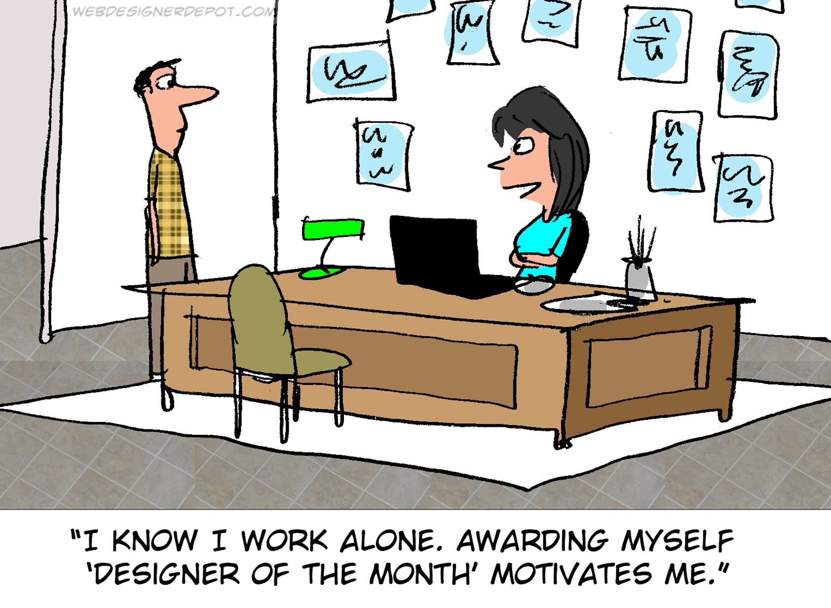
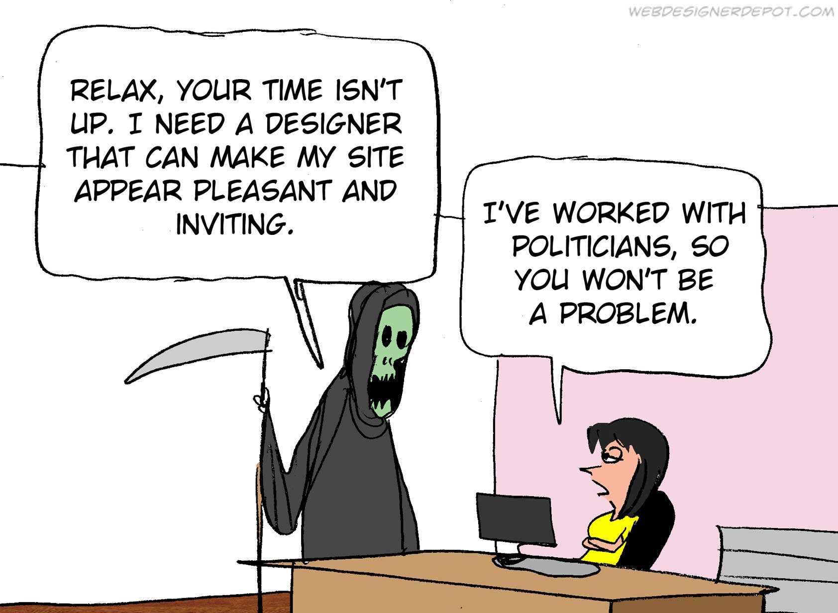
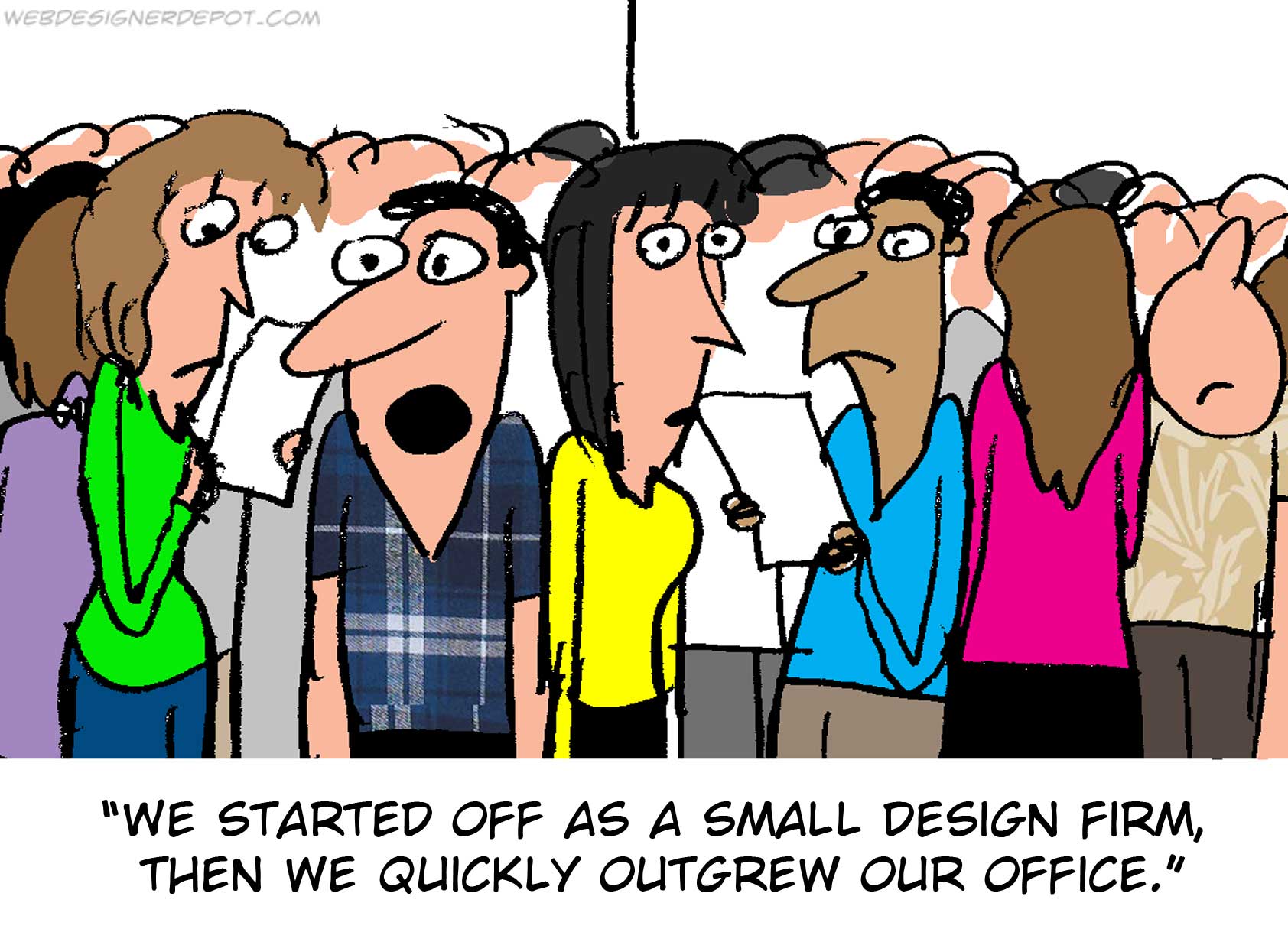
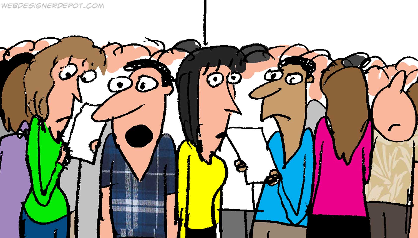
Every week we feature a set of comics created exclusively for WDD.

The content revolves around web design, blogging and funny situations that we encounter in our daily lives as designers.

These great cartoons are created by Jerry King, an award-winning cartoonist who’s one of the most published, prolific and versatile cartoonists in the world today.

So for a few moments, take a break from your daily routine, have a laugh and enjoy these funny cartoons.

Feel free to leave your comments and suggestions below as well as any related stories of your own…

No competition


Relax, he needs a site


Growing pains

Can you relate to these situations? Please share your funny stories and comments below…

Inboard App for Mac Creatively Organizes Your Images – only $9.99!

Source

from Webdesigner Depot https://www.webdesignerdepot.com/2017/05/comics-of-the-week-391/