 Friends, I come with a warning…not to alarm, but to assist. Grab your crucifix, gather your silver bullets, prime your chainsaw, because I’m about to shine a light on nightmare clients that will chill the heart of the most experienced web professional.
Nightmare clients everywhere, await the unsuspecting designer. They’ll suck the time from your day, relentlessly pursue you, and trap you in a project that you’ll never escape.
My friends, forewarned is forearmed. This collection of fearsome fiends is easy to tackle…if you know their weaknesses. So pay attention, because what I’m about to share, may just save your life (or at least your weekend).
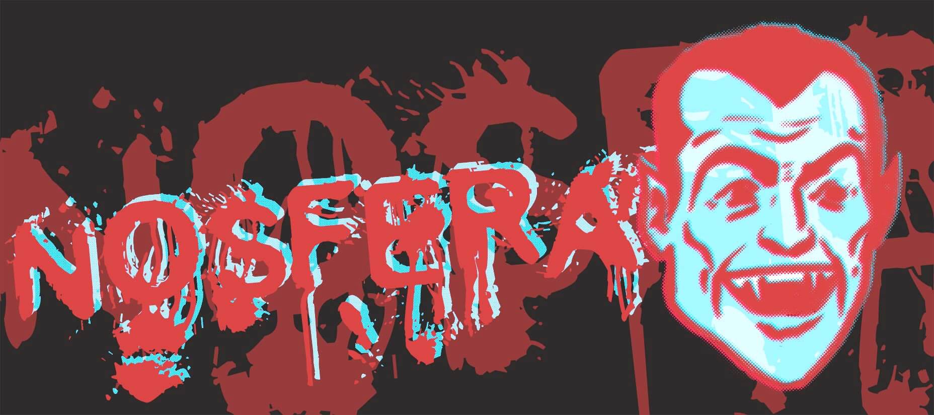
The Nosferatu Client
The Nosferatu client creeps into your home at night, sucking the life from you to feed his own self-importance. Whether it’s a late-night call, weekend texts, or meetings booked for 7am, the Nosferatu client wants to own you, and every second of your life.
The key to defeating the Nosferatu client is setting boundaries and sticking to them.
The Nosferatu’s chief weapon is flattery. You are invaluable to him. Your quick-thinking is keeping the project on track. The work you’re doing is award-winning quality. It is all designed to make it impossible for you to say, “No.”
The Nosferatu client is always looking for ways into your life. If he discovers that you’re working the weekend, he’ll expect you to be available every weekend. Don’t open the door to him.
How to Defeat a Nosferatu Client
The key to defeating the Nosferatu client is setting boundaries and sticking to them.
Let your clients know that you work regular office hours, even if you really work until midnight every night.
Never invite the Nosferatu client into your spare time, once he’s invited in, he’ll never leave.
Never call, post on Slack, email, text, upload files, or make any other sign that you are working after hours. If you finish a deliverable 30 minutes after your official close-of-business, then upload it the following morning.
Never invite the Nosferatu client into your spare time, once he’s invited in, he’ll never leave.
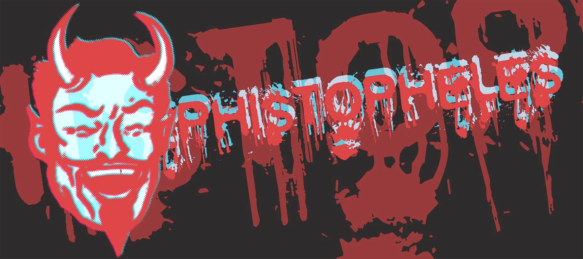
The Mephistopheles Client
Like the devil of Faustian folklore, the Mephistopheles client has a great deal for you. A deal too good to turn down. The opportunity of a lifetime. Never mind the small print, just sign here…
Lots of clients will offer you a terrible deal. It’s easy to turn down solicitation that only offers “exposure”; the Mephistopheles client traps you with a deal that on the surface looks enticing, but has a hidden sting in the tail.
Your terms are a litmus test; if a client wants to modify them, or work under different terms, then look closely at exactly what you’re agreeing to.
Is the client offering you a higher than expected rate of pay? Is the client offering you unlimited creativity? Is the client overly eager to sign you up? Any deal that looks too good to be true, probably is.
It could be that the client has sneaked a clause into the contract that gives him unlimited revisions. It may be that he’s sneaked in a clause that specifies payment on acceptance instead of payment on completion—yes, that has happened to me, and no, the acceptance never materialized.
How to Defeat a Mephistopheles Client
Have a comprehensive terms of service, and attach it to every single quote you send out. Make it clear that these are the terms under which the quote is issued.
Write your terms in plain-English (you probably don’t need a lawyer to draft them). The terms aren’t to cover you legally, or for use in court, they’re to establish ground rules and promote a healthy working relationship.
Your terms are a litmus test; if a client wants to modify them, or work under different terms, then look closely at exactly what you’re agreeing to.
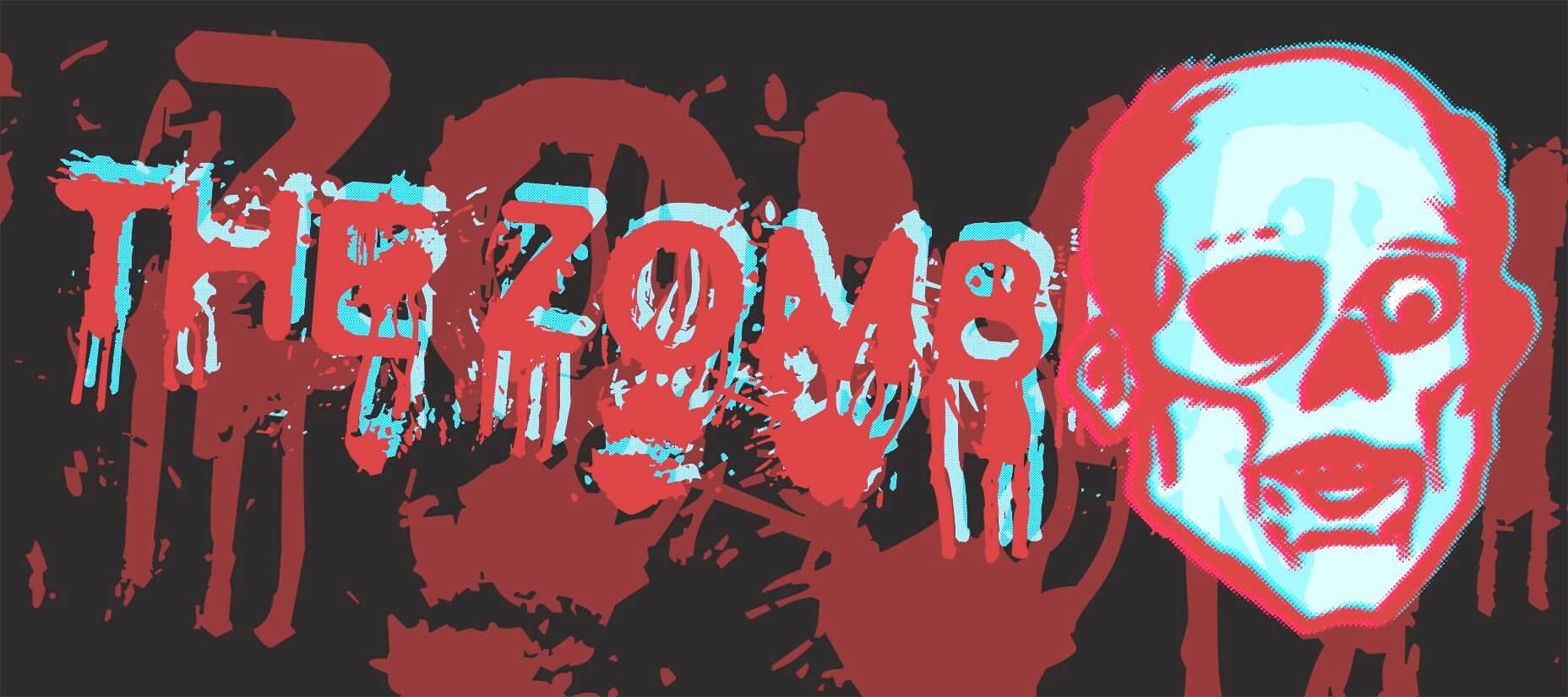
The Zombie Client
The Zombie client is perhaps the most common of nightmare clients, there are millions of them.
The typical Zombie client is slow: sign-off takes weeks, not days; content arrives in months, not weeks.
Be warned…working with one Zombie client will attract more.
The Zombie client knows who his target demographic is. It’s people just like him. He’s certain there are thousands of them, and he intends to use you as bait.
What is worse, the Zombie client is aimless. He doesn’t have a defined goal, and is rarely able to supply a brief. Stray too close to a Zombie and he’ll make you aimless too.
How to Defeat the Zombie Client
The Zombie client is relatively harmless, if kept at arm’s length, but you do need some form of barrier to keep him at bay. The web professional equivalent of electrified fencing is a well-honed project plan.
The Zombie needs to be herded, and actually enjoys being given direction.
Despite his slow speed, and aimless wandering, it is almost impossible to rid yourself of a Zombie client. Years after you think he’s vanquished, the Zombie client will reappear, more often than not asking if you have a copy of his logo on file. Keep an archive of important files like this so you can send it to him and escape; the faster you respond the less likely the Zombie client is to catch up to you.
Be warned, the Zombie client knows countless other Zombie clients, and working with one Zombie client will attract more.
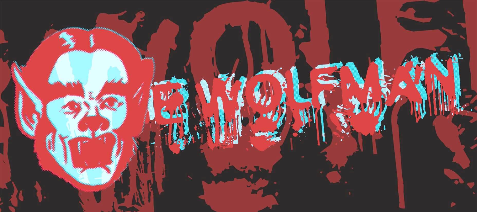
The Wolfman
The Wolfman client often appears to be a regular, even good client. The Wolfman client often doesn’t know he’s a Wolfman. But beware, for the Wolfman is ever-changeable.
Changes define the Wolfman client. One day he’s signed-off on a deliverable, the next day he’s revisiting the project brief.
When the Wolfman client changes his mind he’s like a dog with a bone. The fickleness of his decisions is matched only by his certainty that this one final change will bring the whole project together.
The Wolfman client spends much of his working life confused. The Wolfman will wake, the day after a meeting, unable to recall what was agreed (and wondering where all these chicken feathers came from).
How to Defeat the Wolfman Client
The Wolfman client isn’t a monster, simply a victim of his own nature. But that doesn’t mean you should allow him to make a victim out of you too.
The Wolfman will wake, the day after a meeting, unable to recall what was agreed…
When dealing with a Wolfman client, get all decisions in writing. If a decision is made in a meeting, or on a call, write it down while your memory is still fresh and post it to your project management system (or at the very least pop it in an email). Keep a paper trail.
The Wolfman client is often unaware of his own nature. If you spot one, then try to get off a fixed project fee and onto an hourly rate as quickly as possible; getting bitten by the Wolfman’s changeable nature is a lot less painful when you’re getting paid for every revision.
Fin
Clients often feel like nightmares, because we don’t understand them. The Wolfman doesn’t want to be changeable, he doubts his decisions. Mephistopheles often doesn’t want to trap you, he’s worried about being trapped himself. The Nosferatu client will respect your boundaries, provided you let him know what they are. The Zombie client will hang around, but is relatively harmless unless you let him slow you down.
When we take the time to establish good working relationships, by managing expectations, setting boundaries, and keeping our work process transparent, nightmare clients have a lot less bite.
So the next time you find yourself confronting one of these fearsome fiends, remember this advice dear friends, and you’ll escape unscathed.
Happy Halloween!
| Add Realistic Chalk and Sketch Lettering Effects with Sketch’it – only $5! |
from Webdesigner Depot https://www.webdesignerdepot.com/2018/10/the-secret-designer-halloween-special-nightmare-clients-and-how-to-defeat-them/
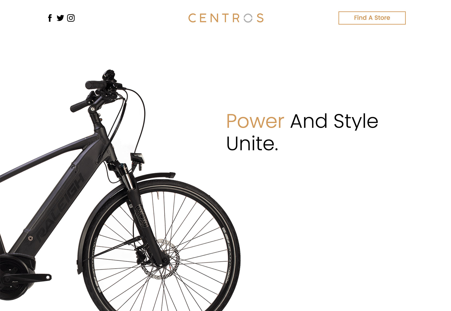
 When looking at good design, I often look for things that aren’t totally obvious. There’s an instinct that you like something before you know why. That’s the common thread among this month’s three essential design trends.

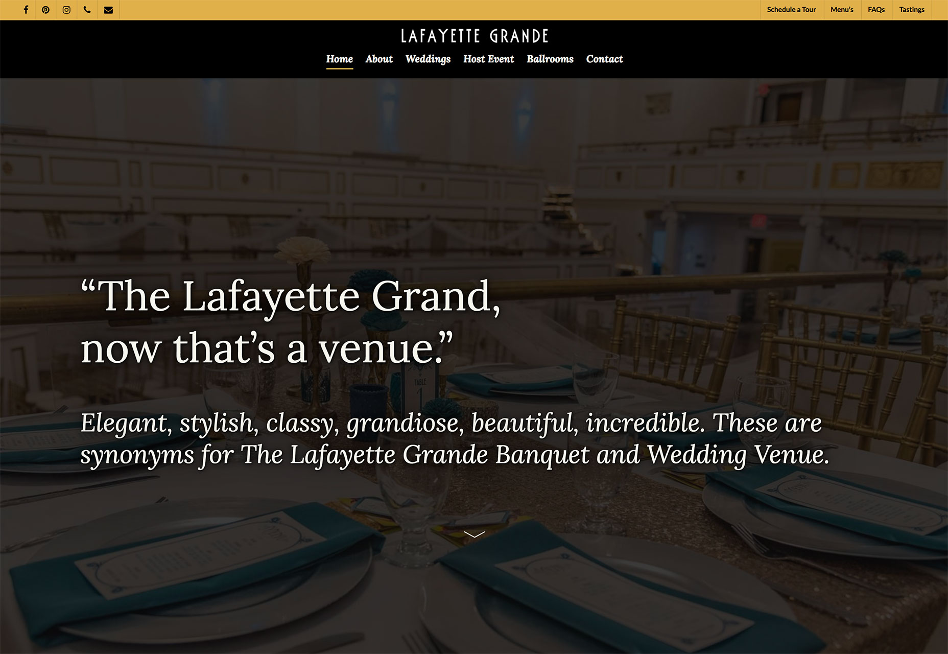

 Every week users submit a lot of interesting stuff on our sister site Webdesigner News, highlighting great content from around the web that can be of interest to web designers.

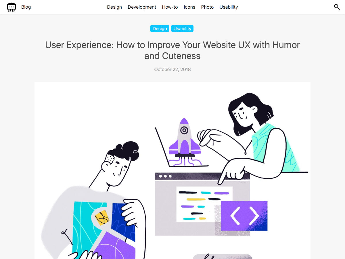


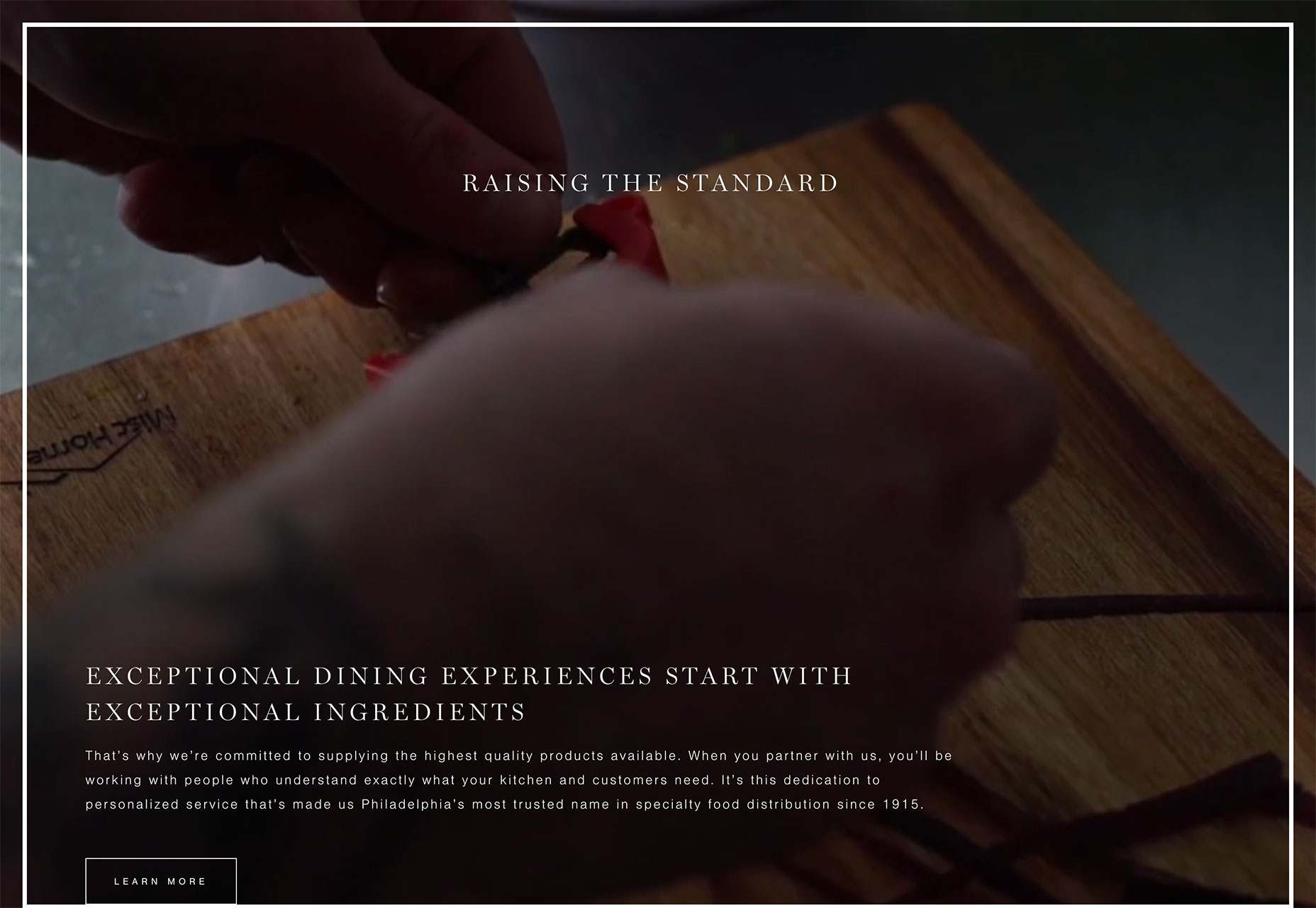
 Before you ever sit down to design a website for a client, you develop user personas that are representative of their target audience. Once you’ve established an identity for the main user (or users), you can more easily shape an experience that caters to their needs and motivations.