Monday 31 July 2017

3 Essential Design Trends, August 2017

If the dog days of summer have you longing for a change of scenery, this month’s web design trends are the perfect start. While minimalism has been the “it” style of late, more designers are beginning to shift toward more details and features within the layout. The striking design patterns that we are beginning to see are a fresh alternative to the stripped-down styles we’ve gotten used to.

What do you think? Are you ready for thinner typography options, more elaborate detailing and icon-style logos? You might be after seeing some of these design projects.

Here’s what’s trending in design this month:

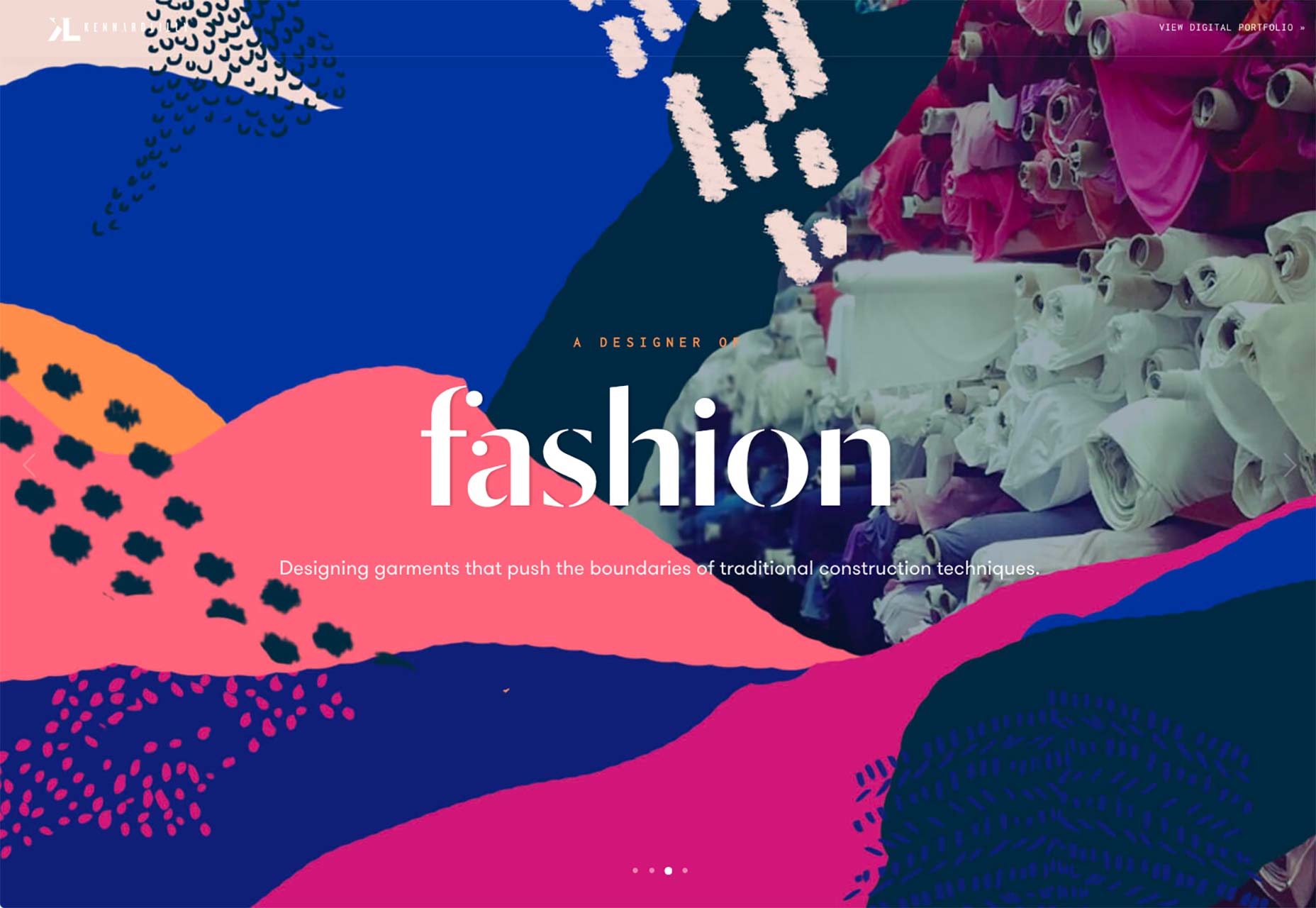
1. Thin(ner) Typography

Thin type is back in! Thin typefaces got a bad rap back when Apple opted for a super thin, lightweight font for its operating system with iOS 7.

Designers balked at the option which was a little tough to read and kind of bucked many design trends happening at the time. (Flat was all the rage, but some argued that Apple’s almost flat combined with the ultra-thin typeface was too much.) At the same time, wider, bolder typefaces became the dominant element for website headline and typography on hero images above the scroll.

The tide is beginning to shift the other way. Today’s thin typefaces are somewhat thinner than what we’ve become accustomed to, but aren’t near as thin as the Apple option.

The best thing about opting for a thinner typeface is that you have a little more freedom in with the design. While thin typefaces are not recommended for body copy, they can work well at larger sizes when there is plenty of contrast.

The examples below all showcase some of the best uses of thinner typefaces:

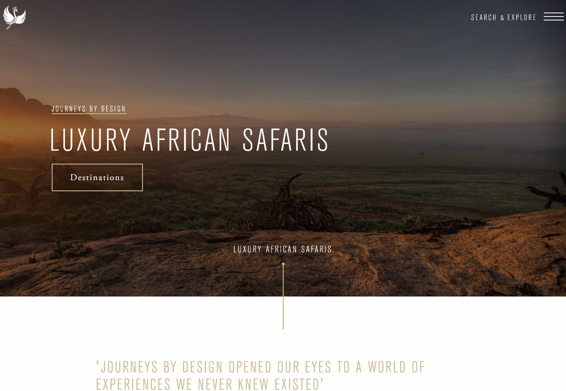
  • Use a thin typeface in all caps to create an impactful headline. This option often works best with only a few words, such as Luxury African Safaris, below. It’s equally important to think about the lettering in relationship to the actual letters; some words can be tough to read in thin typefaces or caps.
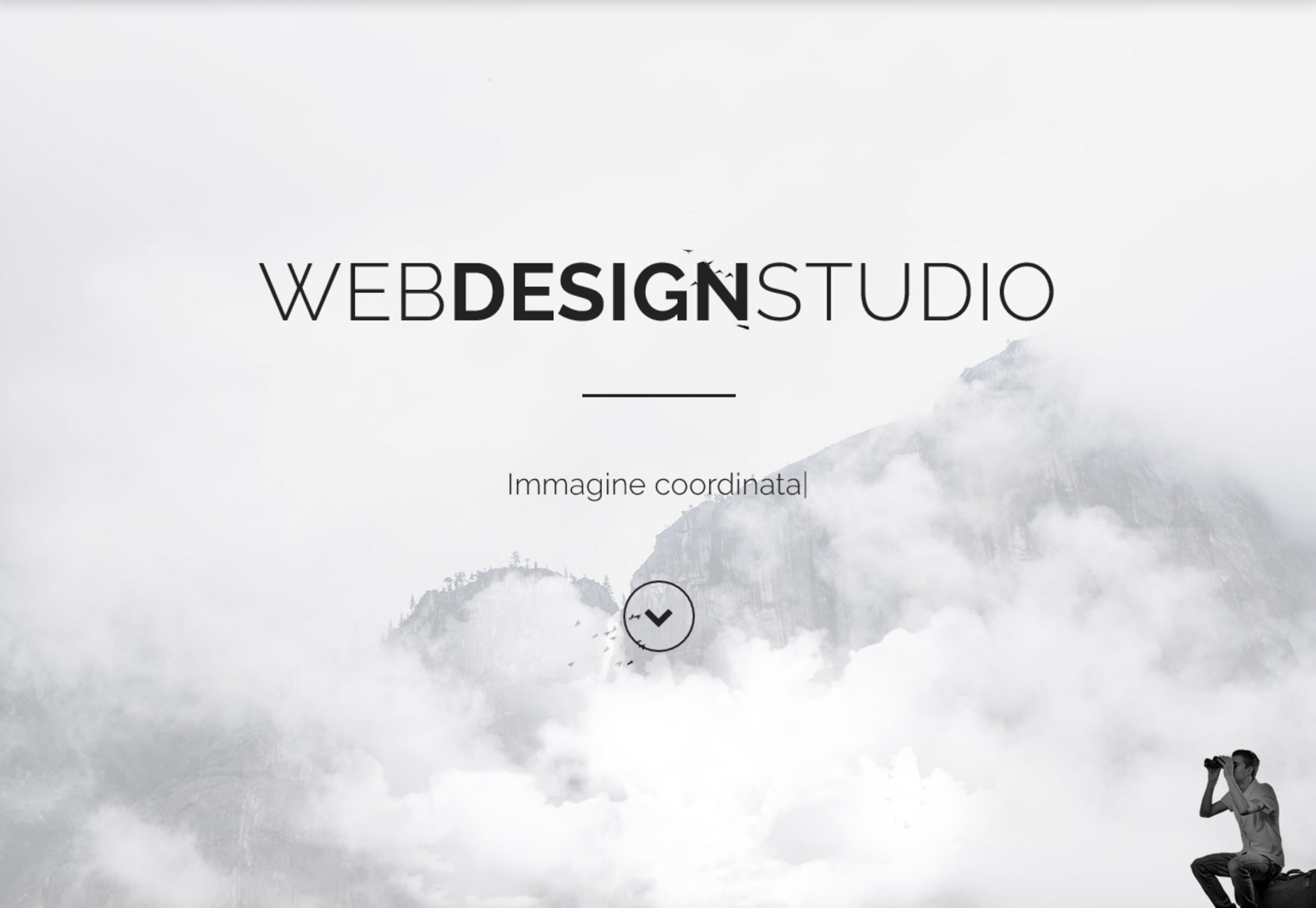
  • Pair a thin typeface with a bolder option to create emphasis, such as WebDesignStudio, below.
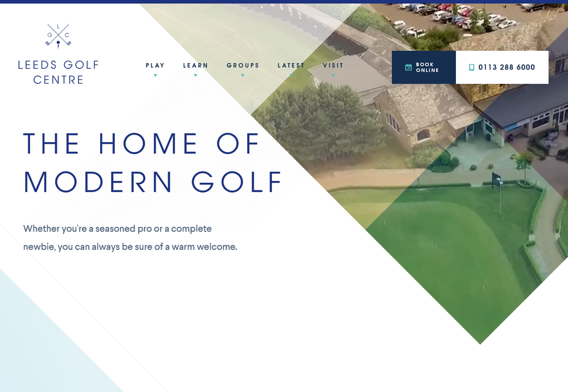
  • Use a thinner typeface in color (on a contrasting background) to add visual emphasis, such as Leeds Golf Centre, below.

Looking for inspiration? Here are five Google Fonts that fit the bill (and will look great): Source Sans Pro,  DosisScope OneRajdhaniMartel Sans.

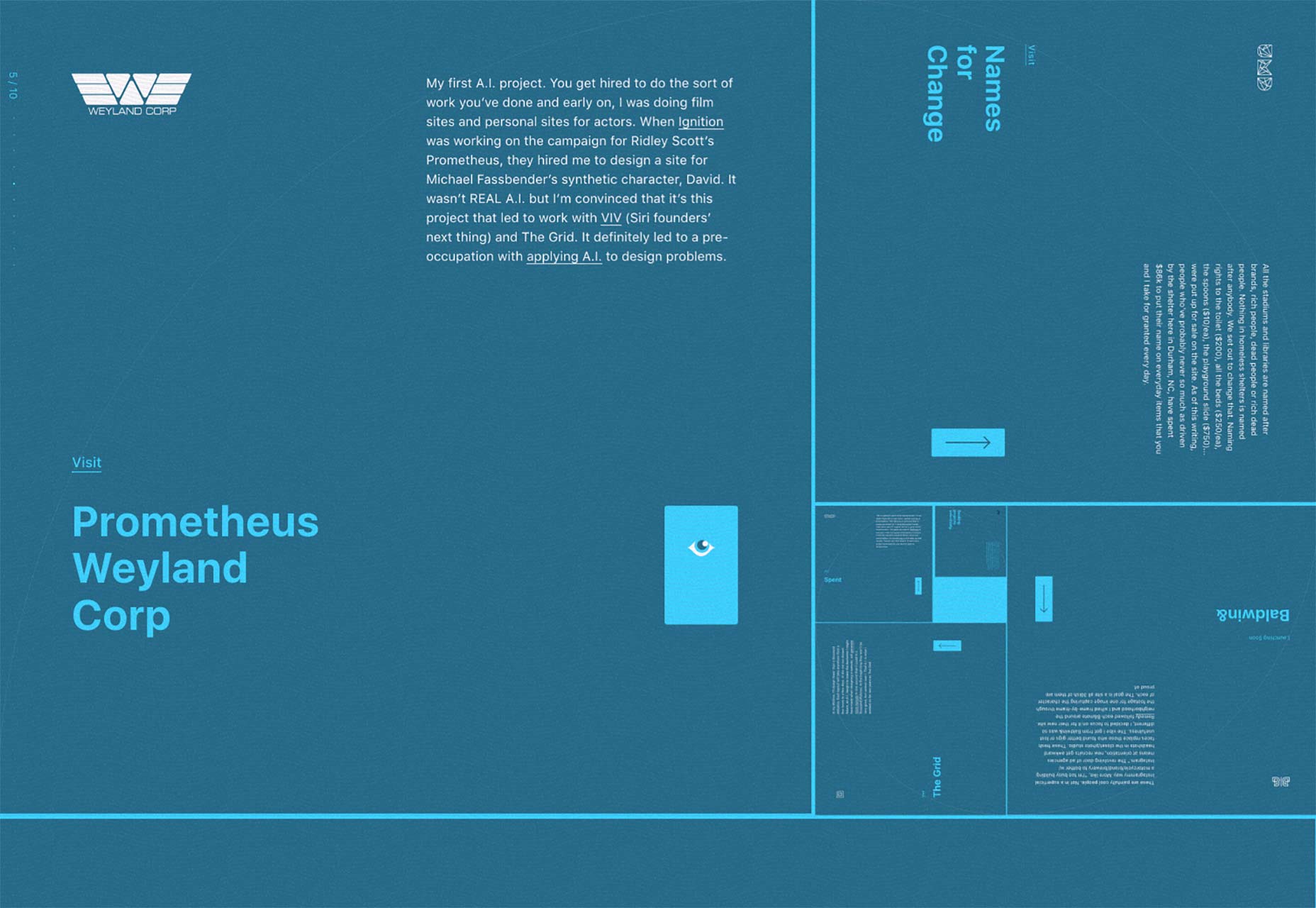
2. Elaborate Details

From fun flourishes to fancy typographic treatments to user interface elements that create unexpected delight, elaborate details are becoming more common. The trick to creating something elaborate is to make it appear as simple as possible for the user, meaning it has to be easy to understand and use.

The great thing about details is that they can add a lot of personality to a project. These elements can carry across mediums from website projects to product design to printed elements so that everything from a brand has that same special something visually. (This is an excellent way to establish brand cohesion.)

These details can appear in a number of ways and should always add to the overall effect, not detract from it. Elaborate details are best used for a single instance in the design and shouldn’t overwhelm users. Using something elaborate too many times can end up creating the opposite of the intended effect and actually visually overwhelm users. So once you find your “trick” use it once and use it well.

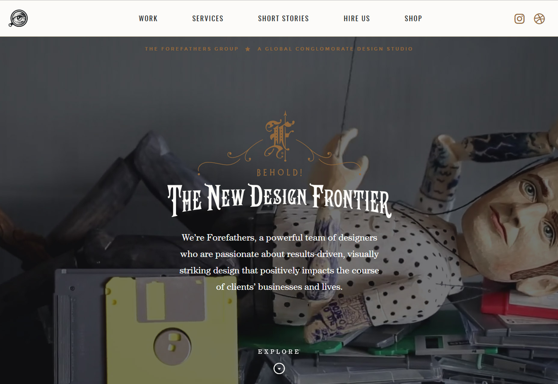
The Forefathers Group, below, uses elaborate styling with an old-style logotype with colored swashes above the headline. The type style is uncommon for web design and combined with the elaborate logotype, it is a striking combination. But you can also see how this design can only be effective with a single use. The typeface could be difficult if used for large blocks of text and the styling could get in the way of messaging. Here, the design team used it perfectly.

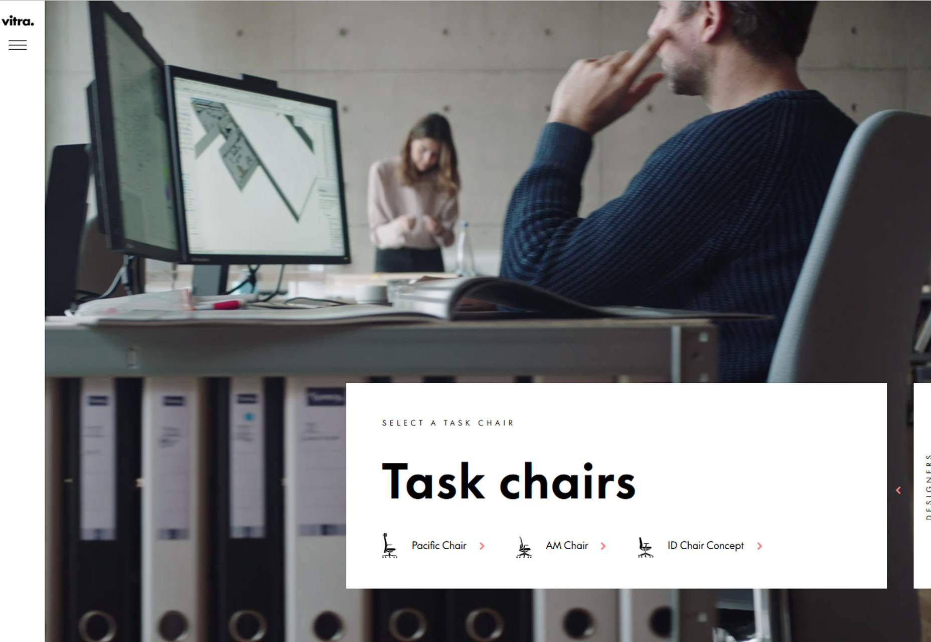
Vitra Task Chairs, below, uses elaborate user interface animations to engage users. The homepage includes a “Drag” button that opens into the product line menu. The background stays the same in both panels so that the chairs are always being highlighted in the video reel. Animations between clicks are equally interesting and even if you aren’t ready to buy a chair, moving around the website is encouraged.

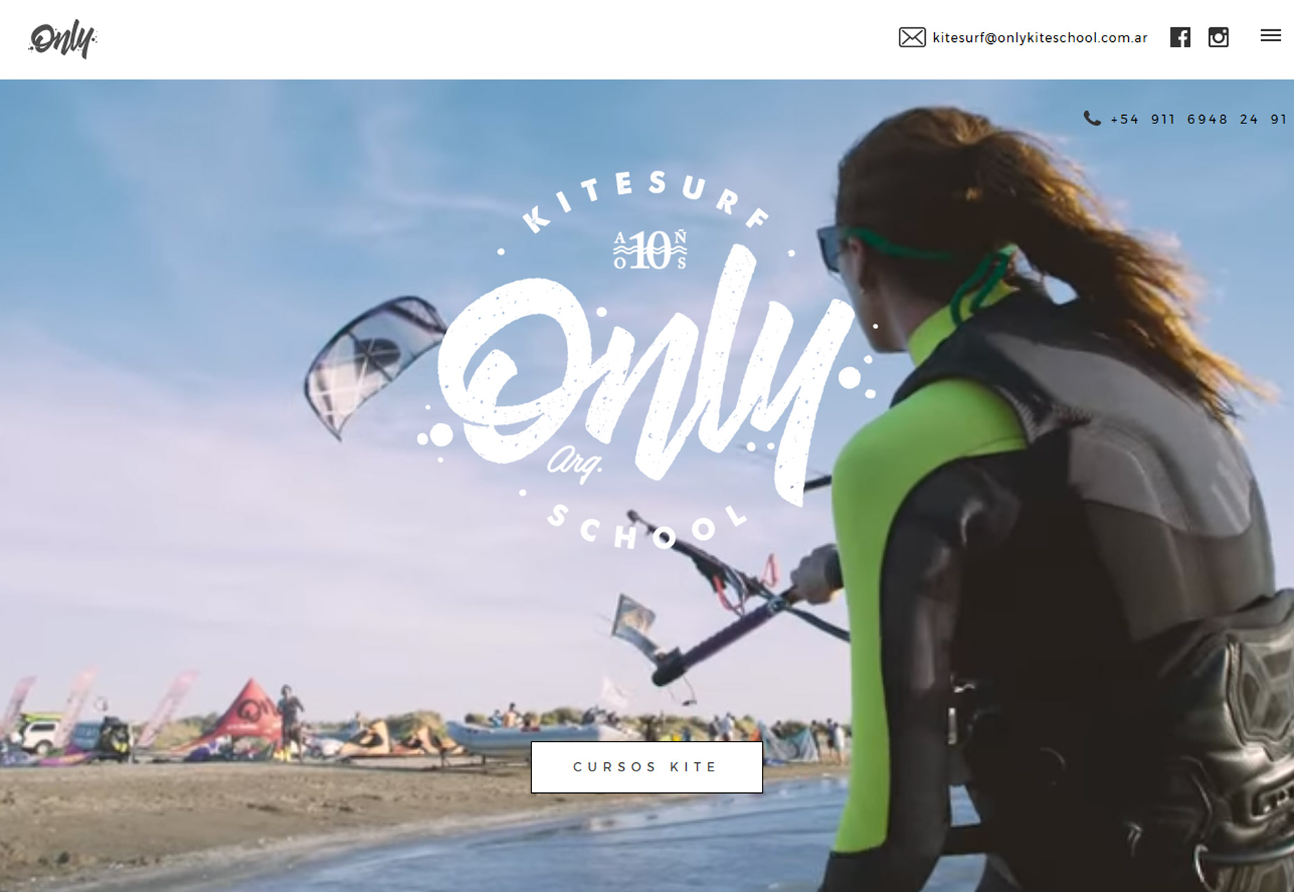
Sometimes the most elaborate design doesn’t include any super special effects. Only Kite School, below, uses fun video real and large logotype for a combination that draws the eye in. While the large logotype looks simple, creating typography that’s both readable and functional in that manner can be tough. Here, it works beautifully and the mood of the lettering matches what you would expect from this type of business.


3. Icon Logos

Is that an icon or a logo? The line between the two design elements is getting more crossed all the time. Icon-style logos are popping up everywhere.

Drawn from the minimal style, and because they work in a variety of applications, icon logos can be colorful or line-art inspired. Most uses lean toward a smaller style logo in a shape that will also carry over to social media sites for consistent branding online.

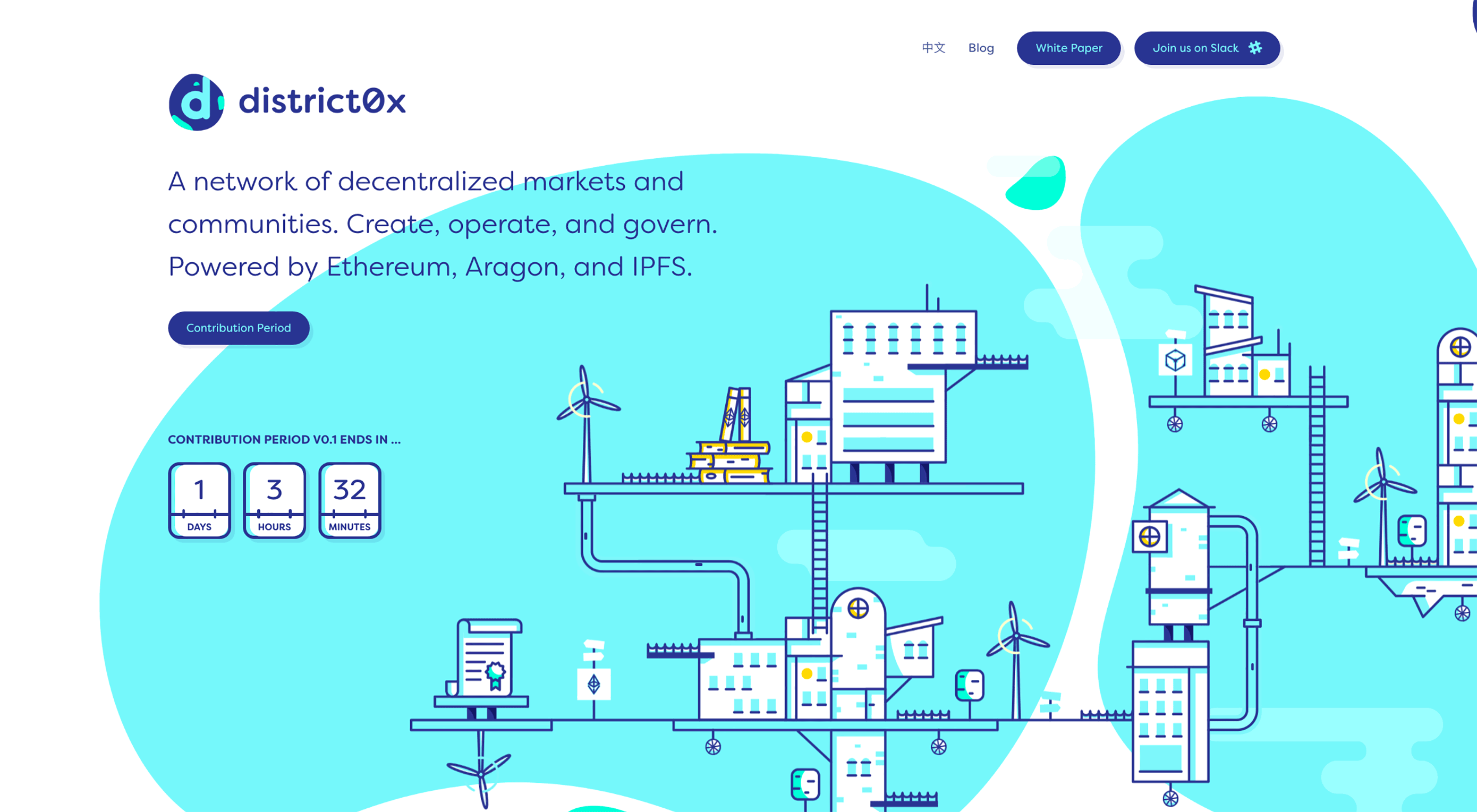
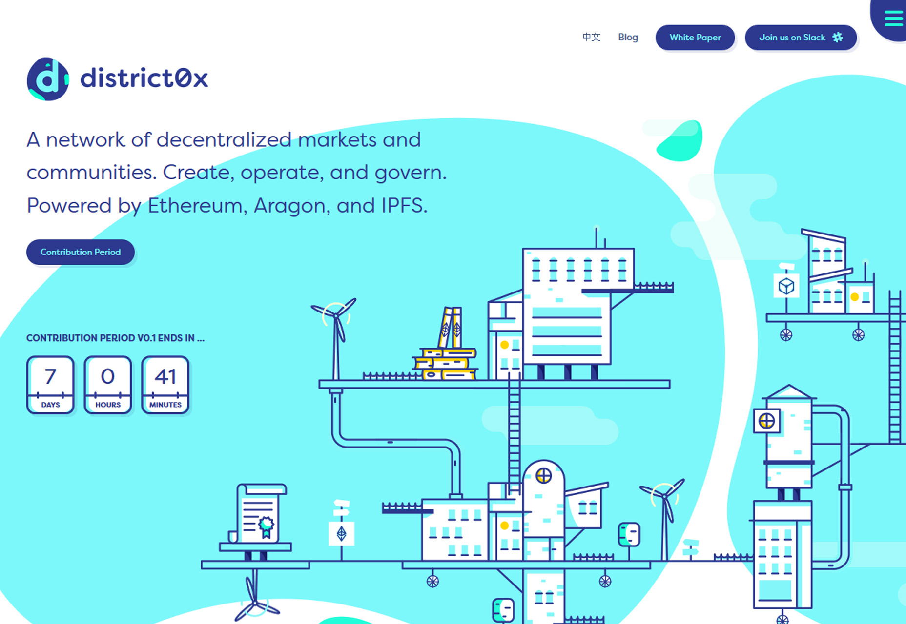
The downside of an icon logo is there’s not a lot of room for an actual company name. The best icon logos are designed so that they can stand alone or alongside lettering, such as District0x, below. Note how the colorful “d” icon could work by itself—it looks great in the circle Twitter logo format because of the asymmetrical shape—and doesn’t feel in the way when paired with the full brand name.

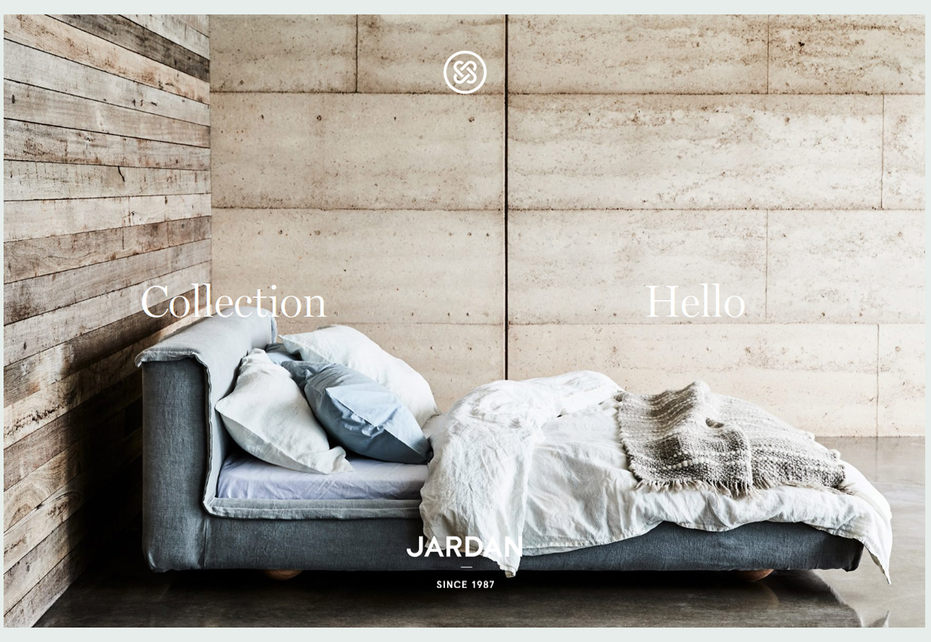
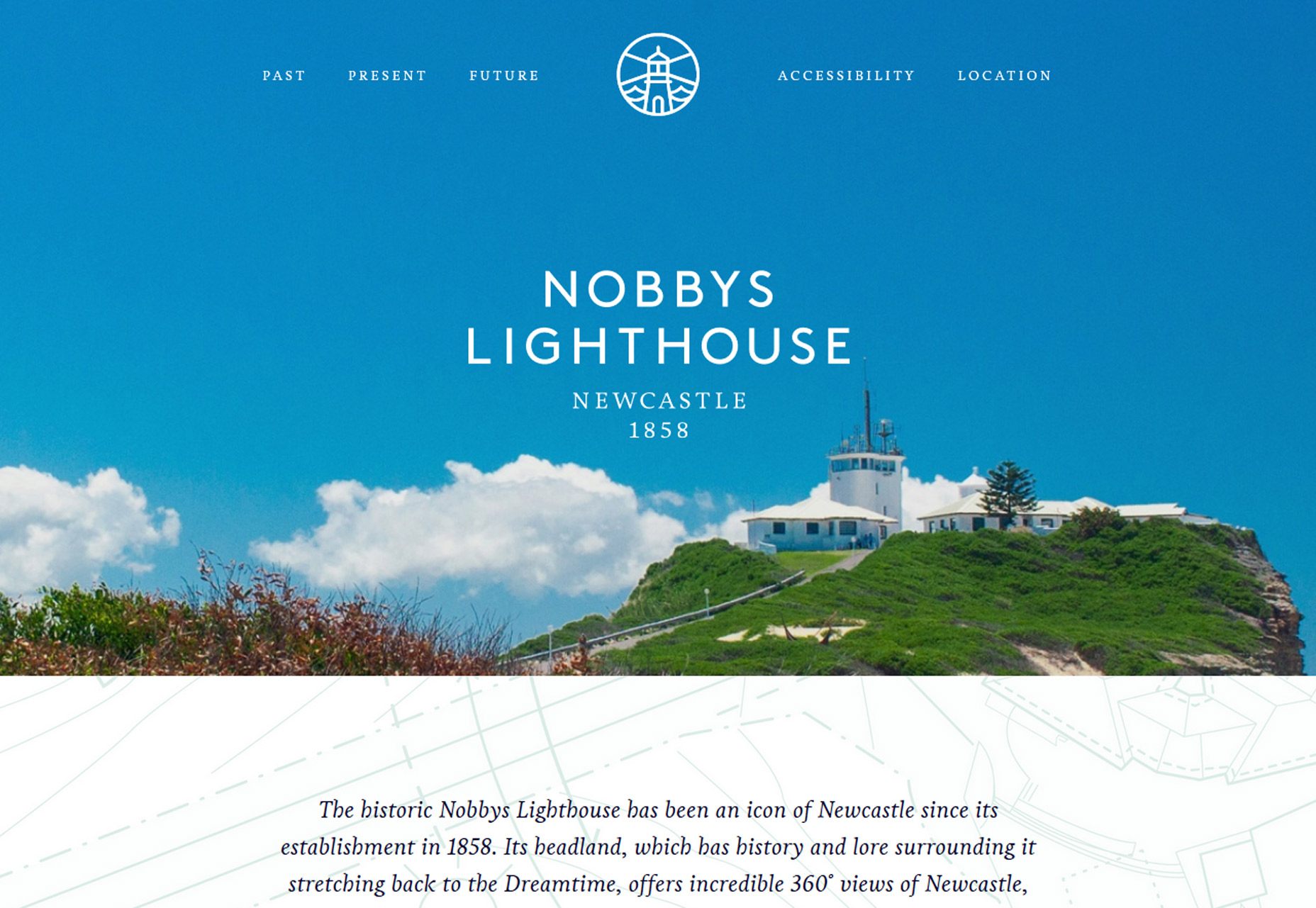
Jardan Furniture and Nobbys Lighthouse, below, opt for more simple icon logo styles with the brand name set in type below. While this is a popular option, it can create some disconnect between the name and logo. Opt for placements that connect the elements—both examples centered the logo and typeset company name—to create an eye path from one element to the next.

Conclusion

It’s fun to watch as trends start to shift from one dynamic to the next. Do you think more detailed styles will replace minimalism? Or is it just a passing fad?

<

p class=”p6″>What trends are you loving (or hating) right now? I’d love to see some of the websites that you are fascinated with. Drop me a link on Twitter; I’d love to hear from you.

280+ Beautiful Hand Drawn Fonts and Watercolor Flowers – only $19!

Source

from Webdesigner Depot https://www.webdesignerdepot.com/2017/07/3-essential-design-trends-august-2017/

Sunday 30 July 2017

Popular Design News of the Week: July 24, 2017 – July 30, 2017

Every week users submit a lot of interesting stuff on our sister site Webdesigner News, highlighting great content from around the web that can be of interest to web designers. 

The best way to keep track of all the great stories and news being posted is simply to check out the Webdesigner News site, however, in case you missed some here’s a quick and useful compilation of the most popular designer news that we curated from the past week.

Note that this is only a very small selection of the links that were posted, so don’t miss out and subscribe to our newsletter and follow the site daily for all the news.

Adobe Just Built the Prettiest UI Ever


Git for Designers is Here – Meet Abstract


Roboto Needed a Website


Inspirational Showcase of UI/UX Design Presentations


Life is About to Get a Whole Lot Harder for Websites Without HTTPS


My First Big Screw-Up: Lessons from 8 Top Designers


11+ Design Mistakes You Should Avoid at any Cost


Grabient: Grab a Gradient


Ghost 1.0 Released


Google has Dropped Google Instant Search


How to Steal Design Ideas (And not Feel like a Schmuck)


Famous Designers as Icons (with Icon Set)


Firefox’s Blazing Speed with Huge Numbers of Tabs Leaves Chrome in the Dust


Comprehensive Guide for Color Usage in Web Design


Are Notifications a Dark Pattern?


12 Signs that your WordPress Site is Hacked


Improving your Visual Design Skills: Thoughts for Beginners


Adobe Mistakenly Leaks Upcoming Photo Editing Software on Creative Cloud


Top 12 New Web Design Tools for July 2017


Mobile-first Indexing is Coming: What this Means for Web Design


Stress is the Enemy of Creativity


Adobe Brilliantly Reimagines the Color Picker as an Artist’s Watercolor Palette


Nailing the Whiteboard Design Challenge


How Shazam’s UX has Changed


Why Companies Rebrand


Want more? No problem! Keep track of top design news from around the web with Webdesigner News.

LAST DAY: Bourton Font Family of 34 Fonts & More from Kimmy Design – only $17!

Source

from Webdesigner Depot https://www.webdesignerdepot.com/2017/07/popular-design-news-of-the-week-july-24-2017-july-30-2017/

Saturday 29 July 2017

Comics of the Week #400

Every week we feature a set of comics created exclusively for WDD.

The content revolves around web design, blogging and funny situations that we encounter in our daily lives as designers.

These great cartoons are created by Jerry King, an award-winning cartoonist who’s one of the most published, prolific and versatile cartoonists in the world today.

So for a few moments, take a break from your daily routine, have a laugh and enjoy these funny cartoons.

Feel free to leave your comments and suggestions below as well as any related stories of your own…

No, that’s not it

Email workout


No rest

Can you relate to these situations? Please share your funny stories and comments below…


1300+ Versatile Photoshop Brushes – only $14!

Source

from Webdesigner Depot https://www.webdesignerdepot.com/2017/07/comics-of-the-week-400/

Friday 28 July 2017

3 Secrets of Successful AR Design

Over the past several years, augmented reality (AR) technology has established a home in entertainment, marketing, education and many other industries. The use of AR apps in the enterprise will grow to $2.4 billion in 2019. On the flip side, augmented reality also brings a lot of challenges for designers. Today most experienced designers have got skills in designing web and mobile apps, but these skills aren’t always applicable for immersive AR experiences.

This article will look at how AR is affecting UX, and how UX designers can rise to the challenge of designing engaging augmented user interfaces.

What is AR?

Augmented Reality refers to technology that uses real-time inputs to create an output that combines both real-world data and some programmed elements. AR adds a programmed layer over actual reality to create a third, dynamic level of augmented experience. With AR apps, instead of just seeing information, users interact with it and receive live feedback on the action they have performed.

AR apps are already thriving in the Android and iOS ecosystems right on our smartphones and tablets. Examples of AR that the majority of users have at least heard of, if not used, are things like:

Pokémon Go: Players can collect game characters that can be uncovered by moving in the real world.

SnapChat lenses: SnapChat uses facial-recognition technology to enable users to enhance images with computer-generated effects.

Snapchat’s lenses feature

Microsoft HoloLens: Using tools like Microsoft’s HoloLens it’s possible to see and interact with complex models such as 3D model of a human heart.


 Microsoft HoloLens

How To Design for AR

The field of designing AR user experiences is still in its infancy, and since there are no established UX best practices for it yet, I’d like to share my own personal approach to UX in AR apps…

1. AR Use-Case Needs to be Evaluated

The concept of “measure twice, cut once” is especially important in building AR apps. Before diving in, it’s important to have a clear answer on the question “What do I want to achieve with this AR app?” Your ultimate goal is to ensure that the AR experience is right for the project. Keep in mind the following:

  • AR experiences should be tied to clear business and user objectives. You shouldn’t create an AR app just because it’s trendy—that’s almost a sure way to create a poor UX. Rather, the desired functionality needs to be evaluated to fit with the experience that the AR display medium can offer.
  • As always, good user experience only comes from close attention to users’ needs.  This means that if you’re going to design an AR experience, you should invest heavily in user research. Spend some time really getting feedback from your target audience, get to know how they do something in the real world without any kind of device, and how AR can help them do it better.

2. Consider the Environment in Which the Product Will be Used

Since you will integrate an AR design solution into the users’ environment, you want it to feel as natural as possible. The environment significantly affects AR design:

  • In a private environment (e.g. home or  work) the UX designer can count on long user sessions and a complex interaction model. The whole body can be involved in the interaction, and specific devices, such as a head mounted display, can be used for manipulation.
  • In public environments, usually outdoors, it’s important to focus on short user sessions. Because regardless of how much people might enjoy the AR experience, they won’t want to walk around with their hands up holding a device for an extended period of time.

Thus, when designing an AR app, you first need to research the environmental conditions in which the app will be used and how it will affect the user:

  • Identify interaction scenarios upfront, even before specifying technical requirements for the project.
  • Collect all the details of the physical environment to be augmented. The more environmental conditions you identify before building a product, the better.

User testing should be a critical step in the review process. When the first working prototype of your AR app is ready, you should run comprehensive user tests on product use in real conditions. Your ultimate goal here is to make interaction with the product comfortable for users.

3. Make the Interaction with AR Simple

AR in an app should be a layer of added value that reduces the time needed to complete simple tasks. Keep in mind that with each product people are seeking out experiences, not technologies, and they won’t like a technology that isn’t friendly to use. Thus, when designing your AR solution I recommend the following approach:

  • go to the environment where the user will perform the task;
  • think through each step that your users will go through in order to accomplish the task;
  • record each of those steps.

This information will help you conduct a task analysis. The analysis will help you make things more natural for the users. Consider the Google Translate app in the example below. The app uses the phone’s built-in camera to translates the captured text into another language. This example perfectly illustrates the value that AR technology can provide.

AR experiences should be designed to require as little physical input from users as possible. When users are looking through the device screen at an augmented picture, it’s going to be hard for them to input data at the same time.


Easily Build Your Own Website with Dragify – only $24!

Source

from Webdesigner Depot https://www.webdesignerdepot.com/2017/07/3-secrets-of-successful-ar-design/

Thursday 27 July 2017

5 Ways to Make Your Website Stand Out

Everyone involved in building a website wants it to stand out from other websites. Clients want to stand out from the competition and leave a favorable impression on potential customers; designers strive for originality and to compete with other designers; back-end developers want a success story in their portfolios and an original or different-looking site can help with that.

And we want it bad. There’s a cottage industry of people writing articles designed to help us design more original-feeling sites. I’ve even seen articles about “Trends to Make Your Site Stand Out”, and it feels like at least one of those words is sorely misused.

Goodness knows I’ve obsessed over it in the past. I know the feeling that your work just isn’t good enough because man, the last couple of sites you made really felt the same. Where’s the inspiration? Where’s the creativity? Well, originality isn’t the be-all and end-all. If a site that feels the same as many others gets the results you want, that’s not a bad thing.

But you can create sites that stand out. Consistently producing original—or at least original-feeling—work doesn’t happen by inspiration or by luck. It happens with planning, and a lot of effort. Here are five approaches you can use to make your work stand out, with their pros and cons. I’m not going to include a ton of examples, because the idea is to not copy other sites.

1. Layout and Structure

Okay, this is perhaps one of the more obvious ways to differentiate your site from the rest. It’s also the most difficult. On the pro side, using a fancy layout or site structure that no one has ever seen before is instantly memorable. It can also be a lot of fun. After creating your fifty-second three-column site, mixing up the layout provides a challenge for your visual design skills and your front-end dev skills that can’t be beat.

The cons: There are only so many ways that information can be organized before you start to lose accessibility and usability points. The development time is often increased, as you end up working to solve problems few have encountered before. The really crazy layouts often depend heavily on JavaScript. Layout should ideally not depend on JavaScript.

2. Branding

Branding is the other really obvious way to make your site stand out. And it’s easy. Just find out what your client’s branding guidelines are, and stick to them. Embrace them. Make your client sick of seeing their own logo and colors. Then maybe tone it down a little, and you’re good to go.

The cons: This approach only works if your client has highly original branding. If their brand style guide consists of Helvetica and not much else, you are at a severe disadvantage.

3. Graphics and Imagery

If the branding isn’t enough, you can use graphics and/or photos on your site to establish a distinct visual style. Sites with big images do tend to convert more, after all. People are visual creatures, so visual stimuli can make it easier for users to connect with you on an emotional level. Plus, the stylistic options are just about endless, which makes it easier to create an original-feeling design.

The cons: Graphics and photos that look original are expensive, because they pretty much have to be custom made. Using stock images will likely kill the distinction that you’re going for.

4. Text and Content

This is probably the most important—and sometimes the most difficult—way you can set yourself apart. What is said on any site can and should be a reflection of the client’s personality and/or company culture, while still being clear. You can use copy, microcopy, and even things like video to communicate personality in a way that sets you apart.

The cons: Ok, first you have to get any text at all from your client. Heh. And then you have to get copy that actually feels like a human wrote it. Most marketing copy has a very specific tone that seems to transcend borders and cultures. Getting the reader to see past the obvious desire to sell them things is the trick, and it’s a tough one.

I mentioned microcopy before, but it really makes a difference. Users expect sales copy when reading up on a product or service. But if the rest of your site, especially the interactive bits like forms, treat the user as human rather than as a mere customer, this will make your site stand out in big ways.

5. Animation

Animation is a huge deal right now, and for good reason. When done right, it can take a pretty good experience and make it unforgettable. While I’m glad splash screens went the way of the dodo, I can still remember some of the animated web experiences I saw during the ’90s. Did I say before that humans were visual creatures? Well make those pictures start moving, and you can start a new industry in California.

The cons: I saved animation for last because it’s very effective, but also very hard to get right. I mean, everyone and their dog is animating their sites now. That means that if you want your animation to stand out from everyone else’s animation, you’ll have to step up your game. Bouncing buttons ain’t gonna cut it. Animation that’s badly done can also cause usability problems, performance problems, etc.

Conclusion

Look around on the internet and you’ll notice that it’s very rare for any of these approaches to be used alone. It’s fairly common for people to even try to combine all five. As usual, however, it’s best not to split your focus too much.

Ask yourself where your strengths lie. Are you a good writer and illustrator? Focus on text and imagery. Are you a great brand designer and animator? Make that logo blow people’s minds. And most of all, remember to have fun while you’re making something new.

LAST DAY: Gigantic Bundle of 1000+ Logos, Elements, Mockups, Textures – only $19!

Source

from Webdesigner Depot https://www.webdesignerdepot.com/2017/07/5-ways-to-make-your-website-stand-out/