 Hey guys, remember Firefox? Remember the Mozilla Application Suite? That second one isn’t relevant, but everyone knows that nostalgia is an attention-grabber. Now that you’re here, let’s move on with that first item: Firefox. It’s getting a logo change… eventually. The Mozilla foundation wants your help deciding which direction to go.
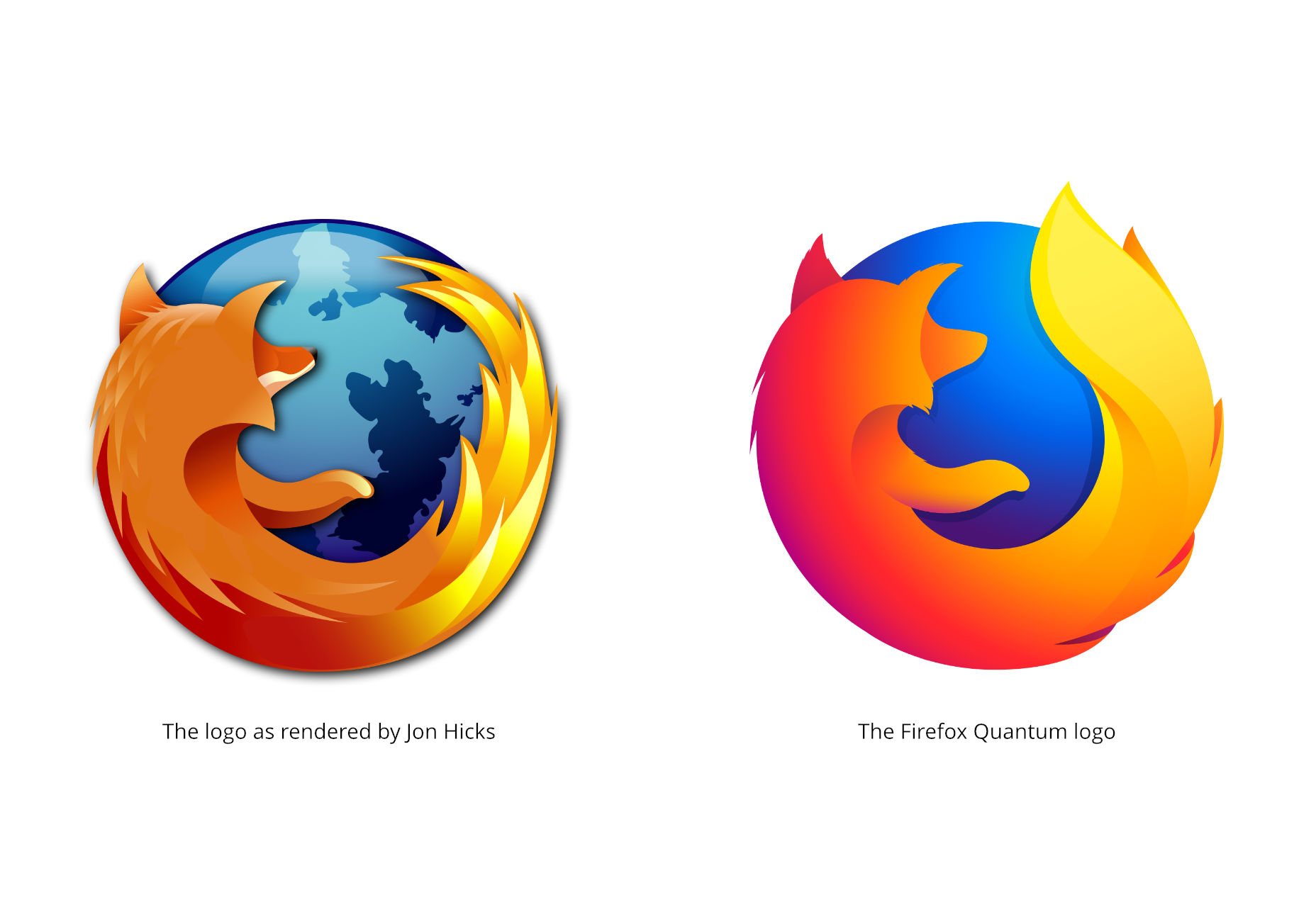
The Firefox logo as we know it was a collaboration by Daniel Burka, Stephen Desroches, and the inestimable Jon Hicks. It was they who introduced us to that little blue ball, and the weirdly-charismatic-even-when-we-can’t-see-his-face fox.
Over the years, though, it has been changed, and simplified. As our collective Western aesthetic evolved, and as screens got smaller and smaller, it needed to change with the times. And now, once again is changing, because Firefox isn’t just a browser anymore; it’s the head of a product family, as Mozilla themselves put it in their own post on the topic.
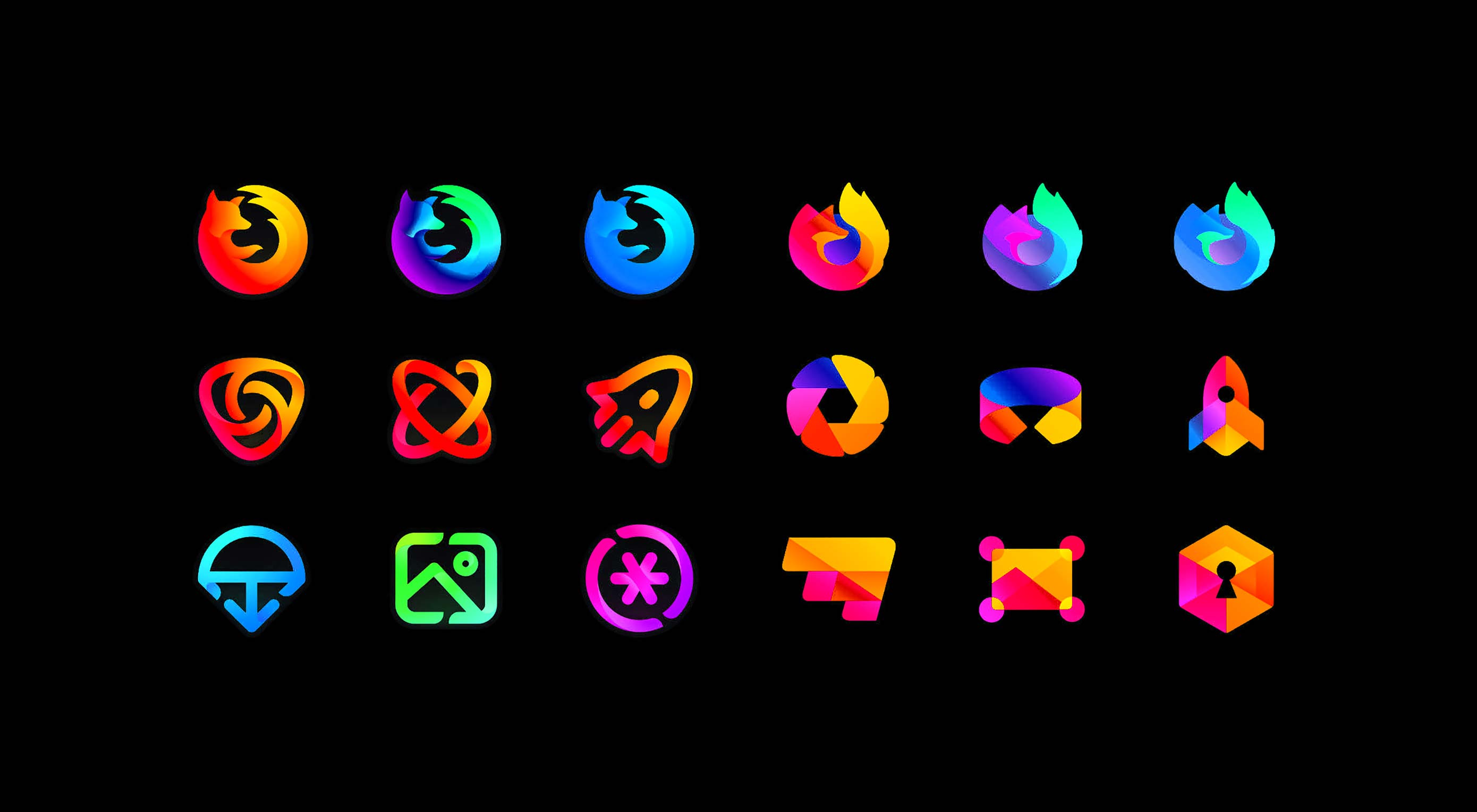
Since a product family needs to more or less match, visually speaking, Firefox’s logo needs to change to allow more flexibility. It needs to be adaptable to other software. To this end, the branding team at Mozilla has come up with two different branding systems, and is looking for feedback on them.
To have your say, leave them a comment on the blog post linked above.
Note that neither of these systems are anywhere close to finalized. Mozilla even refers to them as “a work of fiction” at this point, which should tell you about how close they are to being implemented. Every icon has yet to undergo quite a bit of iteration before any decisions are made.
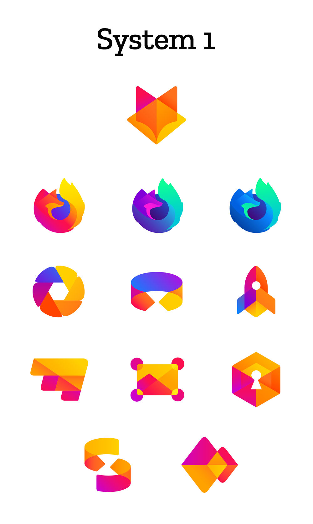
System 1
This first system emphasizes thick geometric shapes, and a strongly yellow-to-red palette, though there is some variation in the color. Of the two, this almost feels a bit more “classic Firefox”.
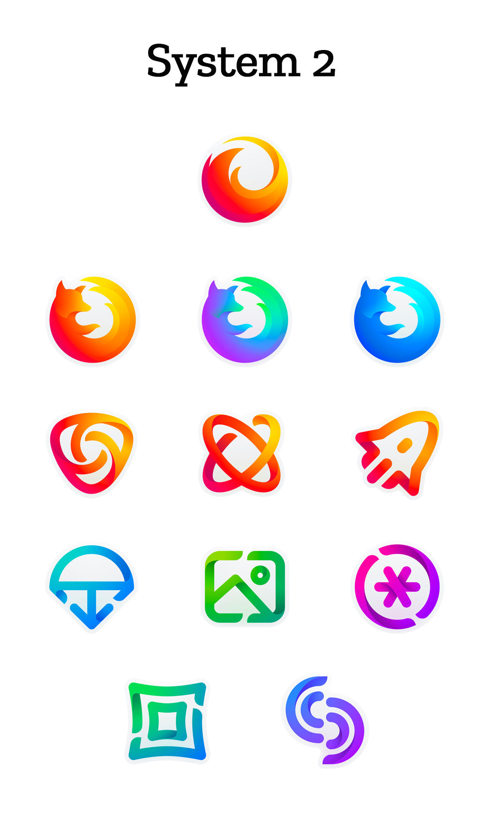
System 2
The second system introduces a bit more color variation, with thinner lines.
My Opinion
These design systems both seem very, very corporate, which I suppose is appropriate, now. I do not think, however, that they are devoid of personality or history like some other recent logo redesigns have been. This is an actual evolution of the brand, rather than a surgical removal of everything fun and/or dated.
Like many in the comment section of the original post on Mozilla’s blog, I think the Firefox icons from System 2 should be combined with the other icons from System 1. It just seems to fit better that way.
The only thing that worries me a little is this quote at the end: “With your input, we’ll have a final system that will make a Firefox product recognizable out in the world even if a fox is nowhere in sight.” I don’t think they actually have any plans to remove the fox imagery; but if that question ever comes up, here’s my community feedback: Keep the damn fox, mmmkay?
| Add Realistic Chalk and Sketch Lettering Effects with Sketch’it – only $5! |
from Webdesigner Depot https://www.webdesignerdepot.com/2018/08/firefox-working-on-a-rebrand/
No comments:
Post a Comment